Sony recently asked Adam Wilt and I to speak about the new FS700 camera at CineGear. My portion of the presentation examined how to profile dynamic range and determine how the various gamma curves changed the camera’s response. Read on to see what I discovered…
I’ve worked as a consultant, both paid and unpaid, to DSC Labs, manufacturers of the best HD color charts in the world. This has some benefits, such as having access to charts that aren’t as easy to find as they should be. One of these charts–the one I consider indispensable when learning how a new camera functions–is the DSC Labs Xyla 20-stop dynamic range chart:
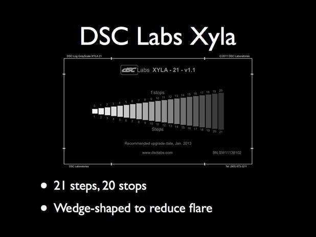
The theory behind this chart is simple: each of the 21 steps is exactly one stop denser than the one before it, which makes it dead easy to look at the image of the chart on a monitor and see, instantly, how much dynamic range a camera has with its current settings. And–even better–looking at the pattern on a waveform monitor will show exactly how the gamma curve is shaped, revealing which portions of the curve are compressed and which are expanded.
And, as every modern camera has the equivalent of at least a half dozen film stocks built into it, this chart makes it very fast and easy to see how the contrast of each of those options varies.
There is no faster way to learn how a gamma curve allocates dynamic range.
The eagle-eyed among you may have noticed that I said the chart covers 20 stops of dynamic range and yet it has 21 steps. That’s because we clip the first step and count stops from there. (You’ll notice that the bottom of the chart pattern is labeled 1-21 in steps, but the top of the chart is marked in stops and is marked 0-20.) That’s because the only consistent exposure reference point an HD camera offers us is the point where the photosites on the sensor saturate, or clip. In film we have a number of density reference points (D-min, D-max, middle gray) but those don’t apply to digital sensors. The one thing we know about every sensor ever made is that, at some point, you’ll max out the exposure and the sensor will give up and show featureless white.
From my presentation notes:
“The only reference point a sensor offers us is where it saturates, or clips. Film has solid reference points: maximum density, minimum density, and 18% gray. In digital cameras 18% gray, or middle gray is an arbitrary value based on the particular gamma curve used. We can’t use middle gray as a reference and measure latitude above and below; we can only reliably measure how many stops down from clip a particular tone occurs. Middle gray moves around depending on the gamma curve used.”
What this means is that one gamma curve may plot 18% gray at the 3rd step below clip, while another may plot it at the 5th step below clip. Both will make a properly exposed 18% gray card look middle gray, but the latter will offer more overexposure headroom–along with an increase in noise.
Noise is the single biggest determinant of how fast a camera can be rated. The less noisy it is the higher the ISO, and the more overexposure latitude can be made available because 18% gray can be pushed closer to the noise floor. This allows the gamma curve to allocate more steps to highlight detail.
I’m quite proud of my own contribution to this chart’s design: contrast is so high between the brightest step and the darkest that flare can dramatically affect shadow results, so the wedge shape minimizes the size of the brightest steps to reduce flare that may artificially boost the darkest steps. (Also, the chart comes with sliders that can block the brightest steps and make the darkest steps easier to view. That part wasn’t my idea.)
In theory this chart should be used in a very, very large, completely black room–but modern cameras can’t see the full range of this chart without using HDR, so we were able to shoot these tests in a dark stage (at Meets the Eye) and get perfectly usable results.
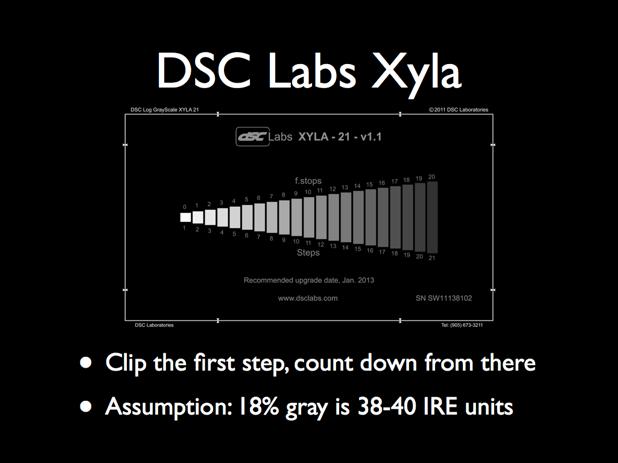
Different manufacturers choose different values for 18%, or middle gray. There is some math involved but I’ve also been told it’s a matter of taste. Most say middle gray is in a range between 38% and 42% on a waveform monitor, so I’ve chosen 40% as a happy medium.
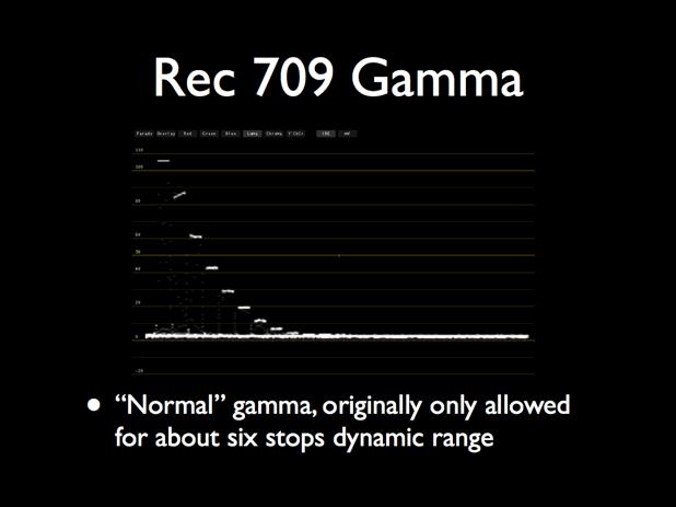
The Rec 709 spec that all HD devices are based on was designed to hold only about six stops of dynamic range. Today’s cameras capture a much greater range of brightness, typically at least ten stops from clip to black. Highlights and shadows can be compressed because that’s what our eyes do anyway: we are most sensitive to contrast in mid-tones, the rest can be cheated. As long as mid-tone contrast is correct, contrast in highlights and shadows can be reduced–which allows the camera to cram more stops into a smaller space.
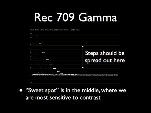
Ideally there should be more space between the middle steps than in the steps at either end. I’ve arbitrarily selected a range between 20 units and 80 units for this example; most gamma curves compress contrast above or below these points.
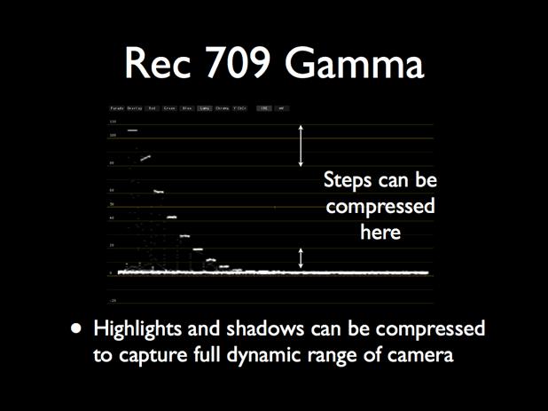
This isn’t a good example of highlight compression but it is a good example of shadow compression. Notice how the steps flatten out as they head toward black. Some of this is simply how the sensor responds to light, but some of this may be the work of the gamma curve. Whereas the original Rec/ITU 709 spec may have allowed for only about 3-3.5 stops in the range between 18% gray and black, we can see 6 or 7 here.
The idea is this: modern cameras capture at least ten stops of dynamic range, but they are forced to fit those into a range originally designed for only six stops because that’s what the Rec/ITU 709 standard dictates. Changing this standard to accommodate the increased dynamic range of modern cameras means scrapping every device manufactured in the last 12 years, so it’s generally more economical to work within the standard than to create a new one.
This means modern cameras must play games to make their images look their best within these limits, so they mush the brightest and darkest stops together to cram 10+ stops into a 6 stop range. The most important area of the curve, where our eyes see the most contrast, is in the middle range. If those steps aren’t nicely spaced then the image will look flat.
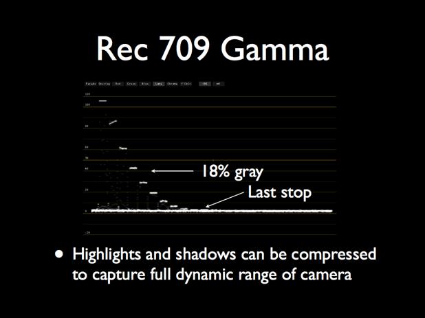
From my presentation notes:
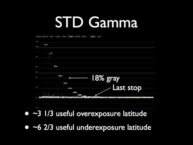
The first step is just clipped, and we count down until we hit 18% gray at 40 units. The first step is zero, or clipped; the second step is one stop from clip; the third step is two stops from clip, and the fourth step is three stops from clip. That’s where we hit 40 units, so we can say that this gamma curve offers us three stops of overexposure latitude above 18% gray. I see seven additional stops below 18% gray before the darkest visible steps dissolve into noise.
The last step visible on the waveform may not be the darkest step viewable on a monitor. This depends on a number of factors, such as the quality of the monitor and whether the viewing conditions are suitable. A lot of ambient light may make the darkest steps harder to see.
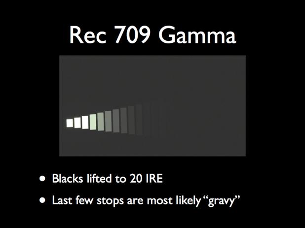
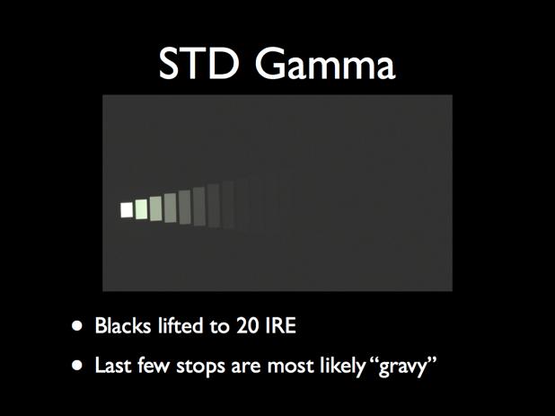
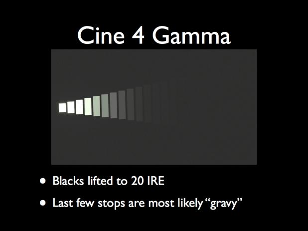
Here I’ve boosted the blacks to 20 units just to see what’s happening in the deep shadows. I count 14 stops from clip to the last visible step. Those last few stops are most likely not usable and shouldn’t be counted on.

I divide these stops between “paycheck” stops and “gravy” stops: paycheck stops are the values that need to be there or your paycheck stops. Gravy stops are nice if they are there, but if they aren’t you’re still going to keep your job. The last few stops we saw on the previous gamma curve are, for me, gravy.
The Xyla chart is a great tool for showing overall gamma response, but we should always look at the image on the monitor to see what’s realistically visible.
On the next page I lay out all the FS700’s gamma curves, in all their glory…
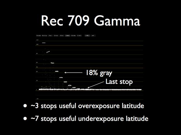
This is the gamma curve we just looked at, and this is what I consider to be the usable range. In actuality I wouldn’t place crucial detail within a couple of stops of that last step, but in theory I’ll be able to see detail that’s seven stops below middle gray. Note, though, that stops -6 and -7 are the same value, so while I can see them they are probably going to mush together as there’s no significant contrast between them.

With blacks lifted…
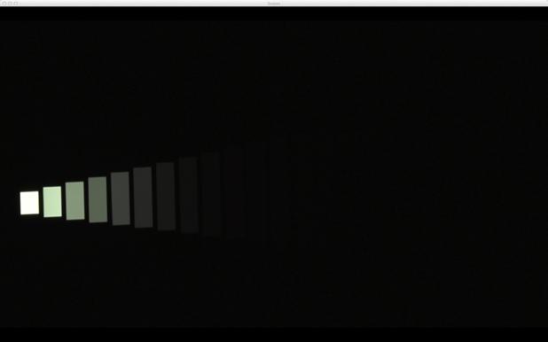
…and with blacks set at 0%. This is what’s actually visible. We should really view this on an HD monitor in a controlled environment, but this gives us a reasonable idea of what’s going on. I won’t show this view for the other curves as I’m worried it will be deceptive on a computer monitor. I don’t mind showing it for this gamma curve as I will probably never use it due to its lack of overexposure headroom.
I’ve said this before in other articles, and I’ll say it again here:
If a camera offers a true Rec 709 gamma curve, DON’T USE IT. Even though this curve is technically correct it is severely limiting as modern cameras offer way more dynamic range than the Rec 709 spec was built to contain.
Most gamma curves are, instead, “Rec 709 compliant.” This means that, while they are not truly built to the Rec 709 spec, they are designed to look good when viewed on a Rec 709-compliant device (like an HD monitor). These curves work within the spec to make pretty pictures, but they don’t conform to the Rec 709 spec exactly.
The best analogy I can think of at the moment is this:
Imagine Rec 709 as a freewayway designed for use with Volkswagon Beetles. At the time the Beetle was a very popular car, but now everyone wants to drive modern BMWs. Do we change the freeway to accommodate these newer cars? No–instead, we design the newer cars to fit on the same freeway. They can do a lot more–go faster, maneuver better, use less gas–and even though they aren’t Beetles they still function fine on the same freeways.
In the case of the true Rec 709 gamma curve, you should only expect about 2.5-3 stops of overexposure latitude. No thanks, I want more.
A good example of a non-Rec 709 compliant gamma curve is S-Log, Sony’s log curve. Log curves are designed for storage only: they cram the most information into the Rec 709 “bit bucket” in such a way as to offer maximum grading opportunities in post, but they are not meant to be viewed on a Rec 709 monitor. You can view them on a Rec 709 monitor but the image will appear very flat unless it is processed through a lookup table that adds contrast to the mid-tones. (For more about S-Log and gamma curves in general, see here.)
I don’t see a huge difference from Rec 709 gamma. There’s slightly more overexposure headroom.
I see maybe 12 stops here, total.
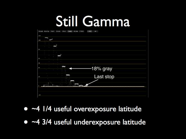
This is where things get interesting. Notice how we now have an additional stop of highlight latitude. STD gamma gave us +3 1/3 stops, but this gamma gives us +4 1/4. Did the camera magically become more sensitive? No, Sony just remapped how the values fall and boosted the mid-tones up a stop. This gamma curve may look a little noisier than the previous one but that may be perfectly acceptable based on the noise characteristics of the camera.
This is crucial to understand: the ISO rating of a camera is completely arbitrary. All it really tells you is that at a specific ISO, and with a certain amount of light falling on an 18% gray card, the stop on the lens that makes that places that gray card at 40% on a waveform monitor should be the same stop indicated by your (properly calibrated) light meter. The ISO says nothing about how noisy the camera is, because different gamma curves will map 18% gray to different exposure levels. They’ll all read as 18% gray when exposed “properly” but the noise levels will vary.
If the camera isn’t noisy then middle gray can be set quite far down the exposure range, which gives us more overexposure latitude. And, as overexposure latitude has historically been the limiting factor in video cameras, the more of that we get the less “video-y” the image will look because we’ll retain highlight detail instead of clipping it.
TL;DR: Two gamma curves may show dramatically different noise characteristics even if the ISO doesn’t change.
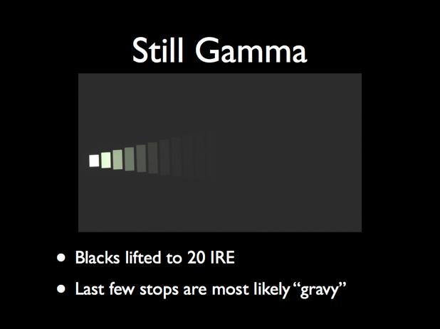
I see maybe 11 stops here, but the last couple aren’t usable.
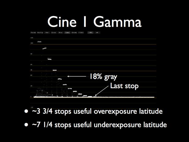
Now we get to the exciting gamma curves, and yes, I get excited by gamma curves. This curve appears to clip at 104% instead of 109%, but we’re up to 11 stops total usable dynamic range.
Most gamma curves exploit the full usable 0-109% signal range, but sometimes they stop a bit short. I’ve seen this in S-Log on the Sony F35, which also tops out at 104%. In the case of the F35 I was told by Sony that that’s all they needed: mathematically they didn’t need any more space to store the data coming off the sensor. As this curve isn’t a log curve there may be some other limitation at work. This sometimes happens when a camera is set to negative gain, which pulls all the exposure values down to reduce noise. In that case the maximum saturation point of the sensor is pulled down as well, so that clip is mapped to a value lower than 109%.
I’m not sure what’s happening here, but it’s good to know that you should set your zebras at 104% or lower in this gamma mode as otherwise they’ll never appear in spite of the signal being clipped. (Note: choosing a different ISO may change where this gamma curve clips. For example, selecting ISO 1250 may make this curve clip closer to 109%. I’m just guessing as I haven’t tested this, but I do know this happens with certain gamma curves in other cameras.)
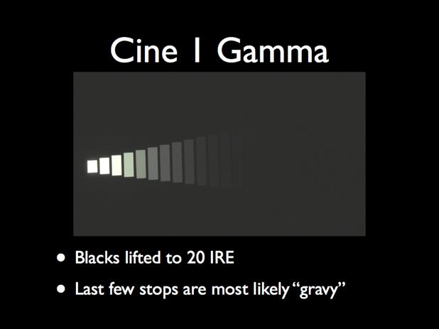
I see 13 stops, roughly… but only 11 are really usable.
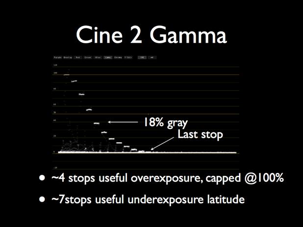
Once again, we have 11 stops of total range but this curve tops out at 100% for broadcast. Anything beyond 100% is typically clipped at the transmitter or when compressed for digital distribution, and this gamma curve makes sure you won’t capture any information that will be clipped later.
That range between 100% and 109% is very useful, though, so I prefer to keep that extra storage space and pull it down in post if need be. That extra room allows for slightly higher contrast between highlight tones, which makes those tones stand out a bit more. There is no 100 unit cap on video for DVD or the web.
I read somewhere that over-the-air video broadcasts are transmitted as negative images in order to save power. Black requires the most power to transmit, which is fine because a black screen is almost never transmitted for any length of time. If black is 100% signal strength then white must be 0%, and since it’s impossible to transmit negative power the signal is hard capped at 100% brightness = 0% transmission. (I’m sure there are some technicalities I’ve glossed over in this description, but this is close enough to communicate the concept.) It’s safe to assume that these same limitations are applied to digital cable/satellite broadcasts for efficiency’s sake: not transmitting that extra 9% of image data reduces bandwidth, which reduces costs for the network.
Such limitations don’t exist in the digital non-broadcast world so we can use the full 0-109% range for non-broadcast use. It’s nice to have that extra storage space for a little additional highlight contrast. We can always pull the highlights down a bit for broadcast.
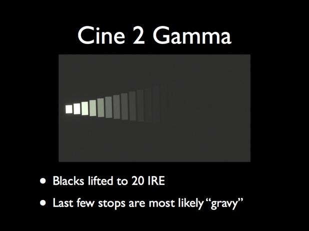
I see 13, maybe 14 stops, of which 11 are usable.
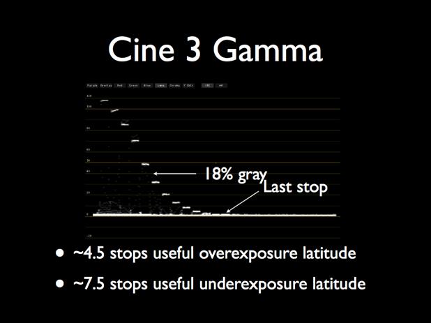
This gamma goes to 109%, and we have 4.5 stops of overexposure headroom. This rivals or slightly exceeds the overexposure latitude of a Sony F35, and really makes a difference in preventing video from looking like “video.” Nothing says “digital camera” faster than a clipped highlight.
Note that the last couple of stops are the same signal strength and will probably mush together due to lack of contrast. Still, they should both be visible. You can see this somewhat in the “lifted blacks” image below.
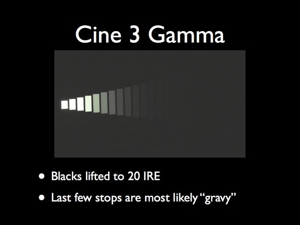
I see 13, maybe 14 stops, of which about 12 are usable.
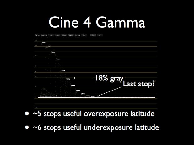
This is my favorite FS700 gamma because it gives me five stops of overexposure latitude. I love shadow detail like the next DP, but highlight detail is where video has traditionally faltered. Five stops of overexposure headroom goes a long way toward reigning in highlights. It’s not an Alexa, with six or seven stops of overexposure headroom, but this isn’t bad for an $8,000 camera.
I can clearly count only six stops of underexposure latitude here, although there may be a few more visible in reality as the last few stops seem to be present even if they are all mushed together. Because this curve assigns 18% gray to a lower value than the other curves, and then pulls that value up to 18% gray to allocate more stops to the highlights, the darkest values are probably suppressed to keep the noise level down.
All of these tests were shot at ISO 640, so while the camera and your meter will agree with each other when set that way the noise level will increase or decrease depending on the gamma curve. Whether you prefer a cleaner signal with less room for highlight information or more highlight latitude with a bit more noise is entirely up to your taste.
Seeing gamma curves represented graphically like this helps me quickly choose the one that should work best for me in a given situation.
I hope you enjoyed this presentation. I’ve done this same test with the Canon C300 and I’ll try to post the results next week. Meanwhile, please do feel free to tell your favorite rental house that you want them to stock one of these charts. No other tool will tell you so much about a camera’s dynamic range so quickly.
(For the rest of this presentation, see here, here, here, here, here, and here.)
Disclaimer: I have worked as a paid consultant to DSC Labs, and I own a lot of their charts as a result.
Art Adams is a DP who would be a lot brighter if he didn’t clip so soon. His website is at www.artadamsdp.com.

Filmtools
Filmmakers go-to destination for pre-production, production & post production equipment!
Shop Now