While for many cinematographers the ideal path goes through a colour correcting and colour grading process in post, something that makes complete sense for many productions, independent videographers will, many times, also because they work alone, try to get as much done in camera as possible. There is also another reason, I believe, for this: not everybody is working for traditional media, as more and more videographers have online channels as their goal, where the needs and aims are, apparently, different.
Although different users may have different views on what the end result of colour correction must be, colour correcting is essentially about getting the image right through good exposure and balance of light. Colour grading, on the other hand, is a subjective process depending on the creative preferences of the DP and editor, while also being related to the message the creators want to convey to the viewers.
There are some aspects of colour correction and grading, in my opinion, that should be remembered above everything else: there are multiple ways to do it, multiple tools, and a complete freedom of choice. I sincerely believe that’s one of the key elements to story telling. The multiplicity of channels we’ve for video these days, not only allow but also challenge videographers to try different things. Some will work, some may not, but the lessons learned will, no doubt, help everybody to get a better understanding of the tools and the diversity we’ve available these days. A big Hollywood production will have different needs and aims than a video for a YouTube channel, but both try, in their own way, to continue the fantastic tradition of storytelling. That’s the magic we must keep as the goal when creating moving images, whether we make them with a big ARRI camera, a small DSLR or a Smartphone.
Colour grading in camera
Now that I’ve set the scenario for this article, we’re ready to dive into the use of Canon’s Picture Styles for giving your video a unique look in camera. Or, if you prefer, get a flat image that you can take into a NLE (Non-Linear Editor) and adjust as you want, both through colour correcting and grading. I do not think there is a right or wrong way to do it, both are acceptable, if you’re comfortable with the results.
Devin Graham, a popular figure from YouTube, is one example of someone doing colour grading or correcting in camera. He says – Devin uses Canon – that Picture Styles are your friend and that you should try to adjust the colours to your liking in camera, instead of hoping to get everything correct in post. Although I understand that this notion may make some traditional cinematographers climb walls, the truth is that there is – apparently – a new generation of people, mostly working for online media, that will be happy enough with what they get in camera. This said, Devin Graham also adjusts colour in post, meaning he is comfortable doing it both ways, and uses, from where I see it, the tools wisely.
Let’s be reasonable: while, theoretically, you may have more tools available to you in post, there is no right or wrong here (I will keep saying this, I guess…), and if you’re happy with the results in camera, why not stick to them? While as a photographer I like to have my images as natural and faithful as possible (and that’s already according to my POV… I guess), so I can edit them afterwards, I must say that in video I’ve tried different things, and I am happy with different results, using different approaches. I’ve used colour grading in post, but I’ve also tried defining colour in camera, and I must say I am quite happy with some of the results. I keep trying new things, though, as I believe this is an ongoing learning process.
One should be aware that there is no “one solution fits all” when it comes to adjusting colour in camera… and here I think it works exactly the same way it does with colour grading in post. You can not use the same settings for all the work you produce, as one of the things with colour grading is the freedom it gives users to adapt the tone to the mood of the action on each specific video or film.
Exploring Picture Styles
Let’s look at Devin Graham’s example. His video, from March this year, is what one can consider new, so this is not an old idea. Graham says that for much of his work he does “Everything in Camera” and that no computer software is used on the images in the video. He believes that once you get everything right, it is easier to do it in camera than to hope for magic to happen later. Especially, let me add here, if you do not have the right tools or know how to use them.
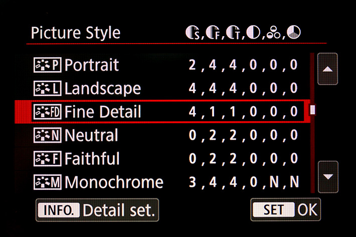
Gavin Graham uses Canon cameras, and explores, as we all do in different ways, the Picture Styles introduced by Canon with their EOS 30D model, in 2006. Although Picture Styles have kept very much the same these 10 years, we’ve seen them grow in sophistication, especially in recent years. The most recent iteration of Picture Styles, present on the EOS 5DS, EOS 5DS R and the EOS 80D, is the Fine Detail, which offers greater control over the sharpening of each photo, while also creating more vivid colours and more detailed edges. The Picture Styles in recent models also introduce greater control over the overall Sharpness, with options for Fineness, and Threshold besides the initial Strength, which can be tweaked by users as they please. This means that from the four initial settings we are now up to six.
Pictures Styles, one should remember, do not affect RAW files directly, but they will make a difference to the JPEG previewed on the LCD. And they will, obviously, be baked in the final JPEG and the video files coming out from your camera. One word of caution here: while the Fine Detail is excellent for – some – photography, I did not like the results with video, although I believe there will be situations where its “extreme detail” will be welcome. Showing, after all, that no “one solution fits all”. Fine Detail is now present in the updated version of Canon’s software Digital Photo Professional, meaning it can also be applied, in post, to all the supported models.
The Picture Styles Editor
Back to video and Picture Styles, the solution can be excellent for a lot of people, depending on their needs and goals. For those just starting with video, Picture Styles may be a way to quickly experiment with different predefined solutions (see my article A Guide to Picture Profiles in DSLR Video https://www.provideocoalition.com/a-guide-to-picture-profiles-in-dslr-video/) and also to explore settings that you think will offer you an image that looks as you intend it to. The advantage of the process is that you an easily tweak the multiple adjustments in camera, create a segment of video and check it. The beauty of it is that, if you do not have much time but still want to check options, you can just select a Picture Style, take a photo and check it to see if it is close to what you’re after.
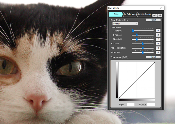
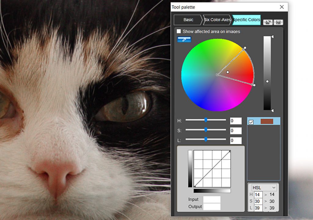
For even more control you can use the Picture Style Editor software provided by Canon to create your own Picture Styles that you can then transfer to the camera. The advantage of doing it with the editor is that you really have access to all the power of Picture Styles, meaning you get to tweak the core of the system itself. While adjustments in camera will be fine, the extra options available in the Picture Style Editor give you a better control of the final result. Although, let’s be fair, you’ll have to invest some time learning the system to really get it to work for you.
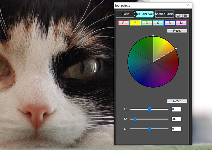
The Picture Style Editor allows you to control the three elements of colour, Hue, Saturation, Luminosity to create your own recipe that you can either associate with files on your computer or transfer to your camera, to use when shooting. In camera, this means you can select that specific Picture Style for video. Canon cameras usually have three user defined slots where you can install your Picture Styles. You can always change any of the other styles present in camera any way you want, and if not happy, revert to the original ones choosing default on the menu for each of them. It is that easy and represents a serious invitation to experiment.
Colour is a personal choice
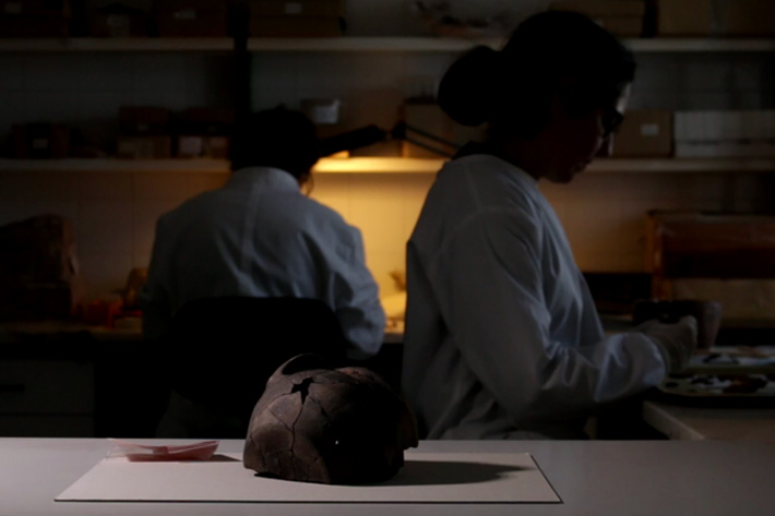
This said, one should understand that Picture Styles are something very personal, and that there is no right or wrong… again. We all have different views on what colour is, and it makes sense to accept this. Gavin Graham states, on his video on the subject, that the solution he found works for him and is his personal choice. If you’ve followed his YouTube channel and happen to like the videos shot with DSLRs… well, the complete Picture Style to get the same results is there waiting for you.
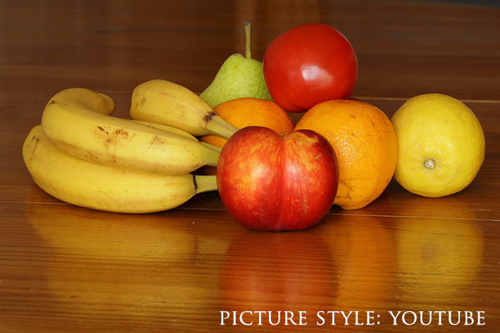
Devin Graham Picture Style is: Sharpness 0, Contrast -1, Saturation +1, Colour Tone +1
That picture style, which I tested in a recent video, works rather well if you’re after saturated colours and a “bigger than life” view of the world around you. It may not be suitable for everything, but I guess it made for an interesting view of a landscape that works well with saturated colours. The fact that on recent cameras, like the EOS 80D, we’ve some extra parameters to tweak – Fineness, and Threshold – extends the possibilities of adjustment of this Picture Style. And yes, no one stops you from using it just as a starting point for your own experiments.
While for some subjects you might want the colours to be well saturated, I believe not all subjects need or can have that kind of “colour grading”. It is time, then, to go for something more classic. This means going for some of the Picture Styles created in recent years, all trying to mimic, more or less, the Holywood look. Canon launched their own Picture Styles for video, the X Series, emulating the results from Canon camcorders. But there are other Picture Styles you can use, from Technicolor, Marvels Cine, Similaar Flaat and others. You’ll find information and links to some of them in my article A Guide to Picture Profiles in DSLR Video.
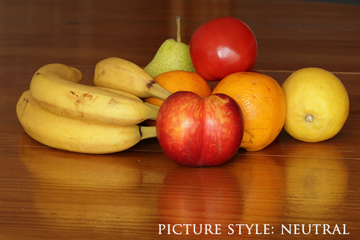
Start with Neutral
While some people swear by some Picture Styles – or in camera colour grading solutions – others say they do not work. The truth is that no single profile will satisfy different users, with different needs or ways to see colour. Even the same users will have different needs according to what they are doing. All this can be very confusing to whoever is just starting, especially because many times all this conversation about colour profiles comes along with the suggestion that “you need to use a picture profile for your videos to look professional”.
Well, Devin Graham is an example of how a simple picture profile can do the trick. I guess, that’s also because the rest of the things he adds around the picture profile work to make his work interesting. So, let me put this in a simple way: if you’re not comfortable with using a picture style, if you’re not sure about the reasons why you should use a specific picture profile for video, you’ll probably get better results by not using it. What this means is that the best thing you can do, sometimes, is to stick to the profiles you’ve available in your camera, or use a neutral profile as a starting point. Now go and tell stories, that’s what’s really important!
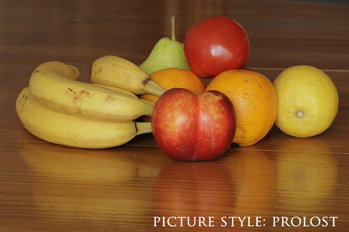
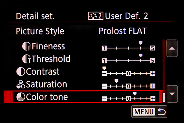
This said – and I do believe the Neutral Picture Style is a good point to start on a Canon DSLR – it is only natural that you want to try other suggestions. We’re curious by nature, and trying things helps us to define our own path. So, if you’re after a FLAT profile, there is a good one you can create simply by changing a few settings in your Canon DSLR. It’s the Prolost, which was, last time I checked, the Picture Style of choice for Vincent Laforet, Philip Bloom, Jason Wingrove, and many others (that was in 2012). To get the Prolost in your camera, select the Neutral Picture Style as the base in one of your user defined slots and set Sharpness to 0, Contrast to 0 and Saturation at -2, leaving Color tone alone. That’s it. Now go out and shoot!
Go wild with 158 Picture Styles
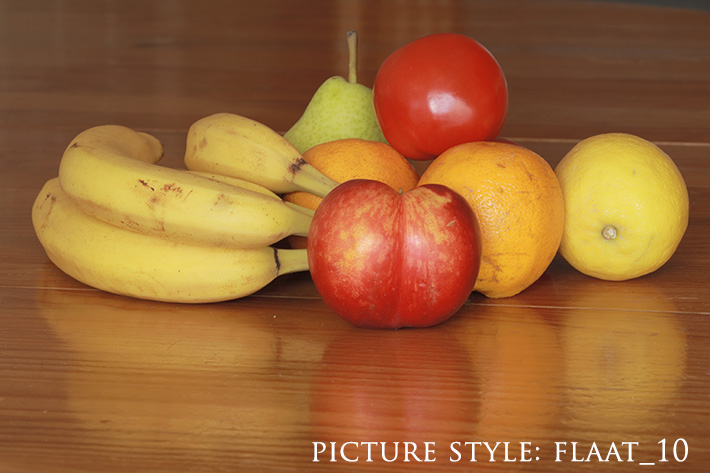
It is important to understand that while some Picture Styles may be used so you’ve everything in camera, others will be used to prepare the files for further editing in post. The Prolost flat profile above goes into that category, as do the Flaat Picture Styles for Canon DSLRs available at the website Similaar. One of them, Flaat_10, based on the Portrait Picture Style, gives a bit over 10 stops of DR (just as much as CineStyle) and keeps skin tones natural. There are many other options, as mentioned in a previous article.
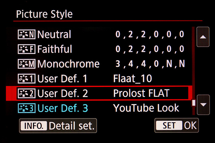
If you want to go completely wild, there is even a collection of 158 Picture Styles for Canon DSLR cameras that you can download and try. Be warned, it’s a time consuming experience that will, more than give you some good profiles to work with, show you the variety of options people have been creating. There is a good side on having so many styles to choose from: you may decide that it is not so hard to create your own. And considering that Canon DSLRs only have three user defined slots for Picture Styles – besides the six predefined available – maybe you should just get two or three that will work for you.
I’ve set my EOS 80D with three profiles I will use or video. Devin Graham’s profile, which I called YouTube, Prolost Flat and Flaat_10. Those and the Neutral I’ve already used in some videos will suffice when it comes to “colour grading”, giving me options to get “everything in camera” sometimes and prepared for further editing and some colour grading in the computer if I feel more inclined that way. I guess that’s enough!
One final note: although I’ve centered my attention on Canon Picture Styles, the ideas presented here can also be adapted, I believe, to other camera brands, and you’ll find “picture styles” for the model you prefer. I recently used a Fujifilm XT-10 and created some video with it using the Classic Chrome film emulation, which is another kind of “picture styles”. So, explore what your camera can do with colour grading… and have fun!

Filmtools
Filmmakers go-to destination for pre-production, production & post production equipment!
Shop Now