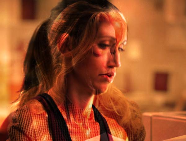
The job of an editor is usually to spin straw into gold: Take hours of raw footage, edit it into a cohesive story, and – depending on the skill of the camera and lighting crews that were employed – color correct to enhance or unify the original footage. The biggest problem comes when you’re stuck with inherently boring footage: You need to come up with ways to add excitement or drama to grab and keep the viewer’s attention.
A great (but relatively little-known) trick is to take an additional shot – usually one that is abstract, with interesting lights – and composite it on top of the normal footage to add color, movement, and mystery using a method other than normal opacity blending. Fortunately, Final Cut Pro offers that method: the seldom-used Composite Modes.
Composite Modes (also known as Blend Modes, Blending Modes, or Transfer Modes) provide alternate ways to blend together the pixels in two overlapping clips. They take some properties of the clip on top (such as its color or contrast) and combine it with some properties of the underlying clip, creating a new composite that is often far more interesting than a simple opacity blend or fade. The results can range from subtle to psychedelic.
Even those who are aware of Composite Modes seldom understand how they actually work, often employing the “happy accident” approach to see which one works on a particular set of clips. In this article, we’ll give you several examples of each mode in action, plus explain what’s going on under the hood.
Let’s go through the basics of how to apply a Composite Mode, look at the footage we will be using for our examples, and then show what normal opacity blending looks like:
Applying Modes
Applying Composite Modes in Final Cut Pro is easy: Place your normal clip in its normal video track (i.e. V1), create a second video track (i.e. V2), and then place your accent clip in that. Then either right-click on the accent clip (the one on top) or select it and choose the Modify menu. Near the bottom of the list will be an entry called Composite Modes. Select it, and to the right a sub-menu of various modes will appear. Choose one, and your accent clip will be “moded” on top of your normal clip underneath. There is no need to set a Composite Mode for the normal clip.
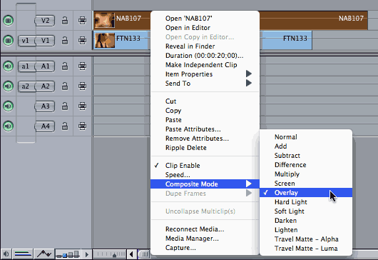
The bad news is that applying a Composite Mode will most likely result in a red render bar appearing over your timeline, as most are based on RGB color channel treatments (as opposed to YUV). The good news is that Composite Modes render quickly.
The Example Footage
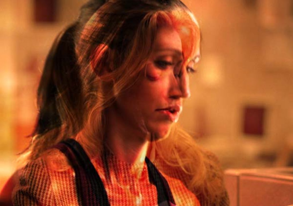
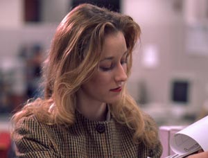
 This clip to the left (FT133 from the Artbeats Fitness collection) will be our “normal” clip that is placed in V1. Note that it was already shot through a gold-tone filter with nice lighting, but we can make it even more interesting by using Composite Modes.
The accent clip can come from B-roll from when the cameraperson was just playing around with focus and filters; it can also come from a personal library of a few well-chosen stock footage clips.
Below are four different clips which we will use as accent clips in the V2 track in our examples: a soft, light abstract background which is in a similar color as our main clip; a soft, slightly darker abstract background which is in a contrasting color; a relatively sharp and constrasty abstract black and white background, and a second “normal” footage clip. These should give you a good idea of the range of possibilities.

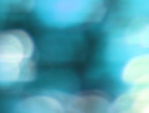
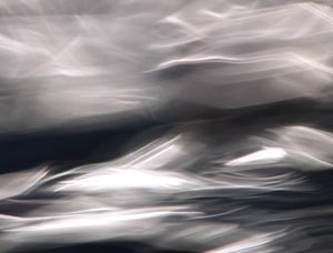
These four “accent” clips are from various Artbeats stock footage collections: LAB128 from Liquid Abstracts, NAB107 from Nature Abstracts, LA230 from Liquid Ambience 2, and BW102 from Business World.
Opacity Blending
Final Cut Pro is rare in that it has offered Composite Modes from the start. Most other non-linear editing packages either added them only recently, or do not support them even to this day. As a result, most editors have been forced to use alpha channels, track (travel) mattes, or simple opacity blends to composite multiple images. Below we’ve taken each of our accent clips, set their Composite Mode to Normal (the default), opened them in their Viewer, clicked on their Motion tab, and set Opacity to 50 to demonstrate what a typical opacity blend would look like:


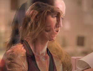
The result of a simple opacity blend between our normal and accent clips.
The results are okay, but a bit washed-out looking. In the examples starting on the next page, we will set the accent clip’s Opacity back to 100%, and use Composite Modes to get more interesting results. Rather than go through the modes in the order presented in the menu, we will group them by similar function, starting with the ones that add or subtract light from a scene.
next page: Multiply, Add, and Screen modes
Multiply

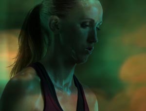
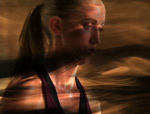

Multiply is sometimes compared to stacking two slides together and projecting the result. With this mode, the color values of the normal clip (V1) are scaled down by the color values of the accent layer on top (V2), resulting in a darkened image that clips at full black. If one of the pixels in the two clips is black, the resulting pixel will be black (since you will be scaling the other pixel by a color value of 0%); if one of the pixels is white, the result will be no change (since you will be scaling the other pixel by a color value of 100%).
Multiply is particularly useful for compositing high-contrast black-and-white clips over background footage: the black areas go to black, and the white areas show the clip underneath – sort of like a track matte. What makes Multiply different from a matte is that the alpha channel is not changed, and the color (not just the luminance) of the clip on top influences the final outcome. A more subtle application is to use the accent clip as a way of adding animated shadows to a normal clip underneath.
Add
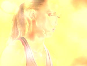
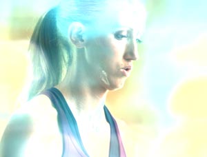

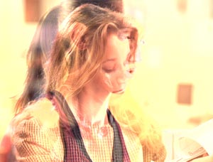
With this mode, the color values of the accent clip on top are added to the values of the normal clip underneath, resulting in a brightened, overexposed-looking image, clipping at full white. Each color channel clips individually, often creating color shifts in bright areas as one channel clips while another is still going through its useful range. Note that if a pixel in either clip is black, no change will take place in the corresponding pixel in the other clip (as you would just be adding zero to it); if it is white, the result is white (as you would be adding 100%).
Screen


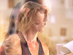
Screen mode is often compared to the result of projecting two slides from different projectors onto the same screen. It is the opposite of Multiply: The color values of the normal clip are scaled above (not below) their original values based on the color values of the accent clip, resulting in a brightened image that clips at full white. (Technically, the inverse brightness values of one clip are multiplied by the inverse brightness values of the other, then the result is inverted. Sorry – the aspirin’s on me.) If one of the pixels in one of the images is black, no change takes place in the corresponding pixel (the other pixel is not scaled up to be any brighter); if one of the pixels is white, the result is white.
Screen can be thought of as a less intense version of Add, in that Screen does not clip as fast, and it does not approach full white as unevenly. The result can appear washed out, but if you reduce the opacity of the screened layer, it looks more like highlights or adding light to a scene. Depending on your sources, one may be preferable over the other.
A Better “Luma Key”
Many pyrotechnic effects are shot against black, with no alpha channel. Likewise, some plug-ins create synthetic lighting effects against black. Rather than use a Luma Key to separate the pyro or lighting effect from its black background, use the Add or Screen mode to drop out the black and mix the non-black parts of the image.
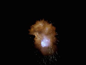
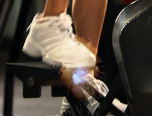
Top left is the original clip; top right is a pyrotechnic clip shot on black (from Artbeats Reel Explosions 3). Rather than use luma keying to composite these two shots, try Screen (above left) or Add (above right) modes.
However, if the foreground clip is supposed to remain completely opaque (such as a person shot against a black backdrop), Screen or Add won’t work: As you can see from the example above, part of the new background clip will be mixed into the foreground clip. If you need the foreground to be opaque, then you are better off creating a luminance matte or key.
next page: our favorite modes: Overlay, Hard Light, and Soft Light
Overlay


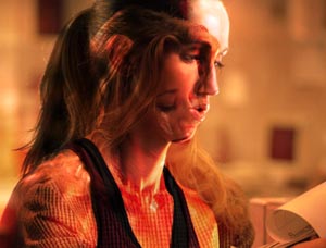
This mode is as close as they come to an “instant cool” effect, making something interesting out of almost any two clips. Technically, parts of the image darker than 50% luminance are multiplied together (see the previous page), and the parts brighter than 50% are screened together. In plain English:
- the lighter areas of the accent clip on top will lighten the corresponding areas of the normal clip underneath, going to white
- darker areas in the accent clip will darken the corresponding areas in the normal clip, going to black
- areas that are 50% gray in the accent have no effect on the normal clip
The result is increased contrast and saturation, with the shadows and highlights still present though altered. Given the increase in saturation Overlay usually brings, you might need to back off the opacity of the accent clip. On the other hand, depending on your sources, you could also increase the intensity of the effect by duplicating the accent clip onto a third video track on top.
Once you get past the inevitable “ohh/ahh” reaction, start looking for clips that have good contrast between light colorful areas and shadows as accent candidates: Those dark areas will end up dark in the result, and the lighter areas will end up with an interesting color mix of both layers.
Hard Light


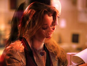
Hard Light follows the same general math rules as Overlay, but only much more so, with increased contrast and usually more saturation. Although an image can get both brighter and darker depending on the mix, in a similar fashion as Overlay the result will be more contrasty and saturated. Note that the accent clip tends to appear more prominent in the final mix than the normal clip underneath. If this is not your intention, try Overlay or Soft Light instead.
Soft Light


Soft Light often looks like a subdued version of Overlay, with less saturation shift. Areas lighter than 50% gray in the accent clip appear to lighten the underlying clip; areas darker than 50% gray appear to darken the normal clip underneath – although in neither case does black or white in the accent clip force the final mix to go completely black or white. Areas that are 50% gray in the accent clip have no effect on how the lower layer shows through.
If you are going for a dramatic effect, you will probably be disappointed with Soft Light and feel that it just looks washed out. However, if you are looking for a more subtle lighting effect without the strong contrast or tendency to go to black or white that several of the other Composite Modes have, Soft Light shines.
next page: the psychedelic modes
Darken

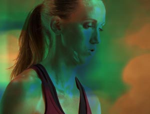
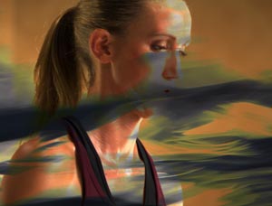
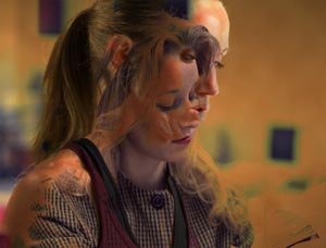
This mode compares the individual color values of the two clips and uses the darker color values for each pixel. The result often looks slightly posterized, containing final colors that were in neither source (as they contain unique recombinations of the red, green, and blue channels). If one pixel is white, the other pixel (clip) shows through unaltered; if one pixel is black, the result is black.
Lighten
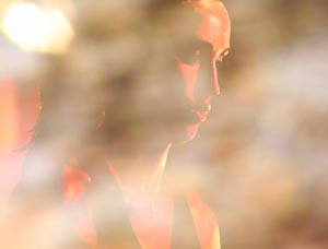

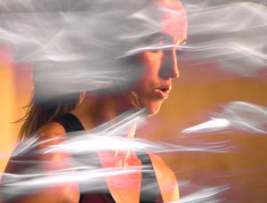
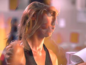
This mode is the opposite of Darken: The individual color values of each pixel for the two clips are compared, and the lighter values are used. No surprise, this tends to make the final composite look lighter. If either one of the clips is not black and white, color shifts will usually result. If one pixel is black, the other pixel (clip) shows through unchanged (since it would be lighter by default); if one pixel is white, the result is white. If one has light shades of gray, this tends to wash out the corresponding areas in the other clip.
Subtract
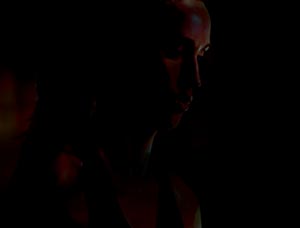


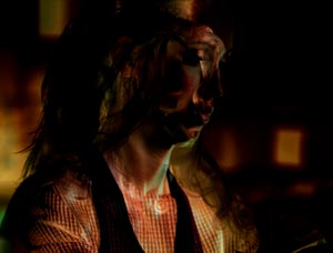
As you might guess from its name, the color values of one clip are subtracted from the color values of the other clip. The resulting composite is usually darker (especially if the accent clip was light, as is the case with the one in the upper left), clipping at full black.
Difference
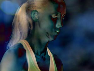
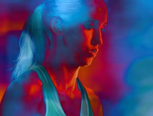

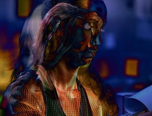
Difference mode is Subtract’s psychedelic brother. The color values of your accent clip’s pixels are still subtracted from the corresponding pixels of the normal clip underneath, but if the result is negative (in other words, the accent clip is brighter than the normal clip), rather than being clipped at black, the positive (or “absolute”) value of the color is used instead. The results are rather unpredictable, looking somewhat like a photographic negative.
Creating Difference Mattes
A common use for Subtract and Difference modes is difference matting: When two layers are similar, only the differences between the two show through. An example would be shooting a scene with and without an actor. The result would be nearly black, except where the actor was present; here, the result would be the difference between the person and what was behind him or her. This can be used in conjunction with levels manipulation to pull a matte. It’s also handy for comparing two almost identical images to check for differences.
next page: additional tips
Tweaks and Enhancements
There are certainly ways to enhance the initial results you will obtain using Composite Modes. When you have an initial composite that looks promising, try these variations:
- Reduce the Opacity of the accent clip. 100% Opacity often yields too strong of an effect; back it off to get a more subtle result.
- Apply Effects > Video Filters > Image Control > Gamma to the accent clip and alter where its middle gray values are. Many modes – especially Overlay, Soft Light, and Hard Light – lean heavily on where this middle gray point sits; changing it changes the balance of highlights and shadows. You can also use Image Control > Brightness and Contrast to move the black, white, and gray points around.
- Apply Effects > Video Filters > Image Control > HSV Adjust to the accent clip and rotate its hue to colorize the result. As you have seen in the previous pages, the color of the accent clip has a big impact on the final composite, controlling whether the result yields a subtle addition or stark contrast.
- Apply one of the Video Filters > Blur effects to the accent clip. This is particularly useful if the accent clip is a copy of the original clip, resulting in a “filmic glow” effect that is quite popular. (If you are a Lynda.com subscriber, we created some video training on employing this technique; if you’re not a subscriber, click here first to get a free 7-day pass.)
Although this article focused on using Composite Modes in Final Cut Pro, you will find similar modes appear in other programs. For example, in Motion they are called Blend Modes. You can access them by right-clicking on the accent layer, or by using the Blend Mode popup in the Heads-Up Display (HUD). Motion offers even more modes than Final Cut:
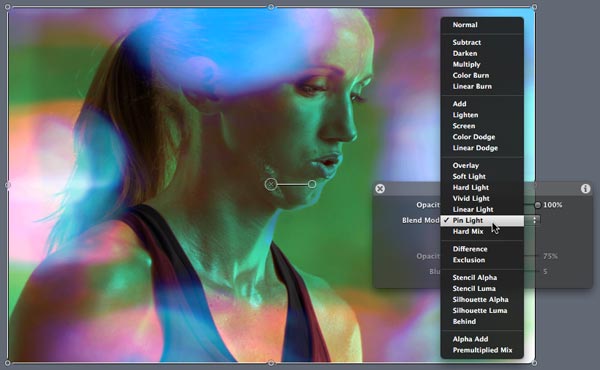
However, the point of this article was to show Final Cut editors how they can quickly achieve motion-graphics-like effects without having to leave FCP! I hope this was helpful; feel free to share your own tips in the Comments below.
Creating Your Own Accent Clips
Full disclosure: I created the Liquid Abstracts and Nature Abstracts stock footage collections which were employed for the first two of the example “accent” clips throughout this article. I’d be thrilled if you bought them – after all, I created them for this very use, among others – but if you’re handy with a camera and a motion graphics application, you can create your own. I created the clips in these collections by putting a camera severely out of focus while shooting natural phenomenon, and then slowing down, blurring, and colorizing the result. You can download a free article on the subject from Artbeats.com.

Filmtools
Filmmakers go-to destination for pre-production, production & post production equipment!
Shop Now