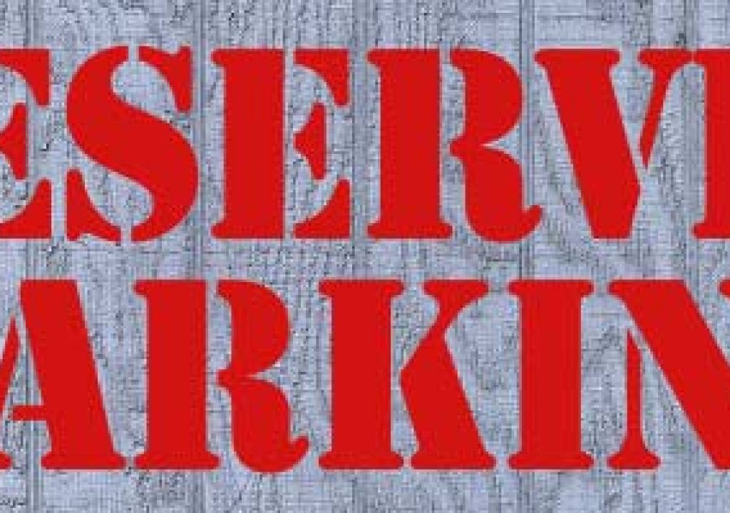

Plain solid-colored text is not convincing when composited on top of another surface (top). Applying it with blending modes (above) can help it blend into the layer behind it. Displacement mapping (below) further distresses it with the background, making the text appear as if it was physically applied to it. Finally, using a copy of the background as a luminance matte (bottom) makes part of the text transparent, which ages it.


We find it useful to employ both 2D and 3D programs in our work – not just to create different looks, but also because techniques learned in one can provide inspiration for a new approach in the other. One example of this is in the area of texture mapping – making a computer-generated object or surface appear to have a physical texture, with real paint or decals applied to it.
In 3D, advanced users wouldn’t dream of leaving a surface untextured; they would apply treatments to make it appear more realistic (or surrealistic, if that’s what the scene calls for). Then why do so many 2D artists settle for plain, solid-colored text? Sometimes, this is the best approach to clearly convey a message – but it can be interesting to consider texturing our 2D objects as well.
There are a series of three tricks we employ to add texture to our text – especially if it is supposed to look like it has been applied to another object in our composite. Let’s take the challenge of making some text appear painted onto a the side of a building to see how we would apply these techniques.
Step 1: Setting Up
The topmost figure above features a background still image of wooden paneling, taken from the Artbeats Exteriors CD-ROM). The text is created using the Adobe font Stencil.
Many of these techniques work better if your background and text layers are the same dimensions and pixel aspect ratios as each other, which are preferably also the same as the composition they are in. The Exteriors CD-ROM presents most of its surfaces as 256×256, 512×512, or 1024×1024 pixel tileable squares, so the first thing we did is create a comp for just our background image, and nested this background comp into the composition where we’re going to blend in the text.
The text was created on a simple solid set to the same dimensions as the comp; if you created it in Illustrator, make sure you position it where you want it to appear on screen, and create crop marks the same dimensions as your intended comp. Or, you can always nest your text in a comp of its own, just as we did with the background.
Step 2: Blending
Our first-call technique to blend any two images together in After Effects is to try Blending Modes. These combine two images into one, using math operations based on the relative color values of the same pixels in the two source images. The result is often a final composite where one partially shows through or influences the other.
Feel free to experiment with the different modes, to see which ones work best for the surfaces and colors you have chosen. Modes such as Add, Screen, and Color Dodge tend to make the foreground layer (the text, in our case) lighten the background where they overlap; Hard Light and Color Burn tend to result in a darker mix; Overlay and Soft Light are less predictable, but tend to split the difference. In the second figure up top, we used Multiply mode: notice how the wood grain starts to show through the text. Note that since Blending Modes often cause the final colors to shift, you might want to go back and re-tweak the color of your text.
Step 3: Distorting
Next, we want the “paint” from our text to look like it was applied to an uneven surface (which the background is, in our case). In the real world, the result might be the paint running into some of the cracks in our wood panels.
After Effects includes an effect called Displacement Map that shifts the positions of pixels in one layer based on the color values of pixels in another layer. The trick with Displacement Map is that its results are considerably less predictable if the two layers involved are different sizes – it will try to center, tile, or stretch to make up the difference. This is why we suggest sizing your layers first, in nested comps if needed.
We looked at the different color channels of our background image, and chose the one with the most contrast in brightness – we’re going to rely on this contrast to create our displacement (or bumps). Displacement Map is then applied to the text layer, the background layer is chosen as the Displacement Map Layer, pick which color channels you want to look at for the displacing, and dial a displacement amount that looks realistic.
Step 4: Distressing
Finally, we want to wear away some of the paint to make our sign look weathered. This is a technique we picked up from Alex Lindsay (formerly of ILM, now if dvGarage. Alex has created a CD-ROM called The Surface Toolkit that contains a large number of “grime” images that he then uses to alter 3D surfaces. The simplest application is to use the grime layer to affect the transparency of an applied sign or decal, using track mattes. This is shown below. In 2D, we’ll sometimes use one of Alex’s grime maps transfer moded on top of another layer to age it.
In our case, our background layer already provides an excellent grime map to wear away our text – after all, in reality the paint would get worn away where the wood was raised and people and wind brushed against it over time. To accomplish this, we duplicated our background layer, and then applied Levels to boost its contrast. The result is then used as an inverted luminance matte for our text – inverted, because the dark areas of the background (such as the cracks in the wood) is where the paint would settle in and be least likely to get scraped away, and therefore should be least transparent. Our Levels effect is then tweaked to get the final text transparency we want. The final result is shown in Figure below, and in the last figure of the stack at the top.
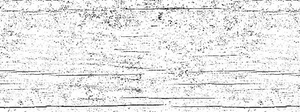

We like to use the grime maps on the Surface Toolkit CD (top) as luminance mattes to scrape away portions of other layers (above).
Postscript
We originally wrote up this trick in 2000, and it remains one of our favorites to this day. We wrote some variations on it last year for Artbeats: click here for a PDF of an update of this article; click here to see how to use Displacement Mapping to map text onto moving footage.
The content contained in our books, videos, blogs, and articles for other sites are all copyright Crish Design, except where otherwise attributed.

Filmtools
Filmmakers go-to destination for pre-production, production & post production equipment!
Shop Now