Optical illusions and irregular visual phenomena mean many things to us. Simple enough to be enjoyed by anyone, yet perplexing enough to keep researchers busy in the foreseeable future. Their meaning would mainly depend on what kind of scientist you ask.
Whether flawed, highly sophisticated and adaptive to its environment or just still not fully understood, our visual system, is filled with mystery and wonders. Our strange ways to interact with light, turn it into data and experience it as colors give birth to countless situations where what we see isn’t what what we think we see – we call these broadly – Optical Illusions.
They should have an especially interesting meaning for Colorists (as well as other video professionals).
Why?
Because they point us right to the limitations and built-in biases of our visual system, and by that, teach us that Our eyes are not measuring devices or cameras and do not include color pickers. They shouldn’t be used as such, or replace proper measuring practices
As video colorists we create, manipulate and reproduce colors daily. We construct what others will later consume. Understanding the system’s quirks & limitations should be a fundamental part of our craft.
~ This article is part of my Color Correction & Digital Color Theory course
And down the rabbit hole, we go…
1. Adelson’s 1995 Checker Shadow Illusion (also called Same Square Illusion)
*Lightness (Brightness) Constancy
Probably one of the most recognized Illusions in this list.
Edward H. Adelson’s simple illusion perplexes minds for the past 2+ decades. It doesn’t matter how many times the illusion is “solved” (image 2). Every time you’ll look back at the illusion (Image 1) it will challenge your visual system the same way.
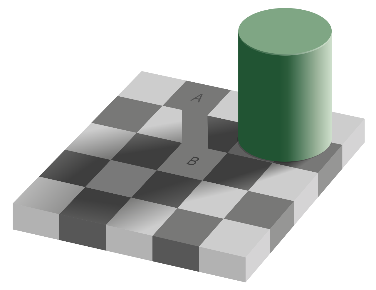
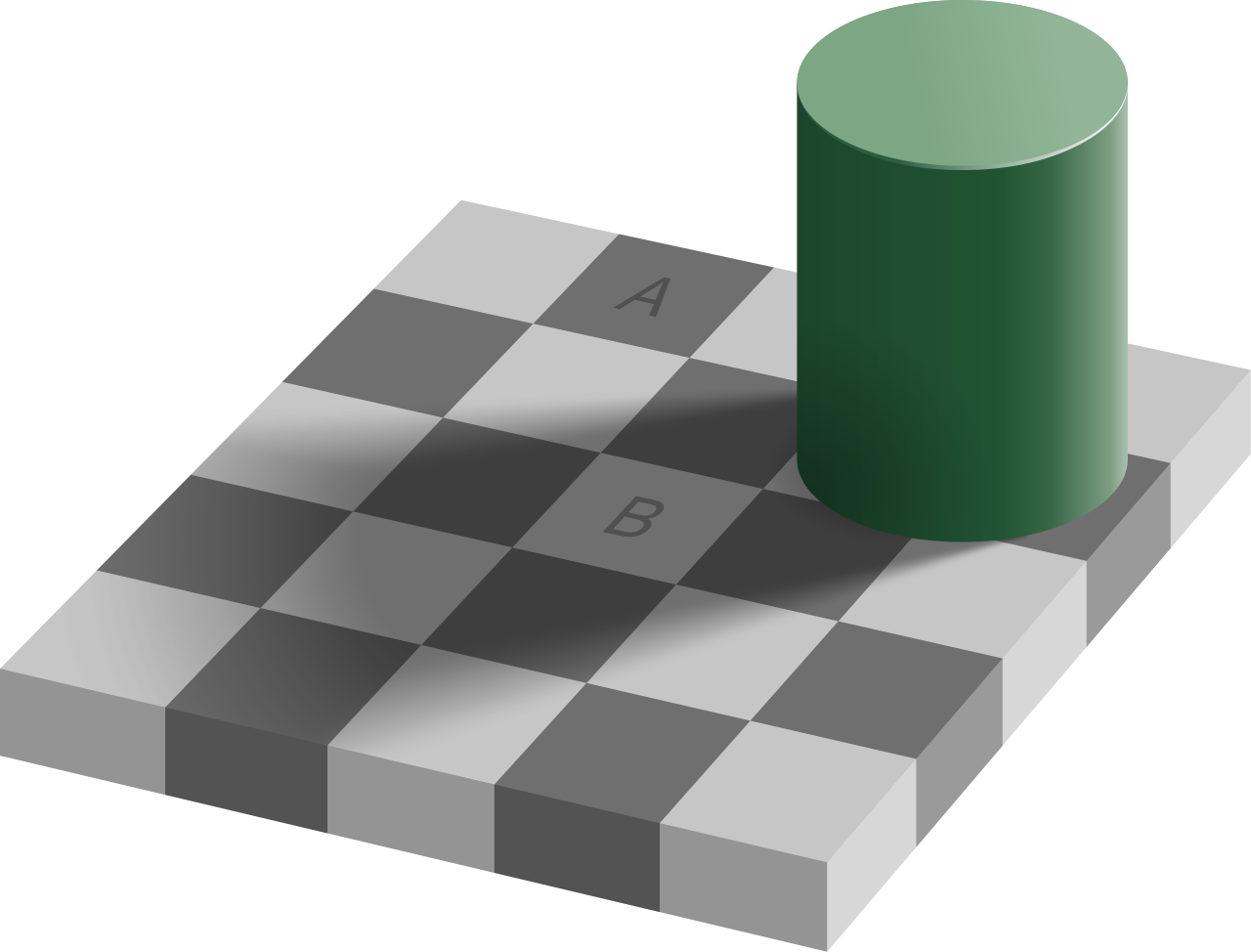
Yup. Squares A & B are equal in value. Measure it yourself if you want to be certain.
Regardless of what your eyes tell you, and regardless of your factual knowledge, the illusion insists. It even does so in real life setups.
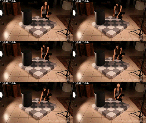
This is partly happening because of a perception concept known as Lightness Constancy. This brain-eye mechanism allows us (from illusionsindex.org) “to perceive the lightness (or reflectance) of a surface as invariant, even when the intensity of incident light (the illuminance) is changing at a point or is variable across the surface. Under normal circumstances, lightness constancy allows us to distinguish between brightly lit dark surfaces and dimly lit white surfaces, which helps us to detect edges and forms”
In other words, our Brains “know” that a Shadow doesn’t change a surface’s true value on one hand, and on the other that any checkerboard they encountered in the past followed the same logic of adjacent contrasting squares.
“Ha” Your brain snorts at you arrogantly, “Your petty tricks didn’t fool me!”
When in fact they do.
Or do they?
Once we accept that our visual system isn’t a light or color meter, we can start to think about how well it serves us in navigating through reality.
Another mechanism that affects this is that our retinal responses depend on the local average image intensity.
Hmm? Check out the Dungeon Illusion (Bressan, 2001)
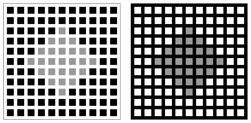
We evaluate brightness in relation to its surrounding more than in its actual values. This comes handy to us as a species in numerous conditions such as object recognition or navigating our surroundings. And probably more valuable to us than bionic-like light measuring capabilities.
The world isn’t directly experienced as it is. It is processed. And this processing is at the core of what makes us human. The world would look awfully different seen through any other visual system than ours. Its colors as we know them are only so in our minds.
Or else… the two squares on the board would have looked identical.
Why is this Important to us as Colorists and Video/Film professionals?
Accepting this simple fact is also accepting that our visual system is ‘flawed’ compared to our expectations from it, it has limitations and “bugs”. And that if it fails on this example, it may very well fail on others, often much less apparent.
This may be an advantage when dealing with everyday reality, but not so much when dealing with precise color workflows and accuracy.
Evaluating brightness is at the core of any color correction workflow. Don’t underestimate the effect Lightness Constancy can have on you.
As a colleague told me recently – “These 2 pixels are of the same value but not the same color“
What can we do about it?
This is a deep and humbling realisation for anyone working with color & light, maybe one of the prime reasons never to solely trust your eyes for measuring, and always use measuring tools like scopes, color-pickers etc, to evaluate true values.
It is also why you shouldn’t work in a fully lit room, nor in a pitch black one
2. Negative Afterimage (also called color afterimage or just afterimage)
Straight from the realm of magic & hallucinations. Our brains make up colors that don’t exist…
You may have come across one of these fun Afterimage Youtube videos where you stare at a dot on a psychedelic looking image then when the image suddenly cuts to a B&W version you subtly notice “correct” colors, which quickly dissolve back to B&W
If you haven’t, here’s a nice one:
https://youtu.be/WKVSgkkNwA8
OK… what’s going on here? If you stop and think about it for a moment. This is quite spooky.
The bee, the flower, the green around it, all seemed so real, and yet, they were only real in your brain. Hmmm…
We sort of “see” in RGB.
Why sort of?
Because its more LMS. Our eyes contain light sensitive cells in our retina, some of them are sort of sensitive to Long, Medium and Short wavelengths (within a narrow range – the visible spectrum) corresponding (broadly) to R G and B spectral hues (there is even an LMS color space), These light-sensitive cells, called Cones, are one of 2 types of light-sensitive cells in our eyes, responsible for color vision and mainly concentrated in the central part of our retina. The Fovea.
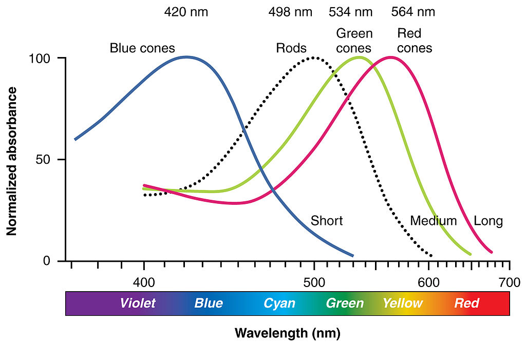
If we stare long enough at a certain hue, Cone cells keep sending the same information from the same location (a bit like a sensor array where cones are photosites in a tripod shot) to the rest of our visual system. After a moment, (about 30 seconds or so) Cones get a bit “tired”…
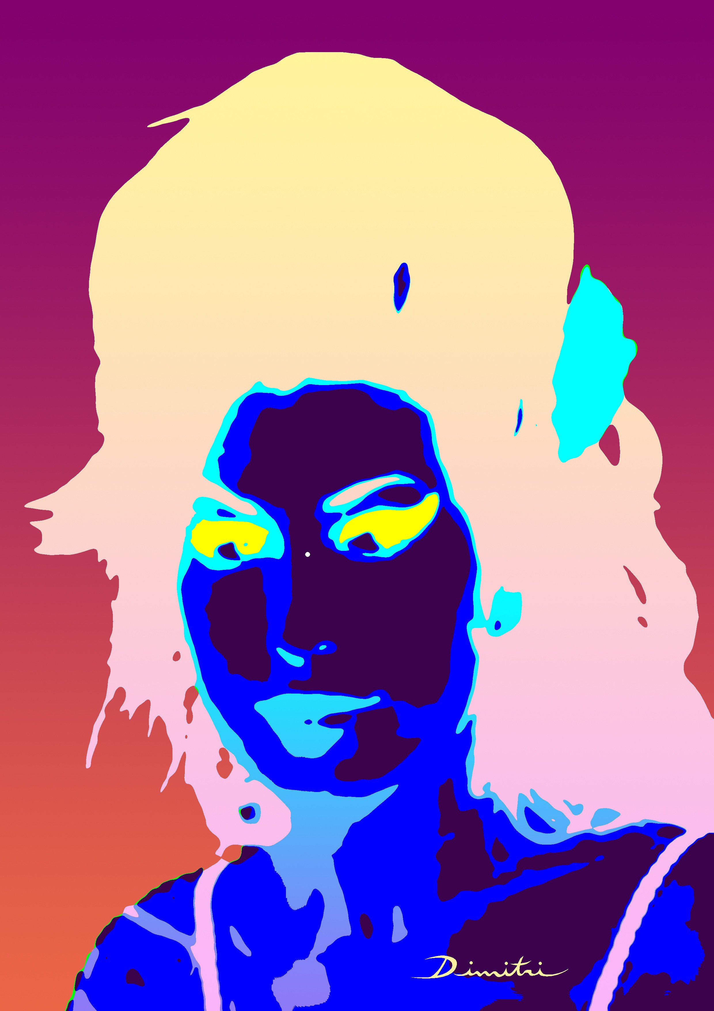
Then gaze here (or at any white surface)
So if we stare at an orange dot, we saturate the visual system with R & G (L & M) data from that part of our “sensor.” Slowly tiring these Cones.
Once the picture changes to grayscale (or white), it sends out even information to all three cone types (255,255,255 = white). But some of them are more tired than others…
The R & G cones in that area of the retina that were just saturated send out a weaker signal than the “fresh” B cones. This doesn’t last long, like short feedback.
Interestingly (and nicely explained in the video below) the effect is much stronger if gaze remains fixed, and shifting the gaze around can “recall” the afterimage.
https://youtu.be/GbHMLV4CZfI
Why is this Important to us as Colorists and Video/Film professionals?
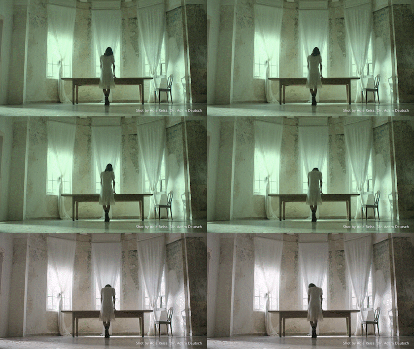
Because staring-at-one-point is a large part of what our audiences are going to do with our work. A Greenish shot on the screen long enough, followed by a mainly neutral shot (but also a merely less saturated, of lower contrast or with a subtler color palette) will induce the Negative Afterimage effect in the viewer’s visual system, causing them to feel the shot as magenta while it actually isn’t.
This also happens when working with a DP/Director and white balancing a shot or turning grades on & off, at first glance it always feels a bit wrong to them. Shots that were too warm now feel a bit cold and shots that were greenish feel magenta. While actually, they are neutral.
What can we do about it?
Working in a calibrated environment is critical exactly because of this type of visual restrictions.
When your walls are neutral gray, your monitor bias-light 6500K and of good quality, and no light pollution enters your suite, you always have a reference to neutral right above the edge of your monitor. This helps to un-bias your visual system quickly and anchor it to truer values.
I often tell clients to gaze at the wall for a few seconds then back at the grade, to better appreciate it.
Of course, awareness of this phenomenon also helps. As one would take more care in what comes after what. Either to eliminate the Negative Afterimage effect or (interestingly) to intensify it.
Lastly, do not correct or grade shots out of context. Always watch back a few seconds/minutes, after every few cuts you make. Using tools like Split Screen in Resolve to see up to 16 cuts playing together is also a good practice.
Addendum.
There is an alternative theory that relates the Negative Afterimage effect to our brain rather than the retina, and to our Opponent Process color system. Data from our Cones is interpreted by a set of 3 cells that can send out data in an either/or way. Red-Cyan Blue-Yellow and Black-White (sound familiar?) are these pairs of data. Our brain response to one (in any pair) is agnostic to the opponent. By this explanation, these on/off cells send out a faint, feedback-like response after being saturated with one type of info.
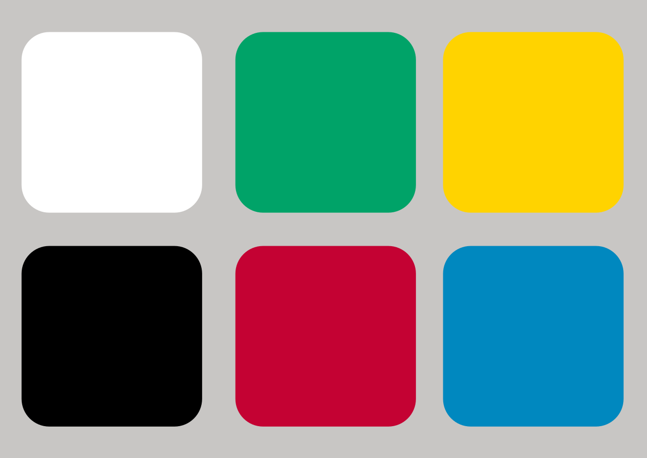
R-G-B-Y are also called the “Pure” or “Unique” Hues since they do not contain each other in our perception. Which means that information that is processed by the brain from a single reading can be either Red or Green. This system is so rigid that colors that are opponent mixtures are considered “Impossible” They may exist all around us. But there is no way for us to experience a Yellowblue or a Greenred. (a concept my students often find difficult to accept)
Pure Hues palettes are often used in company logos (See Google, Microsoft, and eBay to name a few)
Here is a short one to relax from the previous
3. The Helmholtz–Kohlrausch effect
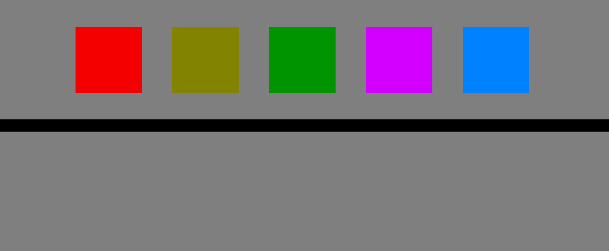
This visual phenomenon (Or Hipster-Bar somewhere…) causes us to perceive an object’s brightness based on its saturation. Especially in spectral hues.
Brightness increase by saturation can be truly evaluated when turning an image to grayscale
In this example, all colored squares are of the same brightness levels (and same brightness as background), which can be seen by the lower part (under the line) which is the upper part turned grayscale.
 Why is this Important to us as Colorists and Video/Film professionals?
Because evaluating and manipulating brightness/saturation values is a major part of our work.
What can we do about it?
Trust your scopes and eye-picker as well as working in a calibrated environment are a good start.
But furthermore, switching to B&W in order to manipulate brightnesses and contrasts isn’t a bad practice it shots or projects where you want to use extra care. It allows for a better evaluation of what you’re seeing and overcomes this perception phenomenon.
Additionally, understanding how saturation affects apparent brightness, and how this effect varies between hues, helps to solve or enhance issues in numerous situations and explore interesting possibilities in others.
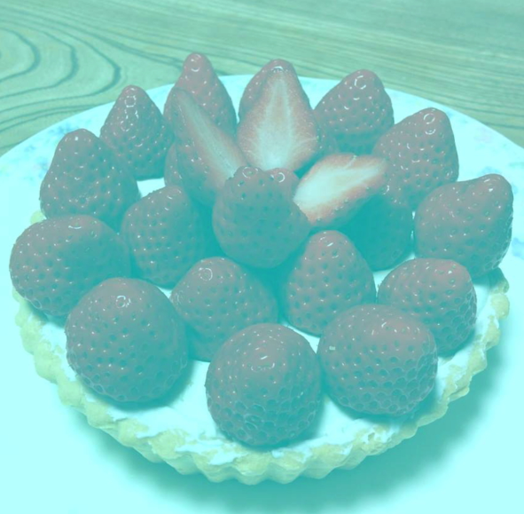
4. Akiyoshi Kitaoka’s Strawberry Tart
Color Constancy – Chromatic Adaptation
Akiyoshi Kitaoka is a grand master of visual illusions of all types. His website is a real treasure for anyone interested in this field. In 2015 he published this illusion.
Nice red strawberries, right?
Wrong!
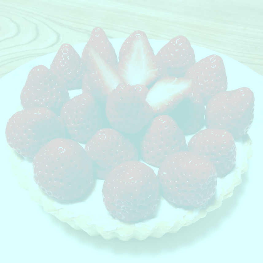
If you use an eyedropper tool to sample it you’ll find that no red pixel value (only cyan or gray) exists in any of the strawberries.
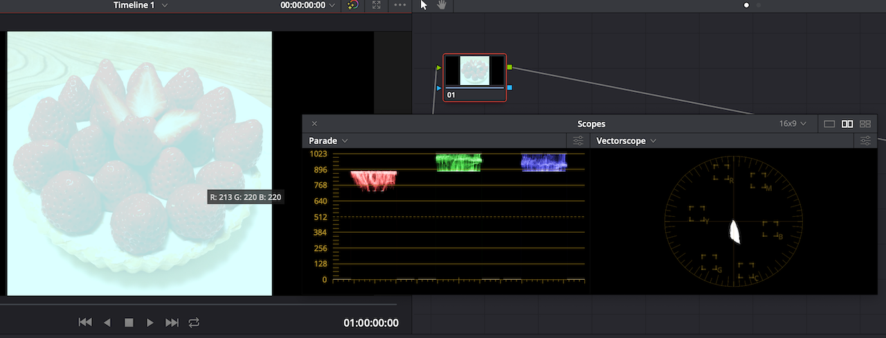
What’s going on here?
Several things. But mainly another constancy mechanism of our visual system. Color Constancy. By it, we are able to recognize objects by color regardless of lighting conditions.
This mechanism is in part responsible for us being able to recognize an orange (the fruit) as being Orange (the color) whether in bluish high-kelvin dawn, white midday sunlight or reddish fire camp light. We deduct an object’s color partly by comparing it to the colors of objects around it.
Another Specialist of visual illusions, Michael Bach, cleverly shows in his website how even when we don’t see strawberries, the effect (though slightly weaker), persists. Showing that its indeed Color Constancy trickery, not our brain’s expectations about strawberries (which also have a proven effect on our visual system)
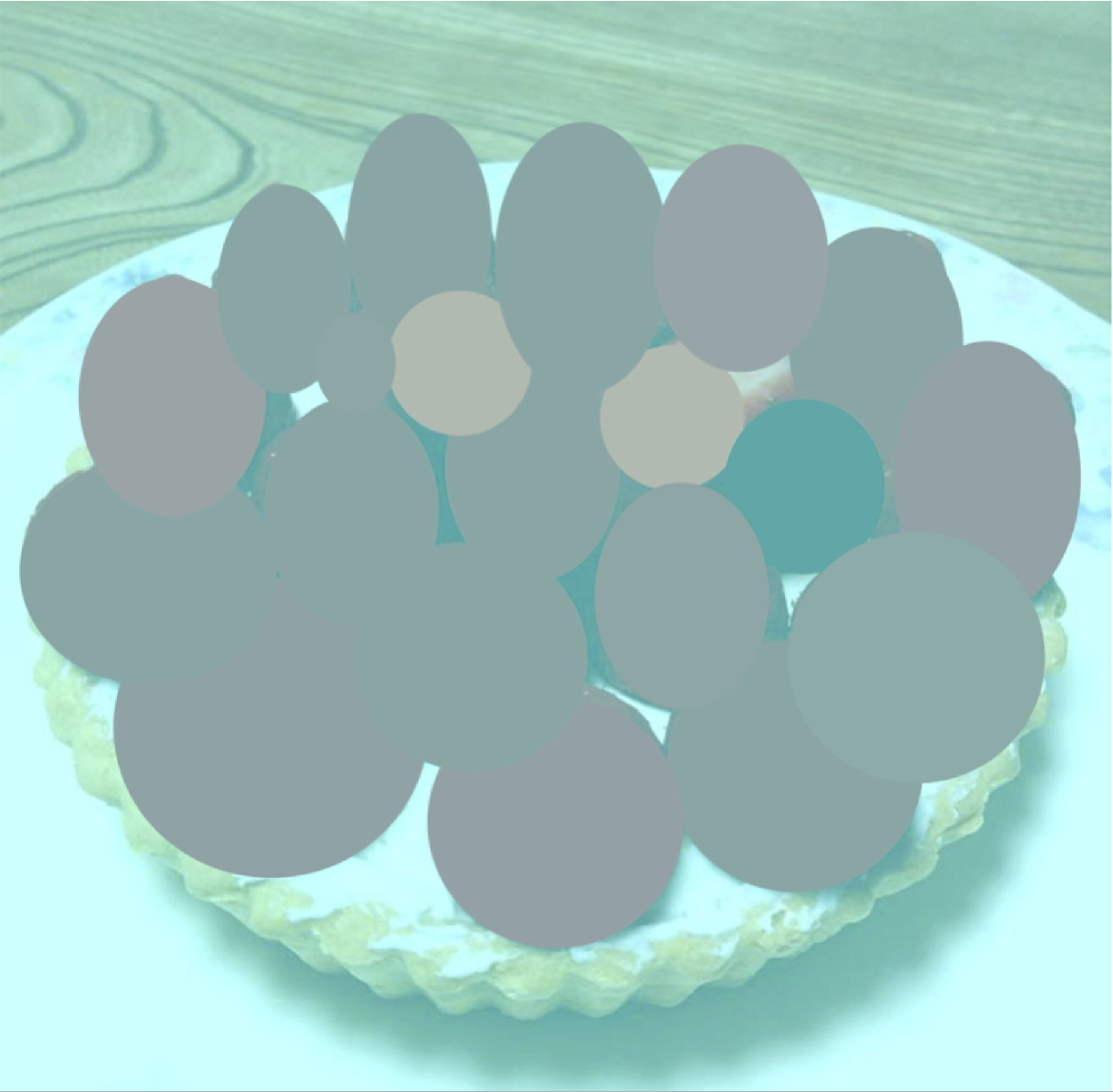
Again. Our eye isn’t a colorimeter, light meter or even mere Vectorscope
We “see” with our brains and the brain subtracts the color of light in order to keep colors constant. Just like White Balancing in camera or post.
*Next time you walk outside during magic hours… look up to windows of houses and flats. This effect causes them to seem more orange/yellow than what they would if you were inside
Since our perception of individual colors seem to be affected by the overall color of a scene as well as by surrounding colors, Color Constancy causes us to “wrongly” perceive colors in many different setups. A seemingly never-ending source of color illusions….
Here are some.
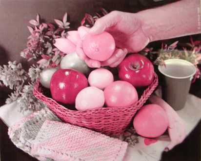
The Land effect – Our brain completes colors in gray areas of images with a strong red tint. Interestingly… it was discovered while trying to recreate Maxwell’s first color photography.
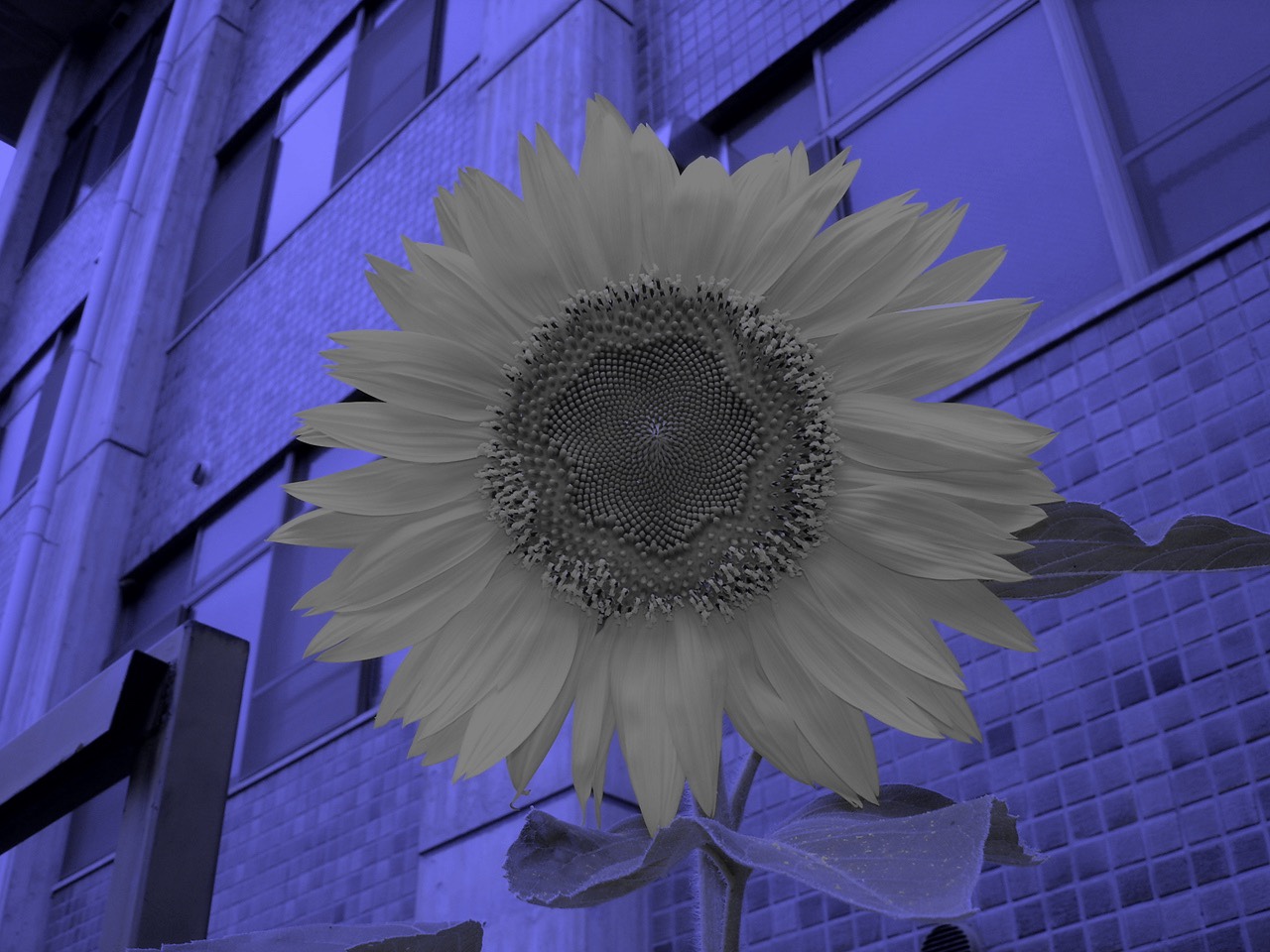
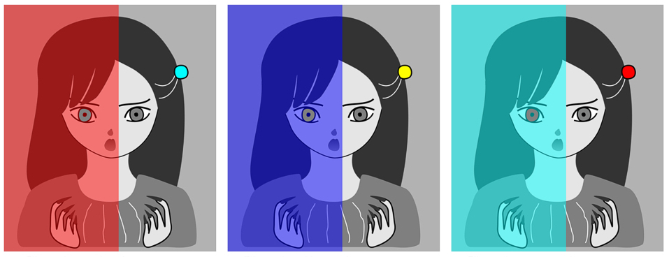
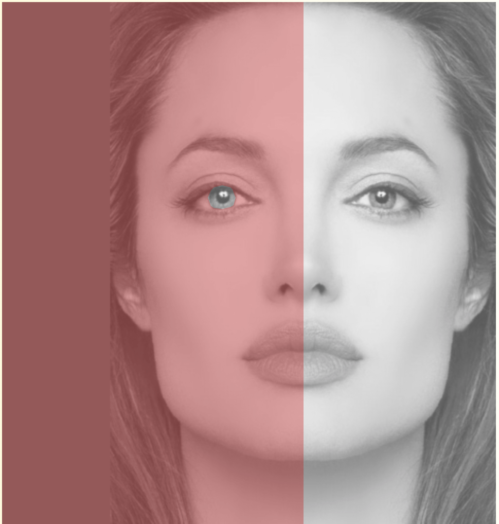
Color Constancy, as well as Color Adaptation (the mechanism by which the Negative Afterimage occurs), is responsible for these (Akiyoshi Kitaoka) illusions, in which the flower isn’t yellow, and eyes aren’t colored.
Why is this important to us as Colorists and video professionals?
Because at the end of our work there are humans seeing it. How we will construct colors, mix them and place them by each other will influence how they are perceived eventually more than the how each individual color is perceived by itself. And this is true from set design and wardrobe through lighting and all the way to color grading.
What can we do about it?
Like in previous cases. Don’t (only) trust your eyes to evaluate colors.
Also, get a deeper understanding of how colored light (or the illusion of) and grays interact in our brains – a better understanding of how we process colors, will help us create better colors to process.
A blue shirt or a red truck will look different in every different environment we place them And to properly manipulate them we should be conscious to how they will interact with that environment and its colors.
Working in a calibrated environment with proper bias light & no outside light pollution reduces the effect color constancy may have on your work.
“Looking” at colors through measuring tools, or by separating them from their surrounding helps us better understand what we deal with and how to improve it when we grade. Looking at it again, plainly through our eyes, (but armed with this knowledge), helps us better understand how our audiences will experience our work and how to enhance their experience.
I think modern video colorists can relate to this quote by Impressionist painter (and color obsessed) Claude Monet
“When you go out to paint, try to forget what objects you have before you, a tree, a house, a field or whatever… merely think here is a little square of blue, here an oblong of pink, here a streak of yellow, and paint it just as it looks to you, the exact color and shape, until it gives you your own naive impression of the scene before you”
5. Bonus… the Dress conundrum
It’s hard to believe anyone with an internet connection in the past years missed this one. Probably the most prominent color viral phenomenon ever documented (in the short history of viral phenomena) – The Dress split the internet in two. And by doing that, maybe, revealed a whole new visual system mechanism. Many saw it as being blue & black (as it actually is ) But many others saw it as white & gold…
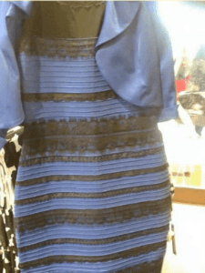
The story in a nutshell – on Feb 2015 a mother and her daughter disagreed on perceived colors in a picture of a dress the mother planned on wearing to her daughter’s wedding. They posted the picture on Facebook for some additional opinions and the internet broke. From Buzzfeed to serious scientific publications everyone seemed occupied with how they perceived the dress.
So… What’s going on here?
Obviously, there is some Color Constancy at hand. The picture was taken in problematic lighting and exposure conditions that may trigger the brain to subtract the light’s color…
Images like this one by Kasuga~jawiki show how the dress can be either a blue/black one in very yellow light or a white/gold one in very blue light.
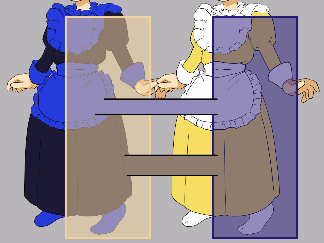
What it doesn’t explain. And still isn’t fully understood, is why results vary between people (with many reporting being able to see both or see the dress shift)
You can check out the Wiki page to get updated on developing research about it.
If you consider that a phenomenon as serious and meaningful (colorwise) as color blindness was only discovered late in the 18th century (though many millions of people were probably color blind throughout human existence), then would it be crazy to think new exciting things can still be discovered about how we see? Maybe The Dress is related to one of them
Why is this important to us as Colorists and video professionals?
Because it reminds us how subjective and personal the experience of color can be. Next time your client tells you they don’t like a certain look, grade or palette, one that you happen to absolutely LOVE. Remember the Dress, and tell them they are right, and that you’ll change it rather than try to convince them to see it as you do.
Unlike them, you have the privilege to not only see with your eyes and brain, but also through your Knowledge, craft and tools. Use both!
I’ll wrap up with a beautiful quote by (badass) color scientist R Beau Lotto.
He talks about his cube illusion (below) where the brown tile on top and the orange one on the side are the same (though we don’t see them as such)
“while looking at one of my color illusions you’re aware of one reality: that two tiles look very different, while simultaneously being aware of an opposite reality: that the two tiles are in fact physically the same. This capacity to be an observer of yourself is phenomenal — and possibly unique to humans. Indeed, to literally “see yourself see” is in my view the principle act of consciousness, which has the power to transform one’s view of the world and of. oneself.” 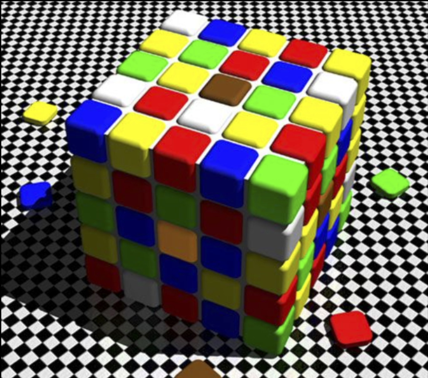

Filmtools
Filmmakers go-to destination for pre-production, production & post production equipment!
Shop Now