Behind the scenes there are five little steps clients never see that will make you money.
Don’t miss out on better sales! These steps are so simple and quick, I know you’ll find them easy to adopt. We’re in a visual business, and it’s all about edit and presentation. The preparatory steps before the clients first sees your work can make or break the sale. My informal survey reveals that most photographers don’t understand the importance of edit and presentation. They just throw everything on line, good, bad and indifferent, with minimal attention and effort.
It’s not enough to do a great job behind the camera. You can still ruin your sale by failing to show your images in a way that suggests maximum enjoyment and multiple image orders. You’re the pro, and the client is looking to you for direction and advice in the purchase, just as they did when asking about clothing for the sitting and fun locations.
For some years platform speakers have touted slide shows and one-on-one sales as the only way to really make good money – yet in practical usage, I have found this to be very old-school in the eyes of clients.
Today’s standard scenario is presenting images on line, because everyone is sensitive to lack of time for multiple studio visits. Few clients have the time or inclination to undergo a lengthy, projected slide show in our studios. A majority of photographers at this time don’t have studios or projection equipment for that matter. The in-house projection scenario can be exhausting for all concerned, and it has been my experience that when clients get tired, the magic is lost and they actually equivocate on their purchases due to the pressure of having to buy on the spot.
>h3>My recommendation is for photographers to take the responsibility to find new ways to satisfy both speed/convenience for clients and a way to demonstrate the quality and value of images to enhance sales. Be part of the solution to provide “new-school” flexibility.
Once you release of an image disc or a proof booklet, even if the images are thumbnail size, you’ve pretty much killed your sale. This is the biggest dampener to sales, yet photographers continue to do this to themselves. Partly because many think it’s just too hard at their lower technical level to tackle any postproduction whatever. My opinion is that that is a serious professional deficiency that would not be tolerated in any other business. And with my little steps, this bridge between photo session and sale is quite easy and intuitive.
Careful edit and arrangement permit my images to sell themselves – along with the great presentation I can make so easily on Smugmug. I rely on Smugmug as the flexible, beautiful, customizable and cheap way to present on line. I love the way it allows various enlargements, full HD video – and to me the most important thing, namely allowing direct sales or not as you see fit. (I almost always print my own, so I’m controlling everything start to finish.) With the best membership level, you never have to delete any files, thus your Smugmug site acts as portfolio, and many photographers use it as their exclusive website. Talk to them about internet sharing and other perks.
Here are my five tips in the edit and presentation process that will elevate sales.
- First cut out the chaff
I generally have 100-150 images to edit from a senior or family sitting with break out groups. You must edit strongly. Eliminate very close duplicates. Show only the best of the best.
“Usually less is more when you show only the best of each grouping or scene. Bu sometimes more is more, for instance this week we had 50 all different great images (56 RAW capture) of a 2-year old birthday sitting. Unusual, almost unprecedented. But they’re all keepers. In this case the sitting is an in-depth personality study that will eventually become a story book.”
- Tweak density and color
Clients’ motivation to buy diminishes with poor color faces and density variation. Using a white balance device and metered good exposure are probably not enough. Since both exposure and white balance are affected by how light reflects off the subject (not just the quality of light falling on the subject), I always find I want to adjust slightly in post. And completely neutral white balance is often not the most attractive color in portraiture – or editorial work for that matter. Go this tiny one step further and adjust basics to perfection before the client sees your images.
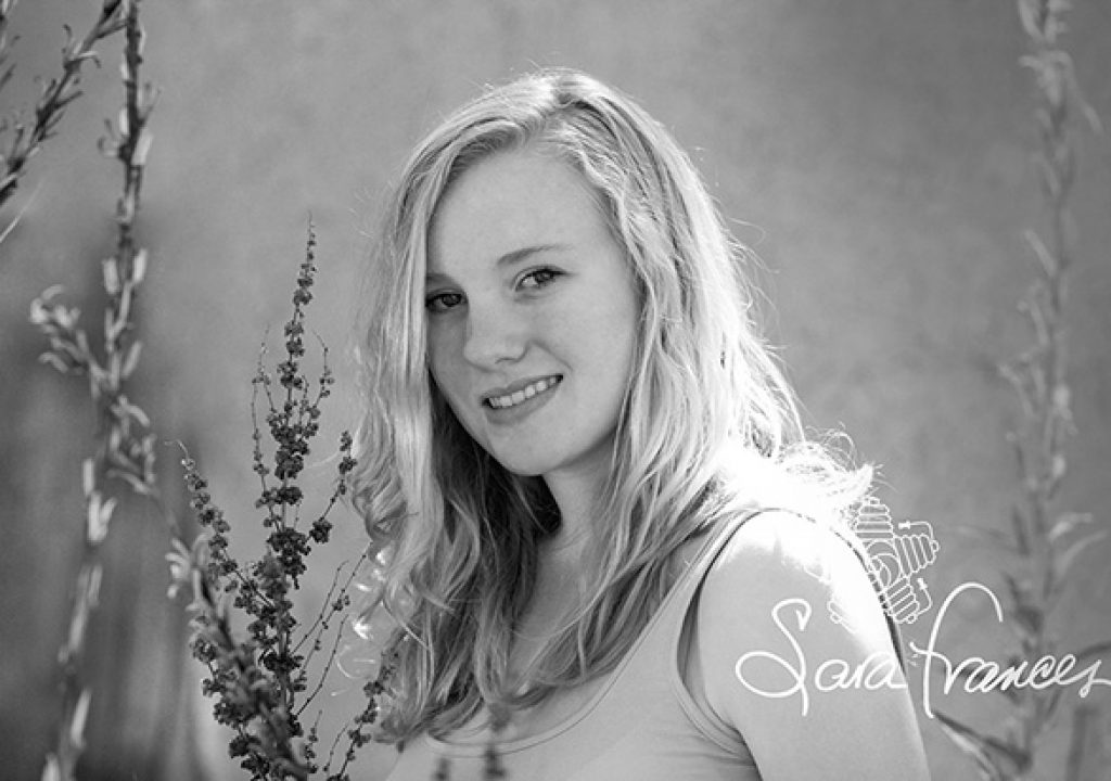
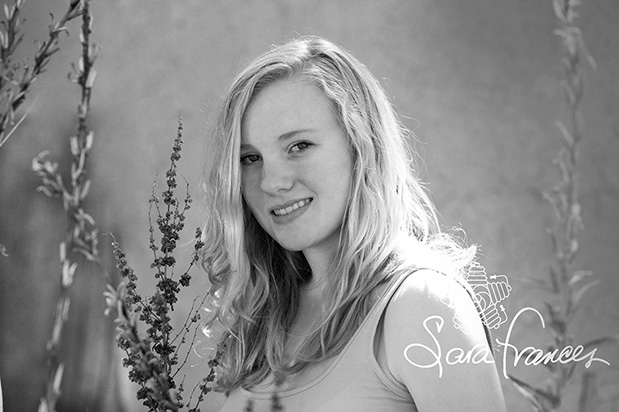
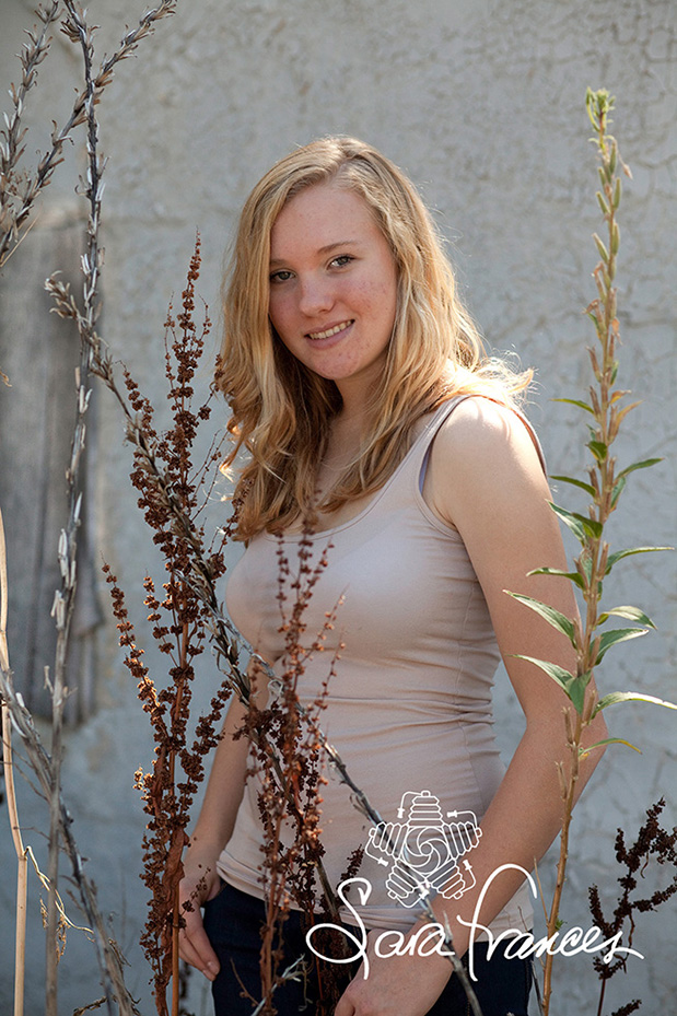
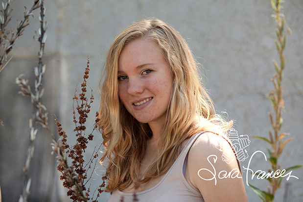
- Interpret proof images with creative cropping and effects
Visual impact is king. If they can’t see it, you can’t sell it. You have the creative ideas, but you can’t assume your client can imagine what’s in your mind’s eye. Cropping is the simplest, but most lucrative, correction you can do to an image. Often a tight crop equals great emotional impact, which in turn leads to instant sales. Imperfect composition looks very amateur. Good content becomes viable if you take just a few moments to crop. Black and white conversion or other special effects add options. I call these interpretations “serving suggestions”, just like what is found on the packaging of every item in the super market, every magazine ad. If there are significant retouching concerns, it’s a good idea to show one favorite image proof both with and without corrections.
“Especially on a senior or child’s sitting I will crop and/or interpret a good image to show it in different ways. It’s true that great expression and body language still define “good” in the eye of the client, more so than technical expertise. However the details I add are the subtle plusses that drive sales. I’ll crop a head and shoulders out of a 3/4 pose, vignette light or dark, elevate contrast or saturation, or alternatively desaturate or sepia tone an image.”
- Personalize presentations
Those camera generated file numbers mean nothing, but clients love it if you rename files with their own names, even if you don’t renumber. I like to do this immediately in Lightroom before editing, so the new name (and keywords) follow the images wherever they go thereafter. For events I always reorganize images in logical time sequence, and sometimes I do this also for portraits. It’s way too confusing to the client if the get away car precedes wedding vows in your proof set. Believe it or not, I’ve seen on-line proofs by several companies that throw capture by several photographers together without rhyme or reason to the sequence.
“Another way I personalize presentations is to drop a “blue ribbon” logo on images I think are extra nice. This not only directs clients to choose the photographically best images, but makes them feel like winners. Yes, I made the ribbon in Photoshop.”

“My experience finds that you need several safeguards to deter internet theft. Smugmug offers disable right click, variable enlargement sizes and a copyright overlay. Overlays, however, can be subverted by a determined thief, so I embed a watermark, at the same time downsizing for loading speed. This takes an extra step, but then the added security gives you the confidence and option to select the biggest enlargement. Bigger always sells better when proofing.
“If you price our work correctly, and include a modest rez size image set with a minimum dollar final order, this is another way to thwart theft.”
- Post on line promptly
Because clients are hot to buy right as they leave the sitting, you can bet that enthusiasm drops off rapidly if you delay posting the proofs, even if they had a great experience. It’s easier for the photographer as well, because I find that if I edit soon after a sitting or event, my memory of what went on is clear and I’m still inspired to make fun interpretations. The sooner I edit, the quicker the edit goes. Of course many photographers pay someone else to do their edit, but my philosophy is that my personal touch is what people are paying me for.
“Once I post and notify my client, I like to set a virtual appointment where we’re both on line and discuss on the phone without meeting in person. Everybody has time for this kind of appointment.”
Take time to make a perfect presentation. It’s your personal design that will differentiate you from the competition and make you money.

- First cut out the chaff
- Tweak density and color
- Interpret proof images with creative cropping and effects
- Personalize presentations
- Post on line promptly
I generally have 100-150 images to edit from a senior or family sitting with break out groups. You must edit strongly. Eliminate very close duplicates. Show only the best of the best.
“Usually less is more when you show only the best of each grouping or scene. Bu sometimes more is more, for instance this week we had 50 all different great images (56 RAW capture) of a 2-year old birthday sitting. Unusual, almost unprecedented. But they’re all keepers. In this case the sitting is an in-depth personality study that will eventually become a story book.”
Clients’ motivation to buy diminishes with poor color faces and density variation. Using a white balance device and metered good exposure are probably not enough. Since both exposure and white balance are affected by how light reflects off the subject (not just the quality of light falling on the subject), I always find I want to adjust slightly in post. And completely neutral white balance is often not the most attractive color in portraiture – or editorial work for that matter. Go this tiny one step further and adjust basics to perfection before the client sees your images.
Visual impact is king. If they can’t see it, you can’t sell it. You have the creative ideas, but you can’t assume your client can imagine what’s in your mind’s eye. Cropping is the simplest, but most lucrative, correction you can do to an image. Often a tight crop equals great emotional impact, which in turn leads to instant sales. Imperfect composition looks very amateur. Good content becomes viable if you take just a few moments to crop. Black and white conversion or other special effects add options. I call these interpretations “serving suggestions”, just like what is found on the packaging of every item in the super market, every magazine ad. If there are significant retouching concerns, it’s a good idea to show one favorite image proof both with and without corrections.
“Especially on a senior or child’s sitting I will crop and/or interpret a good image to show it in different ways. It’s true that great expression and body language still define “good” in the eye of the client, more so than technical expertise. However the details I add are the subtle plusses that drive sales. I’ll crop a head and shoulders out of a 3/4 pose, vignette light or dark, elevate contrast or saturation, or alternatively desaturate or sepia tone an image.”


Those camera generated file numbers mean nothing, but clients love it if you rename files with their own names, even if you don’t renumber. I like to do this immediately in Lightroom before editing, so the new name (and keywords) follow the images wherever they go thereafter. For events I always reorganize images in logical time sequence, and sometimes I do this also for portraits. It’s way too confusing to the client if the get away car precedes wedding vows in your proof set. Believe it or not, I’ve seen on-line proofs by several companies that throw capture by several photographers together without rhyme or reason to the sequence.
“Another way I personalize presentations is to drop a “blue ribbon” logo on images I think are extra nice. This not only directs clients to choose the photographically best images, but makes them feel like winners. Yes, I made the ribbon in Photoshop.”

“My experience finds that you need several safeguards to deter internet theft. Smugmug offers disable right click, variable enlargement sizes and a copyright overlay. Overlays, however, can be subverted by a determined thief, so I embed a watermark, at the same time downsizing for loading speed. This takes an extra step, but then the added security gives you the confidence and option to select the biggest enlargement. Bigger always sells better when proofing.
“If you price our work correctly, and include a modest rez size image set with a minimum dollar final order, this is another way to thwart theft.”
Because clients are hot to buy right as they leave the sitting, you can bet that enthusiasm drops off rapidly if you delay posting the proofs, even if they had a great experience. It’s easier for the photographer as well, because I find that if I edit soon after a sitting or event, my memory of what went on is clear and I’m still inspired to make fun interpretations. The sooner I edit, the quicker the edit goes. Of course many photographers pay someone else to do their edit, but my philosophy is that my personal touch is what people are paying me for.
“Once I post and notify my client, I like to set a virtual appointment where we’re both on line and discuss on the phone without meeting in person. Everybody has time for this kind of appointment.”
Take time to make a perfect presentation. It’s your personal design that will differentiate you from the competition and make you money.
Filmtools
Filmmakers go-to destination for pre-production, production & post production equipment!
Shop Now