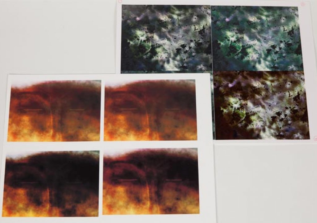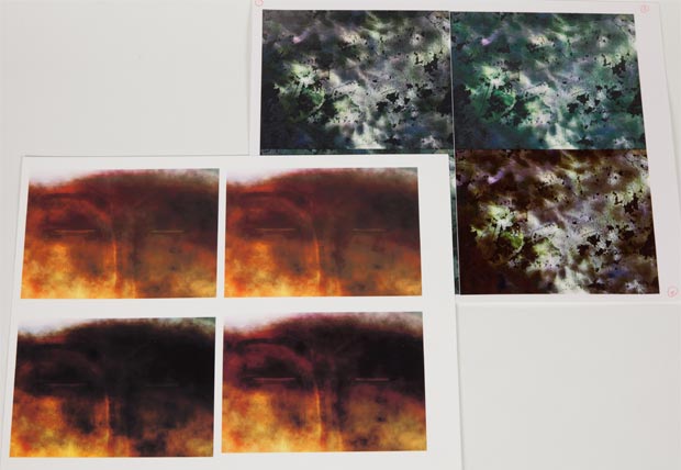
Q: Which one of these test swatches is correct? A: None of them.
An example of life before we learned how to follow a color managed workflow while printing.
One old theory of knowledge was that we were born knowing everything (having gained that knowledge in a previous life), and it was just a matter of “remembering” that which was obvious once explained. Well, with all due respect to the ancient Greeks, color managed print workflow – the best way to ensure what you print is as close as possible to the original image – is not obvious, and being a relatively recent development in the world of photography, we don't have knowledge from a prior life to draw on.
That said, neither is it unknowable – and you don't have to reinvent the wheel to learn it yourself. After watching fellow artists beat their heads against the wall or print endless tests hoping to land upon the magic combination that works for them (and having done that very thing myself several years ago), I thought it would be worth outlining the basic workflow to create repeatable, as-accurate-as-circumstances-will-allow printing. Yes, there will always be devilish details and inevitable exceptions, but this will give you a solid foundation to build on.
Forging Order From Chaos
To understand the need for a color-managed workflow, first you have to start by accepting:
- Every model of computer monitor may display your image differently.
- Every model of printer may spritz ink onto your paper differently.
- Every type of paper may receive your ink differently.
That's why a magic incantation that works for one artist may not work for you, and why you could go through a lot of paper, ink, aspirin and hair printing test swatches to find a spell that does work for you.
The good news is: Once you know enough about each of the above points, you'll no longer be dealing with infinite combinations; you'll be defining a simple workflow that will get you a lot closer to your goal with minimal effort.
The major points of this workflow are as follows:
- Use paper that is “coated” for inkjet printing.
- Get a “profile” that describes your printer/paper combination, and load that into your image editing software when getting ready to print.
- To make accurate changes while viewing your monitor before you print, tell your computer what type of monitor is has connected to it.
Sound easier than expected? Actually, it is that easy – as long as you execute each of those steps correctly.
To remove the aura of voodoo that surrounds digital printing, I'll explore what's going on underneath the hood for each of these steps. Since it's impossible for me to know what operating system, software, printer, and paper you happen to be using, I'm going to have to keep most of this advice fairly generic (sprinkled with examples using our most common combinations: Photoshop CS5 on a Mac, connected to either an Epson 2200 or HP Z3100 printer), although I promise none of it is too difficult to execute yourself.
Inkjet versus Laser; Dye versus Pigment
For the sake of this article, we're going to focus on inkjet printing, rather than toner-based laser printing. Laser certainly has its places – we have a color laser printer in addition to inkjet printers – but in general, most archival fine art printing is done with a variation of an ink jet printer.
And don't skip over that word “archival” – most inexpensive inkjet printers aren't. If the fine print says your inks are dye-based, they're probably not archival; if it says they're pigment-based (like fine art paints are), then they probably are archival.
So that's my first asterisk: If you haven't already, move up to a pigment-based inkjet printer as soon as possible. Just in case you create something that you don't want to fade away sooner rather than later.
Choosing Your Paper
Most paper is fine for writing on. Most is fine for heat-fusing toner onto (i.e. laser printing). A lot of it is even acceptable for drawing and painting. However, virtually no paper in its unaltered form is good at receiving tiny dots of colored ink and keeping them in their place. Those dots tend to blot out to the surrounding areas (softening the image as a result), or not get soaked up properly (resulting in problems with color, contrast, and saturation).
Because of this, you're much better off if the paper has an inkjet receptive coating applied to it. This absorbs the dots of ink more efficiently so that your colors, contrast, and saturation look as good as you could hope, and stops individual dots of ink from spreading so that the image remains sharp.
Copier paper doesn't have this coating. Fine art paper for drawing, painting, or traditional printmaking doesn't have this coating. Most handmade or decorative papers don't have this coating. If an accurate image is your goal, you need to get paper that explicitly says it is for inkjet printing – and preferably from a fine art paper or higher-end printer manufacturer, rather than an office supply vendor (because not all inkjet coatings are created equal).
Good paper can be expensive. Some resellers (such as InkJetArt.com) as well as paper manufacturers (such as Breathing Color) make sampler packs or “trial kits” available so you can try out a variety of papers and see which you like before you make a big investment. I like to collect paper samples and print test images I am familiar with on them, carefully noting both the paper and settings I used. I can then refer to these later when choosing a paper for a particular job.
Without a Coat
Time for our second asterisk: If the paper you really, really want to print to is not inkjet coated, you have three options:
1) Coat it yourself, using Inkaid or Golden Digital Ground. The result still probably won't take an image quite as nicely as commercially-formulated inkjet coated paper, but it will take it a lot better than if you didn't coat it. Coating will even allow you to print to surfaces not originally intended for fine art prints (more on that in a future article).
2) Failing that, get a custom color “profile” made for that paper (discussed next), and print anyway: Your image will still be lacking a degree of contrast and sharpness, but it will be a lot better than if you printed without a custom profile.
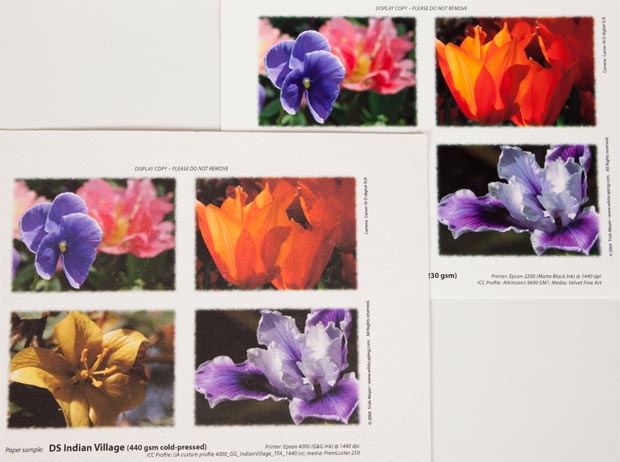
Having a custom profile created for an uncoated paper (lower left) will get you closer…but still nowhere near as good as professional, inkjet coated paper with a good profile (upper right – Arches Infinity with one of Bill Atkinson's profiles).
3) Failing that, crank up the saturation in your image processing program. See if your printer dialog has an option that allows you to adjust the “ink load” printed to paper – if so, crank that up as well. These steps will help you combat the inevitable lack of contrast that comes from printing to paper not coated to receive your printer's ink. But really – you're better off with coated paper, or at least a proper profile.
next page: using profiles to tell your software how to get the most out of your printer and paper
Talking Sense to Your Printer
If you don't do anything special, every different combination of printer and paper is going to yield a different-looking print – none of them probably “right.” However, if you follow just three simple steps, you will suddenly get the closest match possible between your print and original image.
The first step is to use image processing software that supports color management, and make sure it is enabled. Not all software supports color management (Photoshop, Photoshop Elements, Aperture, Lightroom, and Qimage are examples of software that do), but it is near-essential to getting accurate prints. The software's documentation or help files (not to mention books on using your software of choice) will include instructions for how to enable it.
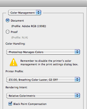 The second step is to obtain a profile (sometimes referred to as an “ICC Profile” after the color standards organization) that describes your specific printer/paper combination, and use it when printing. This will allow the combination of your software and printer to take any image – regardless of where it came from – and automatically tweak it to get as accurate of a print as possible to your chosen printer/paper combination. Many paper manufacturers and resellers make profiles for the combination of their papers and popular printers available for free on their websites (search for the “profiles” link); it's just a matter of downloading them and following the installation instructions to allow your color-managed image processing software (see the first step) to access and use them.
When printing from a color managed image editing application, there will be a “color handling” option somewhere in the print dialog box (Photoshop CS5 is shown here); set it so that your software – not the printer – manages the colors, and then select the printer profile that matches your printer/paper combination.
Just as not all printers or paper are created equal, neither are all profiles created equal: Some manufacturers take more care than others; sometimes motivated users will make their own improved profiles available (always worth a Google search). Also, profiles might not be available for your exact printer/paper combination.
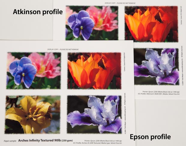
When fine art paper manufacturer Arches starting making inkjet-coated paper, printer manufacturer Epson quickly created color profiles for their Stylus Photo printers to take advantage of it (lower left). However, quick doesn't always mean good; high-quality print pioneer and original Macintosh team member Bill Atkinson followed by making his own hand-tweaked profiles (upper right) and made them available to other users. Notice the difference in colors between the two.
For the best results, you can have a custom profile made for you. All it typically takes is $25-35, two to three sheets of the target paper, and the ability to follow simple instructions to make some special test prints. Mail these prints off to a color profile vendor, and they will email you back a custom profile for your specific printer/paper combination. We used InkJetArt.com to create profiles for our Epson 2200 and 4000 printers; I've seen other users say good things about Cathy's Profiles. We now own an HP Z3100 printer that has the capability to make its own profiles – a really nice feature available on some high-end printers.
The third step is telling the printer what the surface of your paper is like: Is it matte, semi-gloss, or glossy photography paper? Is it more like textured watercolor paper, or like smooth (“velvet” or “pearl”) printmaking paper? Is it not paper at all, but canvas? Each receives ink differently.
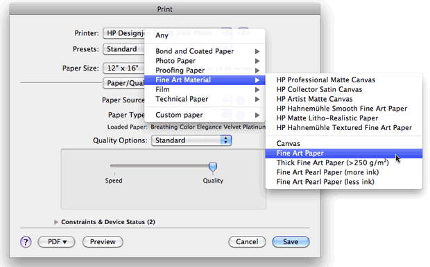
An example of the Paper Source selection dialog in Photoshop CS'5 Print Settings, under the Paper/Quality sub-menu.
In the advanced settings of many printer settings dialog boxes, you will often have the option of telling the printer what the surface of the paper is like. Pick the closest one for starters; experiment with other settings later if you have the curiosity and time. There's a chance the paper manufacturer will provide a preset that contains both the preferred profile and paper setting; programs like Photoshop also have the option for you to create your own presets that include this information and more. Some high-end printers (such as the HP Z3100) can even test the paper themselves, saving specific settings for each paper you use. But for now, choosing the closest basic surface type will get you closer to your goal.
A User Has To Know Their Limitations…
Time for another asterisk: Even with profiles and color managed printing, the quality of your result depends on the quality of your printer as well as the quality of your paper. Color management can help you get the most out of what you have, but it's not going to make your printer or paper better than they really are. Unless you are using a high-end printer, great paper with an excellent inkjet coating, and an excellent profile that precisely describes this combination, chances are there some colors just aren't going to be 100.00% accurate.
However, there are a couple of things you can do to help you work around the flaws:
- Programs such as Photoshop often have proofing options. For example, in Photoshop CS5, if you enable View > Proof Colors, Photoshop will simulate on your monitor some of the potential inaccuracies in color that may appear in your final print. Seeing these before you print gives you a chance to make adjustments to your image to compensate for these flaws. Some software such as Photoshop even contain a print proofing option, so that you can simulate the look of one paper (such as gray newsprint) when you print onto another (such as normal white paper).
- Advanced printing dialogs – such as those in Photoshop CS5, shown above in our second magic step – have options for “rendering intent” or something similar. These provide alternative approaches for how your software should try to compensate for shortcomings in your printer/paper combination, such as what to do with “out of gamut” colors (colors potentially in your image that your printer or paper can't reproduce). As shown above, the common default setting in Photoshop is Relative Colorimetric with Black Point Compensation enabled: In other words, map your image's white to the paper's white, your image's black to the printer+paper's black, and adjust anything that's out of gamut (those that can't be reproduced accurately). Some paper manufacturers include tips on alternate settings for their papers on their websites. Failing that, if you're having issues, experiment and see what looks best; documentation inside programs such as Photoshop help explain what's going on underneath the hood, with advice on what alternatives to use when (for example, try an intent of “perceptual” if you're trying to print a lot of colors that are outside the gamut of what your printer and paper can reproduce).
next page: getting your monitor to stop lying to you
Letting Your Computer Know What You're Seeing
If you've followed the advice on the previous pages about selecting paper and setting up your printer to best take advantage of it, and the resulting prints look significantly different than what you're seeing on your computer monitor, there's a good chance that your monitor might not be accurately displaying the colors your computer is trying to print.
At a bare minimum, you need to get your computer and monitor on the same page. Precisely how you go about that varies depending on what type of computer and monitor you are using:
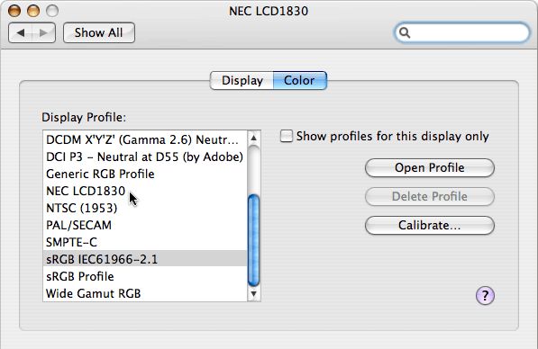
If you are using a Mac and an Apple-brand monitor, your computer can auto-detect what monitor you have connected and will set itself up accordingly. Of course, you can always override that setting (for better or worse). Open the System Preferences, click Displays, then click on the Color tab. The choice at the top separated by a dividing line is the monitor you have connected; use that as your starting point.
If you are using a Windows computer, the default is to assume that your monitor is displaying colors using the Windows-standard sRGB color space. If you've touched the controls of the front of your monitor, this may no longer be true. To get back to a standard baseline, see if your monitor has a physical “menu” or “settings” button; if so, use it to reset any changes that might have been made, and set the monitor's color profile to sRGB. Then in Windows, open the Display control panel and look for the Color Management panel (it's probably under Display > Settings > Advanced) and set the display profile to sRGB as well. If you want to go further, check out the installer disc or website for the monitor you own, and look for a color profile specific to that model. Install it, and try using that as your Display color profile instead.
If you are using a Mac with a non-Apple monitor, follow the Windows instructions above. In the image below, I had an NEC 1830 monitor hooked up to a Mac; I reset the monitor itself to sRGB and then selected the same in the Mac's System Preferences > Displays > Color. (Even though Apple provides a profile specifically for the NEC 1830 as pointed to by the cursor below, I found it to be inaccurate; sRGB gave me better results. Yes, sometimes you still need to reply on your eyes rather than just technology!)
Note that I qualified the instructions above by saying they were a starting point. In truth, sRGB is a least common denominator; it can't display the full range of colors that you can expect from modern monitors. And as also hinted above, the profiles you get from a monitor manufacturer may not be all that great either. If you're getting to the point where you really care about accurate colors for printing, the next step is to buy a color calibrator and create a custom profile yourself for your computer monitor. It's not as scary as it might sound; entry-level systems such as the Pantone Huey or Datacolor Spyder cost well under $100 and come with highly automated software to create a custom profile for your monitor. (When buying a profiler, make sure it is compatible with your current operating system; it appears some models of the otherwise popular Pantone Huey have yet to be updated Mac OS Snow Leopard or Windows Vista.)
And if you go through all this, and your print still doesn't match the image on your monitor…sorry; your printer and/or paper just aren't up to the task. Try better paper; if that doesn't help, you might need to get a better printer. This isn't yet a perfect art.
Working Space
Completely separate from the color profile for your monitor, as well as the color profile for your printer/paper combination, is the color profile you use while inside your image editing software such as Photoshop. Don't mistake any one of those for the others.
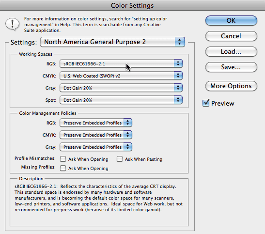
Windows has made sRGB a universal default standard for most cameras, scanners, monitors, projectors, and websites these days. (Asterisk: Higher-end cameras, scanners, and the such allow you to override this; for example, we set our digital cameras to use the higher-quality Adobe RGB color space instead of sRGB.) This means that most of the imagery that comes into your software will originate in the sRGB space, and if you're creating elements for a website or to project at a meeting rather than to print, you will want your final images to go out using sRGB. It's what programs like Photoshop default to if not told to do otherwise:
However, as you can see by reading the fine print at the bottom of the Photoshop Color Settings dialog box above, sRGB is a least common denominator format based on the limitations of old technology. As a result, it cannot describe too wide of a gamut of colors – it's like living inside a phone booth.
When you are editing an image, you would prefer to have a lot more elbow room to push the limits of color your printer can reproduce. Adobe RGB is an improvement over sRGB, and is considered a good match when creating images to go out to a commercial printing press.
ProPhoto RGB is even better, and is the format suggested for photographers and those doing high-end printing.
Note that this setting only affects what your software is using underneath the hood when it needs to process colors. Your computer's operating system translates this internal color space to whatever your monitor requires when it comes time to view that image. And when you go to print, this internal space is translated to the profile you chose for your printer/paper combination. If instead you are saving images to ultimately be used on a website or in a PowerPoint presentation, programs like Photoshop offer “Convert to Profile” functions that allow you to translate it to the sRGB space that is best for websites. Given all that, it is often better to use a larger color space such as Adobe or ProPhoto RGB while editing your images.
I Thought You Said This Would Be Easy…
That was a lot of words; your head may be spinning by now. Sorry; I have a tendency to want to explain things more thoroughly rather than leave them as sound bites – knowledge is power and all that. Given that, let me repeat the same advice I gave at the start of this article:
- Use paper that is “coated” for inkjet printing.
- Get a “profile” that describes your printer/paper combination, and load that into your image editing software when getting ready to print.
- To make accurate changes while viewing your monitor before you print, tell your computer what type of monitor is connected to it.
That's it – that's really all there is to it (most of the time). And now you know how – and why! – to realize each of those steps. It's not intuitive, but neither is it voodoo or rocket science. Understand these steps, and suddenly printing will become a lot more predictable and less stressful.
FTC disclosure: None of the items discussed in this article were provided by any of the manufacturers in exchange for consideration of any kind. If we mentioned it here, we actually use it and paid for it with our own money (with the exception of Cathy's Profiles, which a lot of people on the Yahoo Inkjet Transfers forum had good things to say about several years ago).
Our photographs and artwork, as well as content contained in our books, videos, blogs, and articles for other sites are all copyright Crish Design, except where otherwise attributed. Other examples of my mixed media work may be found on my artist web site.
Filmtools
Filmmakers go-to destination for pre-production, production & post production equipment!
Shop Now