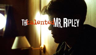
One of our favorite motion graphics design jobs is creating the opening title sequence for movies and television shows (a few of the projects we’ve worked on can be seen here). Title design is a place where typography and animation meet to both convey a story and set a mood.
I’ve recently stumbled across a lovely web site called Art of the Title. Every week, the writers dissect an opening title sequence with still frames and a large (typically 800×336) QuickTime movie of the title, plus the ability for visitors to leave comments and carry on the discussion. It does not contain just recent titles; they will often reach back a few years or even decades to show off a design that particularly resonated with them in either a good or bad way. There is also a well-organized index down the left side of the dozens of titles they reviewed in the past.
By the way, in the next couple of weeks we’ll be adding an article to our CMG Keyframes blog on type resources (including links to numerous type foundries), plus writing an article for Artbeats.com with common typesetting tips and errors – so stay tuned!

Filmtools
Filmmakers go-to destination for pre-production, production & post production equipment!
Shop Now


