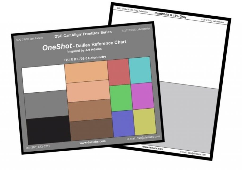
In days of old, white balancing was easy. Now, like everything else, it’s gotten a lot more complex. Here’s why, with instructions to make it simple again.
White or gray… what’s the proper tone for white balancing? As cameras get better, reference white becomes darker. Here’s why…
DSC Labs president David Corley recently asked me whether modern cameras are better white balanced with precision white cards or gray cards. “We’re getting requests for both,” he told me, “and we’re curious what you’re using most.”
The answer was… it depends. I’ve been experimenting. The back of the DSC Labs OneShot Plus chart has both white and neutral gray references, and I’ve been using both… but I expose them each at about the same IRE value. More on that in a moment.
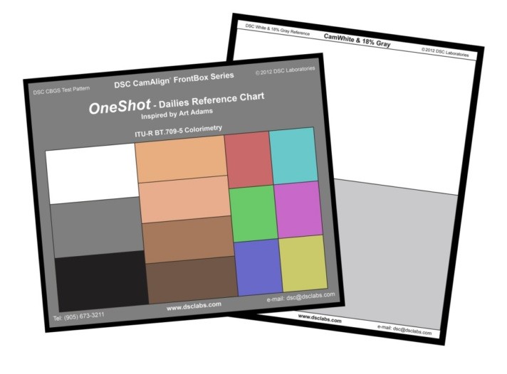
The DSC Labs OneShot Plus dailies grading chart.
It was a revelation to me when, years ago, I discovered that I got much better results white balancing off gray cards when grading in RedCine. I’d been white balancing cameras off precision-printed white cards for a long time, but the newer crop of cameras seemed to prefer darker, neutral tones. The Canon 5D, for example, white balanced much better off a gray card than a white card (or a white card exposed for gray).
White balancing is the coarsest of color adjustments. Every video camera has three color channels—red, green and blue—and aligning those channels using a neutral white or gray reference removes obvious overall hue shifts in environmental lighting. For example, if I’m shooting in an alley lit only by open skylight I might choose to white balance the camera to render the blueish ambient light as neutral. Or, if I’m shooting around sunset in a smoggy area, I might choose to white balance the camera to compensate for the increased warmth of sunlight as it dips below the smog layer.
Or, more commonly, if I’m shooting in a department store and all the overhead lights are fluorescent tubes and appear greenish, I can white balance and make that light appear as neutral as possible.
The trick is determining what tone the camera wants to see. Does it want to see white, or gray, or light gray…? Based on my research and a couple of quick field tests I’ve determined that most modern cameras with a dynamic range of 12-14 stops want to see a white or neutral gray reference in the 50-60 IRE range as viewed on a waveform. This is roughly a half stop to a stop above middle (18%) gray.
The Rec 709 spec was designed to encompass about six linear stops of dynamic range with little to no highlight compression. The exposure difference between middle gray (about 43 IRE on a waveform monitor, according to my Rec 709 math) and 90% white (100 IRE on a waveform) is only about 2 1/2 stops. Those of us who remember the Sony F900 still feel the pain of trying to keep our highlights within that range. Whoever invented the Rec 709 spec didn’t have much imagination, because real world lighting is rarely flat enough that nothing in the frame is more reflective than 90% white. That may be the brightest matte white you’ll find in nature, but the assumption is that it will be the brightest thing in your shot. Unless you’re working on the most flatly-lit stage in the world, and there are no shiny objects in sight, that’s never the case.
Fortunately modern cameras don’t follow the Rec 709 spec; rather, they employ what I call “Rec 709 compliant” gamma curves that are meant to reproduce the full tonal range of the camera within the six-stop Rec 709 spec. That’s quite a trick when most modern cameras capture anywhere from 5-7 stops between middle gray and white clip, which is two to three times more tonal information than the original spec allowed for.
The solution is to stretch mid-tones apart so that the distance between, say, middle gray and one stop brighter than middle gray, is nearly the same as what the Rec 709 spec expects. It may be slightly compressed—one stop brighter than middle gray on a modern camera might fall at 55 IRE on a waveform instead of 63 IRE, according to true Rec 709 math—but ultimately it looks fine. Beyond that range, though, highlight compression kicks in more aggressively as exposure increases to the point where 70 IRE represents not 1.5 stops above middle gray but two stops or more. Beyond 80 IRE it’s not uncommon for the remaining 3-5 stops to be rolled off over a range that encompasses only about one stop in the true Rec 709 spec.
Visually this is no big deal. Our eyes naturally compress shadows and highlights and are most sensitive to brightness changes in mid-tones. From a white balancing perspective, however, this is problematic. Under the old Rec 709 spec you could white balance off a bright white reference because there was little to no highlight compression, but exposing a white reference the same way today could push it so far up the tonal curve, and into highlight compression, that differences in hue are dramatically reduced.
Here’s an example I shot using a perfectly neutral gray card lit with magenta light:

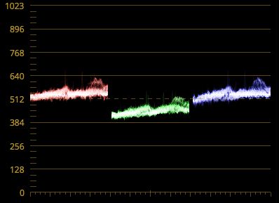
Exposed for slightly brighter than middle gray, I can see the difference between color channels clearly. The green channel is low, resulting in a magenta hue shift. Note that the peaks on the right side of each channel, which I’m going to use as my reference, show a difference of approximately 128 code values between green and both red and blue.

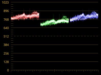
As I increase exposure and push the gray card values farther up the tonal curve (in this case I’m using an Alexa LUT as it’s designed to compress highlights aggressively to squeeze its extraordinary dynamic range into the Rec 709 spec) you can now see that those values are only about 64 code values apart. The differences in hue are less pronounced.

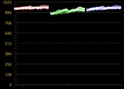
A further increase in exposure shows the hues are even closer than before: there’s now only about 32 code values between the green peak and the blue and red peaks. This is where we’ve traditionally white balanced cameras.
My question to you is: where do you think you’ll get the best white balance? Are you better off using a gray card, or an underexposed white card, and exposing your neutral reference as a mid-tone, or should you expose a white reference for a value that actually looks white?
Based on what I see here, I’m going to suggest that exposing your neutral reference as a mid-tone—say, between 43-55 IRE on a waveform—is the best option. The wider spacing found in mid-tones should allow for greater precision than the narrower spacing found at brigher exposures. The more the gamma curve compresses the highlights, the less accurate white balance will be because the differences between color channels are diminished.
I used an Alexa Rec 709-compliant gamma curve in my example, but this image passes through Arri’s LogC gamma before being mapped to Rec 709 for on-set viewing. That means, in theory, that a typical white reference exposed as white shouldn’t come anywhere near extreme highlight compression in LogC. The sweet spot, though, is still at the same IRE value.
I plotted this curve using Ben London’s excellent LutCalc application:
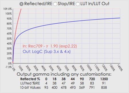
In case you don’t know how to read a graph like this:
The left side is waveform values in %. (The “IRE” designation died with HD, as it’s an SD-only measurement, but as reflected light values are also measured in percent it helps to differentiate between the two. For example, I feel it’s more clear to say “18% gray falls at 43 IRE” than to say “18% gray falls at 43% on a waveform.”)
The bottom is reflected light values, from 0-1400%. Everything you see in nature that is not a specular highlight falls between 0-90% reflectance, or almost to the 100% marker on that bottom line. (90% reflectance is bright matte white.) Everything else is highlight information. 100% reflectance, if it existed, would reflect back every last photon of light that struck it. If a camera can capture a brightness level twice that (200%) then that would be a dynamic range increase of one stop. Double that (400%) and you buy yourself two stops. Double that (800%) and you get three stops. Double that (1600%) and that would be four stops.
This, by the way, is how camera manufacturers like Sony like to tell you how much dynamic range their cameras have. For example, if Sony says an F55’s dynamic range is 1300%, you know they are claiming they can hold detail in highlights that are nearly four stops brighter than the brightest matte white object possible. If you know that 100% reflectance is 2.5 stops brighter than 18% gray (and it is) you’d know that Sony was bragging slightly more than six stops of overexposure headroom between middle (18%) gray and bright matte (90%) white.
Look at the blue line in the graph above, which represents Arri’s LogC. 90% white in LogC is mapped to 58 IRE on a waveform, allowing plenty of headroom for overexposure, but note that 58 IRE is just beyond where the exposure curve goes through a 45-degree turn. That curve is where changes in brightness start to transition into a highly compressed state, so the sweet spot for white balancing appears to be exactly where the curve goes through 45 degrees. That looks to me to be around 52 IRE, based on the vertical scale to the left. That’s probably about a half stop brighter than middle gray. I’m sure that white balancing a stop brighter than that isn’t going to cause too many problems, but as it makes sense to me that the most accurate white balance happens at the point where the color channels show the strongest signal with the most contrast, I’d say that exposing a perfectly neutral white or gray card at the same exposure as normal caucasian flesh tone should yield the best results.
If we look at that same graph again, though, and pay attention only to the red Rec 709 curve…

Now you can see why an older camera shooting true Rec 709 can white balance on an actual white reference: there’s really no highlight compression to speak of as a range of 0-90% reflectance falls between 0-100 IRE, unlike LogC which crams 6-7 stops of dynamic range into the same (or less) space. White balancing just below white clip in true Rec 709 has nearly the same precision as white balancing at middle gray. This is certainly not the case in any modern high dynamic range camera.
This is why we no longer use the Rec 709 gamma curve. If you want to see what that looks like, there’s a true Rec 709 gamma option in just about every Sony camera made. You’ll only look at it once. (Have a bucket nearby, you may need it.)
I started thinking about this while using DSC Labs IllumaMatch system :
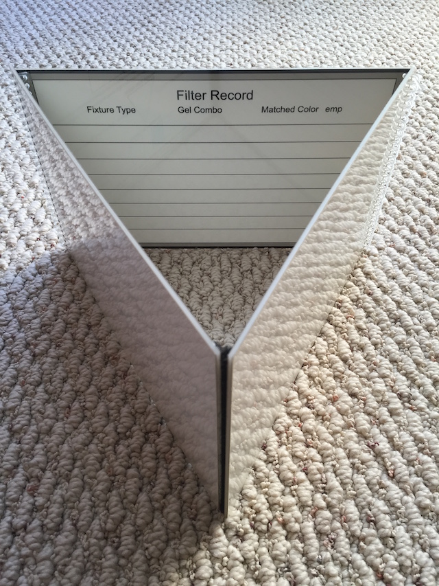
The DSC Illumamatch chart, sitting on my living room floor. Both sides of the chart are as perfectly neutral a white as can be printed. The surfaces are glossy to help eliminate glare: all surfaces, including matte surfaces, exhibit glare, and if you can see it you can eliminate it. A glossy surface makes glare obvious, so you know when it’s there and when it’s gone. A matte surface will show a low level of glare no matter what you do.
The idea is simple: fold that chart into a triangle, illuminate one side with a reference light and the other side with the light you’re trying to match. I used it to match my tungsten lights to overhead fluorescents while shooting with an Alexa in a supermarket: I had to quickly find out how much plus green to add to my tungsten lights so that I could white balance to the fluorescents and have all my lights match as best they could. I set the chart on top of a lens case with one side facing the interior of the store, lit by endless banks of fluorescent lights, and then lit the other side with a small tungsten fresnel. I then used my Video Devices Pix-E5‘s parade waveform to gauge exposure.
There was some fluorescent spill on the tungsten side of the chart so I spotted the fresnel into that side to wash it out. This created an exposure difference between the two sides, and I had to compensate by changing the T-stop on the lens as I compared sides.
I exposed the fluorescent side of the chart for “white” and white balanced, and then exposed for the other side of the chart (the brighter fresnel-lit side) and added green to the tungsten light until the green channel matched the red and blue channels. As I changed exposure between the two sides of the chart I could see the difference in highlight compression, and I saw how differences in hue were obscured as the tungsten side of the chart became brighter. I realized how much compression was being added when I exposed the white reference as actual white and decided there had to be a better way.
Based on what I saw on the waveform I white balanced again, this time with the fluorescent side of the chart exposed at 50 IRE instead of 70 or 80, and then closed the aperture and exposed the tungsten side of the chart for 50 IRE and verified that the red, green and blue peaks were still aligned. They weren’t: highlight compression in the camera had prevented it from seeing subtle hue differences in the light sources. I adjusted my gel pack (I think we went from 1/4 + 1/8 plus green to full 1/2 plus green), re-white balanced at the darker exposure, and ended up with a perfect match.
When I exposed the fluorescent-lit side as bright white and then white balanced, I was cheating myself by compressing the differences between the color channels. When I tried to verify my work by exposing the tungsten-lit side by the same amount, I couldn’t see that there was still some discrepancies between the color channels. Once again, to revisit my previous illustrations, you can see how much less compressed, and much more obvious, color differences are at darker exposures:

A gray card photographed to appear magenta and exposed where I’d normally white balance a bright white reference.

The same gray card exposed as middle gray. The differences between color channels are much more obvious here, and the camera’s correction will be much finer.
This may seem like a simple thing, but it’s an interesting lesson in how not to make assumptions about things that may appear commonplace. I thought I knew everything there was about white balancing as I’d been doing it for 25 years. It turns out that, when it comes to modern technology, we can’t take anything for granted.
Film was relatively simple to work with. HD is much, much more complex. Fortunately I like a challenge.
Disclosure: I have worked as a paid consultant to both DSC Labs and Sound Devices/Video Devices.
Art Adams
Director of Photography
www.artadamsdp.com

Filmtools
Filmmakers go-to destination for pre-production, production & post production equipment!
Shop Now