Between January 2007 and April 2008 I consulted for Element Labs on the development of the Kelvin Tile. During that time I learned a lot about color and spectrum. Someone on the Cinematography Mailing List’s CML-Basics list asked a question about color rendition and broken spectrum lighting, which got me going on a riff that I will post here, with some embellishment.

The Kelvin Tile uses two LED packages, of three colors each, to create a very broad spectrum adjustable color temperature light.
Color is created when spectra of light striking an object are either absorbed or reflected. For example, lighting a green object with full spectrum white light will result in all the wavelengths of light that are not green being absorbed, while green wavelengths are reflected.

The visible color spectrum, courtesy of Wikipedia.
Certain lights, such as sodium vapor streetlights, are missing large parts of the light spectrum, because they work by electrically exciting gas mixtures that only emit light in very narrow frequency ranges. That’s why you’ll see very little color at night in a parking lot lit with sodium vapor lights: the white cars will appear orange, because sodium vapor lights emit mostly yellow-orange light and the white paint on the cars contains that part of the spectrum, but they don’t look white because the light’s spectrum doesn’t contain any of the other colors necessary to create white. (See “additive vs. subtractive” on the last page of this article.) And other colored cars, such as blue or green or red, will appear nearly completely black, because they absorb all of the orange-yellow light and reflect none of their own color back because it’s simply not present in the light. You can’t reflect what isn’t there.
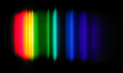
The sodium vapor spectrum, courtesy of Wikipedia. Any color whose spectra fall into the gaps between these colors will not be faithfully rendered. And there are a LOT of gaps.
Fun fact: the City of San Jose, in which I live, uses low pressure sodium vapor street lighting in order to reduce light pollution that would otherwise interfere with the operation of nearby Lick Observatory on Mount Hamilton. The narrow spectrum of low pressure sodium vapor lighting can be easily filtered by astronomers as it doesn’t interfere with the spectrum of light that they are observing. I learned this because I shot the video at the bottom of this page as a freebee for Lick Observatory more than ten years ago. All proceeds benefit the operation of the observatory.
LED lights are tricky. There were, when I last studied them, two types: phosphor and dye. Phosphor LEDs emit a fairly broad spectrum of light, while dye LEDs emit very pure, very narrow spectra. Up until the Kelvin Tile was developed most LED lights used only phosphor LEDs, and they weren’t perfect: they emitted a little too much green, which is why most of those lights come with some sort of minus green gel for color correction. Their spectrum isn’t perfect but it’s good enough to convince the eye that it’s white light, although if you looked at two MacBeth charts side by side, one lit with an LED light with phosphor LEDs and the other lit with a tungsten light, you’d notice that some colors on the LED side were dull and lifeless compared to the tungsten side.

A graph of white light created by three dye LEDs, courtesy of Wikipedia. While this light will appear white to the eye, any object whose colors fall between the spikes will not be faithfully rendered.
Read on for more interesting spectral goodies…
A tungsten filament emits light across the entire visible spectrum. It’s spectrum is weighted toward the red end, which is why it is a warm light, but it contains every wavelength, from one side of the visible spectrum across to the other, in an unbroken chain. With that entire range available, any visible wavelength that an object can reflect is available to be reflected. This is not true of all LED lights, or indeed most HMI and flourescent lights.
The Kelvin Tile solved this problem by using six different colored LEDs together to create as full a spectrum as possible. By changing the brightness level of different LEDs we were able to skew the color temperature to any value between 2000k and 10,000k with very good color reproduction. We jumped through hoops trying to nail specific color targets in ways that looked appropriate on both film and HD, because while there are lots of color mixtures that look right to the eye there are much, much fewer that look right to an objective chemical or digital medium.
We learned a couple of things during all this testing:
There is a significant difference between light you look at and light you illuminate with. If you’re looking at an LED that contains red, green and blue dyes then you can mix any color your eye can see out of those three colors. But you can’t light objects effectively with that LED package because dyes emit light only on very narrow wavelengths, and if you try to light something that’s yellow with narrow spectrum red, green and blue LED lights you’re out of luck. It won’t work, because yellow falls between their spectra. A yellow object won’t reflect yellow light if yellow light isn’t present to begin with. White light is no guaranty of a full spectrum. The eye is easily fooled.
This has to do with additive versus subtractive color. When you look at a light you are seeing additive color, because as you add colored lights together they get brighter, and equal amounts of the primaries will create white light. We you look at an object you are seeing subtractive color, because when white light hits an object all the colors that aren’t contained in that object are absorbed, or subtracted. The remaining light is reflected and creates the color we see with our eyes. If you don’t illuminate the object with light that contains all the spectra necessary to reflect its color, then you aren’t going to see its proper color.
We discovered that using an emissive light color meter (it looks like a very large spotmeter that provides CIE XY color coordinates when aimed at a colored light source) tells you nothing about how that light will look when photographed. It’s possible to find a color of light that is “3200k” on a CIE chart and then use an emissive light color meter to make the LED’s emit that color of light. We tried that and ended up with light that looked good by eye but that photographed very green. Plus, getting the color of the light correct says nothing about the spectrum of that colored light. The key is that you have to create that color using the largest spectrum possible for maximum accuracy in color reproduction. And, lastly, getting the color right requires looking at targets being lit by the light, not by looking at the light itself.
For some reason that we never quite figured out, the Kelvin Tile saturates colors more than tungsten or HMI’s do. They “pop” a little more. It’s a very interesting effect, and it looks great on flesh tone.
We were never able to get the magenta target on any of our color charts to look right. After a bit of research we discovered that this was because there is no wavelength of light that is actually magenta in color. In light, magenta appears when there is an absence of green. If we lit a white wall with the Kelvin Tile set to 3200k or 5600k, and then dialed out the green LED, the wall turned magenta. That’s why there are minus green gels, but not plus magenta gels: you’re subtracting green, not adding magenta.
Litepanels has released an adjustable color temperature LED unit that apparently mixes 5600k phosphor LEDs with 3200k phosphor LEDs. Any color temperature in between can be attained by mixing the two color temps together. It’s a clever design, although I’m curious how full spectrum each of those phosphor LEDs are. (There are no spectral charts on their web site that I can find.)
On the next page: what’s the practical impact of knowing all this stuff?
Knowing how color works in light can be quite handy, especially when you want to add saturation to an object. A great example is blue/green screen photography: there’s a reason that super blue and super green Kino Flos exist, and that’s because the dyes that color blue and green screens aren’t perfect reflectors of just blue or green. They reflect mostly blue or green but they reflect some of the rest of the spectrum as well, which washes out their primary color. The solution is to light a screen that reflects mostly blue or green light with PURE blue or green light. A mostly blue or mostly green screen lit with pure blue or green light will reflect only pure blue or green.
Tip: to super saturate a green screen when using tungsten lights, use Lee 122 “Fern Green” gels. (Thanks to DP Geoff Boyle for that tip.) To super saturate a blue screen under a tungsten environment, light it with uncorrected HMIs or daylight Kino Flos. (This applies only to screens that are separate from the talent. Do not use these tricks on screens where the talent is standing on, or touching, the screen.
You can pop an object’s color just by adding light containing a bit more of that color. For example, if you’re lighting something that’s made of warm wood and you want to make it warmer, add 1/4 CTO to your lights and see what happens. You’ll be surprised how much adding a hint of an object’s color to its light will punch up its saturation.
On to the last page, where we talk more in depth about additive and subtractive color…
Additive color means that mixing the three primary colors together will “add” up to white light. The additive primary colors are red, blue and green. You can create any color your eye can see by mixing these three colors together, as long as you are looking at the light and not at something it is illuminating. Adding color makes the light source brighter.
Subtractive color means that mixing the three primary colors together will “subtract” to black. This is how printing works, and it is also how we see color: colors not present in an object lit by white light are absorbed, or subtracted, leaving the object’s color to be reflected. The subtractive primaries are cyan, magenta and yellow. Adding color makes the result darker.
Film is a subtractive process, because the dyes on the print are filtering, or removing, color from the white light of the projector. Red light is created by dyes on the film filtering out all the light that’s not red, etc. Black is created by completely blocking the light. So while labs may give printer lights in R-G-B numbers, they are really telling you C-M-Y printer lights as they are printing onto a subtractive medium from a negative image.
Gels and filters are also subtractive. An 85 filter, for example, holds back (or subtracts) some of the blue in daylight in order to create a “proper” image on 3200k film. Adding Lee 122 “Fern Green” to a tungsten light subtracts everything in its spectrum except for a yellow-greenish color. Gels and filters never add color, they only remove it.
Printed materials, such as magazines, use a further dye that is just plain black, as cyan, magenta and yellow inks blended together don’t make as rich a printed black as actual black ink. So instead of simply CMY, printers use CMYK–where “K” is black ink. In a way this is similar to the bleach bypass process: silver halide crystals are bound to the colored dyes in the film, and these crystals react when struck by light. During processing the silver is normally removed using a bleach process, leaving behind colored dyes that were activated by the light-struck silver. Bleach bypasses skips all or part of the bleaching process, leaving behind varying degrees of silver.
When applied to print stocks the effect is to increase contrast by dramatically enriching the shadows, as well as desaturating colors. You could say that the silver is the film equivalent of “K” in the ink printing process: since dyes can only block so much light, and the silver physically blocks all the light, the remaining silver causes much deeper blacks.
Using the same process on a negative causes the opposite effect: highlights blow out, because light is prevented from passing through the negative and hitting the positive print stock.
That’s it for now. I’m constantly amazed at how much there is know about cinematography. It sure does keep life interesting.
Art Adams is a working director of photography based in the San Francisco Bay Area. His web site is at www.artadams.net.

Filmtools
Filmmakers go-to destination for pre-production, production & post production equipment!
Shop Now