
Read through any of the online forums and you’ll often see this common concern: “Why doesn’t my export look the same in QuickTime as it does in Premiere Pro?” This tends to be more common with Mac users than PC users, but it happens with Windows, too. The underlying assumption that they should match is a fallacy and I’ll explain why in this article. This is a companion piece to another article Trusting Apple Displays looking at some of the display options and settings available in Apple devices from iMacs to iPads.
Let’s start with displays
If you line up a CRT monitor, an older flat-panel plasma, and newer LCD, LED, and OLED displays, then you would be very hard-pressed to get the same image to match identically across all displays, even with calibration. The physics and technological design of each means they will render images differently. A color bar test pattern may match, but a series of organic, real-world images won’t. This is why veteran editors and colorists have long maintained two rules – only have one color display in the room and stick to one, consistent reference monitor for all projects.
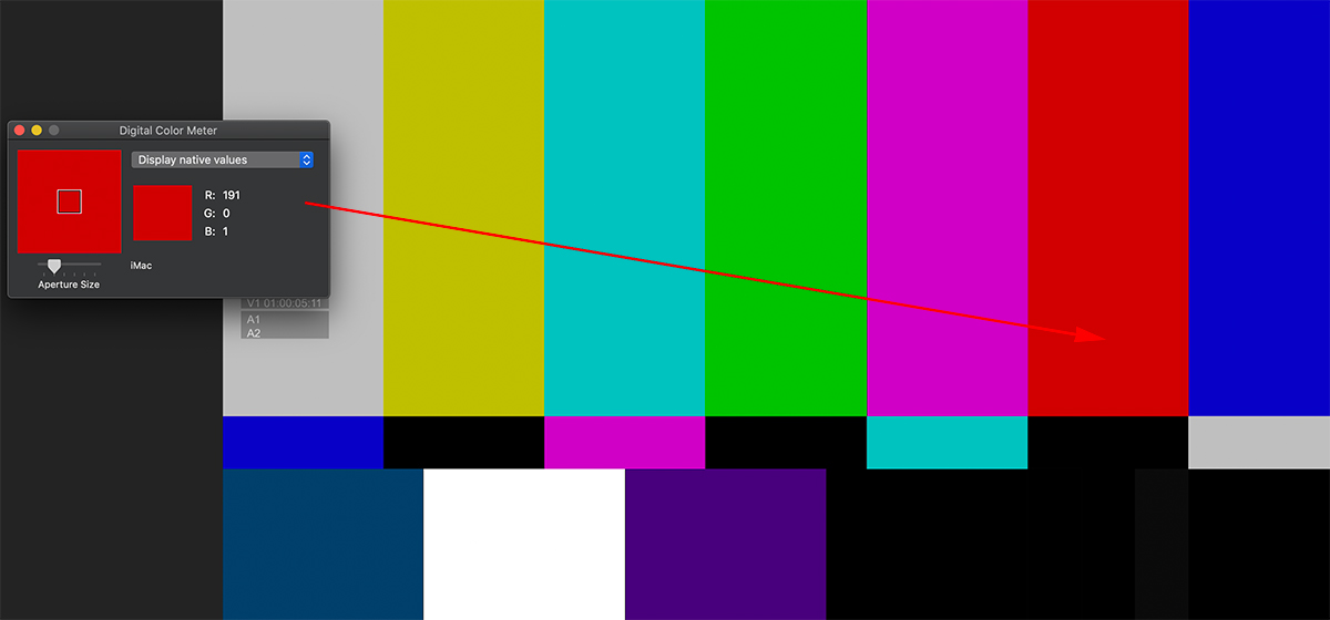
The current color TV standard for SDR (standard dynamic range) uses a display profile known as Rec 709 with 2.4 gamma. I’ll skip the math explanation, but simply put, gamma is a nonlinear operation to encode and decode luminance values. In practical terms, think of it as a curve that changes the midrange of the image. A change in gamma value will make the image appear brighter or darker based on the numbers. Consumer TV sets and broadcast reference displays are all designed to display Rec 709, 2.4 gamma. That’s a signal based on brightness, contrast, saturation, and hue. Digital displays show images using a combination of RGB (red, green, blue). Each color ranges from 0 to 255 on an 8-bit scale. A value of 255-0-0 is pure red. As G and B values increase, the image appears to become brighter and the red is less saturated, until you get to 255-255-255, which is white.
The world of Apple displays
If you are working on a newer Apple iMac, iMac Pro, or Pro Display XDR, then you are using an image system calibrated for a different display profile. iMacs use the P3 D-65 color standard with the ability to go up to 500 nits of brightness (traditionally SDR maxes out at 100 nits). P3 encompasses a wider color space than Rec 709. Furthermore, the Pro Display XDR features an extended dynamic range intended for HDR (high dynamic range) signals. As Stu Maschwitz has noted in his Prolost blog, Apple is also using some “secret sauce” to accommodate the appearance of HDR content on displays that are technically not HDR (defined as 1,000 nits or higher).
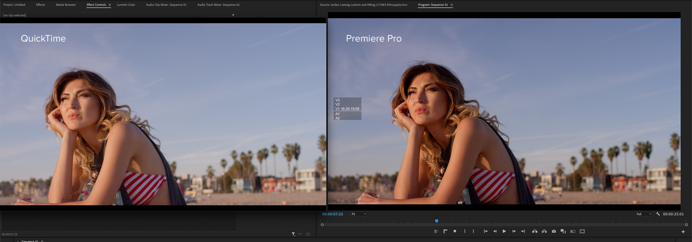
The only consistent reference you will ever have is how the image appears through AJA or Blackmagic i/o hardware to a reference display. How does all of this apply to what you see in your editing software and your video files? Of the four leading NLEs (Media Composer, Premiere Pro, Final Cut Pro, and DaVinci Resolve) none can faithfully produce a perfect match when comparing the viewer image to the image on the monitor nor an exported movie file played through QuickTime, VLC, or Switch. I’ve found the closest to be Final Cut Pro, which is likely due to Apple’s “secret sauce” when using their displays. However, even if the movie export doesn’t match the viewer, it should look identical on the external video monitor when you play that file using Blackmagic’s or AJA’s standalone player utility. It’s purely an interface display difference and not a problem with any video processing.
Adobe Premiere Pro’s working color space
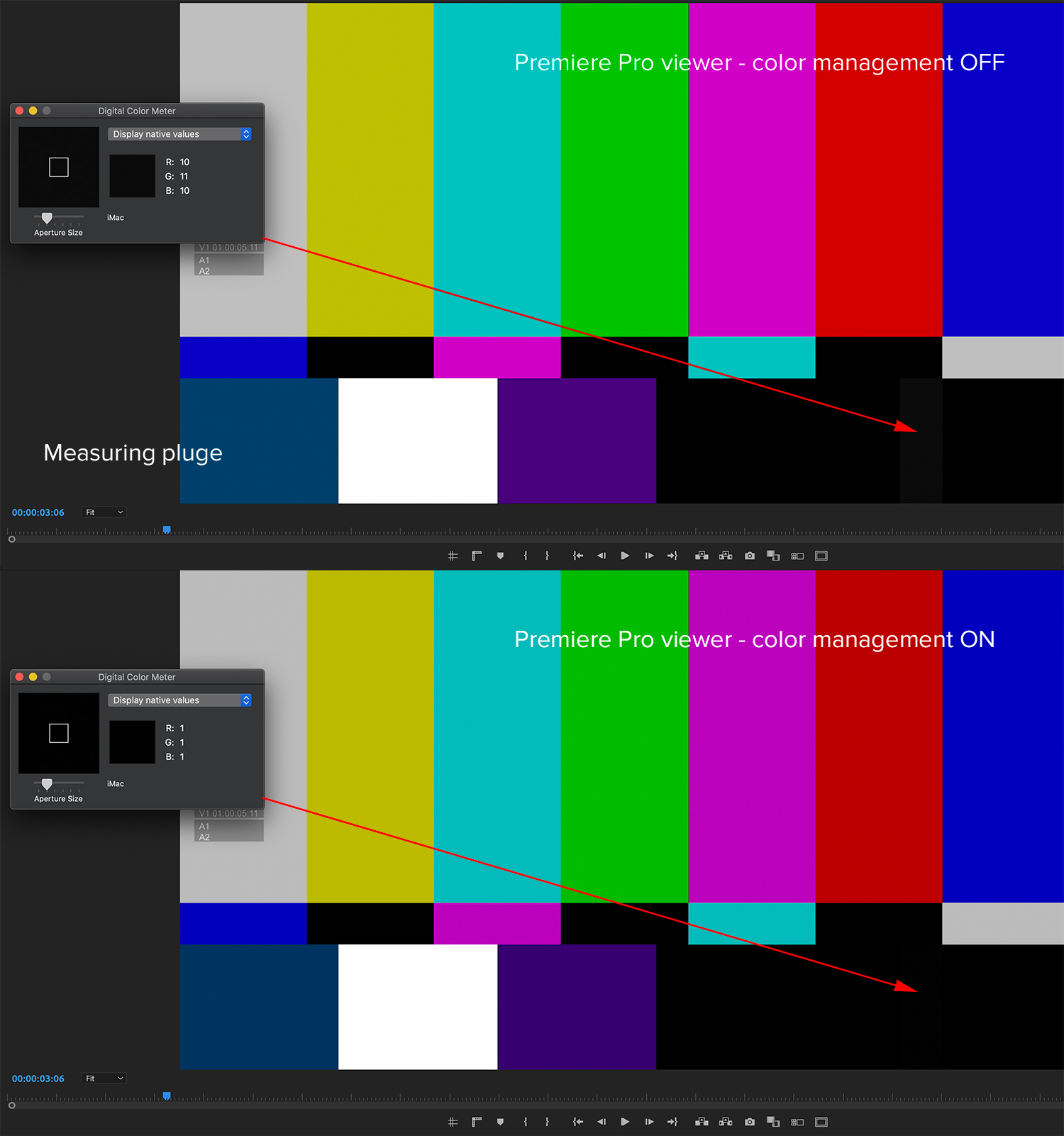
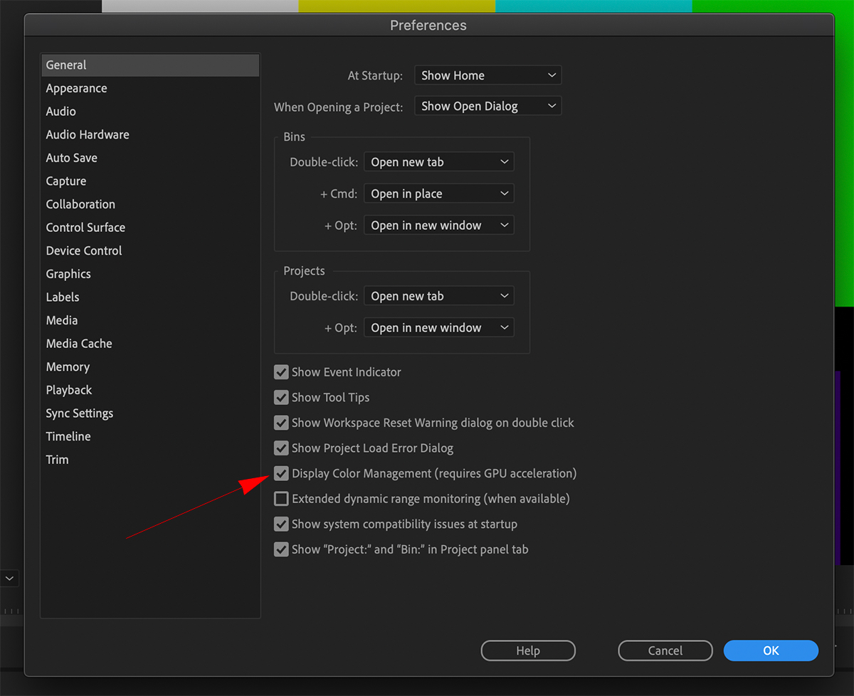
SDR sequences in Premiere Pro are designed to use Rec 709, 2.4 gamma as the working color space for the timeline and viewer. There’s a preference toggle for display color management to compensate for the interface display that you are using. If you are working on an iMac, then the display is using the P3 color space, which tends to accentuate reds and general saturation. With this color management setting OFF, the brightness and contrast of the image in the viewer will be a close match to both Rec 709 on an external video display, as well as to the exported file viewed in QuickTime. But the image will appear too saturated in the viewer, especially with any red tones. Hence, the common complaint that my files look “washed out” after export.
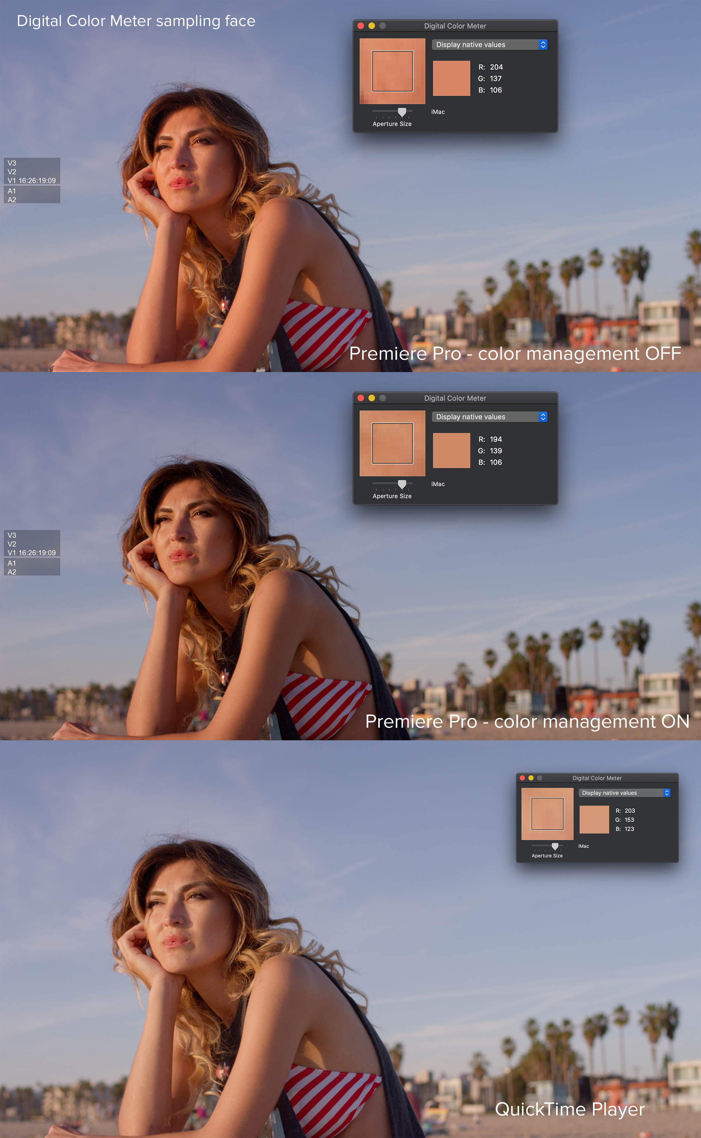
With color management ON, the viewer image will have the closest saturation match to what you see on a display, but shadow detail will be somewhat “crushed.” This is evident when you look at the near-black pluge patch on a color bar chart. Apple includes a handy Digital Color Meter utility that can be used to measure the RGB values anywhere on the screen. Remember that how an image appear in the viewer to your eye is subject to the brightness adjustment of your computer display.
Solving the problem?
My recommendation is to turn display color management ON in the Premiere Pro preferences. This gives you a proper visual match between the timeline and the output to a reference display. Unfortunately this leaves you with the dilemma of the exported file.
Whether the appearance is a distraction for you depends on several factors. If you aren’t particularly sensitize to these differences, then it doesn’t matter. Also, an image that doesn’t have a lot of saturation in the midrange to begin with, won’t show as great of a difference anyway. But if it does bother you – or if you want to be visually accurate to your viewer – then there are a couple of solutions. If you are delivering for broadcast and web use, you may actually need to export two different files – each optimized for a different destination.
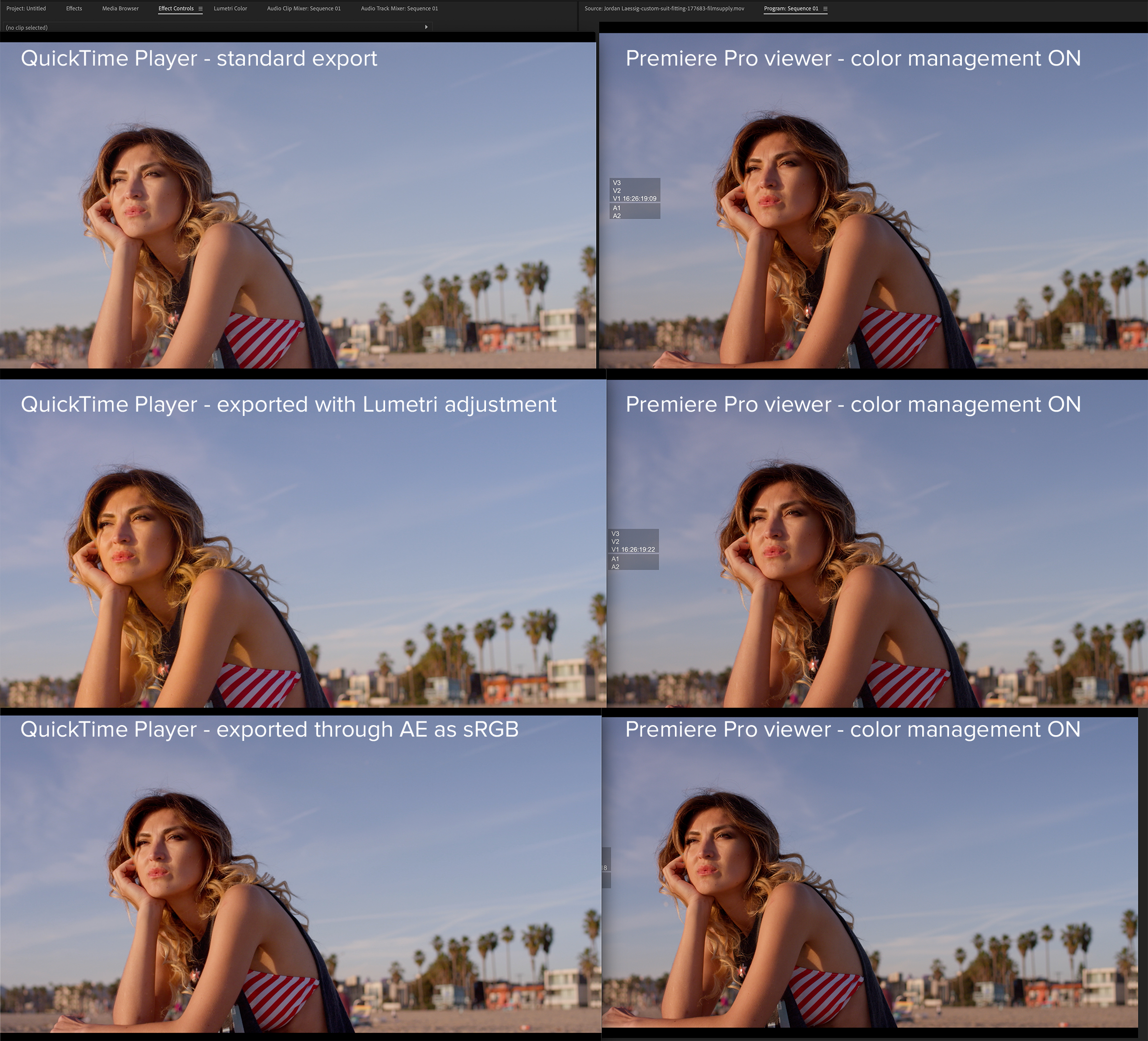
I’ve tested some of the export LUTs that are intended for gamma correction. I find that they don’t work well. The simplest answer is to first export a “standard” file for broadcast use. Then add an adjustment layer to your Premiere Pro sequence and apply a Lumetri effect to it. Increase saturation and lower shadows slightly. Test to taste. Export that as your web file. This should be a reasonable match in Quicktime to what you’ve been seeing in the Premiere Pro viewer while editing (prior to adding the adjustment layer and Lumetri tweak).
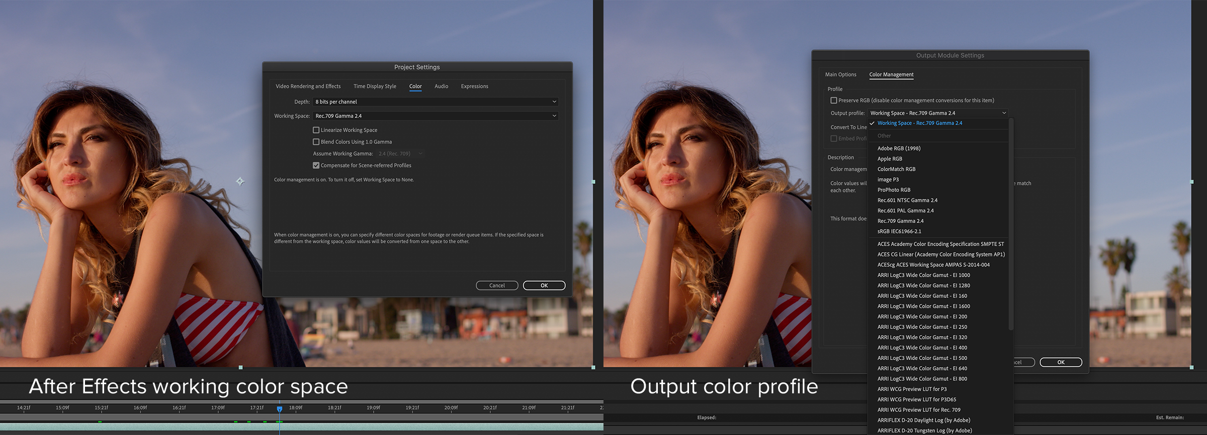
An alternative is to use After Effects, which differentiates between the working color space and the export color profile. In this application, bring the “standard” file that you exported from Premiere into After Effects as a new composition. Your working color space should be set to Rec 709, 2.4 gamma. In the render queue, change the color profile to sRGB. This exported file will look very close in QuickTime (or any other media player) to the image you see in your Premiere Pro viewer.

These two solutions are meant only for final export, because the custom file settings will not match the original files if you were to re-import them into Premiere Pro. While these methods might seem convoluted, they are the only solutions I’ve found to date that solve the problem, if in fact, such minor differences bother you in the first place. Ultimately, your video will most likely go to some web platform, like Vimeo or YouTube, where additional changes happen. There are only so many things you can control. Hopefully this article has offered some insight and potential remedies.

Filmtools
Filmmakers go-to destination for pre-production, production & post production equipment!
Shop Now


