Introduction
Color management (and understanding color management) isn’t a dark art, but there’s more to it than most people realize. Without it, what you see in your edit bay won’t necessarily match what your viewers see on their computers, phones, tablets, TVs, cinema screens or printed material. And all that stuff’s supposed to match, right? The good news is, if your apps do “the right thing” then it’s should all work seamlessly. The bad news is that many apps don’t do the right thing, and it all falls apart.
Up front, my focus here is on color correction for everyday online uploads, and not for broadcast or feature film exhibition. If you’re delivering to TV or cinema, you should be judging color on a broadcast-quality monitor with a specific delivery color space, and likely using DaVinci Resolve or another app which offers far finer control over color than an “everyday” NLE like FCP or Premiere Pro.
Let’s start with a look back at how things used to work without color management.
The old days, in print
We’ll start with a talk about print, because in many ways, color management is far more advanced in the print world. And even before the tools made this easy, color correction was important. In the early years of this millennium, I was working in print, in a reprographics house in London, doing design, color correction and retouching. CRT monitors were the best we could get, but they would drift over time. Every month or so we would tweak the individual color curves that drove our monitors, matching an on-screen image in Photoshop to match a known good Cromalin print of the same image (a very nice, glossy, vibrant one-off print). Automatic color management wasn’t really widely used back then, and we had a system that worked.
One of my jobs was to do color correction for a well-known nationwide clothing retailer, and the process wasn’t nearly as simple as pressing “print” and getting approval. When I’d finished a draft of an image, it would be output to film, then sent to a room out the back where a guy would make a Cromalin print from it, by hand. I’d then inspect it under specific known lightbulbs in a dedicated viewing booth before our couriers would take it across town to the client, who would then inspect it in their viewing booth — with the same specific lightbulbs.
When the Cromalin that was approved, we made plates from the film and ran several sheets of the correct card stock through a short-run press, to see how different the colors looked on the stock they’d be using for the final job. I then corrected for any changes using curves in Photoshop, we ran some more film, plates, and prints, and then finally the client got to make their changes too.
We did get good results, but it was a pretty manual process, and automated color management could have made it all much simpler. So how should it work today?
ColorSync and color management
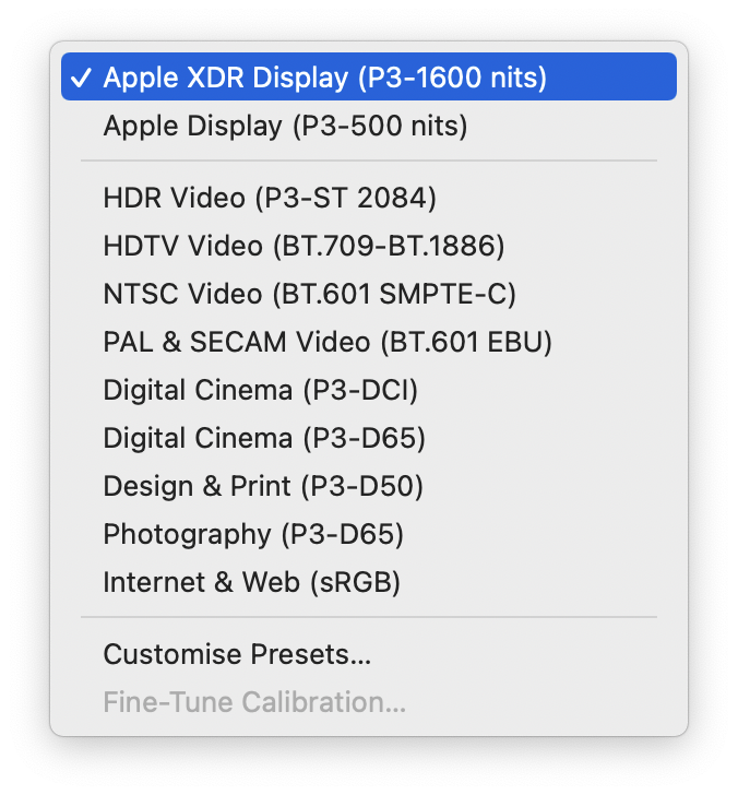
Color management (ColorSync on Macs) ensures that what you see is as close as possible to what everyone else sees. Every device that outputs color — displays and printers — should have a color profile which describes what it can do, in terms of the specific range of colors and brightness values that it’s capable of. Digital files need to be tagged with a profile too, usually by the camera.
If your source file and your display are both tagged correctly, transforms are applied to make sure that you’re seeing the correct colors. Some devices are better than others, and you need to map from one profile to another in the best way you can. One simple print-world example is that newsprint has a much lower ink limit (the total of C+M+Y+K inks used) that other print formats, so you often have to lighten artwork destined for newspapers. You can do this manually, but if color profiles are used, they can do the conversion for you. Your nice print ad is passed along directly for the magazine print, but made lighter for the newspaper.
Today, the digital side of color correction is more important, and we’re using a more diverse range of more capable displays than ever. Still, just a few years ago, most web browsers ignored color correction, or did a poor job of it — and it caused issues. Why?
The default color space of most monitors is sRGB, a lowest-common-denominator profile, but many Macs and fancier PCs had moved beyond this, to a wider color gamut space called Display P3. Most images on the web, but not all, had been tagged as sRGB. In a color-managed browser like Safari, sRGB images looked the same on all kinds of monitors, as they should, but without color management, a super-bright red like #FF0000 (255, 0, 0) would be remapped to the capabilities of the monitor, and look super-vibrant on a more capable monitor. Punchy, but not what the creator intended.
Today, all major browsers are color managed and you can be pretty sure that most people see the same thing. You can even (if you’re careful) go beyond sRGB by tagging images with wider color spaces, and people with fancier monitors can move beyond the constraints of sRGB. Mobile phones aren’t limited to sRGB, and it’s a little surprising that we haven’t seen wider use of super-bright or super-vibrant graphics so far.
So that’s the background — how does the world of video embrace color management? Video files are tagged with NCLC tags, which define specific standards rather than including a unique color profile alongside the video. Exporting to a known standard profile is fine, but there’s a problem.
NCLC tags and Gamma issues
You might have heard people complaining of the “QuickTime Gamma Bug” or a “QuickTime Gamma Shift”, blaming QuickTime for making their Premiere videos look washed out when compared to the Premiere Pro timeline. The truth is a bit messier.
There are indeed different gamma values used between computers and TVs, and between PCs and Macs. A gamma curve (or transfer function) maps the space from black to white, and influences not just the brightness of an image, but also the contrast. While Macs used to use a system-wide gamma curve of 1.8, in 2009 they switched to 2.2 and matched the Windows/sRGB default. However, the Mac still expects regular video files to use a gamma curve of approximately 1.96, and with default video tags, that’s the assumption made before color management adapts the video to the display gamma (likely 2.2). So why is ~1.96 assumed?
To explain that, you need to understand NCLC tags, three numbers that define the color standards that should be used when interpreting a video file. FCP and Premiere Pro (and many other video apps) tag most standard files with [1-1-1].
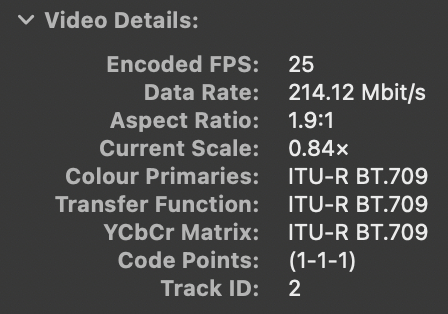
The first value is the Color Primaries, the color gamut available, and 1 means ITU-R BT.709. So far, so good.
The second value refers to the Transfer Function, or gamma, used for playback, and the 1 here represents ITU-R BT.709 as well. Unfortunately, there’s disagreement on how to interpret that second “1”, because there was no official guidance on the transfer function BT.709 should use — or at least, there wasn’t when QuickTime decided what it would do.
In the absence of a firm gamma number in the BT.709 spec, Apple had to figure something out, and it’s not really clear exactly how they came up with a gamma of ~1.96. One developer document says that it’s an average CRT gamma with a contrast enhancement factor subtracted. It’s also possible that a transfer function intended only for cameras at capture time (an opto-electronic transfer function, or OETF) and not for display (an electro-optical transfer function, or EOTF) was inverted to come up with ~1.96.
Either way, this is the standard that Apple seems to have followed for display purposes in ColorSync. Note that there is no option explicitly defined in the standard for a broadcast-friendly 2.4 gamma transfer function. In theory, you can specify a value of “2” here, with a supplementary value to define a 2.4 gamma, but not all apps will observe this.
The third value defines the Conversion Matrix, and again “1” represents ITU-R BT.709. (Usually the first and third values in an NCLC tag are the same.)
Most common HD SDR files are therefore tagged [1-1-1], but note that this changes if you step up to HDR and/or Wide Gamut (Rec.2020) workflows. Rec.2020 SDR is tagged as [9-1-9], Rec.2020 PQ is [9-16-9] and Rec.2020 HLG is [9-18-9]. Note that FCP will handle this automatically, but to export from Premiere with the correct tags, be sure to follow the instructions here: https://helpx.adobe.com/au/premiere-pro/using/hdr-workflows.html
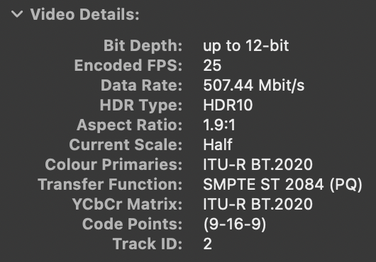
So yes, a regular SDR video encoded at ~1.96 gamma will appear brighter than it would if you were to encode a broadcast gamma curve of 2.4, or the sRGB curve of 2.2. Technically, it’s doing what QuickTime has always done to interpret BT.709 — even if that’s not what broadcast TV editors would prefer. It’s always been different, by design, at least in part because most computers and mobile devices are used in brighter areas than a TV is.
Leaving gamma and tagging for the moment, there’s a bigger issue: Premiere Pro’s viewer isn’t always color managed.
Color management for video
Tagging a file with a specific output standard is one thing, but showing the editor accurate color in their NLE is, sadly, another. It’s easy to end up in a situation where what you see in the edit bay, and in QuickTime Player, and in VLC, and on YouTube, and on a TV, are very different things. If you’re using a dedicated, calibrated broadcast monitor and direct video output in a more advanced workflow, this is where you get to empathetically sigh at everyone doing color grading on a regular “UI” screen.

Premiere Pro, for most of its existence, has not used any kind of color management, and the discrepancy between an unmanaged color pipeline in Premiere Pro and a color managed pipeline elsewhere dwarfs any gamma differences. While Premiere Pro 2022 does include color management, by default, it’s turned off, and it’s not exactly the same as ColorSync. Let’s see what happens with some video.
A quick check with real footage
I took a C4K 4:2:2 H.264 clip from my GH6 and threw it into a timeline in FCP and Premiere Pro, then exported it to H.264 at the same resolution. The resulting output files looked almost identical in QuickTime Player, and there were only very minor differences (<1%) on a few parts of the image. The output matches — a good start.
Note that in the upload process, images in this article have been reprocessed, which changes their color profiles and interferes with any comparisons you might want to make. If you’re using a P3 display, please click the comparison images here to access to the original files.

Note that the color management setting in Premiere Pro doesn’t affect the output at all; you get the same file either way. But the color management setting does affect how the video looks in Premiere Pro, and both settings look different from how video looks in FCP.

Taking a small average from very close to the same spot, I measured RGB values of 89/128/60 in the output files, 88/129/60 in FCP, but 66/117/42 in Premiere Pro with color management off, and 69/108/43 in Premiere Pro with color management on. The numbers don’t tell the whole story, though.

With color management off, everything looked too vibrant, with saturation too high — and that’s just what’s going to happen when you blindly pump values to a wide gamut HDR display like the one on my MacBook Pro 16”. With color management on, Premiere’s viewer looked darker than the output, but otherwise similar. It’s a closer match than the numbers might suggest.
As editors often need to incorporate company logos and match brand colors, I thought I’d try adding some images too — and this is where it got really interesting.
Surely a simple logo will match?
As a second test, I took an sRGB file I exported from Photoshop in several different formats: the native PSD, a TIFF, and JPEG and PNG files saved in three different ways each: Save a Copy, Quick Export As, and Save for Web. These files appeared identical in Quick Look, Preview, Safari and Chrome, as you’d expect.

All those files were placed into the same SDR timeline in Final Cut Pro and Premiere Pro, to check they all made the transition successfully. FCP doesn’t understand all the subtleties of Photoshop layers, so that version didn’t work correctly, but all other images looked much the same as they did in Photoshop, and the same as each other.

In Premiere, with color management active, I hit a snag. Two images looked lighter than the rest — the two JPEGs made with Quick Export As and Save a Copy (Save for Web was fine). Everything else looked the same, and much like FCP. As a result, I’d avoid JPEGs with Premiere Pro entirely, because those images should have been identical; the source image and the output image were both sRGB, but something’s been misinterpreted.

With color management off, everything looked quite a bit more vibrant (and a little lighter) than the same image in Photoshop, but the two faulty JPEGs still looked different from the rest. The bottom line is, if color management is turned off, video in Premiere Pro just doesn’t match color managed apps, especially on a modern P3 monitor. If you need to see a logo’s correct colors in a timeline as you edit it, you absolutely should turn color management on.
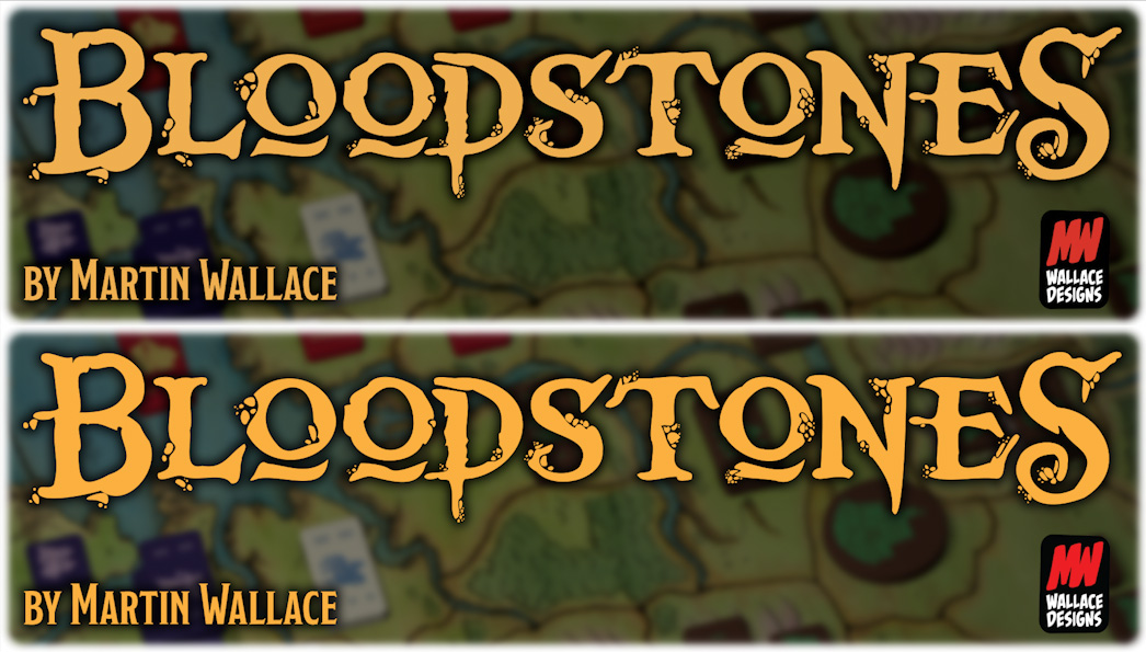
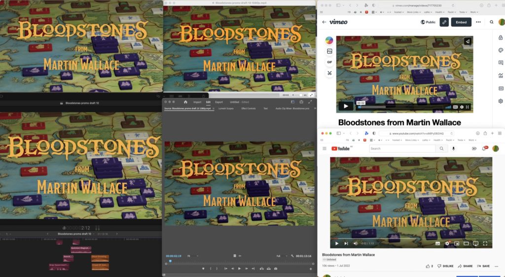
Time to export to an H.264. Ideally, the logo should look the same in video and still form, and it largely does, at least when viewed in QuickTime Player or Quick Look. A quick comparison, then. I opened the FCP and Premiere Pro output movies on the same screen as Photoshop, then took a screenshot of them all together. Measuring the yellow of the title in Photoshop, the original in RGB is 239/178/86. FCP’s output in QuickTime Player, Quick Look, and uploaded to Vimeo and YouTube in Safari matched almost exactly: 239/179/86. Unfortunately, Premiere Pro’s output was noticeably a bit off: 241/188/94.
It’s important to understand what color management is doing here. If you sample the yellow in the original logo in Photoshop, you get a different reading entirely (251/176/64) because it’s measuring in the sRGB color space of the file, and transforming that for display. When you take a screenshot, it’s no longer in sRGB, but directly in the display’s color space, likely the wide gamut Display P3. You should therefore be careful not to compare colors in the original Photoshop file with a screenshot of the movies — nothing will match! You have to screenshot everything together for a fair comparison.
It gets worse if you use VLC
Opening the Premiere or FCP output in VLC is a disaster, because VLC doesn’t pay attention to the color profile of the display you’re using at all. As a result, on any wide gamut display (every Mac laptop!) all output looks really vibrant, like Premiere Pro with color management disabled, and you read 250/176/64 in Premiere Pro’s output, or 249/166/55 in FCP’s output — both wildly wrong.
Yes, the numbers you get from Premiere’s output, when viewed in VLC, are really close to the original Photoshop values, but those values are for a defined sRGB space, not for a wide gamut display, and it doesn’t look the same at all. While VLC does make it possible to adapt its output to your Mac’s display, the option to do so is buried several clicks deep in the advanced settings, and I doubt many people have ever seen it, let alone know which settings to choose here.
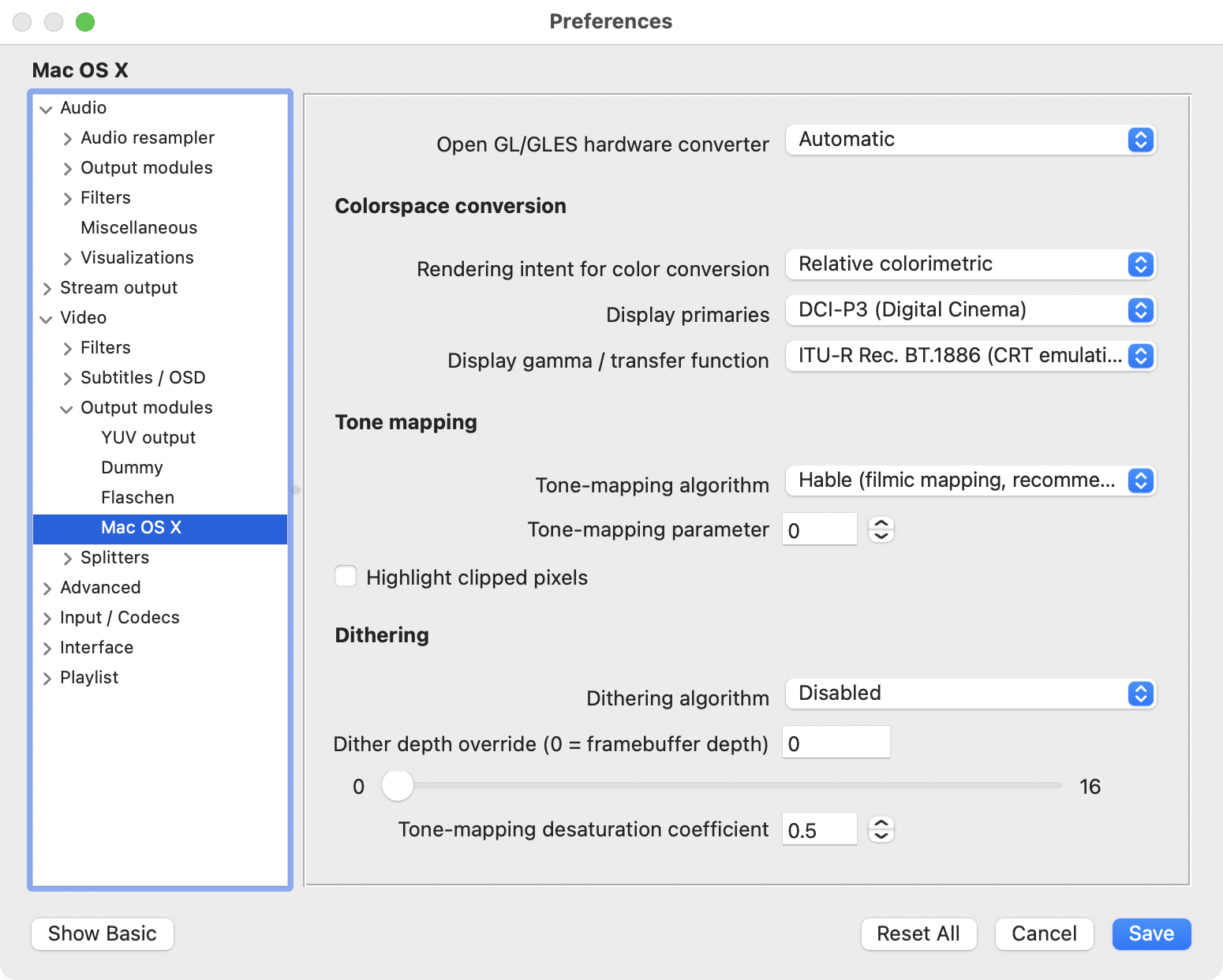
Don’t let your clients use VLC on a Mac to judge your work. It’s a very capable playback app, but it has its head stuck in the sand with regard to color management.
And what about other devices?
This is where it gets a little messier. Viewing YouTube on an iPhone and taking screenshots, I get slightly different results again: 237/169/79. It looks perhaps a little darker and more contrasty, but nowhere near as different as VLC. The opposite is true when using my LG OLED TV’s built-in YouTube app — things look slightly less saturated there than on my phone, perhaps even a little less than on my Mac.
On a PC, the results you get depend on if the device you’re looking at is color managed. If there’s no color profile set up, your results will look like VLC on default settings (249/166/55 for the yellow titles). On an Android phone, again, your mileage may vary, and I’ve seen a screenshot reporting 247/166/54 on a screenshot claiming to be sRGB.
While it’s disheartening that color management outside the Apple ecosystem is so variable, there’s really no solution other than embracing color management. It’s simply not possible to assume sRGB as a default when the device ecosystem encompasses so many wildly different display types. But to be honest, it’s not going to happen. The temptation for manufacturers to make default appearances “a bit more vibrant” is ever-present, and usually trumps any desire for color accuracy.
Conclusions
Unfortunately, the big takeaway is that no matter what we do, our playback devices won’t all agree, but color management is helping them to stay closer than they would otherwise. Using an sRGB display for video might help your work look like everyone else’s, but you’ll never be able to move up to wide gamut or HDR workflows that way. Color management is the only sane way to accommodate differences between displays, even if it’s not perfect.
If you can expect a file in QuickTime Player to look much the same online — and it does — then I think it’s fair to expect that the NLE should look like that too. Final Cut Pro already does, and Premiere Pro, with color management on, looks close, just a shade darker. In some ways that’s a useful reminder that you can expect some variation in brightness and contrast at playback time. If every device was accurately calibrated and described, and everyone could agree on the transfer functions we should be using, we’d be sorted — but of course that’s not the case. We live in an imperfect world and we’re doing the best we can.
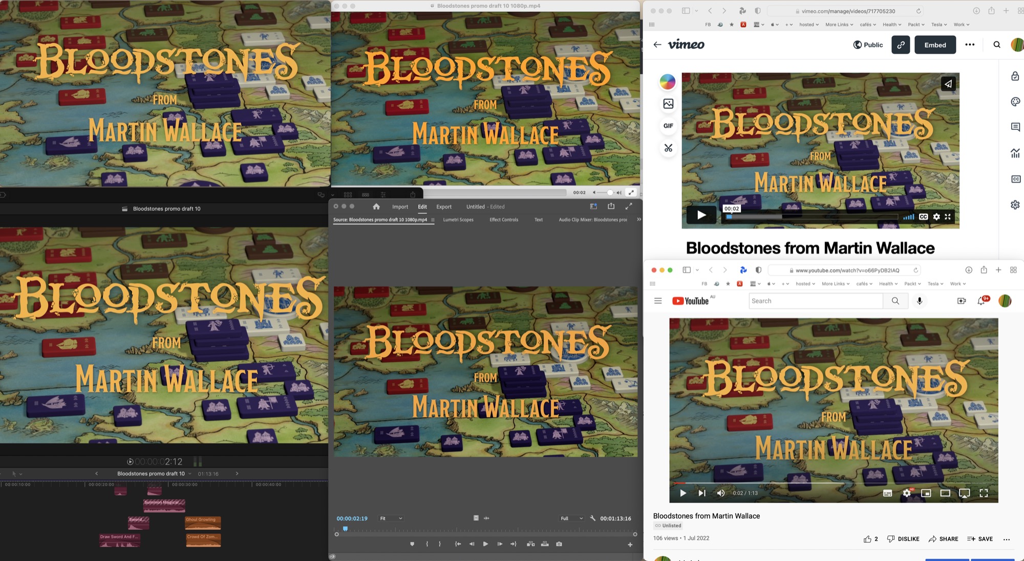
Still, Premiere Pro’s color management (when used to import color managed still images) doesn’t seem to be spot on, and there may well be a setting I’ve missed — please let me know in the comments if so. The bottom line is that I’d expect to see the same colors in a Photoshop file viewed on the web as I do when that same image is placed in a Premiere Pro timeline and exported. Color management in Adobe’s design apps has been class-leading for years, and I’d expect a similar experience in their video apps.
Going forward, as we move to HDR and wide gamut workflows, we might be able to leave our disagreements about SDR gamma standards behind us. More and more devices support a wider range of colors and brightnesses, and if you can offer your clients a new way to stand out, they may well thank you for it.
But hang on — isn’t HDR still a bit tricky to deliver? Well. That’s another article for another time.
Many thanks to those who proofread this monster before publication, with a special shout-out to the extremely knowledgeable @restlesspix. Errors are mine.
Further reading
An excellent video on QuickTime Colour Management from FilmLight: https://vimeo.com/349868875
A long, useful discussion: https://community.adobe.com/t5/premiere-pro-beta-discussions/nlc-tags-1-1-1-vs-1-2-1-and-prpro-s-actions-and-practices/td-p/11990408
Adobe’s instructions for HDR export: https://helpx.adobe.com/au/premiere-pro/using/hdr-workflows.html
Apple’s developer article on Tagging Media with Video Color Information: https://developer.apple.com/documentation/avfoundation/media_reading_and_writing/tagging_media_with_video_color_information
Apple’s developer article that explains how 1.96 was reached: https://developer.apple.com/documentation/avfoundation/media_reading_and_writing/evaluating_an_app_s_video_color/evaluating_video_using_quicktime_test_pattern_files
Apple’s Technical Note TN2227, Video Color Management in AV Foundation and QTKit:
https://developer.apple.com/library/archive/technotes/tn2227/_index.html
A helpful article here going into more detail about Premiere Pro’s color management: https://www.provideocoalition.com/understanding-premiere-pros-color-management/
A full list of NCLC tags:
https://github.com/bbc/qtff-parameter-editor
A 2010 plea from Charles Poynton that there’s no standard gamma for HDTV
http://poynton.ca/notes/PU-PR-IS/Poynton-PU-PR-IS.pdf
Discussion about Apple’s calculation of 1.96 gamma between Jamie LeJeune and Charles Poynton:
https://twitter.com/restlesspix/status/1561805186737156097?s=20&t=XTM_9xGgaVG4IXI2ym3RJg

Filmtools
Filmmakers go-to destination for pre-production, production & post production equipment!
Shop Now