After an announcement back in April alongside the new iPad Pro and FCP v2 for iPad, the latest version of Final Cut Pro has just dropped. There’s a brand new slow motion mode, a vastly improved ML-based automatic color correction feature, and you can now also rename effects as well as drag them directly between clips. These features were discussed in a previous article, based on details from the original press release, but now that the app is out and we’ve had a chance to use it, we have a lot more detail to share. (Please excuse a little shared content between the two articles.)
Smooth Slo-Mo
A bit of background first. Alongside the more basic “Frame Blending”, the slow-motion mode “Optical Flow” has been in FCP since day 1, allowing you to slow a clip to a lower frame rate than it was shot at. Optical Flow makes up new frames by morphing between the real frames captured, essentially the same trick that TVs do while performing motion smoothing. While it usually looks OK, the effect falls over with complex movement — anything that’s not a relatively solid object moving as a single unit. For example, a person tossing their long hair around is likely to end up as a blurry mess, falling back to Frame Blending and overlapping the neighboring frames rather than doing anything intelligent with them.
Now, we have a new option, apparently exclusive to Apple Silicon Macs: Smooth Slo-Mo, AKA Machine Learning Optical Flow. This uses machine learning (ML) to create missing frames in the video, and does a markedly better job than the old-school optical flow. While Smooth Slo-Mo does demand extra processing time, it’s not excessive.
I’ve tested this feature on several clips, and in several situations where Optical Flow faltered, the new ML-based Smooth Slo-Mo remains sharp. Though it’s still possible to find flaws, artifacts caused by occlusion are far less common. For example, in this frame of a very ordinary hand-held iPhone shot showed to 25%, Optical Flow didn’t know what to do with this cyclist:

The ML smooth slo-mo did just fine:

Here’s a clear example of what you can do with a shot from a moving vehicle. The original shot lasted for about a second, shot at 25fps. I slowed it down to 10% with Optical Flow, and you can see flaws in the sidewalk and around the sign as it moves in front of background elements. There were no visible artifacts in the ML-based Optical Flow version, so for fun I slowed it down to 2% — again, no problem. If you can shoot video from a moving vehicle, it can now last as long as you need it to. Check this out:
Though it’s still a good idea to capture slo-mo with a high frame rate, remember that cameras reduce image quality as they increase the frame rate. If you know your camera is compromising image quality to reach the high frame rate you want, consider shooting at a lower capture rate and asking FCP to fill in the difference. Of course, this depends on what you’re shooting. This new feature won’t fill in missing temporal details (like a transient spark) but it will do a better job of an object moving from one place to another.
Of course, it’s worth doing some tests for specific types of shots, but it’s certainly possible that you could get better results by shooting at a not-too-fast capture rate (such as 60fps instead of 120fps) and letting FCP create the extra frames you need. Alternatively, if there’s not much changing, you might be able to create slow-mo footage from regular footage.
While most pro users will probably be on Apple Silicon already, this feature simply doesn’t exist for those on Intel Macs. The existing slow motion quality options have been renamed, but there’s no “Best” option, just: Fast (Floor), Fast (Nearest Frame), Good (Frame Blending) and Better (Optical Flow).
Enhance Light and Color
Simply put, this is an AI-based, more intelligent way to perform automatic color correction. While it’s similar to the previous Balance Color command, there’s one massive difference — you can see how the sliders have been adjusted, then tweak it to taste. Instead of a black box with an optional eyedropper, Enhance Light and Color adjusts the sliders in the Color Adjustments correction in an entirely visible and transparent way.
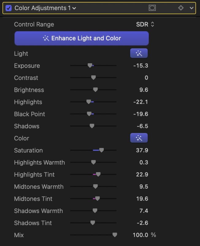
The Color Adjustments correction allows you to choose between SDR and several flavors of HDR at the top of the panel, which is definitely welcome. Even if you’re not working in HDR yet, you’ll probably have to deal with it eventually.
Note that if you only want Light or Color (and not both) to be adjusted, you can do that too. Instead of pressing the big button at the top of the panel, press the smaller “magic wand” buttons to the right of Light or Color.
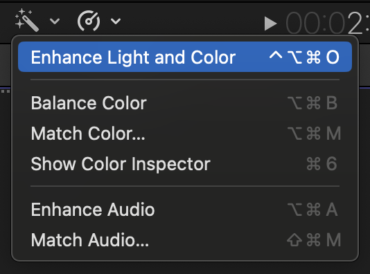
Importantly, Enhance Light and Color lives in the Color Inspector, not in the Video Inspector like Balance Color. This means that finally, you can do all your corrections in one place instead of jumping back to the Video Inspector to improve or turn off Balance Color. And one more difference: if you use the menu command or the shortcut to apple Enhance Light and Color, you can apply it more than once.
How well does it work? In my tests, it seems to make less dramatic changes to a shot than Balance Color did — and that’s probably a good thing. If you try to correct a shot which you know was shot on the wrong white balance:
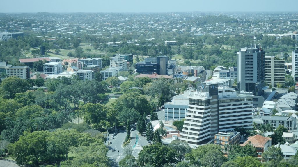
Then Balance Color tries to enforce mathematical correctness:
…but because there’s nothing to tweak, you end up fixing it manually anyway. Enhance Light and Color doesn’t change as much:

…and because it’s left the sliders there for you to play with, you can adjust the sliders to your taste — paying attention to the shadows in a Parade Waveform, it doesn’t take long to get where you want. Both these tools try to make your shots look “better”, and will not perfectly balance a shot of a colorchecker chart — but that’s fine. While I do prefer the new starting point that Enhance Light and Color gives me, having immediate access to the tools I can use to make it much better is more important.
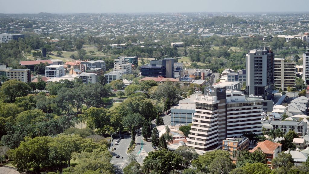
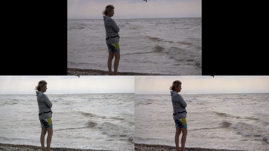
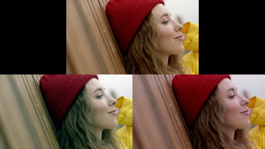
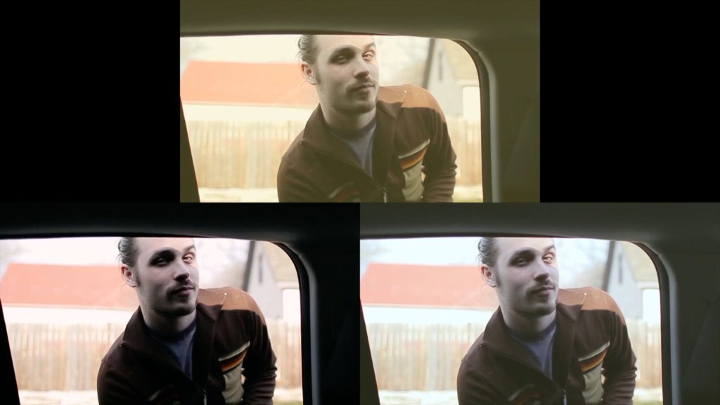
I tested this feature on several more images with (unsurprisingly) varying results, but the new feature gives more pleasant results. For comparison purposes, here’s a selection of stock shots with the original is on top, with Balance Color to the lower left and Enhance Light and Color lower right. (In each case, the first frame was used for the correction, because if you don’t pre-analyze, the frame you’re looking at is the one used to evaluate the clip.)
Here’s a underexposed beach scene:
Here’s a shot of a woman wearing a red beanie:
Here’s a processed, very contrasty shot from inside a car:
And lastly, here’s another yellow-tinted shot of a man playing baseball:
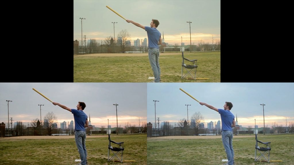
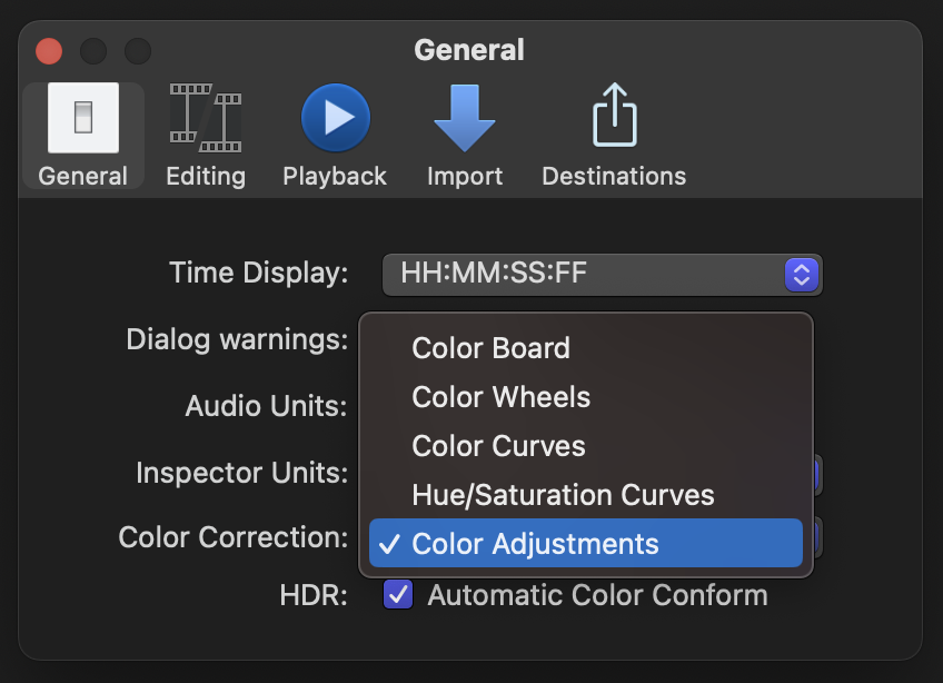
It’s also possible to find shots that are not improved by either automatic correction method, but that’s fine and expected — it’s easy to turn off. The simple fact that you can see what’s happened and finesse automatic corrections further makes this a clear improvement. Balance Color’s eyedropper means it won’t go completely unused, but I expect to be using Enhance Light and Color a whole lot more. Simply, it’s tweakable, and if you want to use this more, consider making it your default color correction tool in the General tab of Settings.
But there’s more!
Renaming effects and color corrections
Finally, you can now rename any effects to describe precisely what they’re doing. In the Video Inspector, just double-click on any effect name and you can rename it instantly. However, in the Color Inspector, you can click on any correction’s name and choose Rename Correction.
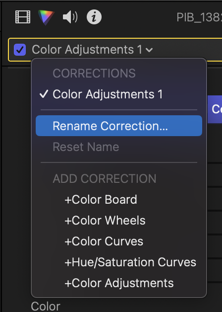
Renaming corrections may seem like a small detail, but if you’ve ever added more than a couple of color corrections or effects to a clip, you’ll really appreciate knowing what they all do.
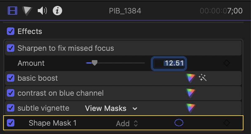
Add a subtle Curves and rename it “contrast boost”. Add a Color Wheels and call it “color cast fix”. Add a color board midtone boost with a tracked shape mask and call it “face exposure boost”. If you’re a fan of LUTs, name the corrections for the LUTs you’re applying. If you’re adding a subtle sharpen, call it “fixing Dave’s missed focus”.
One of the other benefits of naming corrections and effects, even if you don’t do this every time, is to create intelligent, self-explanatory presets which you can share with colleagues and new editors. Rather than a stack of corrections which make no sense, you can explain exactly what’s going on. Even though this is not a node-based setup like Resolve, it’s now far easier to perform different tasks in different correction units, all named for the functions they’re performing, not just “Color Wheels 3”.
Renaming also dovetails very nicely into the next new feature…
Drag and drop effects and color corrections
Yep — rather than copying and pasting effects or attributes, or using the well-hidden Apply Color Correction features, you can now drag and drop any number of selected effects between clips. You’ll need to switch to the Video Inspector first, but it works exactly as you’d expect: select the effects you want to drag by ⌘-clicking or ⇧-clicking them, then drag any of them to another clip in the Timeline. Note: if you drag to the Viewer instead, the effect will be applied to the topmost clip in the Timeline. This is what you want in most cases, but perhaps not if you’ve set up a split-screen.

The power of this feature is that you can set up a timeline full of example clips, each one with a selection of named color corrections and personalized effects, and then bring those clips into your new timelines when you want to apply the same looks once again. You could even apply all your favorite effects to a single clip, and use that as a single “master source” for your entire timeline. Or you could make a single solid clip, connected underneath your other clips, to store the corrections you’re using for all the different angles and cameras in your timeline. When you move to the next clip in your timeline, drag on all the same corrections you’ve been using on other clips.
This feature should save a lot of time in the Paste Attributes dialog box, because drag-and-drop is always a great way to get things done quickly.
Advanced Timeline Search
This new feature will be very much appreciated by advanced users. In the Timeline Index, you’ve always been able to search for text in a clip name, or in a caption, a title or a marker. And though this was a well-kept secret, you could also search for “missing” to discover clips for which media was offline.
Well, that feature now has UI to expose it — just click on the magnifying glass and choose “Missing Media” to find those clips. You can find other things easily now too — clips which have audio effects or video effects applied, clips with missing effects, or clips which have been retimed, as well as the Duplicate Ranges which lived here previously. If you search for one item and then want to search for another, just press the “X” at the right-hand side to clear out this field before searching again.
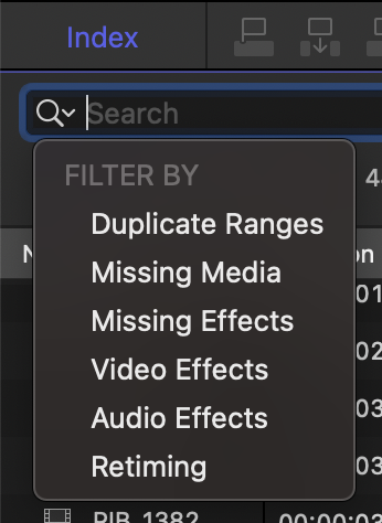
That’s not all — you can now perform regular text-based searches in the Timeline Index to find Reel, Scene, Camera Angle, Camera Name, Custom Metadata fields, user-created Roles, and Effects — even those with custom names.
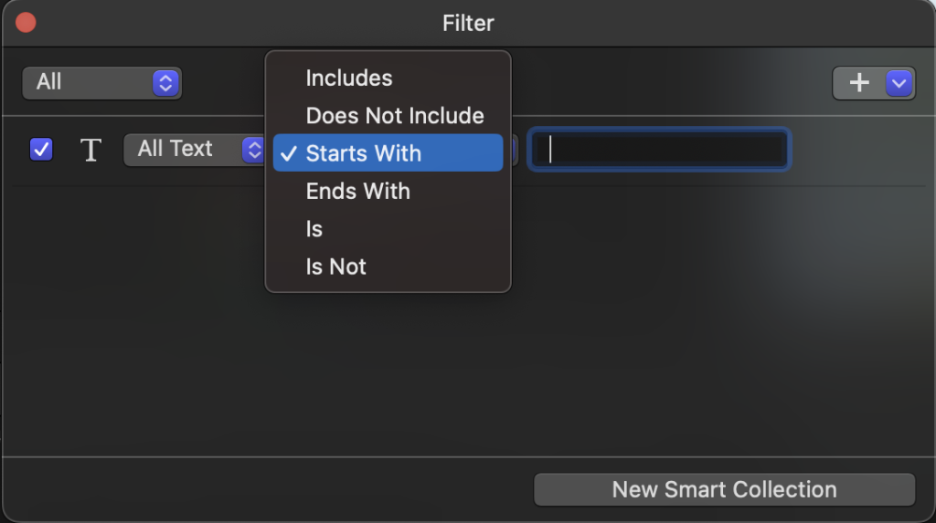
There’s one more minor feature available when searching in the Browser, too. Click the magnifying glass at the top right of the Browser to open the search field, then click the small icon below to bring up the search HUD. This is where you can perform complex searches and even save searches as Smart Collections, and where you’ll find the new options. When searching Text or Format Info, you can now use “Starts with” or “Ends with” in addition to the older options of “Includes”, “Does Not Include”, “Is” and “Is Not”.
Continuous Timeline Scrolling has an icon
This was added in the last release, and the UI has now changed to make it easier to manage. In 10.7.1, you could change a setting in preferences to enable or disable continuous timeline scrolling, in which the Timeline automatically scrolls to keep the playhead in the centre of the view. This is a very welcome feature most of the time, but sometimes you’ll want to disable it.

While it was possible to add a shortcut to this feature, the process was a little obscure. To make it more obvious, a new icon has been added to the central grey bar, to the left of Skimming. As with the other icons here, blue means on, white means off, and it can be toggled during playback. The default shortcut to toggle it is ⌥⇧S, but you can change it or add another if you search for “scrolling” in the Command Editor. As usual, you might want to reset your shortcuts to Default to allow new default shortcuts to work correctly.
New Titles and Generators
This is minor, but several new titles have been added in a new Basic Text category. These new titles enable a large central title, a title and a subheading, a lower third, or a huge block of text, and the controls in the Title tab enable a graphic background, a “backplate” that sits exactly under the text, and control how much the footage beneath the titles is blurred.
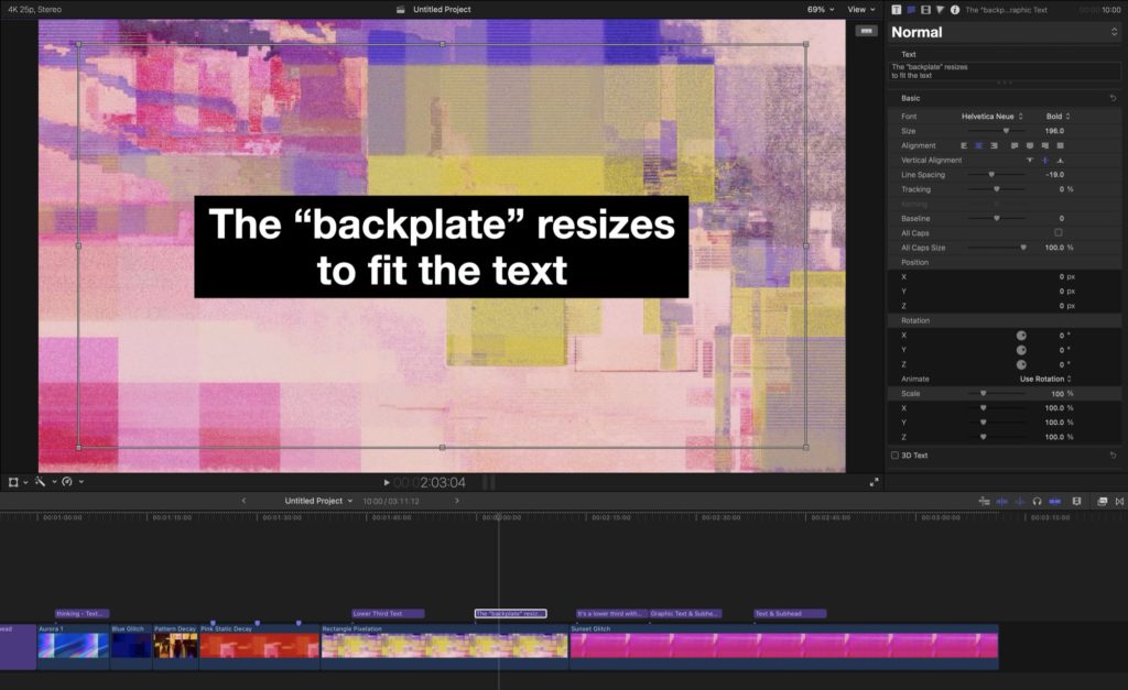
The Dynamic Backgrounds category has gained a few new glitch-based options, including Blue Glitch, Dot Grid, Pattern Decay, Rectangle Pixelation and Sunset Glitch. Unfortunately, as with the other options here, there are no controls to tweak things further, but you can still change color or add additional effects on top if you need variety.
Motion and Compressor
Motion has gained the new Enhance Light and Color feature that’s in FCP, but not much more. It’s a shame, as Motion remains an excellent tool (at an excellent price) for motion graphics. Compressor has gained some new features regarding Spatial Video, which is marked as 3D in the interface.
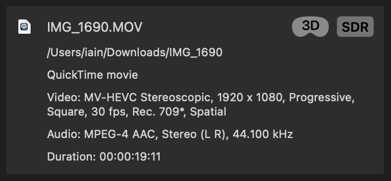
You can view the video streams for individual eyes and export them separately, though it’s not (yet?) possible to toggle between the two eyes. This is a stepping stone towards the full Spatial Video support now promised for a fall release, but we’re getting there.
Conclusion
This is a solid release with plenty to like. While it doesn’t include text-based editing, automatic transcription or automatic AI-based clip keywording, there are new machine learning features here, and Apple’s recent Apple Intelligence-focused WWDC offers plenty of potential down the line. Though I don’t expect to see generative video showing up any time soon, these are substantial new features that many editors will use every day, and which will make working editors’ lives easier.
The new smooth slo-mo feature is very welcome, and the search improvements build on FCP’s metadata strengths. But in this release, I’m most excited about the color correction improvements. Now that we can see what the automatic systems are doing, and name any effects or color corrections to describe them, it’s easier to understand exactly what’s going on, and use those same corrections and effects on future jobs. Of course, this update, like every update since 10.0, is free. For safety, it’s a good idea to zip your original apps before updating, so you can roll back if needed, but if you’re not in the middle of a job, grab it from the App Store and enjoy.

Filmtools
Filmmakers go-to destination for pre-production, production & post production equipment!
Shop Now


