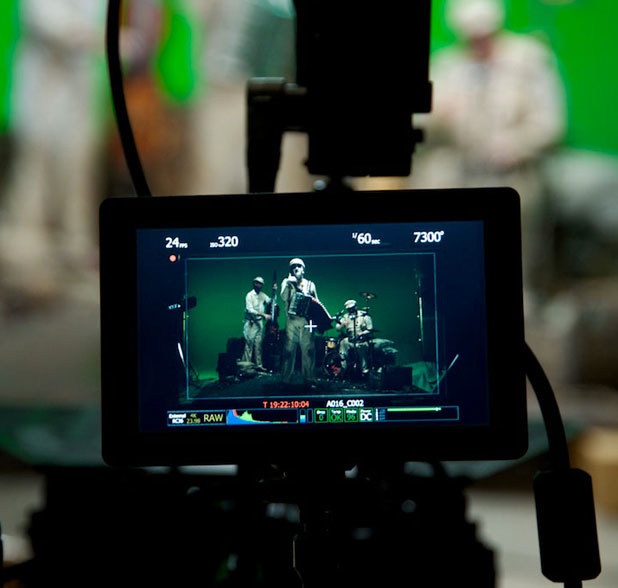
[TB]
An accordion-playing lead singer; a drummer who occasionally uses a doll instead of drumsticks; and a song based on the “Rime of the Ancient Mariner.” Just another day on set with one of the most macabre bands in existence: the Tiger Lillies.
The email’s subject line read “A Beg, Borrow or Steal Production.” One look at the sender’s email address guaranteed that the only suitable response was “Sign me up.”
I’d worked with director Mark Holthusen once before, on a spot for San Francisco’s Commonwealth Club. Shot on RED in one day, the piece required numerous visual effects including crowd replication and rotoscoping messages onto walls and buildings. One look at Mark’s web site reveals that effects like these are no big deal: he regularly creates fantastical still images in Adobe Photoshop that are up to 400 layers deep. “After Effects is Photoshop with a timeline,” he told me. “It took me a day to learn it.”
His foray into spots and music videos is a natural extension of his print work, and fortunately for me he has no interest in being a DP. My challenge is a unique one: I have to figure out how to give him the elements he needs for his compositions while staying on time and budget. That’s especially important for the Tiger Lillies video as there is a finite amount of time to shoot and almost no budget.
As Mark’s connections are primarily in the stills world, I called on a few of my friends and coworkers to help out. My regular gaffer, Alan Steinheimer, was available for only one day of the shoot, but he gave us a deal on his 4-ton truck and sent gaffer Ernie Kunze to fill in for him. Adam Wilt’s employer, Meets the Eye Productions, is in the process of building two sound stages, and as neither of them were finished he offered us a deal on one of them with the proviso that we give him feedback to help him improve it. He also offered us one of his company’s RED camera packages, with himself as camera assistant.
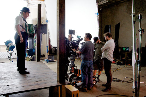
Lining up on a shot of lead singer Martyn Jacques. Left to right: Martin, camera assistant Adam Wilt, me, key grip Kyle Rudolph, and director Mark Holthusen. TB
The music video won’t be finished until sometime in February of next year, but read on for a sneak peak behind the scenes of a very compelling and bizarre work of art. Please keep in mind that all composites are very, very rough and have been assembled simply for the purpose of editing a rough cut before serious compositing begins.
We create a virtual world on the next page…
The Tiger Lillies don’t pay money for their promotional work. Instead, they pay artistically. They give free reign to whoever offers to do the work. This has led to the occasional surprise. (In this case it will be a very happy one.)
Mark sent me the following Quicktime videos as a reference to the project’s look:
The bottom clip shows Mark standing in for the ship’s captain, who, in the “Rime” and the song, plunges his crew into a living hell while trying to kill an albatross.
These clips gave me a good idea of the look Mark was going for, and I noted that the light source was soft, had some contrast, and came from the right side of frame. Knowing that there was only so much I could do with our small crew I asked Mark if I could use the same rough look for the beginning of the piece, which takes place on a gazebo at dusk. He said yes, so I formulated a cunning lighting plan:
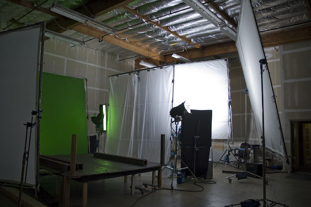
The platform doubles as our ship’s deck and gazebo floor, and the only real surface that appears in the video. Against the far wall is a 12’x12′ Ultrabounce, lit with both 4k and 6k HMI PARs. The diffusion material in front of it is Half Soft Frost, which softens the bounced light further and makes the Ultrabounce appear larger and very evenly lit. (PARs almost never create an even spread of light across a bounce surface, so the additional layer of diffusion smooths out the hot spots. Half Soft Frost is very thin, almost like shower curtain, and absorbs almost no light.) We put the Ultrabounce fairly far away so that its light would drop off less across the platform.
To the right of the Ultrabounce is our “fill from the key side,” a 12’x12′ bounce consisting of a layer of bleached muslin on top of a 12’x12′ griffolyn. Griffloyn is shiny and can create specular “hits,” so covering it with muslin gives it a matte finish. Muslin alone is transparent and needs a backing to make sure all the light bounces forward instead of some escaping out the back.
I love filling from the key side. Filling opposite the key creates two tones: a bright “key” side and a darker “fill” side, while filling from the same side as the key extends the key and wraps it around the subject, creating a much wider range of tones. In essence it creates the impression of a larger key source. It also “hides” in the shadow of the key and frequently doesn’t reveal itself as a separate source. If it does, I feel it to be much more pleasing to have two soft shadows falling in the same direction, as might occur in a room with two windows next to each other on a wall, rather than one shadow falling one direction and another falling in the complete opposite direction, which feels very “lit” to me.
On the left is an 8’x8′ frame of muslin, providing a base fill opposite the key to boost the darkest shadows to a minimum level. A12’x20′ green screen is rigged behind the stage. This is the biggest screen that we could reasonably use in the space, and we shot off the edges a lot. Mark said that he wasn’t terribly worried about shooting off the screen as the platform’s straight edges would be fairly easy to track.
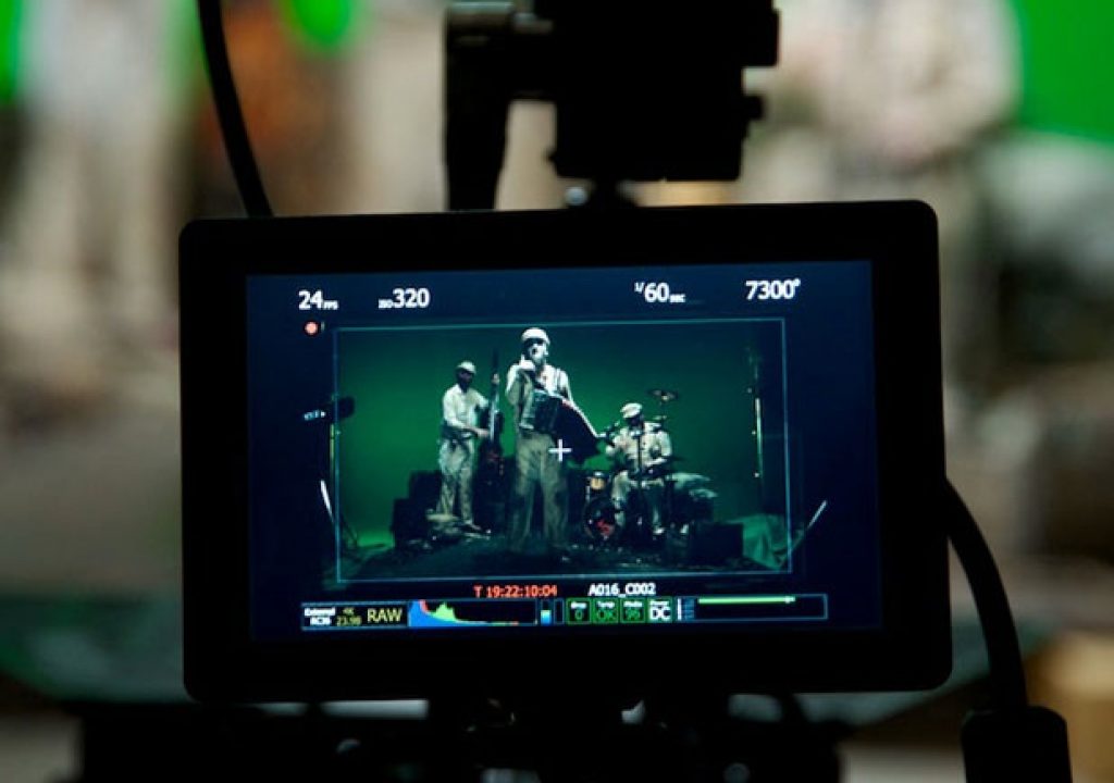
We used Build 20 on a RED ONE, set at EI 320 but rated at EI 160. (I tried setting the camera to EI 160, having habitually rated the RED at Ei 160 but never actually encoding that into the metadata, but the resulting image appeared too dark on the director’s monitor.) I habitually rate the RED at EI 160 to crush shadow noise, and while others rate it at 200 or 250 I feel more comfortable giving it a full stop of additional exposure light. I’ve had very good results so far, but it makes interiors awkward as producers are not used to budgeting for that amount of light. In this case, with a total of 10,000w of HMI light plowing into the Ultrabounce, I got a whopping T3.5 on my meter. As I wanted the flesh tones to pop a little we shot at T2.8 for most setups. (The key side fill was T2.4, and the opposite side fill read T1.2.)
Except for one shot, everything was lit for 5600k daylight. I set the camera shutter to 1/60th, not so much to avoid flicker (all lights were on flicker-free ballasts) but to slightly reduce motion blur and make keying and rotoscoping easier.
Here’s the opening shot, of the band playing on a gazebo at a wedding:
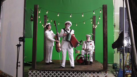
And here’s a moving test composite. There’s a lot of cleanup that has to be done here, but that’s what happens on low-budget VFX shoots: we shoot first and worry about details later. Normally that just adds to the post budget, but given that the director is going to do a significant amount of post work himself, and is having quite a bit of success enlisting post houses to donate their time toward building his reel, it made sense to work quickly and get everything in the digital “can” than to spend long hours making everything perfect and taking excessive advantage of the crew’s goodwill.
We returned a week later for a day spent shooting extras for insertion into other parts of the music video. For one of our setups we shot a man and a woman, a bride and groom, for insertion in front of band footage shot the previous week. (The Tiger Lillies are playing for this couple’s wedding, and the song reduces the bride to uncontrollable sobbing for the last shot of the video.)
I tend to be very analytical in my approach to visual effects, which is a bit of a contrast to Mark’s approach which is very intuitive. I tend to want to precisely match camera movements, focal lengths, camera height and angles, whereas Mark is very comfortable doing all that by eye. The following clip shows how successfully we matched two dolly moves, shot a week apart, just by eye. This is a VERY rough comp:
This apparent distance between the couple and the band makes it less obvious that the foreground dolly shot ends before the background plate dolly shot begins. When the couple dances by they are moving left to right only in front of a still camera–and we shot them in slow motion at 48fps and 3K resolution. They feel as if they are floating past the camera. It all works wonderfully.
The surreal feel of the video is established within seconds, so a little discontinuity actually works to the video’s advantage.
I lit the couple the same way I lit the background plate, although I added two Kino Flos on the floor for a little uplight on their faces. After this shot we reset for the pull out, where the bride sobs as her new husband tries to console her. While the previous shot took place at dusk, this one takes place at night, after the song has concluded. I turned out my big soft sources and lit the bride and groom very simply, with no fill:
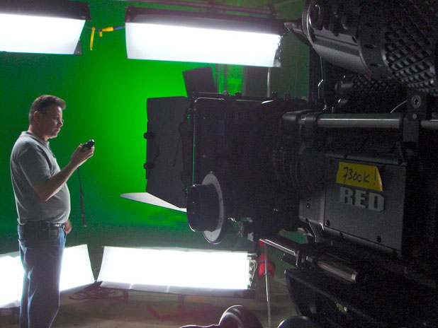
I’ve been working in HD so long I’m not sure which part of the meter to read. The camera white balance is set to 7300K to give the light from the daylight-balanced Kino Flos a warm tungsten feel. [AW]
I don’t have an example of how that looks at the moment, but it felt as if a ghostly light was coming from the gazebo. The ghostly part was due to the lights on the ground, which provided the same lovely uplight as in the previous setup but was a little out of place here. It looked great but it wasn’t technically correct, and that added to the surreal feel of the piece.
We shot the couples dancing in the background behind the gazebo two at a time right up against our green screen, and Mark dropped them into the background behind the band as needed.
Here’s the background plate for the end of the video. Try to imagine a reverse dolly move passing between the bride and groom as she cries helplessly and the guests look on, horrified. Ah, good times!
I think it’s pretty obvious that the band has a very rich, dark and funny sense of humor.
As you can see, the lighting for this setup was very simple: we hung a Kino Flo Vista Beam 600 from a Speed-Rail goal post and diffused it heavily with Lee 129. That, combined with the tungsten practicals wrapped around the gazebo and some Super Green Kino Flos on the screen, was all we needed. Although the light is motivated by the practicals, pushing light into the scene from roughly the same direction is often enough to satisfy the viewer’s brain that the light source is real. This doesn’t always work perfectly, but it works often enough to be a valuable trick of the trade.
You may have noticed a green flag on the left side of the frame. Due to the small size of our green screen (12’x20′) and the 24mm Ultra Prime that felt just right for this shot, the gazebo posts fell off the sides of the green screen at the start of the shot. Mark reassured me that he had no problem tracking straight edges with a matte, but that small black lantern passed in front of black visquene that covered the door into the next studio, and I knew it would he hell to rotoscope that lamp as it would simply disappear. I had our key grip wrap a flag in green fabric and place it behind the black lantern in order to separate it from the black background. It probably won’t make for a perfect key but it’s a start, and it’ll make rotoscoping the lamp a lot easier.
I used roughly the same lighting setup for a sequence in which the band sings in the hold of a sailing vessel:
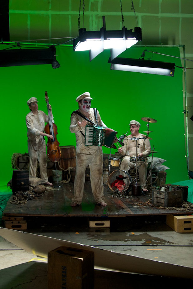
[AW]
The Vista Beam was suspended by rope so it could be swung side to side, simulating the light from a gas lantern that will be added digitally along with the ship’s hull. The dividers on the light create an “egg crate” or “grid” effect that reduces the size of the light source from left to right, splitting it into three smaller sources and emphasizing the feel of a swinging light over the lead singer without reducing the amount of light falling on the rest of the band to the rear. As I’m deathly afraid of the RED’s noise floor I decided to pop the other band members with two additional Kinos, and then bounced some “ambient” fill into the set using a 1200w PAR aimed into a 4’x8′ bounce card below the lens.
Bounce light from below feels very much like “ambient” or natural light, and I love the subtle beauty of a big soft fill source near the lens. The farther along I get in my career the more I feel that placement of the fill light is vastly more important than the placement of key lights. An otherwise ugly or “overly realistic” lighting setup can be rendered beautiful by a fill light of suitable quality placed in just the right spot.
I’m thrilled any time I can create a sense of space with lighting, either by moving a light during a shot or lighting spaces that people or things can move through. Part of the illusion of depth in two dimensions is created by the reaction of a person or object to a light source: changes in brightness, changes in shadow length and edge softness, shadow texture, motion, etc. At a coarse level you can think of lighting in layers: depth can be created by playing a bright foreground against a dark background, or a dark foreground against a bright background, or any combination of alternating layers. In the case of the shot above, the swinging light causes shadows to play differently upon the foreground and background, creating a sense of depth by lighting the two layers in slightly different ways over time. There’s a strong sense of where the light is in space in relation to the people in the shot, even though the image is viewed on a flat plane.
Here’s the shot in motion (but not sync’d yet–this is from a VERY rough cut):
I love that closeup.
I think that was a 24mm Ultra Prime. (I asked Adam Wilt to keep a log of camera details for post–lens, subject distance, focus, camera height, camera angle, etc.–although after seeing some of the rough comps I suspect it won’t be needed.)
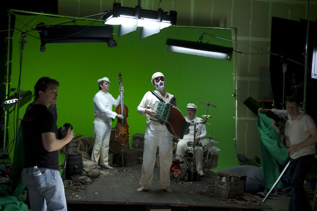
The stills crew shoots for the cover of the band’s CD. [TB]
Let’s go up on deck and see what’s happening on page 2…
There’s so much to shoot on a project like this that it’s crucial to design lighting setups that can be used for a lot of different things. The hanging and swinging Vista Beam worked well for the end shot of the video, which is a night exterior lit by “tungsten” lamps (although all the additional lighting was daylight balanced) and for the ship’s interior. It was a fairly simple setup, and for a while the goal-posted Vista Beam lived alongside our brighter, bigger daylight setup, allowing us to switch between them as needed.
The vast majority of what we shot, though, was lit by the big broad daylight setup, and once set up it never changed. We just moved the camera around as fast as we could and focused on shots and performances instead of lighting.
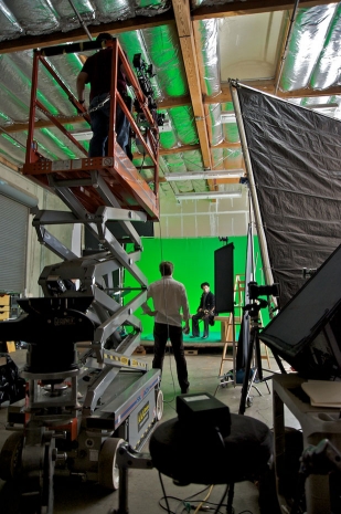
Setting up for a high angle on the ship’s captain, who’s desperate to shoot an albatross–possibly over a bad debt or excessively high phone bill. [TB]
For example, we had a lot of shots of the ship’s captain searching for, and eventually shooting, an albatross. First, the search:
The ship is a model that Mark shot in his studio using a home-built motion control rig. The lighting isn’t a perfect match, but Mark says that the entire image will be a lot softer by the time he’s done with it. Here’s an example of the look he’s going for:
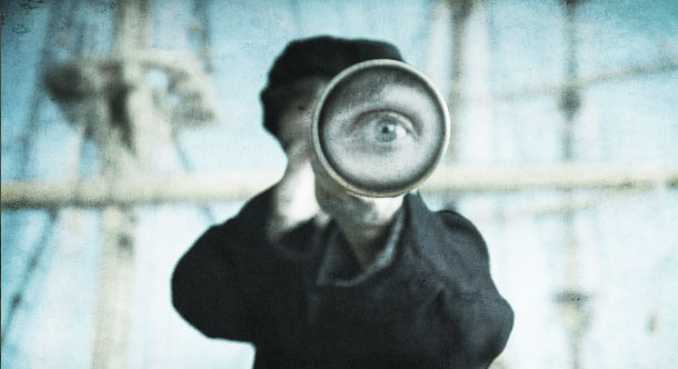
This is a temporary comp, where the captain was shot with the RED and a stock “eye” was dropped into the end of the telescope. We re-shot this on our last shoot day (day three of three) with the telescope sweeping from side to side, along with a shot of the actual actor’s eye.
The captain aims at the albatross, before…
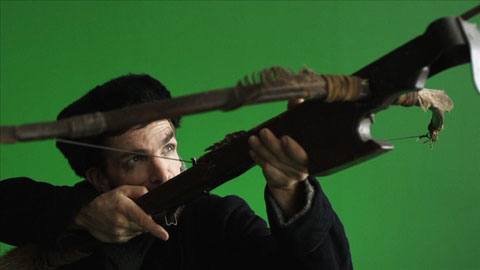
and after:
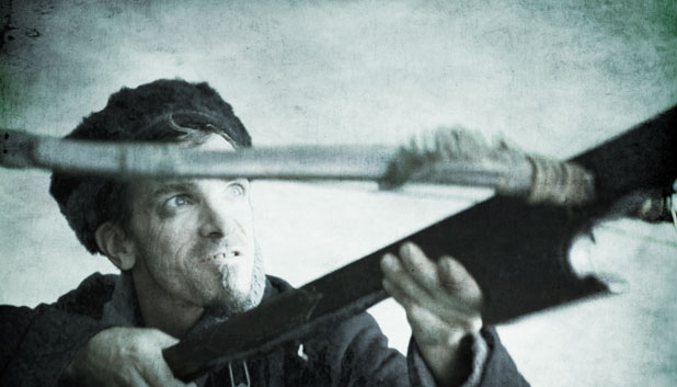
The captain takes a break after a hard day of hunting albatross and beating his crew:
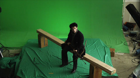
And a rough comp:
The green screen on the floor was a scrap, as we didn’t want to mess up the pristine and heavily-discounted green screen in the background.
What you don’t see in the shot above is the crew floating just under the surface of the water. Rather than stay aboard and tolerate their abusive captain, they offed themselves. (I felt like that the one time I worked on a reality TV show.) They were shot separately, in a small pond built in a corner of the stage, by the stills crew, so they’ll appear perfectly motionless under a layer of animated water.
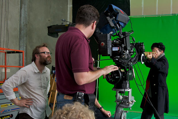
Left to right: Director Mark Holthusen, me, and the ship’s captain. Adam Wilt is hidden behind my girth. Blond hair by Alan Steinheimer. [TB]
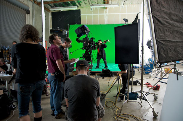
The captain lines up for a shot, first against green:
[TB]
…and then for real:
Mark and his crew had a great method for figuring out whether an angle would work: I’d line up a shot and they’d shoot a still of it off the director’s monitor, a 17″ Panasonic LCD. Then, using Adobe Photoshop, they’d comp it into a still of the background plate. I seem to have a latent talent for determining the correct camera angle from rough story boards: Mark would hand me a storyboard page, I’d place the camera, his gang would check my shot against the background plate, and nearly every time I was dead on.
Although I used an O’Connor 2060 for the high shots off our scissor lift, I used a Gearnex gear head for everything else.
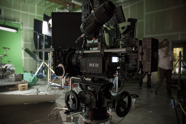
I really enjoyed working with it, although I don’t think it has yet reached perfection. There should be a bit more of a difference between the two gears (one is twice as fast as the other) and the head can bind a bit when a heavy camera is tilted all the way down or up. Also, the size of the cradle is so small that it pays to make the camera as short as possible–in the case of the RED, that’s aided by mounting the battery and hard drive off the side of the camera instead of off the back.
For the most part, though, it was a joy to use, and I operated a number of shots with it, including closeups. There is definitely something unique about the look and feel of a gear head, and I’m thrilled that someone has finally found a way to make such a head that is affordable to the HD crowd. I’ve had very few chances to use one over the course of my HD career, and I miss them terribly.
And last but not least, let’s talk a bit about the RED ONE. I really do enjoy using the camera, in spite of its many shortcomings, but it is still a major cause of headache and heartache. While ultimately not that big a deal, as we didn’t lose any footage, we had a number of hard drive faults that prevented us from rolling on a number of occasions. It only took a few seconds to clear the fault, typically by hitting the record button a couple of times until the camera rolled again, but it certainly does make one’s heart sink to see that big red warning message pop up in the viewfinder. Fortunately it’s fairly fast to play back the last clip in-camera to ensure that it actually exists.
There seemed to be no reason for it. The fault never happened when the camera was moving. Strange.
Then there was the saga of the RED 18-85 zoom. This is, in theory, a great zoom: it encompasses the entire range of a normal prime lens set, and it opens up to a T2.9, which is quite handy when shooting with a slow camera like the RED. Unfortunately accurate focus marks are an as-yet unrealized upgrade option: when horizontal, the markings on the RED 18-85 lens that we used were fairly accurate, but they drifted severely when the camera was tilted at a severe angle. For example, while shooting off the scissor lift at a 45-degree down angle and with the zoom fully wide at 18mm, eye focusing on a subject 20′ away yielded a distance of 50′ on the lens. Under such conditions one can’t zoom in, focus and zoom out as the focus doesn’t track properly; one has to pick the proper focal length and use the RED’s focus-checking digital zoom to verify sharpness.
We shot a fair amount of high-angle footage from a scissor lift, and the zoom was a lifesaver as it saved us a lot of scissor lift drive time, but the lack of focus integrity made me nervous.
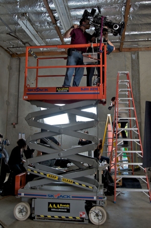
Focus, focus, wherefore art thou, focus? [TB]
Adam Wilt’s employer owns three RED cameras and two RED 18-85 zooms. Adam told me a story about how one of the zooms, the one we used, was fairly accurate out of the box–at least when fairly level–but the other was completely off. Focus marks weren’t even close to accurate. He sent it back to RED for adjustment, and then called a while later to see how it was doing.
“We don’t find anything wrong with it,” said RED.
“But the focus marks don’t line up at all!” said Adam. “How can this be okay?”
“It’s within our specs,” said RED.
If RED isn’t able to repair it Adam may have to dedicate one of his company’s RED cameras specifically to that lens, mis-adjusting the back focus in order to make it usable. But I guess one can’t complain too loudly. The lens costs 30% of what a real lens would, and you get what you pay for. It is usable, but it’s not camera assistant friendly. For what we needed, it was fine: I needed to find the proper camera height and angle first and the proper frame size second, and having a zoom for those high-angle shots sped us up considerably. Fortunately we didn’t have to follow focus on any of those shots.
It’ll be interesting to look at some still frames down the road and see how the RED zoom compares to our earthbound lenses, a set of Zeiss Ultra Primes.
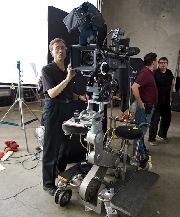
Left to right: Adam Wilt, me, producer Jason Santos. [TB]
I can’t close this article without saying some nice things about Adam Wilt. As well as being a friend, and my local guru of all things electronic, he served as my camera assistant for this project as a condition of using Meet’s the Eye’s RED package. I was a camera assistant for about five years and I consider myself to be somewhat “old school” in my expectations of camera assistants, having been whipped into shape (literally, in some situations) by several well-seasoned IA veterans who didn’t let me get away with anything, and I knew we were going to have some tough shots to do. Adam surprised me on every level. Not only was he superbly detail oriented, he was also calm and cool and after a while didn’t blink when we threw a tough shot at him with very little rehearsal. He tackled some very tough focus pulls and did remarkably well. I’m glad he chose to stick in there with me rather than kill himself and float, hauntingly, next to the dolly for the duration of the shoot.
Someone shot behind-the-scenes footage that appeared recently on Youtube. The music video coverage starts at about 2:15.
NEW: Meets the Eye has posted more behind-the-scenes photos.
Song: “Living Hell”
Album: Rime of the Ancient Mariner
Group: The Tiger Lillies
Director: Mark Holthusen
Producer: Jason Santos
DP: Art Adams
Camera Assistant: Adam Wilt
Gaffers: Alan Steinheimer, Ernie Kunze
Key Grips: Kyle Rudolph, Mike Best
Production Designer: Claire Mack
Props and Wardrobe: Georgie Perrins
Makeup: Aurora Bergere
VFX lineup: Michal HorevajStudio: Meets the Eye Productions, San Carlos, CA
Studio support: Tim BlackmoreSpecial thanks to Meets the Eye executive producer Marshal Spight and Lighting by Steinheimer for their help in making this production possible.
Photos marked [TB] are copyright 2009 by Tim Blackmore/Meets the Eye Productions. Photos marked [AW] are copyright 2009 by Adam Wilt. Thanks are due to both of them for allowing me to use their work in this article.
All video clips are copyright 2009 by Mark Holthusen Photography.
Art Adams is a DP who snacks on albatross at theatrical events. His web site is at www.artadams.net.
Filmtools
Filmmakers go-to destination for pre-production, production & post production equipment!
Shop Now