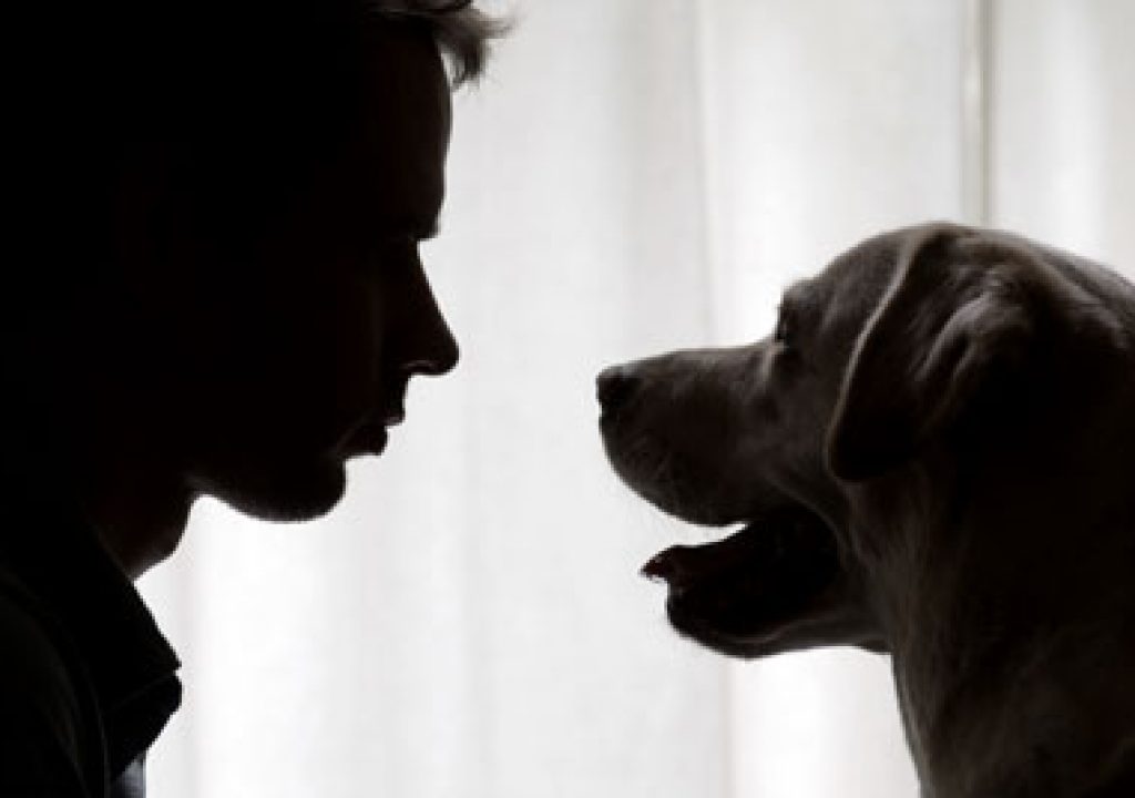
A short schedule, minimal crew, no budget, a RED with an untried software build, and a trained dog in nearly every shot. What could go wrong?
AUTHOR’S NOTE: I’ve gotten some complaints from people who have found this short film offensive. I get that it’s not everyone’s sense of humor, but I’m proud of my work on it and I’m not ashamed to show it off.
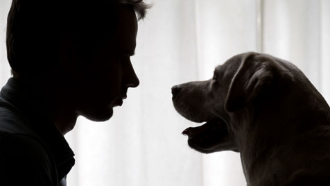
Having said that, if you don’t have a strong offbeat sense of humor, and if you are a little squeamish about odd sexual themes, DON’T CONTINUE. While this film isn’t graphically sexual (except for the end credits, which contain some interesting historical artwork) it implies a lot. If you don’t find the picture above even a little funny then please move on to another article.
Just for the record, this film took Grand Prize at the 2009 Goodby, Silverstein & Partners Annual Film Festival.
Once in a while a project comes along that makes me say “How could I NOT do this?” This short film was such a project. The director and producer found me on the Internet and asked me to meet them for coffee and a chat. We got on very well and six weeks later (August of 2009) we started a two day shoot with a borrowed RED, a bunch of free lights, and a dedicated cast of very talented actors.
This was a study in lighting quickly and moving fast, two things that happen regularly on low-budget projects and anything containing animals. By embracing what’s available, and framing pretty shots, the lack of equipment and crew can be largely overcome. Simply placing the camera in the right place, with the right lens, is probably the most powerful tool we have as cinematographers: the frame is the conduit through which the story is told, so finding the right perspective is extremely important. It’s also the easiest thing to do.
Lighting is extraordinarily important as well, but as lighting tools can be limited on low-budget productions it’s important to prioritize. The best of both worlds is finding a lighting setup that works for the entire space, or most of the space, and then focusing on finding good shots that work within that lighting setup. If most of your lighting is set up in advance, and coverage merely requires moving the camera around, you’re going to be very popular with the director, producer and cast.
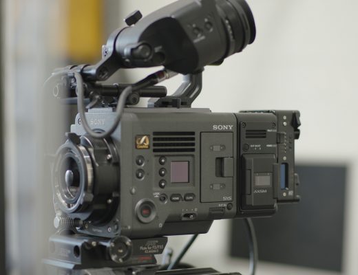
We shot this on a privately-owned RED ONE camera. This was the first time I’d used Build 20 to shoot a project, and I very much liked the new color science, even though I shot this entire project using daylight-balanced lights. The color was prettier and more accurate, and the noise–when it cropped up–was no longer tinged with blue speckles. I did learn that, up until now, I’d led a charmed RED life as I’d never had any significant problems with the camera. On this one project, though, we had times when the white balance would change for no apparent reason and the camera would shut off when moved, requiring a lengthy reboot. We didn’t lose any footage or any appreciable amount of time but it was definitely a different experience.
WARNING: The second half of the film contains graphic images that some may consider offensive. If you are easily offended and/or don’t have a sense of humor, please don’t watch the end credits.
I’ll start at the beginning of the film and work my way through, although this is not the order in which the film was shot. Watch the film and then turn the page…
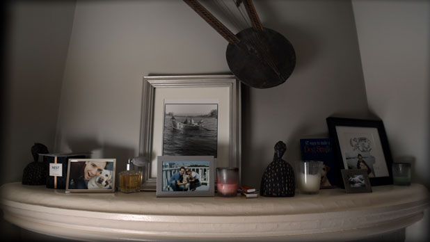
We shot this on day two, in a house in the Marina District of San Francisco. It was at the top of two flights of stairs (blech!) but it was a very nice home so dragging all the equipment upstairs was worth it.
Soft light from below the lens feels very “ambient” to me, so when I want to light a room quickly and in an interesting manner I’ll bounce a light off a large piece of foam core placed somewhere below the lens axis. This is a 1200w PAR aimed into a 4’x4′ piece of foam core placed upright on the floor to the left of the camera. The feel I’m going for is that of sunlight coming through a window and bouncing upwards onto the fireplace. I didn’t have the tools or space to create a nice hard shaft of sunlight so I didn’t bother trying; but I had more than enough to reproduce the feel of hard sunlight bouncing around a room.
The lighting setup for this room was pretty simple:
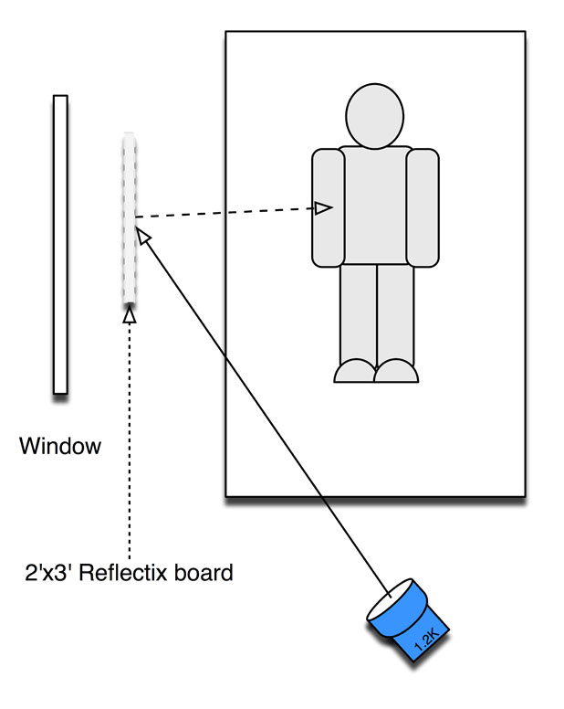
I wanted the light to appear as if it was coming from the window but I also wanted a source with some directionality to it. I didn’t have much of a crew, or enough grip equipment, or even enough space, to properly shape a large light source, so I opted instead to use a smaller more reflective option: a 2’x3′ piece of foam core covered with Reflectix.
I’ve written about Reflectix before: it’s water heater insulation, available at your local hardware store or anywhere online where you might buy supplies for your massive interior pot farm. It’s highly reflective but with a textured surface, so while it’s a very shiny source it casts a soft “messy” shadow. In a case like this, shooting in a small room with nowhere to put a forest of C-stands and flags, using a smaller soft source that cuts itself is a very practical way to work. For example, in order to keep light off the back wall, all one has to do is rotate the card slightly in the opposite direction.
It’s also easy to rig, as the card can be grabbed with a C-stand arm at full extension, keeping the base of the stand out of the shot.
An alternate method might have been to rig a Kino Flo onto the C-stand, but that is a very different quality of light with different fall-off characteristics. I used a Kino Flo in just this way for one setup, but I’ll get to that in a bit.
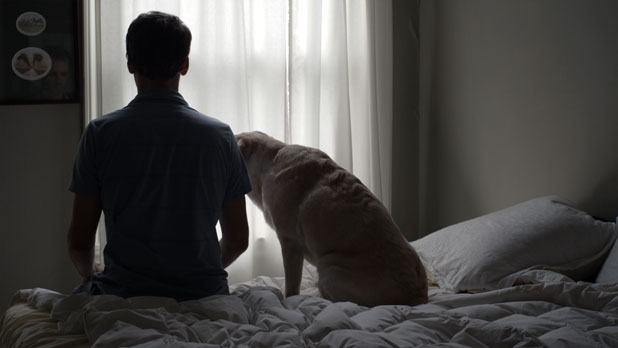
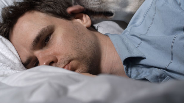
I remember this as being lit with natural light, but when I look at the right wall it appears there’s a Kino Flo on the floor. I love the actor’s reflection in the picture on the wall. Notice the amount of fill light that is falling onto his back from the top of the bed. Remember that: we’ll revisit it a bit later.
Right now I’m going through a phase where I’m very much trying to control how I expose footage with the RED, in order to make for consistent dailies and ease of color grading. While shooting this project, though, I opted fully for the “expose to the right” method: rather than filling with more light I simply opened up the exposure as far as I could without clipping a detailed highlight and let the ambient light do its thing. Ambient fill has a definite feel and it’s not right for every project, but as the director wanted a very natural and real look, and since we were moving very quickly, this technique felt like the right way to go.
By watching the raw data exposure bar graph and zebras it’s very easy to push your exposure right to the edge of clipping. The bad news is that, while shots within a scene or lighting setup are consistent, exposures between scenes can vary dramatically and require entirely different color grades in post. It did provide the “thickest negative” possible on the RED, which is always good as it keeps shadow detail above the noise floor.
In a scene like this I took the curtains right to the edge of clipping and used the ambient lighting for fill. For this setup this approach worked very, very well. If the lighting is already there then there’s no need to mess it up.
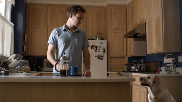
The kitchen was a little difficult to figure out. Originally I tried using an HMI PAR to create the quantity of light that I wanted because I was concerned that the window to the left would become overly bright as the sun moved around to that side of the house. Rather than start off with a small light and then find myself in a bind when the sun started blasting through the window, I tried to use a large light so I could quickly deal with brightness changes.
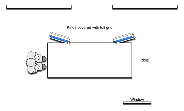
I couldn’t quite get the look or the control that I wanted by using such a big light in a small space so I ended up putting a 4’x4 tube daylight Kino Flo on the kitchen counter, standing it vertically against a wall just outside the left of frame. You can see a little bit of spill from the light on the kitchen counter.
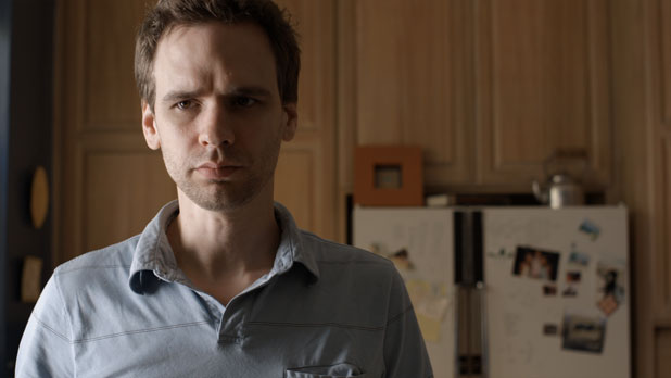
I pushed the flesh tone exposure as high as I could, for a nice thick “negative,” and let the ambient fill do its thing. The quality and direction of the fill light isn’t perfect, as it would have been if I’d filled from the key side or from somewhere near the lens, but this project didn’t want to look “perfect.” I would have needed a lot of negative fill, mostly on the ceiling, to accomplish that “perfect” look, and I didn’t have the time, crew or resources.
I really like this frame.
The refrigerator in the background is lit by warm bounce off the floor. There’s a 575w HMI in the back left corner of the room bouncing off the warm wood floor to light the dog.
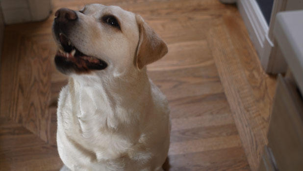
One problem when working with animals is the trainer often has to stand somewhere near the camera to cue the dog, and that can be problematic in small spaces. For this shot the only place the trainer could be was in front of the light source, so we used a Power Window to brighten the dog’s face. The eye light is from the Kino Flo placed on the kitchen counter.
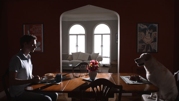
It’s kind of like “My Dinner with Andre,” only shorter and with less conversation.
The arch in the doorway was a blessing for this shot as it gave me plenty of room to hide lights. The director wanted a bleak-but-real look and edge lighting the actor and the dog, with little or no fill, seemed like the right way to go.
When I looked at this shot later I panicked a little as the arch looks off level and I thought that either the camera wasn’t level or there was an issue with the lens sitting properly on the camera. (I’m obsessive about leveling cameras so I thought I was losing my mind!) Closer examination shows that the camera was level but the walls of the building are leaning. It’s pretty clear from the moulding above the background windows that the building is settling down and to the left.
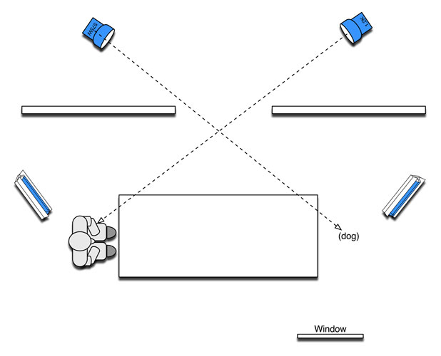
The only fill in the room is from a window on the dog’s side of the table, and rather than block it I opted to work with it. It gave the dog a little more of a “pop.”
Originally I wanted to do two little sconce light effects, one on each of the background posters, but one of my two 300w fresnels died and I couldn’t match the look of the remaining 300w light with a 650w fresnel. Instead I used two Kino Flos to give the walls a little bit of illumination. In the future I’ll probably light walls like this a little brighter, as there were very few bits utilized in imaging that dark tone and it ended up a bit noisy.
I protected the background window highlights just in case we wanted to see some detail outside, but we opted to put a Power Window around them and blow them out in post as that looked better.
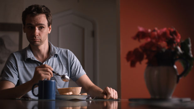
I first tried a big source for this shot, but a 6’x6′ grid cloth just off frame right was too big a light for the space. It went everywhere. A 4’x4 tube Kino Flo covered with light grid cloth worked perfectly. We aimed the light away from the back wall in order to give it a little shape. The back wall went orange in post instead of orange-ish red so we added a secondary color correction to fix it. (Bonus trivia: men prefer reddish oranges, while women prefer blueish oranges. It’s a fact.)
The hallway illumination in the background is natural light from the living room.
We did the same thing for the dog’s closeup.
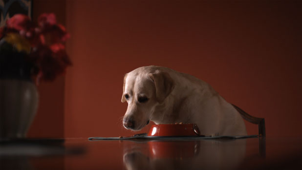
The table gives a real sense of depth as it extends from beneath the lens all the way to the subject, where it catches the subject’s reflection. The flower vase provides a sense of geography and helps to unify the shots.
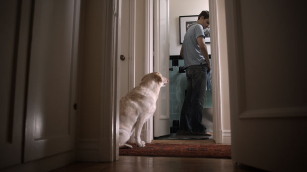
This shot was lit with two lights: one is a vertical 4’x4 tube daylight Kino Flo down the hall to the right that lights the dog, and the other is a tweenie hidden on the floor to the right side of the door bouncing into an 8 1/2″x11″ piece of typing paper behind the toilet. The glow behind the toilet helps set the toilet off from the background, plus I was hoping to get a little bit of backlight on the urine stream. (Yes, I tried to backlight a urine stream. It’s not really urine, it’s water from a plastic bottle the actor is holding.)
The remaining light is from a small window over the toilet.
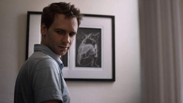
The predominant light source in this shot is a window over the bathroom toilet. We put a flag in front of the bathroom door, just out of the left of frame, to eliminate that as a bounce surface and make the shadows on the actor’s face a little deeper for this closeup. He’s still getting a lot of fill from the ceiling.
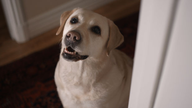
This shot was lit entirely by the Kino Flo sitting vertically on the floor of the hall about five feet out of left frame.
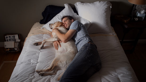
Once again, here’s the lighting diagram for this shot (you saw it earlier at the top of the page):

This lighting setup worked for all of our bedroom shots except for those that were silhouetted against the window. I exposed the scene by pushing the white pillow highlights to the edge of clipping. In the closeup I actually clipped the blue channel a touch but as the other channels held plenty of detail it was completely unnoticeable. (Clipping one of the RED ONE’s color channels usually isn’t a big deal. Clipping two is a big deal.)
At least the scene you’ve been waiting for:

The Reflectix gag described above worked for most of the bedroom shots, but for the shots facing the window I needed a different gag. The director wanted complete silhouette, but I wanted to wrap a little of the window light around the talents’ heads to bring out a little bit of facial detail and give them some depth. Here’s the lighting setup:
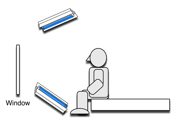
I’m simply extending the window “source” around a bit more than normal. Adding sources to a naturally-lit scene, while preserving the natural look, can be very tricky. The best method I’ve found is to simply extend or cheat the existing sources as much as necessary. It’s a little bit like keying from the fill side: I’m extending the wrap of an existing source, and since my second light is coming from much the same direction as the first light they tend to blend and compliment each other rather than conflict.
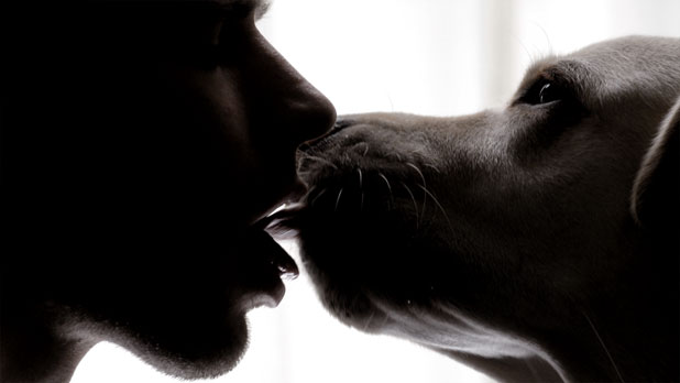
Here you can see the subtle reflections cast by the Kino Flos, both in the top and bottom of the dog’s snout and the actor’s cheek and chin. We crushed the shadows a little bit in the color grade while boosting the highlights, which gives the highlight “shines” a mild bleach bypass feel.
This sequence was shot at 3k, 50fps for dramatic effect. Originally we smeared peanut butter to the side of the actor’s mouth but the dog’s licking didn’t look right, so the actor put a big dollop of peanut butter on his tongue and said “Leth shoot!” THAT’S dedication to one’s craft.
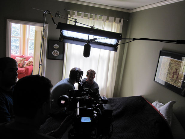
Never underestimate the power of negative fill. We covered the bed’s white duvet with a blank furniture pad to eliminate a ton of ambience bounce light.
That’s it for the beginning of the film/day two. Turn the page for the end of the film, shot on day one…
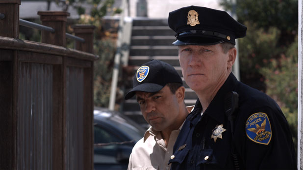
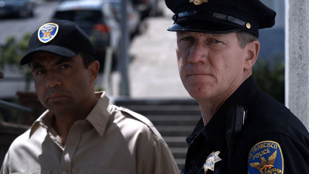
This sequence was shot on day one at a location halfway across San Francisco from the first day’s location.
This was the project’s very first shot, and it’s a shot I really enjoy from an operating standpoint. I really enjoy how the animal control officer leans out from behind the cop, but I love the primarily vertical move that follows the cop as he approaches the door. During rehearsal I found a frame that worked for the end of the shot, but during the move I didn’t frame to accommodate the animal control officer at all. I framed the cop so that he would land in the right place for the end composition, and then I let the animal control officer land in his proper place without moving the camera.
By framing for the final composition early, as the cop advances, and leaving the frame unbalanced in anticipation of the other actor stepping into his final mark, I created a much stronger shot than if I’d moved the camera around and tried to keep everyone in the frame. Creating an unbalanced composition creates tension, and letting the actors settle into their proper positions over time, without constantly trying to find a balanced frame, gradually releases that tension. I thought this subtle touch helped create more tension in an already emotionally tense scene.
Compositions don’t happen only in space; they also happen over time. I think this is a great example of a composition whose every frame may not work as a still but that pays off over the course of the shot.
Half of camera operating is knowing when NOT to move the camera.
The only lighting in this shot is a bounce card taped to a window just off frame right. You can see it light the cops cheek and give his face a touch more modeling as he approaches the door. I love soft light sources that interact with actors and objects as they move through a space. It creates a greater sense of space and depth in a 2D image.
During the location scout I discovered that the sun would set directly down the entryway of the house (thanks to Suunto and Sun Path). We decided to start shooting at around 2pm and do all of our east-facing shots while the sun was too high for front light but was perfectly positioned for backlight. All of our shots facing out of the house (the cops, looking out the house door, the woman on the street) were shot between 2-4pm. When the sun was low enough to provide flattering front light on faces we turned around, at about 4pm, and shot the rest (the wide shot of the house, the lead actor waving at the woman, the lead actor in the doorway with the dog, etc.). We shot our way out of the house early in the afternoon and then worked our way back in as the sun went down.
We really had to race, though, because while the sun set in such a way that it lit the front door of the house until it was gone, the rest of the street fell into shade very quickly.
For example,
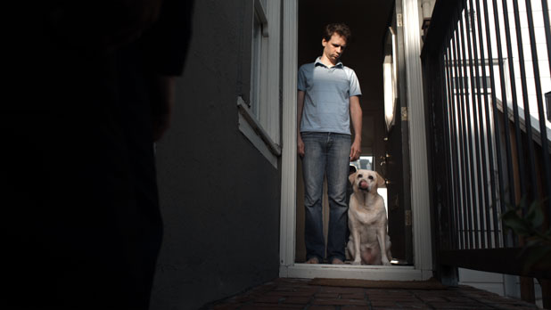
This was among our last shots of the day, and you can see the sun is nearly gone. It’s hitting the actor but not the dog. A rectangular Power Window around the dog allowed us to brighten the dog enough that the lack of sunlight striking him isn’t really noticeable.
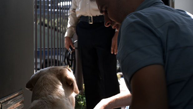
This was our second shot of the project. The hot streak of light on the dog is pretty cool, and it’s a complete accident. It’s reflected off an outside window. I added a little bit of fill here by bouncing a 1200w HMI PAR into the wall and ceiling over the camera. The idea was to lift the shadows just enough to see what was going on, but not enough to feel lit.
If you look at the top of the actor’s arm you get the sense that the light was coming from above. Ideally the light would have come from below the lens, as that’s where reflected sunlight would have normally come from, but we didn’t have the technology to get that much light into that small a space. The 1200W PAR was placed around the hallway’s 90-degree turn into the living room as there wasn’t enough room in the hallway for myself, the camera, the camera assistant and the talent.
The direction of the fill light isn’t that critical here, though, because the dimmer a light is the less you can discern its direction and quality. That’s not to say that you can be sloppy, but fill lights or underexposed key lights can be cheated more easily because they create less contrast than bright sources do. Contrasty scenes require more precise light placement than low contrast or dark scenes.
The little bit of light reflecting onto the underside of the actors face, and giving him a little bit of facial modeling, is from a 2’x3′ bounce card laid on the ground just outside the door, in the sunlight.
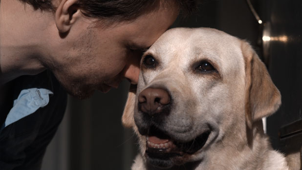
While we had sun for most of this shot, the fog was starting to roll in and the exposure changed a bit during this take. Our colorist added a ramp to even out the worst of it, and he did a great job. This shot was done entirely with natural light, and worked out so well because we calculated the sun’s path in preproduction and opted to take advantage of it.
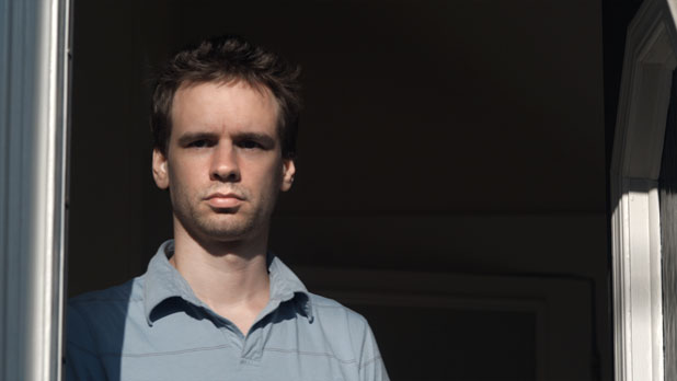
This shot, too, was all natural light. For the first take I tried to light up a little of the hallway, just to open the shadows a little, and it didn’t work at all so I turned the light out. The shadows on the actor’s face are natural, a result of the number of power lines crisscrossing the average San Francisco street.
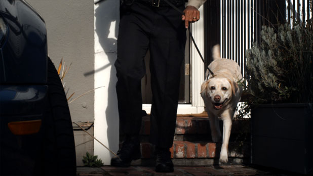
We did this shot at 2k, 120fps just as we were losing the sun off the house. The colorist created another ramp that brightened the dog as he entered the shade. If I were shooting with a baked-in camera I’d try to do a stop pull, but on the RED it’s better to let the exposure go and track it in post, where it can be finessed. This assumes that the shadow portion of the shot isn’t horribly underexposed, which could result in a change of noise quality as the shadows are boosted. I pushed the exposure as far to the right as possible in order to ensure good shadow density.
When I first watched the 2k footage in REDCine I was worried about how soft it looked. I’m happy to say that Spy Post’s processing of this footage eliminated most of that softness. The difference in sharpness between this shot and the others was minimal in the telecine suite, and that’s where it looks the best it ever will.
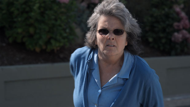
This sequence was the last east-facing shot of the day. We shot everything facing outward, toward the cops and moving out of the house into the street, and after these shots we turned around for our big wide shot and worked our way back in.
There’s no fill on this other than sunlight bouncing off the row of houses lining the street–and that ambient fill looks quite good.
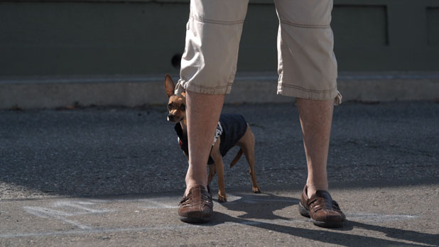
We rolled on the dog for several minutes and just let it do what it wanted to do. That’s the advantage of shooting HD: you can roll and roll and roll and not worry about missing that perfect moment.
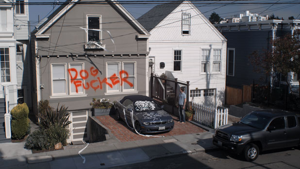
This is our wide reveal shot. The shaving cream and toilet paper are real; the spray paint was added in post. The producer was tempted to create actual graffiti but elected not to as it was his uncle’s house and he didn’t want the neighbors to gossip.
We’re starting to play “beat the sun” in this shot. You can see it’s already creeping up the sidewalk and we haven’t started getting our reverse angles yet. Fortunately none of the reverses required much, if any, lighting–something we discovered, and planned for, on the scout. You can work really quickly if the lighting is in place and all you have to do is move the camera around.
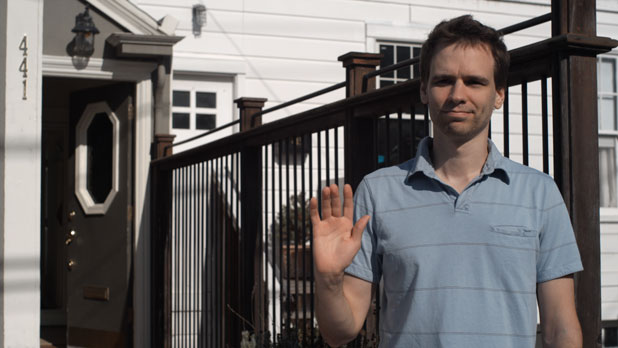
There’s a small bounce card just off frame left, but that’s it for lighting. The sun is in a great position, and while it’s not quite getting into the actor’s eyes his face is modeled very nicely.
I love this frame. It’s dynamic and it carries him all the way from the front door to his end position without a single framing adjustment.
I was truly fortunate to have a location that offered such beautiful natural light, along with a producer and director who were happy to plan our schedule around my lighting needs. As a result we moved very, very quickly, and completed this sequence in about six hours. That might be considered a bit slow normally but as my entire camera/grip/electric crew consisted of a camera assistant and two PA’s that were intermittently available I think we did remarkably well.
This was a very satisfying experience, not just because the cast and crew were a lot of fun but because we did some nice work very simply and quickly. I used to love assisting and operating on episodic television shows because it never got boring: I was always moving, always thinking, always trying to figure out how to squeeze a little more out of the shot. At the end of the day it was fun to look back and think about how much shooting we’d done in such a short time, and how nice it looked overall. That’s how I felt at the end of this shoot: proud that we’d done such nice work so quickly and with so little.
Thanks are due to my camera assistant Jamie Metzger, second day gaffer Chris Galdes, and especially to the director and producer who I won’t name yet as they don’t want this short film popping up in Google searches while they’re submitting it to film festivals. (They’re listed in the credits.) Thanks especially to colorist Cary Burens of Spy Post for doing a great job grading this project.
Art Adams is a DP who works doggedly to improve his reel. His web site is at www.artadams.net.

Filmtools
Filmmakers go-to destination for pre-production, production & post production equipment!
Shop Now