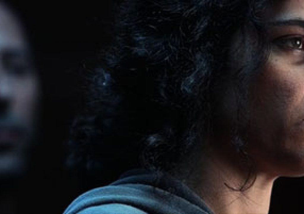
“Dad has a barn and mom can sew–let’s put on a show!” Production budgets aren’t what they used to be, but that doesn’t excuse sloppiness. There’s almost always a way to do good work as long as your creativity extends beyond lighting and framing into the realm of “making do.”
Director Ian McCamey, with whom I did my Porsche, Lego and Facebook spots, called me back in October and asked if I was game for a couple of low budget PSA’s. They were to be produced by a local post facility, Rough House, that had a relationship with the ad agency. Years ago Ian had interned at Rough House, and after losing his job as a VFX editor when The Orphanage shut down early last year, he got back in touch with them and let them know he was building a directing reel. This is an example of a long-term relationship paying off.
These spots are currently on the air in the Sacramento area, although there’s some talk that they may go national on ESPN.
Ian wasn’t terribly optimistic, though, when he called to gauge my interest. “We have a budget of $7,000,” he said, “and a lot of actors. How do we make that work?”
With a little help from our friends, as it turned out. I contacted my friend Adam Wilt at Meets the Eye Studios in San Carlos, and asked if he and his employer, Meets the Eye Studios, were willing to help us out with equipment and space. Luckily enough, they were–and we became their last official clients of 2009.
Let’s take a look at the spots as they are airing now:
WeaveForPVC from ProVideo Coalition
(They’re also on Youtube.)
Adam’s primary concern was that his company’s sound stages weren’t ready for prime time. In fact, they were about to be demolished and rebuilt. Fortunately we had only a couple of shots that were large enough to require shooting in the sound stage area. The rest we shot either in front of the facility or in various rooms scattered throughout the building.
We shot with a RED ONE and either an 18-85mm RED zoom lens (for “Perp,” the first spot) and a set of Zeiss Ultra Primes for the second spot (also known as “Lineup”). Turn the page for shot-by-shot behind-the-scenes action…
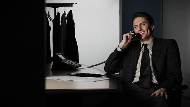
Here’s the first shot of “Perp:”
And here’s the lighting setup:
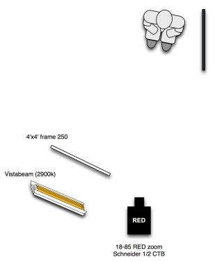
This was shot in the Meets the Eye conference room. The lighting started out a little more complicated than you see here but it didn’t work for me, so I simplified.
The two lights used are Vista Beams, which are very high intensity 8-tube Kino Flo lights with special reflectors. Meets the Eye has two of them, and I love them. They’re punchy big sources that can run off a wall socket. Originally I had my gaffer, Luke Seerveld, set up some pools of light on the table using tungsten Source 4 lights, but for some reason they turned out looking a bit too contrived and video-like, so I settled on one Vista Beam as a soft key light from near the camera and another aimed at the window in the background that was covered with 1000H tracing paper.
Tracing paper is a beautiful diffuse material that was very popular in the 80’s, back before Chimera soft boxes came to rule the industry. Its only downfalls are that it’s hell to transport and it’s fairly flammable. Otherwise it’s one of my favorite diffusion materials ever as it completely removes any trace of specularity from a light source: it becomes a big, evenly lit glowing source that makes everyone and everything look good. (Lee makes a gel called Lee 129, which is a fire-resistant plastic version of tracing paper.)
The fill side of the actor’s face picked up too much light from the white drawing board on the right side of frame so we blocked the ambient spill with a 4’x4′ floppy flag. The high contrast on the actor’s face, in combination with the bright window in the background silhouetting some clothes and reflecting in the table, makes this a very interesting yet simple lighting setup.
I also framed a dark portion of wall in the foreground of the wide shot to help focus attention on the actor. It might not seem obvious that blocking part of the frame with a black object would enhance a composition, but I think it worked pretty well here.
Rating the RED one a EI 320 makes the footage too noisy for my tastes. I rate it at EI 160 for a smoother, cleaner look that pushes the noise down into the blacks. I used a Schneider 1/2 CTB filter in front of the lens for partial correction back to 5600k from 3200k to keep the RED’s daylight-balanced sensor somewhat happy.
As you can tell, we opted for a “shakey-cam” style of operating. Ian likes gritty images, so not only did I shake the camera a bit but we also over-sharpened the image in the color grade. More on that later.
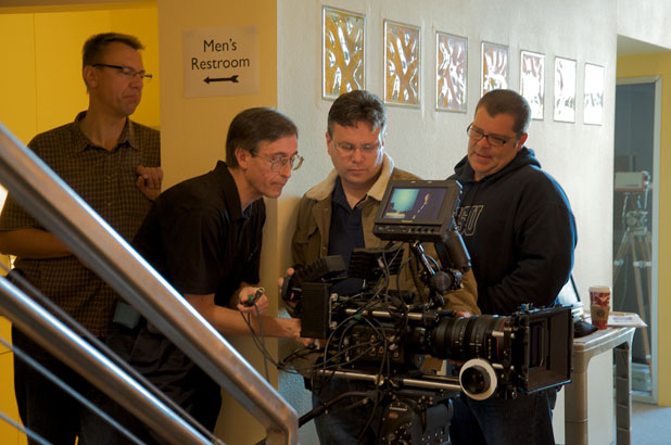
Left to right: Gaffer Luke Seerveld, camera assistant Adam Wilt, me, our sound person. That’s a RED ONE with a RED 18-85mm zoom. We’re shooting into the MTE conference room from the kitchen area.
Originally I tried to color the back window blue, using daylight Kino tubes, but that was determined to be a little too expressionistic and pretty for what we were doing so we switched the 5600k tubes to slightly warm 2900k tubes. (Kino Flo 2900k tubes match tungsten light sources better, as tungsten lights tend to be 3000k instead of a perfect 3200k.)
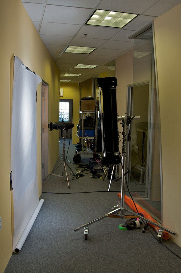
A Kino Flo Vista Beam lights a window covered with 1000H tracing paper. In the background a Source 4 leiko gives the actor an edge light. I eventually eliminated that light as it was just too much: simpler was better.
On to our next setup:
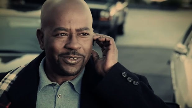
Originally we set this up as a low shot, following this gentleman from his car in the background to this final position, framing him against the sky. There were a lot of clouds in that part of the sky, though, and the combination of blown-out clouds and dark skin made the shot look really ugly. We raised the camera and shot downward as a compromise to eliminate the over-bright clouds. (Dark skin looks great if it’s brighter than the background. A bright background tricks the eye and makes dark skin look even darker. A “proper” exposure might, under certain circumstances, look way too dark.)
I wanted a little modeling on the actor’s face as he landed in his final position, so as an experiment we set up a Vista Beam with daylight bulbs at the actor’s end position. It turned out to be bright enough to make a difference in open shade. There was nothing I could do about lighting the actor’s starting position, about 20′ away, because I didn’t have a light bright enough to make a difference at the necessary distance to keep it out of the shot, but the end of the shot was where the payoff was so I didn’t worry so much about the beginning.
The smaller a person or object is in the frame the more you can get away with, and it wasn’t that big a deal to forego lighting the deep background as long as I could make the actor look good for his closeup on his end mark. The end of the shot is where I focus most of my efforts, because that’s usually where the the payoff is. (This may explain why I always set dolly shots in reverse.)
It helped that, in the final edit, the early part of the walk was cut out due to time constraints.
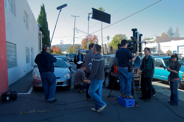
The Vista Beam is visible just past the camera. Gaffer Luke has a blade on a stand in an attempt to cut sunlight off the Vista Beam’s silver reflector. Director Ian McCamey is center frame wearing headphones.
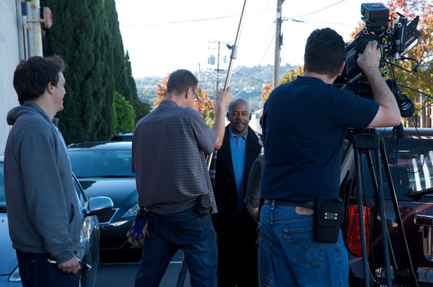
Another angle of the same setup. You can see the Vista Beam tubes reflected in the windshield of the car on the right.
While we graded the previous shot to be very neutral, this shot felt like it wanted to be a slightly unpleasant green color. We carried that theme through on the final sequence:
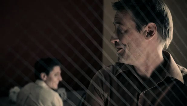
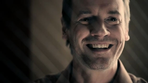
Originally the main actor was going to stand behind the window the entire time, but Ian thought it would be nice if he sat on the desk in the background, stood up and walked into his closeup. It was a very nice move, and it was lucky that I’d already lit the shot in a way that would accommodate this:
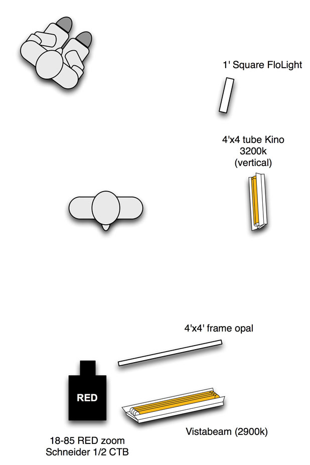
The Vista Beam comprised the main source, and you may wonder how I came up with the idea of putting it on the floor. Very simple: it reflected in the window in nearly every other position. I could have placed it above the frame but I was worried the light might look too nice, as light from a high angle tends to flatter faces and this wasn’t a flattering spot. I put the Vista Beam in the only other place that worked.
The Kino Flo from the side created a nice highlight on the side of the actor’s face, which then transitioned into a “normal” exposure from the Vista Beam, which then tapered off into shadow. It’s pleasing without being flattering. It had the added benefit of lighting the actor at his seated position, lighting him through the full range of his move from background to foreground.
We added a 1’x1′ FloLight, an LED light made by Prompter People. Luke consulted on the design of several of their lights and he has a couple in his kit. They aren’t the greatest LED lights in the world, but they’re punchy and cheap and they work great in a situation like this where you need a small, flat, cheap soft light on someone in the background. The main actor actually blocks it as he stands up.
FloLights tend to be a little green, so this one has 1/4 minus green gel on it.
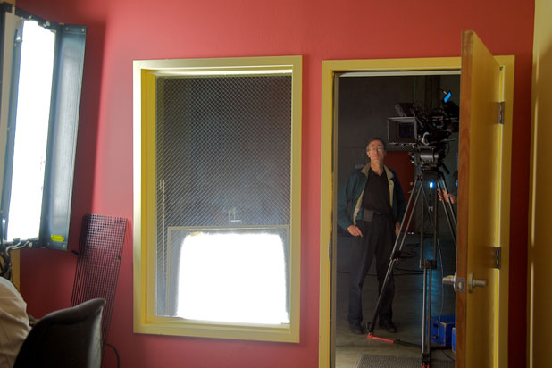
Adam Wilt waits patiently for me to stop lighting things and shoot. The light on the other side of the window is a 2900k-bulbed Vista Beam through a 4’x4′ frame of opal diffusion. (The thin diffusion helped to blend the separate tubes into one smooth light source.) The 4’x4 tube Kino Flo on the left of frame is also bulbed for 3200k. Not shown, outside frame left, is the FloLight.
You may have been marveling at the amazingly adequate color grade given to this piece. Ian and I did it ourselves, at Rough House, in Apple’s Color. There was no budget for color grading, because initially there was no budget for a RED (MTE gave us a very generous deal on the gear and their facility in order to contribute to the cause), so we winged it. I have a little experience grading my own projects, and Ian has been working in post his entire career, so between us we comprised one fairly competent colorist. I think we did a reasonably good job.
That’s it for the “Perp” spot. On to the next page for “Lineup”…
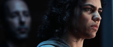
Here’s the first shot of “Lineup”:
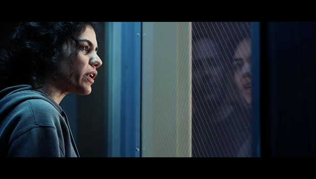
And here’s the first lighting setup:
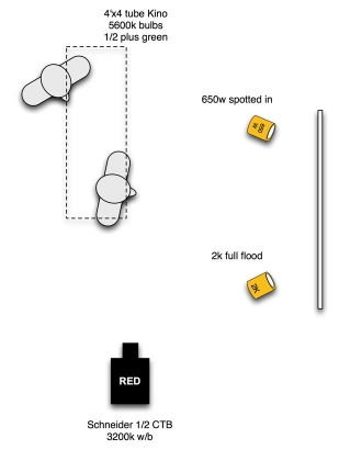
I exaggerated an old moonlight trick to create a stylistic industrial look: some of the prettiest and most interesting blues have a lot of green in them, and a common recipe for night lighting calls for 1/2 CTB and 1/4 plus green gels for a cool-but-not-pure-blue feel. Another variation is to use 1/2 CTB and the old arc correction gel White Flame Green, which creates a silvery moonlight that can be stunningly beautiful.
In this case I wanted a not-so-subtle mercury vapor lighting look, so we swapped all the Kino Flo tubes to daylight (5600k) and put 1/2 plus green on the unit itself, along with some diffusion (probably Lee 250). By setting the white balance at 4300k (not 3200k–ignore the white balance temp in the diagram) I not only compensated for my Schneider 1/2 CTB filter (which converts 3200k light to 4300k) but the 5600k light goes a little cool and the 3000k light goes a little warm. I’m white balanced exactly between them.
If the woman were to look up she’d see the Kino Flo directly over her head–which means that her face would get little front light from it. The cop in the background, on the other hand, would see the unit stretching out in front of him. That’s why he is lit very softly, with a lot of blue-green light wrapping around his face, while her face is mostly lit from inside the room.
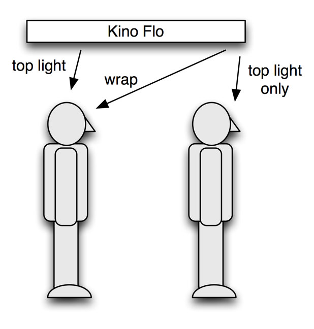
Using lighting in this way helps to define a 3D space in a 2D medium and is a very easy way to create interest. Even though we can’t see it there’s clearly a light over them: she’s in front of it in space, and he’s behind it.
Lighting the foreground warm and the background cool also creates a classic warm/cool color contrast, which is a very interesting look. Warm colors tend to attract our attention and make objects seem closer, while cool colors tend to reduce interest and seem farther away.
The lighting effect is most dramatic when the woman steps up to the window in complete shadow, at which point the inside lights come on. (In this edit that light change is hidden by the fade up at the beginning of the spot.) I had a 4’x8′ bounce card rigged inside the room, laying on the desk inside with two lights aimed at it. (It’s the same room used for the last shot of the previous spot, “Perp,” and we’re just looking into the window that the previous character was looking out of.) The 650w fresnel spotted into the card is there to provide a little glow to the inside of the room and provide a hint of light to the woman’s face as she enters frame, while the 2k (operated by a film student I’ve been mentoring, Ted Allen) provides most of the light when she lands on her mark. The subtlety of the 650w was lost in the edit, which happens quite often; the important thing, though, is to try to add those little touches when possible because we never really know how the edit is going to turn out until it’s done. It’s better to add a nice little touch and not see it used than to miss an opportunity and then stare at that gaping creative hole every time you see the finished product. (Such touches, though, are easily sacrificed if the schedule doesn’t allow for them. Fine brushstrokes are nice, but broad brushstrokes are most important. The faster you can paint with the broad strokes, the more time you’ll have for the fine strokes.)
There’s a piece of black foam core leaning against the wall on the other side of the window to make the reflections more noticeable. We also enhanced the window reflection in post by selecting it with a rectangular window in Color and increasing the exposure inside it.
Here’s a slightly different angle:
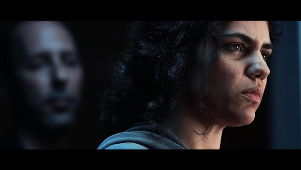
You can see the subtle intermixing of colors on the actress’s face. I really like that look. The cop’s face in the background is a nice contrast. You can also see the sharpening we added in Color to enhance our gritty look. (This was shot on a 135mm Zeiss Ultra Prime, probably at T2.)
Here’s what the setup looked like:
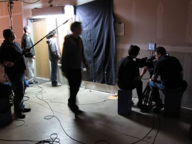
The nicest wide shot included some plasterboard wall on the side of the window toward the camera, so we put Duvetine up against the side of the window to make the wall go black. You may notice that the tilt angle of the camera alines with the actors’ heads. (The piece of paper on the wall is a lighting diagram left over from my Tiger Lilies shoot on the same stage.)
Our other setup showed the actual lineup, which included a couple of actors from the previous spot plus a crew member. Ian originally sent me this still to illustrate the look he wanted:
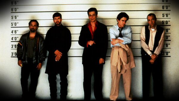
I took one look and knew exactly what to do:
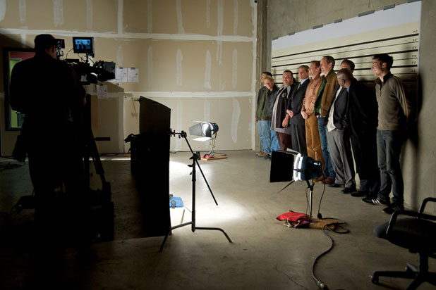
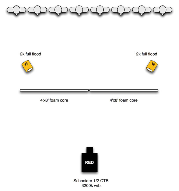
Soft light from below can be very flattering, but in this case we over-sharpened the image and cranked up the contrast to make it look a bit sinister. Here’s a behind-the-scenes still:
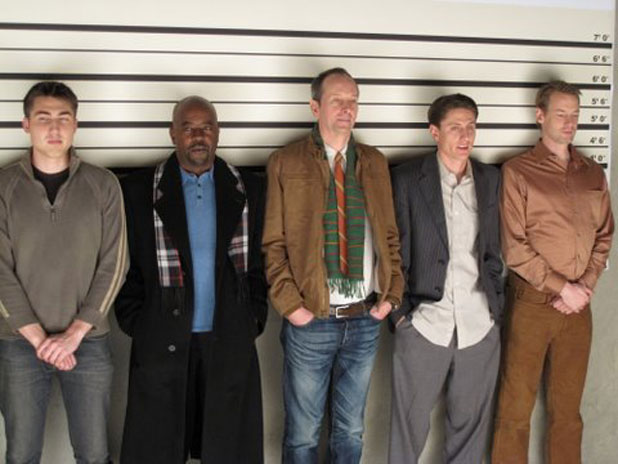
My film student, Ted, is on the left. (He was drafted at the last minute because he fit a certain age demographic we didn’t have cast.) And here’s a color-graded screen grab:
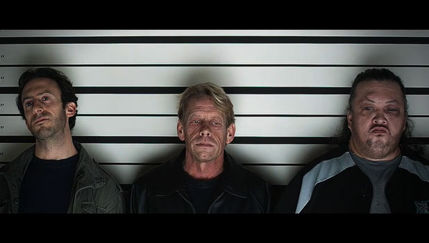
As you can see, Ian and I like vignetting our images. (The vignette looks a lot more subtle on a video monitor than it does here.) Don’t let anyone tell you that you can never light “flat” by putting a big soft source near the camera. Depending on the size of the source, what side of the lens axis it’s coming from, and how far off-angle to the lens it is, it’s possible to create a large number of very interesting, rich and subtle looks.
The trick with a lighting setup like this is to light the bounce cards as evenly as possible so there’s one shadow, not two. If the lights are too spotty or too close to the cards they’ll create two hot spots, one at either end of the card, which results in double shadows. There’s a little bit of a double shadow in the midst of this shot but it’s not horrible.
Ideally we’d have evenly lit the cards with a row of Lowell Tota-lights placed in a row on the ground, but as we didn’t have any we punted with the 2k’s. It worked fine. It’s important to understand what’s important and what’s not important in a lighting setup, and in this case we were able to get 90% of what was necessary quickly with two lights instead of five or six.
We did the dolly move on a doorway dolly, which was not the best method possible but it was what our budget allowed. We really needed track to make the move useably smooth, but as we didn’t have any we used the unsteadiness of the move to simulate the woman’s POV as she looks down the lineup.
One last note: we shot this spot in 16:9 but Ian cropped it to 2.4:1 “scope” letterbox during the edit. Normally I don’t like having my work reframed in post, but I have to admit that it looks great. There are exceptions to every rule, and the rule of “don’t touch my footage!” sometimes gets in the way of someone else’s creativity making the piece better. I don’t encourage this, but I also take credit when it works.
That’s about it. Very simple overall, although it took a while for me to learn to light that way. Lighting simply pays huge dividends: fast and pretty are popular modalities both in cinematography and in dating, and both can result in a lot of callbacks–albeit for different reasons.
All original photos are copyright 2009 their respective owners, who in this case are Tim Blackmore/Meets the Eye and Luke Seerveld.
NOTE: After testing Schneider CTB filters for this article, Schneider let me keep them. I use them all the time with the RED because they provide just enough color correction to make a difference without sacrificing too much light.
Art Adams is a DP who is fast and pretty, but in a very different way from how he was 20 years ago. His website is at www.artadams.net.
Filmtools
Filmmakers go-to destination for pre-production, production & post production equipment!
Shop Now