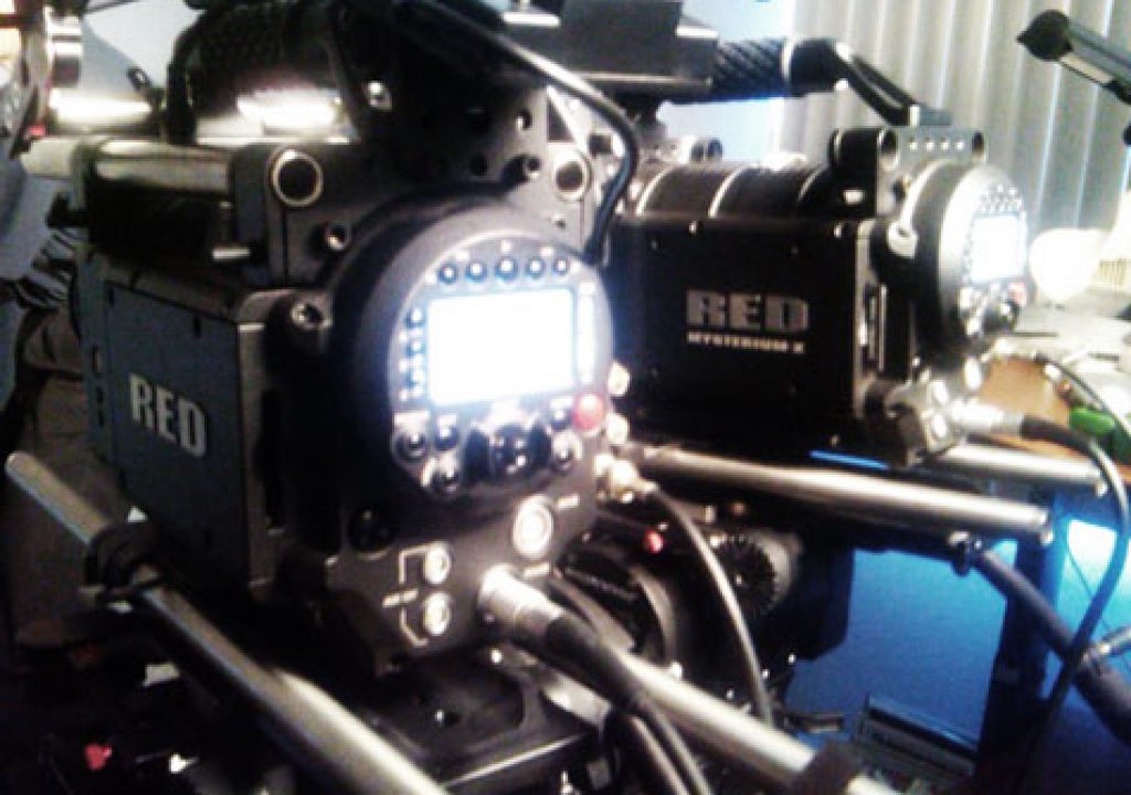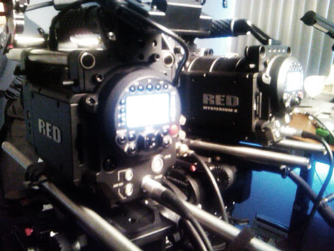
Comparing the RED ONE “M” and the RED ONE “MX” in Adam Wilt’s office.
The RED ONE MX is finally here, and it looks great–better than it should, considering that RED says that it hasn’t changed the colorimetry of its sensors, only its sensitivity and noise levels. How could software alone make such a huge difference? I found out… the hard way.
A while back I wrote about an apparent flaw in the original RED ONE’s colorimetry that added blue to any color containing green under tungsten light, making the RED ONE truly a daylight-balanced camera if one desired bright accurate colors. As of Build 30, though, the RED ONE’s color quality improved dramatically, and the blue/green contamination problem seemingly disappeared. Colors photographed under tungsten light now appear slightly richer than those photographed under daylight, and the overall color is much more pleasing and accurate under any color temperature.
RED says the color filters on its MX sensor are the same as on its M sensor, although some say that the dramatic improvement in color science implies that this is not the case. Did RED change its sensor more than they’ve led us to believe, or did they effect these spectacular changes in software only? I had to find out for myself, and with Adam Wilt’s help I was able to photograph the same test chart, at roughly the same time, under both tungsten and daylight light sources with RED ONE M and MX cameras.
The results are a bit… surprising.
Turn the page for the prologue to our technical journey…
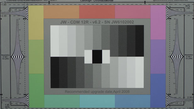
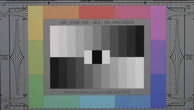
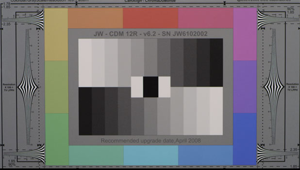
This is a DSC Chroma-du-Monde chart, which is probably the best designed broadcast color chart ever.
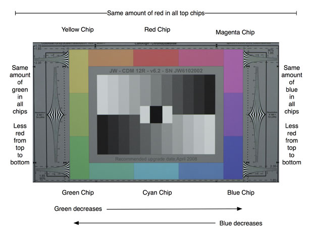
This chart’s design makes it exceptionally easy to discern how a sensor sees color just by looking at a parade waveform. The bottom left corner of the chart contains a green chip, and the column that extends upward from that chip contains green plus increasing amounts of red, resulting in an even split between green and red–yellow–at the top of the column.
Moving right from yellow sees green diminishing and red remaining constant until we reach the middle chip, which is pure red.
From there blue is added until we reach the far right chip, which contains equal amounts of red and blue (purple) and from there to the bottom right corner of the chart red diminishes until we reach a chip of pure blue.
Moving left from blue along the bottom row sees green gradually increase until we reach the center chip-cyan-and then blue decreases until we reach the green chip.
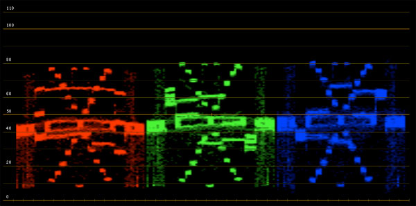
DSC Chroma-Du-Monde chart viewed under tungsten light in RedColor color space. White balance is tungsten preset. Pulled from Apple Color. Note the “arms” on the green and blue channels where they respond to seeing, or not seeing, their own color.
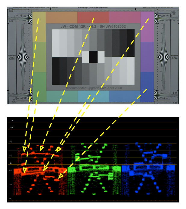
RED CHANNEL: The beauty of the Chroma du Monde chart is that we can see, very specifically, how the camera’s color channels respond to color. In the case of the red channel we can see the waveform peaking where it sees red, and dipping where it doesn’t. For example, look at the blue chip and see how low its trace is: that’s because the blue chip has no red in it. The red chip’s trace is fairly high, as is the entire top row which contains the same amount of red mixed with other colors (green on the left, blue on the right). It’s interesting to note that, in this case, the green chip’s trace is higher than it should be when compared to the blue chip, which implies that the red dye on the sensor may pass some green light as well as red.
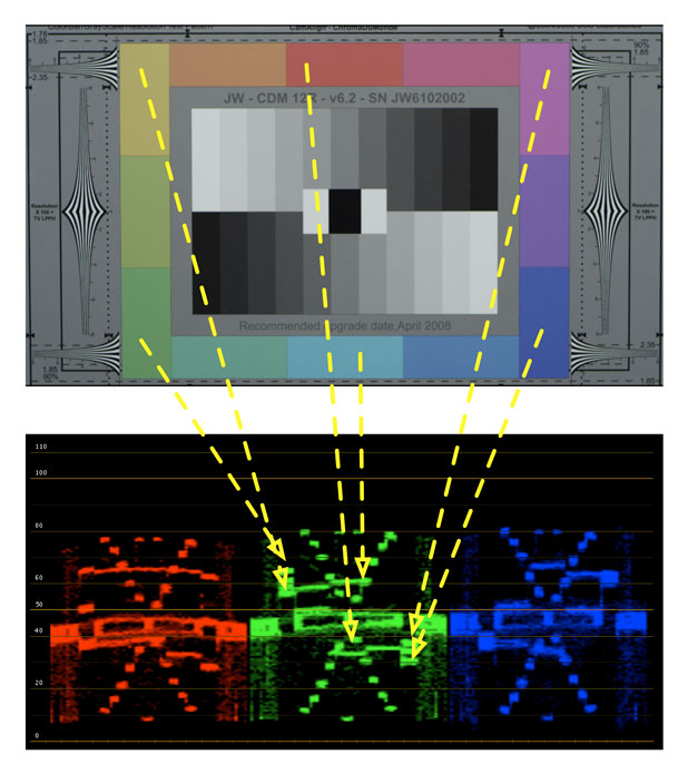
GREEN CHANNEL: Notice the “arms” on the left and right side: on the left the waveform peaks because the left column contains the same amount of green in each chip, while it dips over the right column as there is no green (only blue and red) on that side of the chart. Notice, also, how red causes a dip while cyan causes a peak, because cyan contains green and red doesn’t.
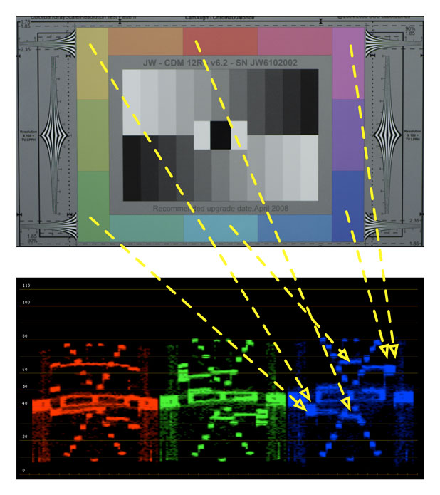
BLUE CHANNEL: Same thing again, only in reverse: the waveform trace peaks where the chart contains blue and dips where it doesn’t. Thanks to the chart’s layout the blue channel is almost a mirror image of the green channel.
If a color channel sees too much of another channel (color “crossover”) the overall colorimetry of a camera can be compromised.
What I discovered, back when I was trying to discern how RED was able to reduce blue noise levels so drastically in the RED ONE “M” running Build 20, was that the blue filters on the sensor pass a lot of green light as well. First, here’s a 5600k chart viewed with a RED ONE, M sensor, Build 20:
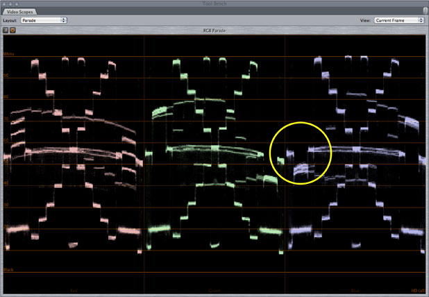
The circle shows that there’s a nice dip in the blue channel where the green/red column is, which is normal and expected. Here’s the same chart viewed under 3200k light:
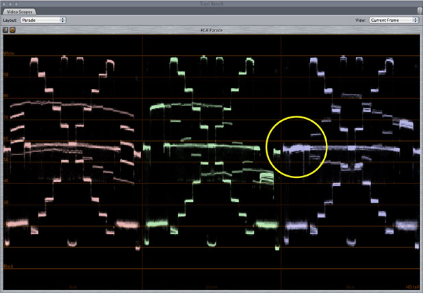
This waveform shows the blue channel responding to blue where the chart contains only green and red. From this I was able to surmise that the blue filters on the sensor’s photosites passed a little bit of green along with blue: instead of being a “pure” blue the filter is more of a greenish blue:
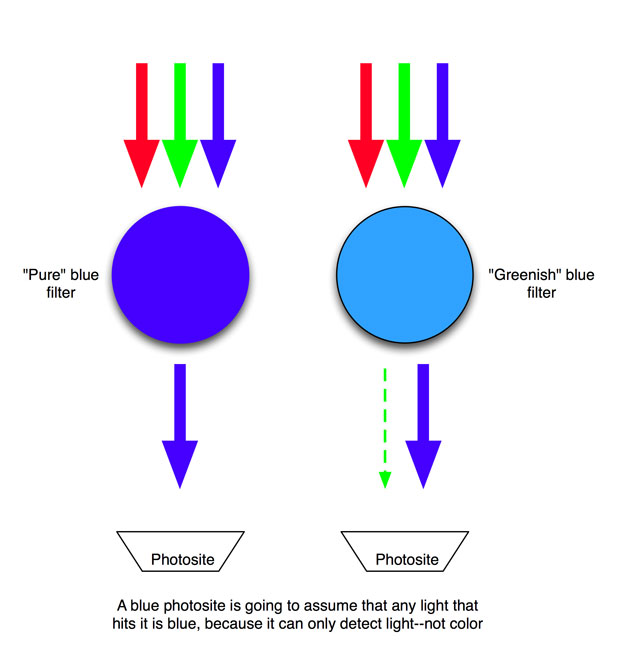
This is a dramatization, but it communicates the general idea. Filters operate by absorbing wavelengths of light that are not the same color as the filter, so a blue filter absorbs, and eliminates, any wavelengths of light that are not its hue of blue. If a filter is greenish-blue instead of “pure” blue, then it will pass mostly blue along with a little bit of green. (The exact wavelengths passed by these filters vary from manufacturer to manufacturer and are closely guarded secrets. There’s very little agreement as to what wavelength is a “pure” hue of any color, so different manufacturers have different sensor “recipes.”)
The photosite underneath the filter has no idea what color is being passed, as it can only count how many photons hit it: silicon alone can’t determine light color, only that light is present. A digital camera’s processor “knows” what filter covers each photosite, so by counting the number of photons hitting a photosite and referencing what color filter covers it, the processor creates a value that represents how much color that photosite “sees.”
For example: If photosite number 2745 generates a signal that tells the processor that it is detecting some light, and the processor checks its directory and sees that photosite 2745 is covered with a blue filter, then it will route the signal from that photosite into the blue channel.
The resulting numbers from all the photosites are then processed via a de-Bayering algorithm to calculate red, green and blue values for each pixel, even though each photosite can only detect one color.
NOTE: Photosites and pixels are completely different things. Photosites are the individual light-sensitive points on a sensor, while pixels are “picture elements” derived from photosite data. The number of photosites and the number of pixels in an image don’t have to match; for example, the Sony F35 uses clusters of six photosites (two rows of red, green and blue photosites) to create a single pixel.
Before Build 30, colors that contained green looked dull under tungsten light, although not under daylight. My theory was that the enormous amount of blue in daylight overwhelmed the small amount of green that’s passed to the blue-filtered photosites, so the small amount of green light passed by the filter was effectively overwhelmed and buried.
Under warm tungsten light, however, there’s so little blue that a small amount of green light made a much bigger difference as there wasn’t enough blue light to drown it out. Since a photosite has no way of knowing, on its own, whether it’s seeing blue or green light, it tells the processor that everything it sees is blue. The processor dutifully adds blue to the areas in the image where the blue photosites register light, even though some of those areas are green.
And what happens when blue is added to a bright color like green? It becomes a dull color.
When I looked at the RED MX sensor in RedColor color space I saw no indication that this was still a problem. The MX’s color actually looks brighter and richer under tungsten light than under daylight, which was a bit of a surprise to me. Greens were particularly vivid. Maybe, just maybe, RED changed the filters on its MX sensor such that the RED ONE saw much more accurate color under tungsten light. Certainly the new vibrant colors have led many to think so.
What I needed to see was something close to a “raw” image off the sensor. Camera RGB is simply an image in sensor “color space” that is white-balanced but has no additional color processing to match it to a viewing device (such as a Rec 709-compliant monitor.)
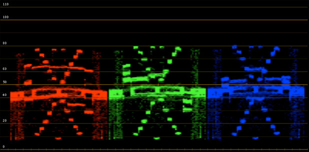
Same chart as above viewed under tungsten light but using Camera RGB color space. Note the the left “arm” of the blue channel is now raised, not lowered.
See anything familiar? Yup, it’s the same problem I wrote about before: the blue channel sees green, and quite a lot of it. I was a bit baffled when I saw this. I hadn’t studied Camera RGB for my previous article on this subject, only RedSpace, and I suspect I should have paid more attention to it at the time.
I hadn’t seen this green-blue issue in RedSpace under daylight conditions in my previous test, and it occurred to me that I should take another look at daylight in Camera RGB and see what popped up.
Wow. The crossover issue is there as well. It’s not quite as bad, but it’s definitely there. Here are some pictures that show the difference between Camera RGB and RedColor and under tungsten and daylight. These were shot on the MX sensor:

Camera RGB, daylight. Note that all the colors that contain green, from just left of the blue chip all the way around the left side of the chart and just short of the red chip on top, are muddy due to blue contamination.
RedColor, daylight. The blue cast is gone.
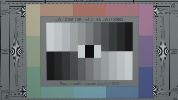
Camera RGB, tungsten light. The green chips are REALLY muddy and dingy under tungsten light, much worse than under daylight.
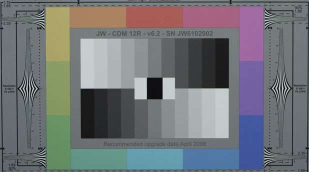
RedColor, tungsten light. The chart is more saturated and rich than it was under RedColor in daylight
There’s no sign of the blue-green crossover problem in RedColor. It’s completely gone. It appears that the MX sensor does have similar colorimetry to the RED ONE M if one looks only at Camera RGB, but why does Build 30 make both the M and MX cameras look so much better? Could RED truly be fixing this issue solely in software? And if so, how? A possible solution lies on the next page…
The big question is this: if the blue photosite sees both blue and green light, but can’t tell the difference on its own, how does the processor know to remove green’s influence from the blue channel? It can’t know just from looking at the blue photosites, because a photosite can only detect light and not color, so the processor must be looking elsewhere. The green channel seems the obvious place to look for information about green in the image, therefore RedColor must be taking information from the green channel in order to remove green from the blue channel.
I set up the following node structure in Apple Color’s Color FX room: the idea was to split the camera’s RGB signal into its individual red, green and blue components, subtract some of the green channel’s signal from the blue channel, and reassemble red, green and blue into an RGB signal again:
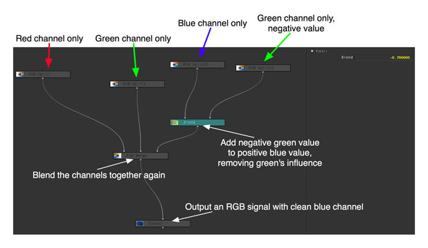
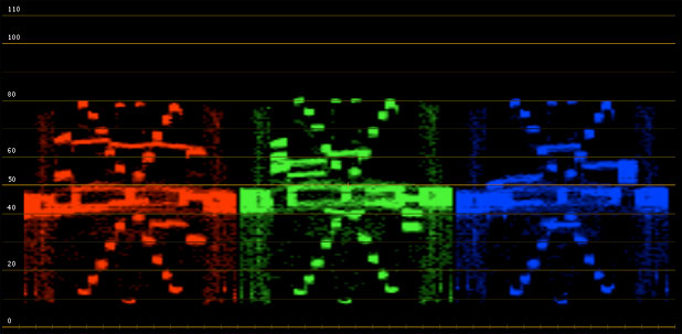
Nothing is done to red or green, but blue is modified by blending a negative value of the green signal into it (in this case the “Blend” value was -.7). Since blue photosites react to both blue and green, but the green photosites reliably react only to green, we should be left with a richer blue if we subtract the green signal from the blue signal.
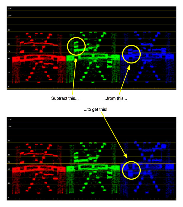
This becomes a bit more clear if we look at a waveform again. The first waveform shows Camera RGB before the node tree, and the second shows Camera RGB after the node tree:
And here’s the difference in the chart’s appearance:
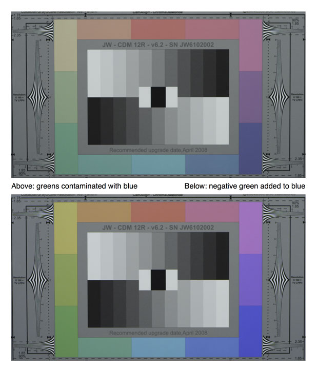
Another side effect of subtracting green from the blue channel is that blue becomes much more highly saturated, which is something I see now in RedColor.
Do I have any hard evidence that this is what RED is doing? No. But I’ve certainly found a viable way of fixing the blue channel in a way that looks remarkably consistent with RedColor.
Don’t expect my results to match RedColor as I’m not doing anywhere near the kind of finessing that RED, or any other manufacturer, does with their proprietary color science. I’m just demonstrating one method of cleaning up a specific anomaly, albeit a fairly dramatic one.
Lets look at some vectorscope patterns. These aren’t perfectly white balanced (I used camera presets in order to avoid tweaking the image data unnecessarily) but we’re just looking at the overall pattern so that shouldn’t matter.
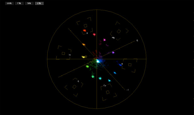
This is Camera RGB, under tungsten light, with no correction.
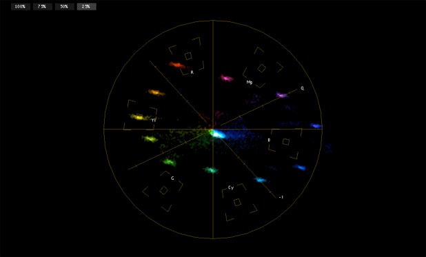
This is the same Camera RGB signal processed through the node tree, with green subtracted from blue.
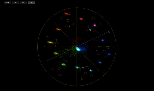
This is the same signal processed via RedColor, with no additional tweaks.
Clearly my node tree correction doesn’t make Camera RGB look anywhere near as good as RedColor; I don’t know enough about color science to pull that off. What I notice when comparing these vectorscope images is that my nodal tree correction skews the colors along the blue-yellow axis:
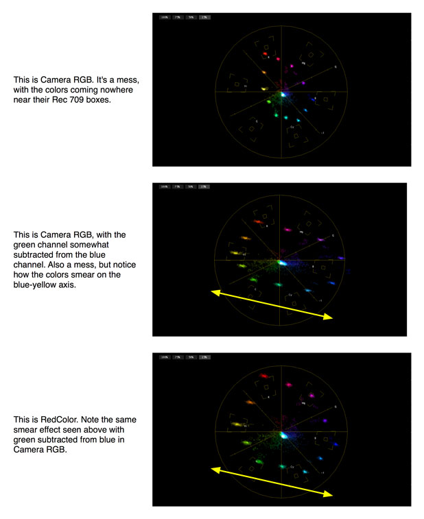
By the way, if there was one color you’d expect to be affected dramatically by this subtraction process, what would it be? My guess is that cyan would suffer the most as it contains equal amounts of green and blue. In my head, I see cyan as leaning toward blue: if cyan is supposed to be a 50/50 mix of blue and green, but the blue photosites add a bit of green so the green/blue mix ends up being 50/70 (because green sees only green, but blue sees blue plus some green), subtracting green from blue should result in a skew towards blue. And that’s exactly what we see on the vectorscope: cyan, in RedColor, trends toward blue.
Cyan is one of the hardest colors to reproduce for any camera so I have to wonder if this “blue filter passes some green” issue isn’t fairly common. In the early days of color television it was difficult to make a red phosphor that glowed as brightly as the green and blue phosphors, so rather than dim the green and blue phosphors to match to match the dimness of the red phosphors the solution was to add green to the red phosphor to help it glow brighter.
This process worked but it resulted in orange-ish reds that plagued color television for quite a long time. I have to wonder if there’s a similar issue in creating blue dye filters for photosites: silicon is more sensitive to long wavelengths of light (infrared and red) and least sensitive to short wavelengths (blue) so perhaps manufacturers intentionally use greenish-blue filters on blue photosites to boost the otherwise weak blue signal.
Initially I thought this was the end of the story: I figured out how RED removed green contamination from the blue channel–huzzah!–but I was still confused by the fact that the vectorscope that resulted from my bit of Color FX digital magic still didn’t look anything like RedColor. That’s when it occurred to me that I’d only seen the tip of the iceberg, and the only way to figure out how all the RED’s colors interact was to (gulp!) try to build my own color matrix.
So that’s what I did, and I learned a ton. More on the next page…
Anyone who has traversed the menu structure of a Sony or Panasonic camcorder has likely seen the matrix. Like the movies, this matrix can be a bit confusing until you’ve played with it for a while. I’m nowhere near being adept at manipulating it, but I learned enough from building my own pseudo matrix in Apple’s Color that I have a better grasp of what it’s for and what it’s meant to do.
The bottom line is this:
A color matrix, or series of color matrices, massages the raw sensor color data into a form that looks correct on a specific viewing device, and allows some customization of how the camera responds to color at a very deep level.
DIT Peter Gray has a page on his web site that deals with various settings, including the matrix, in the Sony F900, so if you haven’t seen a matrix before then click here and scroll down the page for a rough explanation. There’s also an interesting article about this under DSC Labs’s Tech Tips column. Look for Dave Adams of Sky Television.
Every camera has at least one matrix, and typically two or three. Based on what I’ve seen in my experiments, matrices are fundamental to the proper functioning of a camera at a very, very deep level. The matrix most of us have seen is Sony’s User Matrix, which in many of their cameras offers settings that read as follows: R-G, R-B, G-R, G-B, B-R and B-G. Many engineers I’ve spoken to understand that these controls “push” colors around on a vectorscope, but my experiments have shown me that the matrix is more complicated than that:
Matrix settings either
(a) mix a color channel signal into another color channel signal, or
(b) subtract a color channel signal from another color channel signal.
For example, (b) is how I eliminated green spill from the RED’s Camera RGB color space on the previous page: the blue channel saw a lot of blue and a little bit of green, so I told Color to subtract some of the green signal from the blue signal until all that was left in the blue signal was a response to the color blue only..
Except that it wasn’t that simple. With modern cameras it never is. Subtracting the green signal from the blue channel solved part of the problem, but not nearly all of it. Clearly there was more that had to be done.
And with that thought, I decided to build my own matrix (or matrix emulator) in Apple’s Color. I was curious as to whether I could build a node tree in the Color FX room that would add and subtract color channels from each other in such a way that I could make a Camera RGB image look like RedColor.
Here’s my starting vectorscope showing Camera RGB under tungsten light:

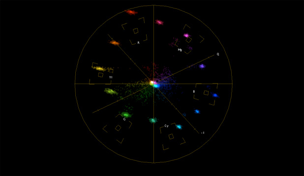
Here’s RedColor:
And here’s the look I was able to build using a node tree in Color:
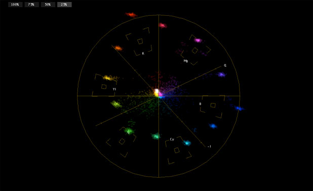
I’ve got the basic shape correct, although some of my colors are a bit oversaturated compared to RedColor. The important thing is that the colors fall onto their proper vectors, even if they don’t fall into their designated boxes. (An electronically-generated color bar signal will put all the colors into their boxes, but this rarely works when shooting in the real world. A “vector” is a line that passes from the center of the display through each color box, and as long as each color falls somewhere along its vector it’s usually okay even if it doesn’t fit neatly into its little box.)
There are some other problems as well, so let’s look at what the actual charts look like. Here’s RedColor:
And here’s my look:
Close, but no cigar. Well, not an expensive cigar, anyway.
Lest you think this was easy, here’s the node tree I created in Color over the course of several hours:
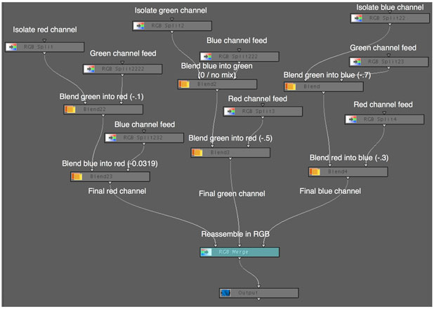
This may look complicated, but it’s really not–at least not at this level. What I did was isolate the three color channels–red, green and blue–and then create branches where I could add or subtract the signals from the other color channels. For example, after isolating the red channel I set up branches where I could add or subtract blue and green; for green I set up branches that could add or subtract red and blue; etc.
Mostly I subtracted colors, which meant that I was compensating for the colored filters on the photosites seeing colors other than their own. (A little of this is essential, otherwise secondary colors like cyan, yellow and magenta will suffer horribly–as they do on many older cameras.)
It’s important to note that we are talking about color signals, not actual colors. On the previous page I didn’t really subtract green from blue; instead I subtracted a green signal from a blue signal. The signal itself isn’t a color, it’s just information that lets the camera’s processor know how much color is present at points in the image so it can build an RGB picture. When you subtract a signal from a signal you’re merely removing one signal’s influence from another’s, as opposed to subtracting one color from another color which results in a new color.
Think of a color signal on its own as a monochrome image. As an example, I created some imperfect but good enough examples in Photoshop. Here’s blue:
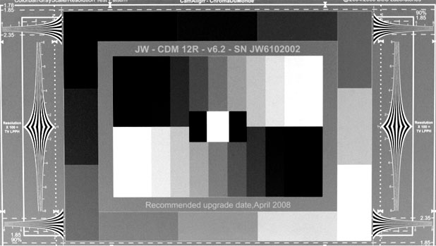
And here’s green:
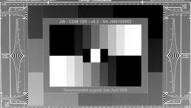
Bright tones mean that the a color channel sees its color in the image and dark tones means it doesn’t. If we take the values in the green channel and subtract them from the blue values, the parts where green values are the highest will wipe out the areas where blue overlaps, because the blue values are lower. That has the effect of eliminating green contamination from the blue signal, making blue much more pure.
Conversely, as green doesn’t see much blue if it sees any at all, green’s values will be very low in the blue areas of the chart, and subtracting low green values from high blue values leaves the blue portions of the image alone.
Since we’re doing all this work only in the blue channel, blue is the only color affected.
This delicate balance is what differentiates one model or make of camera from another. It’s all about what filters are used on the photosites to detect red, green and blue, and how their signals are mixed together to form pure and pleasing colors. There’s no such thing as a pure green, pure blue or pure red filter because colors are comprised of a range of wavelengths, not a single wavelength. The filters on the photosites often pass a range of wavelengths to the photosite, and occasionally have sensitivities, or “leaks,” where they shouldn’t. (Infrared comes to mind.)
In addition, it’s beneficial for each color channel to be at least a little sensitive to other colors as that’s how secondary colors are made. If photosites only see very narrow wavelengths of red, green and blue then they’ll never respond to yellow or magenta or cyan. Some overlap is necessary.
On this web page you’ll see charts of the spectral response of a number of popular DSLR cameras. Note how all the colors overlap somewhat in spectral response, and yet these cameras reproduce very pretty and accurate colors. That’s because every image is being processed through a color matrix, either in the camera (JPEG) or later through an import plugin or some other software tool (raw). There’s a formula that these manufacturers developed that allows them to selectively add and subtract color channels from each other so that all these different signals blend into a very pleasing and accurate color palette. This matrix is specific to the spectral properties of the red, green and blue filters used on their sensor. (This is true of any camera.)
When you look at matrix numbers you are seeing deep into the heart of the sensor, right down to the way the dye filters on each photosite respond to their designated wavelengths of light. That’s pretty amazing, and very powerful.
In a camcorder there are often multiple matrices. In the Sony F900, for example, there are four obvious matrices:
(1) The OHB matrix. This adjusts for color differences between this camera’s optical head block and any other F900’s optical head block. At a very basic level the OHB matrix strives to make all F900 cameras look the same in spite of subtle differences in their prisms.
(2) The preset matrix. This is how you specify a color space for viewing. If you’re shooting for broadcast you may set this to ITU (Rec) 709 to make sure that all the colors you capture are “legal” and look correct on a standard HD monitor.
(3) The user matrix. This is where you can customize how the camera responds to color in a manner that you choose. Adjusting this is not for the faint of heart, as channel mixing requires a interesting blend of technical know-how, experience and voodoo.
(4) The multi matrix. This allows the user to select a swath of color and affect it exclusively. This is handy if you need to make a product a very specific shade of color that the camera doesn’t automatically reproduce accurately. This is the simplest matrix and allows the user to grab a “pie slice” of the vectorscope and drag it one way or another.
In the RED ONE MX there’s matrixing that happens as part of the de-Bayer process, and a matrix that is applied in-camera to the monitor outputs (RedColor or “raw”). Multiple matrixes are available in Red-Cine X. By selecting RedColor, RedSpace, Camera RGB or any other option you are choosing to interpret the recorded RGB signals through a specific color matrix. (RedColor is the matrix that produces ITU (Rec) 709-compliant color for viewing on any standardized HD monitor.)
I saw an interesting demonstration of the matrix years ago when watching an F900 demo at Bexel in Burbank. The engineer aimed the camera at a gray card and then dialed a number of very extreme numbers into the User matrix. The gray card didn’t change at all, but when he zoomed out and revealed the room every color in it was severely messed up. You can’t adjust a color matrix by looking at a grey card or grey scale chart: you must observe known color references during the process. Matrices respond to very specific colors, so you have to look at those very specific colors in order to see how they change.
That’s where our old friend the Chroma-Du-Monde chart comes in.
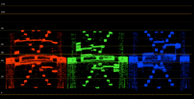
Here’s RedColor’s waveform from the above experiment:
And here’s the look I created:
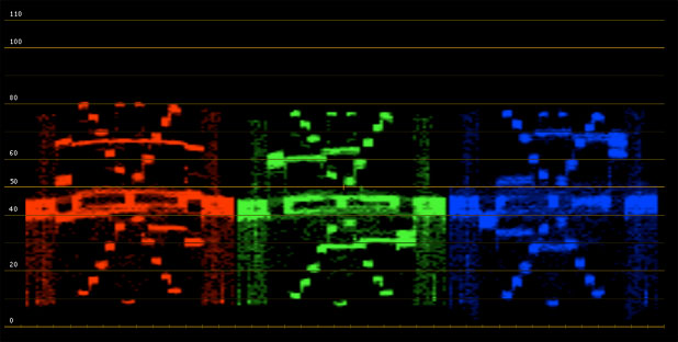
I got close, but it’s not a perfect match. The important thing, though, is that all the color channels have “arms.” See how the left and right sides of each color have notches that show how they are responding to colors on the chart? The downward blue notch on the left of the blue channel shows that it isn’t seeing green, and the upward notch on the right shows that it is seeing blue. The green waveform shows that green, too, is only seeing green in parts of the chart that contain green, as does the red waveform (although red shows up differently as both of the chart’s side columns show decreasing amounts of red from top to bottom).
These “arms” show color separation, which is very important for pure and accurate color: not only do the colors need to fall onto the proper vector on the vectorscope, but they need to have broad distinct “arms” on the waveform in order to show that they are only responding when they see their own color in the chart (and in the real world). A Chroma-du-Monde chart and a parade waveform monitor are the only way to see this accurately.
While working only with a vectorscope I discovered that I could get the colors onto the right vectors and still have a lot of crossover between colors. Remember the blue notch that started all this?

When I created my own matrix I discovered that if I only watched the vectorscope I could get all the colors lined up with their little boxes but STILL not create that notch. I could get blue and green to look proper on a vectorscope, but green was still contaminating blue. In order to eliminate that contamination and recreate that notch I had to watch both the vectorscope AND the parade waveform, because the vectorscope didn’t tell me where colors were crossing over. My process went like this:
(1) Separate Camera RGB into its red, green and blue components
(2) Look at the chart for obvious color contamination, such as blue in the greens. Work on one channel at a time.
(3) Add and subtract colors from that color channel to get that color into its vector (in line with its color box on the vectorscope) taking my clues visually from the chart. (Does green look bluish? Then subtract some of the green channel from blue and see what happens…)
(4) Look at the parade waveform and see if the color I’m working on has big “arms” or not. If it doesn’t, go back to step 3 and try subtracting and adding other colors. If it does have big arms, and it lands on the right vector on the vectorscope, move on to the next channel and repeat.
(5) Do the channels still fall along their vectors on the vectorscope? Tweaking one color channel affects all the others, so if I change one I frequently have to go back and tweak the others. If the colors line up on the vectorscope, move on. If not, go back to step (2) and try to place each color in its vector without sacrificing the “arms” on the waveform.
(6) Repeat endlessly until done.
Adding and subtracting color signals from a color does two things: it affects where that color falls on a vectorscope, which shows color accuracy; and it affects color separation, making sure that each color channel is pure when viewed on its own. The vectorscope shows color accuracy, while the parade waveform shows color separation.
Back at the beginning of this article I mentioned that this journey started as an experiment to determine whether the RED ONE M and RED ONE MX sensors shared the same color filters. Here are some waveform/vectorscope images from Color that show the results of the tests. Remember that I didn’t tamper with these images in any way, using white balance presets in both cameras, so the images are not perfectly white balanced. This reveals itself in two ways:
(1) When white balanced the center of the vectorscope will show a tight white dot. In these images you’ll notice that the center of the vectorscope is not a tight white dot and that the chart doesn’t always look perfectly accurate. The direction of the white dot tells you what the color bias is, so if the dot is skewed toward blue then expect the chart to look blue.
(2) When the white dot is skewed that means the overall vectorscope pattern is skewed in the same direction. This does not change its shape. Compare the shapes of the vectorscope patterns, not where they fall on the scope.
(3) Same with the waveforms: they won’t match perfectly due to the different white balances, but you’ll be able to see where the “arms” fall and that tells you a lot about color purity.
All of these tests were shot with the cameras set at ASA 400.
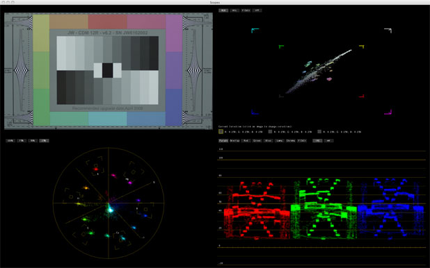
M sensor, daylight, RedColor. White balance is a little on the cyan side.

MX sensor, daylight, RedColor. White balance is cyan-blue, but the basic shape of the vectorscope matches the M sensor. Notice how tight the dots are on the MX sensor, which shows that it displays considerably less chroma noise than the M sensor.
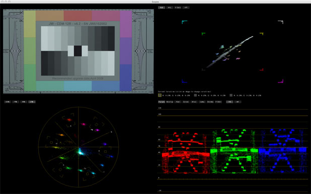
M sensor, tungsten, RedColor. White balance is a little cyan.
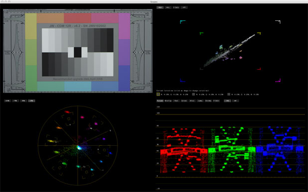
MX sensor, tungsten, RedColor. White balance is a little cyan. Once again the shapes are roughly the same, including the way the dots smear on the blue-yellow axis. We saw that earlier in the experiment where I subtracted green from the blue channel.
Based on this comparison my best guess is that RED is using the same colorimetry in both cameras, and the only significant difference between the two is that the MX sensor is much, much, much quieter than the M.
I’ve learned a lot from this process. Specifically, I learned that what I thought was a RED-specific flaw is actually representative of what every camera manufacturer has to deal with in one way or the other. While the RED’s path has been fraught with growing pains, those pains have allowed us to see inside a process that is normally hidden from view. One thing is for sure: from a color and noise perspective the RED ONE is finally a mature camera.
Thanks to Adam WIlt and Meets the Eye Productions for their help in shooting the tests used in this article. Thanks also to Gary Adcock and Bill Hogan for spot-checking this article and David Corley and Michael Wiegand of DSC Labs for their insights.
Disclosure: DSC Labs sends me free charts for my tests and so far hasn’t asked for any back.
Art Adams is a DP who makes frequent trips to the heart of the matrix. His website is at www.artadams.net.

Filmtools
Filmmakers go-to destination for pre-production, production & post production equipment!
Shop Now