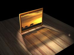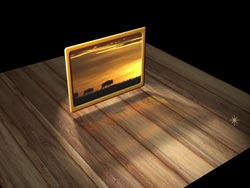

The image on the left is a normal computer crossfade; the image on the right uses linear blending – note how the bright areas are emphasized. Footage courtesy Artbeats.
Most of us have been navigating the waters of computer graphics with the assumption that the world is flat. And it’s remarkable how well we’ve done with this fundamentally flawed assumption. However, some of you may have heard whisperings that the world is actually round – often couched in terms of how important it is to understand the subject of gamma, and to composite within a “linear light” model.
An exhaustive treatment of the subject of gamma requires something more akin to a book than a column – along with several bottles of aspirin. Here, we’re going to give a very light introduction to the subject of gamma (no pun intended), and demonstrate how you can experiment with these concepts in existing programs such as After Effects, Motion, and combustion. Although visual effects artists – with their pursuit of reality – are often obsessed with accurate recreations, motion graphics artists – with their pursuit of surreality – may find that breaking the rules yields a more interesting result.
(Note: This article was originally written before After Effects natively supported gamma-corrected compositing. As of After Effects 7 and later, there are checkboxes in File > Project Settings which allow you to do this without the extra layers and expressions detailed below. However, the following is still highly useful for understanding the underlying concepts, implementing linear gamma in other programs, and creating your own custom gamma working spaces to create new looks. At the end of this article, we’ll discuss those checkboxes in After Effects in more detail.)
When 18 = 50
In most computer software, a 50% luminance value is intended to be perceived on a monitor as “50% gray:” an equal mix of black and white. This is logical and intuitive; many processing functions such as Brightness and Contrast as well as blending modes are based around this. Too bad it’s not the way light really works.
 In reality, our eyes are very sensitive to low light levels. As some of you know, an “18% gray card” or a similar section of an exposure chart is called this because 18% of available light is being reflected back to the viewer. However, we mentally perceive it as “middle” (or 50%) gray. The signal capture and presentation chain, including cameras and monitors, have corrections built in to bend this reality to the computer’s representation that a 50/50 black/white mix is really middle gray. The number most often used is a gamma correction of 2.2 (although different computer systems and file formats can use different values; 2.5 is also a common reference value).
Thanks to these gyrations, we can successfully perform most of our graphics work in the computer’s gamma-corrected space. However, if you are trying to accurately recreate the way light works, some of the way colors mix in the computer are off a bit. Therefore, more users are finding ways to undo the computer-based gamma corrections so that they can composite images in “linear light.”
Homemade Gamma Correction
It is relatively easy to hotwire your software to allow you to composite in linear light space. If your software allows you to select a higher bit depth, use it; 16-bit linear mode will reduce banding, while floating point mode will allow preservation of extreme shadows and highlights. (The eLin plug-in suite distributed by Red Giant Software simulates the benefits of floating point in After Effects 6.5, while also performing gamma-corrected compositing.) As an experiment, follow these steps:
- Create a simple crossfade between two images that have good bright and dark areas. Render a reference copy of this transition.
- Set the gamma for each source footage item to be 0.4545 (1 ÷ 2.2). You can do this in After Effects or Motion by applying a Levels effect to each layer (in Motion, if you are using the Fade In/Out behavior to create the crossfade, apply Levels before the behavior). In combustion, you do this by applying a color correction operator to the layer and adjusting its Histogram.
- Set the gamma for the final composite to 2.2, which reintroduces the gamma the computer requires – after the processing (in this case, the crossfade) has been done. In After Effects, this can be done by creating an Adjustment Layer above all the other layers, with Levels applied. In Motion, apply Levels to the Layer containing your media and crossfade. In combustion, apply a color correction operator to the Output Node.
- Render a copy of this new transition, and compare it to your reference render. If possible, set up a side-by-side or split screen between the two renders for easy comparison (see the figures at the top of this page)
If you look closely at the two images at the top of this page, you should notice that in the “linear light” render, the lighter areas in the second clip appear more quickly as that clip fades up, and that the lighter areas in the first clip disappear later. This more accurately mimics our eyes’ sensitivity to lower light levels, and is sometimes known as an “optical fade.” Aside from being more accurate, this uneven crossfade can look more interesting as well. This phenomenon of emphasizing the brighter areas also shows itself in a number of other ways, such as when an object with motion blur crosses in front of another (the blur trails will appear brighter), or when you have feathered edges or glows around objects.
Here’s another one of our favorite tests to show the differences between gamma-corrected and linear light compositing:
- Take a still image (a face works well), illuminate it with a simple light (such as a point light in After Effects), and animate the light’s value from 100% to 1000% over a few seconds, causing the image to “blow out” to white over time. Render a reference movie of this.
- Apply a Levels effect to the source footage, and set the gamma to 0.4545. This will cause the light to interact with the layer in linear, rather than gamma corrected, space.
- Apply a second Levels effect to the final composite, this time with gamma set to 2.2.
- Render this new treatment, and compare it to the reference render.
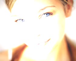
In this case, you should note differences in the way the image blows out over time: The width of the bands in the transition area from somewhat normal color to blown-out color are broader when performed in linear space, looking subjectively more subtle or pleasing. Darker details such as the eyes and shadows in the creases of the face should persist longer in linear space, making the face recognizable longer during the blow-out (see the figures below). You will also find that you need to crank up the light much brighter – perhaps to 5000%, instead of 1000% – to completely blow out the image.


Overexposing an image with normal computer gamma causes it to blow out more or less evenly (left); applying the same illumination with linear light gamma creates a more subtle, pleasing effect (right). Original image courtesy Digital Vision.
These tests provide you a with blueprint of how to perform linear light compositing: Correct the sources to linear by applying a gamma of 0.4545, perform your treatments, and correct the result back to a 2.2 gamma. However, you cannot blindly apply this to any project. For one, some blending modes (such as Overlay, Soft Light, Hard Light, and to a degree Screen) will no longer work “properly” as they are based around the idea that a 50% pixel luminance value means 50% perceived brightness. You will also find that you will need to adjust or increase parameters such as light level, cone feather, and glow amount to achieve the same general results as you saw in the computer’s default space.
Nonlinear Thinking
This is all well and good if your goal is to mimic nature and reality…but that’s often not the goal of a motion graphics designer. For example, what if you want to favor the dark areas of an image instead of the light areas? Or what if you want a less (or more) severe effect? The simple answer is to experiment with gamma corrections other than 2.2. Here is one way to set up such a project with maximum flexibility in After Effects:
- Add an Adjustment Layer to the top of your composition, and name it Master Gamma. Apply Levels (Individual Controls). Expose its RGB Gamma parameter in the Timeline window.
- Apply Levels (Individual Controls) to your source footage layers. Reveal the RGB Gamma parameter, and enable expressions for this parameter. Type “1 / ” (without the quotes), and then use the pick whip to select the RGB Gamma parameter for the Master Gamma layer. Hit Enter to seal off the expression, which should now read:
1 / thisComp.layer(“Master Gamma”).effect(“Levels (Individual Controls)”)(“Gamma”)
- After you’ve gone through the trouble of creating this once, make an Animation Preset of it (use the Animation Preset popup in its Effect Controls window) which you can then easily apply to other footage layers.
Then perform any treatments, effects, or compositing you like! For starters, try the simple crossfade you created in the first example. In this example, place the time marker in the middle of the transition, and then vary the RGB Gamma parameter for the Master Gamma layer. Note how the composite image changes, favoring light or dark areas depending if the gamma is above or below 1.0 (see below).


A normal computer crossfade (left), a “linear light” crossfade (center), and a creative fade using the opposite gamma as linear light (right).
Hopefully this will open up your mind to the potential in gamma-corrected compositing. It’s not something you need to employ on every job, but it’s an important tool to be familiar with, for both realistic and creative applications.
Postscript
As mentioned earlier, After Effects 7 and later now implement linear gamma as option in File > Project Settings, which eliminates the need for all of these extra layers, effects and expressions. The one downside is that you can’t set the gamma correction yourself (the last trick shown above); it is currently hardwired to the perceptually-correct 2.2 value.
In After Effects CS3, there are two choices:
- Linearize Working Space: When enabled, all image processing – including color profile conversions, masks, effects, 3D lighting, and the way layers are blended together – are performed in a gamma 1.0 space. The result is particularly strong with 3D lighting, as illustrated below:


It can be deceptive to set up 3D lighting in a scene (left) and then enable Linearize Working Space: The result will appear blown out (right) as the lighting will appear to be boosted.
- Blend Colors Using 1.0 Gamma: This option can be thought of as “Linearize Working Space Lite.” When enabled, only the blending together of layers is performed in a gamma 1.0 space. You can enable this even when color management is disabled. It is enabled by default when Linearize Working Space is enabled.
In After Effects 7, there is only one choice: Linear Blending. It has the same effect as the Blend Colors Using 1.0 Gamma description above. We were greatly disappointed that we couldn’t achieve the lighting effect demonstrated earlier using this option in 7, but we now can using Linear Working Space in CS3.
Change these setting before you get too far into a project, as they will change how your composites look (observe the images above); you don’t want to select one of these modes just before blindly starting an overnight render!
By the way, Color Management in After Effects CS3 is covered in more detail in Creating Motion Graphics 4th Edition, Chapter 25.
The content contained in our books, videos, blogs, and articles for other sites are all copyright Crish Design, except where otherwise attributed.

Filmtools
Filmmakers go-to destination for pre-production, production & post production equipment!
Shop Now


