
The day I stop learning about lighting will be the day my EKG goes flatline. There’s an extraordinary amount to learn and absorb, and I doubt I’ll ever learn all of it. That’s okay, because it means I’ll never run out of new things to learn. My most recent fixation is on the one light many think about the least: the fill light.
I’ve gone through periods of my career where I focus on different lights and how to use them. I started by looking at key lights: how to place them, what works on different kinds of faces and what doesn’t, how big they should be in relation to the actors, etc. Then I spent a lot of time on backlighting and edge lighting: where are the best spots to place backlights, should I use both a back light and an edge light or use one light to do both jobs, when can a back light become a key light on the next setup, etc.
It took me a bit longer to concentrate on fill light, as early on in my career I was focused more on shaping the bright areas of the frame than I was on filling in the shadows. It’s only been in the last ten years or so that I really came to learn the power of the fill light.
About that time I participated in an online conversation on the Cinematography Mailing List that resulted in an offline exchange with a famous director of photography. “The fill light is, of course, the most important light and yet it is also the most difficult to place,” he said, and I, of course, agreed completely while at the same time having no clue as to what he meant. I should have simply asked him, but for some strange reason I didn’t, preferring to imply that I knew exactly what he spoke about. (Strange. Ah, youth.)
The good news is that I started paying a lot more attention to fill light, and I am now of the opinion that it is possibly the most important light on the set.
I’m now going to do my best to tell you why.
First, a short story: I was day-playing as an operator on a well-known (but not not terribly good) TV series with a very talented director of photography. I noticed that he always filled from the key side. That technique had been somewhat on my radar but I hadn’t practiced it religiously and had not yet discovered what a fabulous technique it is. He would set a key light for the scene (raking sunlight, a large soft source from the side, a bare light bulb–whatever) and then place the fill light near the lens on the same side as the key light. Often it consisted of a small light through a frame of Lee Opal or 250, with the bottom corner of the gel frame at the top right corner of the matte box. (This kept the light close to the lens axis, for reasons I’ll go into shortly, while allowing the camera assistant to see underneath it.) Regardless of how harsh the key light was he never moved or diffused it; he simply filled from the same side, near the lens axis. The results were consistently beautiful and natural.
First I’m going to run through a number of different techniques and show diagrams for each. At the end of the article I’ll show you some examples from my own work. I don’t have good, recent examples of every technique because, honestly, I don’t use every technique I’m going to explain; but I’ll show you the examples I have (or that I’m willing to show) and encourage you to take the knowledge you glean from my diagrams and experiment on your own.
You’ll learn more by doing that anyway. I’m firmly of the belief that learning is primarily the act of becoming aware of something and looking at it in a new way. I hope the knowledge that I impart will allow you to become more aware and observant of this element of lighting so that you can improve your use of it.
Turn the page and let the diagrams begin…
In film school we were taught that the fill light determines the density of the shadows. What we weren’t taught was how important shadows are, and that while the “key” light certainly has directionality, the fill light can as well. Where shadows fall is just as important as how bright they are, which means that we need to look at not just intensity (which I’m not really going to cover here; that’s determined by your own taste) but at placement as well.
Here’s a typical three-point lighting setup. This is both a great learning tool and an awful formula to follow, because while most lighting breaks down into this in one way or another it is severely limiting if this is all you know how to do. Still, it’s a good starting point.
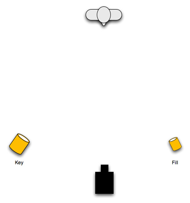
Top view.
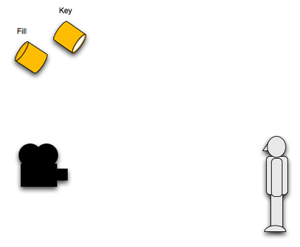
Side view.
NOTE:
In these examples I’m using a simple hard-source key light. I’m not advocating this approach in every situation; it’s just that I’m focusing on fill light in this article and key lights are a different and equally complex subject. The fill examples I give should work well in conjunction with any key source.
The reason the fill light is at the same height as the key probably stems from early studio cinematography when much of the lighting was placed high in a grid. Beauty lighting was often done from the floor (more on that later) but live television and grand feature film sets were almost always lit from the air.
In this scenario the key light is placed so that the nose shadow falls along the “smile line,” the line between the corner of the base of the nose and the edge of the mouth. The position of that light can make the nose shadow long (connecting to the cheek shadow for classical Rembrandt lighting) for “masculine” lighting or short when lighting for glamor. The fill light was set up opposite the key simply to fill in the shadows left by the key.
In the diagram above, where the key and fill light are the same size but differing intensities, the fill light will cast just as hard a shadow as the key light. The fill light’s shadow will be less obvious because it is less bright but it will still be present. There may be a dark area under the chin where neither light reaches but that can occasionally be helpful in hiding what a friend of mine calls “the gobbler,” pertaining to loose skin that collects under the chins of mature leading ladies.
PROS:
Simple, basic lighting suitable for use from an overhead grid or in a location with high ceilings.
CONS:
Very “theatrical” looking. Not very naturalistic.
Multiple shadows indicate competing light sources, possibly drawing attention to the lighting.
Possibility of two opposing nose shadows instead of one.
No guarantee of getting light into deep eye sockets.
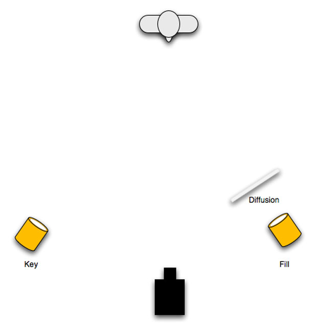
This setup hides the fill shadow somewhat because the fill shadow is softer. Broadening the fill light is always a good idea because a soft shadow will be much less apparent when competing with a stronger key light. Our eyes are sensitive to brightness over everything else, and seeing two sharp shadows from a key and a fill light can be distracting even if the fill shadow is much dimmer. By reducing the edge contrast of one of the lights we can better conceal it.
PROS:
Simple, basic lighting suitable for use from an overhead grid or in a location with high ceilings.
Fill shadow is better hidden, which feels more “natural” and less obviously “lit.”CONS:
Can still look “lit” under certain conditions. The bigger the fill source, and the softer the fill shadows are, the less likely this will be.
Still may not reach into deep eye sockets.
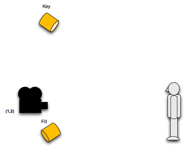
A variation on this technique is to lower the fill light and put it at an opposing angle to the key light. This is an older method of lighting, from the old studio days when it was more important to make actors look pretty than it was to make the lighting look natural. This can be a very glamorous look but can result in dual nose shadows and a weird upward-cast shadow on walls or objects behind the actors if the light is too hard.
PROS:
Can be very pretty.
Puts a nice catch light in eyes. (Lights from below or near the lens are more likely to reach into eye sockets than lights placed high.)CONS:
Not a very naturalistic look.
Upward-cast shadows on walls and near objects, which become more acceptable if the source is broadened/softened.
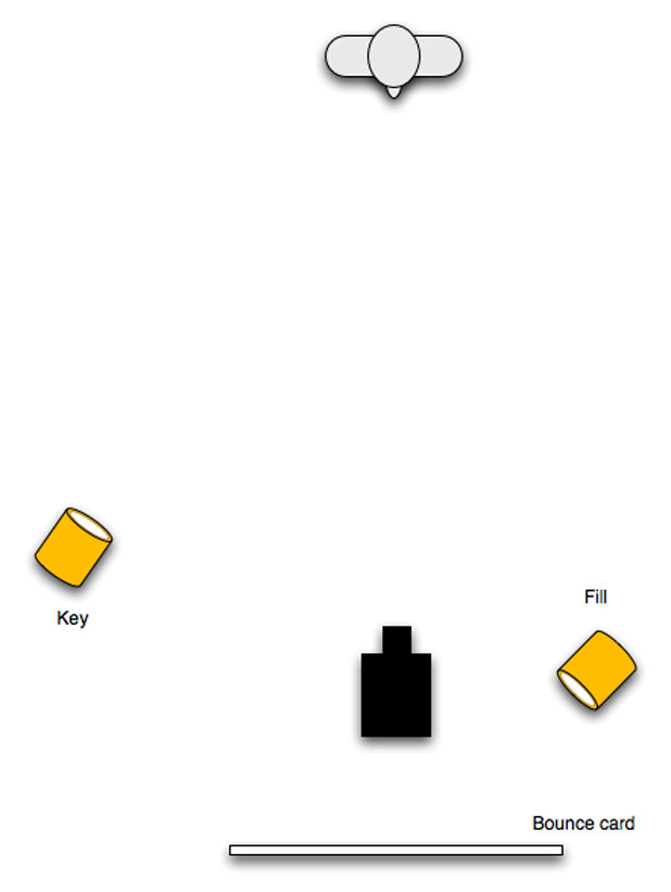
Bounced fill.
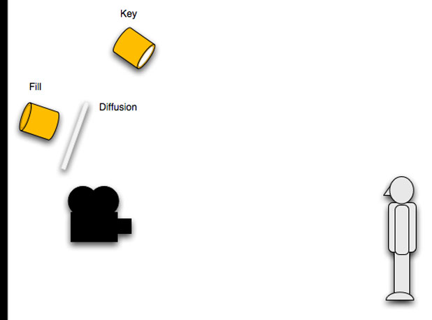
Diffused fill.
Putting a broad fill light directly over the camera hides the fill shadow almost completely. The shadow falls downward, behind the actor, and is largely hidden from view unless we can see the floor in the frame. We may see some shadows on the fill side if the actor waves their hands around in front of their body, but such shadows are usually minimal. If the source is large enough then fill shadows will be neglible. Any shadows that might appear are cast downward, which often feels natural. There are lots of light sources in our environment that cast soft downward shadows. (White ceilings come to mind.)
Lighting over the len axis illuminates just about everything the camera can see until the light intensity diminishes naturally over distance. As the light is illuminating the scene from very near the lens axis it creates a smooth look, because facial imperfections such as wrinkles and dimples have nowhere to cast their shadows. If the fill light came from the side then those facial features might become more visible through casting both a key light shadow and a fill shadow; but light from near the lens axis erases those shadows nicely.
Filling from near the lens axis goes a long way toward erasing skin imperfections and creating or emphasizing the feel of healthy skin.
Lighting from the lens axis is a very powerful concept. Imagine that you could put a light in the back of the lens and illuminate everything the lens can see. The scene would lack a certain amount of dimension because there would be no visible shadows from the perspective of the lens. Depth could be perceived through the gradual fall off of the light deep into the set, but that’s about it.
What you gain, though, is very interesting:
Anything reflective will have a highlight in it. This includes eyes. If a light is near the lens axis then it will reach into any eye in the frame. This is why the “Obie” light was so popular in earlier days: by mounting a small light source near the lens the actors were guaranteed a catch light in their eyes at all times.
That highlight will always face the lens and be in the center of a round object. This can create a sense of roundness in a 2D image, particularly in faces.
The only place a fill light over the lens won’t reach is a surface that faces downward that the lens can see but that the fill source can’t because it is higher than the lens. For this reason it’s a good idea to keep the source lower than higher, although the farther back the fill source is the higher that can be. Here’s why:
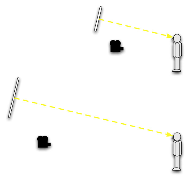
Filling a small area vs. filling a large area: a fill source that is farther away from the actor will reach a larger area, while a fill source closer to the actor is limited in what it illuminates. Note that while the height of the source changes based on distance, the angle is roughly the same.
For this reason I almost always fill from as close to the lens axis as possible. If I’m lighting a big space the source will be above and behind the camera; for a smaller space, or for an actor’s close up, the light will be very close to the matte box.
That covers the basics. Turn the page for some advanced tricks…
One interesting side effect of putting a large source near the lens axis is the glow that it casts in skin. Here’s a still from a green screen performance I shot shot for a PepsiMax viral:

(The actual video is here.) The budget for this project was very, very low and my entire lighting package consisted of a 1200w PAR, a set of Lowell lights, and six 4’x4′ black and white bounce cards. For this setup I set the camera (a Canon 5D) about 12′ away from the talent and set two 4×4′ bounce cards directly behind it, making a large 4’x’8 wide source. I then aimed every tungsten light I had into these cards, lighting them evenly. In this way I was able to light both the talent and the green screen beautifully, while casting few shadows on the green screen. I didn’t have the space or the lights to illuminate the green screen perfectly or separately (we shot this in the back room of a health spa) so I just lit down the lens axis with every tungsten light I had.
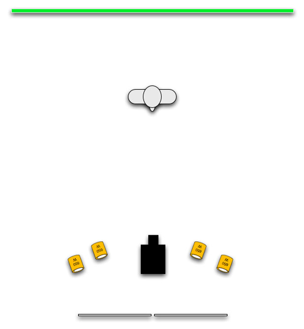
Top view.
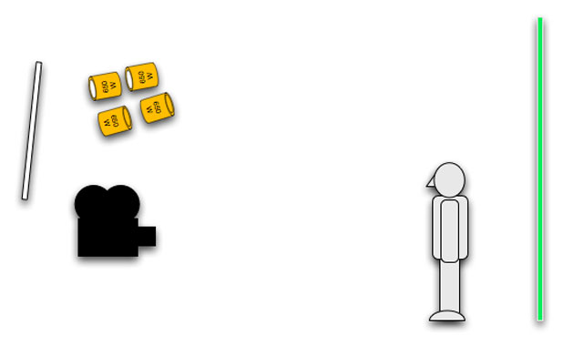
Side view.
The glow in the center of their faces is beautiful. Just imagine what that would look like if you filled a shot that way: you’d have both the directionality of the key and softly glowing skin from the fill. Even if the key is temporarily blocked by a moving person or object the fill light takes over nicely.
PROS:
Soft light from near the lens axis looks natural and makes faces look their best.
CONS:
Fill light has to follow the camera around as it changes position.
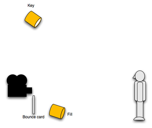
Bounced fill from under the lens.
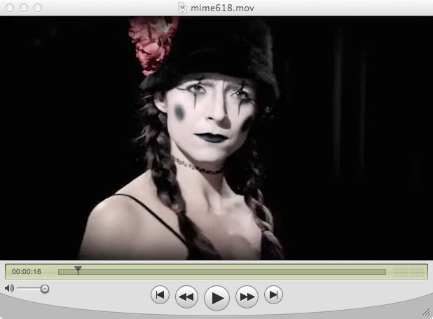
Here’s an example from a music I shot a while back. Here we see the key lighting the actress’s face (casting the nose shadow along the smile line), with the fill source lighting the shadows:
And here’s what happens when she tilts her face so that her hat cuts her key light off her face:
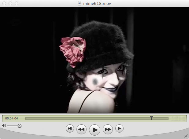
That beautiful hit in her eyes is a 2K bounced off a 2′ square white card directly under the lens. The edge of the card is almost touching the bottom of the lens. As the source is fairly small it did cast upward shadows, but they were so soft that they looked natural. Soft light from below, particularly from a big source underneath the lens (such as a 4’x8′ sheet of foam core) looks very much like ambient light that has struck the floor and bounced upward. The larger the source, though, the softer and dimmer the eye light, and sometimes a bright eye light is more important than softening a fill shadow. (Smaller, brighter sources cast harder shadows but create brighter eye lights. Large, soft sources cast indistinct shadows but are less visible in eyes.) Deep eye sockets can be hard to light, but a light placed under the lens will almost always reach into them.
NOTE:
I learn a lot about light placement in movies and TV shows by watching highlights in eyes during close ups. I can often tell the number of lights hitting the face, where they are in relation to the face (above, below, or level) and their approximate sizes. It takes a while to get a feel for this as the roundness of eyeballs tends to make large sources look smaller and the angle of lights can be exaggerated, but over time it’s possible to learn a lot about how other people are lighting by counting eye lights.
PROS:
Fill light is almost always seen in eyes so a catch light remains even if the key is blocked.
CONS:
Upward shadows, although under certain conditions this can look quite natural especially if the fill source is large.
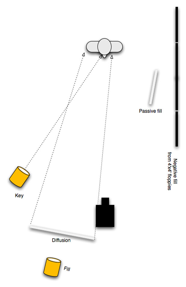
Moving the fill light to the key side works wonders. One of the problems of putting the key opposite the fill is that it creates a competing shadow, falling opposite the key, that can be distracting; but placing the fill such that it casts a shadow in the same direction as the key is much less distracting. There are lots of natural situations where this might happen, such as a room where there are a large number of windows on one side of the room. Each window casts its own light, but as the light sources overlap none of the shadows is strong enough to be noticeable on its own as each window’s shadow is usually being filled by other windows.
For some reason our brains seem to accept multiple light sources that all come from one direction more easily than from opposing directions. (Roger Deakins, ASC, BSC exploits this technique often, as he has spoken many times about lighting large exterior sets by lining up large numbers of specular lights on a nearby hillside and not needing to diffuse them to make them feel like one source.)
One of the reasons this trick looks so good is that it creates multiple tones on the talent’s face. The traditional key-on-one-side-fill-on-the-other creates two tones: one side of the face is bright and one side is less bright. Filling from the key side results in a highlight that transitions through many tonalities as the key wraps into the fill, and the fill wraps around into deeper shadow.

This frame, from a music video I shot for the band the Tiger Lillies, is lit by two light sources and one bounce: there’s a large source to the far right, another source from just off the right side of the camera (filling from the key side), and a passive bounce on the left that is dim enough that it doesn’t create a bright highlight. (A “passive” bounce reflects light that is already in the scene, whereas an “active” bounce is a bounce card that is light with its own light.) You can see the two large sources in the actor’s frame right eye, and the fill-from-the-key-side source alone is visible in his frame left eye.
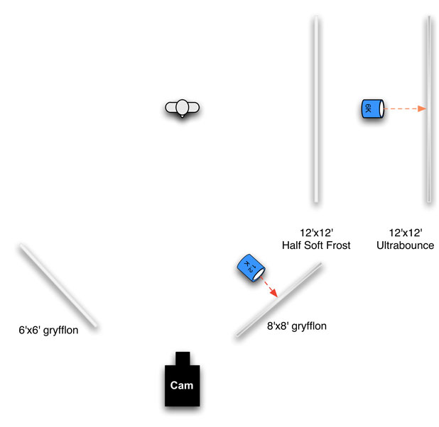
A diagram of the lighting setup. The half soft frost smooths the 12’x12′ bounce and makes the light appear more even across its surface from the subject’s perspective.
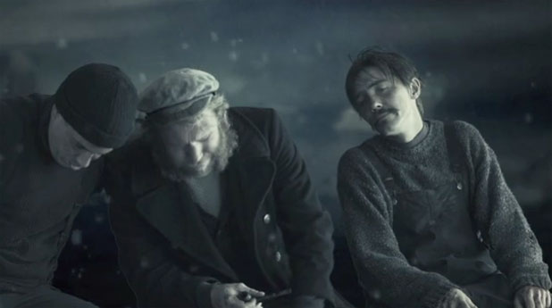
Another example using the exact same lighting setup. Note how the key light wraps around to transition into a darker tone created by the key-side fill, and then further around into darkness on the leftward facing surfaces. There are a lot more tones here than one would get from a traditional three point lighting setup or from simply putting the fill source over the lens axis.
It’s possible to fake the look of a much bigger source by using a soft fill from the key side. This can be handy when a large source would spill across the background, making it too bright, while a smaller source could be cut off the background. By defining the beginning and end of a large source it’s possible to emulate the look of a large key but with smaller, more controllable lights, put at the ends of where the larger source would be.
Filling from the key side works no matter where the light is coming from. If the key source is overhead, for example, then a fill light just above the lens axis will look very natural and “unlit” while creating a nice catch light in the talent’s eyes.
The trick with fill light is trying to find where to place it so that it does what you want without taking a lot of time to move it around. Time is always at a premium on set and it’s crucial to use fill light techniques to shorten setup time rather than increase it. In episodic television it used to be common to hang a space light over the set to create a base fill level, and then the key and fill lights would overpower it in the foreground while it gave some depth to the background. (Backgrounds are the hardest to light, because there’s always so much of it!)
Something I do a lot is to establish a key direction (soft light from a window or other source) and then build a big fill light that stays at the back of the set on the same side as the key. The farther the light is from the talent the deeper it will carry into the set and the more consistent in brightness it will be as actors move around.
Or, if the set is lit with a big enough source that I don’t need a specific fill light, I’ll only use one fill source on closeups to clean up faces. Ambient light can do nasty things to faces, creating dark eyes and accentuating wrinkles, so putting a fill light close to the lens just for closeups cleans a lot of that up.
I use a lot of negative fill, often because I don’t like what the ambient fill light in a room is doing to closeups. Maybe it’s too toppy, coming off the ceiling, or maybe it’s the wrong color due to a colored wall or carpeting. I’ll stand on the actor’s mark and look around to see what surfaces I see on the fill side that are radiating light (like a white wall) and then I’ll have the grips cover that with flags or duvetine. If the shot is wide then we may have to use larger solids farther back, but if I’m only worried about the closeup then we can use smaller flags closer and fuss less with the wide shot.
Sometimes the negative fill removes a little too much light and I’ll add a bounce card just to lift the shadows on the dark side of the face. I generally keep the bounce card as far in front of the subject as I can because, while a card alongside the talent’s face will catch more light, it may not reach into both eyes. If you want a harsher look, moving the fill light away from the lens axis can accomplish that.
The idea is to remove the ambient light that I don’t like and replace it with ambient light that I do like.
Sometimes it’s necessary to fill a deep set. This is occasionally easier than it sounds. If I’ve rigged a big soft source in one part of the set I can often add smaller fill sources from the same side of the lens axis to carry it deeper. These lights don’t have to be as powerful as the primary fill because the actors are probably still getting some light from the fill source, just not enough. If my fill reads T1.4 at the primary acting area, and T1.0 in the background, I only need to use a light that is half as bright as the primary fill to bring up that area. Here’s an example from the sitcom world:
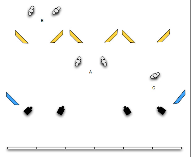
Back when I was a camera assistant, this is generally how sitcoms were filled: there was a row of 4’x8′ pieces of foam core across the front of the set, high enough that the studio audience can see underneath, and hung in front of them were dozens of small, cheap open-face lights. This created a very soft beautiful fill that reached a fair distance into the set. The “A” people are nicely filled by this source.
The yellow lights boost the fill levels deeper into the set, where people “B” need a little help. These lights can be smaller units because they aren’t creating all the fill, they are just adding to it. Even though they are usually smaller in size the shadows they cast are usually washed out by the main fill source.
The blue “wing” lights are to wrap the foam core source around the front of actors who are standing at the far edge of the set. Person “C” would be very dark on the camera right side if that far right blue fill light wasn’t there.
(Note that I’m not showing key lights, which would typically be placed facing the opposite direction as back cross keys.)
Something to keep in mind is that distance solves a lot of problems. For example, it might be advantageous to fill the background of a shot simply by bouncing a light into the ceiling for the wide shot and then adding a fill light closer to the lens to wrap that light around faces for coverage. I’ve even filled with hard light at a distance, putting a tweenie directly over the lens and aiming it at someone in the distant background. If the light is directly over the lens it will cast a minimal shadow, and if the person you’re filling is far away from the camera and small in frame that shadow will never be noticeable.
Another interesting trick is coloring the fill light. This can be done in film cameras by pre- or post-flashing the film or using a device like the Lightflex or Panaflasher, both of which change the color of the shadows only. It can also be done simply by putting a colored gel on the fill light. This has the effect of lightly tinting the highlights and creating much more saturated shadows, and can be a great way to create mood. Just be careful not to use colors that compete with the set or wardrobe (filling a blue set with warm light) as the effect may be completely lost or distort other colors, and don’t dig yourself into a hole by finding that you now have to recreate that look for a sunlit day exterior. It is most definitely an option, though, and one I use fairly often. I’m shooting a spot in a darkened restaurant this weekend and I’m going to make the fill light warm and slightly red for a romantic and cozy feel. (I’ll probably use full CTO on the fill, and since HD cameras tend to see warm light as slightly greenish I’ll probably at 1/4 minus green to make the light a little more salmon in color and less yellow-green.)
Turn the page for lots more pictures, which a short description of what’s going on in each shot…

This still is from a corporate project I shot a long, long time ago. It’s about corporate espionage, and I wanted to create a moody look while being able to relight quickly for closeups and such. In this shot the key light on the woman was an open-face tungsten unit, probably a 1K, pushed through a 4’x4′ frame of Lee 129 diffusion. Lee 129 is very, very dense stuff, and I love it because the diffusion becomes a very flat even source that’s wonderfully soft and wraps around anything. We also hid 4’x4 tube Kino Flos along the walls above the bar, where the wall meets the ceiling, as a general soft back/side light.
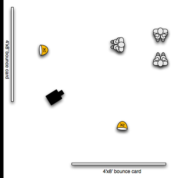
This is a diagram of the fill units only. (There’s a third person, on the left, that isn’t shown in this frame.) This setup created a soft even base light that was very flattering to everything it saw. There’s something about a large diffuse source at camera or head level that creates a very flattering flatness. I don’t know how else to describe it, other than to point back to this example:

The highlights in the center of round objects is probably what makes this technique shine (literally).

In this example, the key is also the fill. (Key and fill are kind of arbitrary terms anyway. I hate using them to describe lighting plots because they are a bit formulaic, and lighting is anything but formulaic.) The foreground actor is lit by a Kino Flo Vista Beam laying on the ground to the right of the camera and aimed through a frame of light diffusion. There’s a vertical 4’x4 Kino Flo hidden behind the window frame to the right adding sidelight, and the guy in the background is lit by a 1’x1′ LED panel.
This is an excellent example of keeping all of the lighting on one side of a person’s face. The Vista Beam is filling from the right side of the camera, the Kino Flo edge is also on the right but further around… it all blends together very naturally and creates a very striking image. I especially like how the low fill strikes the actor’s face: it feels very natural, as if light is bouncing off a floor or desk, yet the contrast and desaturation make this “portrait” appear very ominous.
You can read more about this project here.

In this case there’s fill coming from two directions: through an 8’x8′ grid cloth rigged behind the camera, for the almost shadowless fill lighting the boy, and another massive 12’x20′ bounce off the right side of the set that you can sense on the back wall. (The 8’x8′ grid behind the camera is a little offset to the left to bring some modeling and shadow to the boy’s chin line and ear.)
This project was shot on a Phantom at 1000fps so using big sources seemed like the right thing to do: we needed 1000fc just to get to a T2, so lining up a lot of very bright lights and bouncing or heavily diffusing them gave us a nice base level that only required occasional bright accents, like the additional soft light on the girl’s face or the back lights on the dog and the curtains.
You can read more about this project here.

This project you won’t read about anywhere, as it’s totally top secret. I can’t tell you anything about it other than how we lit it. This project required two angles, shot at the same time:

And the layout (of the chimeras only; back light was a dimmed 2K zip, and there were specials on various background objects):
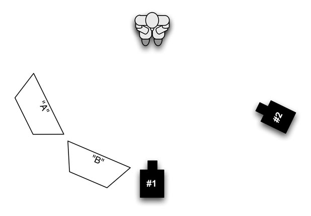
The solution was to use two medium chimeras, nearly side by side. The “A” chimera created a fair bit of modeling for the front camera, and became an edge light for the side camera. The “B” chimera was to the right of the first one and was fill for the front camera angle and a key for the side camera.
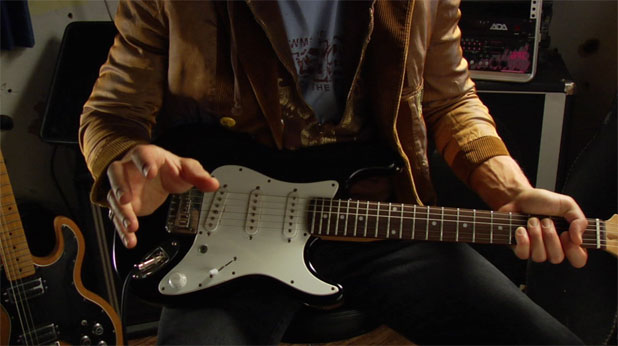
The next three images are all from the same project, a low budget piece to lure financiers for a low budget feature. Shot on an HVX-200 and using a four-light Arri kit and some bounce cards, we did a lot with a little. The look is very much derived by filling from the key side.
In the first image, above, the key is a light bounced into a soft silver reflector off the right side of frame. This sidelights the actor’s right arm and left hand and makes them pop. The fill, which is bounced from just to the right of the lens, wraps that light around and fills in the shadows subtly but beautifully. All the shadows in the shot come from the same side of the camera, which I find to be a very interesting look. There’s something magical about hiding multiple shadows by making them fall the same direction: they blend instead of compete. This isn’t always desirable, and sometimes a large soft fill from opposite the key side is necessary, but I really do like the fill-from-the-key-side look.
There’s also a silver reflector hidden in the back left corner of the room to edge light the left hand and separate the left arm from the back wall.
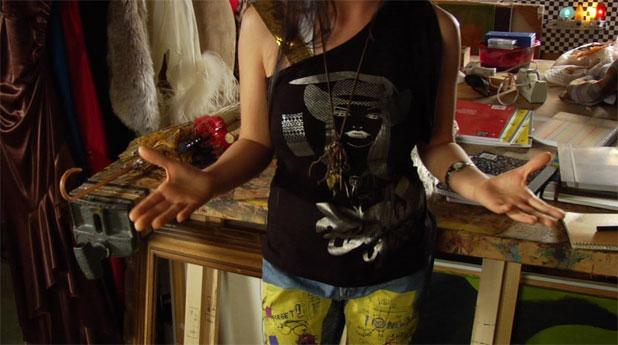
This shot uses much the same approach: a light is bounced off a silver reflector from frame left that rakes across the actress’s body, creating highlights on her arms and texture in non-black clothing like her pants. The fill is from the left side of camera and is probably a small light bounced off 4’x4′ foam core. There’s another bounce light coming from the right rear of the shot to give her a little edge light while also illuminating and bringing out textures in the background.
Look at all the tones on her left arm, starting with a nice highlight and wrapping gradually around into darkness. The detail on her frame left hand is amazing: thumb and forefinger are nicely side lit, and the fill accentuates the creases in her fingers and the palm of her hand. This is where the height of the fill can make a big difference. Fill above the lens is very different from fill at lens height, and fill from below the lens does different things yet again. It’s important to look at the shot and decide what’s important, and in this case–where I don’t have to worry about perfectly lighting a face–I can instead focus lighting to emphasize textures and volume.
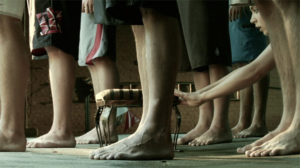
This was a very, very simply lit shot. The swimmers are facing a roll-up door and are lit by soft skylight, but because the roll-up door is next to a wall the skylight can only reach them from the side and behind. Added to that is a single 1K open-face tungsten unit, uncorrected, that highlights the stool. Once again all the light is coming from the same direction, but the fill is much farther around the side than normal. (We could probably call it a soft key, with the tungsten accent light really a back light. Think about it however you like; it’s not important what you call the lights as long as you get them to work for you.)
You can read more about this project, and see lighting diagrams, here.

The last example I’ll offer (for now) is this one, where the key is effectively fill. This was a project launch video for Microsoft’s Zune and we shot a bunch of actors bouncing up and down on a trampoline holding Zune mockups. As I had no idea what the actors would do while in the air (they didn’t know either until they did it!) we put a 12’x20′ bounce below the lens, with the top of the bounce immediately under the lens for more vertical wrap. Then we put bounces in the rear corners of the stage to create the soft highlights on either side of the actors’ faces. Soft light from the lens axis can look very smooth and glamorous but might appear a little flat and dead in situations where, like this, the background is brighter than the foreground. The additional highlights prevent this shot from being boring, but the soft light from near the lens gives it a subtle “fashion model” beauty.
Conrad Hall, ASC used to speak about “room tone,” not in the context of sound but in the context of lighting. He espoused the theory that there is always a base level of light coming from somewhere in a room that sets the tone for the scene, and part of his lighting process was to find that spot and put the appropriately-sized source, of the appropriate intensity, in that spot.
I’ve not quite reached the point where I can find that spot and then not move it when the camera angle changes drastically, but it’s a goal I’m shooting for. For now, though, placement of the fill light is currently of the utmost importance to my lighting technique. While the fill light is -only- lighting the shadows of a scene it is equal to the key light in importance when defining the look, feel, mood and glamor of a scene. Where you hide the fill light, or whether you hide the fill light, makes a huge difference. Where you place it can make or break how the actors look on camera. And having a small mobile fill light can make or break a day by allowing you to clean up closeups quickly without having to move any other lights. It may only be lighting the shadows, but shadows are half of any picture.
Art Adams is a DP who likes to live on the dark side. His website is at www.artadamsdp.com.

Filmtools
Filmmakers go-to destination for pre-production, production & post production equipment!
Shop Now


