In this redesign of PAX TV’s on-air look, the primetime promotional end caps are filled with light and translucent shapes. Simple flat characters and shapes were exploded and hit from a number angles with different-colored lights. Multicolored light rays add dimension and energy. (creative director: John LePrevost of LePrevost Corporation; art director/designer: Wendy Vanguard of Manna-Design; realization: Chris Meyer of CyberMotion)
Because of either lack of time, or simple Fear of the Complex and the Unknowwin, many editors and 2D graphic artists resist learning how to use a 3D program. And that may be unwise. More graphic design is incorporating 3D elements – from the ubiquitous extruded flying logo, to cool lighting effects, to wireframes of simple geometric shapes added as visual spice. Your clients may not even know this is “3D”, but they know it’s a look they want…and if you can’t supply it, they’ll look for an artist who can. Don’t worry – you don’t have to create Toy Story 3 single-handedly – but some basic skills will more than pay back the moderate effort invested.
There are many solutions that give you limited variations of 3D inside your normal 2D environments, such as plug-ins that add 3D text or objects to After Effects or various editing packages. Some 2D compositing applications such as After Effects, Motion, and combustion, also allow you to animate planes of graphics in 3D space and to move a camera around them. These are indeed useful, and provide enough 3D for many jobs, but rarely do they offer the power and flexibility of a full-blown 3D program.
For those new to the field, the first two pages of this article will cover some of the basic concepts that make 3D different than your normal 2D programs. I’ll then go over a trio of real-world case studies from our vaults that feature relatively simple 3D: They don’t feature any dinosaurs or pod races, but neither could they have been pulled off as effectively in 2D alone. The concepts explained here can be carried over to virtually any 3D program.
3D: The Lay of the Land
I don’t want you to be intimidated by 3D, but I do admit that the field is deeper and more complicated than can be explained in a single article. Fortunately, there are literally hundreds of books out there that can help – either in general, or with specific lessons and advice for the program of your choice.
To get you started, the following is a list of concepts of how 3D varies from the 2D or editing programs you’re already using:
Depth and Movement
The primary advantage of 3D over 2D is that it has an additional dimension: depth (sometimes referred to as Z space, for the third axis in the traditional X/Y/Z coordinate system). In addition to left/right and up/down, you now have front/back, with objects automatically scaling themselves as they get closer or farther away.
Working in three dimensions initially takes some mental calisthenics, but a lot of advantages naturally fall out from it. For one, objects at different distances will automatically multiplane as you move past them. They also have depth: you can turn them on their side and they don’t disappear, unlike many psuedo-3D implementations in 2D programs.
 The other mental exercise required by 3D is that not only can the objects move, but so can the virtual camera that “sees” the object. If you’re only used to moving objects around a video frame, you can get yourself tangled up real fast if you try to animate both the 3D objects and the camera at once, with the objects seemingly wandering out of view. Try to restrict your first animations to either keeping the camera stationary and moving just the objects, or arranging the objects into a stationary arrangement you like and then moving the camera around them.
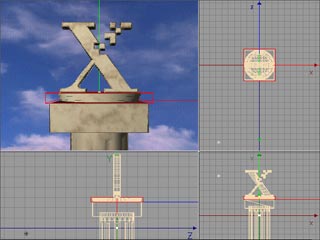
Moving in three dimensional space also means you often use more than one “view” – such as from the front, the side, and the top – to really see what is going on with your motion paths, especially if you’re moving in Z space. Most 3D programs tend to be flexible in letting you set up these alternate views. An example of this may be seen in the figure above.
Timeline & Keyframes
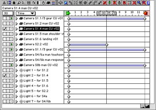 All 3D applications we’ve used have a timeline and keyframes, similar to what you’re using in 2D compositors or to keyframe effects. There’s just a lot more parameters that can be keyframed: Z position for starters, but also all kinds of information about the surface of the objects, plus how they may scale or deform. Many of these parameters may be hidden initially from the user. The figure at right is an example of this: Only the location of keyframes are shown; you have to twirl down the arrows to the left to reveal the individual properties.
Those used to After Effects’ easy access to velocity curves will dislike how 3D programs often hide them in a separate “function curve” window; those moving over from programs like Discreet’s combustion will be more used to this concept. Some 3D programs also lack the option of entering precisely the amount of ease in/out influence you want; you might have to add more keyframes to get the speed curve you need.
Another area of frustration can be in attempting to trim and fade objects. In some applications, a 3D object will hang around the entire duration of the project, unless you explicitly edit its visibility to turn on and off at certain frames. Fading objects can be trickier too: sometimes just changing its surface color to black or turning down the lights works, but it will still be there in the alpha channel, which can cause confusion later. There’s also a difference between “transparent” (as in glass) and “invisible” (as in gone), again with the result often being visible in the alpha.
If you need to do traditional video-style editing on 3D objects, it is often better to render them as individual elements, and then edit and fade them in another application. Indeed, it is good to employ scene-based storytelling techniques with 3D; too often, beginners go for overly-long, continuous camera swoops simply because they’re so easy to do in 3D.
Texture & Light
These are the areas that I personally enjoy most about 3D. In most 2D applications, every object or layer is usually “lit” evenly, and any text or simple shapes you create default to perfectly smooth, even color. But that’s not what happens in the real world.
If you don’t have experience using real lights, virtual lighting can be one of the biggest challenges to learning a 3D program – but if you do, you’ll find 3D far more flexible than most lighting tricks available in 2D programs. By using lights, you have a much wider range of moods you can set by focusing on individual areas, or just “brushing” an object with light. The figure at right is an example of a simple, flat logo that has been made far more mysterious by focusing a pair of spotlights on relatively small regions of the semi-transparent letters.
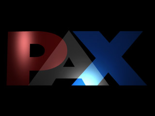
Virtual lighting in 3D encourages artistic experimentation in setting moods, even on these three simple solid-colored letters. The “P” also has a slight bend deformation along its face, to allow the light to play off it in a more interesting fashion.
Most 3D objects default to the look of smooth, white plastic – not a big improvement over the solid colors in 2D programs. However, all 3D programs allow great latitude in how you “texture” the surface of your objects. You can either apply a texture map, which can be a still image or movie of the type of surface you want your object to have, or use a “shader” which automatically calculates building-block style textures, such as clouds, bricks, or surface grain. Both texture map libraries and shaders are available from third parties, akin to stock footage and plug-ins for 2D programs.
Avoid the temptation to use textures that resemble shiny gold or blobby day-glow psychedelics; they’re sure marks of a beginner. Quite often, I choose only a simple color for my objects, and then add a “bump” map which modulates and diffuses the light that hits the surface to make it look like it is rough or has a pattern. Another underused, understated trick is to manipulate what’s usually called the “diffuse value” of a surface, which decides how much light is absorbed or bounced back at various points across the surface. Applying a grime map or even a simple cloud shader, you can age a surface nicely for added realism. (For more on this technique, we particularly like the Surface Toolkit from dvGarage – it’s the first texture library we load up for every job.)
Modeling
Perhaps the scariest thing about learning 3D is learning how to build the objects that will populate your virtual worlds. Some dedicate their careers to the art of building 3D models. But even though knowing how to model is a definite plus, there are shortcuts.
A large amount of simple 3D consists of bringing in text or EPS outline art, and extruding it into 3D models. Fortunately, most programs have this ability built-in. If not, you can buy a plug-in or application that does this; Zaxwerks’ Invigorator Pro is one of the most popular for After Effects users, while their ProModeler is a stand-alone application for other users. Most 3D programs also make it easy to create primitive shapes, such as boxes and tubes.
A secret weapon to add to these is to learn your program’s deformation tools, which allow you to bend and warp your models. The letter “P” in the figure above shows a common trick of adding a slight bend to the surface of an object: light plays across it in far more interesting ways than perfectly flat objects. Some of these techniques were covered in a previous column.
And just as you can buy stock footage of shots too expensive or impractical to get yourself, several web sites act as clearing houses for 3D models, such as TurboSquid and 3D Cafe. Also don’t rule out hiring someone who has dedicated their career to the art of 3D modeling – this way, you end up with something custom, and most appropriate for your job.
Rendering
The biggest gotcha of 3D is the time it takes to render a scene. If you thought a few seconds to render an edit transition was painful, wait until you experience a few minutes per frame for a high quality, moderately complex 3D render. This means you will probably need at least one more computer, so it can render while you get work done on your main workstation. In the meantime, plan your renders for overnight.
A related gotcha is the plethora of render settings you have to understand. Virtually every 3D company claims they have the fastest renderer, but most of their comparisons are at their default lowest quality settings – which are often unacceptable for broadcast work. If you see moir© patterns in the textures and crawling dots along the edges of your objects, you’ll need to increase your oversampling and/or anti-aliasing settings to smooth them, with a corresponding hit in render times – indeed, the idea behind oversampling is to create an image two to 32 times larger than needed, and then scale it down to the requested size in an effort to average out these artifacts. These setting usually have much finer increments than the typical “draft” and “best” in a 2D program; run test renders to see the best balance between quality and speed before rendering the entire scene.
Most 3D programs also have a choice between different rendering algorithms. The “Phong” algorithm is a great balance between quality and speed. The downside is that reflections between objects in a scene do not automatically occur with Phong – you will need to step up to “raytracing” for that (again, with a corresponding hit in speed). Different programs also have different subjective rendering qualities, even when using the same settings and algorithms – this is one of the reasons we personally use multiple 3D programs. Use your eyes, and not the manufacturer’s spec sheets, to decide what works for you on a particular job.
Parts of a Whole
The last area of initial confusion is that the separate tasks involved in completing a 3D scene – modeling, animation, and rendering – are often separate programs that are part of a suite. This is initially even more frustrating that having the CG program separate from your editor; there certainly are advantages to integration. However, this can be a strength down the road, because you can use different modeling or even rendering packages if you are uncomfortable with the tools provided by the main program you bought.
But enough theory – let’s get on to some case studies!!!
Project 1
Rotating Logo: Xerox Comdex
The most common applications for simple 3D are either extruded text, or the ubiquitous “flying logo”: a client or show’s name converted into a 3D model, flown across the screen or down into place, often with enough perspective for you to see that it has actual depth. The term flying logo occasionally has derogatory connotations, suggesting something cheesy (cheesy is easy to do in 3D, unfortunately), but in reality a broad range of motion graphic design employs them.
We had the opportunity to create a twist on this theme for Xerox Media West. Xerox’s recent television ad campaign was based around the concept of Greek gods – led by John O’Hurley – helping mere mortals solve their document problems. They wanted to carry this theme over to every aspect of their appearance at COMDEX, a major technology industry trade show – right down to the video monitor countdown before another stage presentation. Originally we thought we would create a flying logo animation for this, but decided instead to go for something more architectural.
We started with a column from one of our pre-built libraries, and added a simple box shape on top with beveled edges to serve as the face for our counter. We then added Xerox’s distinctive “X” on top, and rotated it for visual interest. To accomplish this, we extruded an Illustrator version of their logo in Maxon Cinema 4D. To give the X something to rotate on, we crafted a turntable by creating a circle in Illustrator, and extruding it with a complex bevel profile in Electric Image using Zaxwerks’ Invigorator plug-in mentioned earlier.
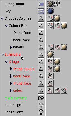
This collection of models and shapes was assembled, scaled, and positioned to fit in Cinema 4D (see the figure below). Most 3D programs are able to exchange basic models; we often use the .obj format. Texture mapping the objects was fairly simple: marble from the Artbeats Marble & Granite library, a ground texture from KETIV Just Textures to serve as a bump map to roughen the beveled edges, and a sky movie from Image Shoppe edited to loop every 15 seconds.
Building a set in Maxon’s Cinema 4D, from bottom to top: the column came from a commercial library; the box is a simple primitive made in Cinema, the platter was at the time created with Zaxwerks’ Invigorator inside Electric Image (we would now do it inside After Effects) and imported into Cinema; the X was the result of extruding Illustrator artwork inside Cinema. This screen shot is representative of a typical 3D program, with alternate views of the scene to add arrangement, numerous tool palettes, and windows to manage the objects and the textures applied to them. (Click on the image to see the full project window; it will take a sec…)
Cinema 4D has a raytracing renderer, which meant we could have the sky reflect in our marble. We toned down the strength of these reflections to avoid that cheesy look; instead, it just gives some additional motion along the surface. (These reflections also turned the marble more blue than we wanted; we had to color-correct our texture back to the desired tone.) The X and its turntable were keyframed to rotate once every 30 seconds, giving us a nice loop we could chain together for as long as necessary.
We transfer parts of the work flow from 3D to 2D whenever we can, both to save time and gain more control. In this case, the countdown and supporting text on the face of the column’s box was actually created inside Adobe’s After Effects using a variety of effects, including Alien Skin’s Carve. This resulted in an overall time savings, since we only had to render the 30 second loop in the much slower 3D program, instead of the full five minutes of counting. The final result can be seen below:
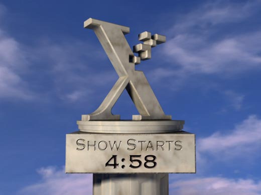
The final scene, rendered with ray tracing turned on to get highlights of the sky onto the marble. The numbers and letters on the face of the box were actually faked in After Effects, to save on overall rendering time. The rough-hewn edges on the X and box are the result of a “bump” map in the texture, not of tedious modeling.
Project 2
From Print to 3D: QAD Explore 2000
There was a time when “industrial” graphics meant lower quality than broadcast. This is often no longer the case: Clients expect the same quality they see on TV. As a result, many corporate videos for trade shows and other special events have budgets similar to broadcast show opens. Additionally, we often find we are given greater creative free rein on these jobs.
For several years, we have created the video that opens the worldwide user conference for enterprise software company QAD. The creative brief is to reinforce the messages the company tries to get across in their ads and brochures, involve their customers in the audience, and to crank them up before the keynote speech.
We typically use the client’s print materials as starting points. A lot of the imagery in these are created in Illustrator, but have false perspective added to create more of a 3D look. A few years ago we started moving this imagery into actual 3D space, to the positive response of our client.
![]() When creating corporate graphics for a trade show, we like to start with elements from the client’s brochures and print ads. The image at right is an example from a then-recent brochure. This shows the various faux-3D icons already used by QAD, plus their theme of connectivity. The icons (designed by Ridgely Curry & Associates) denote different parts of the supply chain, including corporate headquarters, manufacturing, and distribution.
When creating corporate graphics for a trade show, we like to start with elements from the client’s brochures and print ads. The image at right is an example from a then-recent brochure. This shows the various faux-3D icons already used by QAD, plus their theme of connectivity. The icons (designed by Ridgely Curry & Associates) denote different parts of the supply chain, including corporate headquarters, manufacturing, and distribution.
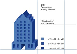 Many clients have style sheets for their logos and icons that include original outline artwork and color guides. Indeed, QAD supplied the individual icons as Illustrator artwork (see left). We removed the outlines that created the forced perspective to leave just the building faces, imported them into Cinema 4D, and extruded them so they would have actual depth (also seen below).
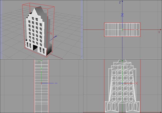
These building faces were then extruded into “real” 3D in Cinema 4D. The frontal view in the lower right shows outlines of the polygons (facets) created by Cinema to realize this model.
To keep things fresh, we gave these icons a different graphical treatment each year. For their 2000 user conference, we left them slightly transparent, gave them the same surface color as used in the brochures, and used Electric Image’s “polygon edge” outlining feature to get a wireframe look superimposed over the normal buildings. A touch of glow was added later in After Effects to complete the Tron-influenced look.
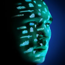
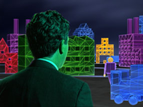
QAD also developed a series of print ads where they projected these interconnected icons onto the face of people (see the figure below left), to convey the idea that their customers could enter this digital space to manage their enterprise. We decided to echo this idea by placing the talent from the ads into our 3D world. That initially sounds way beyond basic 3D, but it wasn’t that scary; it came down to staging a bluescreen shoot, and compositing the keyed talent into a render of our 3D world, as seen in the adjacent figure below above.
That bluescreen shoot was indeed another area where we pressed a 3D program to service. We created an animated storyboard before the shoot by taking some simple human models from a pre-built library (as seen below), placed lights, and animated moves such as pushing in on or rotating around the talent. We edited together these renders so the client could sign off on our concept before the shoot, and brought a Powerbook with QuickTime movies of the individual shots to the set so everyone knew exactly what we needed to capture.
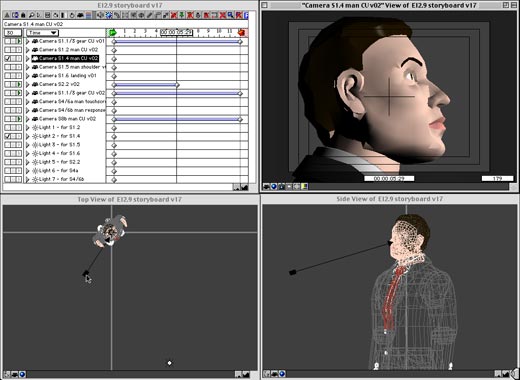
Before the bluescreen shoot, we storyboarded all the scenes in 3D using simple models. The client signed off on the storyboard before the shoot, which also provided us an excellent guide on the set. The upper left shows part of the project window from Electric Image, where we created a separate camera animation for each scene we needed.
Bits from the final project are shown in the video at the left. Although it looks rudimentary by blockbuster motion picture standards, the client as well as their audience were thrilled. So, to reinforce: Learning “just enough” 3D can be enough to wow your industrial and corporate clients, as well as get them to go for increased budgets (as was the case on this job).
Project 3
Filled With Light: PAXTV Primetime Promos
One of the side effects of a 500 channel universe is the need to make a viewer stop when they surf to your channel, and get them excited about your lineup once they’re there. Strong promotional graphics is one tool to accomplish this. PAX TV was one of the many networks who redesigned their on-air look to try to cut above the noise (alas…).
We were sub-contracted by the Leprevost Corporation to execute Art Director Wendy Vanguard’s design for the primetime promo elements. The design brief was to give the impression of lots of radiating, prismatic light with a touch of mystery, along with motion and perspective. In this case, we relied heavily on lighting tricks using Electric Image, along with 3D animation of otherwise flat elements such as text.
 In the figure at left, notice first that the large background “PAX” is not filled with a solid color, but has lighter and darker areas. The letters were created by again using Zaxwerks’ EPS Invigorator for Electric Image. The surfaces were given normal colors, but each letter was made semi-transparent, and lit by a set of spotlights that had narrow cones and soft, overlapping falloff regions. The letters unfolded onto the screen and then animated apart slowly, causing the stationary lights to seem to play across them. The 3D camera also rotates slightly up and around all of the elements, furthering the hint of 3D perspective.
Numerous component layers were rendered from Electric Image, each with the same camera animation so their moves and perspective were matched. These were then blended in After Effects with a variety of masks and transfer modes. In some cases, the elements (such as the slogans) were simple white letters or shapes, which were then used as mattes for other elements.
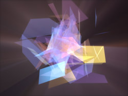
For example, the figure above and on the left is a frame of animated colored glass shards that were created by applying a shatter effect in 3D to a simple pyramid. It was then hit with a number of colored lights, some of which were also set to emit “volumetric” light rays when they hit the shards. The result was mixed behind the letters and slogans in the final image, using the light rays coming off the main letters as a partial matte. This same element was then blurred (the figure on the right) and used as a fill for the various copies of the slogan “share the wonder”.
The final composite is shown in below. This is an example of a graphic that would have been very hard to finish inside a 3D program: Virtually every element is colorized, faded, masked by a matte, or serves as a matte for another element, with all these parameters changing over time. The 36 individual elements take over 20 hours to render for a few second promo, but because they are mixed in a 2D program, client tweaks could take as little as a few minutes. In the end, the combination of a 3D and a 2D application is often the best approach to creating cool final graphics.
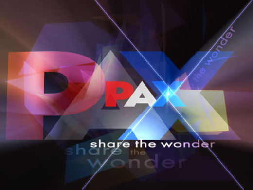
The final animation was composited in After Effects, which provided greater control over colorization, matting, and blending of the individual elements than could be achieved in a 3D program alone.
The content contained in our books, videos, blogs, and articles for other sites are all copyright Crish Design, except where otherwise attributed.
Filmtools
Filmmakers go-to destination for pre-production, production & post production equipment!
Shop Now
