Many of us talk about “the cinematic look” without defining what it is. Here’s my take.
For a Mother’s Day outing, my spouse, in-laws and I went to Filoli, one of the last country estates of the early 20th century and now a private park. The main attraction is the gardens, which are particularly lovely, but the old manor house is open for self-guided tours.
I’m not terribly interested in flowers, or manor houses, or self-guided tours, but I love creating images, so I use such trips as an opportunity to transform the sights into images that appeal to me. On this day I must have been in a bit of a dark mood, as I spent my time transforming this lovely estate into an images of a creepy haunted house and a lost bygone era.
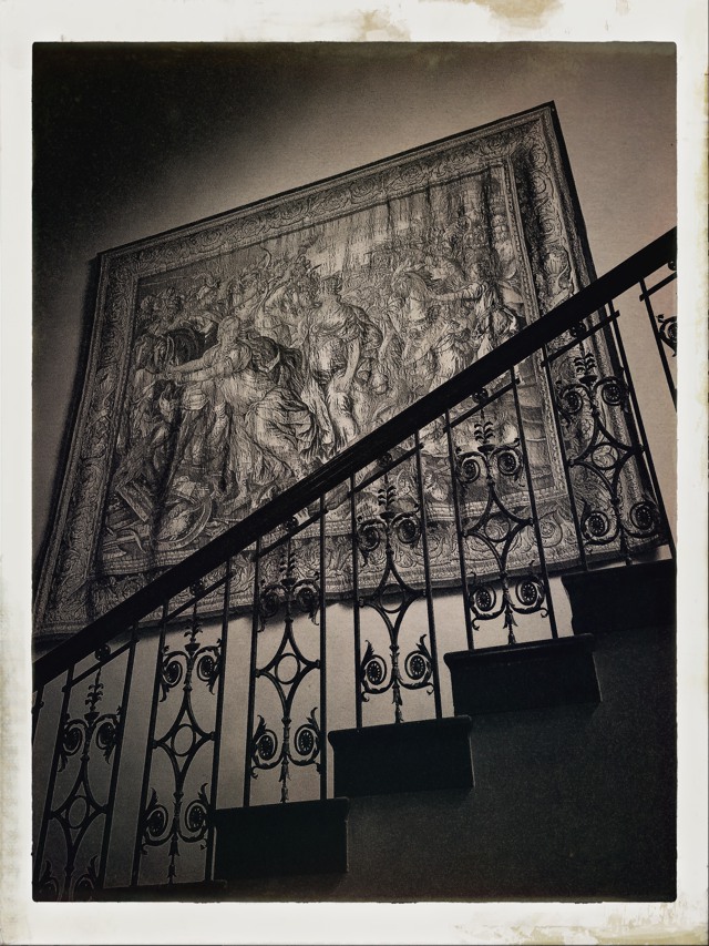
This is the image that triggered this theme:
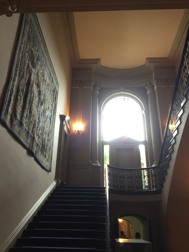
I snapped this shot spontaneously as I walked out of one of the nicer of the manor’s rooms. I felt the germ of something as I looked up the staircase, and it took me a second to figure out what it brought to mind. It was, of course, this fairly famous image:
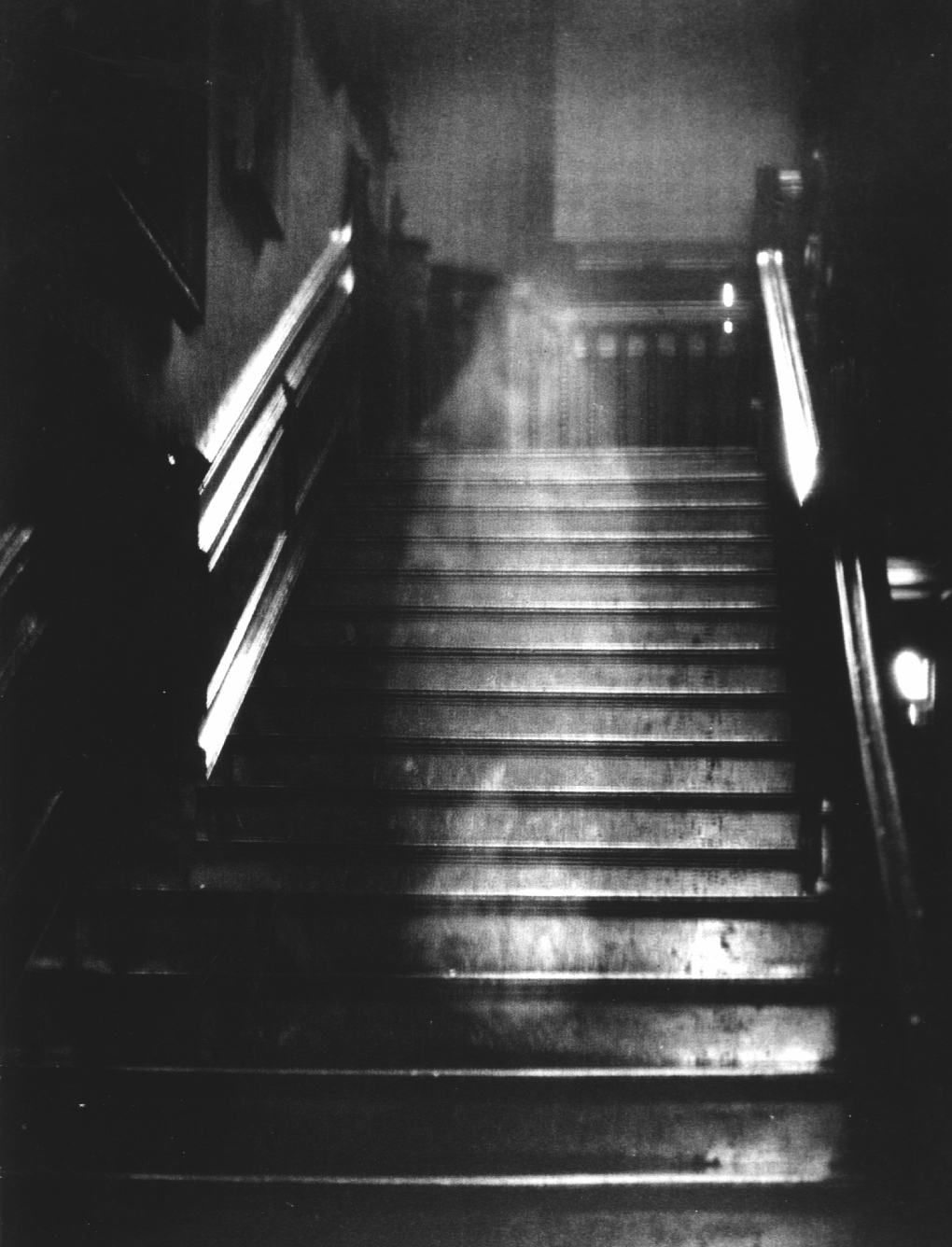
This is The Brown Lady of Raynham Hall. When I was a kid, this was one of the most famous “ghost photographs” ever taken. It’s clearly a fake, but most of the images I make professional are exactly that: fake. The trick is that fake images serve a purpose: they tell a deliberate story and evoke a specific mood. I love the mood of this image: it’s mysterious and other worldly, and the primitive photographic technology adds a layer of abstraction that makes me think, “You know, that could have happened, and the image is far enough removed from perfection that it almost feels more real.” If the base image had been shot on an iPhone it would hardly have felt as creepy… at least without a lot of manipulation.
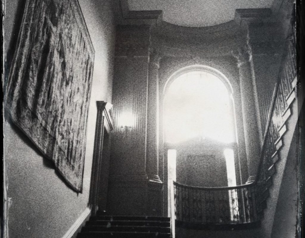
Have I mentioned yet that I’m a huge fan of Hipstamatic? No? Well, as soon as I looked up this staircase I knew what image I wanted to create, and Hipstamatic delivered in spades:
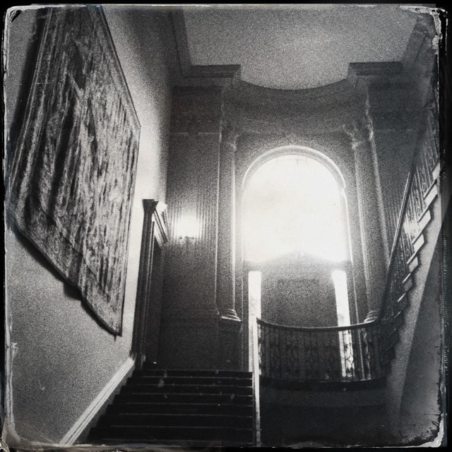
My image doesn’t have a ghost in it, but the mood almost invites one to appear. Everything about this—the softly blown-out window, the contrast, the lack of color, the “film grain,” and the sloppy border–adds a level of abstraction that becomes a story in itself. Out of sheer boredom, I transformed the image of a historical monument’s backlit staircase into a foreboding image of a haunted moment in time.
I love that. This is what I get paid to do: tell stories through images, and transform real places into fantasies that sell products. I rarely get to create anything so creepy in my commercial work, as there aren’t many products that are branded as “creepy ghostware,” but I love to transform places into images that reflect something that they aren’t. I do that at work all the time, and I also do it for fun.
There’s a power to the aged photograph that’s hard to communicate. It’s truly a moment lost to time, and there are questions surrounding it that will never be answered. I love stories that dwell on such things. One of my favorite TV mini series is called The Lost Room, and while it is fairly low budget the concept is powerful: one sunny morning in 1961, a hotel room near Gallup, New Mexico is torn from reality, and everything within it reappears possessing extraordinary powers. Some of the objects, such as the wristwatch, are benign: put an egg in the watchband and it will be instantly hardboiled. Some, though, are more interesting: touch the bus ticket and you will be instantly teleported to a deserted highway near Gallup, no matter where in the world you happen to be.
Why? No reason. Or whatever the reason, it’s beyond understanding.
In this scene, our heroes take one of these objects—a Polaroid picture—to the site of the lost hotel room, and discover that, through it, they can see how the room appeared just before it went missing in 1961:
https://www.youtube.com/watch?v=nTeh3Z8GBBc
I don’t find this series to be shot in a terribly cinematic way, but that scene gives me chills. Over the course of the show the mystery of the room is slowly revealed, and the fact that we can only glimpse what it once looked like through an old, wrinkled Polaroid picture adds enough abstraction that we are drawn into this image, willing to accept as real whatever it happens to show us. The very act of putting a frame around an image makes it abstract and draws us in. In this case, the frame within a frame is what grabs us.
For me, part of the process of making something “cinematic” is transformation: taking one thing and turning it into an abstract image that pulls the viewer away from reality and puts them into a visually constructed story with a strong point of view.
There’s been a trend away from this kind of abstraction, in the form of using documentary techniques to tell dramatic stories both in commercials, movies and TV. This has been an interesting experiment, and I’ve shot quite a lot of this kind of material, but my hope is that we can return to crafted storytelling sometime soon. Historically, audiences have responded more to abstract imagery than to realistic imagery, and while doc-style production is fast and easy I feel as if it is slowly losing its power. Even in its abstraction, audiences are seeing it more and more as realistic, and it’s becoming boring. Audiences, especially younger audiences, want to see images that are compelling—not necessarily real.
This is why we have Hipstamatic and Instagram. It’s also why I used used lenses that were between 50 and 80 years old to shoot a recent commercial project. The cleaner the images we can capture technologically, the more we yearn for images that had more character. (And when people say “character,” I usually translate that as “strong point of view.”)
Film is abstract by its very nature: you had to look past the grain and the softness and edges of the frame to see the story within. We still have the frame edges to work with, but digital is very clean and sharp. Sometimes that’s the right look, but other times… it’s nice to make a statement by affecting the image optically, in a way that you’d never see if you were viewing the same scene by eye. Reality is interesting when you’re experiencing it, but when an audience is watching a story through a frame, they want to see that story through a strong viewpoint that isn’t their own. That means making it appear visually less real while telling a story that feels more real as a result.
After I created a ghost story out of a staircase, I set out to show the house as it would have appeared in snapshots of the time in which it was built. I wanted to see how abstraction made modern images tell a distant story. Here are some more pictures, and then I have three videos to show that illustrate an aspect of “cinematic” imagery.
This snapshot felt like it could be interesting, but as captured it was too “real.” I knew, though, that with a little tweaking I could do something special with it.
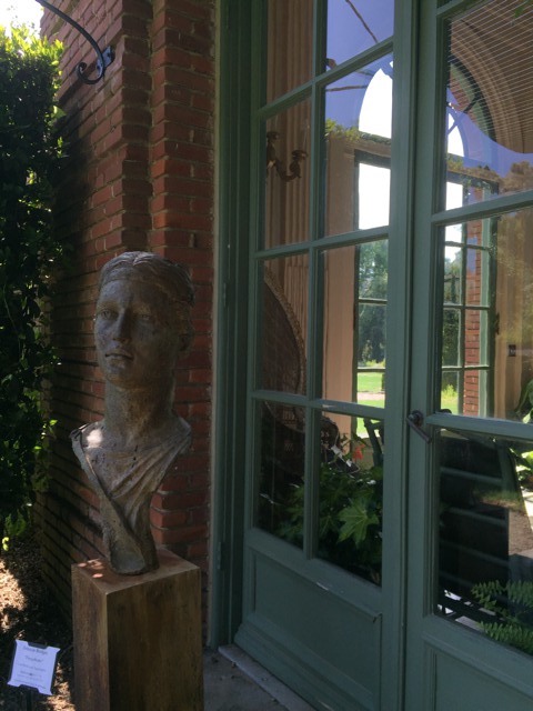
Transforming it into an image from another time made it much more compelling:
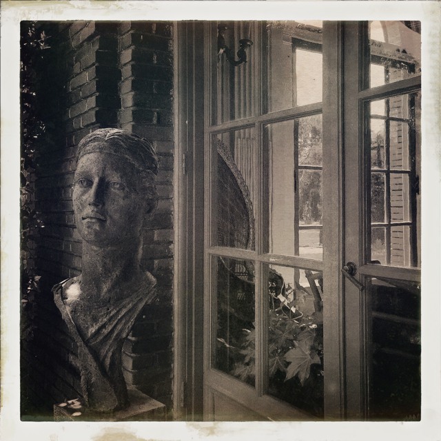
There’s a story here, and it is told both through its precision (the framing, the window panes pushing the viewer’s attention toward the stone head, the layers of depth within the image) and its abstraction (the sloppy border, the textured sepia “paper”, the “film grain”). By adding abstraction, I made a humdrum image into a compelling historical snapshot by embracing past limitations.
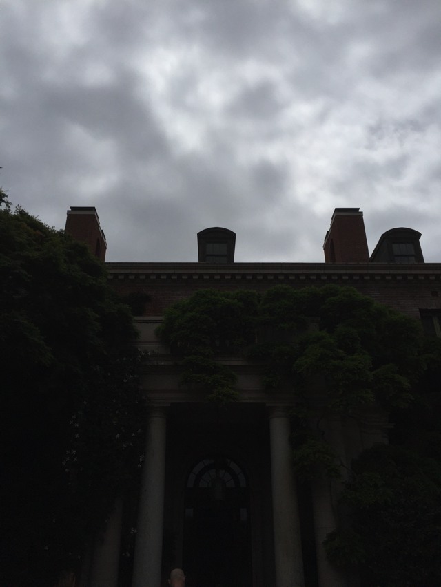
I snapped this shot as we approached the front of the mansion. It’s a very pleasant-looking building, but I found that boring. I did a little interpreting: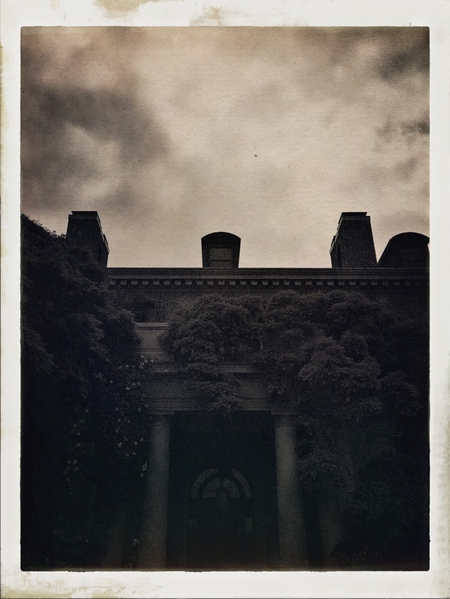
This feels a bit like a historical photograph that pushed the edge of the film’s technical boundaries.
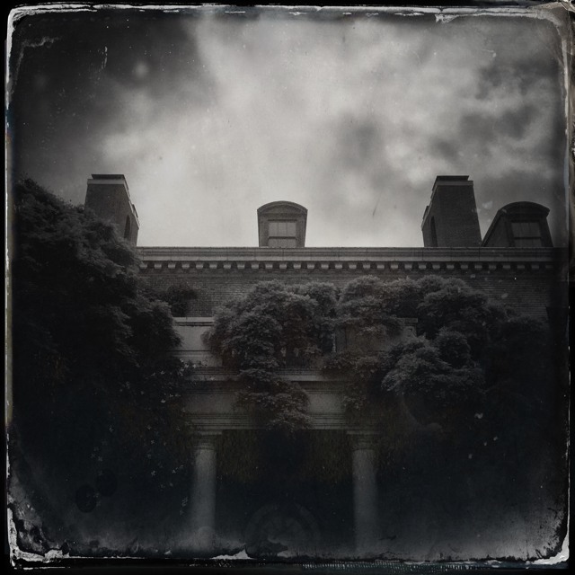
This image tells a different story. The image above just feels old, but this one feels as if it’s a moment of time that’s actually in the process of decaying, to be lost forever. The mood is very different. Also, the image above feels a little like a cheap postcard due to its soft contrast, whereas the image below has some “snap” and feels like a much more professionally crafted image.
Both are more interesting than the underexposed color photo I snapped with my iPhone on full auto, and yet I knew roughly what I wanted the final shots to look like when I captured the original image.
I wanted this image to communicate the feeling that someone from a distant time was just about to step into view of the mirror:
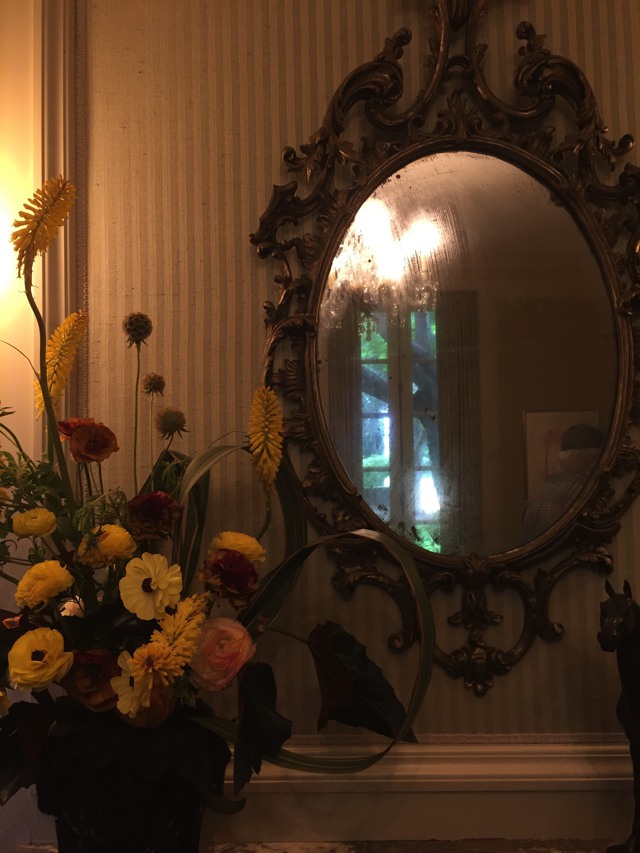
My iPhone is great for capturing quick shots on the fly, but not so good at interpretation. I did the rest in Hipstamatic:
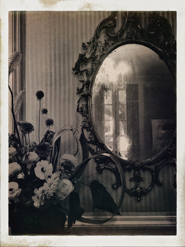
Now I’ve got a story. The fact that I’m showing only part of the mirror, while it is clearly the focal point, and the mirror is only showing part of the room, makes the image mysterious. The image doesn’t tell a story in itself, but it feels as if it’s about to tell one. That’s even more interesting.
This is not so much about showing what’s possible when shooting snapshots with an iPhone, but to show that one can impart mood by carefully removing an image from reality by removing it from reality, through a combination of lensing, framing, exposure and coloring. What’s more, one can decide on what one wants to do in advance and create photographs that will work even better for that particular look. For those of us who create compelling images to order, this is great fun.
Here are some other ordinary images that became interesting snapshots from another time:
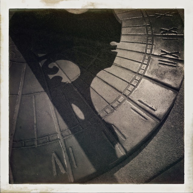
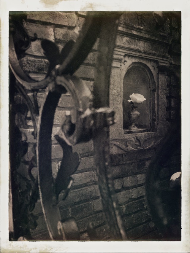
This last image was one of my favorites:
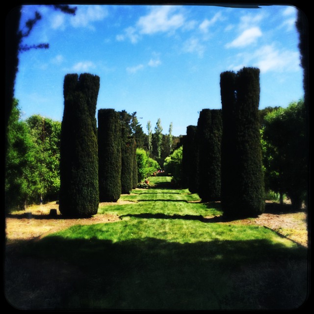
I couldn’t get the exact shot I wanted using the iPhone’s wide lens, but I knew that I could crop in a fair bit while dodging the branches I didn’t want to see at the top:
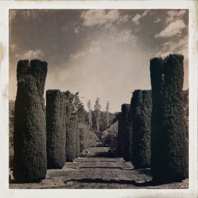
I was inspired to take this picture, and in a very roundabout way:
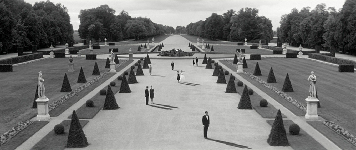
This is a frame from a film that, when I saw it in film school, had a profound impact on me: Last Year in Marienbad. This is a film that people either love or hate. I loved it, even though—ultimately—it is completely style over substance. Or, it’s whatever you want it to be: when interviewed about the film shortly after its release, the director and writer gave deliberately contradictory answers about the film’s plot, and never willingly explained what the film was about.
It’s extraordinarily pretentious, stunningly beautiful, abstract, and precise, all at the same time.
This is a beautiful cut down showing off this film’s imagery while eliminating much of its pretentiousness:
https://www.youtube.com/watch?v=lxXTIU3AxQ4
If you ever watch the movie, you’ll discover that there’s not much story there. Perhaps that’s deliberate. One theory about this film is that you’re meant to make of it whatever you will. My point, though, is that this is about as far from reality as you can get, and that just makes it more beautiful and compelling.
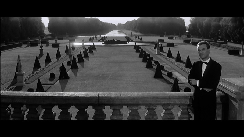
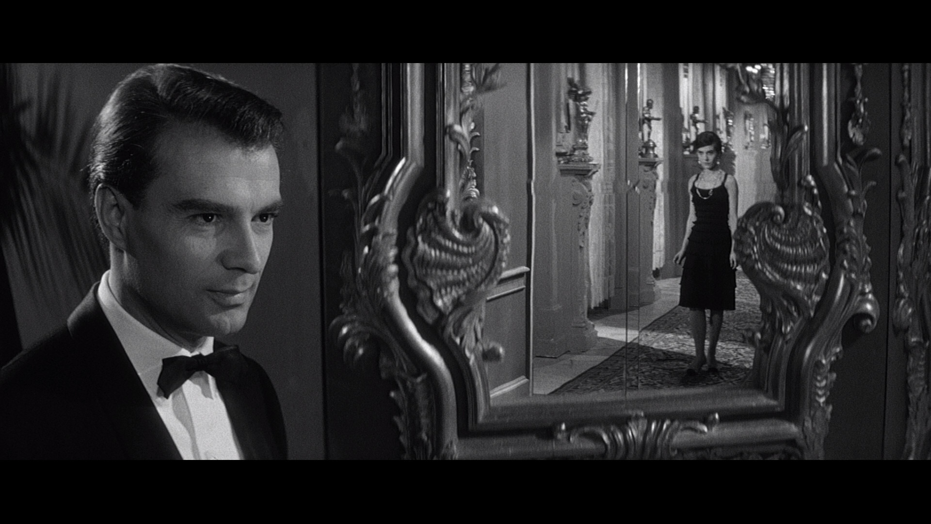
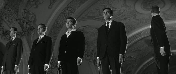
For me, this is cinematic. It’s very precise, very symmetrical, very constructed… and very wrong. It’s not at all like reality, but it’s an interpretation of reality where every frame tells the story in a cohesive way. This is not the only way to shoot cinematic images, but rather an example that shows that the most cinematic images come about when you figure out what story you’re trying to tell, distill it to its essence, and then create images from that essence.
While researching this article, I came across a music video that was inspired by this movie. Some creative soul then took that song and recut the music video using footage from the actual movie.
Here’s the music video:
https://www.youtube.com/watch?v=0DjHKqb365A
And here’s the recut version using actual images from the film:
https://www.youtube.com/watch?v=nVWqDPVu7pg
The music video is fun, but it’s not as good as the movie. Clearly it’s hard to follow in the footsteps of a modern work of art, but I tried to figure out what it was that drew me out of it. I think the answer is “precision.” The movie is very precise in its compositions and movements, to the point where the camera is disconnected from the “reality” it is capturing, and that makes the imagery extremely compelling to me. It’s as if the actors are on a stage, constrained to the movements of the camera, instead of the camera being constrained to the movements of the actors.
The music video doesn’t quite succeed in the same way. It is 85% of the way there, but the camerawork isn’t as rigidly precise. There are wide angle shots from head height, for example, where the foreshortening feels wrong, as if placing the camera at the same height as a person’s eyes for a wide shot was a bit too real and accommodating.
Cinematic images are artistic images. They are not reality, they are interpretations of reality. And, if you think about it, there’s no such thing as a “real” image: as soon as you put a frame around reality, you are imparting a layer of abstraction upon it that represents your point of view as a storyteller. I don’t see a good reason not to take that as far as possible, because that’s where the truly amazing visual stories live. That can mean distorting the image, or making it sharper, or moving the camera precisely, or shaking it a lot. What’s important is figuring out what this visual storytelling language is in advance and sticking to it.
Recently I shot a spot for a company where we captured images distorted by wine glasses held right up against the lens. It worked for the product and it looked great… and the abstract imagery makes the spot one that draws viewers right in. The distorted image tells a visual story that’s different and interesting, yet totally appropriate.
No matter whether we’re shooting spots, movies or TV, the question to ask ourselves is: why make this look “real”? It’s never going to be real, so why not push the limits? And, rather than shoot the story and find it later, why not find its essence and let that permeate every shot? That’s when “cinematic” truly happens.
“Cinematic” imagery is intentional imagery. Viewers don’t want to see reality. They want to see your reality.

Filmtools
Filmmakers go-to destination for pre-production, production & post production equipment!
Shop Now