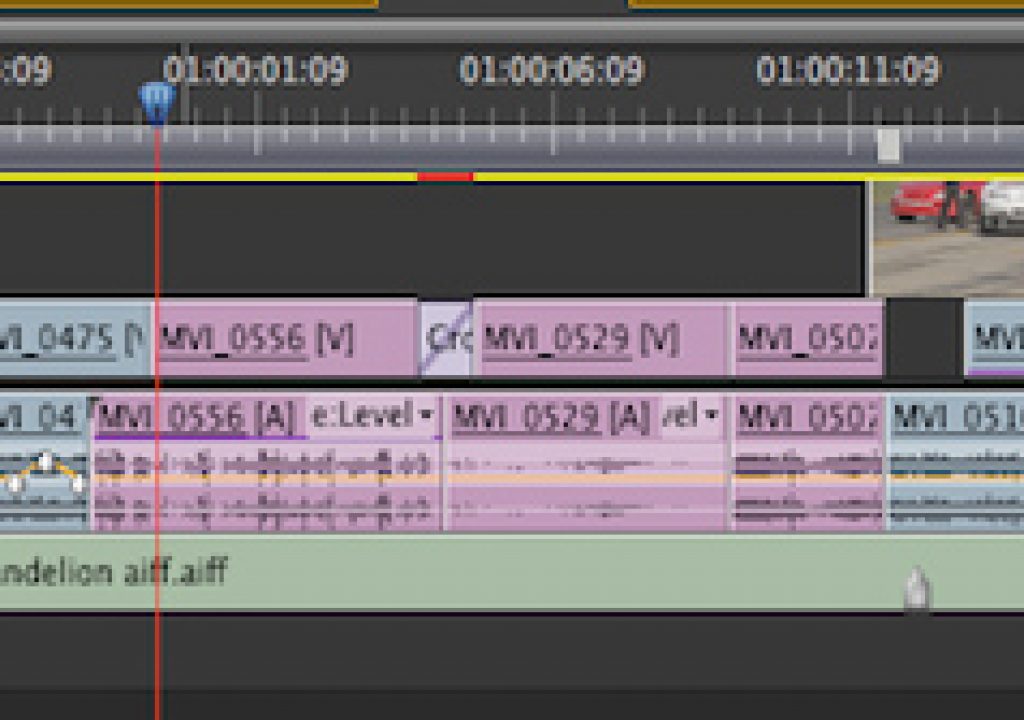
When working in a non-linear editing application the editor spends many, many hours working in the timeline. Boy do we spend a lot of hours working in the timeline. If you’re moving from Final Cut Pro 7 to Adobe Premiere Pro 5.5 then you won’t be totally lost as there are a lot of similarities between the two application’s timelines. But there are some important differences as well. Let’s take a closer look at the Premiere Pro timeline if you’re moving from FCP 7. Did I mention how much time editors spend working in the timeline?

A basic Premiere Pro CS5.5 timeline.
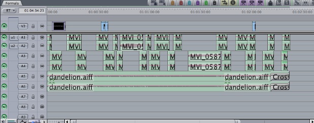
A basic Final Cut Prop 7 timeline.
A few timeline basics.
The first thing you’ll probably notice is that they look similar in that both are track based. There are video and audio tracks just waiting for media. Both applications have a “patch bay” on the left for routing source media into the desired tracks. In PPro the source side media patches don’t disconnect or break like they do in FCP7 but rather you turn them on and off with a click, which highlights when the tracks are on.
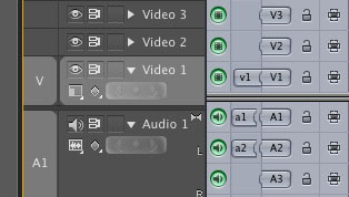
The PPro patch bay on the left looks different from that of FCP but their functionality is similar.
Drag the source patches on the left (that is the V or the A) up or down to route the source media to the desired destination tracks in the timeline. Or right+click on a track name and choose Assign Source video or audio. It’s important to note that on the Program side (or in the timeline itself) PPro doesn’t have the tiny Toggle Auto Select indicators that FCP7 has to toggle tracks on and off for things like IN to OUT selections. Instead click the Video 1, Video 2 button itself to turn a track on or off. Active tracks are highlighted in a lighter gray.
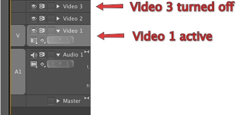
Turning video tracks on and off for targeted editing and IN to OUT selection is as easy as clicking the track names.
The other buttons and switches will be easily understood by the incoming FCP user. The eyeball is Toggle Track Output which turns the entire track on and off. Toggle Sync Lock attempts to keep all tracks in sync as long as the symbol is turned on. Turn it off and sync isn’t maintained for those off tracks when an operation like an Insert edit is performed. Finally Toggle Track Lock locks each track with an overlay and doesn’t allow any edit operations on the track.

Each track has toggle switches to toggle different types of functionality.
Expanding track heights to reveal keyframing “rubber bands”, audio waveforms, etc.
When looking at a PPro timeline for the first time one thing that you might notice are the disclosure triangles on each track. Twirl each of those down to see more detail about that individual track.
.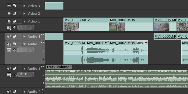
In the above image Video 1, Audio 2 and 3 have been “twirled down” to show clip frames and audio waveforms.
For video tracks, this is how you can reveal clip thumbnails. For audio tracks this will reveal waveforms. This obviously makes the tracks taller but track height isn’t limited to that size. Like FCP7 you can click and drag in the divider line just above a track heading to adjust the size of a track. But the disclosure triangle must be open to resize a track height.
If you look closely at each clip in the timeline you’ll see each one has a small pop-up menu that lists a specific parameter for each clip. This reveals keyframable rubber-banding for different parameters of a clip.
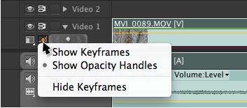
Clicking the Show keyframes button lets you choose the type of keyframes to display as well as hiding them altogether.
In FCP7 the rubberbands represent opacity for video clips and level for audio. In PPro you can choose to keyframe and animate a number of different parameters for many items of a clip, including filters and effects. We’ll see this below.
Stereo audio tracks
Probably the biggest thing that trips up a new to PPro user the first time they toss a piece of media, with audio, into a PPro timeline (especially if it is being dragged directly into the timeline) is it often doesn’t go right into A1 or A2 as expected but rather tries to land in track far below. This is most likely because it’s a stereo track and you have only a mono timeline … or some variation on that problem.
PPro allows for both stereo, mono and 5.1 audio tracks in the timeline. This is easy to see when using the Add Tracks dialog box:
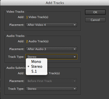
You can also see that PPro can use 5.1 audio.
When these different types of tracks are added they are also identified by icons in the audio panel of the timeline. These icons are small but they’re there.
![]()
The different type of audio tracks are identified by the audio track icons. The above image has 3 stereo tracks, then 2 mono tracks and then one 5.1 surround track.
Premiere Pro also includes the ability to add and use Submix tracks for more indepth audio mixing. They are added via the Add Tracks dialog box and mixed just like other audio tracks. The use of Submix tracks are beyond the scope of this article but you can read about them here.
In addition to Submix tracks PPro has a master audio track as well that’s handy as a master tool for audio mixing. It can be keyframed as well as adjusted overall. It can come in handy when it’s time to normalize audio as this Adobe tutorial shows.
Audio mixing can be more in-depth in PPro than FCP. PPro allows for adjusting of both gain and volume. In addition you can adjust levels and keyframe audio on both a clip basis as well as a track basis. Exactly what you’re working on in the timeline can be chosen by the Show Keyframes popup in each track.
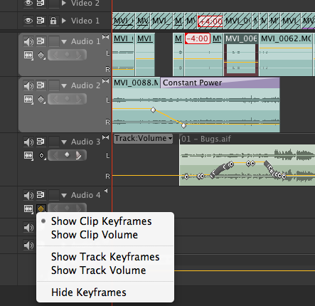
In the above image Audio 1 and 2 are both showing Clip Keyframes where Audio 3 is showing Track Keyframes. Notice the yellow rubber band of Audio 3 that extends into the filler where there is no audio. The little left and right arrows are used for navigating to and from keyframes as well as adding them.
It’s worth studying the Premiere Pro help files for adjusting volume levels to get a more in-depth idea of exactly what all you can do with audio in the PPro timeline.
Timeline Preferences
There are several settings in the PPro preferences that are worth noting as they have a direct effect on the timeline. The first is a very handy setting called Timeline Playback Auto Scrolling.
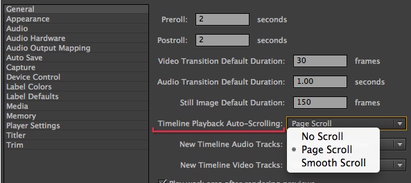
This preference gives some very nice options for how the timeline behaves during playback.
When the Page Scroll preference is turned on the timeline will automatically jump forward to the next region when the playhead reaches the right edge of the screen during playback. The playback continues and doesn’t stop. This is very helpful when watching down a long edit as you can keep the timeline zoomed in to see good detail but don’t have to do anything to keep the playhead in sight. I rarely turn this option off.
The other option is Smooth Scroll which essentially leaves the playhead stationary and scrolls the timeline behind. It’s a very impressive option when clients are around but I’ve seen it bog down on complex timelines so I opt for the Page Scroll.
A second preference to note is audio scrubbing.
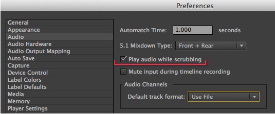
Audio scrubbing is toggled in the Audio preferences.
It’s a simple off or on option for audio scrubbing but it’s important to note for FCP7 users that it’s located in the preferences and not a button on the timeline or the keyboard. I turn audio scrubbing on and off all the time during an edit so I wish this audio scrubbing was more easily accessible. While you can access the Audio Preferences via a mappable keyboard shortcut I would prefer a keyboard shortcut that is mappable to turn the audio scrubbing on and off without having to click a check box in the preferences.
Up Next: Keyframing in the timeline, the big submenu and three buttons.
Keyframing and animation in the Premiere Pro timeline.
Like FCP7 animation and keyframing can be performed on clips right in the timeline. Any filters applied can also be animated without going up to the Effects Controls tab. You don’t have to “open up” the dedicated key framing area like you do in FCP7.
First you have to make sure you’re showing keyframes in the timeline.
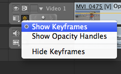
With this setting turned on you can keyframe and animate in the timeline, including filters. If you turn on the Show Opacity Handles then the yellow rubber band on the clips behaves like the opacity rubber band in FCP.
To keyframe and animate in the PPro timeline you can use the Pen Tool to add keyframes to the yellow rubber band. Many editors would then move up to the Source monitor (that’s called the Viewer in FCP7) and do direct manipulation on the image for things like scaling, position and rotation. But you can achieve the same animation results by dragging the rubber band keyframes up and down.
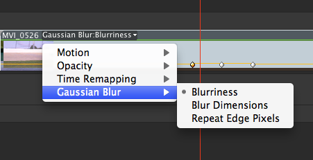
You can see in the above image that you can choose different parameters for Effects that are applied to a clip in the timeline. In this example I animated a blur.
Change the parameter in the pop-up menu to animate something different. It’s worth noting that you can often drag a keyframe up to an extreme number. For example, in the Gaussian Blur:Blurriness parameter I could drag the value up to 30000 which blurred the image into nothing. A more usable 50 barely registered a move in the timeline. Hold down the option modifier key when dragging a keyframe in the timeline to gear down the movement to make it more manageable. These extreme numbers will hopefully be turned down in the future.
Working with something like Scaling, which has two separate options for scaling height and width is interesting. You can turn on the rubber band for Uniform Scale and then drag the rubber band to turn in ON or OFF. When ON you only get one Scale option in the timeline to animate as opposed to when Uniform Scale is OFF. Then you can get rubber bands for separate Scale Height and Scale Width.
This same timeline keyframing is true for audio as you can keyframe levels and audio filters as well.
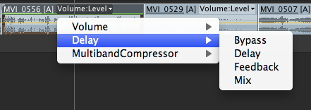
Keyframe audio levels and filters in the timeline just as you do video filters.
One other thing worth mentioning is that you can also right + click (or control + click with a single button mouse but does anyone use a single button mouse anymore?) on a keyframe in the timeline to bring up standard animation easing controls.
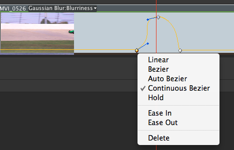
All of your basic keyframe easing controls are available in the Premiere Pro timeline as well.
Choosing something like Bezier handles will allow you to adjust those handles right in the timeline. Any change you make to keyframes and animations in the timeline are also reflected in the Effect Controls tab for each clip. While it’s nice to be able to do this in the timeline it’s often easier to really fine tune the animations in the Effects Controls tab.
The big timeline submenu.
PPro also makes use of submenus throughout the application and the timeline is no different. Right + click on a clip to reveal many options under the submenu.
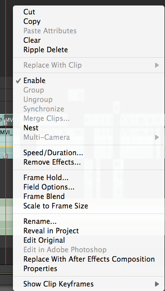
You’ll become very familiar with this clip submenu as there’s a lot of useful options that live here.
This submenu could be the subject of its own article (and a lot of the menu items are self-explanatory) but here’s some highlights of the clip submenu.
Cut, copy, paste commands are the same as FCP7 with the exception of Paste Attributes. Pasting PPro attributes pastes all the attributes of a clip, including filters. This is one area where FCP7 has a leg up as PPro needs the option to selectively paste only certain attributes. Maybe next release. Strangely you can selectively remove certain effects but not paste them selectively.
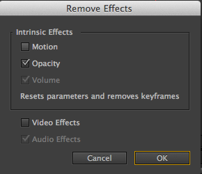
The Remove Effects dialog box give an option to selectively remove certain things.
Replace edit operations happen with the Replace With Clip option and can replace from the Source Monitor or directly from a bin. Replace edit works like a replace edit should and keeps motion and effects intact. I especially like the Replace With Clip > From Source Monitor, Match Frame. That keeps a sync point between the playhead in the Source monitor and timeline. This works very much like Sync Point Editing in Avid Media Composer if you’re familiar with that function and is one of my favorite advanced editing techniques.
Like FCP you can both turn clips visibility on an off in the timeline via the Enable command. You can also Nest clips just like FCP. A double click of a nest opens that next in a new sequence. One extra feature of the PPro timeline is the ability to Group and Ungroup clips. This works exactly as you think it would and allows you to select groups of clips with one click. It’s a nice feature only there’s no visual indication of which clips are grouped together unless you choose to label the group with a color. I wish there were more colors available.
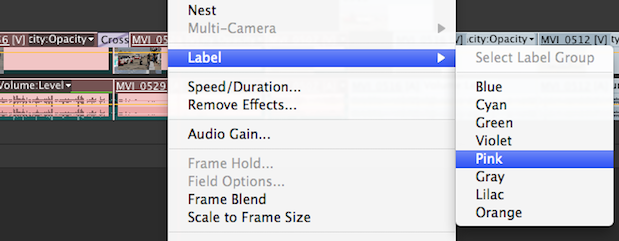
Grouping of clips is one of my favorite PPro timeline features as it makes an easy way to group clips together without having to nest them. Label them for easy identification.
Synchronize Clips isn’t a PluralEyes like auto-syncing feature (though PluralEyes is available for PPro) but rather a way to quickly sync in the timeline. Choose this option and you’re give choices on how to sync the clips.
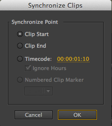
Any of the above options can be used to sync clips in the Premiere Pro timeline.
It’s just one more tool to use in the PPro timeline to make life and work a bit easier.
I make use of the Reveal In Project option as that is a basic Find Bin command that shows the master clip in its bin. Strangely this isn’t available from the Source window. Also note the Replace With After Effects Composition. If you’re using Premiere Pro then you’re probably an After Effects user as well and Adobe’s Dynamic Linking between the two is a very big selling point. See a previous PVC article about using Dynamic Link to bring AE’s Warp Stabilizer into PPro.
Missing from the timeline clips submenu is a way to add Clip Markers to a clip. PPro uses several different kinds of Markers so hopefully that will be added as it seems like a natural way to add them.
And then there’s three buttons in the upper left corner
Finally there’s three buttons in the PPro timeline under the timecode display.
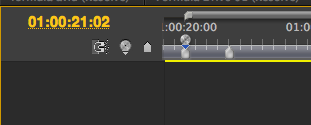
While PPro doesn’t have a customizable button bar like FCP there are three buttons there.
The left magnet icon is to toggle snapping. The middle one that looks like a disc icon is to Set Encore Chapter Marker. Finally on the right is a basic Set Marker button. Double clicking on a marker that is set in the timeline will bring up a dialog box for editing the marker.
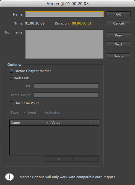
Since Adobe is still into things like DVDs and Flash, there’s quite a lot of things you can do with a Premiere Pro marker. It’d be nice if you could assign them different colors.
Wrap Up
I hope this primer on the Adobe Premiere Pro CS 5.5 timeline has been useful to those moving over (or just trying out) from Final Cut Pro. I’m still learning things about Premiere Pro every time I use it and I learned a lot by writing this article. This article hasn’t covered every aspect of the PPro timeline so if you’ve got some of your own timeline tips please post them below. It’s great to discover new things that I’ve never had access to while editing in other NLEs (like PPro’s Group clips function which is entirely different from what Avid calls a group clip). FCP7 users won’t have much trouble adjusting from one timeline to the other if you just remember they are different programs and all features aren’t exactly the same. They are very similar in operation so if you study their similarities and come to understand the differences between the two it’ll be an easy transition.
FTC Disclosure: The creation of this article was partially subsidized by Adobe. Although they approved the general subject, they had no control over its editorial content. I do hope they take a couple of those suggestions back to the engineering team and implement them in CS6.
Filmtools
Filmmakers go-to destination for pre-production, production & post production equipment!
Shop Now