For a long time my primary source of employment was shooting corporate marketing communications videos. As these consist primarily of “talking head” interviews, I tried every lighting setup I could think of to make people look their best quickly, as many of these shoots have tight schedules and not much turnaround time between interviews. This setup is the result of years of experimentation.
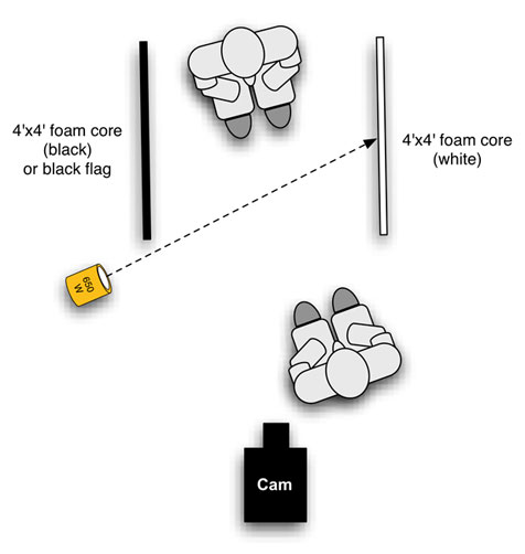
Here it is:

Yes, it looks simple. Deceptively simple. Believe it or not, it takes a long time to learn to light so simply. There was a time when I used every light on the truck (or the van) on my shoots, but as I’ve matured the number of lights I use has dropped dramatically.
That’s very important, because it’s not enough to be able to do great work as a DP. You have to do it in a very short period of time. Creating the prettiest lighting setup in the world doesn’t help anyone if it takes so long that the director only has five minutes to get what they need. Lighting is important, but it’s not the most important thing.
The seed of this idea formed during my search to make talking head interviews interesting for me to shoot. The bar for corporate marketing videos is often quite low, so I found myself able to experiment with lighting setups without getting in trouble for it. If I couldn’t find a fast, pretty way to light something to my satisfaction most of my corporate clients were still very happy with what I came up with, so I took those opportunities to examine what worked and what didn’t when lighting a human face under unpredictable circumstances. (Anyone who shoots these kinds of corporate projects knows there’s usually no scout and no technical pre-production at all: you show up, see the locations for the first time, and make the most of the hand you’re dealt.)
I started in the film industry before Chimeras became a household name, back when the grip crew would build soft boxes out of foam core and 1000H tracing paper at the beginning of every day and then trash them at wrap because tracing paper didn’t travel well. When I started shooting video between film operating gigs, on broadcast shows like “The New Candid Camera Show” and “Inside Edition,” the lighting kit consisted of a Lowell Tota kit and some umbrellas. The entire camera and lighting package fit on a small folding luggage cart.
The advent of the collapsible light bank for hot lights changed quite a lot, and suddenly every EFP location lighting kit had a small video Chimera in it. I played with these for a while but found them very frustrating: their size, at 24″ by 32″, resulted in a soft-ish light that still had a lot of directionality to it, and while I try never to flat light a face I also found that the small video bank cast a shadow that was just a little too sharp. The harder a light is the more precisely it has to be placed for each face that appears before it, and I found that small Chimeras weren’t big enough to softly wrap around noses while simultaneously filling deep eye sockets.
Some people have narrow faces, so the light has to be moved near the camera to reach into both eyes; some faces are flat or round and require side light to appear three dimensional. Sometimes the light has to be placed quite low to reach into deep eye sockets, which causes the nose shadow to fall horizontally against the fill-side cheek. Classical portraiture calls for the nose shadow to fall along the “smile line,” which connects the corner of the nose to the corner of the mouth. This isn’t a hard and fast rule for dramatic productions, but for a dry corporate marketing video or documentary interview where the audience is staring at a person’s face for a long period of time, placing the nose shadow along the smile line helps a lot.
Producers would occasionally express annoyance at my futzing with this small Chimera as we had very little time between interviews and they wanted to roll as soon as the subject sat down. Other camera people placed that small Chimera once and then never moved it, but I didn’t like the results. I set out to find the perfect, fast way to light anyone’s face so that results would be excellent at least 90% of the time.
I experimented with bigger sources, and while the medium Chimera light bank, at 36″x48″, offered much better results, it wasn’t as portable as the small video bank was, and producers balked at renting it as the small Chimera “works just fine for everyone else.” I had to find a fast way to create a big beautiful source using materials that were extremely portable and cheap.
Turn the page for a detailed explanation…
Let’s look at that diagram again:

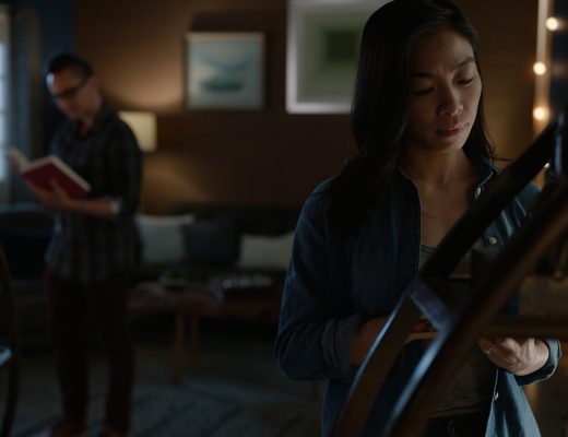
Here are two examples of the look that I get from this setup:
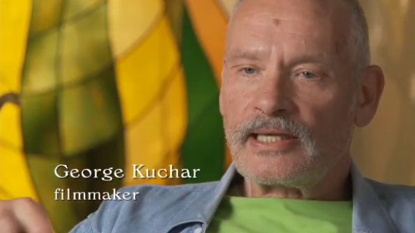
This was a three light setup: one light, bounced, on the subject, and two more on the background, which consisted of art glass.
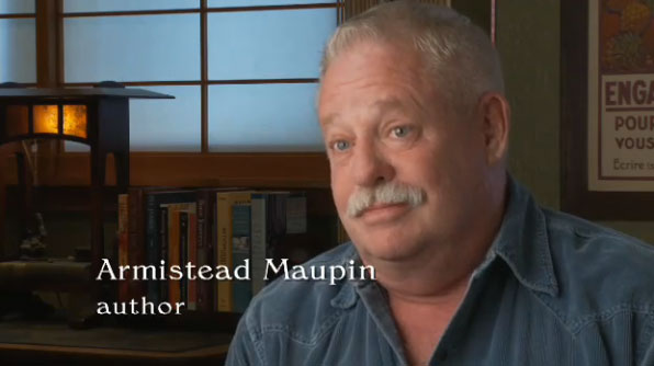
This setup used a single light bounced off a 4’x’4′ piece of foam core, plus a negative fill card with a smaller piece of foam core clipped to its face. Camera for both setups was a Sony EX3.
These are screen grabs from a documentary I’ve contributed to over the last few years. The fill is a bit brighter than I normally like but that’s what was necessary to match looks established by other camera people.
There are certain magic numbers and ratios in the film industry, and 4’x4′ is one of them. The 4’x4′ bounce or diffusion frame is very common in the industry because it does beautiful things in close quarters, particularly to faces. When I first tried this setup, placing a 4’x4′ bounce card 2′ to 3′ from the subject and lighting it with a 650w fresnel, the results were exactly what I was looking for. The nose shadow was very, very soft and gentle, and it almost didn’t matter where it fell because it’s difficult to see. The source wraps beautifully around the average face and light reaches easily into both eyes. The reflection of the light source causes skin to appear to glow from within. This quality of light, from a large source at close distance, works well on almost everybody.
There were still a couple of problems to solve. The first one was contrast: soft light goes everywhere, and a small room with white walls reflected a lot of unwanted light back onto the subject, resulting in a very flatly-lit face. I had to add some contrast, so I introduced a 4’x4′ negative fill card.
“Negative fill” implies an active approach to removing light, whereas the reality is that you’re passively replacing highly reflective surfaces with something darker to eliminate stray light. Right now, for example, I’m sitting in front of my computer with a window to my right, and although I’m directly lit from one direction I’m filled from every other by light reflecting off walls, the white ceiling, and the light rug on the floor.
For example, here I am sitting at my computer and lit by natural light (shot on my iPhone):
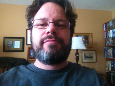
Here’s what happens if I hold a large black card on the left side of my face, blocking ambient light from that side of the room:
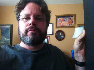
The side of my face nearest the card is darker, as a reflective wall outside frame right has been blocked by a non-reflective surface.
Here’s what happens when I block ambient light from the ceiling:
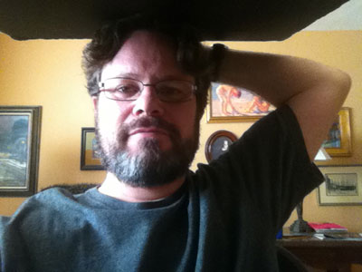
Now the top of my face is darker as I’ve placed a dark surface between my face and the white ceiling.
In 3D computer animation terms this is called “radiosity,” and it was a big deal when it was introduced in the 1990’s. An algorithm examined all of the surfaces in a 3D model, looked at where the virtual light sources were placed, and added ambient light into the scene to show what the environment would really look like when every surface became a passive reflector. Architectural firms jumped on this technology so they could see, for example, what would happen in a white hallway if they installed red carpeting. (Result: sun hitting the carpet would turn the walls, and everything else in the environment, red.) The reason radiosity is so useful in 3D modeling is because this is what happens in the real world: every lit surface around you, at this moment, is lighting you to some degree.
One of your tasks as a cinematographer is to decide whether this is desirable or not. If not, you have to figure out how to eliminate it or replace it.
Unless I’m lighting an interview in a big room with lots of space between the subject and the nearest wall, I add a 4’x’4 black card on the fill side to reduce ambient light and increase contrast. Ambient light looks okay to the eye, but once we frame a shot it can take on a very different feel. It can be the wrong color, or fail to reach into eye sockets, or just look sloppy. (That’s why I found the old Dogme 95 movement so amusing: a lot of “natural light” looks awful once you put a frame around it. Light is a storytelling tool and should not be ignored.)
A really dark fill side, however, is not always desirable. My solution is to use the black card to remove the ambient light that I don’t like, and then use a smaller bounce source to add the ambient light that I do like. My fill source of choice on fast-paced corporate and documentary shoots is:
(wait for it)
Copy paper.
You can always find copy paper in an office, and in a pinch I’ve used my call sheet. It doesn’t matter if it has type on it, just as long as it’s primarily white and reflective. I’ll usually place one sheet on the black card, as far forward as possible and at head height, to create a nearly invisible fill. Putting it forward, closest to the camera, prevents the front of the face from falling into shadow: a bounce that’s placed toward the back of the card, on the side of the subject, will light the subject’s cheek and ear but will leave a very dark area around the fill-side eye. That’s usually not very flattering, so bringing the fill around the front of the face both eliminates that overly-dark eye shadow and hides the fill as a separate source as it no longer casts a noticeable shadow of its own.
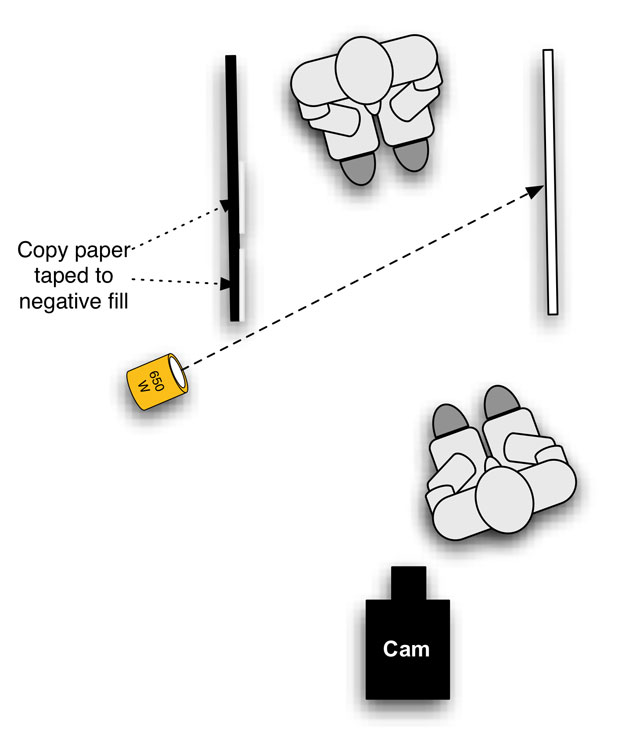
If I want more fill, I tape another piece of copy paper next to the first sheet.
There are exceptions to this lighting method, as there are to everything. People with very round or flat faces may require the removal of fill light to create contrast, as the source wraps around their faces too much. A large source doesn’t work well on people with reflective glasses. And it really doesn’t work well with people who are crazily animated and sit forward into the beam of light that’s lighting the 4’x4′ bounce. None of this happens terribly often, and 90% of the time a person who sits into this lighting setup will look great.
There are a couple of things to watch for:
Foam core has a little bit of specularity to it. The light it reflects is soft, but there is a little bit of a hot spot that may cast a shadow. This can be remedied by covering the foam core’s shiny surface with a matte material, like muslin. Generally this hot spot isn’t a problem.
The light source usually wants to be a little higher than the average subject height:
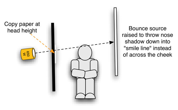
While the nose shadow is very soft it’s not nonexistent, so raising the source throws it down a little bit into the smile line.
The black card serves two purposes. The first is negative fill, but the second is to cut direct light from the lamp itself off the subject. All lamps leak a bit, and stray unwanted light wandering through a set is something that I really, really hate. I always walk the set, if it’s large, or sit where the subject sits in an interview situation, and look around to see if I’m being struck by any unwanted light. In this setup there are two forms of unwanted light that I see most often: light from the glowing fresnel lens of the light, as seen through the gap between the barn doors and the instrument, or a reflection off the barn door farthest from the subject. The paint on black barn doors is shiny, and folding the far barn door the wrong way can mean catching the light from the fresnel lens and reflecting it directly onto the subject.
The best way to solve all of these problems is to back the lamp behind the negative fill card and use it as a flag, such that the subject can’t “see” the stray light. (If they can’t see it, they aren’t being lit by it.) If you can’t back the lamp far enough to hide the barn doors behind the negative fill it’s often enough to open that far barn door all the way, eliminating the reflection.
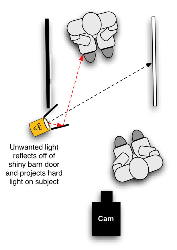
Backing the lamp behind the black card solves the issue of direct unwanted light on the subject. If this isn’t possible, make sure the gap between the lamp and the barn doors is wrapped with black wrap and open the barn door nearest the camera so the reflected light goes elsewhere.
Sometimes I add negative fill over the top of the subject, but not very often. Negative fill on the fill side is often more than enough unless the ceiling is very low and very reflective.
I’ll often light interview setups with two lights: one on the foreground and another on the background. This makes for very fast setup and breakdown. I don’t use back lights in interviews very often anymore, as I prefer the subtlety of placing the subject against a background of a different tone for separation, but this is a matter of taste. (And it’s a matter for another article, as back lighting is an art in itself.)
Turn the page and I’ll describe the basic interview tools I used for years when shooting hundreds of talking head interviews…
Everything I used for corporate interview shoots had to fit on a cart, and uncut 4’x4′ bounce cards are unwieldy to pack and don’t go through doors easily. A local rental house came up with a trick to make them more portable; I’ve shamelessly stolen this trick and I now offer its theft to you:
Cut a 4’x4′ bounce card into two 2’x4′ pieces.
Lay them about a half inch apart on the ground.
Tape them together using 2″ cloth tape.
The half inch gap allows you to fold them in half. Without that gap they’ll resist folding.
I worked with one client for about ten years shooting enormous numbers of talking head interviews, and I carried the following lighting/grip kit:
A four-light Arri kit, typically with a 1k open face unit, two 650w fresnels, and a 300w fresnel. The 1k open face was great for situation where I needed more punch out of my key light, such as when I was lighting an interview in a room lit by ambient skylight. (I only ever added half CTB to my lights for daylight correction as full CTB costs too much light and half correction to daylight allows the person to look a little warmer or the background to look a little cooler, depending on how you white balance.) Depending on the senstivity of the camera I could use either a 300w or 650w fresnel to light my bounce card.
Four of the previously-described collapsible 4’x4′ cards, made of foam core that is black on one side and white on the other. I could use the white side as a key bounce or fill, and I could use the black side for negative fill or to block large sources of unwanted ambient light, like windows.
Four C-stands.
Those basics allowed me to walk into almost any interview situation, sight unseen, and make it work. Block a window here, setup up my white card/black card setup there, turn on a light or two, and shoot.
Three more notes:
Sound people sometimes complain about the “slap” of sound bouncing back and forth between the two cards. This can be solved by used a 4’x4′ flag instead, or hanging a black sound blanket from a C-stand as negative fill, or covering a 4’x4′ card with black duvetine. Cloth absorbs sound, whereas foam core does not.
Some producers made fun of this setup and called it “the tunnel” or “the cave.” I responded by pointing out that it makes everyone look good on their schedule, and they couldn’t argue with that.
Make sure you fill the entire bounce card with light for greatest benefit. Spotting a lamp into the center of the card not only results in a smaller source with harder shadows but it’s also less efficient. Filling the entire 4’x4′ surface results in softer light, as the size of the source is much larger in relation to the subject, and reflects the most light possible.
Being fast is as important as making pretty images. This technique allows for both. Give it a try and see what you think.
Art Adams is a DP who loves lighting faces. His website is at www.artadamsdp.com.
Filmtools
Filmmakers go-to destination for pre-production, production & post production equipment!
Shop Now