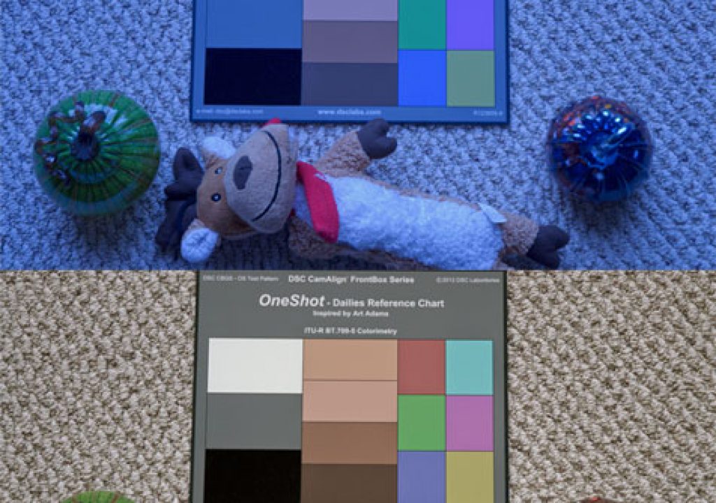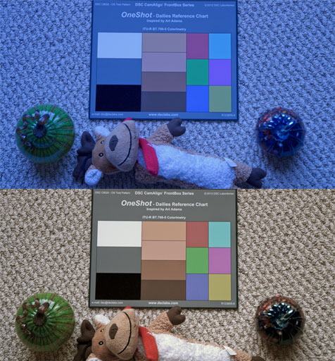
In the old days we shot an 18% gray card to tell a film dailies timer where we wanted our exposure placed and what color we wanted dailies to be. Now that film is being replaced by HD a simple gray card is no longer enough, because while film colors are fixed by emulsion video colors are not. A gray card in video doesn’t communicate anything about accurate color. That’s why I designed the DSC Labs OneShot dailies reference chart.
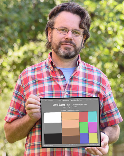
The author holding his technological baby.
Note: Purchasing information for this product is given at the end of the article, on page two.
The DSC Labs OneShot is intended to give a colorist the most information possible without taking up a lot of time on set. The chart contains white and black chips for white and black balancing (yes, black has a color, and if it’s not right your entire image will suffer); an 18% gray chip for exposure; four common flesh tone references; and the Rec 709 primary and secondary colors, at 50% saturation.
This chart is only truly usable for Rec 709 colorimetry, which is HD colorimetry. We’re working on a digital cinema version of this chart, but for now this will do as dailies are almost always viewed in Rec 709.
The Rec 709 primaries and secondaries are printed at 50% saturation because it is impossible to print them at full saturation: their colors, as seen properly on a monitor, are more saturated than modern printing technology can reproduce, so they fall outside the CMYK color gamut. Printing them at half their saturation means that using 2x magnification on a vectorscope puts them into their targets.
The primaries and secondaries are perhaps the most important references on the chart. It is certainly possible to neutralize the image using only white and black references but this doesn’t necessarily mean that color will be accurate after doing so: the camera’s matrix generally doesn’t affect neutral tones (white, black and gray) but it ALWAYS affects colors. White balance means that neutral tones will appear white, but says very little about how red, green, blue, cyan, yellow and magenta are rendered.
I’m going to use Apple’s Color for this demonstration:

These are the controls in the “Primary In” room, where overall color corrections are first applied to an image. They are fairly similar to what you’ll see in most color correction programs. The three main controls are lift, gamma and gain, shown here as “shadows,” “mid tones” and “highlights.” If you’re using a mouse or trackball, as I am, it’s handy to note that the color wheels match exactly the color layout of the vectorscope. For example, if I push the highlights “dot” toward red I’ll see every color on the vectorscope move toward red.
Here’s our sample image, shown in Color:
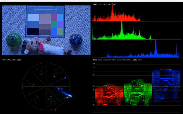
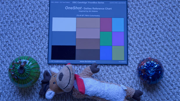
That’s a DSC Labs OneShot chart (designed by yours truly) alongside a flesh-colored dog toy and two glass pumpkins on a beige rug–really just a standard test setup. (Right?)
As you can see the image has a very strong blue cast. I shot this in indirect skylight with a Nikon D7000 whose white balance was set at 4000K.
The first thing I’m going to do is zoom in to the chart so it fills the entire frame. As the waveform and vectorscope in Color only sample what is within this frame, zooming in isolates the chart so I can see exactly what I’m doing.
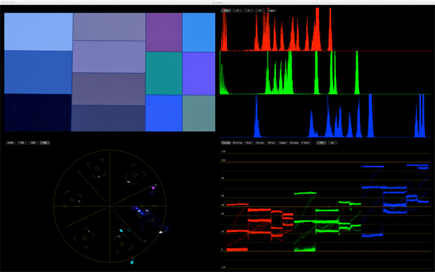
It’s not important to frame the chart perfectly as the waveform and vectorscope don’t care. As long as I have some of each chip in the frame I should have plenty of information to work with.
The first thing I’m going to look at is overall color balance, and I can see that by looking for the white, black and gray chips on the waveform monitor. If they are all in a line then I’m good to go. As you can see, though…
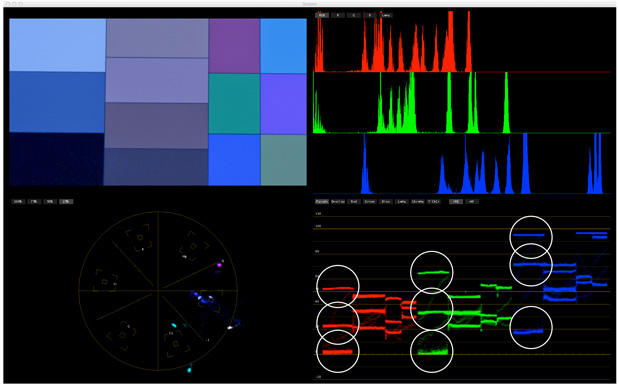
…they aren’t. There’s a strong blue cast to the image. To make this right I’ll have to reduce the amount of blue in the image while boosting red and green.
I’m going to attempt to neutralize this cast by making the following corrections:
(1) I’m going to use the highlights color control to make the white chip’s peak line up in the red, green and blue channels. If the peaks are the same height then the white chip is neutral. I’m not going to worry about how bright white is at the moment. As long as it’s brighter than 18% gray I’m happy.
I’m also going to use the luma slider (the slider on the far right of the highlights circle) to change the overall exposure so that the gray chips fall at around 40 IRE on the waveform monitor. If the gray chips don’t line up together then I’m going to place the gray chip in the green channel at 40 IRE and worry about the others in a moment. (Green is an important color in HD as it’s the channel from which most of the luma information in the shot is derived. It seems like a good idea to give it preferential treatment.)
(2) Next I’ll manipulate the shadows control to line up the black chip in each channel. This is a little more difficult as there’s so little red in the image that the black chip appears smeared in the red channel. By pushing the shadows toward red I’m adding gain to the red channel, and that smear you see is noise–because gain amplifies everything in the signal, including noise. (As so little red was captured in the image due to a poor white balance we have to really amp up whatever small amount of red is left.)
I’m not overly concerned with making black touch 0 IRE yet. I’m happy as long as it’s close to 0 IRE without being crushed. Moving the black level around later will change saturation–pushing it down, for example, increases overall saturation–but we can also reduce saturation overall later, once we tweak the individual colors.
(3) Lastly, I’ll manipulate the gamma (mid-tones) control to make the gray chip line up at 40 IRE in all three color channels.
(4) I’ll need to repeat all the above steps (align the white chip in the highlights, shadows and mid-tones) until the white, black and gray chips line up in the color channels. Changing any one of these parameters affects the others so it’ll take several passes to get them all aligned.
I always manipulate the highlights first, because often the blacks and mid tones will fall into place if the white balance is close to accurate. If the shot is severely out of balance then I’ll manipulate the blacks second, as bringing the highlights and shadows into alignment often brings the mid tones into alignment. I’ll play with gamma last, simply because it generally requires the least amount of work. (Also, most camera paint boxes/camera control units will not allow you to adjust the color of the gamma–I assume there must be a reason for that, so I always leave color adjustments to gamma until last.)
It’s also helpful to watch the vectorscope while doing all of this. The center of the scope is where white, black and gray should fall. The vectorscope can be somewhat helpful when white balancing if you can identify the dot that represents highlights and push it into the center of the scope, neutralizing it. The problem is that white, gray and black all show up as dots, they all belong in the center of the scope, and if they are out of alignment it can be difficult to determine which of the three different dots is which. I find that if I can get the chips on the waveform close to alignment I can then see which dot is closest to the center on the vectorscope and nudge it directly into the center. When all three are aligned the chips on the waveform should be aligned horizontally across all the color channels and there should be only one dot in the exact center of the vectorscope.
For example, if the gray chip isn’t lining up because the red channel is low, look and see if there’s a white dot on the vectorscope is leaning away from red. If it is, push the gamma (mid-tones) control toward red and see if that moves the dot toward the center of the vectorscope.
Here’s what it looks like when white, black and gray are aligned and balanced:
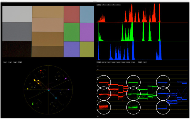
The most important value here is 18% gray. The vectorscope doesn’t show any information other than color accuracy and saturation, but color saturation will appear to change if the image is made brighter or darker. Putting middle gray at 40% ensures a consistent starting point for color saturation.
Here’s what the controls look like:

Not a subtle correction, as you can see.
The Rec 709 spec defines the brightness levels where the white and black chips should fall on a waveform monitor, but Rec 709 was only ever designed to hold six stops of dynamic range. In theory the white chip (90% reflectance) should be placed at 100 IRE, but as that chip is only 2.5 stops brighter than 18% gray you’ll end up throwing away most of your overexposure headroom if you’re using any modern camera. If your camera has 4.5 stops of overexposure headroom, for example, putting that white chip at 100 IRE potentially throws away 2-2.5 stops of highlight detail!
The black chip is similar. Most HD cameras can see five or six stops of shadow detail easily but the Rec 709 spec only calls for about three stops of underexposure detail before hitting black. My preference is to use middle gray to set overall exposure, as our eyes are most sensitive to mid-tone contrast anyway, and the highlights and shadows can be set by eye later. The chart is technically correct, but nearly every modern camera exceeds the Rec 709 contrast specification.
Here’s what the vectorscope looks like:
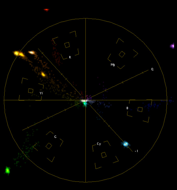
Not good. I’ve zoomed in on the vectorscope by 2x (or 25% in Color’s terminology) and the color chips are way too saturated and not terribly accurate. The image isn’t perfectly color balanced as something is drifting a little toward cyan, as evidenced by the cyan dot just below the center of the scope. Overall, though, white balance is fairly close to perfect so I’m going to move on to secondary corrections now and try to put the colors in their boxes.
The chart looks like this:
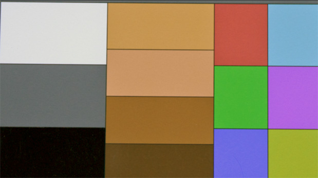
Close, but not close enough.
We’ve done the broad strokes, but there’s still more to do. Turn the page for the fine strokes…
Now that we’ve made the neutral tones fairly neutral it’s time to look at our primary and secondary colors. The vectorscope shows us where they should fall, so if we put their respective dots in the boxes we should see accurate color reproduction.
There are two things to note here:
Some cameras have a hard time saturating colors enough to go into their boxes. That’s not always a bad thing as that kind of detail gives cameras their “look.” It’s more important to ensure the colors fall on the correct “vectors”, which are lines drawn from the center of the vectorscope through each color box. If the colors fall on the proper vectors they are at least accurate, even if they aren’t fully saturated.
For example, if the green chip falls on the green vector then the color is accurate, even if it isn’t saturated enough to reach its box.
Cyan and green always seem to be the hardest colors to put in the boxes. I don’t know why this is, although I have a couple of theories that I won’t bother you with right now. What I will show you in a bit is why it may not be a good idea to fully saturate those colors to the Rec 709 spec.
For this part of the grade I’m going to go into the secondaries room and activate two secondary corrections. In the old days of film grading the primary grade (“primaries”) controlled the coarse adjustments of the telecine: highlights, shadows, mid tones and their hues. Primary controls are the broad strokes. “Secondaries” are the fine strokes that take place not in the telecine but in the color grading software itself: this is where we add vignettes, selectively desaturate colors, etc. on top of the primary grade.
Primary controls manipulate the image overall, while secondaries manipulate part of the image.
We’re going to start out looking only at the hue adjustment, as this is where we can put the colors on their vectors. Selecting a color on this line and pushing it up or down rotates that color around the center of the vectorscope without affecting the others overly much. If a color is landing off to one side of its vector this adjustment will move it around until it lands in the right place.
This shows the corrections I had to make to put each color onto its vector:

As you can see I really had to tweak every color. Green and red seem closest to their vectors. Blue and cyan needed some help, as did flesh tone. Now all the colors are technically accurate: the colors on the chart are being accurately reproduced in the video signal.
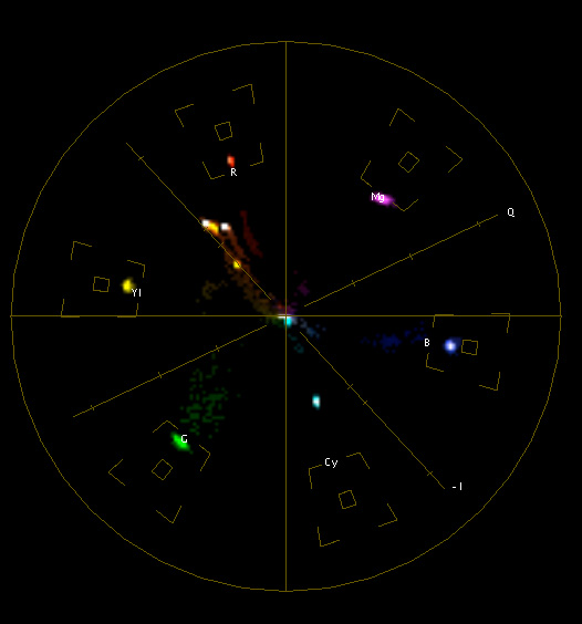
This is what the vectorscope looks like after the hue curve adjustment. (I had to zoom out from 2x for this view as several of the colors were way too saturated and were shooting off the scope!) All the colors are now on their lines, or vectors, that run from the center of the scope through their color target box. The flesh tones are falling along the I-line of the scope, between the red and yellow boxes, which is exactly where they should be. (The darkest flesh tone should fall directly on the I-line, while the others can fall a little to the side.)
Next I use an additional secondary control to adjust saturation. By saturating or desaturating a color I can move it toward the center of the vectorscope (less saturated) or away from the center (more saturated). In this case I want to put each of the dots into their boxes by putting a point on the adjustment line for each color that is improperly saturated and push it up or down until it hits its box. All of these adjustments interact so I may have to do this a couple of times per point.
Here’s what the saturation curve looks like:

As you can see I had to reduce saturation overall except for a slight adjustment upward in magenta and a massive adjustment upward to cyan. (Remember I mentioned that cyan was always strangely undersaturated? Now you can see what I mean.)
Here’s what the vectorscope looks like, now back to 2x magnification:
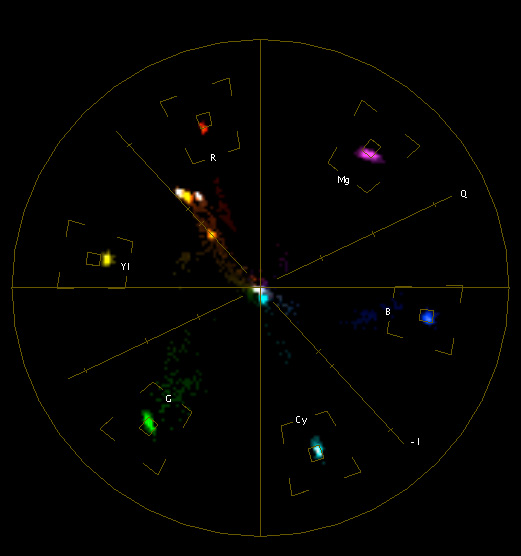
Every color is near perfect. Yellow is a little short, but I’m going to say that’s close enough for this demo.
There’s one very important thing to note here: see how green, cyan and magenta are elongated? That’s due to noise from pushing the color matrix too far. In this article I talk about how matrices affect the image, and talk a bit about how to use the user matrix to manipulate colors and create “looks.” The user matrix is a table that usually looks like this:
R-B
R-G
G-R
G-B
B-R
B-G
Each of those pairs affects the image in a fundamental way. Without getting into the math (because I don’t understand matrices mathematically anyway):
When affecting a color pair, like R-G, red will change in saturation and green will change in saturation AND hue. That means green will move not just toward or away from the center of the vectorscope, but toward or away from red–making it a touch yellow or cyan, depending on which way your adjustments push it.
The problem is that excessive matrix manipulation can create noise, and color noise looks like a smear or a streak. The hue and saturation controls in Color are matrix adjustments, and I’ve pushed cyan so hard to make it “properly” saturated that we’re adding a lot of noise to the green channel. The streaks fall roughly in the direction that each color will travel if I affect them in the matrix: green smears in the direction that it would move if I adjusted R-G, as does cyan because it is composed of equal parts green and blue. I don’t know why magenta is smeared, but it’s interesting to notice that its tail extends opposite that of green. (I played around with the saturation controls and couldn’t find a setting where magenta didn’t smear!)
If I back off on the cyan saturation I end up with this:
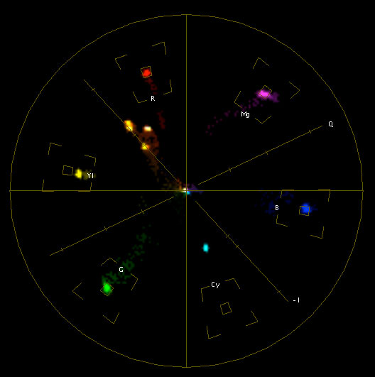
The green channel is a lot cleaner now. If you tried to manipulate this in camera you probably wouldn’t have access to a matrix function that affected just cyan (some cameras do offer this control, but most don’t) so you’d probably have to back off on the green saturation (G-R and G-B) to make green less noisy. This is normal, and it’s how most cameras function out of the box. If you put green into the box using the in-camera matrix you’ll probably end up with a smeared dot on the vectorscope and a lot of extra noise.
It is possible to get perfect Rec 709 colors out of a camera, but there may be a price. That’s why I said earlier that getting the colors on their vectors–making them accurate–is often more important than making them perfectly saturated, because perfect saturation is sometimes too much for a camera to reproduce and can result in a lot of noise.
Just for fun I’m going to remove the correction I just made to cyan and put all the colors back in their boxes. Here’s what the image looks like:
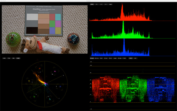
Last, but not least, I need to set contrast by making white and black look right to my eye. As you can see in the waveform image above, black is fairly black but white is a little dim at 70 IRE and I want a little more contrast than that.
I’ll make white brighter in the “Primary Out” room, because I can control the gain and the blacks without changing their color.
If I change brightness in Color’s “Primary In” room, where I’ve added all my overall color corrections, increasing brightness will also add warmth because I’ve added red to the highlight control to eliminate the blue cast. For example, if I use the highlight slider to make the highlights brighter I also add more red, because I’ve added a lot of red to the highlights control and that is amplified. Color can’t separate brightness changes from color changes within the same room.
Changes made in the “Primary Out” room sit on top of everything I’ve done so far, as it’s the last step in the grading chain, so boosting brightness here doesn’t add any color to the highlights.
By raising the highlights slider a little in the “Primary Out” room I increased the white chip to 85 IRE as that’s where it looks right to my eye.
This kind of luma correction is easy to do in Blackmagic Resolve simply by increasing the brightness of the highlights, as Resolve uses a YRGB model that separates luma (brightness, or “Y”) from the red, green and blue channels. Changing Y [luma] in the highlights doesn’t affect the color at all, in any mode.
Here’s what we started with:
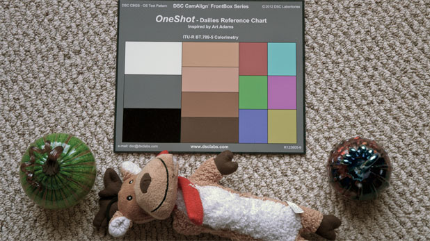
Here’s the final grade:
Some of what I’ve done might horrify a real colorist. I’ll admit that I’m an amateur at this stuff and I only do it so that I can learn what colorists can and can’t do. It also helps me communicate my wishes to a colorist using terminology they understand. Amateur or not, though, understanding how all of this works helps me troubleshoot camera setups and know when a camera error can be repaired using a post fix or if a reshoot is required.
What I’ve shown is that if I put a chart in the shot with known values on it, and then grade for those values, I can easily neutralize an image that contains a very strong color cast. If this was a log or raw image I could very quickly create a color accurate and neutral rendition of what the camera saw on the set. I can then use this reference as the basis for further color corrections to create a specific look, or leave it as is so that the DP’s intended look comes through exactly as she/he shot it.
This chart really isn’t a guide for final color correction as that’s more of an artistic process than a technical one. This chart is about dailies: getting the image right, or right enough, that all concerned can get a sense of what looks a DP is creating on set. This not only helps the DP maintain their chosen look throughout the post process but also reassures the director and producers that they are getting what they want and expect.
The FrontBox OneShot(tm) is available now from DSC Labs for US$287. Quantity discounts are available. Order by phone at (866) DSC LABS or +1 905 673 0929, or by email.
There is a smaller “Pocket” version that is available only through SMPTE for US$94.50. Please contact them here.
Note: I have worked as a paid consultant for DSC Labs, and I designed this chart.
Art Adams | Director of Photography | 09/18/2012 | www.artadamsdp.com

Filmtools
Filmmakers go-to destination for pre-production, production & post production equipment!
Shop Now