Panavision’s DXL2 is a unique offering, backed by a unique color pipeline. This is not your average Monstro.
When I started out in the film business—at a time when dinosaurs roamed the Earth and the numeral “zero” was a distant glimmer in a mathematician’s eye—two major companies made nearly all the cameras that I worked with on a regular basis: Arriflex and Panavision. Each had their pluses and minuses, and crews certainly had their preferences. I was happy to work with either system, and toward the end of my assisting career—when I made most of my living day-playing on “B” and “C” cameras on features and TV series—it helped that I could drop into any situation and know how to work with the system-of-the-day.
Panavision was the first film company to wander into the digital arena with the Genesis, but over time they drifted away from making their own cameras and focused on customizing other cameras to take their lenses and accessories. They still boasted world-class customer service and a lens shop that could customize glass for any occasion, but it wasn’t the same as the days when you’d be putting those items on an actual Panavision camera.
The DXL seemed a good move. It was a Panavision-branded camera with custom color science that took advantage of the fact that they have probably the best selection of large format glass in the world. Still, if one looked close enough one could still see vestiges of the RED Dragon look.
Monstro, though, is a different game altogether. It sports a new sensor design, with better color than anything RED has put out previously, and that’s obviously an advantage for Panavision. What makes the new Panavision DXL2 unique, though, is that Panavision decided to customize not only the color of the Monstro camera, but the optics as well.
THE UNDERRATED IR/UV CUT FILTER
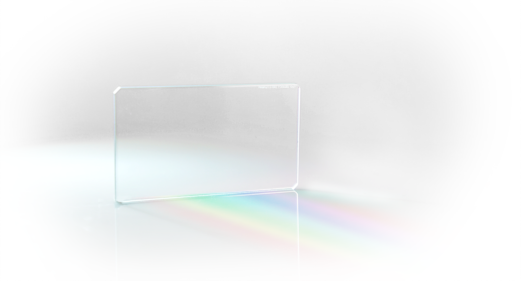
When RED gives us the choice of swapping out the OLPF package on their cameras, I don’t think we’re really swapping out the OLPF. We’re definitely swapping out the IR/UV cut filter on the front of the sensor, and this is easy to test.
A while back a production company ordered some Dragons for a shoot before they hired me, and without my knowledge they ordered the Low Light OLPF package. The rental house, however, only ever sent out the Skin Tone/Highlight package, so while they swapped out the OLPF package they forgot to reset the internal matrix that tells the camera what IR/UV cut filter to expect. When we turned the cameras on, the images were bright red. The camera was expecting a low IR cut, but the Low Light OLPF package has a much higher cut, so the extra IR washed the image with a startlingly bright hue of red.
The Low Light OLPF (really IR/UV cut) lets more non-visible long wavelength light strike the sensor in an attempt to take advantage of the fact that the blue dyes on most sensors will pass red light beyond a certain wavelength. Most cameras have a lower IR/UV cut filter to eliminate that, but RED gives us the option of using some of that light to “flash” the blue channel and lower the noise floor under low light conditions. This distorts color to some extent, but under extremely low light conditions that might be acceptable. The Skin Tone/Highlight package eliminates that contamination completely, and the Standard package appears to split the difference between the two.
The IR/UV cut filter shapes the spectrum that strikes the sensor and has a huge impact on color reproduction and flare characteristics. It’s already cool that RED lets us swap this out depending on our needs, but Panavision went one better: they designed their own.
Panavision is, first and foremost, a company with deep film roots. They decided to replace a key optical component, that affects everything from subtlety of hues to the delicacy of flesh tones, in the pursuit of a more filmic look:

This is RED’s stock IR/UV cut filter. This flare pattern is pretty, but we need something to compare it to.

This is the new Panavision PXPro IR/UV cut filter. I would have been reasonably happy with the original filter, but by comparison I prefer this to the stock filter. The flares have a different character to them: they’re a bit more well defined, in that I can more clearly see tertiary colors, and the colors are less saturated, more delicate, and show more subtle transitions between hues than the stock filter.
The IR cut is particularly crucial to flesh tone reproduction. Sensors love long wavelength reds, including hues that humans don’t see, so it’s important to trim off those wavelengths before they distort the image to the point where it looks… strange. At the same time, that filter must pass some of those wavelengths as flesh tone lacks lustre without them. Trimming too much far red (red at the edge of human vision) makes people look dead. Getting this balance right is a big part of reproducing luscious skin tones.
That takes us on to the next stop in our DXL2 journey: color.
LIGHT IRON COLOR FOR DXL2
Film and video differ in significant ways. Video is an additive medium: it starts with black and adds colored light to create hues, with the most saturated hues being the brightest. Film is a subtractive medium: it starts with white light from a projector and then subtracts color, which means the most saturated hues tend to be fairly dark. A key part of the “video” look that so many of us hate has to do with oversaturated and over bright colors that look “electric” instead of the highly saturated shadows and lightly saturated highlights of film.
Light Iron’s proprietary color processing remaps saturated hues with high luminance values to lower luminance values, driving saturation down into the mid-tones and shadows in an attempt to emulate film’s subtractive color. In a more traditional Light Iron “video” look, the red dress has plenty of saturation but its brightness obscures this to some extent.
 This image has slightly higher contrast than the video look, but the dress is significantly darker and more saturated. This might be what you’d expect from a film stock that captures saturation as an increase in density, rather than an increase in RGB values. My color picker says that the RGB values between the dress in the first photo vs. the second photo vary by about 100 points between red and both green and blue, but all the dress values have dropped by 30-40 points. Flesh tone values are roughly the same on the lit side of the face, and the shadow side of the face is darker by about ten points in the second image by comparison to the first.
Looking at the highlights out the window, the lighter green hues are the same in both images but the darker hues have some high contrast “stretch” to them.
“In this in-camera sample, Light Iron Color right renders a denser version of green and blue than the traditional 709 color palette left which appears brighter and more synthetic. Even though DXL2 16-bit images can be colored to any desired result in digital intermediate process, the Light Iron Color Film LUT offers filmmakers the ability to emulate a film-like rendering right on set.” -DXL2 Website
Reproducing film color is a tricky thing.
The top layer of a film stock captures blue, and that makes film very sensitive to blue light. A little goes a long way. Even subtle blues will photograph deeper than they might appear by eye. This is because the silver halide crystals, to which color dyes attach, are natively sensitive to blue light. Once light strikes that layer, there’s a filter that tries to block as much blue light as possible from striking the next layer. Meanwhile, this layer gets a lot of exposure with very little effort.
The middle layer captures green. Green is the color that carries most of our visual system’s luminance information. After this layer is exposed, green light is filtered out, leaving red.
The red layer is the hardest to expose as quite a lot of light is filtered out by the blue and green layers. The old rule of thumb was to open up one f/stop when shooting after sunset, or with fire or candlelight, as very warm light—light with a lot of red—can appear underexposed otherwise.
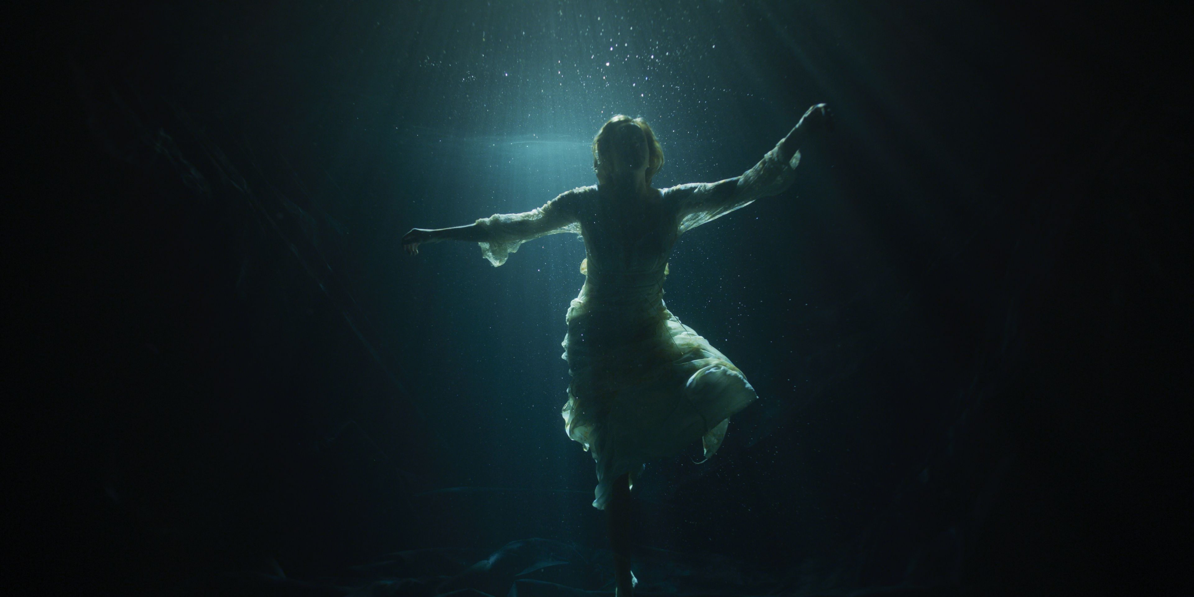
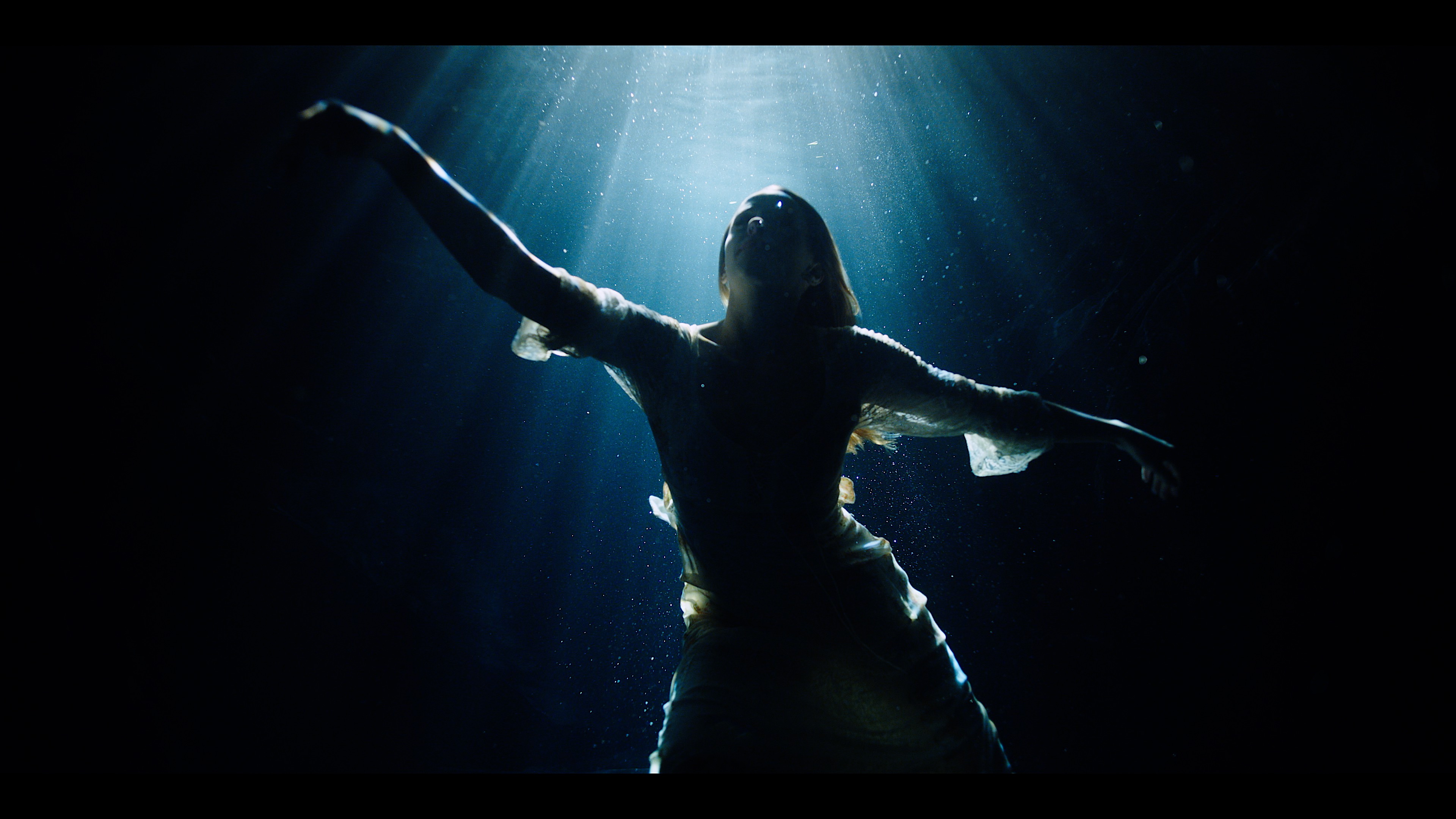
In the image above, the 709 red reflects video’s characteristics: silicon loves long wavelengths, so reds expose—and can overexpose—easily. In the Light Iron film emulation, the red layer is darker and more deeply saturated, which is likely how it would appear on film—a medium whose most saturated hues are the darkest ones, and is also less sensitive to red than is a silicon sensor.
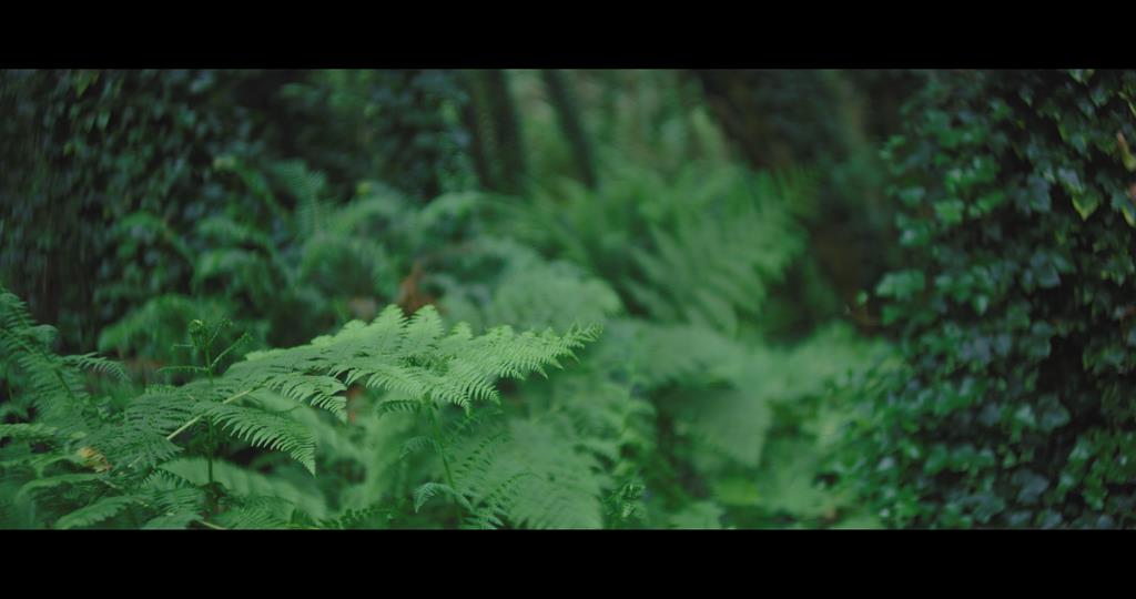 Traditional video greens are both bright and saturated. They tend to blend together in this image, making it less interesting to my eye.
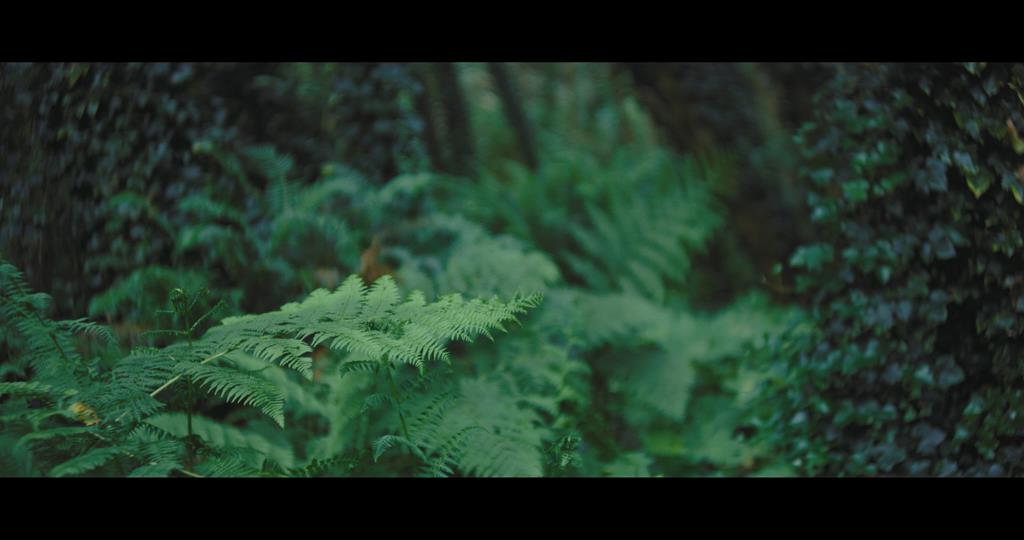 When those brighter hues are remapped to lower luminance levels, the variety of saturated hues in the image becomes apparent. The out-of-focus ferns in the background appear much cooler and bluer than the ferns in the foreground, and this is likely due both to the reduced brightness of the image but also to Light Iron’s attempt to emulate film’s treatment of blues. Either way, I see a lot more color discrimination in the latter image than in the former, along with a greater sense of depth.
Is this a unique technique in color grading? No. The advantage here is that this is DXL2’s “out of the box” look. If you shoot with a DXL2, this is what you’ll see if you do nothing else. Also, I think it’s safe to say that there are likely some differences in color discrimination between the average Monstro and the DXL2 with its new IR/UV cut filter.
At the other end of the camera—the side farthest from post—we find the one thing you can’t change in post: the lens. There are few places in the world where you’ll find a better selection of these to choose from.
THE LENS
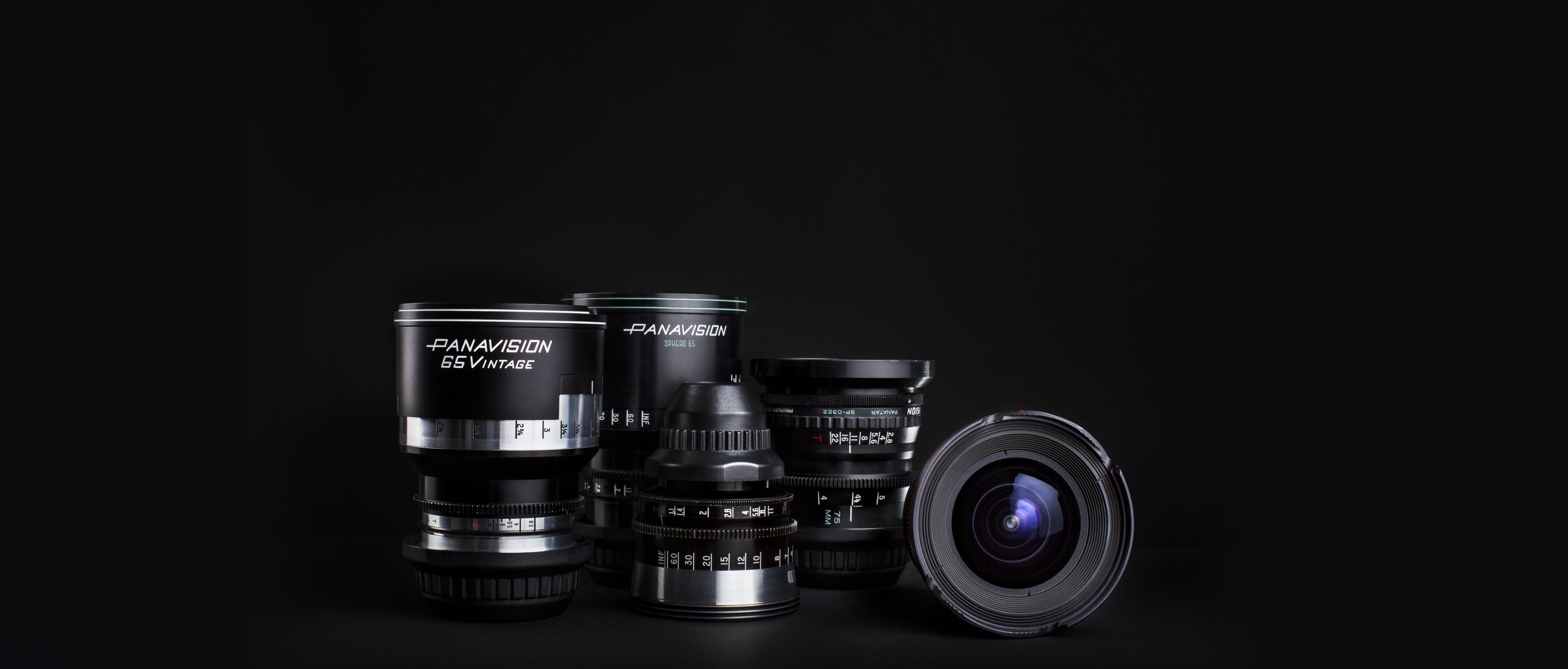
I regularly read articles in American Cinematographer that refer to Panavision modifying lenses to order for various projects. It’s no secret that they have a huge inventory.
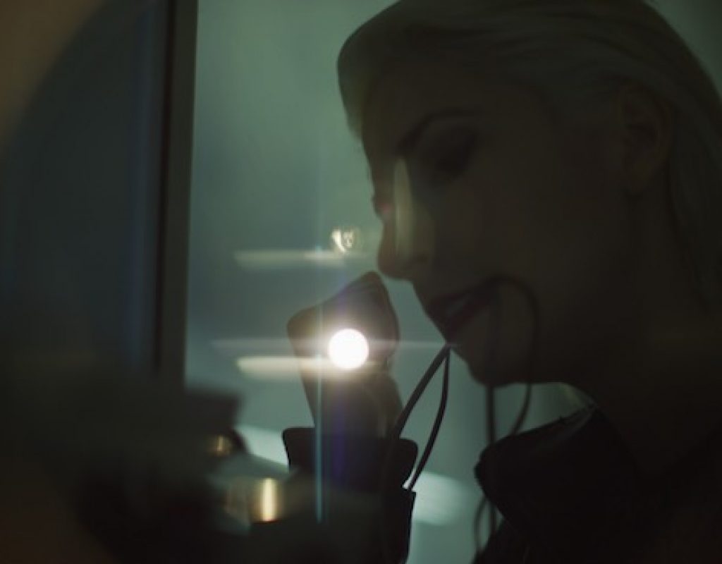
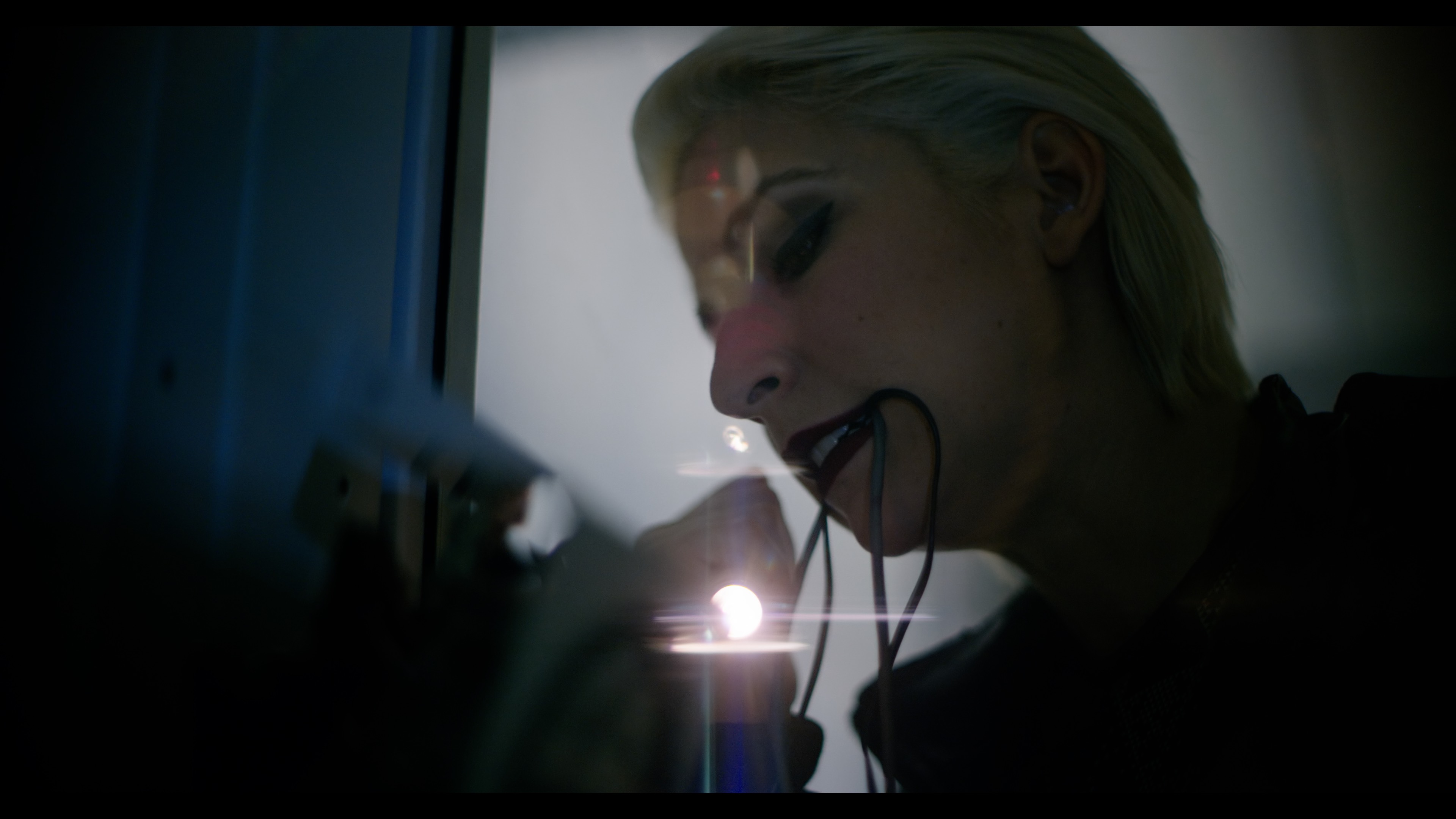
In the video below, Hack, produced by Panavision, the closeup of the woman at the desk was shot with a new 65Vintage lens at T1. Dan Sasaki, Panavision’s lens guru, has optimized this lens series to work with Monstro’s 5 micron sensor and their new IR/UV cut filter. In a conversation we had a while back, Dan told me that the longer focal length lenses used to cover large format sensors give him more opportunities to craft an optical look. Focusing a large real-world image into a very small image circle, such as for 16mm film, means working hard simply to create acceptable results. The larger image circle of 35mm means less compromise, but it’s still hard work. The longer VistaVision focal lengths don’t have to “negatively magnify” real world objects to as great an extent, so he can work less hard on producing acceptable images and enjoy the luxury of adding different types of lens aberrations to create a variety of looks.
Dan also told me that it’s important to look at what the lens does in combination with the sensor. Photo site size, IR/UV cut and fill factor contribute affect how subtle lens distortions are reproduced, and some lenses don’t play well with some sensors.
In other words, the smaller the image circle the harder it is to make a lens that just looks decent. A large format lens, with a longer focal length for the same angle of viewer, allows him to start with a high quality lens and selectively distort it until it looks interesting.
Watch this video for areas of high saturation and low luminance (the “filmic” look).

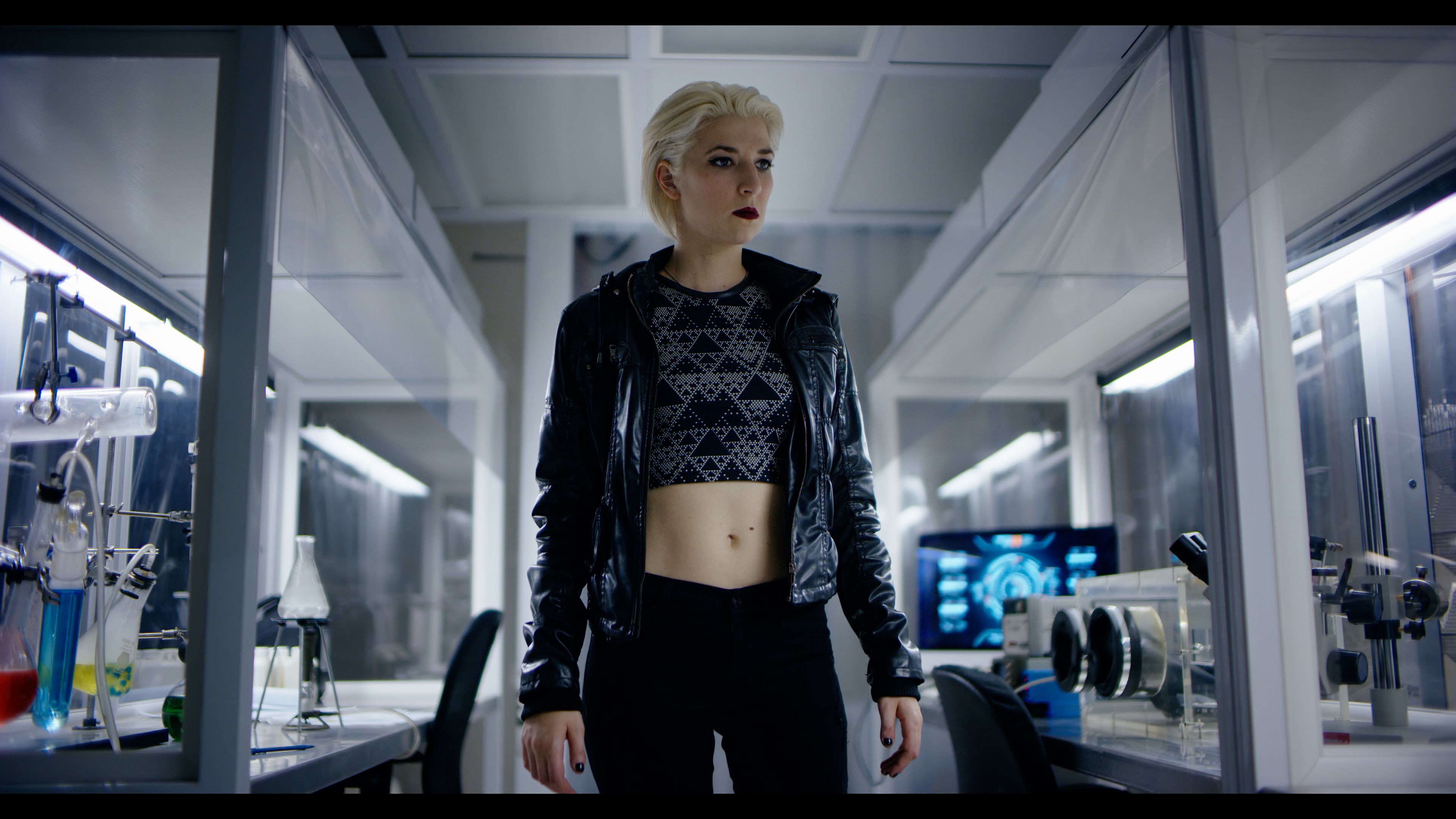
I like the DXL2/Light Iron look. I feel that I’m seeing a much greater range of saturated colors and subtle hues in DXL2 than I saw out of DXL. Flesh tones feel subtle and pleasant, and color discrimination is significantly improved. So far I like what I’m seeing.
MISCELLANEOUS NOTES
Panavision says they think the DXL2 can be safely rated at ISO 1600. I took a look at some frame grabs and saw some noise, but it was actually kind of interesting.
In this article I looked at the difference in noise between a non-Panavision Monstro in both 5K and 8K. I’m going to revisit a couple of frames here.
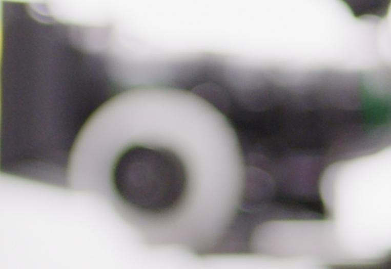
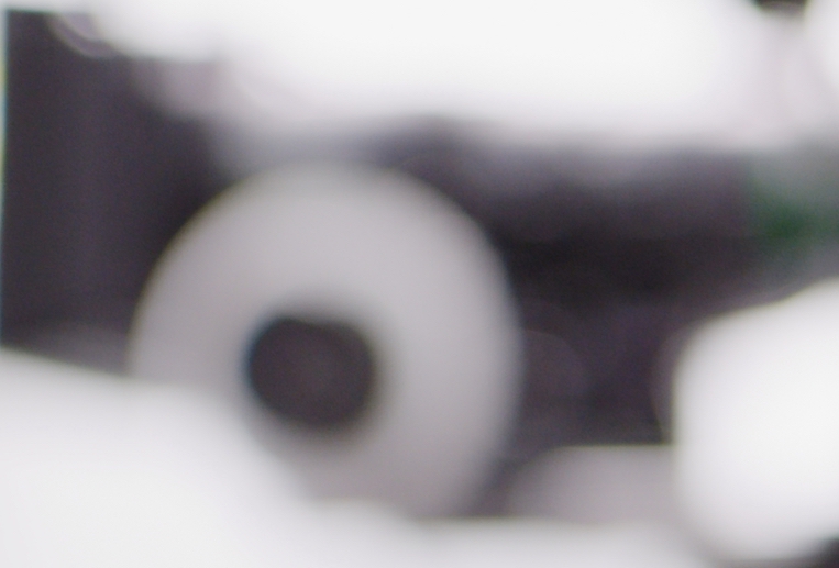
When I look at the 5.5K frame, the noise really bothers me. It creates the illusion of banding, and it’s not subtle at all. The 8K image, though, shows very fine noise that almost feels like film grain.
Tungsten light is the real test of noise in a digital cinema camera:
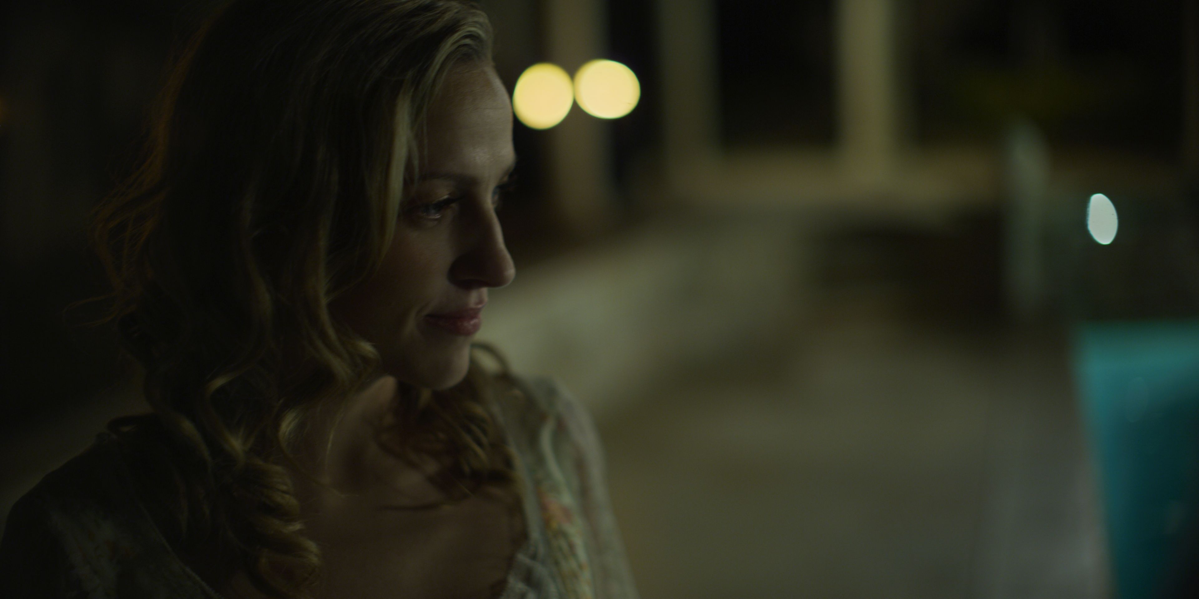
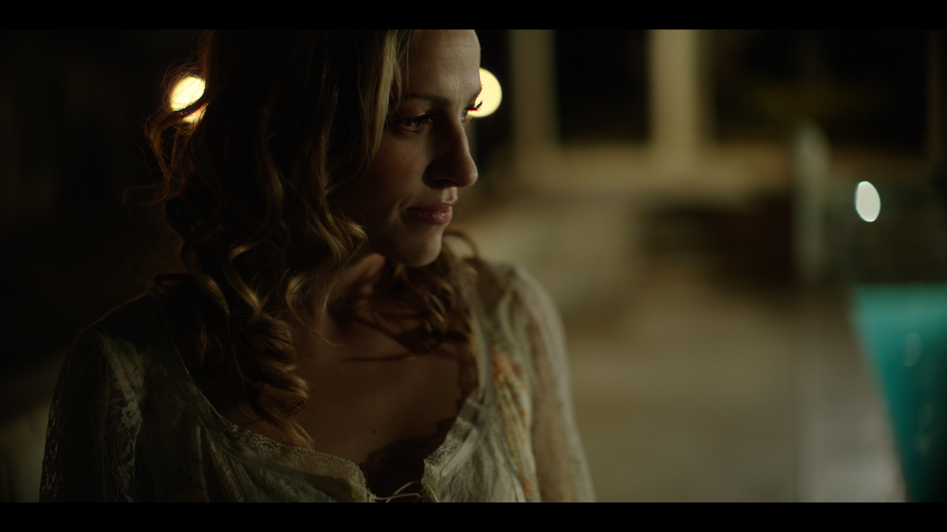
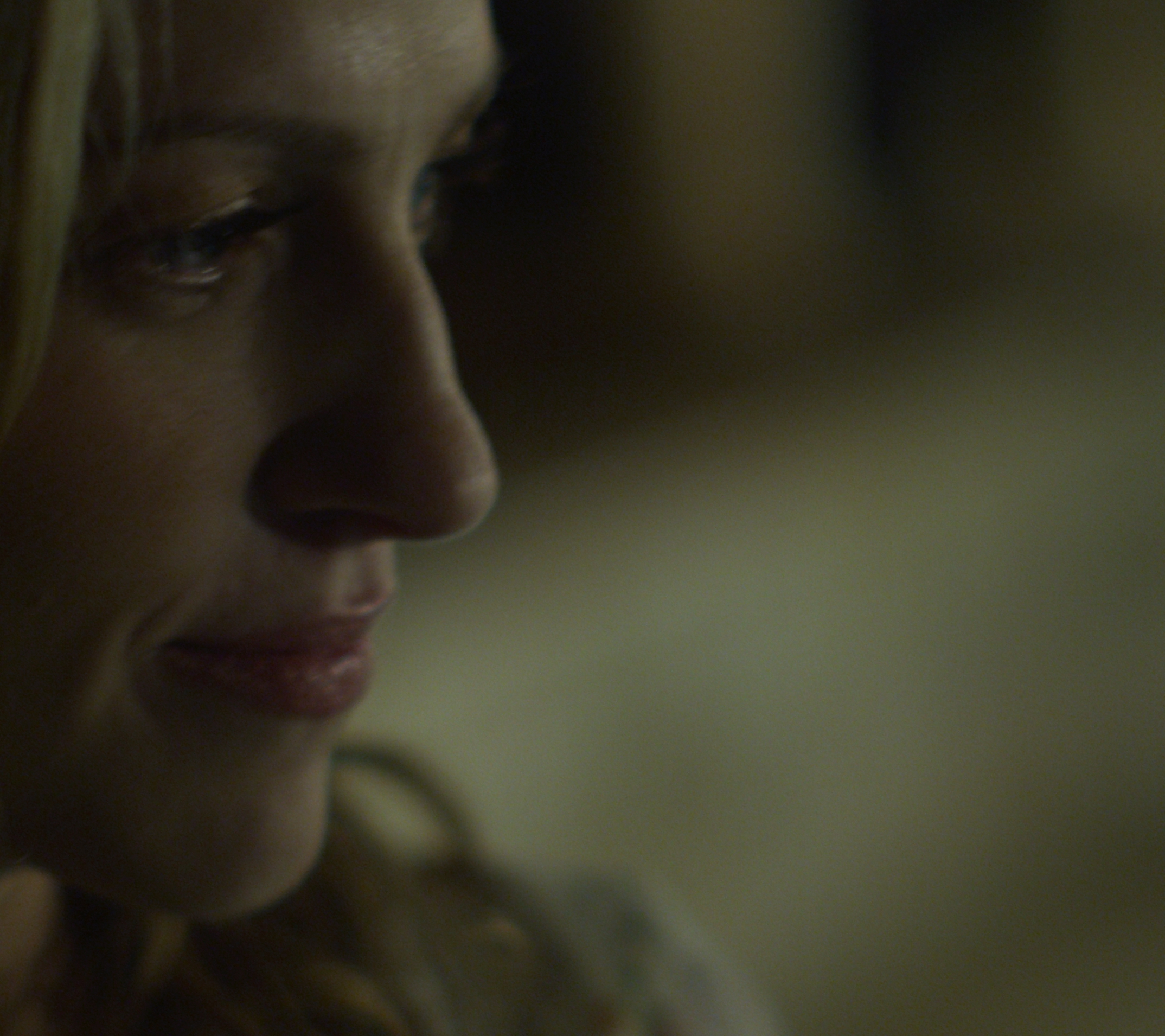
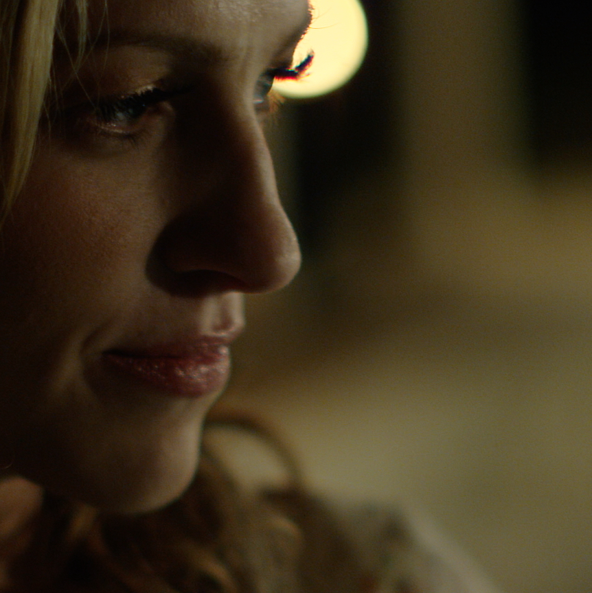
I expected to see a bit more noise in this than I do, as the blue channel tends to be a bit stressed under tungsten light, but it’s not bad. There’s always the chance that data compression could be causing some inadvertent noise reduction, so let’s take a look at an image that was captured at 5:1.

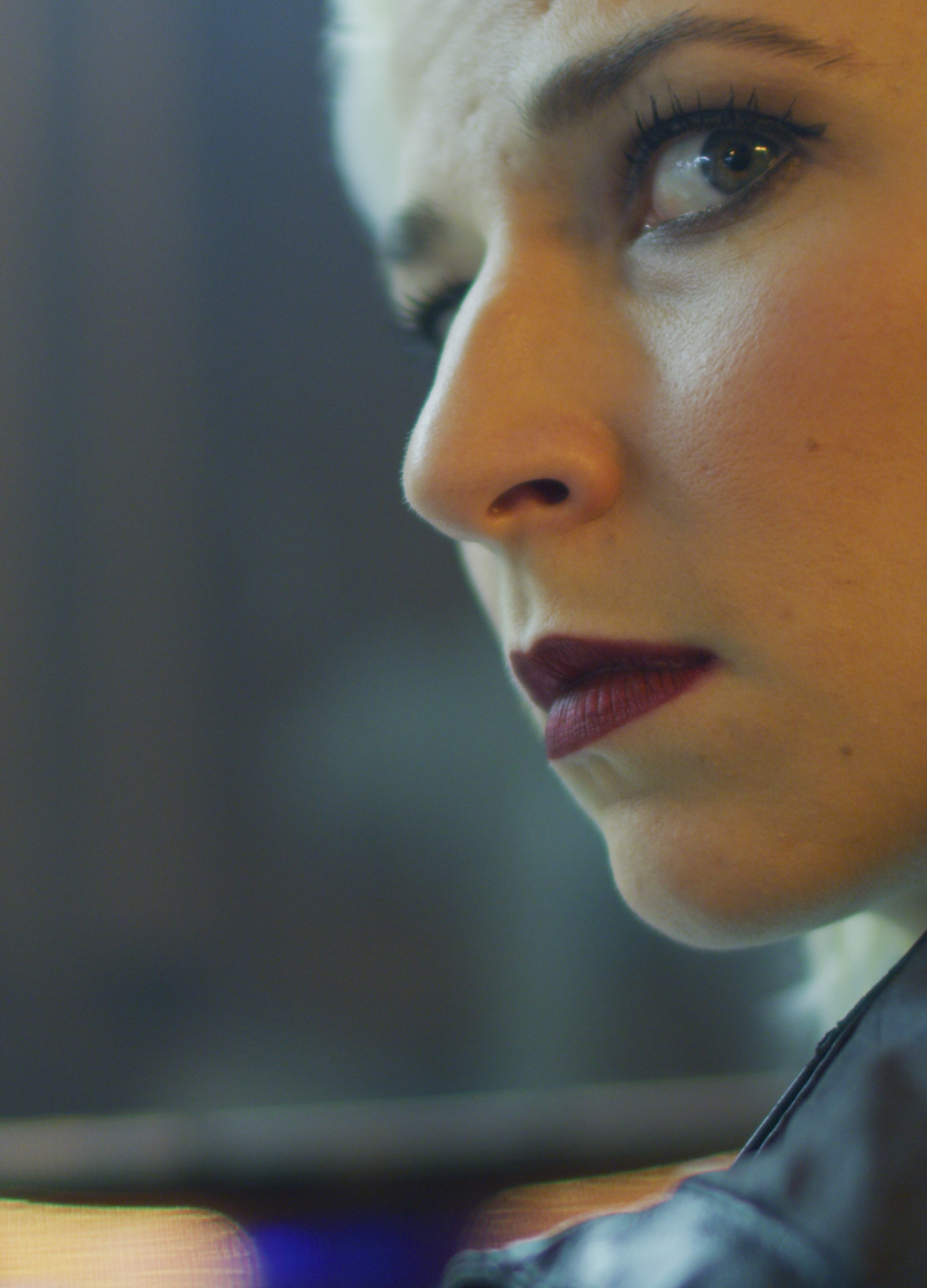 Not bad at all for ISO 1600. The image has some texture but it doesn’t feel thin. (That lens is pretty cool!)
Recently I saw “Call Me By Your Name” in a theater and couldn’t believe the amount of noise I saw in the shadows. At the end of the credits there was a note that said it was shot entirely on Kodak 5219 film. I think my eyes are out of practice if I find film grain distracting; maybe it’s time to bring back some texture to cinematography.
Several shots in the video above were captured using Panavison’s new AFA (anamorphic flare attachment) that adds anamorphic flares to any lens. This feels like a good idea in a world where digital’s clean look is driving us back toward analog imperfection. Typically viewers want to see an interpretation of reality, not reality itself, and our job as cinematographers is to interpret, not simply capture, images that tell the story at hand.
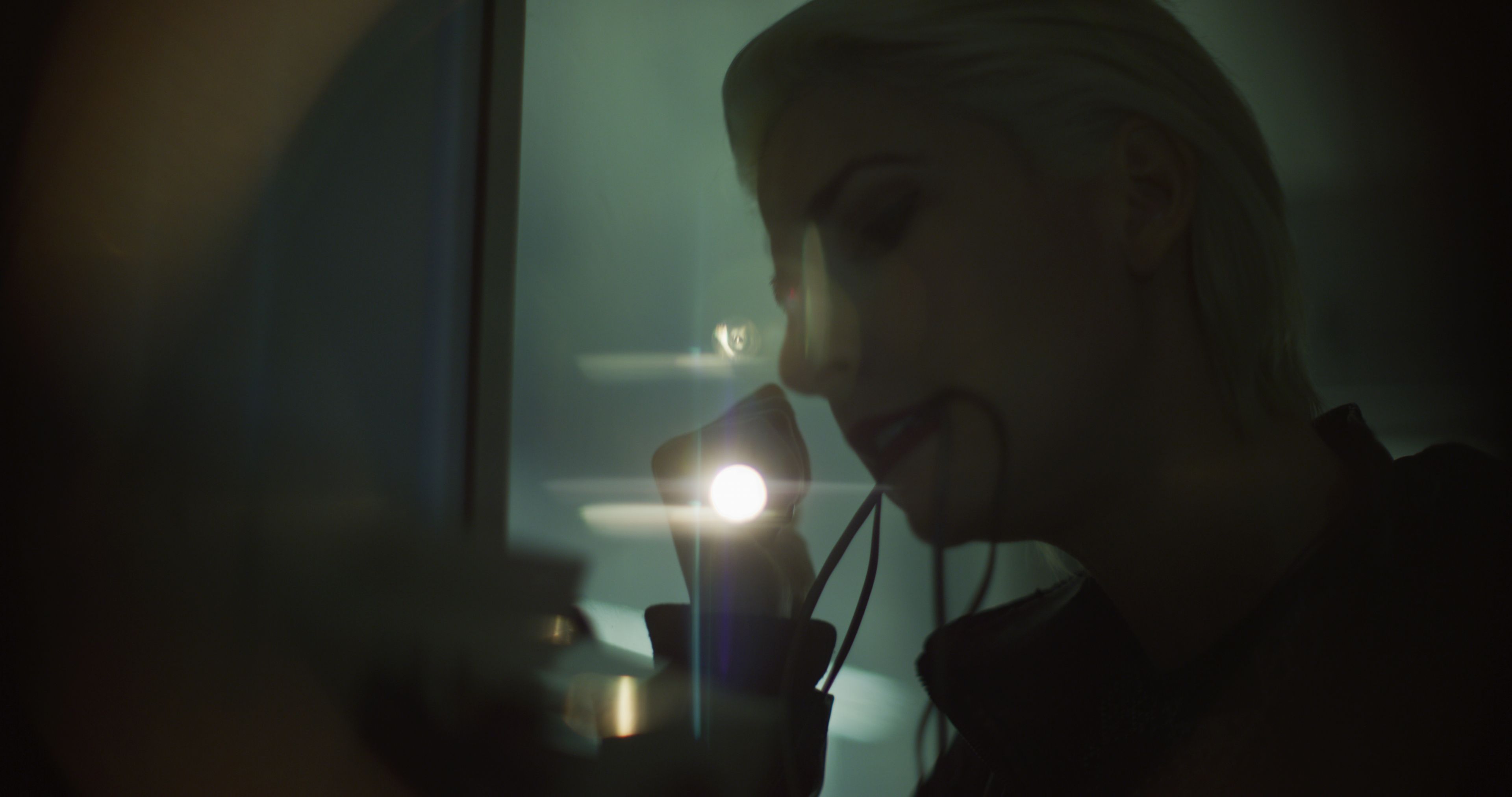
DXL2 looks really promising. I’ll be curious to see more footage out of this camera. My guess is that we’ll be seeing more of it sooner than later.
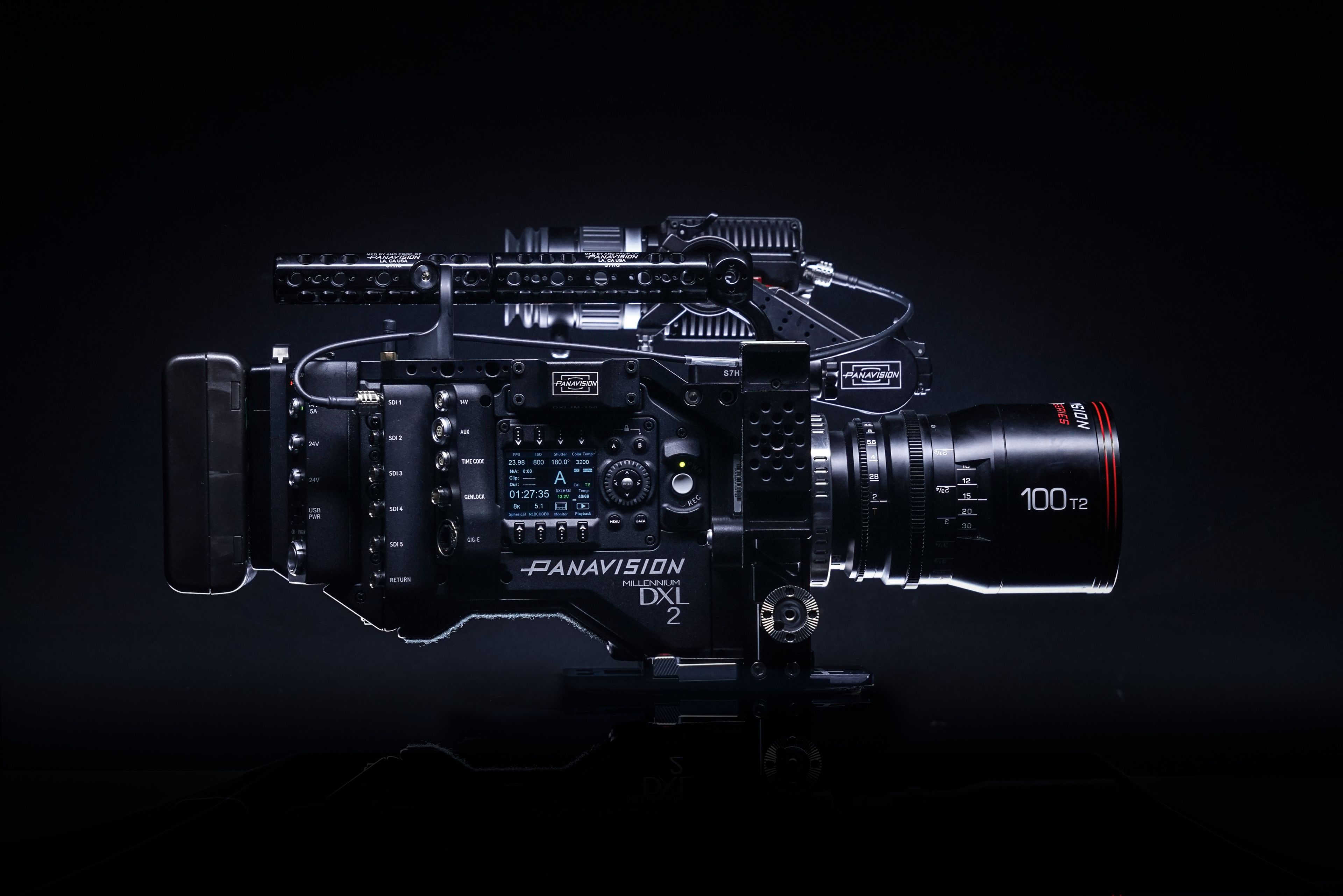 DXL2 will be available internationally as of February 5th, 2018, although Panavision is still working to update some of those bodies with the new PXPro OLPF filter. You can get more info here.
Here’s a behind-the-scenes look at the making of Hack:
I have worked as a paid consultant to DSC Labs. I have no financial relationship with Panavision or Light Iron.

Filmtools
Filmmakers go-to destination for pre-production, production & post production equipment!
Shop Now