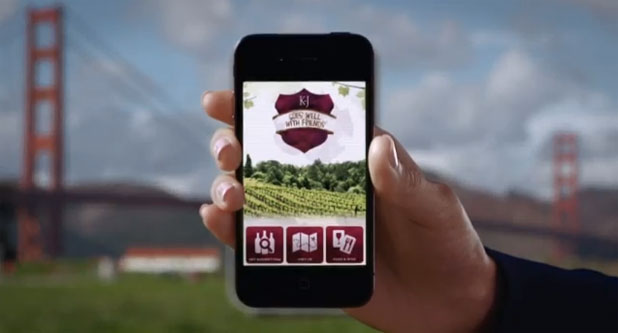
These days it's all about getting the most bang for your budget, and this promo for a new Kendall-Jackson wine pairing iPhone app had to look spectacular for not a lot of money. Fortunately the Canon C300, a sunny day and a great grip crew made this possible…
First, watch the spot as it appears on Youtube:
Our budget wasn’t huge by normal commercial standards.Kendall-Jackson saved a considerable amount of money by producing the entire piece through their internal media department. This is a trend I’m seeing on a lot of my jobs, where the creative is done either internally by the end client or by a production company that both creates the content and then executes it. Bypassing the agency certainly isn’t a good idea for every job, but for a small project like this it gave us a lot more “bang for the buck.” The creative content and production were both handled by one of my regular collaborators, director Ian McCamey.
The product is a mobile app for wine pairing and social connectivity. While it’s not exclusive to any specific platform the choice was made to use an iPhone as a prop for demonstration purposes. We had a props company (FonCo Creative) build an 8’ iPhone that we shot on Crissy Field in San Francisco. We looked at several urban San Francisco locations before settling on this one: one looked great by eye but wouldn’t have photographed terribly well, and another would have photographed fine but didn’t contain anything that was “iconic.” Crissy Field gave us a stunning background and lots of space to work, plus the sun’s path was favorably placed.
Part of my due diligence when surveying an outdoor location is to figure out where the sun will be, and when, as this has a huge impact on the shoot schedule. Based on Google Maps and some help from Sun Seeker I determined the the iPhone would be front lit for most of the morning, but lit from the side in the afternoon. There was only one place we could put the iPhone in order to frame it within the Golden Gate Bridge so there was nothing to be done but to go with whatever light we were dealt with. Fortunately lighting changes between wide shots and closeups are fairly easily cheated, as we’ll see shortly.
I wasn’t overly bothered by having the sun directly over the camera for the wide shots. While light coming from the direction of the lens can feel “flat” as shadows are minimized and objects can feel a bit two dimensional, I wasn’t worried about that here. Depth solves a lot of problems, and the fact that the bridge and most of the background was out of focus gave us enough separation between foreground and back ground to create the illusion of depth. There’s also plenty of contrast between the foreground and the hills and clouds in the background.
We shot this using a Canon C300 with settings that I detailed in this article (see page 2). In a nutshell I chose EOS Standard color matrix with the gain set at -30, and the Cinema1 gamma curve. My testing has shown that while most of the color matrices in the C300 render pretty color, the EOS Standard matrix is the only matrix that reproduces accurate color. The Cinema1, Cinema2 and Norm matrices made the grass look a little blueish, which—in a way—was interesting as this made the grass appear dull and put more emphasis on the iPhone. At the same time, though, the spot felt like it wanted to feel fresh and lively, and the EOS Standard matrix reproduced the actual yellowish-green color of the grass and made the image feel a bit livelier.
My one complaint is that EOS Standard really makes reds pop, but it was also the only matrix that made the Golden Gate Bridge the proper rust-red color while also accurately reproducing the cabernet purple found in the Kendall-Jackson logo and app. Out of the box this matrix is very, very saturated, which is why I set the matrix gain to -30. That setting retained enough color to make the image feel “right” without becoming cartoonish. Sophisticated audiences tend to prefer sophisticated and desaturated colors over bright “poppy” color, and Ian and I agreed that subtle color was the best way to approach this spot.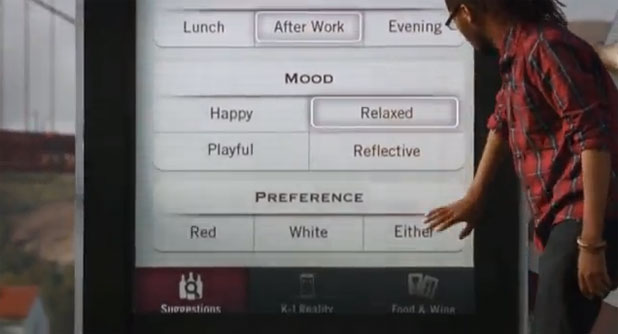
Lit buttons not included: the “active button” glows were added in post using After Effects. The fact that they track the button as the camera moves makes the effect seem more real, as if they happened live.
One way to keep costs down when using the Canon C300 is to use Canon still lenses. They aren't as sharp as regular moving image glass, focus marks don't track properly and the aperture varies across the zoom range, but if you can work around those variables then it's very cost effective to have a variety of focal lengths on hand. I opted for Canon 24-70mm and 70-200mm stills zooms, using the 24-70mm set at about 65mm for the wide shot and the 70-200mm set at 200mm for the tighter shots. (The f/stop was around f/5.6 all the way through.)
We put the camera on a high-hat to get it low enough that the iPhone was nicely framed against the bridge.
There's no additional lighting for the early wide shots, but as the sun came around to the side we had to take action to hide the fact that the lighting direction changed so dramatically. Key to this was using a 20'x20' frame of half soft frost to diffuse the light and make it feel a little less directional. As the sun came around the shadow of the iPhone's bezel on the screens became quite pronounced and the half soft frost smoothed that out.
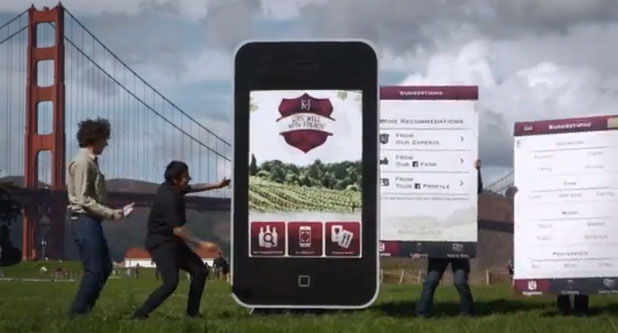
Early in the day the sun came right over the camera, but as the day wore on the sun drifted camera left and the shadows lengthened and drifted camera right.
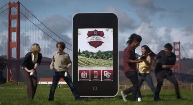
Later in the day the half soft frost overhead softens the shadows and makes their change in direction less obvious. (You can see the change of sun direction between the two shots on the bridge towers in the background.)
Our biggest concern was that the sun came around so far that it didn’t light the flat screen as brightly at the end of the day as it did at the beginning, as the flat screen started the day lit frontally but sat at a right angle to the sun by late afternoon while the three-dimensional people were still quite brightly. The half soft frost spread the light out a bit and added some exposure to the screen more while erasing the hard shadow cast by the bezel, but I found I had to open the f/stop a bit and overexpose the highlight side of the actors’ faces in order to keep the screen looking reasonably bright.
There are differences in brightness between the iPhone screen on the wide shots verses the tight shots but the difference in frame size between those shots is so great that the difference becomes much less noticeable.
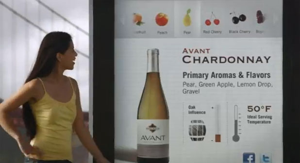
The screen is noticeably darker than in the shots above, but the average viewer most likely won’t notice or care. If the story grabs the audience they won’t notice or care about details like this. At this point the sun is diffused by the 20’x20’ half soft frost, which softens the light on the actress and softens the shadow cast by the bezel onto the screen. The fill source, a 12’x12’ Ultrabounce placed just outside of frame right and backed off a bit, brightens the shadows without giving itself away. Keeping it near the lens axis hides any shadows it might cast.
I was quite pleased with how the combination of the EOS Standard color matrix and the desaturated color kept bright flesh tones looking natural. It’s not unusual for some cameras to push flesh tones a bit yellow or orange as they approach clip, but that didn’t happen here. The flesh tones stay nicely neutral and appear a bit bright instead of bright and discolored.
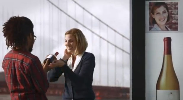
Bright flesh tones stayed pleasantly neutral, even when overexposed by a stop or two.
Here's a shot of the relationship between the half soft frost butterfly and a 12'x12' bounce I added as fill:
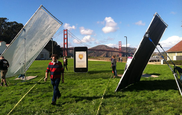
Background: 20'x20' half soft frost. Foreground right: 12'x12' Ultrabounce. Photo courtesy of director Ian McCamey.
None of this was necessary until the sun came around toward 90 degrees to the iPhone, at which point I had to soften the sunlight a little and punch up the shadows a touch. I let the shadows go very dark early in the day as the sun was directly over the camera and they were such a small part of the frame, but as the sun came around and the shadows lengthened they became a bit too extreme for the closeups and for the final wide shots.
My gaffer wanted to push the 12’x12’ bounce closer to get more punch out of it but I held him back. I wanted the fill to be frontal and “invisible.” The closer it got the more obvious it would be become as people would be noticeably brighter on the right side of the frame than on the left, and there was no visible reason in the wide shot to motivate that. I also didn’t want to see a fill shadow, preferring instead a slightly less bright but invisible fill with a more natural feel. This forced me to open the f/stop to hold shadow detail as compared to the wide shot, but I had to do that anyway to keep the exposure up on the screen as the sun moved around to the side.
The nice thing about half soft frost is that it softens light without reducing it much. It dropped the exposure on the actors and the iPhone by no more than a half stop to a stop, which helps considerably when the background consists of white fluffy sunlit clouds. I had to let the clouds blow out a little on the closeups but I don’t think it’s noticeable or objectionable.
My biggest fear at the beginning of the day was that the foreground would drift in and out of sun and clouds, which could have been a nightmare as chasing exposure manually on a still lens was not going to be an option. It’s hard enough to pull the aperture in similar circumstances on a real lens, but there was no way I could have done that smoothly on an electronically-controlled zoom. Instead I rated the camera as slowly as I possible could, which I believe was ISO 320, knowing that the only barrier to bringing up the exposure later in post is the noise floor. By setting the ISO as low as possible I pushed the noise floor as low as possible, so if we had to pull the image up a stop or two later I should—in theory—have plenty of room to do so, only ending up with the kind of noise I’d get at ISO 640 or 1250. That way we could ride the exposure in post, where we stood a much greater chance of making the exposure transition as precise and unnoticeable as possible. (This kind of shift is always noticeable to some degree as the as the shadows suddenly disappear and all contrast in the image flattens out, but we do what we can in order to make our schedule.)
We shot the real phone late in the day against green screen. One of our actresses took on additional duties as hand model, and it would have been really hard on both her and the actors to have her land in the right spot at the right time in order to do this shot live (racking focus from the iPhone to the background action). By shooting against green she could try a series of actions, finessing her hand placement and orientation on each pass, and the director could pick the one that worked best in post.
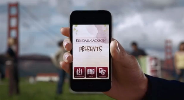
The screen was nearly black. We had some sort of bright image on it so the compositor—in this case, the director—could add the appropriate screen later. If we’d tried to do it live we’d have wasted at least an hour trying to knock down the sunlight so that the screen appeared bright enough and eliminating reflections in the screen surface.
There are three lighting elements at work here. The sun is softened by a 4’x4’ frame of very light diffusion, probably Hampshire frost. There’s a 4’x4’ bounce fill to the right of the lens and set a bit low, so as to feel as if it’s a bit of sidewalk or something else that might reflect light naturally. There’s an additional 4’x4’ bounce card at a 3/4 back angle to the right side of the hand to create that subtle highlight around the base of the thumb and in the thumbnail. (I love soft backlights. They don’t light skin so much as they reflect in it, and they have a very different feel from a light that’s actually projecting a beam. The result is a soft and subtle reflection instead of a hard edge.)
We managed to pull this off efficiently and pleasantly in about ten hours with a fairly small crew. Thanks to a spectacular setting, and spectacular weather, a cool concept and some very enthusiastic actors, the spot seems to be a hit.
Art Adams | Director of Photography | 11/30/2012 | www.artadamsdp.com

Filmtools
Filmmakers go-to destination for pre-production, production & post production equipment!
Shop Now