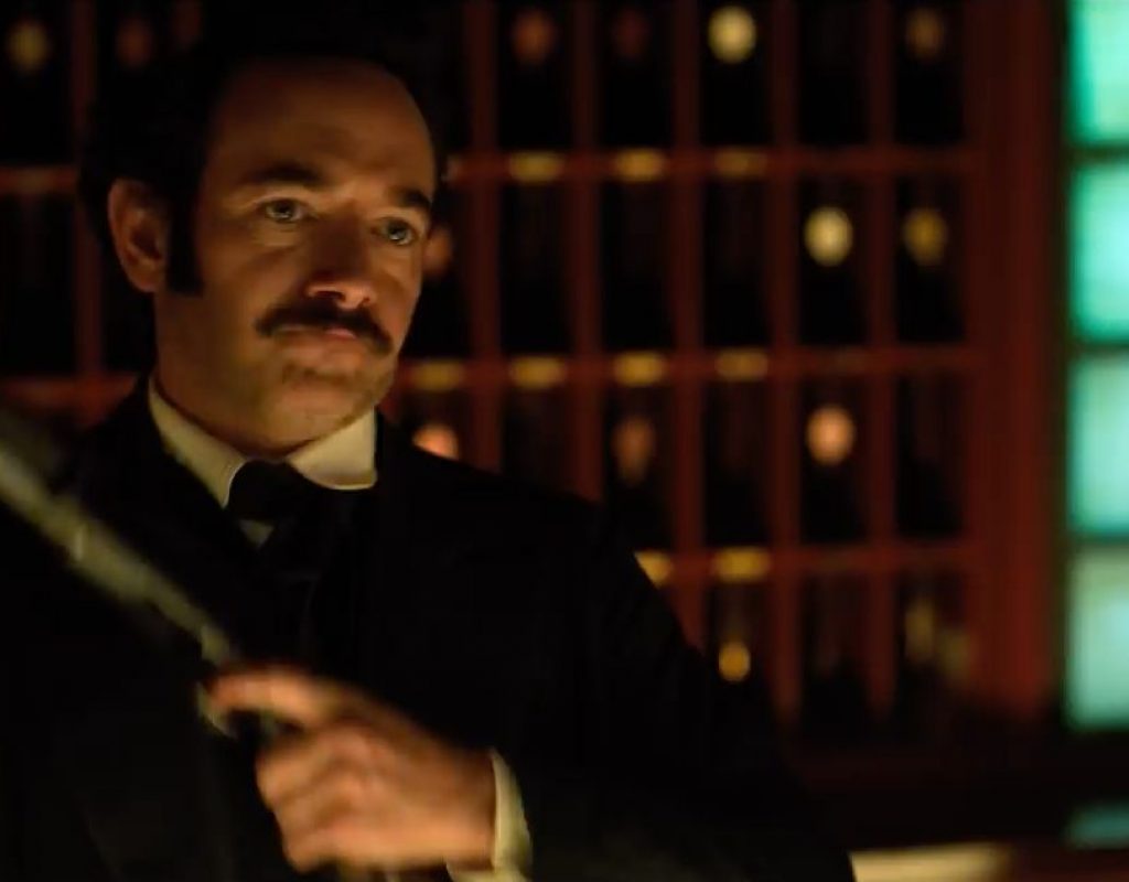
I’m eight episodes in to Netflix’s Altered Carbon, and I’ve officially become a believer in large format TV cinematography. Here’s why.
It’s no secret that studios and theater chains have long sought new and interesting ways to plant butts in movie theater seats. Cinemascope, VistaVision, 65mm, Cinerama… all were invented to lure people away from televisions and into movie theaters. Sadly, they no longer work very well: TV seems to be where the best storytelling is right now, and competition between streaming channels is fierce. It was only a matter of time before they’d compete on image quality as well, especially as UHD HDR is officially available, if not yet in very high demand.
Plenty of shows are shooting in 4K or UHD on REDs and Sony F55s, and probably also Varicam 35s (although those aren’t on my radar in the same way), but I find it particularly interesting that several series are shooting on Alexa 65. Altered Carbon is the first of these that I’ve seen, and as I work my way through the series (I’m currently on episode 9 of 1o) I’ve got some thoughts on the look that I’d like to share.
The trailer is here:
https://www.youtube.com/watch?v=dhFM8akm9a4
There are three things at play here: color, resolution, and depth of field.
COLOR
There’s a reason that Alexa is the gold standard for color. It just looks freakin’ great. There are certainly a lot of good looking RED and F55/F65 series, and I can’t say I have a lot of visual complaints about them, but when a series is shot on Alexa—and it’s particularly colorful—wow, what a difference.
Cinematographers often talk of lighting direction and quality, but a key component of lighting that isn’t spoken of enough is color. Every light has a color, even if it’s neutral. Every light elicits a spectral response. Every color elicits an emotional response. And every camera has a way of reacting to color in the environment. Altered Carbon’s cinematographers do some very interesting things with color contrasts, and while these color schemes aren’t particularly unique to the series, they are simply stunning when combined with the Alexa 65’s reduced depth of field.
For example:
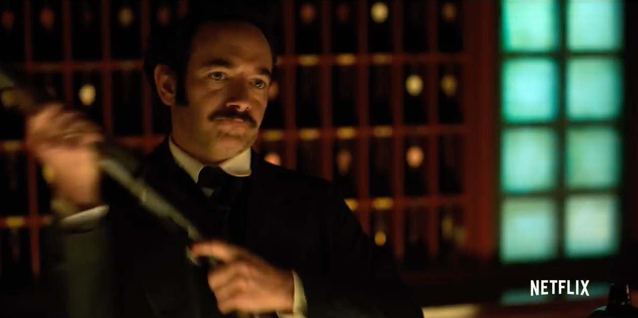 This yellow/cyan color scheme is wonderful. I saw an industrial version of this in Netflix’s Daredevil, where it played as opposing sodium vapor/mercury vapor lighting in urban environments. Putting contrasting colors together like this enhances the overall effect as it’s impossible for our eyes to become exhausted by a strong hue and then attempt to compensate for it. An overall warm scene may lose its warmth over time as our eyes fatigue, and the same is true for overall cool scenes. Color contrast not only prevents this from happening but it can create interest in situations where contrast and shadow alone aren’t enough.
Our eyes see color using a color opponent system, where red and green oppose each other, and blue and yellow do the same. You’ll never see a reddish green or a greenish red, nor a blueish yellow or yellowish blue. In the shot above, the warmth is yellow/red and the coolness is blue/green. This is the ultimate in color contrast, and it really works.
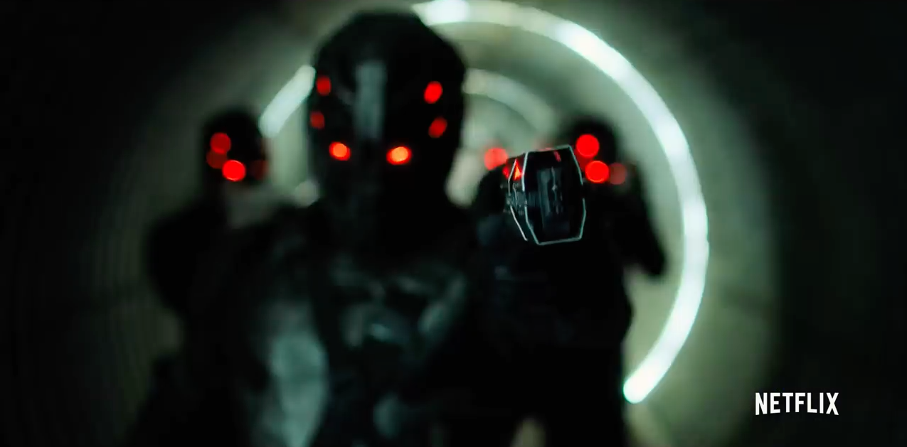 Another example of strong color contrast. The background is very slightly green, which opposes red nicely and makes it pop all the more.
RESOLUTION
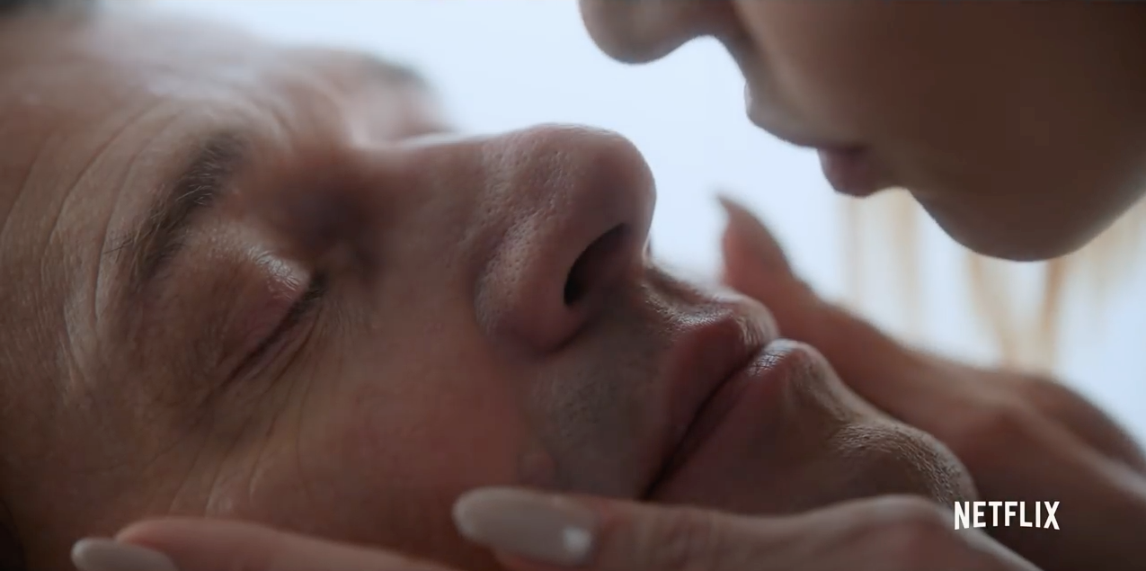 Alexa 65 is normally 6.5K across, but this show was shot in a 5K mode that I didn’t know existed. This was apparently to keep the amount of data from being completely overwhelming instead of simply overwhelming (the Alexa 65 only outputs Arriraw, and while it is log encoded it is otherwise completely uncompressed) but also to take advantage of a slightly larger frame size than 4K or UHD.
The rule of thumb is that de-mosaicing results in a 20% loss of resolution, although I’m told by Arri that their engineers believe they have gotten this down to about 10%. Whatever that number may be, I can see the difference that oversampling makes, even on my 720p LCD TV at home. There’s a startling amount of visible detail.
I never noticed this on other series that I’ve seen shot in 4K or UHD on RED and F55/F65. A lot of RED series look pretty good these days. The F55/F65 does have a bit of crispness to it that can give them away, although mostly what I look for are their distinctive rendering of blues (slightly electric, a little green, but generally very pleasing). There’s something about the resolution from an Alexa 65 in 5K, though, that really catches my eye.
DEPTH OF FIELD
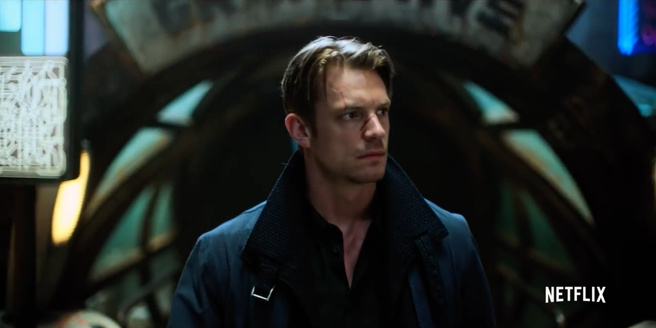 Even wide shots have soft backgrounds. It’s startling when a shot in this series shows a deep depth of field.
I really like this look. I don’t think it’s perfect for everything, but for a series where there’s so much going on visually it really helps direct my eye. This will be particularly important when a large proportion of the audience starts watching in UHD, as full UHD detail across a large frame may make it difficult for us to know where to look during a four second or less shot.
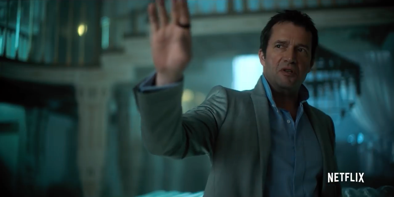 Many shots feel as if they are part of a dream. I love that I can see the funkiness of the lens. Based on what I’ve read elsewhere, Canon-CE primes were used for focal lengths shorter than 65mm, Cooke S5s for 65mm and 100mm focal lengths, and Cooke S4s for longer focal lengths. I’m guessing the shot above was on a Canon prime as it doesn’t show the characteristic octagonal bokeh seen in Cooke primes. Look at how the highlights in the background feel as if they are coming through the back of a glass bottle. The rippling curves on the right side of the frame are particularly interesting. One nice aspect of shooting at high resolutions and larger sensor sizes is that this brings out the “character” of lenses, which is often code for emphasizing their defects. Defects, though, are often the most interesting things about lenses. Seeing reality as it is can be boring. Seeing reality through a distorted lens can be fascinating.
I was surprised to read that Canon-CE lenses covered Alexa 65’s 5K mode. In this article I took a look at the effect of putting older S35 glass on large sensor cameras and found a number of creative looks that I’d like to explore further. Many older lenses can cover larger sensor sizes, often with slightly unpredictable effects. It seems that the DPs of Altered Carbon are doing exactly this.
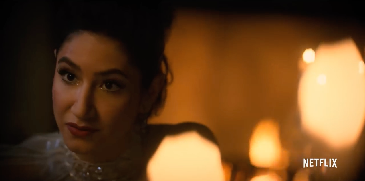 There’s some of that beautiful Cooke octagonal bokeh.
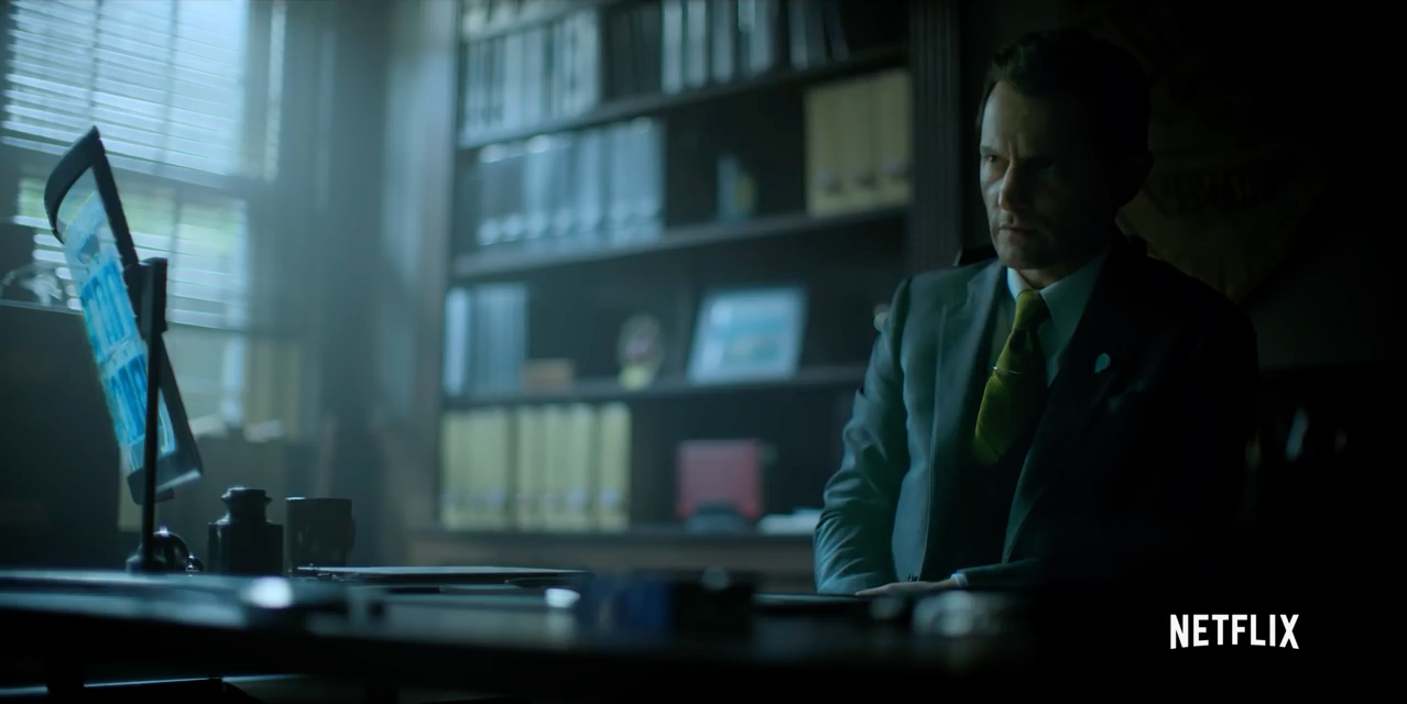 I love the out of focus books and blinds in this shot. They smear together in a really interesting way. I love that what would be a simple medium shot in any other police procedural can be so beautiful here.
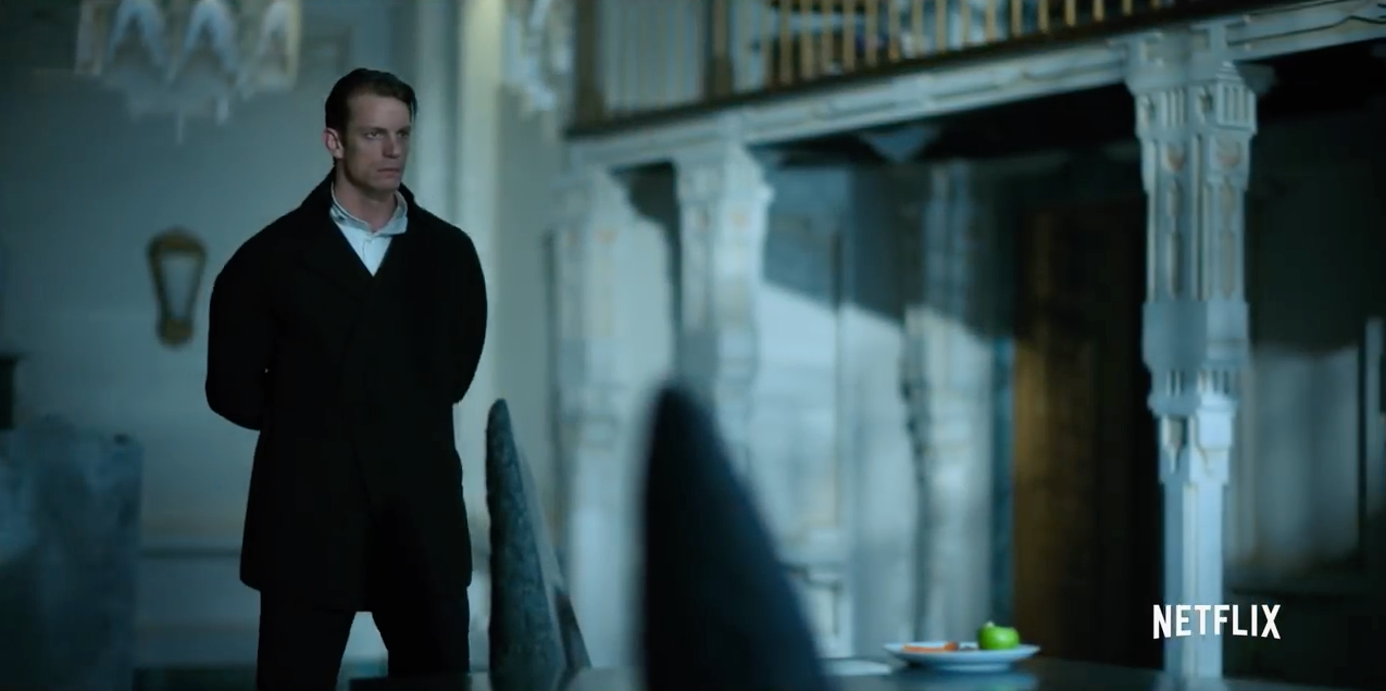 Even this long-lens wide shot has a painterly look due to reduced depth of field. In a fast paced and heavily-edited TV action/drama it helps to focus our attention on exactly what we need to see in the few seconds the shot is on screen.
UPSHOT
This series is beautifully photographed. Sadly, this is about the only reason I can find to watch it. The first two episodes were fascinating, and I felt that I was watching a series whose world building surpassed Blade Runner 2049. From the third episode on, though, it devolved in a very slick but poorly-written cop drama, full of cliches and scenes that I’ve seen repeated so many times in other series over the last few decades that I had to fast forward through several. Just last night I had to skip over a “Lead character has to pretend his love for another has been a farce, rejecting her in order to save her life” scene.
There are some great actors here, but the leads generally can’t carry their roles. There was one episode where, due to the fact that one lead mumbles and the other has a very strong accent, I had to turn on subtitles in order to keep track of what was going on. The violence and gore are gratuitous, as are the soft core-quality sex scenes. The story feels like it’s been artificially lengthened to hit the required number of episodes. And there are episodes that are just plain poorly written in every way. At this point I’m going to finish the series simply because I’ve fallen pray to the sunk cost fallacy: I’ve come this far, I might as well get through it.
The good news is that the visuals keep me interested. That’s generally not enough, and I worry that Netflix is doing what a lot of traditional movie studios do: as the budget increases, the chances they take decrease, until they’ve got a very glitzy, glamorous, expensive project filled with tropes and dialog that we’ve seen and heard a hundred times before. Between this and Netflix’s recent The Cloverfield Paradox, which was truly awful in every way but visually, I worry that they are mistaking great cinematography and flashy sets for quality. I’ve got nothing against great cinematography, but that alone is not enough to keep me interested in most movies and TV series.
Altered Carbon is showing me all the ways that large format cinematography can enhance television, and I hope we see more large format TV in the not-so-distant future (there are several other series and original streaming movies that have been shot on the Alexa 65, and I’m sure the Alexa LF will be filling in a few more gaps in the next year), but visuals alone do not a movie make. Some of the best shows on Netflix, Amazon and HBO are the ones that truly take chances and play to niche audiences, and what I’m finding is that quality becomes its own niche. A show’s subject matter may not initially excite me, but if I hear good things about it I’ll give it a shot. If the storytelling quality is high then I’m happy to watch just about anything.
I have worked as a paid consultant to Arri.
I’ll be teaching two Arri Academy classes in mid-March, 2018 in Brooklyn and Chicago. If you’d like to learn the ins-and-outs of Arri cameras, accessories, color processing, LUTs, recording formats, etc., this is worth checking out.
Filmtools
Filmmakers go-to destination for pre-production, production & post production equipment!
Shop Now