In my first book on color correction, “Color Correction for Video – 2nd Edition” there’s a great story about an early color grading pioneer. When they built his color correction suite, they made it like a “smoking room,” with warm, incandescent lighting and dark, rich woods. Just the kind of place you’d want to hang out and watch TV for hours at a time. Unfortunately, it was NOT the kind of place you would want to GRADE hours of TV at a time. Because of the warm, orange surrounding environment, it had the effect of subtracting those same tones from his monitor, so to compensate, he graded his images warmer and warmer throughout the day. By the end of a long session, his skin tones were “oompa loompa-like.”
Nowadays, colorists know better. You don’t want to color grade with your favorite giant, bright red, “Reservoir Dogs” poster right next to the monitor. What you want, is a neutral viewing environment. You also want a fairly dark room, but not pitch black, because of the eye strain of looking at a very bright monitor in a very dark environment. The ideal illumination is to have a gentle backlight hidden behind your monitor, known as “bias lighting.” Lights behind the monitor limit or eliminate reflections and glare, while providing enough additional illumination to “bias” the iris of your eye, reducing eye strain and fatigue.
The trick with this kind of illumination is that the color temperature of the backlight has to match the color temperature of your video monitor, which is daylight, or D65 illumination. This is not easy to find. The other trick is that the backlight should not be too bright or too dark.
Enter Ideal Lume.
The idea for Ideal Lume started as part of Alan Brown’s Cinemaquest home theater installation company. Like many home theater specialists, Brown was trained by the Imaging Science Foundation.
The ISF helps teach proper color calibration techniques for home viewing environments and they pointed out the importance of having a proper viewing environment, but they didn’t provide the tools to achieve it. So Brown devoted a good amount of research to finding and developing one of the most critical elements of that viewing environment: the light.
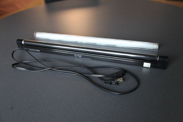
The best, most accurate light for generating D65 (daylight) is a metal halide incandescent. However, the heat that these instruments put out is overwhelming for the typical color grading suite. The brightness of these bulbs is also very hard to adjust without altering its color characteristics. But the next best thing in terms of spectral response is a specific type of seven phosphor fluorescent light patented by Gretag-MacBeth (since bought by X-Rite). They patented a fluorescent fixture that was used in their special color viewing or proofing booths.
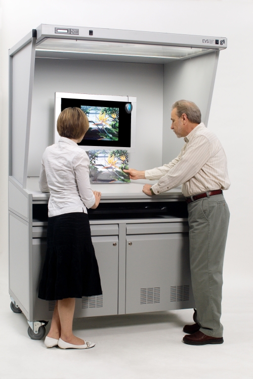
When I worked at VeggieTales, the design team had a booth with these lights that they used to analyze and view printed material. When color is critical, you can’t simply view a color sample under the office fluorescents.
Here’s a similar booth from gtilite for color proofing.
Gretag’s seven phosphor lamp meets the specifications that the International Commission on Illumination (CIE) describes for a D65 illuminant. SMPTE also published a document of best practices for viewing environment and they encouraged ambient lighting be as close as possible to CIE D65.
Ideal Lume checked out numerous suppliers, testing each bulb with the same color calibration hardware used on the monitors themselves, looking for the closest match to D65 that had a smooth spectrum power distribution curve, without odd peaks or valleys at specific hues along the spectrum.
The other issue with these fluorescent lights is dimming. Originally, Brown just tried using neutral density filters to adjust the comparative brightness to the monitor, but he discovered that the neutral density filters weren’t completely neutral across the entire spectrum and they got worse as they aged. So Brown created a mechanical dimming system using a special film originally developed by Polaroid, that allows the bulb to be dimmed by actually blocking some of its light output.
The Ideal Lume system is a complete package of electronics, mechanical dimmer, mounting hardware, fluorescent bulb and instructions.
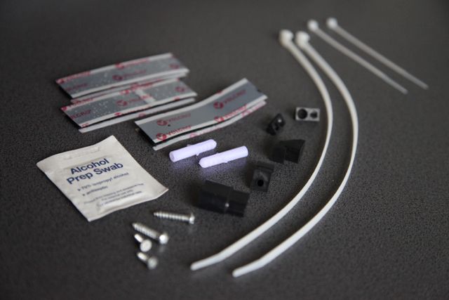
Originally it was developed as a high-end consumer solution. AV enthusiasts and videophiles are well aware of the benefits of “bias lighting” but there really wasn’t any place to purchase the proper lights. While Brown was in the final stages of developing the more accurate and feature-rich “pro” version of his lighting system, Industrial Light and Magic called to order six of the consumer versions and ended up purchasing the very first six models of the “pro” version.
Since then, others, including fellow colorist and color grading trainer, Robbie Carman, have endorsed the product. Not to speak for Robbie, but I’m sure a big part of that endorsement is because of the wealth of information about viewing environment and color science that is available on the cinemaquest website (http://www.cinemaquestinc.com/blb.htm).
Brown says that the biggest thing he’s learned over the past decade about the principles or a proper viewing environment, “is that far too often a major component is ignored or isn’t understood. The room is always critical in both sound and video and the one component that gets ignored is the viewer. The better we understand how the human vision system works, the better we can create these rooms. Very few people understand that part of it.” To that end, there are numerous white papers and links to other articles and pertinent information on the perception of light and color and the importance of viewing environment peppered throughout his website. If you’ve been looking for a resource on viewing environments, this is basically your one-stop-shop.
As for the walls themselves, for consumers, he recommends a lighter gray color (yeah, my wife will agree to “light grey” for our living room!) and for professional environments a darker gray, similar to a Kodak 18% gray card. This color is available from a company called Munsell. The generally accepted reference is Munsell N5 which is in the middle of the reflectance scale. There are also Munsell N7 and N8 latex paints that are more cost effective and less noxious when being applied. Munsell Latex neutral paint, available here and here
I have been using the Ideal Lume system behind my main color grading monitor for several months now. For me, I didn’t need the mounting gear that came with the light, because my monitors are supported by two metal arms that sit directly behind the main monitor, so I simply set the light across the two arms. My light is probably a little further from the wall than most installations – maybe two feet away.
One of my editing and color grading stations is pictured. The wall was painted before I moved in and is a light grey color. The backlight visible behind the system is from the Ideal Lume. Prior to installing the Ideal Lume, I used an Ott light, which is marketed as a full spectrum light, but I never had it tested for compliance to D65.
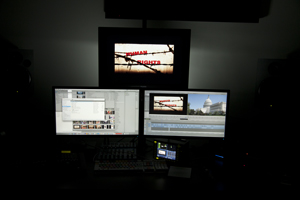
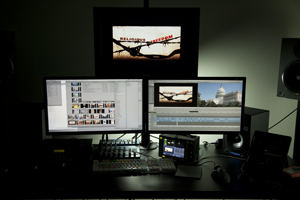
I can’t say that my color grading has gotten better since adding the Ideal Lume, but I was pretty close to having a correct environment to begin with. But notice what color the background appeared to be when I was using the Ott light. To my uncalibrated eye, it looked like daylight, but these two images – Ott and Ideal – show the color differences. The Ideal Lume is to the left and the Ottlite is to the right. Hopefully I wasn’t grading in too much green to compensate before the Ideal Lume arrived. I’ll have to go back and look at my original grade of “Transformers…”
The hated FCC Disclaimer: Ideal Lume did provide me with a light to review. And I didn’t really grade “Transformers.” That was Stefan Sonnenfeld.
Filmtools
Filmmakers go-to destination for pre-production, production & post production equipment!
Shop Now


