There was a time in the distant past when I thought of lenses as transparent glass. Film and digital sensors have dynamic range, but lenses are merely optics. Right?
Wrong.
After 31 years of freelancing—five years as a camera assistant and 26 years as a director of photography—I am now an ARRI employee specializing in cinema lenses. This has its perks. For example, for several weeks over the winter holidays, I suddenly found that I had a half million dollars worth of camera gear and lenses parked in a corner of my home office.

This offer of equipment came just before the holidays, so I didn’t have time to craft a plan. Often the best tests are the ones where one works without preconceptions, so I dragged the camera into my living room and commenced shooting.
The results aren’t necessarily great art, but they are fascinating.
I had an odd collection of lenses to look at, as I took every lens ARRI Burbank had available at the time:
- 32mm, 50mm, and 85mm Ultra Primes
- 35mm, 47mm, and 75mm Signature Primes
- A single 40mm Master Anamorphic prime
In the same way that daylight or tungsten light looks white unless one has something to compare it to, lenses are best evaluated against a reference. So, I evaluated each lens against the others.
As a camera assistant in the late 1980s/early 1990s, I didn’t experience a wide variety of lenses. When I worked with ARRI cameras I saw Zeiss Super Speeds and Standard Speeds, Cooke Varotol zooms, and PL-adapted Nikkor and Canon still lenses for long-lens shots. On the rare occasions that I worked with Panavision equipment, I saw Primos, Ultra Speeds, spherical zooms and anamorphic primes. That may seem like a lot of lens varieties, but by today’s standards, it’s nothing.
I knew DPs who had the luxury of working with expensive or rare lenses, and who had the clout to select a set of matching lenses for every project. Lens consistency was not a given, even within lens designs, so it wasn’t unusual to hear about an ASC member sending their assistant to the rental house to look through several dozen primes to compile a single set that matched in color, flare, and resolution. (I was able to do this exactly once.)
These days we have more lens choices than I’ve ever seen. I think it’s important for all of us to look critically and deeply at our lens choices so we clearly understand the differences. They are a fairly critical creative choice: after all, everything the audience sees passes through a lens first.
It’s important to acknowledge that most of what we consider “character” in vintage lenses is an optical designer doing their best to make a perfect lens. A “perfect” lens reproduces the world as it is, and the fact that most lenses don’t do this has more to do with the optical manufacturing limitations of the period than lack of desire. Over time some lens manufacturers embraced these limitations as abstract interpretations—effectively making lenses with built-in contrast, diffusion, and distortion filters. Others pursued lenses as “a window to the world,” with varying degrees of success.
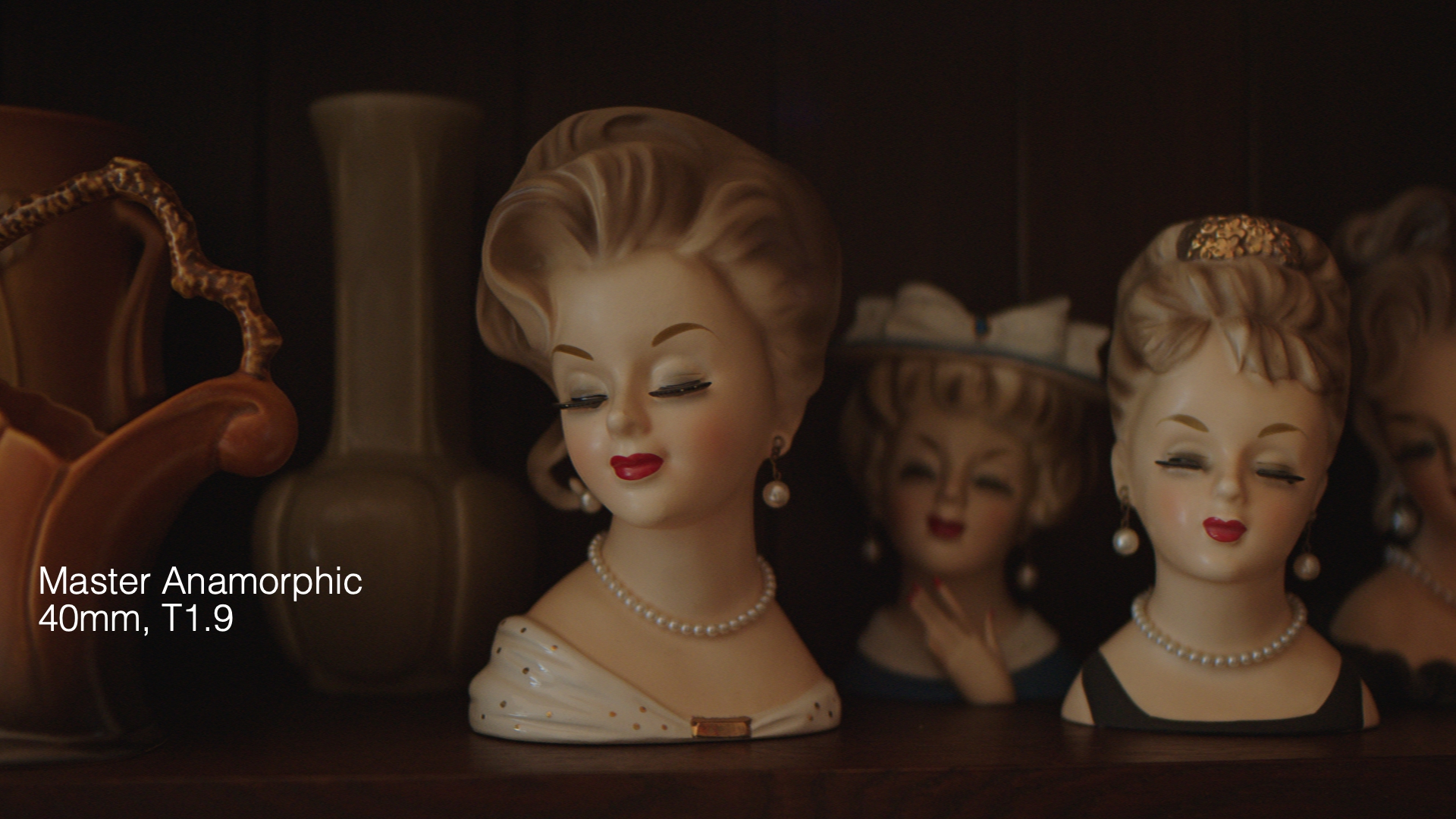
This is a 40mm ARRI Zeiss Master Anamorphic prime lens. I wasn’t able to get my hands on Master Primes, which are probably the most optically correct lenses ever made for S35, but the Master Anamorphic lenses possess many of their characteristics: sharp at any stop (many anamorphic lenses aren’t), high in contrast, and heavily resistant to flare. They aren’t everyone’s taste, but if you want anamorphic bokeh and background character without excessive flare or noticeable distortion, these lenses might be your only option.
Master Anamorphics are great lenses for UHD, as high resolution tends to reveal lens distortions, and flares in HDR tend to be very bright, saturated and distracting.
In the image above, I’ve framed within 2.39:1 for 1.77:1 (16:9) and resized the image in Blackmagic DaVinci Resolve. This is a technique currently seen in TV series that shoot with anamorphic lenses but are delivered full screen.
I’ve used the default ARRI 709 LUT found in Resolve, and I’ve done no additional grading.
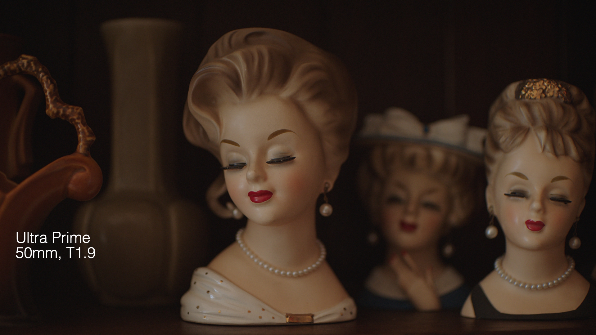
This is a 50mm Ultra Prime, shot at the same T-stop as the Master Anamorphic (T1.9). These two lenses look very similar, and indeed it’s possible to cut between Master Primes, Master Anamorphics, and Ultra Primes without seeing significant color and contrast shifts.
It’s not always simple to match the focal length of a spherical lens to an anamorphic lens, but in the case of the Alexa LF, it is. In the film world, the height of an anamorphic frame is different from that of a spherical frame, but in Alexa LF UHD mode they are precisely the same.
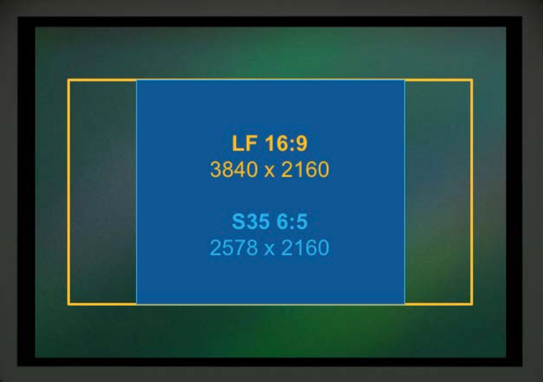
As an anamorphic lens is always two lenses in one (in this case, a 40mm lens vertically and a 20mm lens horizontally, for a 2:1 squeeze), and the aspect ratios are different between 2.39:1 anamorphic and 1.77:1 spherical, it’s only possible to match frame heights. If I framed a shot from waist up using a 40mm anamorphic lens and then switched to a 40mm spherical lens, the shots would match vertically, although the anamorphic lens would yield a wider frame.
As I didn’t have a spherical 40mm lens, I used a spherical 50mm instead for a slightly tighter image.
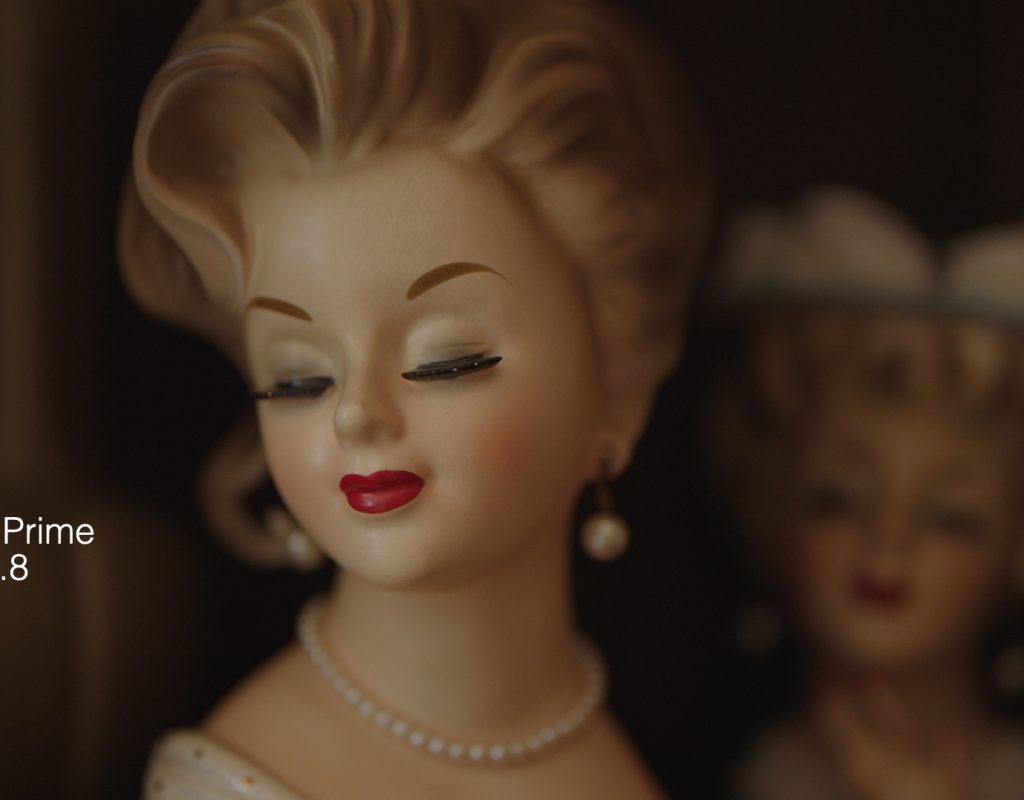
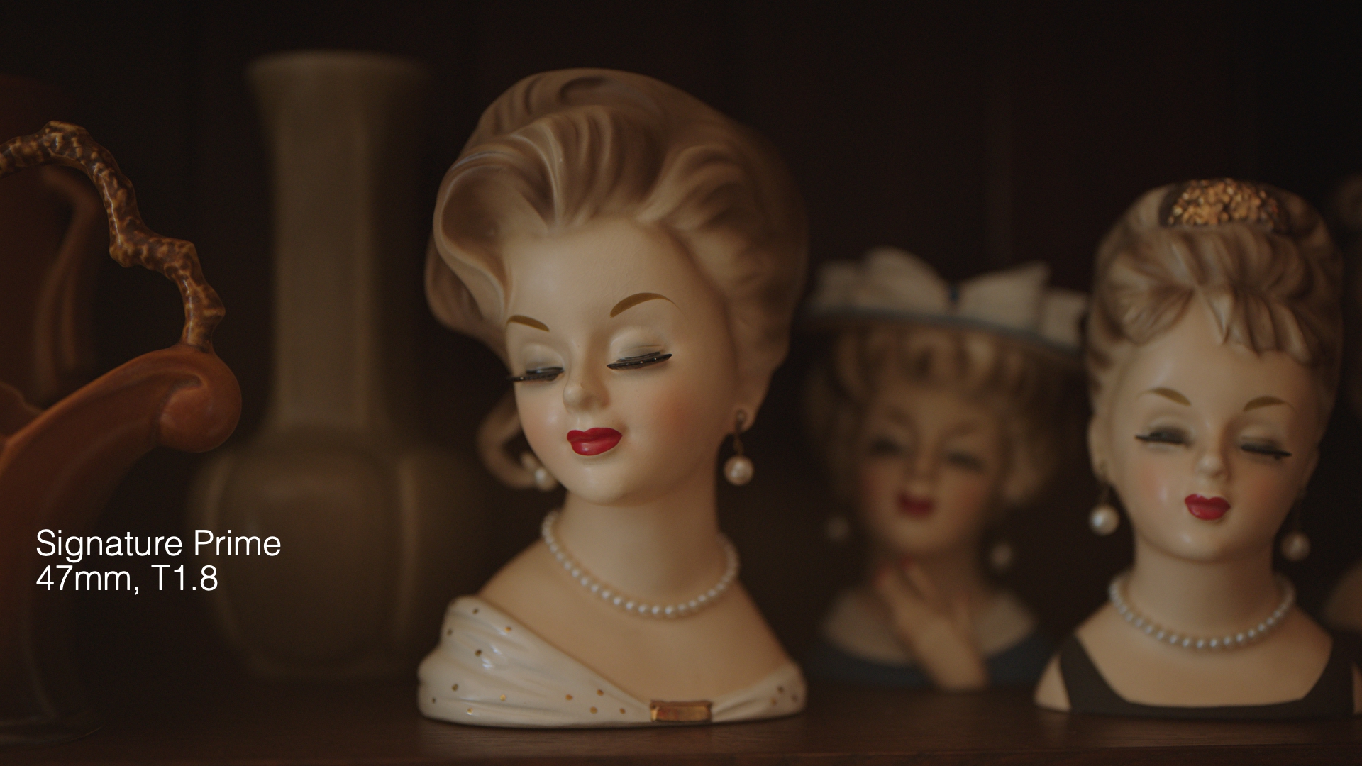
This is a 47mm Signature Prime. This may seem an odd focal length, but given a roughly 1.3:1 crop factor between LF Open Gate and ARRI SXT Open Gate, the angle of view of an Alexa LF with a 47mm lens will match the angle of view of an Alexa SXT with a 35mm lens. The odd focal length is intentional.
The visual differences between the Signature Prime and the other lenses are significant. The first thing I noticed is that the “skin tones” of the faces look to be 1/3 to 1/2 stop brighter, something I’ve not seen in a lens before. While I shot the other lenses at T1.9 and the Signature Prime at T1.8, that’s a difference of approximately 1/6th of a stop. That shouldn’t be noticeable.
The second thing I noticed is that the Signature Prime shadows are more open by comparison to the Ultra Prime and Master Anamorphic images. I see a lot more detail and an expanded tonal range.
At first, I assumed that this was lens flare, but the waveforms showed a different story.
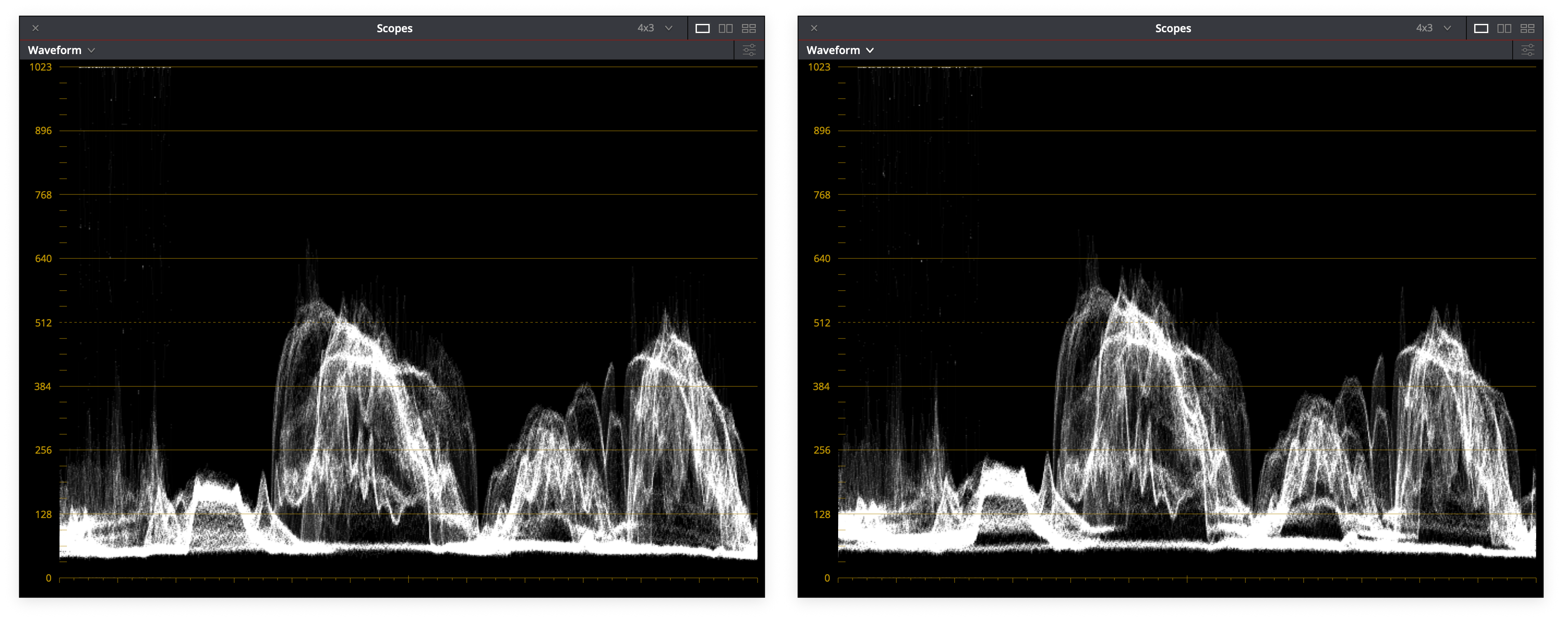
The waveforms verified both of my impressions. The Signature Primes make flesh tone brighter and shadows more open than the Ultra Prime and Master Anamorphic lenses. The crucial observation is that the Signature Prime does not show lifted blacks, which would have indicated flare. Whatever is happening in this image, it’s not due to poor flare control.
The lens coatings appear to lower contrast in fine detail without eliminating resolution. This effect increases with the amount of light within the frame, so it shows almost no impact in the shadows but ramps up in the mid-tones.
The result is a very high-resolution lens that rolls off contrast such that flesh tone is reproduced as soft and delicate. What we perceive as sharpness is an abrupt transition between areas of contrast, and that’s preserved in areas of broad detail. Skin tone texture is fine detail, and these lenses selectively smooth that over.
Also, based on the fact that these lenses feel a bit golden to me, and produce golden lens flares (more on that in a future article), I’m guessing that the micro halation layer has a golden hue to it.
Looking again at the comparison images, the Ultra Prime looks neutral in color while the Signature Prime has a slight golden hue. The shadows in the Signature Prime image show more detail, and the fill side of the doll’s face looks brighter, but her black eyelashes are crisp and black.
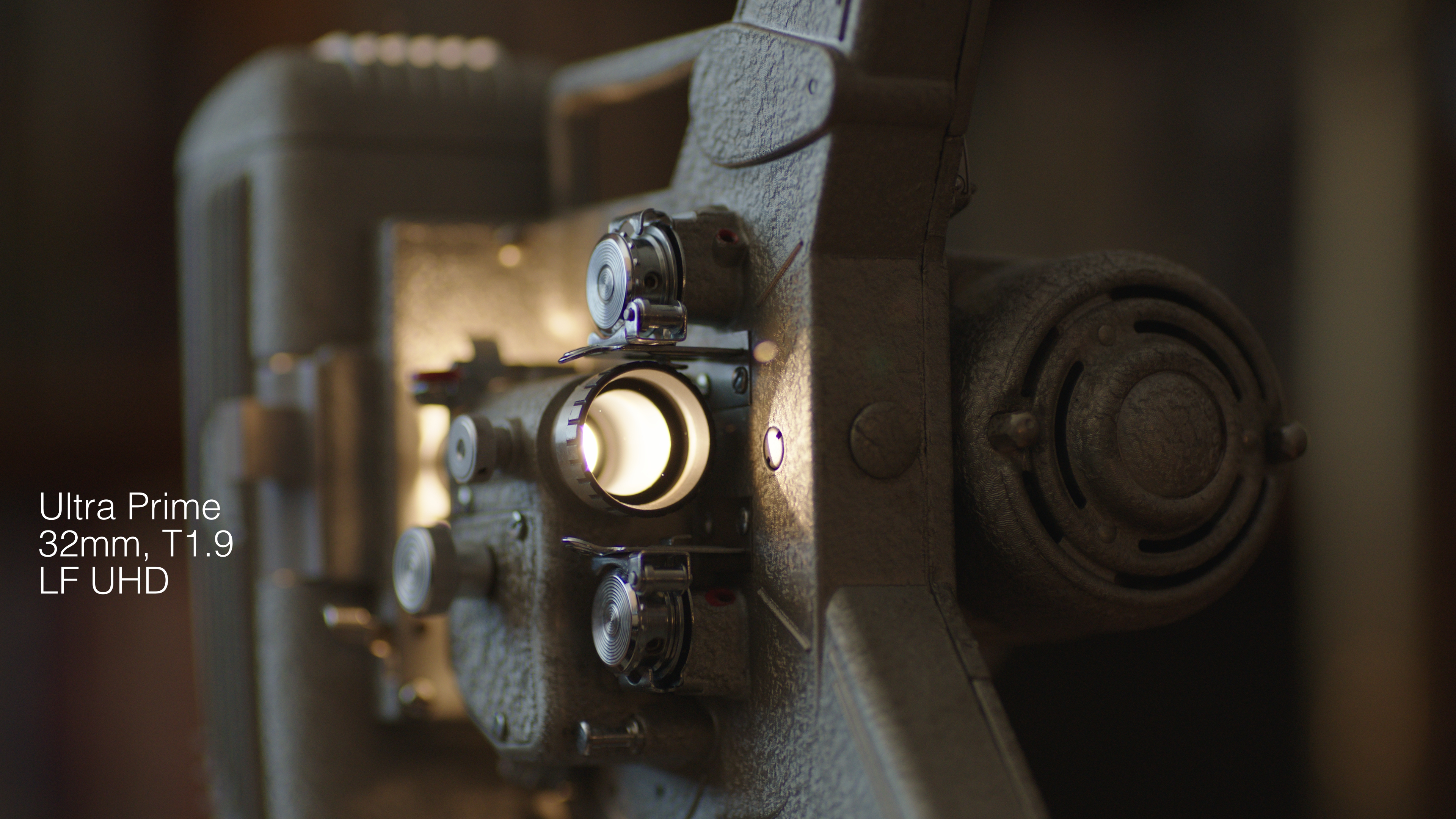
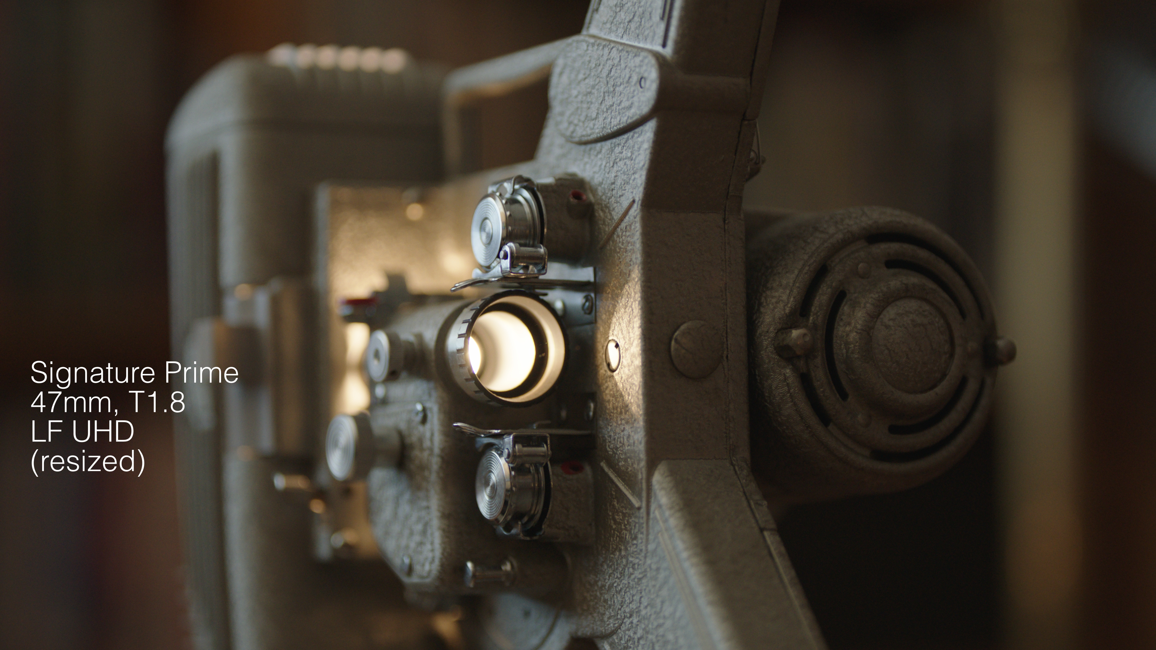
This pair of images illustrates a different, and much more interesting, point:
The projector is three-quarter backlit by skylight through an open window, which appears cool in the Ultra Prime image but slightly warm to neutral in the Signature Prime image. The mid-tones are, once again, brighter (I’m looking primarily at the shadow under the handle) while the shadows are still deep and dark (see the shadow under the lower sprocket wheel).
What really caught my attention is that the highlight around the projector gate, at the rear of the lens housing, is dimmer and retains more detail in the Signature Prime versus the Ultra Prime. Somehow, while boosting mid-tones and opening up shadows, the Signature Prime yields more highlight detail and another half stop or so of highlight dynamic range.
I have no idea why this happens. I hope to learn more as opportunities arise to talk to the optical team behind these lenses.
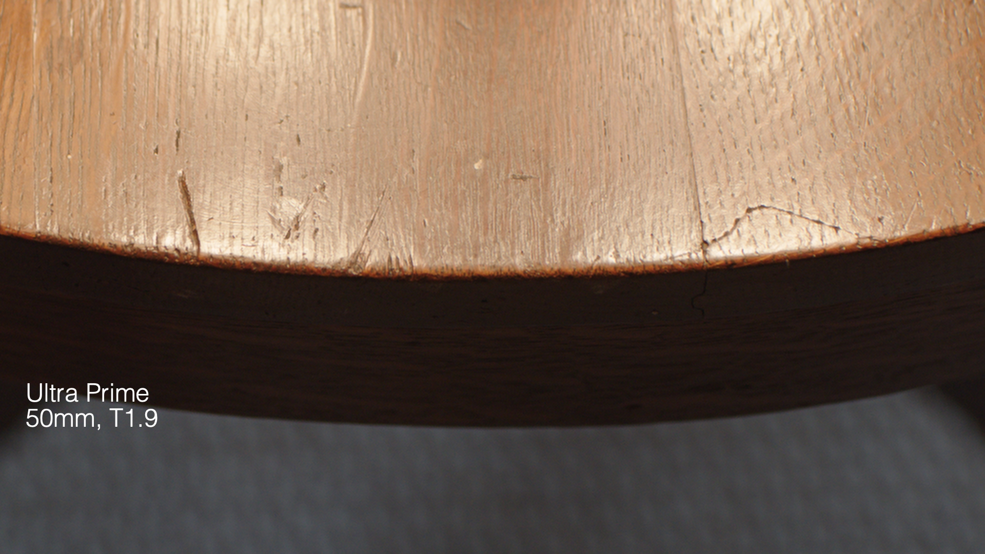
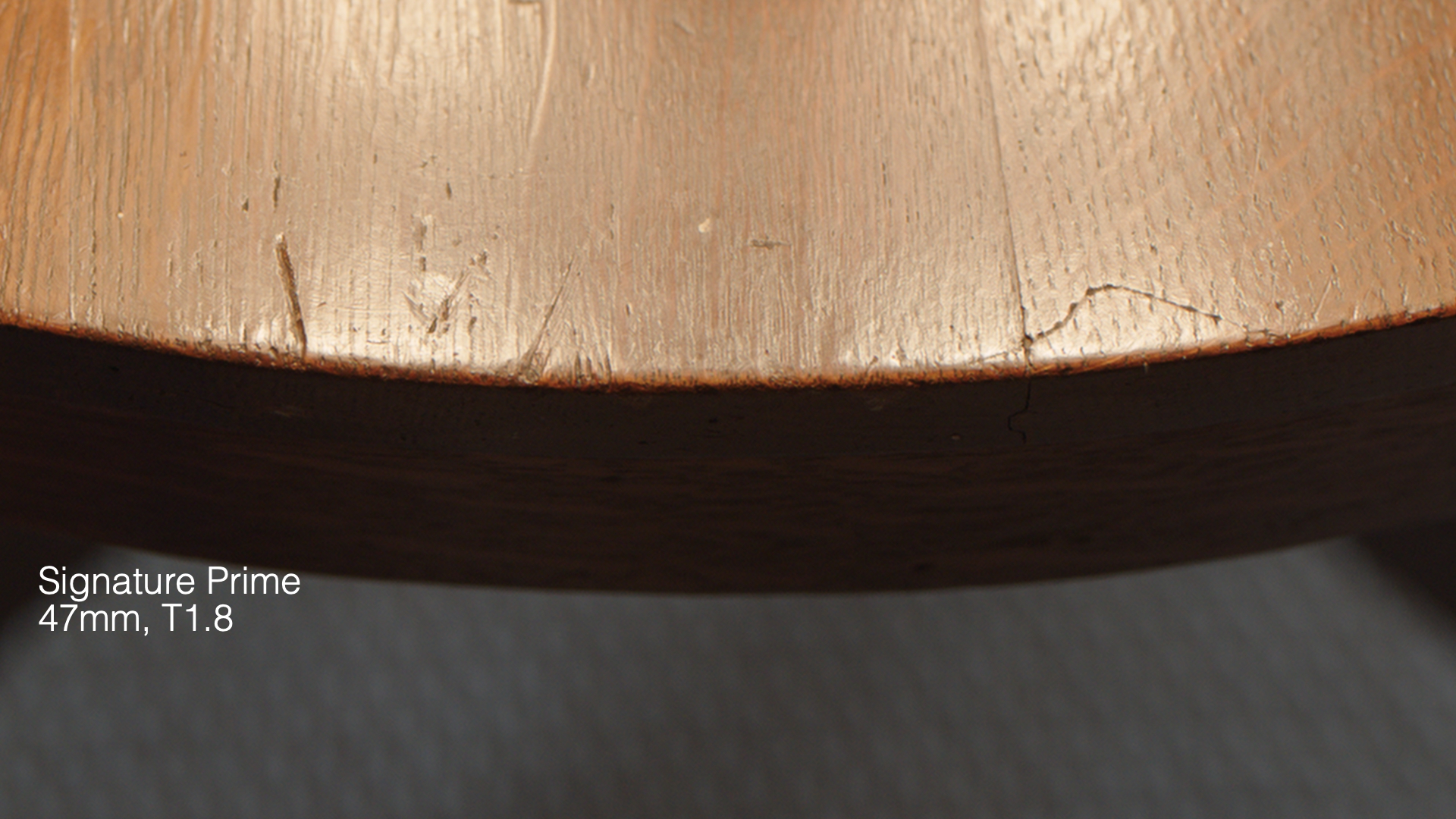
Here’s the last pair of images that I’ll show for now. This is a table in my living room:
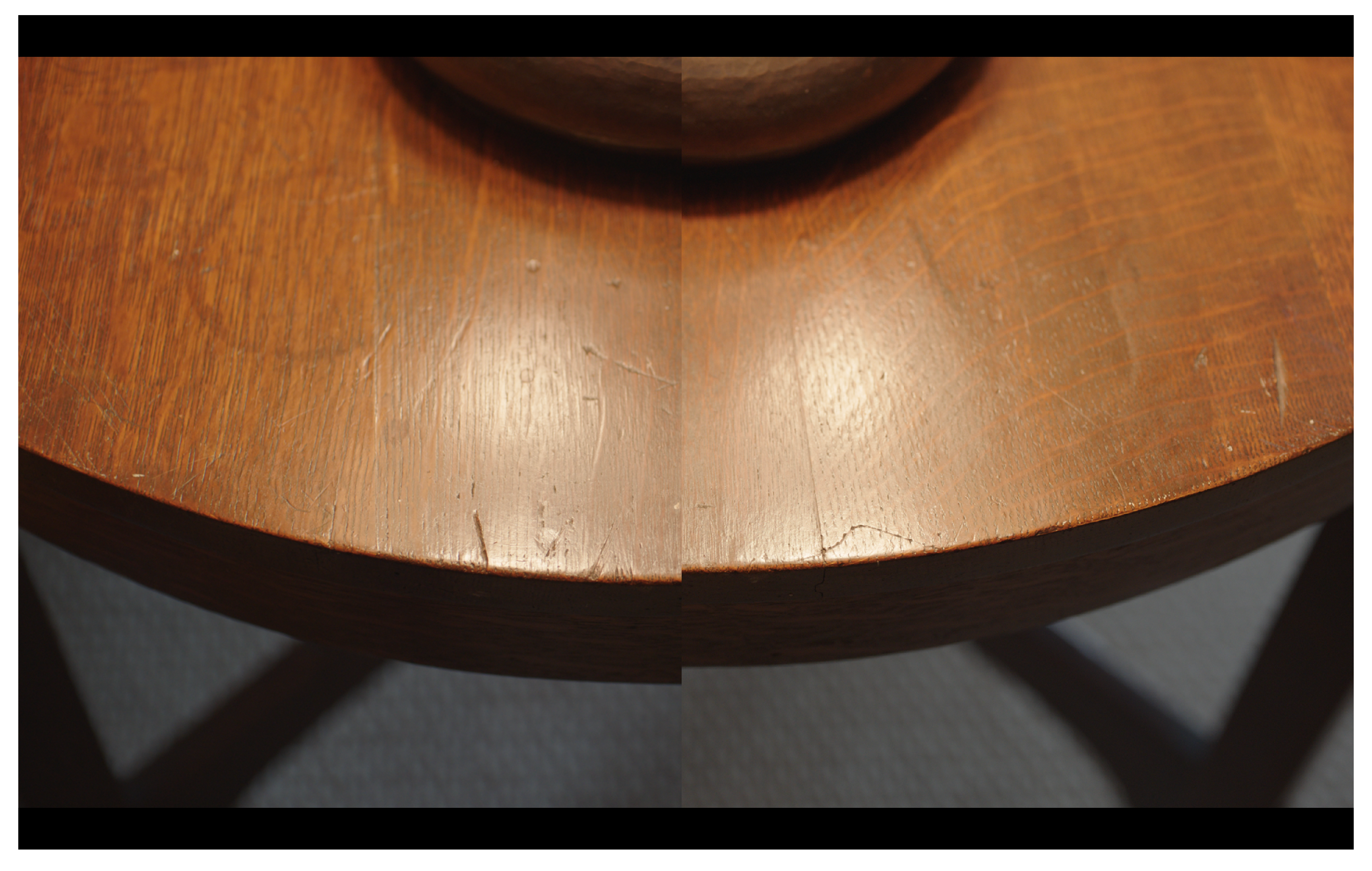
The reflections on the surface of the table are brighter, as are the highlights. The texture of the wood is slightly softer in the mid-tones and highlights when seen through the Signature Prime. And the Signature Prime image is slightly golden, as seen on the surface of the table and in the daylight illuminating the floor.
Lens choice is a very personal artistic decision. Each is a paintbrush, and every paintbrush has a use. Before we use them, though, we must understand what they do.
I have many more images to show you, but I’m going to stop for now. Future articles will look at the differences between these three different lens types, as well as a few others, in geometry, focus breathing, chromatic aberration, and bokeh. Stayed tuned!
Art Adams is Cinema Lens Specialist at ARRI, Inc. He was a freelance director of photography for over 26 years. You can reach him here.
Filmtools
Filmmakers go-to destination for pre-production, production & post production equipment!
Shop Now