When the iPad first came out, I was intrigued by the storytelling possibilities of haptics and what role they would play in the works of future writers and content creators. I was also interested in seeing how the iPad would be used as a new storytelling canvas, and how long it would be until we saw hybrid concepts that were not film, game or book, or even a blend of the three, but something quite original that re-examined the connection between narrative and this exciting new medium.
Now, having spent the last 3 years actively exploring this question via music and animation through my work with Wivern Digital, an independent digital production house, I thought I would share some learnings. In doing so, I hope to prompt a discussion from other creators and directors who are also exploring this medium from different and innovative avenues.
Using the tablet to entertain, engage or educate?
Since I am presently focused on developing principally text-based stories for the older children’s market (6 to 12 years), I realized that incorporating educational aspects from a teacher’s or parent’s point of view would be desirable, and therefore more appealing to the people actually buying our products. But when I was at that tender age, I wanted to see things explode (on TV at least), and if I was playing a game, I wanted to pull off awesome stunts or shoot down helicopters. I read books to laugh or to follow cool characters through fantastical landscapes so I knew that if were going to ‘educate’ with our stories, we’d have to do it subtly. We’d have to take our bearings from the gaming industry and keep the focus on fun (and a few explosions).
A more technical aspect of the process that we really needed to explore was to consider the degree to which we harnessed the audiovisual abilities inherent in the tablet to create this fun factor within a text-based story. In this space, it is often the case that less is more, and the interruption of the reading experience with audiovisuals might detract from the overall experience, particularly as kids got older. With more words in their vocabulary, these kids can imagine more and need less visual prompts to help their word association and development. A happy balance was therefore required, with less (or even optional) interactivity for any story designed for readers nearing the ‘expert’ level, which is normally attained at around twelve or thirteen. To this end, we developed a concept framed by the works of Tolkien called Enlivened Rhymes – musical animations embedded in books that could be activated with a tap of the screen, just as if the user was tapping into the imagination of the character whenever they sung.
Here we were already entering non-linear narrative territory and doing so directly through the imagination of the character. It’s kind of cool, but not exactly new. Flashbacks spring to mind here, although in film, flashbacks are normally required for the plot, whereas Enlivened Rhymes might be considered more like moments when the Muppets sing – maybe not essential to the plot, just extraordinarily good fun. PC-based interactive learning packages have also provided users with something similar for more than a decade. Ultimately, then, I felt we were just scratching the surface of what the tablet could do here. So we explored non-linear narrative a bit more and started inserting vertical descents, which basically means that users can scroll up instead of left and right through the story, or potentially tap specific words to access hidden elements of the storyline.
This goes back to the idea of subtle education, in that the approach doesn’t impact on the story itself and could be skipped if the user doesn’t want to ‘go deeper’. It allows the reader to access the “sub-space” by going through the character’s mind to not only discover facts the character knows, but actually learn how to do what the character is doing in the same way he or she learnt it, like language or music skills. It’s something the reader can experience while happily enjoying the story in a linear fashion and is definitely something we plan to explore further.
 How do we implement animated scenes into story apps?
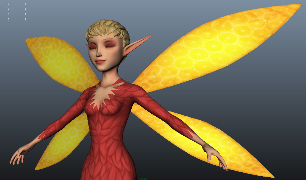
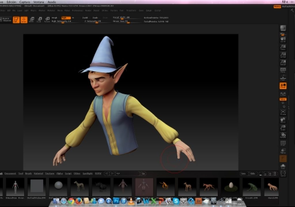
The animation process starts in the recording studio, where musicians record the songs from the manuscripts that are then compressed from the WAV to MP3s and delivered to the animators who use the lyrics for the 2D or 3D visualisation. For 3D animations we use Maya for modelling, character setup and animation, then Mental Ray for the rendering, and Photoshop and Zbrush for texturing. After Effects is employed for compositing in both 2D and 3D ‘approductions’. Objective C and Java (for Android builds) is then used to weave the finished MP4s into the app itself, so that readers can tap the musical scene into life with colour and song.
If you only want a four-sided MP4 that overlays or fits snugly into the page like those black and white pictures Tolkien drew for his ‘The Hobbit’, the above approach is easy and lightweight enough. But if you want to walk your characters over the page or at least appear like they are waiting for some action directly on the page, an alpha compositing approach using an animated sequence of PNGs may seem like a step in the right direction. But those transparent pixels are going to increase your download times. Transparent video is going to do the same, while rendering with the same background as the page will be affected by codec issues, usually leaving you with a slight colour variance. Download times are our limiting factor, because one thing we always keep in mind is connectivity issues in developing lands where tablet usage often exceeds the ability of networks to supply them well.
To look at that another way, if for film we say that 90 minutes is your safe zone, while you’re looking at 60,000 words for a YA novel, then for story apps, you really don’t want to exceed 120MB. 120MB is pretty low, but it’s interesting when you consider that no matter what medium you’re working with, we are all confined in some way, either stylistically or technically. If you’re going over 120MB (at present) you need something special to merit more than 30% extra weight. It’s an easy trap to fall into though, because everyone who writes a screenplay that’s over 200 pages thinks they have something special that justifies it. We’re seeing this most notably now because we are working with ideas where characters just up and leave page they’re meant to be on, which is great fun, but it ups the download time!
From there you move onto text implementation, and this actually took a bit of trial and error to get right. We needed it to be done via a mix of alpha and vector-based compositing due to improving screen resolutions. Which means you can’t easily take a JPG snap shot of a PDF because it will pixelate on various resolution screens like the retina display. To overcome this, we presently work with text blocks that are saved as transparent PNGs that overlay a series of four or five different page backgrounds that are randomly placed to give the effect of different pages being turned. But again, with more experimentation, networking and feedback, I’m sure we’ll be able to improve on this aspect as well. If anyone is working with or improving transparent video, please drop a note in the comments section.
The sub-space of the storyworld
So far I have only touched on the possibilities that the iPad offers modern crafters of stories. As technology changes and develops, these possibilities will expand and grow and the only limitations will be in our own minds.
I really like the Carrollian concept of ‘going down the rabbit hole’ within a story itself into another hidden world of active, character-based learning. You can miss this world in a blink but the young mind is usually a very inquisitive one, so offering them a rich and expansive plane of learning they can explore at their leisure is both incredibly challenging and rewarding.
Figuring out what we can capture and create is an ongoing process, and we can’t wait to see this project fully realized. To find out more about the project, check out the video below or visit our Indiegogo page.
Addison’s Tales: The animated musical storyworld for mobile devices from Wivern Digital on Vimeo.

Filmtools
Filmmakers go-to destination for pre-production, production & post production equipment!
Shop Now


