Here we are midway through 2021 and it feels like Adobe is at a fork in the road with their high-end video editing tool Premiere Pro. Do they continue to engineer the NLE for a high-end market creating feature films and episodic television or dumb it down simplify many of the confusing things that have been a source of frustration over the years to appeal to the vloggers and social media mavens out there?
On the surface, it would appear they are doing both. We have both Team Projects, Productions, and vital timecode updates in the form of a high-end timecode panel and a new timecode effect. All of those items are for high-end workflows. On the other side of the coin, we have Premiere Rush, an entirely different app designed for quick and easy video creation on any device you might own.
What else does Adobe need for video creators?
It would appear that need is a redesign for Adobe Premiere Pro to make it easier to use across the board, from setup to export. Today we get the first look at that redesign in the form of a Premiere Pro Public Beta that introduces “streamlined new designs for importing media and exporting finished projects” as the first indication of the direction this new design might be taking us.
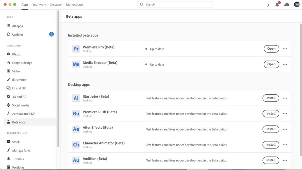
Check the Beta apps tab in your Creative Cloud app and you can install the Premiere public beta alongside your existing install.
The new IMPORT
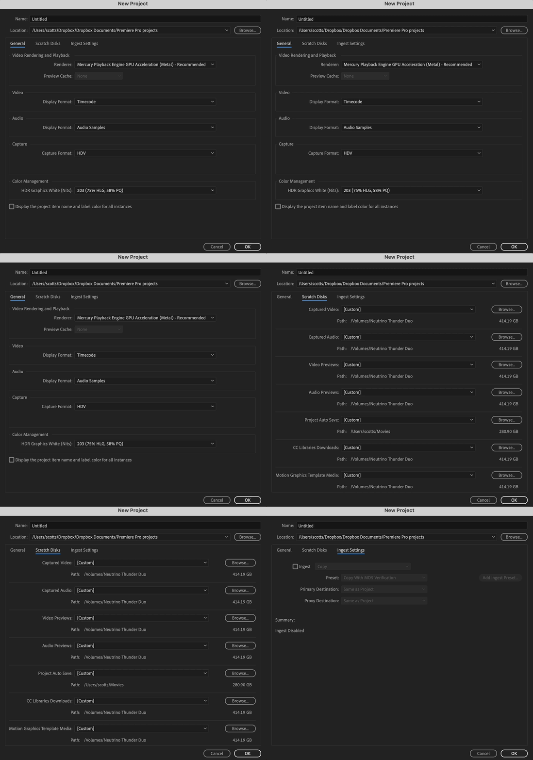
I can’t say these new options aren’t completely a bad thing. I mean, look at the current create new project dialog box in Premiere:
This thing has always been a bit of a kludge. That might be less about Adobe’s design for it and more about the complex world that is high-end video post-production. Then again the PPro design for dealing with scratch disks, media cache and preview renders has always been overly difficult IMHO.
Once your project is successfully created in the “old” Premiere then you have to create a new sequence to edit with and that’s its own world of hurt if you don’t know what you’re doing.
I think you get the picture.
Now take a look at the new design for a future version of Adobe Premiere Pro as it’s looking to simplify a lot of that complexity.
Specifically, what Adobe is showing is a simplification for new project creation, the IMPORT part of the editing process and the creation of a new sequence. That’s three separate parts of the early part of an edit combined into one window.
It’s much more simple that is for sure.
The new IMPORT tab is a substitute for the Media Browser (or the Finder/Explorer drag-in) and is designed to give editors a way to visually explore their media before they begin cutting. The Media Browser isn’t gone in the new beta btw. It’ll still have some advantages as the new IMPORT tab currently can’t seem to dig into complex source camera folder structures like those that some Canon and Sony cameras create. I’m sure that will come with beta feedback.
You can Hover Scrub clips to preview them as well as use a list view for some limited metadata info. You can start to storyboard by placing clips at the bottom of the new IMPORT tab and have it automatically create a sequence with the switch on the right.
I don’t mind PPro automatically creating a sequence as it might save us from that overly complex New Sequence dialog box above.
Once a new project is created with this new method you better get in there and check your Scratch Disks as they look to default to where you have saved the Project. That’ll be an instant no-go for those working more advanced workflows with attached a RAID or NAS or those that keep Project files on Dropbox or some other Cloud service.
But imagine my shock when I saw that new sequences created by the IMPORT window automatically set the Video Previews to the format and codec of the first clip you choose.
That’s a really nice thing to do. 👏 You finally might be able to banish some of the yellow timeline render bars forever and make good use of the Use Previews button upon export. But more on EXPORT in a second.
At first glance the new IMPORT option might seemed dumbed-down but I’ll reserve judgment until I use it for a while. It looks handy for quick turnarounds but completely useless for complex multi-day shoots with thousands of clips, different types of media and mulitcam management. The good news is you don’t have to use it and can continue to work the old way. For now.
The new EXPORT
The other big rethink comes in the EXPORT. And this one couldn’t come a moment too soon. Here’s the current Export Media dialog box:
For years I’ve thought Adobe was shooting themselves in the foot on this one as it was mainly the byzantine number of codecs you had to wade through that seemed unnecessarily complex. How many of us really need JPEG2000, OpenEXR or AS–10? And then you have all those checkboxes at the bottom that are so confusing even Adobe debates what should be checked and when.
So why not simplify that?
Well here ya go, it’s the redesign EXPORT … world?
This one doesn’t look nearly as daunting and while it will take some time to dig through it actually looks like a lot of the same export options are there… including top-level access to JPEG2000, OpenEXP and AS–10 under the Format menu.
What’s strange is that the very commonly used finishing codecs like ProRes and Adobe’s own Cineform no longer have top-level availability and you have to go into the Preset Manager to access them.
You win some, you lose some. 🤦♂️
Once there you can get all those old codecs back as well as favorite them. This does reduce the clutter but it seems it would be less confusing to reduce the Format clutter and not the Preset clutter. This seems like a thumbing the nose at high end editors who use them all the time. Will provide some beta feedback on that one.
If you’ve got a laser focus on your destination then you should be able to get there more quickly with this new design. I’ll take the EXPORT change any day.
Of note, File > Export > Media takes you to this new EXPORT tab (though Adobe Media Encoder is just a click away).
File > Import does not take you to the new IMPORT tab, it’s still the old import dialog box.
The new HEADER BAR
Currently, Premiere has a header bar that is for workspaces. There are many that complain that this takes up valuable screen real estate. I guess those people don’t know you can turn it off. 🤷♂️
Regardless of that Adobe is redesigning the header bar in this rethink. Or is it rethinking the header bar in this redesign? 🤔
Of this new header bar, Adobe say this: “new header bar will be a common design element across the Creative Cloud applications to help users orient themselves more easily within different creative workflows.”
I can see this idea that Adobe wants to somewhat unify this experience but something about this worries me when I look at this new header bar in Premiere. This looks to me like it can’t be turned off.
It may be a small thing but I don’t want to have an IMPORT and EXPORT tab permanently staring me in the face as I edit. There might be days, weeks, months even between the import and export on large jobs so there is no need for those tabs to be permanently there. Nor do I need to always have mouse-click access to a lot of that stuff on the right (but keep in mind this is from the beta). And that little asterisk that lives next to the current project name to let you know it is unsaved seems to be gone. 😥 I really like that as I could glance up and know if I was saved. Maybe that means true background saving is on its way? 🤞
I’ll reserve judgment on this new header bar but on the surface that does feel like it’s being dumbed down. And I don’t see any way to turn it off. One big advantage of Premiere over the other NLEs is how incredibly customizable it is so I just hope and 🙏 that will continue.
The big question is … What’s Next?
Adobe has made it clear that they aren’t stopping this rethink/redesign at the Import and Export phases. All aspects of Adobe Premiere Pro will be put under the spotlight. Honestly, I shudder to think about what might happen to the Premiere timeline. Right now it’s at a pretty nice place as far as functionality and speed but there is always room for improvement.
I’ve been wanting to kill this little + thing that automatically creates new audio tracks in a timeline if your source media has more audio channels than you have audio tracks for years now.
And I mean kill that thing with fire.
Hopefully, anything major Adobe does in a timeline redesign can be turned off.
For the love of all that is good and holy, just don’t make it permanently magnetic. 🧲
Here are all the bullet point changes in this new Premiere Pro Beta:
- Import mode is a visual interface for importing media. You can organize in grid view or list view, and filter content by media type (video, audio, images, all).
- Import from multiple locations in the same import process, and add folder locations as favorites for easy access using the star icon.
- Preview the clips by hover scrubbing and click to select. Selected clips will show up in the tray at the bottom.
- Give the project a name and location at the bottom.
- Automatically import the selected clips to a new sequence (optional).
- The header bar has been streamlined to provide top-level navigation and easy switching between Import, Edit, and Export.
- Workspaces have been relocated into a dropdown menu on the right which is a much better use of space.
- Export mode is a destination-centric full-screen mode that is focused on where your video is going and you can publish directly to online destinations like YouTube.
- Export to multiple destinations at the same time right out of Premiere Pro. There is still an option to send to Media Encoder, however.
- Encoding settings are arranged into logical groups of accordions and entire groups can be powered off all at once. For example, you can have many effects enabled and disable the whole group all at once.
- Additional presets can be found in the preset manager which is accessed at the bottom of the preset dropdown, or in the overflow menu next to the preset dropdown.


