Trade show time! You know what that means, it’s also time for another big update to the Adobe Creative Cloud suite of video tools and, of course, Adobe Premiere Pro. This NAB season is no exception and while PPro doesn’t get a lot of big, never-before-seen, long-in-the-making, Earth-shattering new features we do get several nice enhancements to some existing tools. Those utilize some of the often talked about by Adobe magic they call Adobe Sensei. If you’ve watched any Adobe MAX keynotes over the last few years you’ve seen Adobe Sensei at work with some of the feature and future-feature demos they’ve showed. All that technology is filtering down into Adobe’s shipping products and we get some fruits of the Sensei labor in Premiere Pro.
But I’ll start this off with a new Sensei-less feature that many might think is the most boring thing Adobe engineers could add while in reality it’ll be one of the most welcome additions for those editors working in broadcast television and feature film: the updated Timecode panel.
Timecode

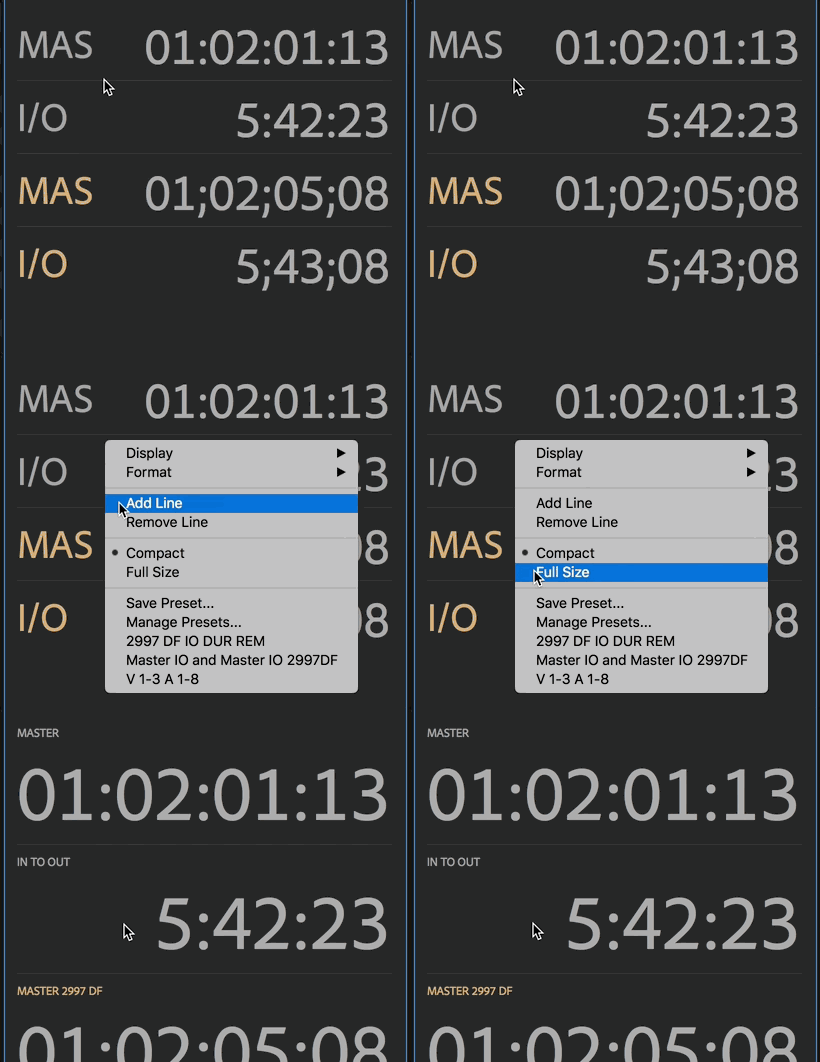
Adobe Premiere Pro has always had a timecode window under the Tools menu but it’s been limited. This new update updates that Timecode window with a slew of display options. The operation will be quite similar to those coming from Avid Media Composer.
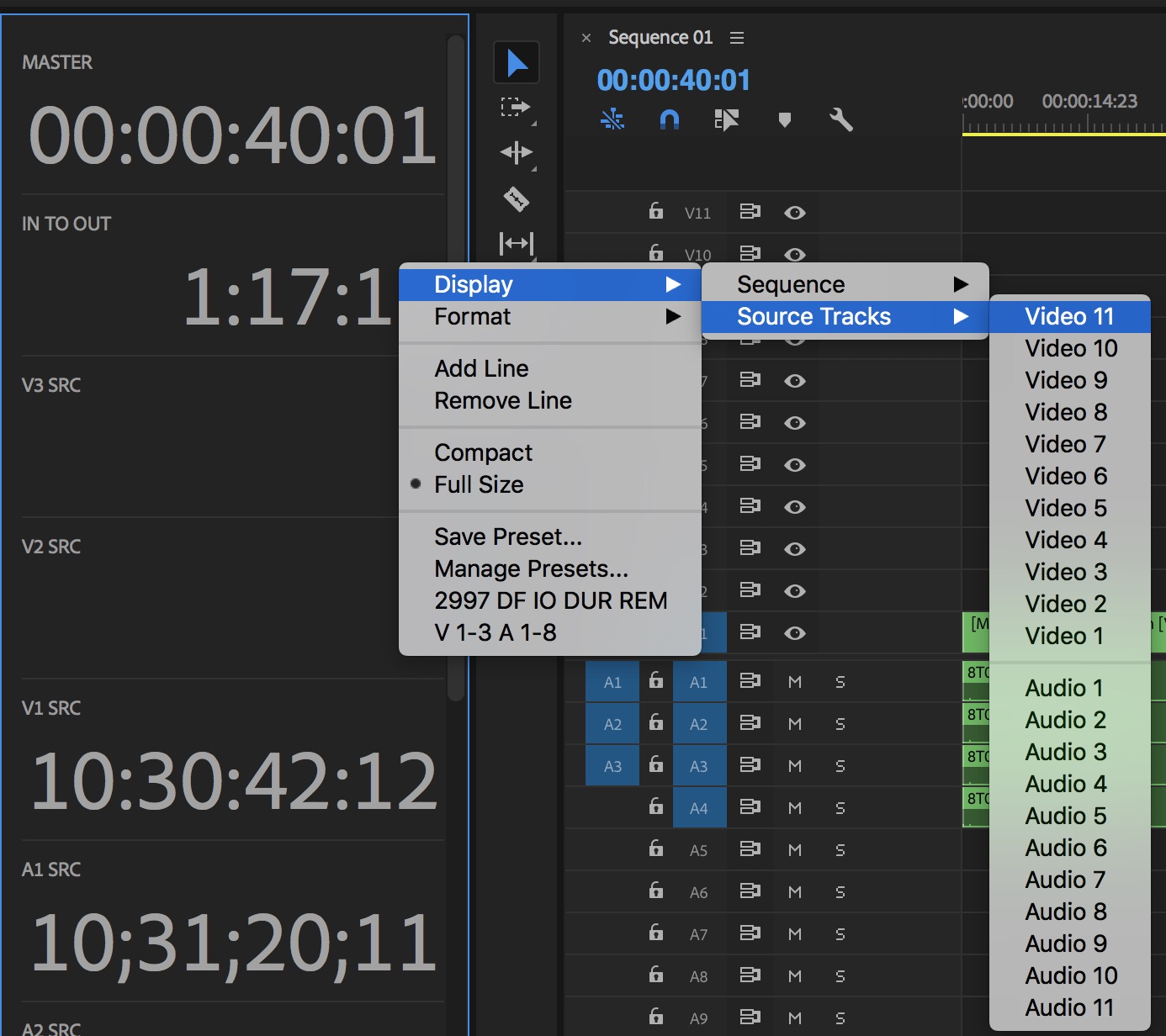
There are things you’d expect from a proper timecode tool like Master timecode, IN to OUT durations, sequence durations and time remaining. There’s also the ability to display source timecode data for clips in all audio and video tracks. The Timecode window will reflect both the Program and the Source monitor.

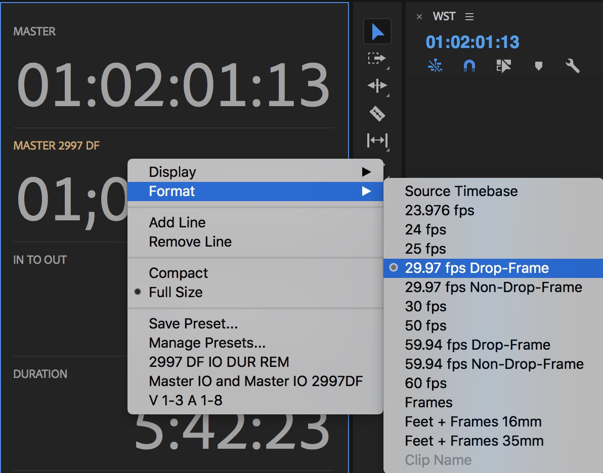
A hugely important addition is the ability to count timecode in different formats. This is a much needed feature for things like broadcast television where editors often need to see and count timecode in 29.97 drop frame even though they are offlining in native frames rates like 23.98. Off timecode counts are displayed in yellow.

These off native sequence timecode rates can be set for any of the sequence parameters. That means you can set it to display the IN to OUT range at something like 29.97 drop frame when your sequence is 23.976. This is important as the IN/OUT durations will be different.
Setting up the new Timecode display will be what takes some time. A right+click on the display brings up a submenu for display options and formats.
Adding a new data line places that new line at the bottom. There is no way to rearrange the lines so take some care on complex setups. Luckily we can save a preset for a setup we like. Rearranging the Timecode panel into a different panel placement is a bit tricky as you have to grab it just right in the tiny space above the top display.
Like most things in PPro there is a keyboard shortcut for these new timecode presets.
I’m sure some will think that we’ve had this all along by turning on the Overlays under the Program and Source wrench menu. This is true but you can’t display the different frame rate counts plus … this new option is Timecode in its own panel and not obscuring the viewer.
Comparison View and Auto Color Match
Yes I know that the new Comparison View is probably the signature feature of this new PPro update but IMHO the Timecode window trumps that for many workflows. But Comparison View is nice!
Comparison View is entered by clicking a new button under the Program monitor, heading to the wrench menu or entering from with the Color Wheels & Match section of the Lumetri Color panel. You get what you’d expect from most any comparison view: Side by Side, Vertical Split and Horizontal Split.
The Reference is on the left and the Current frame is on the right unless you choose to swap them with the Swap Sides button. A playhead under the Reference monitor along with Previous Edit and Next Edit buttons lets you scrub through the timeline to see reference frames. When I was working with this new Reference monitor in the Comparison View I was reminded that Speedgrade had a mechanism for setting multiple playheads in the Speedgrade timeline and how that might be a cool addition to Comparison View. Imagine a second, different looking playhead that pops up when you have the Reference monitor open. That’d add a bit more granularity being able to see exactly where in the timeline you’re moving the Reference to.
Once you’ve found the hero reference frame you can utilize a bit of that Adobe Sensei magic I mentioned earlier and try the new Apply Match button under the Color Wheels & Match tab. There’s a check box for Face Detection where skin tones will be identified, analyzed and matched. I didn’t have anything too off the wall to try out but on a small multi-cam shoot it was able to do a pretty good job with cameras that were only slightly off. The best auto-match I’ve seen by far is DaVinci Resolve so it’ll be interesting to see how well Adobe Sensei can do the same task. If nothing else it’ll be a good matching start as an auto-match will actually move the color wheels so you can see what it’s doing and tweak from there.
There’s another button in Comparison View called Shot or Frame Comparison that can actually be used a good bit beyond just color matching and color grading. It functions, as far as I can tell, with most anything in the timeline so if you want to see a change in a graphics element then you can use Shot or Frame Comparison to tweak text and graphics before committing to those changes.
Have some effects applied on a clip and you’re curious what a few tweaks of the sliders might look like? Use Shot or Frame Comparison View to play around with those effects before committing to the change. When you hit the button it puts the current frame, the state of applied effects, everything at the playhead and puts it into the Before frame on the left. Tweak away on existing color or effects, add more effects or work with titles you’ve already selected via the Essential Graphics panel. The Before shot will stay in the buffer until you click out of Shot or Frame Comparison by clicking in the timeline.
Yes you could duplicate the sequence and make changes there or just make sure you’ve got plenty of undos in your History panel but this Comparison View makes it fast and easy. We’ll take fast and easy any time.
Copy Paste Includes Sequence Markers
Here’s another little gem that many will appreciate. Check the bottom of the Markers menu for Copy Paste Includes Sequence Markers.
When this is checked if you copy/paste clips in a sequence that have markers or extended markers on the sequence timecode ribbon above them then those markers will go along for the paste if this new option is checked. That includes pasting within the same sequence and pasting to a different sequence as well. Simple enough.
Audio Ducking
This Adobe Sensei powered feature made it into Audition last year and it was immediately asked for in PPro, by me and I’m sure many others.
It comes in the form of the Essential Sound panel, under the Music Audio Type.
I wish Premiere would add something like Final Cut Pro X’s Range Selection tool to quickly do this manually.
But then I also wish Apple would adjust the slope of the fade handles when using the FCPX Range tool for manual audio ducking. I still find myself always adjusting the ramp in and out of these audio fades.
Speaking of Adobe Audition …
Adobe Audition improvements
Adobe always has some new Audition feature editions of note in these big Creative Cloud updates but I often don’t cover them as I tend to stay inside of Premiere for mixing. It’s not the best workflow as Audition will do audio things PPro dares not dream. But this Audition update is worth noting for a specific new feature: Open Premiere Pro projects in Audition.
No longer do you have to send a multi-track sequence from PPro to Audition, extracting or creating new audio files in the process (though you still can). Using Audition’s Media Browser you can choose a PPro project and import selected sequences right to Audition.
This will make at least one direction of the audio exchange much easier. On the sequences I tested Audition didn’t have to create any new audio files at all, even looking into the original camera card folder structures for audio from .mxf files.
There’s two questions many people are asking about this new Audition/PPro workflow:
Do I still have to bounce a new mixed files back to Premiere or can I magically send the mix back in some kind of new interchange?
Yes you still have to bounce a file or files back to PPro but Adobe is trying to make this as easy as possible. When done with your mix in Audition select Multitrack > Export to Premiere Pro and you have options.
The magic of that box is Open in Adobe Premiere Pro as that squirts the mix back into your project (at least if you have that project open) and will automatically lay your mixdown audio file into the timeline for you.
I don’t know how long that option has been there for such an easy exchange back to PPro but I’m glad I’ve discovered it now. I really should use Audition more.
Can I make changes to the timeline I’ve opened in Audition and have those changes automatically update in Audition.
No.
After opening an edit in Audition, when I go back to Premiere and make changes those changes don’t update in Audition. I would not expect them to since your Audition session is its own file that you have to save independently as opposed to some direct/dynamic link from PPro. And if this was possible I would expect Adobe marketing to be all over that as a big marketing feature.
What you can do is re-import the sequence from Premiere but any work you’ve done in Audition will be gone. Like the send back to PPro I would expect a live direct/dynamic link between Audition and PPro to be something Adobe would love to make happen. Apple tried it with mixed success between Final Cut Pro Classic and Soundtrack Pro. I bet this is really, really hard as we haven’t even seen this between Media Composer and Pro Tools (Avid owns them both). Maybe Adobe Sensei will find a way.
I do want this new Audition Tracks panel in Premiere Pro.
This little thing is a handy way to keep track of a lot of tracks while you’re working. Functionality seems to be limited currently to highlighting the track you’re working in and hiding tracks with the eyeball.
Hitting the panel menu unveils some other options depending on what you have in your session. I do hope that something similar makes it way to PPro as I can see a lot of functionality that could be added to the Tracks panel.
Enhanced Essential Graphics Panel
The Essential Graphics Panel seems to be the recipient of a lot of love these days and this update is no exception. I have yet to dig too deeply into the world of Motion Graphic templates other than using ones that others way better are graphic design have made. But the first thing you’ll notice in this update is that Adobe Stock has been integrated right into the Essential Graphics Panel.
I’m not exactly sure how I feel about that as I generally don’t want my editing interface cluttered up more trying to sell me things. It’s one thing if I actively seek out a third party extension and install it myself but to have Adobe start selling me things right in the interface is a slippery slope. It feels like only a matter of time before we get a full Adobe Stock panel that will probably be pinging the Internet more than I would like.
On the other hand you can toggle the new Adobe Stock Essential Graphics panel to only show you the free offerings. It would be nice if there were more of them.
I’ve started using the new Type Tool for most of my text work in PPro and I’ve left the Legacy Title behind (which is still there btw). I find it a lot easier to use especially when it comes to tweaking text.
And addition to the Essential Graphics panel will make animating easier as with this update you can turn on an option to record keyframes for any of the parameters in the Essential Graphics panel and as you play over a graphics container and adjust the parameters in the Essential Graphics panel those change will be recorded as keyframes. Those keyframe are fully viewable and editable in the Effect Controls tab.
It’s a bit tricky to find this new record keyframes toggle but if you click on the parameter icon that you want to record animation for in the Essential Graphics panel that icon will turn blue.
The Other Stuff
A couple of preferences has changed.
There’s a new option for how you can manage opening multiple projects. I honestly can’t figure out what this new preference does. Once a project is open its bins behave just like other bins when opening them and it doesn’t seem to work from the Media Browser so if you figure it out please comment below.
Also the Default Audio Tracks preference has moved to the Timeline tab in the preferences.
Here’s a few notes one some of the other stuff in this new Adobe Premiere Pro update. I didn’t have the time or ability to test all of this stuff so here’s some notes straight from Adobe’s press materials:
Enhanced Adobe Immersive Environment: Navigate 360 VR space with new controls that let you rotate your view without having to move your head. Floating panels show your position in time and space. Use handset controls to change your orientation or move on the Timeline.
Windows Mixed Reality: Use the best headset for the task at hand with new support for the Windows Mixed Reality platform, expanding the range of available head-mounted displays for VR work in Premiere Pro.
Streamlined collaboration with Team Projects: Real-time presence shows when teammates are online and new badges indicate when a project has been updated. Read-only access to older versions combined with Team Projects’ robust automatic version tracking and infinite undo make collaborative production simple and seamless.
New format support: Camera RAW Sony X-OCN (Venice), Canon Cinema RAW Light (C200), and RED IPP2.
Video Limiter: Ensure that your color grading will meet broadcast standards. Work within a defined standard as you edit, or apply Video Limiter parameters to your project on final export.
Before you update
Overall it’s a solid update for Adobe Premiere Pro though maybe not as feature packed as some we’ve seen in the past. I don’t mind this one bit as Adobe continues to work on stability and bug fixes under the hood. The prerelease version I was working with felt good and I didn’t have any crashes or performance issues while playing around with it. I opened several projects, one of moderate size, ranging from 1080 up to 4K.
Here’s the proverbial warning that you should never upgrade or update anything mid-project as you’re only asking for trouble. But since there are those that will, those that do and those that find themselves never between projects update with caution and do it right.
This new update WILL convert old projects to a new format that are not backwards compatible. And keep a close eye on your settings in your CC app and uncheck remove old versions if you want PPro 12.0 left behind (this new update is 12.1). U
UPDATE: This new version WILL overwrite your 12.0.1 install. It seems that coming down from the CC app you can’t run 12.0.1 side by side with 12.1. Why leaving old versions can’t ALWAYS be an option any time a new release updates a project file is beyond me. That’s the way it should operate IMHO.
Happy Editing!

