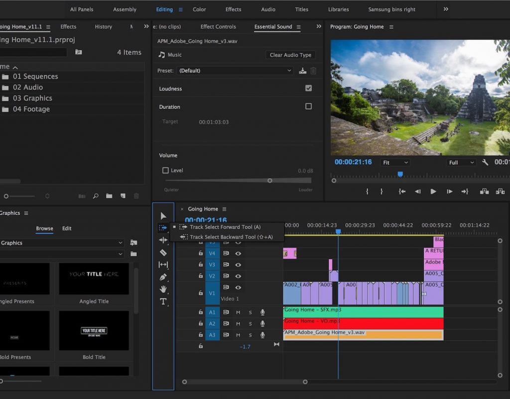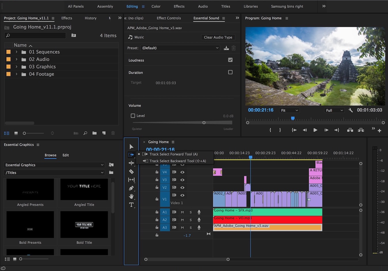
Here we are on the cusp of another NAB so like we’ve seen for the last few years that must mean we are on the cusp of a big update to Adobe Premiere Pro CC and the whole Adobe Creative Cloud video suite (check out the After Effects update here). 2017 is no different … but there is one big difference this year: we won’t have to wait until sometime late summer to get the update as it should be available much sooner, probably today … maybe right now as you’re reading this (check your Creative Cloud app as it might take longer to populate to some users).
https://www.youtube.com/watch?v=b3i1JKIY4Jo
As what seems to be the tradition here on The Editblog I’m going to try and peer beyond the press release and take a look at some of the stuff editors will most be interested in.
The Tools and the Toolbar
Take a trip to the toolbar first thing upon launching the April 2017 version of Adobe Premiere Pro CC. It’s been condensed and a number of the tools have been moved into wells that pop out to reveal similar tools. If you’re a mouse-based editor it might take an extra second or two to access a tool that used to be a faster single click. The advice then is to learn the keyboard shortcuts as that is how you should be accessing the tools anyway.
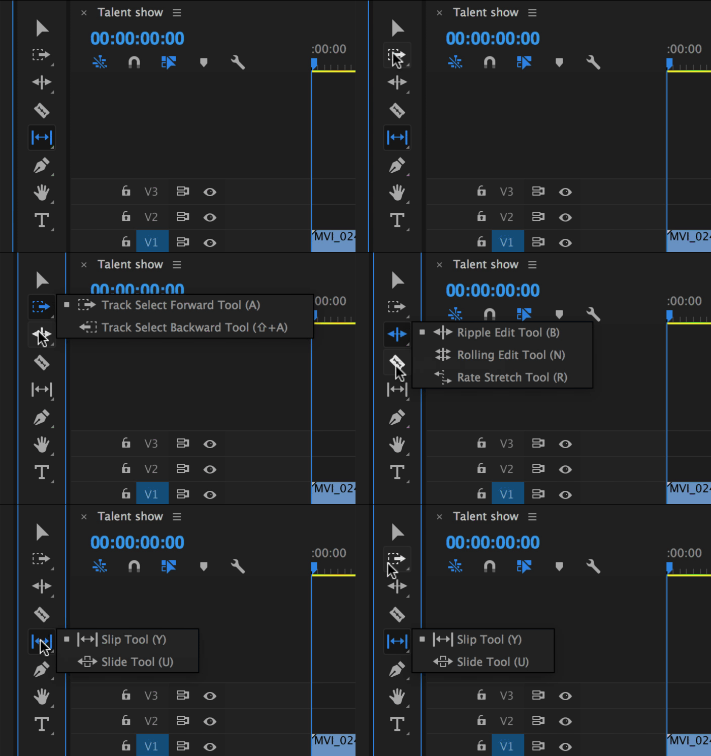
You’ll want to take note of those keyboard shortcuts as a few of them have changed to facilitate the new type tools (more on those later). This redesign also brings PPro more inline with the other Adobe CC app as far as the toolbar goes.
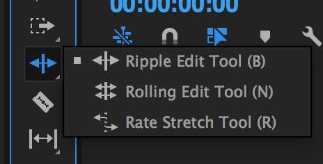
And if you’re coming from another NLE you may notice that each tool still has a unique shortcuts. For example, hitting the B key repeatedly won’t cycle through all those trim tools that are housed in the above well. This is kind of a bummer as that seems like it would be easy to do.
Updated Preferences
While the new toolbar will be the first thing editors notice I think one of the most important things that isn’t going to get much press in the wake of the flashy new features is a number of changes to the Preferences including a tweak to that eternal bag of hurt the Media Cache.
Media Cache
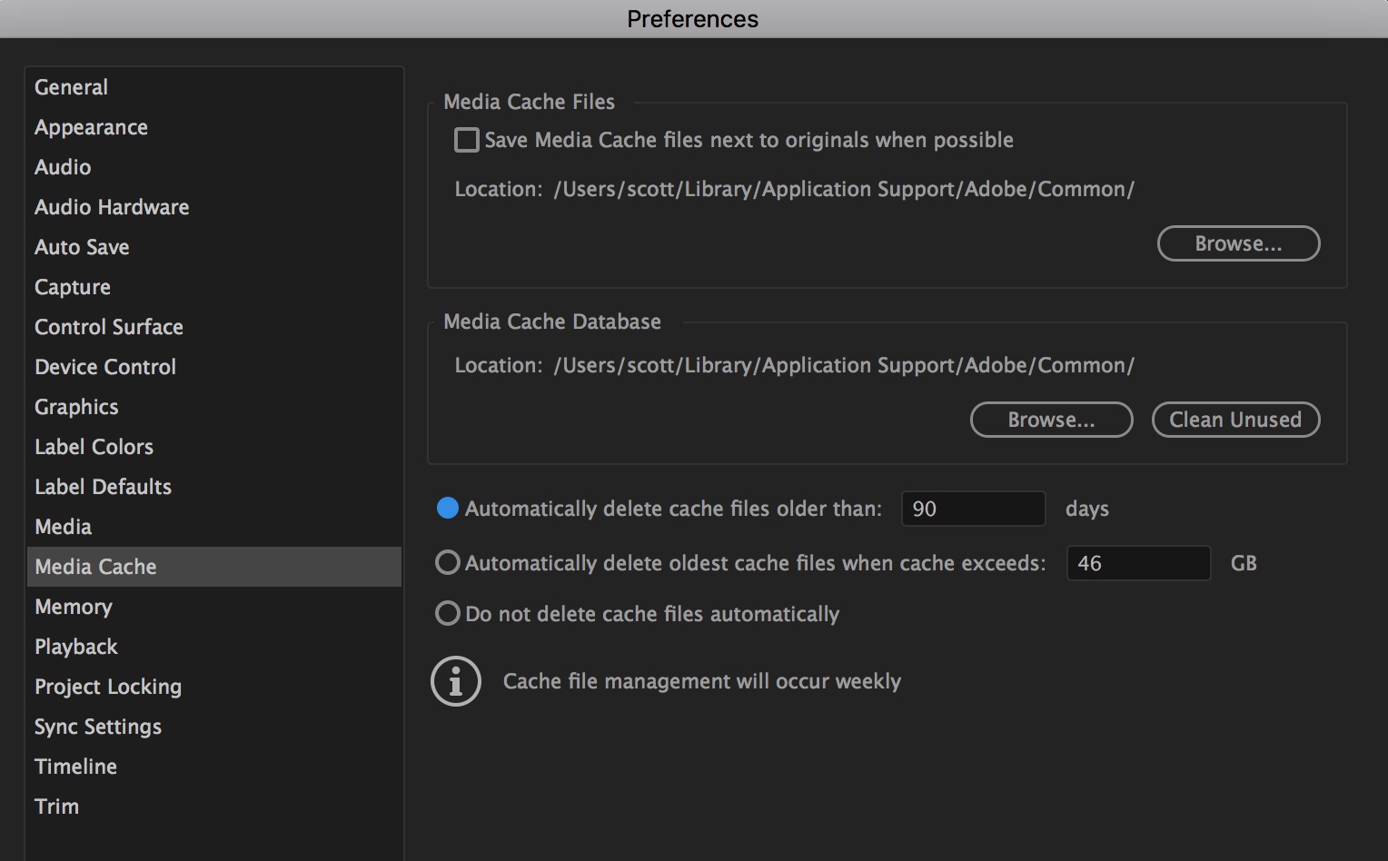 Media Cache has been broken off from Media in the preferences which is great as it is a separate thing. The engineers have added 3 options to help manage the media cache a bit better. Depending on your work, deleting old files might make the most sense but since the Media Cache default goes to your system drive the second option to delete cache when it exceeds a size might make the most sense on a laptop.
And if you look under the Media Cache Database the old Clean button now says Clean Unused. While that seems like a good change I now wonder if that is unused as far as the projects that aren’t open or unused over a time span.
Regardless it’s some change to the Media Cache which is welcome even though I still find the media cache one of PPro’s weak links. This media cache blog post from 2011 is still one my most often read posts to this day. That tells me people don’t understand it. For more education on the media cache this article from Screenlight does a great job explaining it all.
Timeline
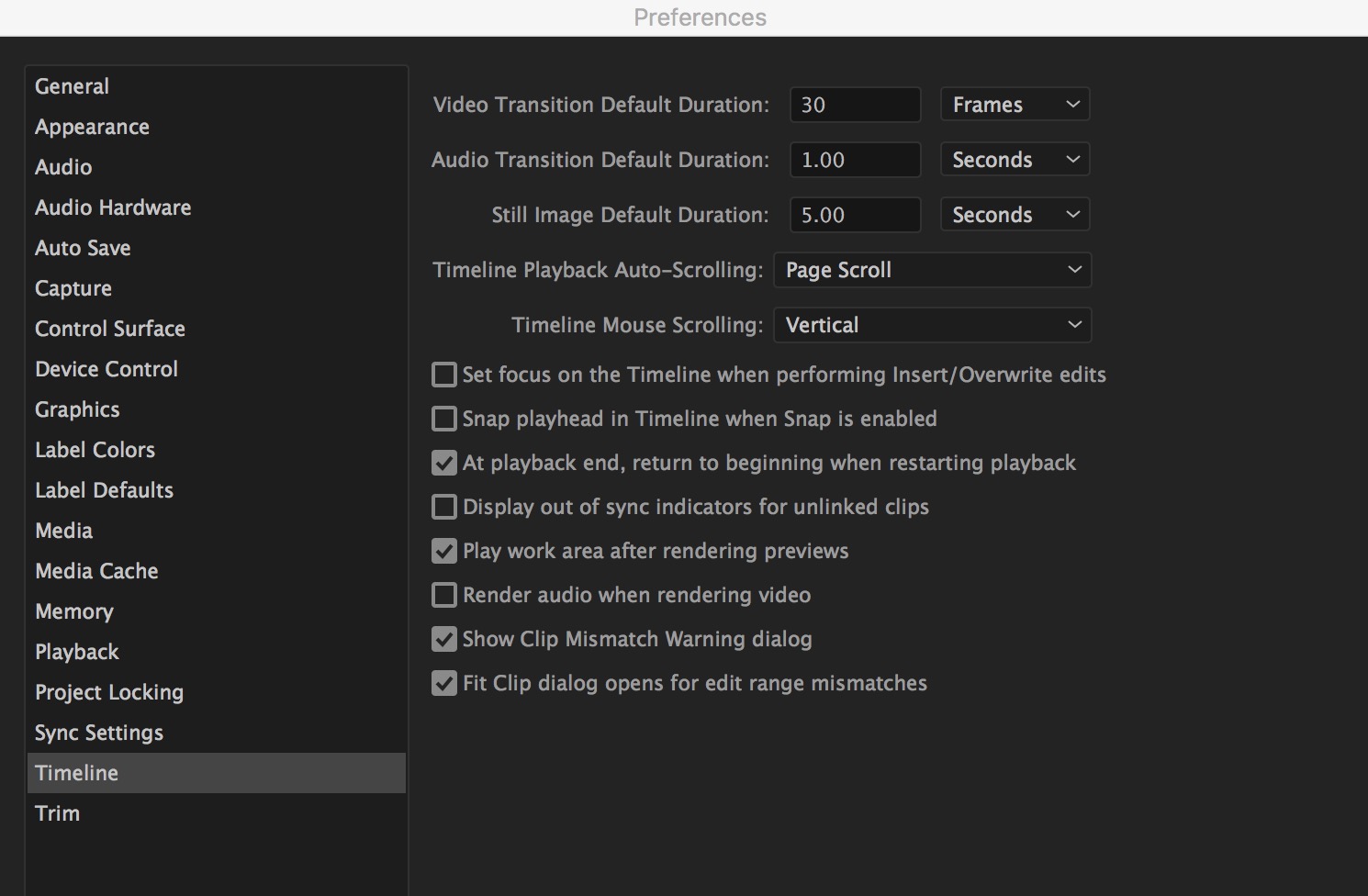
The Timeline gets its own Preference tab now. Nothing new there as all of those preferences used to be under the General tab.
Graphics
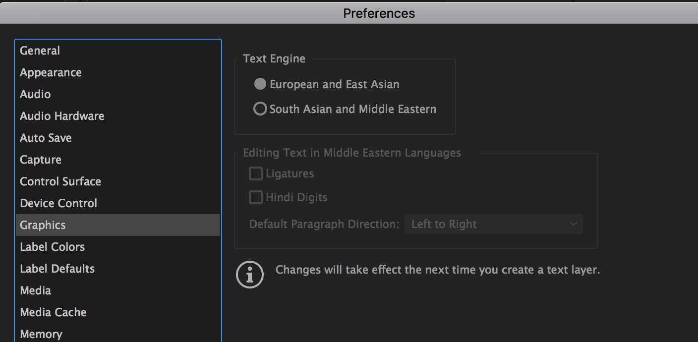
The other new category is Graphics which I guess is now a necessity with all the new graphics functionality.
Media
The old Default Scale to Frame Size check box preference is gone and that’s now handled under Media with both SCALE and SET to frame size as options. What’s the difference? Dylan has the answer. To this day I still get those confused.
Playback
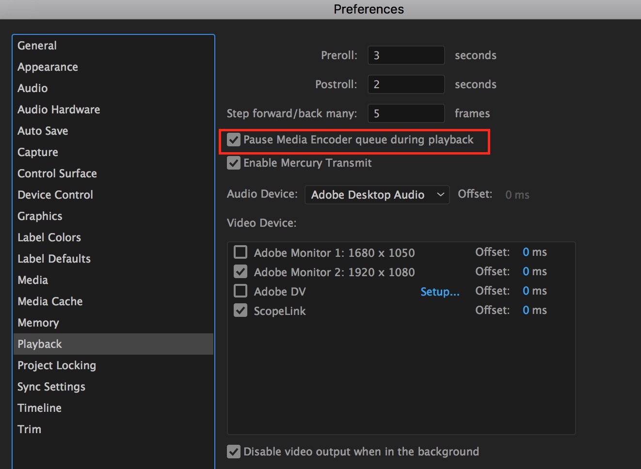
The last preference change I want to point out is the Pause Media Encoder queue during playback. This is the default behavior in older versions as pausing left more computer resources to playback video in PPro. If you uncheck this new preference Adobe Media Encoder can keep churning away in the background to get that encode done. Beware this might affect the performance of Premiere Pro. But it’s nice to have options.
The Type Tool
https://www.youtube.com/watch?v=V166BpsIgHs
With the April 2017 release of PPro Adobe has completely rebuilt the type tool and taken it from a somewhat passive way to add text and shapes on the screen to what is essentially a new container that can do a whole lot more. I was never a hater of the PPro title tool, in fact I once wrote an article defending the CS4 title tool when compared to Final Cut Pro Classic and Avid Media Composer. But that was 2009 and this is 2017 and apparently the old PPRo title tool was just too old to really have any future so Adobe engineers decided to give it a rethink.
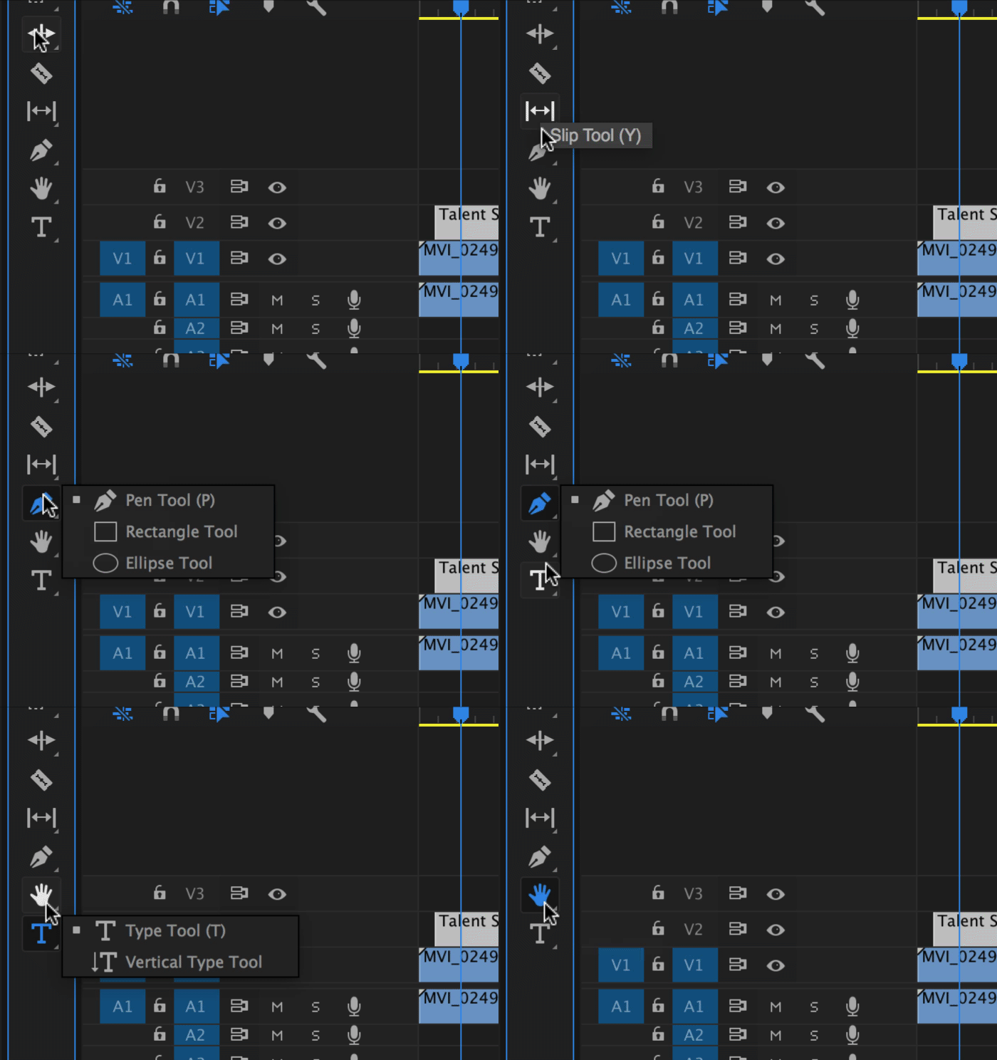
Get to know the new Type Tools in the new toolbar as you’ll spend a lot of time in them if you do a lot of typography in your video editing.
You don’t “open” the title tool anymore (it doesn’t exist) as text and shapes are created right on the Program monitor. Hit the T (or click the Type Tool if you must), click somewhere in the Program monitor and begin to type. Clicking and dragging draws a text box. If you want shapes then the Pen, Ellipse and Rectangle tool lets you draw just like you’re in Photoshop or Illustrator.
The big thing to really know about this new way of working with type and graphic elements is that a lot of time is going to be spent in the Effects Controls tab when it comes to design and manipulation of the elements. Each element you put into a design becomes a text or a shape layer in the Effects Controls (with intrinsic Transform controls like Position, Scale, Rotation and Opacity) built into each layer. If you want to change the order a Send to Back is handled by dragging to rearrange the layers. Depending on the element they might have different options available.
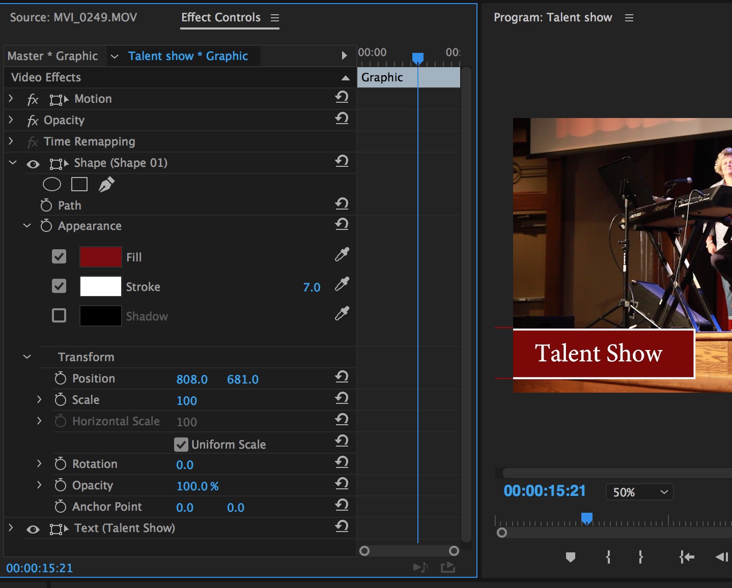
Shapes have simple design options like Fill, Stroke and Shadow. This is just the first implementation of these new tools so I would bet they will get further refined in upcoming versions.
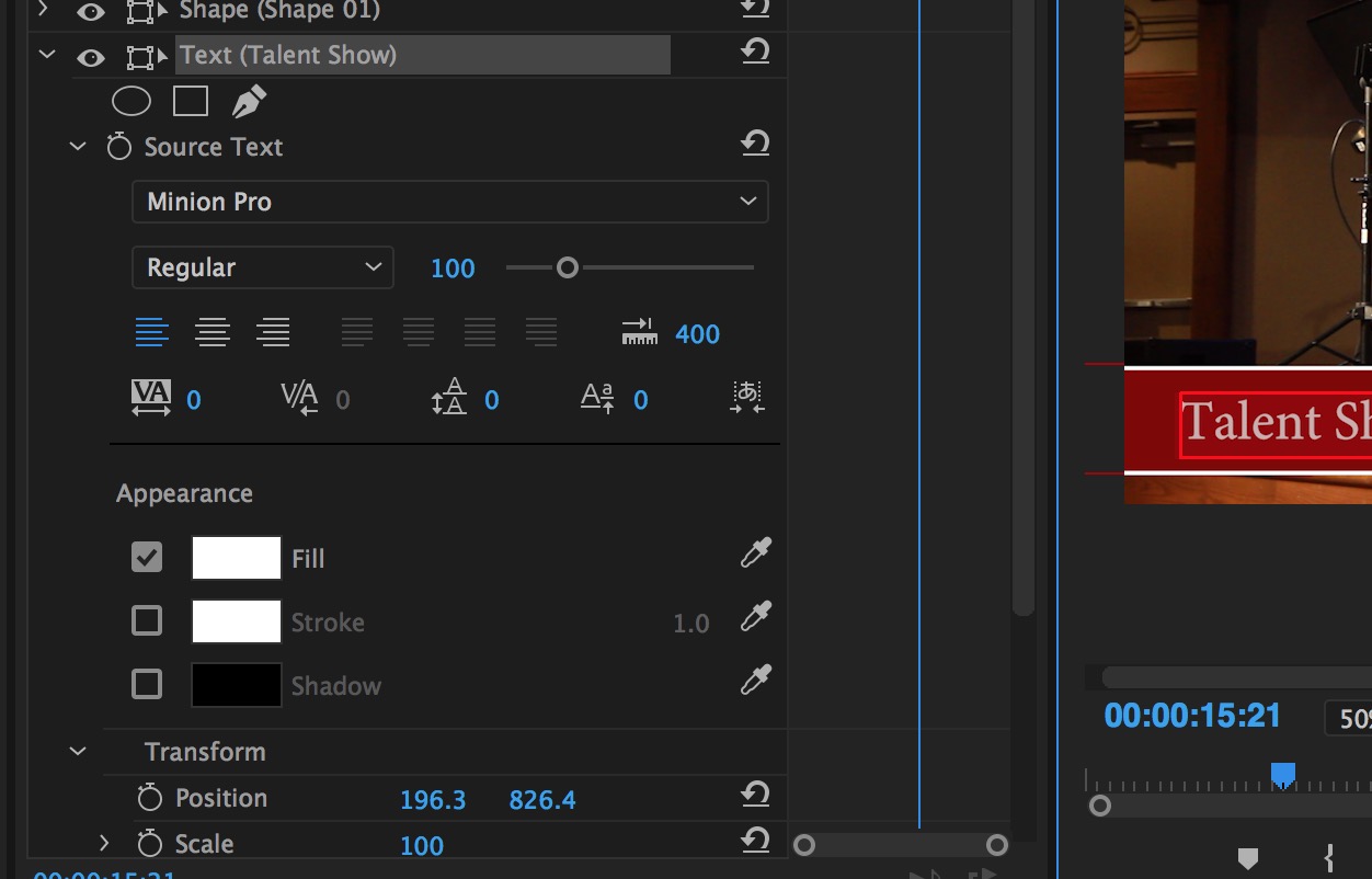
The stuff you’d expect from type formatting is there too: font, style, alignment and the various typographic controls. I’ll miss the centering buttons of the old title tool (unless I’m missing them in the interface here somewhere)being front and center but you can find those in the new Essential Graphics panel. More on that later.
The other big change in this new Type tool to wrap your head around is how it operates in terms of clips vs master clips. When you create a new piece of text in the Program monitor you get a new CLIP on the timeline. That is a graphic container. As long as you have that clip/container selected in the timeline any new element you add with the new type tools go into that container. Want a new, separate graphic container/clip? Be sure any other graphic contenders are deselected in the timeline and new creations go onto a track above. PPro will auto-create a new video track if it needs to to accommodate a new graphic element.
When new graphic containers are created they are created only in the timeline. Copy/pasting those will let you create new versions independent of each other. If you want a graphic element to be a new master clip in a bin then drag it from the timeline to a bin. This will turn a named-text clip into a Graphic and it will then behave like an old-school piece of text. If you want to new, independent version of that master graphic just duplicate it in the bin. If you get a Copy 01 in your clip name then you have two different graphic elements.
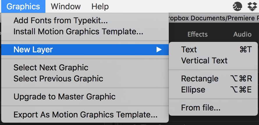
We get a new Graphics menu item that has a number of rather self-explanatory options. You can use this menu to add graphic elements without using the tools. It’s worth noting here that if you have a graphic container selected in the timeline using this New Layer option will add that new layer to the existing comp in the selected graphic element. If nothing is selected you get a new graphic element!
- New keyboard shortcuts exist for Select Next / Previous Graphic but they are unassigned by default
- Once an element becomes a Master Graphic it seems best to edit that from the Source monitor
- Many elements of a graphic container can be animated
- Using the selection tool in the Program canvas will grab and manipulate individual elements of a graphic container, not the whole thing
- You can move and manipulate an entire graphic container by using the Motion fx parameters in the Effect Controls
- Layers can be added to graphic containers From File… so there’s a lot of possibilities for custom art and logos to be imported for design use
This new way of working with type and graphics in Adobe Premiere Pro CC April 2017 is quite different and quite powerful. If you come from a design background and have used other Adobe tools it’ll make sense pretty quickly. For others it will take some trial and error to really understand how graphic containers work, how duplicating of them affects relationship to others and how the Master Graphics concept works.
Essential Sound Panel
https://www.youtube.com/watch?v=nYevGgTLWUc
In what is a further melding of the features across the entire Creative Cloud suite the Essential Sound Panel comes over from Audition to PPro. If you’ve used it in Audition it works pretty much the same way.
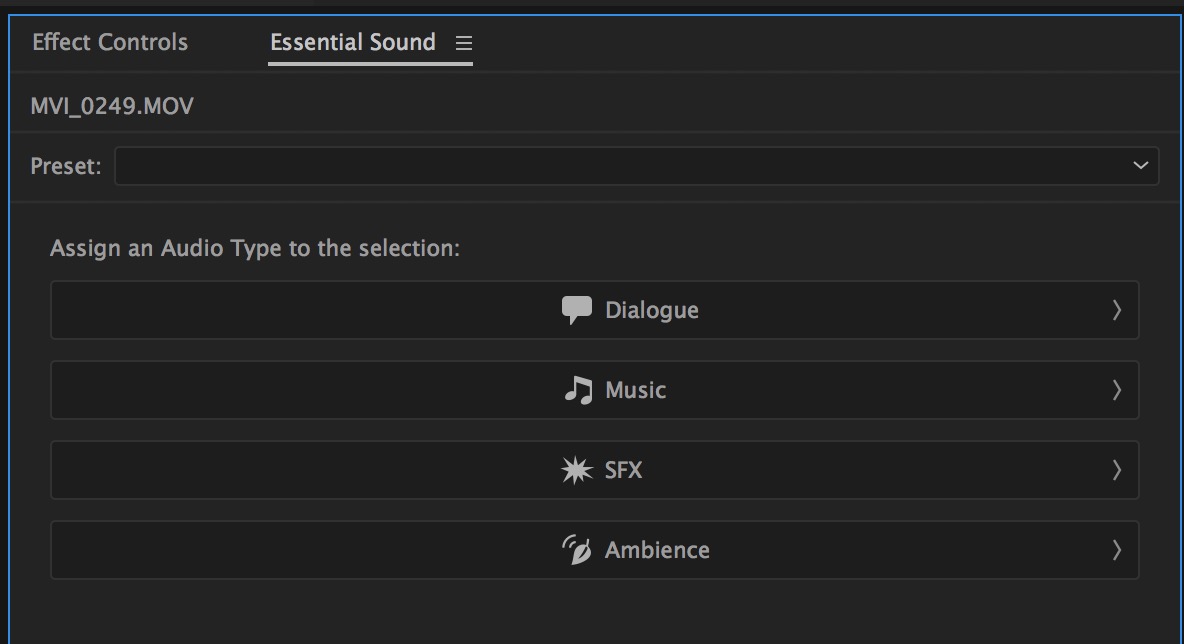
- Many elements of the Essential Sound Panel are independent of the clip settings. Changing the Volume>Level slider doesn’t raise or lower a clip’s rubber band automation.
- Unfortunately the Essential Sound > Music > Duration option is the amazing Remix feature found in Audition but rather just a way change the audio playback speed with pitch shift.
Motion Graphics Templates and the Essential Graphic Panel
https://www.youtube.com/watch?v=6371bM52SH4
These are two separate new features in the April 2017 release but I think they go hand in hand. Motion Graphics Templates are … well … templates created with text and shape layers that are saved out for later recall and use.
Motion Graphics Templates are a new .mogrt format for graphic elements that you can build with the new Graphics engine in PPro and export as a template. Send those to another editor, use them in another project … whatever you want to do with them.
But the big news on Motion Graphics Templates is they can also be created in After Effects which means the motion design possibilities are much greater that just Premiere alone. In the hands of a great AE designer and animator a whole new world of possibilities open up.
Those possibilities come to life with the addition of the Essential Graphics panel which is where editors will interact with these new templates.
Before these new Motion Graphics Templates the After Effects integration was limited to mainly changing the text but this new workflow will enable a lot more customization for the editor as “text, color, size, layout or mood of the motion graphics” will all be editable depending on how the motion graphics artist sets up the template. One note from the press materials says this: “To work with Motion Graphics templates created in After Effects in Premiere Pro, After Effects (trial/license) must be installed.” Most everyone will have the full CC license so a download of AE might be in order but if you are working with a single app license of PPro you might have to install an AE trial to get Motion Graphics templates from AE to work.
I can hear the Final Cut Pro X/Motion folks already dismissing this workflow as just a copy of the FCPX/Motion integration where Motion becomes an effects and template generating powerhouse tool for FCPX. I guess it is pretty similar and since Apple did it first it could be looked at as a copycat but the PPro/AE relationship is a very natural one that had only continued to evolve over the years. Maybe Apple will add “dynamic linking” to FCPX/Motion one of these days!
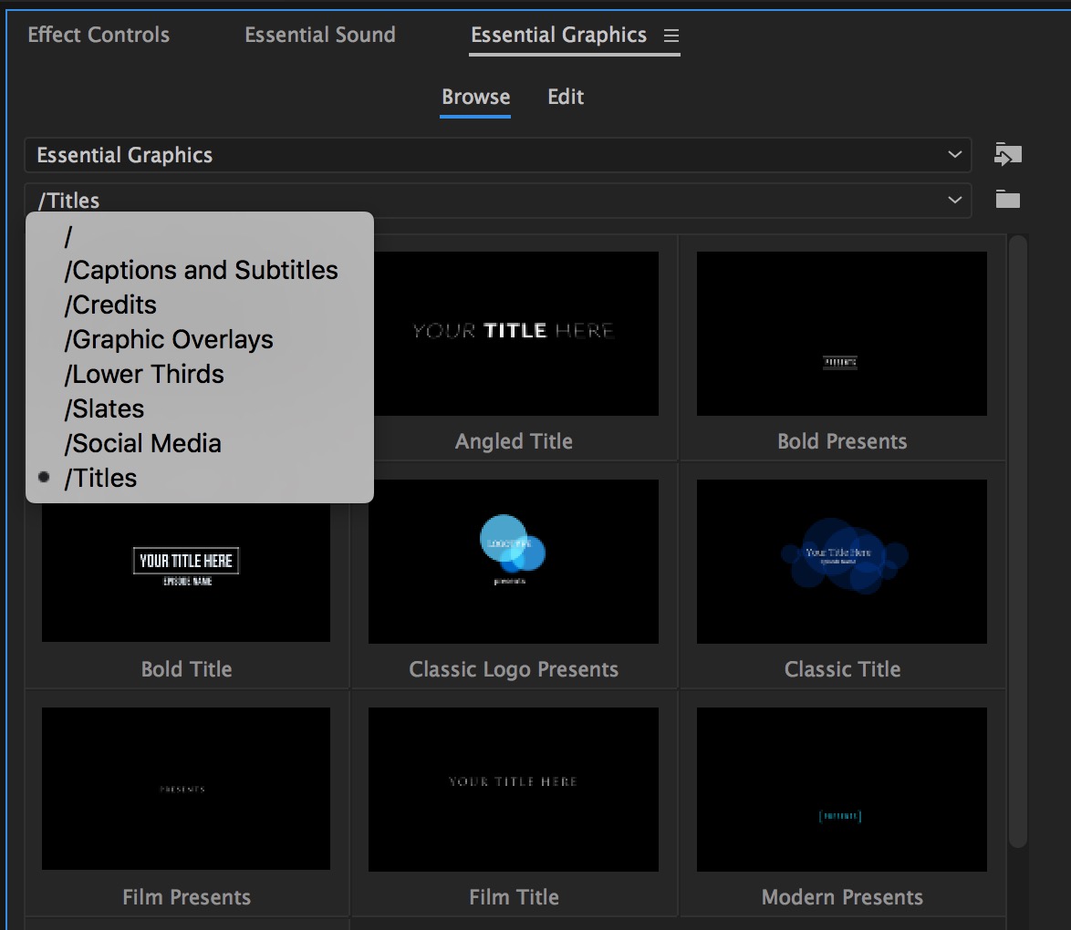
- A bunch of prebuilt Motion Templates come preinstalled in the April 2017 release so we’ll get a good place to start from.
- I don’t think there’s an Adobe-sanctioned method or marketplace for third parties to sell Motion Graphics Templates to the world but I can’t image there won’t be some coming through Adobe Stock or enterprising designers who won’t just do it anyway.
- Move your mouse over the Font pop-up in the Essential Graphics panel and a two finger drag on trackpad will scroll through the different fonts.
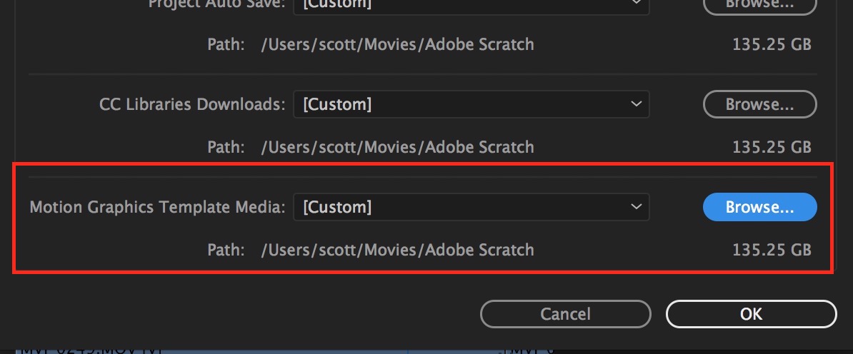
- There’s yet another destination added to the ongoing mess that is Premiere’s Scratch Disks and caches. The destination for Motion Graphics Templates Media means there’s yet another folder to get unintentionally saved to the unintended destination.
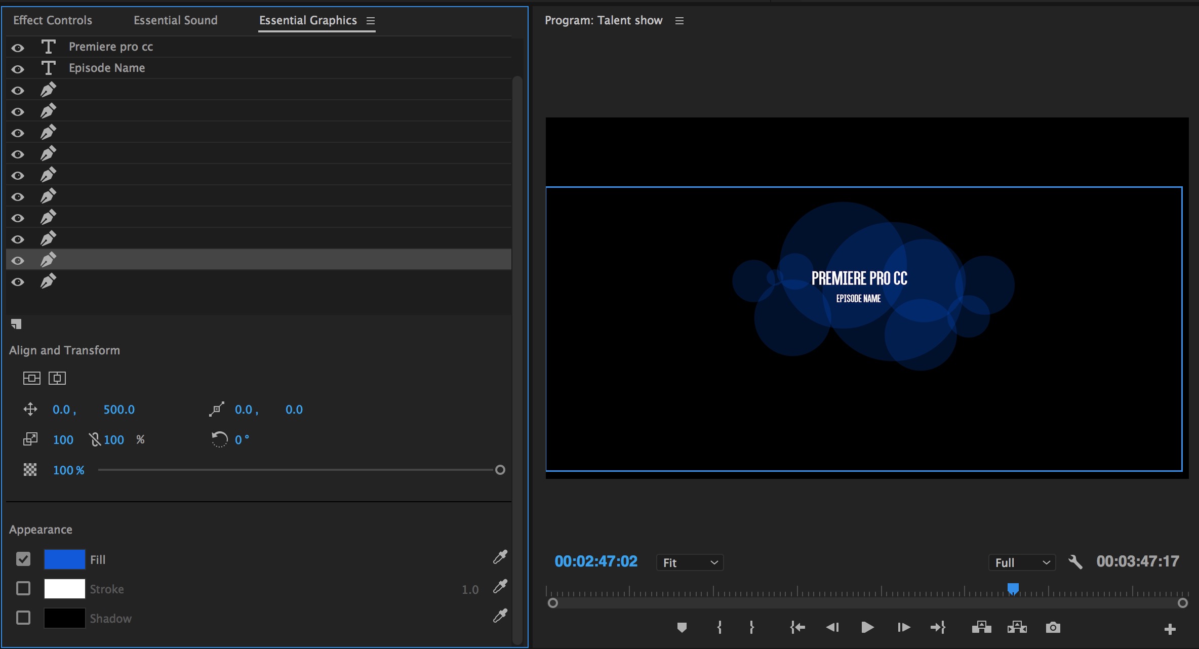
- Above is one of the installed templates editing in the timeline. You can see how it breaks down in the Essential Graphics panel. The two lines of text are changed not in the panel but with the Type Tool in the Program monitor. All the circles are made up of shape layers. Each of the elements have Align and Transform as well as Appearance parameters that can be changed.
- You can share Motion Graphics templates via CC Libraries so that means that feature might actually get some use from a lot of us video people.
Another little addition to the April 2017 release of Adobe Premiere Pro CC is a bit of help for the new editor. Depending on your setup you might see a new welcome screen that is a video that is designed to walk the new editor through the editorial process. Most over that screen and there are options for Watch, Get Started and Explore.
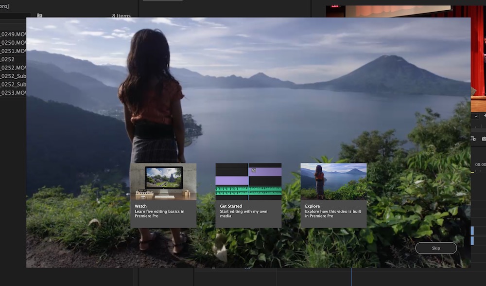
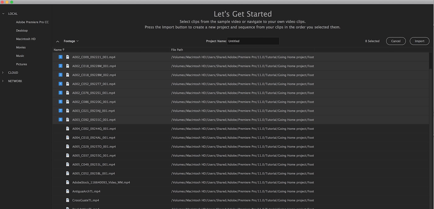
If you don’t see the screen pop up just go to Help > Welcome Screen and you can find it. If you choose Get Started you’ll be taken to a new Let’s Get Started import box to get that first bit of footage loaded and move on to editing.
Choose Explore and PPro will open a pre-buit project called Going Home that is an edit of that background video. 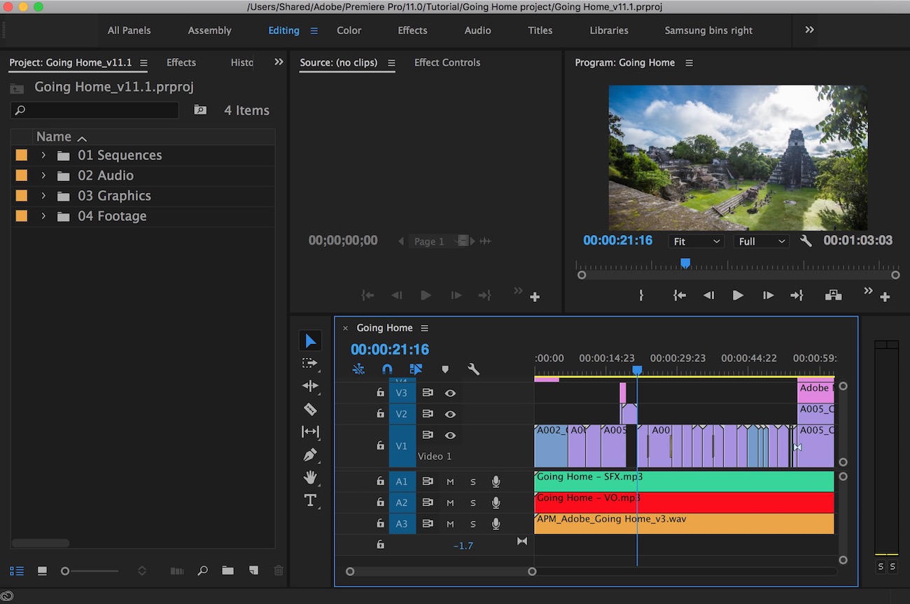
If you look closely above you’ll see that video was loaded into a tutorial directory in the Shared user profile. Looks like Adobe might be downloading that automatically with the update. It’s just over 165 MB so it’s not too big. Add this tutorial project to the new Essential panels and you’ve got Adobe making a push for the new user. It truly is a video world that we are living in.
And speaking of that you can now publish right to Adobe Stock as a new encoding destination.
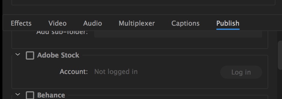
Plus a few more bullet points straight from the Adobe release site:
- New audio effects & improved integration with Adobe Audition – Send audio effects and keyframes used in Premiere Pro to Audition without any rendering.
- Ambisonic audio output for VR-enabled platforms such as YouTube and Facebook.
- Support for Apple MacBook Pro Touch bar and Microsoft Surface Dial.
- Support for new formats.
- Enhanced support for Team Projects Dynamic Link.
- Motion graphics Enhanced 4K 60p performance.
- Improved support for Apple Metal.
- Video preview of Stock footage within the Libraries panel and much more.
Those are the big features updates as I see them in this April 2017 update to Adobe Premiere Pro CC. As mentioned above it’s a big change to have this update ready for download day and date of the announcement. It goes without saying that you never update in the middle of a project but if you do then do it the right way. And make special note that Premiere Bro says there is not option to keep the previous version of PPro installed as there has been in the past. This is different from previous updates so PROCEED WITH CAUTION.
And since this is a patch that updates the old install this video below can help find any previous version if you need to do a complete uninstall.
Filmtools
Filmmakers go-to destination for pre-production, production & post production equipment!
Shop Now