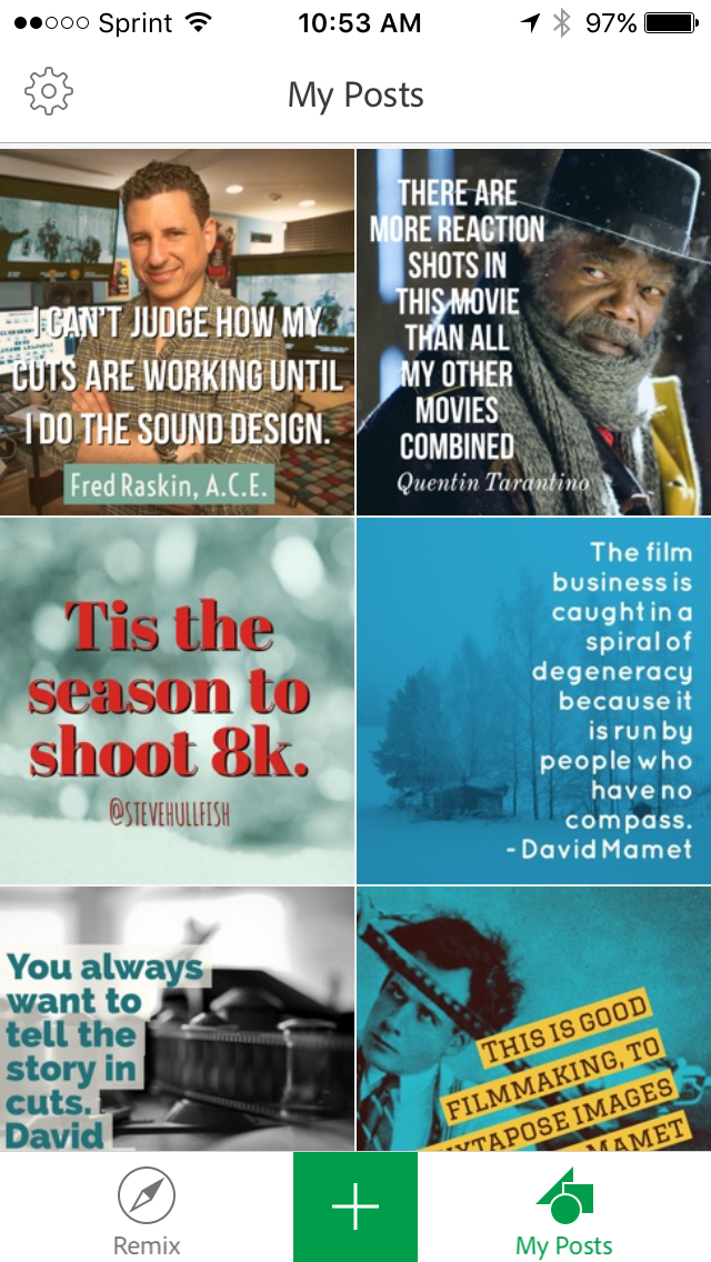
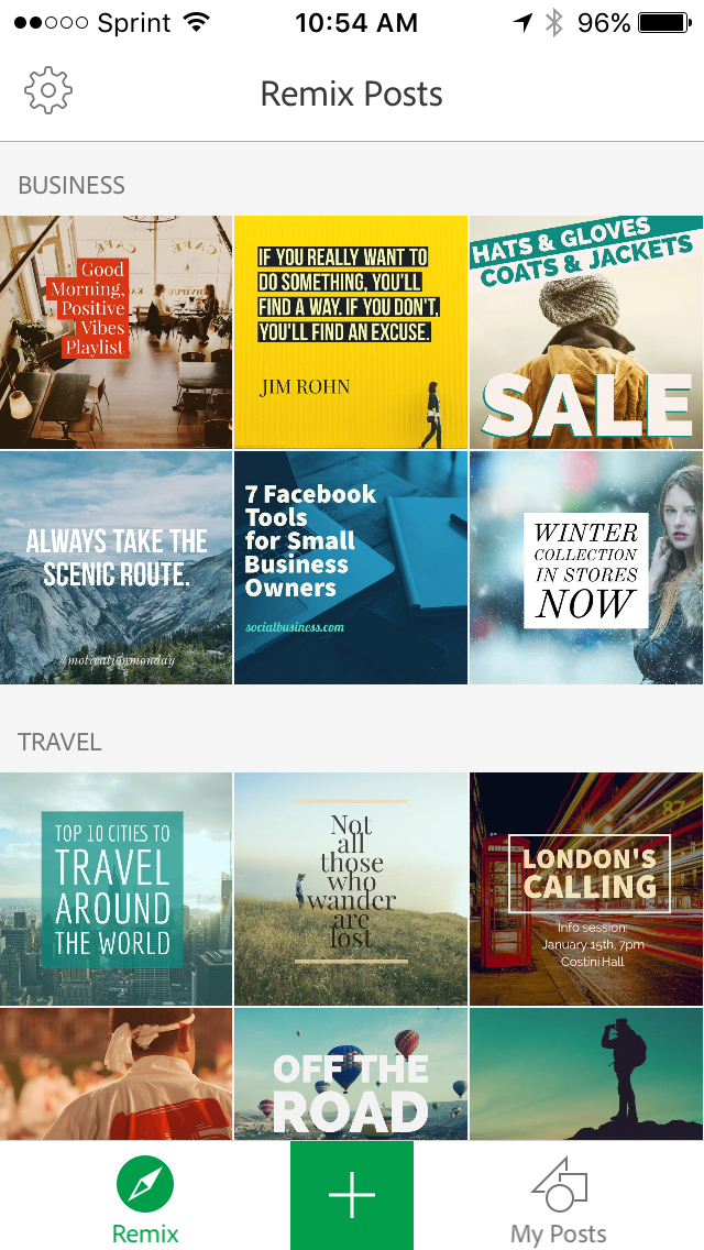
Posting to Facebook and Twitter – not to mention other social media sites – is a great way to promote yourself. Images are always better for engaging eyeballs, but it’s a lot of work to create something graphically powerful.

Adobe to the rescue. Adobe has provided a nice, FREE, mobile app that is a combination of Photoshop and InDesign.
You can “remix” one of dozens of pre-made templates, changing color schemes, fonts, text and photos or start from scratch with your own photos. Everything can be changed very quickly and easily. Adobe did a great job of picking a handful of really great “headline” fonts.
If you are interested in getting it for iOS, here’s the link.
https://itunes.apple.com/app/id1051937863

Photos can come from the “remixes” or from your iPhone’s photo library. I wanted to do some promotion for my provideocoalition.com Art of the Cut series, and I wanted to pull some photos from the internet or stock imagery. I was able to do that through the rather roundabout method of using Creative Cloud to get the images from my laptop to my iPhone, though, obviously there are other methods for getting photos to the phone’s photo library.
With the app installed and launched the process is pretty self-explanatory, but you’ll definitely want to link your Twitter and Facebook and Adobe IDs to the app. Once that’s done, creating, saving and posting your “posts” is very simple.
Adobe Post originally launches to the “Inspiration Wall” from which you can choose a starting design for a “remix” by simply clicking on the design you want to start with then click “remix” at the bottom to confirm or the “x” button at the top to pick another design.
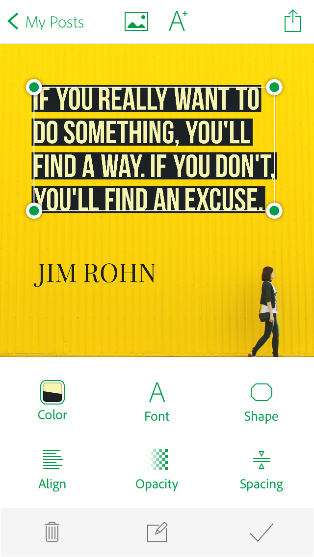
Simple buttons at the bottom of the screen allow for changes to design, color palette, and photo filters. As you select each of those items, clean icons at the very bottom of the screen allow you to either “x” for “don’t change” or check-mark, for “select.” Double-clicking on the temporary text to be able to edit the text. The text box can be re-shaped and resized so that it doesn’t cover critical areas of the image. Another important tool for text is the line-spacing tool which provides leading (spacing between lines). You can also change opacity, font, font color and alignment. At the

If you would rather create your own posts from scratch instead of using a “remix” use the large green button with the “+” in the middle at the bottom of the screen. That launches you into a screen where you can navigate to your base photo or image, which can come from your Photo Library, Camera, Search Free stock photos, Lightroom or Creative Cloud. The free stock images are fairly generic, but beautiful backgrounds. If you use Lightroom, you can add and sync photo collections from Lightroom and they will be available here. As I mentioned, my method was to utilize my Creative Cloud account to sync some public domain files from the internet to my phone.
The icons on the top of the screen are the same as for the “remix” option. One thing I learned from trial and error is that if you share your “post” using the far right icon, it doesn’t SAVE the post. If you want to save it, you need to use the far left “<My Post” button.
Adobe gives permission to use any of these free images and designs on commercial websites.
Each post – originally – will have a little #AdobePost watermark. You can click on this and remove it by sharing AdobePost with a friend. You can also get access to more fonts and designs by tweeting a link to the app. Adobe is planning on creating an Android version, but for now, it’s iOS only.
I had a few feature requests: The main one is that the “posts” are designed perfectly for Facebook, and work great in Twitter, but in many Twitter mobile feeds, the shape of the image in Twitter is more “widescreen” than the square Facebook design. It would be nice to be able to either make a “twitter” version of any post or to decide upfront whether you want to post to Facebook or Twitter. I’d also love to have a way to have a hyperlink built in to the design. I wanted to post cool, short quotes from my Art of the Cut series and then have a built-in link to the full interview.


