The “After Effects Project Diaries” provide inside details and behind-the-scenes accounts of real projects I have worked on. In the very first AE project diary, I look at the Ninjago project for Legoland, a theatrical stage show where all the sets are high-resolution digital projections.
Welcome to the first After Effects Project Diary, a series where I share behind-the-scenes insights into real projects I’ve worked on. As this is the first (official) After Effects Project Diary, I’ll begin with a quick introduction and explanation of what to expect, and why I’m starting this series.
How did they do that?
When I first began working professionally in 1997, the desktop video revolution was well underway. The changes in post-production technology were not only directly responsible for my first job, but were so significant they changed the way the video production industry had operated for decades. These changes were so profound I created a 3-part, 50-minute video series that looks at the differences between post-production in 1997 and 2014.
In 1997, After Effects was at version 3.1 and the very concept of doing visual fx on a desktop computer was novel. With online communities springing up to support these digital pioneers, a very common question was “How did they do that?”
In 1997 the question “how did they do that” was always a technical one – what software, what plugin, what settings were used to create an effect or ‘look’. But as desktop technology evolved and improved, and I gained knowledge and experience, I became less interested in specific technical details and I became more interested in the overall production process. I was certainly not the only one who started to look at the bigger picture, and so the question “how did they do that” moved away from advice on specific plugins and towards topics including budgets, pitching, scheduling, resources and so on.
Again, these changes in attitude were so significant to my career that they became the subject of another lengthy article, and although the “desktop revolution” article is a video series and the “growing pains” article is text, they’re really two halves of the same story: one half on the technology and the other half on the people using it. But really, both articles address the question “How did they do that”- just from different points of view.
While there are countless tutorials out there that look at specific aspects of software, there are surprisingly few articles that give this broader perspective on real-life projects. I’ve joked before that there are many After Effects tutorials that teach you how to turn text into sand, but there aren’t any that tell you what to do if your co-worker has bad body odour. Actually this isn’t just a joke, it’s more of a real-world observation.
When I originally started writing for the ProVideo Coalition, my very first article (on the Centrica project from 2006) was an attempt to fill in the blanks and provide insight into the overall process – that’s why I named this channel “After Effects Anecdotes”. I skipped the “step 1 do this, step 2 do that” style and instead I included details on the original pitch, showed some work-in-progress, talked about the decisions behind some of the things I was doing and some of the problems that I faced.
This seemed to work pretty well, so I took the same approach a few years later for the Vivid project that was projected onto the Sydney Opera House – again including some of the original pitch documents, and also mentioning things that I would do differently if I had to do the project again.
While I’ll continue to post articles on a wide variety of After Effects related topics, I’ve decided to use the “Project Diaries” title for the ones that deconstruct real-life projects I’ve worked on, and continue the tradition of the Centrica and Vivid articles.
So let’s travel to Legoland and deconstruct a project made for their Ninjago world.
Overview
The Ninjago project is a 20 minute theatrical stage show for kids, based on Lego’s Ninjago characters and performed by puppets at the Legoland theme park. The stage show follows on from the success of Lego’s Ninjago TV series.
All of the sets are digital projections – so all of the backdrops and supporting visual effects were created using computer animation. The overall duration of the show was just over 20 minutes.
The animation was produced by Sydney based company Artists in Motion.
I’m not exactly sure how to count the people involved, but I think it’s fair to say that there were three 3D artists (Maya) and three compositors involved for about six weeks.
Pre-production
Once the project officially began, the initial steps involved basic communication between the various companies involved. This is not something I had anything to do with, and it’s rare for me to have any involvement at this stage. But it’s normal for different aspects of the overall show to be handled by separate companies – there was an overall production company who had come up with the concept (based on the Ninjago TV series), a separate company responsible for the video projection and playback equipment, another responsible for the puppets, us creating the animations and so on.
During this initial stage, mostly conducted by email but with the occasional Skype call, several important technical decisions were made. These included the number and type of video projectors to be used, the playback system to be used and so on.
The script was still being developed and “placeholder” actors were used to record read-throughs, which allowed the composer and sound mixer to begin work with approximate timings.
None of this preliminary work involved us, so for several weeks a lot of communication was taking place but there wasn’t much happening in the office.
OK to go!
Once the stage plans had been finalized and the AV company had determined the format of the video projectors, we had the information we needed to begin work. At the same time, a pixel-map had been designed which provided us with a basic template for animation – we were working at a resolution of over 7,000 pixels wide, by almost 3,000 pixels high.
Many of the design aspects of the show, including key elements like the main characters, already existed courtesy of the Ninjago TV series – however several new elements had to be designed specifically for the stage show. All new elements had to be in the same Ninjago style, and had to be approved by Lego.
The overall show was about 20 minutes long and had 10 different scenes. These scenes were divided up amongst a number of different artists in the office, and I’ll take you through the basic production process for one of the scenes I worked on: Scene 2, or “the dojo scene”. Scene 2 introduces us to the main characters, and in keeping with the overall Ninja theme it’s set in a dojo. If you’re quick at maths you might have figured out that if there are 10 scenes in a 20 minute play, then each scene must average 2 minutes duration. And that’s about right – this scene ran for two minutes.
The staging company had designed the set using a CAD program, and this was supplied to us in a format that could be opened in Maya. While it can get confusing, the point is to understand the difference between the physical set – constructed on the stage at Legoland – from the digital set, which is the animation projected onto it.
The physical set doesn’t change and incorporates all of the elements needed to perform the entire show – this includes things like stairs, doors, windows and other openings for characters to enter and exit, platforms for the characters to stand on, sails which unfolded for a scene on a ship and so on. We had no involvement with the design of the physical set, but we needed the plans so that all of the animation aligned correctly.
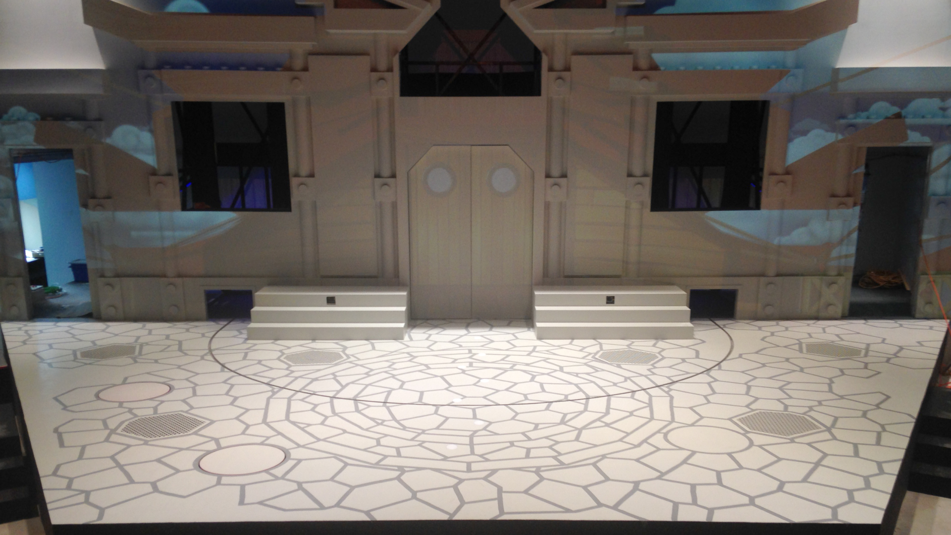
The stage under construction at Legoland.
The dojo set was modeled in 3D using Maya, based on the supplied CAD model of the stage.
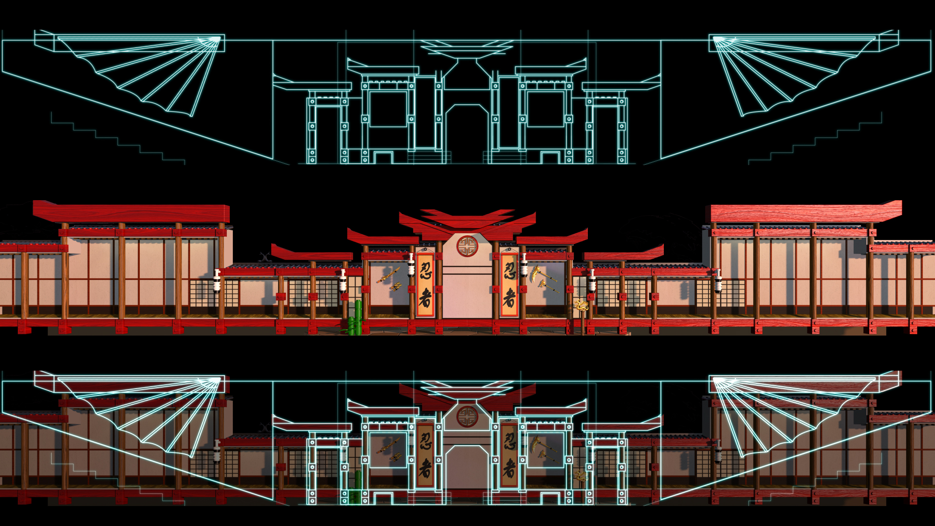
(top) Supplied CAD plans. (middle) 3D model in Maya (bottom) CAD plans overlaid to show alignment.
Here you can see the outlines for permanent stage features at the top, the basic 3D render out of Maya in the centre, and at the bottom the plans are overlaid to show everything in alignment.
Remembering that we’re only animating the backdrops and not the play itself, there’s no need to actually produce 2 minutes of 3D animation – at 7K resolution this would have been a major undertaking. Instead, we only needed a single frame of 3D out of Maya, and the rest of the work could be done in After Effects – which is much faster to work with.
For the dojo scene, the Maya artist set up multiple mattes to give me control in compositing, and rendered everything as a single EXR file with multiple channels. The single EXR file was over 100 meg in size. I’ve found that different Maya users have different preferred ways of working – many render out seperate tifs or jpgs for each channel. In this case, supplying everything embedded in a single EXR file was simply the choice of the individual Maya user who modelled the dojo. Had someone else modelled the scene, they may have given me multiple tiffs, jpgs or even tgas depending on their own habits.
Colour and movement
There were several stages to producing the final 2 minute animation from the single frame rendered out of Maya.
The 3D render came with a large number of mattes, and because all of these mattes were supplied embedded into a single EXR file, the first step was to create a precomp for each matte, and use the EXtractoR plugin to isolate each channel.
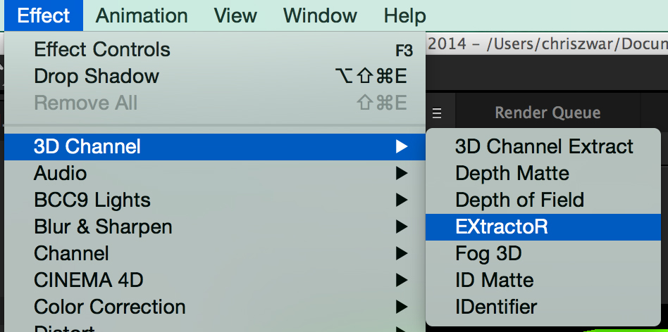
The EXtractoR plugin was used to create individual precomps for each channel of the original EXR file.
Once I had the mattes in a useable format, I could begin compositing.
The final renders were never intended to be photo-realistic – after all this was a production for children inspired by an animated TV show, based on toys made out of plastic! Even so, with over 7,000 pixels to play with there was plenty of scope for detail – it would just be in the overall Lego world style.

Basic “beauty pass” straight out of Maya.
The main thing all of these mattes were used for was a basic colour grade – mostly this was about adjusting the exposure of individual elements, and in some cases adjusting the hue to avoid large flat areas of exactly the same colour. Some of these tweaks were so subtle that it’s difficult to spot the difference when the 7,000 pixel image is scaled down to the 600 pixels that you’re seeing here, so I haven’t included a before/after.
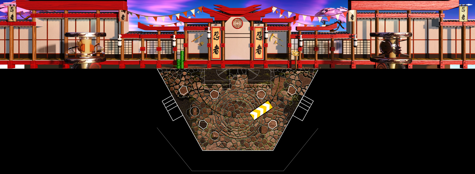
A single frame of the composited dojo scene, showing how the back wall and floor are arranged in a single ‘flat’ template. The overall size of the back wall was 7460 x 1080 pixels, with the floor area being an extra 2160 pixels high. The overall frame size was 7460 x 3240.
Although we had a single frame out of 3D, we didn’t want the audience to feel as though they were watching a still frame, so the next step was to introduce some small and natural movement into the background. This would help make the scene feel alive, but without distracting from the characters.
The sky was a single large plate that had been created in Photoshop, and it was easy to add a slow drifting movement over the course of the two minutes. I experimented with having some birds fly through the sky but this was too distracting.
While the overall 7000 pixel background plate was supplied as a single still image, the 3D animator also supplied a few separate elements that animated – flags fluttered, the plastic Lego trees swayed and so on. These individual elements didn’t have to be rendered at the full 7,000 pixel size – even at 100% size, they were relatively small and fast to render. These looping elements were 300 frames in duration, and when the same element was used more than once, the in-points were staggered to provide variation when projected – the same banner animation was used six times, for example.
Looping elements added ‘life’ to the scene.
In keeping with the dojo theme, this particular set featured a large number of Japanese-style paper screens, which in reality would be slightly translucent. The final step to bring the shot to life was to create subtle animated lighting differences between the paper screens.
To do this, I raided the stock footage library and found some old Artbeats footage that was possibly about 20 years old! Even though it was low resolution – PAL was 720 x 576 – all I needed was some blurry coloured movement, so I was able to scale a few different clips up, slow them down, and then blur them altogether. The end result was a slow, subtle but effective lighting texture that helped the original still frame come alive and also gave each paper screen its own texture.
A whole bunch of old stock footage was blurred together to create a slow moving texture.
The combination of the 3D looping animations, the moving sky and the lighting variations meant that we now had a basic background plate that ran for two minutes, while only having to render a single 7,000 pixel frame out of Maya.
Before (top) and after (bottom). 5 seconds of the 2 minute background animation.
The next step was to go through the script and create the visual effects required for specific moments in the play. The first of these required a portion of the set to catch fire.
The fire elements were straightforward – mostly just stock footage with a little bit of Trapcode Particular thrown in. Many of the fire clips I used came from Video Copilot’s Action Essentials package.
Bang… lots of Action Essentials. Cheap at twice the price…
To make the set look as though it was burning, I created an alternative grade of the dojo using the same 3D passes, just processed differently.
Firstly, as the dojo is predominately red, all of the detail is in the red channel. So I used the “Shift Channels” effect to copy the red channel into the green and blue channels. This gave me a greyscale version of the dojo, but with all of the woodgrain detail. I then just used the Curves effect to crunch the brightness down, and the end result looked a lot like burnt wood. Finally, I just used some fractal noise over the top to add some variation in brightness, and I had my burnt version of the dojo.
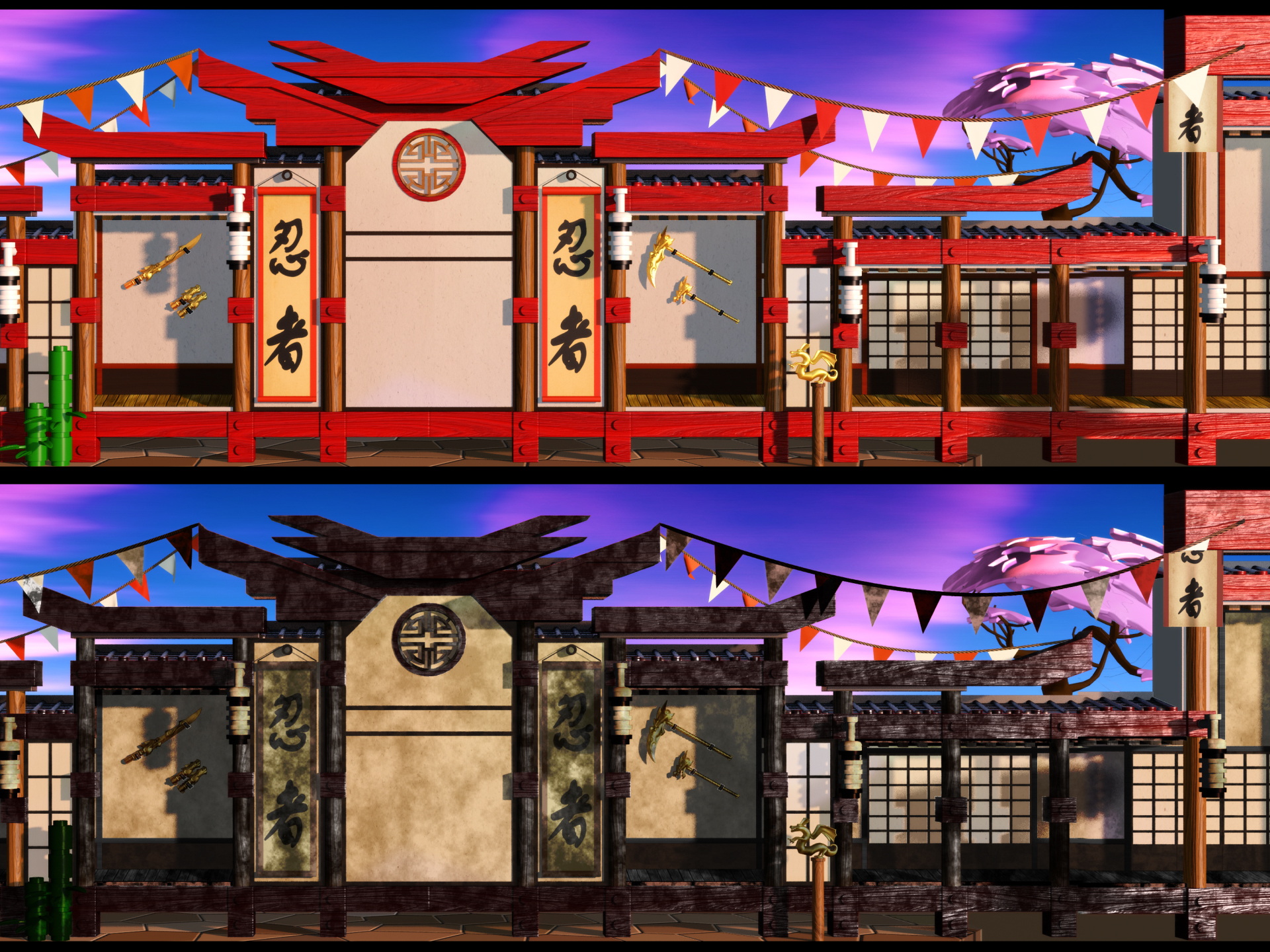
Basic colour grade (top) and burnt effect (bottom).
However only a small area of the dojo caught fire, so the next thing to do was to create an animated matte to only reveal the burnt areas where the flames were. This was simple and quick to do with a few masks – drawn in alignment with the fire stock footage clips I had already laid out – and then revealed with the ‘Stroke” effect. The layer with the animated strokes was simply used as a matte for the burnt artwork. Putting all of these elements together, I had a fire effect that revealed a burnt version of the set.
The reveal-matte was created using the ‘stroke’ effect…
…combined with the original composite to align with the fire elements.
As part of the story, a water Ninja quickly extinguishes the fire, and so the next step was to create the water effect. Stylistically this was more difficult, as using stock footage of water looked too “real” in the Lego world. Perhaps it’s odd that using real fire worked but using real water didn’t, but that’s the sort of thing you only discover by trying it, and you can’t predict from reading a script.
After trying a few alternatives, most of which were simply too realistic, eventually the water effect was done very simply using the “Blobbyise” and “Mr Mercury” plugins. These old-school plugins not only created the perfect look for Lego water, but also rendered very quickly.
The overall effects sequence… Dojo catches fire, fire is extinguished!
To help us visualize the animations as we worked, we used a UV map of the stage and the RE:Vision FX plugin RE:Map. This is a process I have described in an earlier article, so I won’t repeat the details here. We had two different UV maps that provided two different perspectives of the stage.
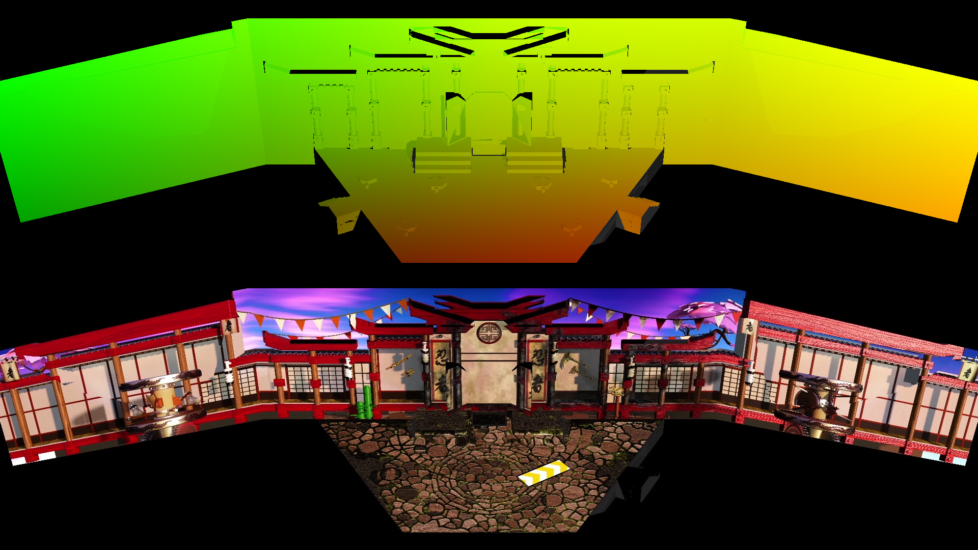
The RE:Map plugin was used with a UV map render to preview the animations on the set.
While we were working on the animations in Sydney, the puppeteers were busy rehearsing at Legoland, and every few days we’d receive new footage from the actual rehearsals synchronized with our animations. Like any theatrical event, there were lots of timing and position tweaks as the director worked with the actors and blocked out all of the scenes. On several occasions the script was revised and the audio remixed, which would require us to adjust our timings to suit.
We’d get updated rehearsal footage every few days… always made us smile!
Once the script was approved and locked off, it was recorded by the “real” actors and the audio file we were given could be considered the “final” mix. Again, this is not something we had any involvement with.
As the opening date approached, rehearsals moved into the actual theatre and the performers were able to practice with the video projections. As was to be expected, tweaks and revisions were continually being made as the show evolved.
To this point, the project had gone very smoothly with no problems, but when the renders were projected in the theatre we encountered our first unexpected hurdle – they didn’t line up properly. This was a major concern.
As illustrated earlier, all of the 3D models had been designed in Maya based on the supplied CAD files. However it was discovered that the CAD file delivered to us had been exported incorrectly, and this meant all of our animations had been made to the wrong template. In reality, the back wall of the theatre wasn’t perfectly flat, but rather it was divided up into 3 sections (a centre and two wings), with the outer two sections angled towards the audience. While I don’t have the exact details of what the problem was, the simple explanation was that when the CAD file was exported the angle of the wings wasn’t preserved, so the wings and the centre of the stage appeared as one single flat surface. Once the cause of the problem had been identified, a revised CAD file was delivered to us with the correct projection, but we still had to revise all of our work to match it.
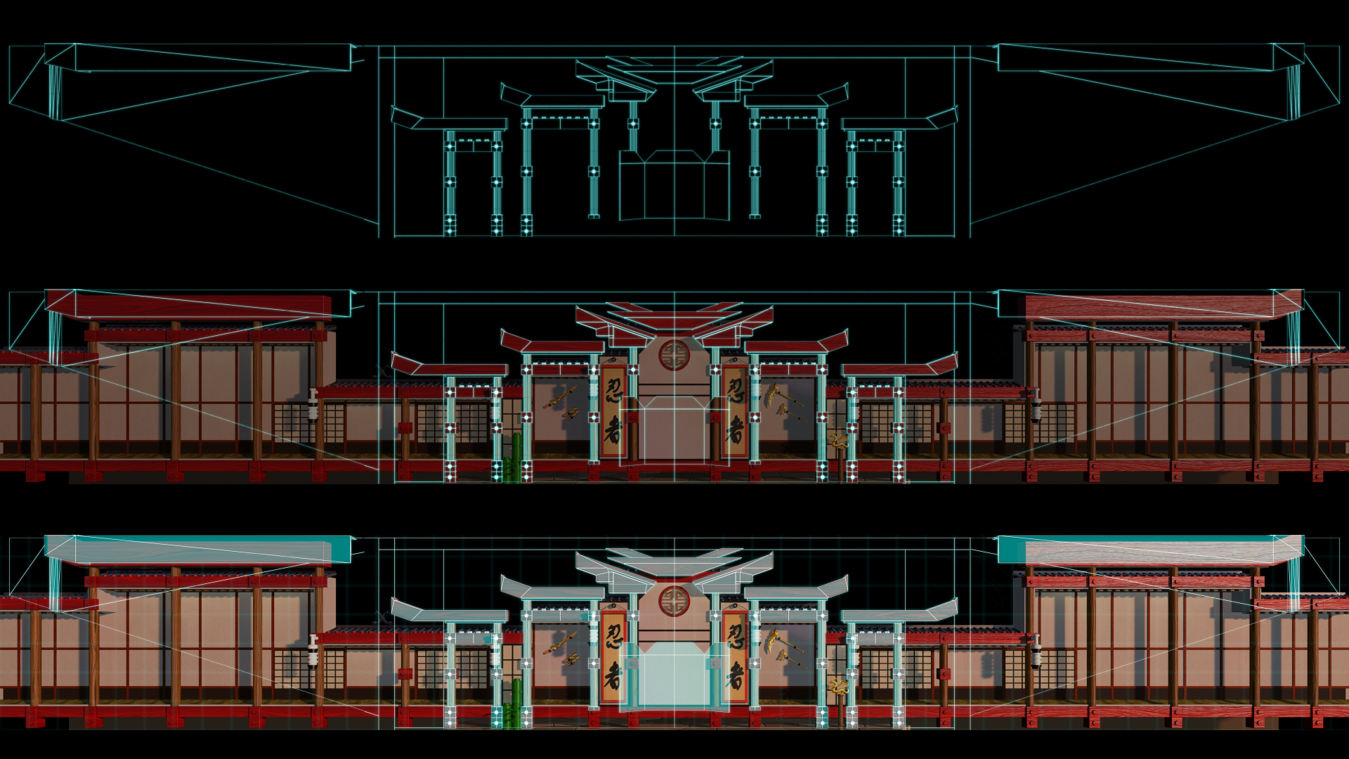
(top) The “correct” CAD guides (middle & bottom) overlaid on the animations to show alignment problems. The centre stage is fine but the side wings are simply wrong.
Here you can see revised CAD plans, and how the animations we made for the original plans don’t match up.
This mistake in the way the CAD file was exported affected every scene, with the centre areas aligning but with the outer wing areas slightly off. With the launch date of the show approaching, we looked at the most efficient way to fix the problem.
The overall show had about 10 different scenes in it, and although some were created in the same way as this dojo scene, using a single frame from 3D with 2D animation added in After Effects, others were fully animated within Maya using 3D camera moves. For the scenes that were animated within Maya there was no option but to go back and re-model everything to match the new set plans, but this placed a heavy burden on the 3D animators, and also the 3D render farm.
Because the differences in the templates were actually quite small, and they only affected the sides of the stage, if a scene had a static backdrop then we could actually fix it in After Effects. All I had to do was mask out the left and right sides of the existing renders and scale them to match the new template. This was quick and easy to do – you can see here that after being cut up, resized and shuffled around, the building now matches the projected area.
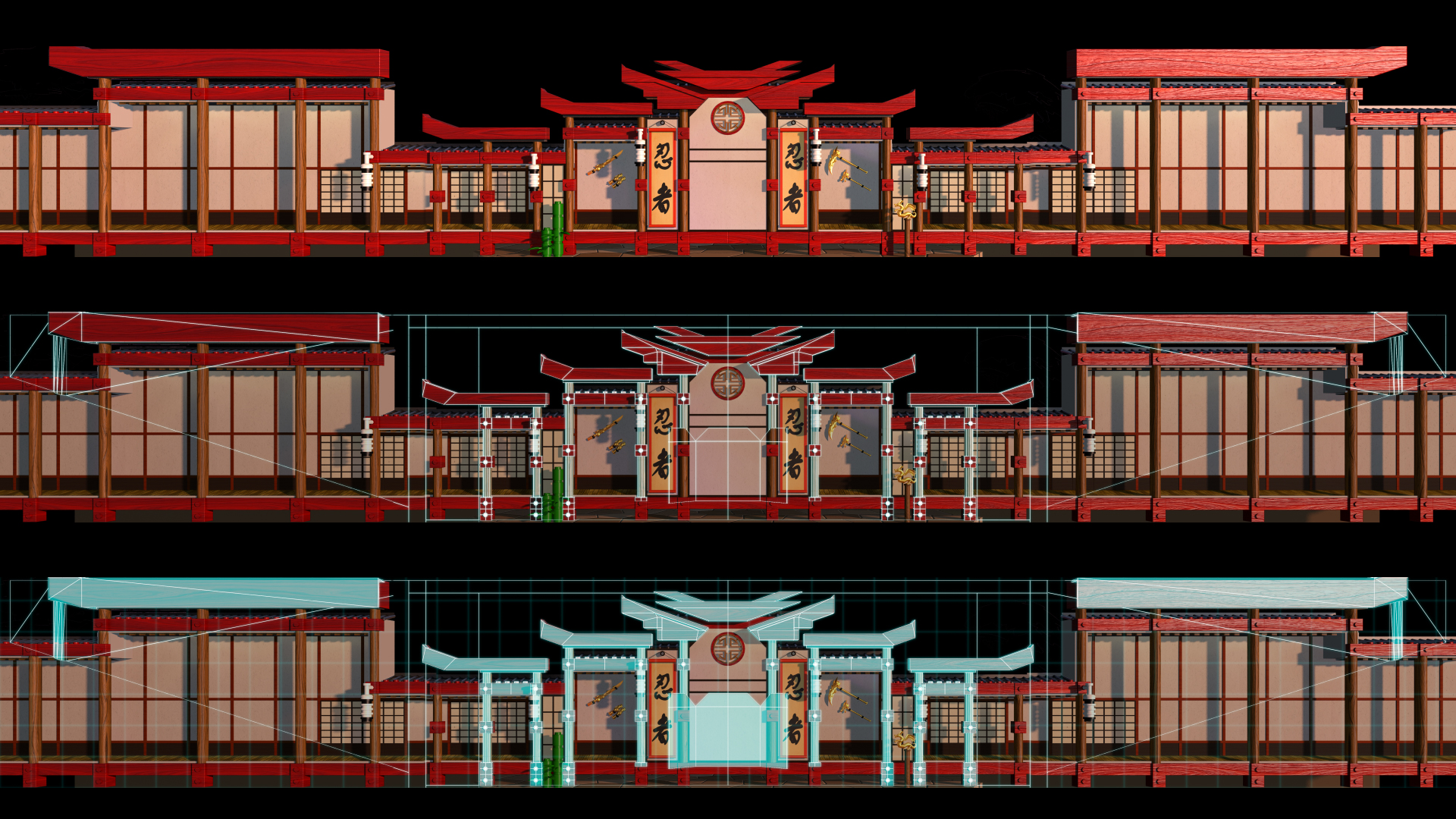
Static scenes could be fixed in 2D – here’s the Dojo, now aligned to the revised guidelines.
Being able to fix most of the scenes in After Effects took the burden off the 3D animators (and 3D render farm) and was relatively painless to implement.
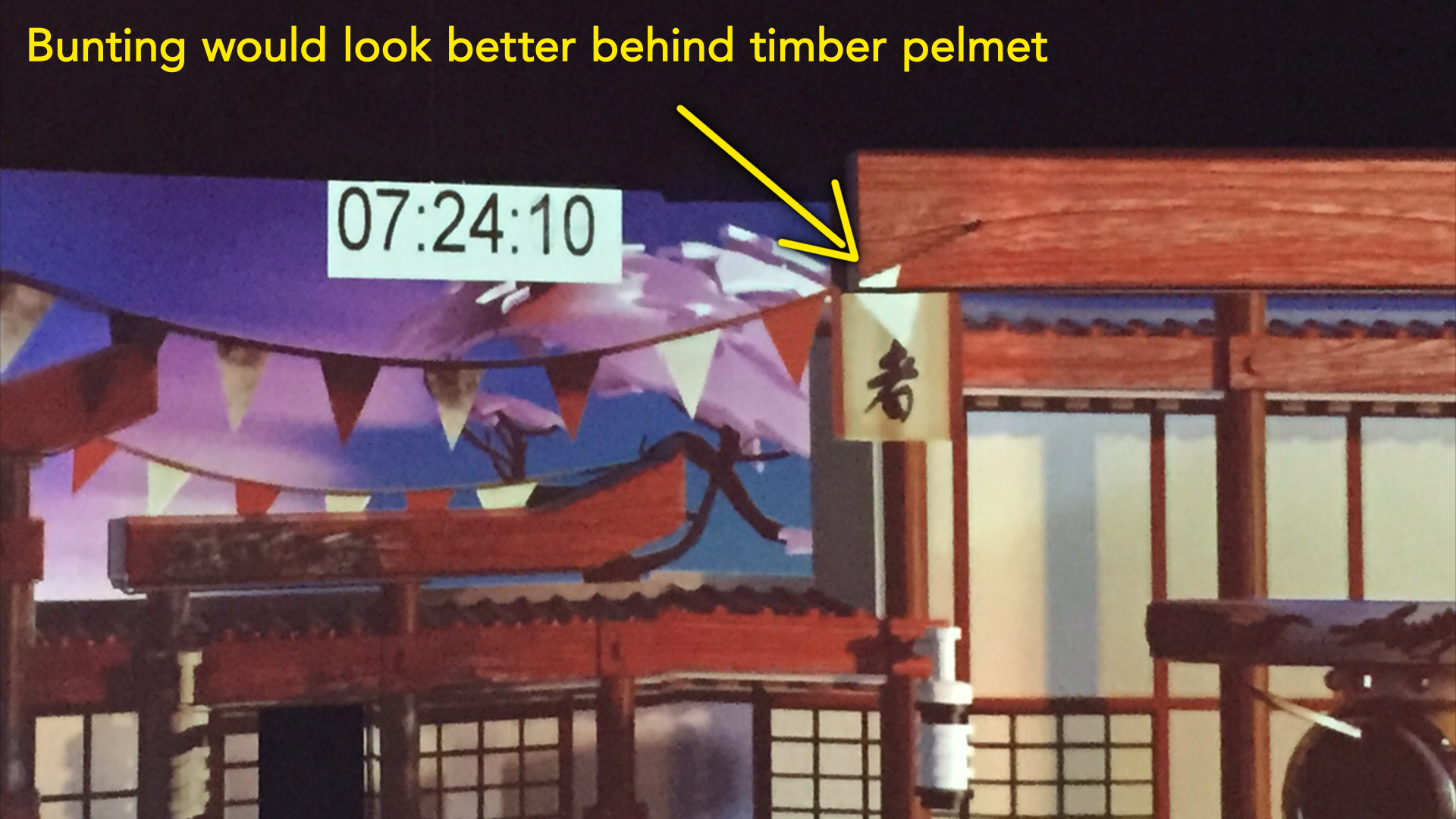
While this change was the result of a technical mistake, other revisions were made after seeing the animated content projected in the theatre. Even though we had been previewing the animation using the Re:Map plugin, nothing could compare with seeing the projections live, on the actual set itself. A few more changes were requested to help some of the design elements look better. In this example, the banners that are fluttering look better hanging down behind the timber frames, instead of in front. Again this is a simple fix in After Effects.
A more interesting change was something that came out of rehearsals with the puppeteers, and involved the way the audience would see the show from their seats.
At the end of the dojo scene the original script called for the scene to transition out over six seconds. The music and audio track had been timed accordingly, and a Lego-style transition had been built in 3D as the transition device.
However the real-life rehearsals proved that six seconds wasn’t enough time for the puppeteers to clear the props off the stage from the dojo scene, and then set up the props for the next scene. After lots of practice, it was determined that the transition out of the dojo scene needed to be 12 seconds – or twice as long. The audio was re-mixed accordingly, and I retimed the Lego transition animation to the new duration.
But now that the transition was long enough for the actors to clear and re-set the stage, a new problem became apparent – and one directly linked to the nature of video projection.
Video projectors are a source of light, and so as they project the animations onto the stage they are also illuminating the stage itself. The problem was that the transition animation was casting enough light for the stagehands to be visible as they prepared for the next scene.
Here you’ll see that the centre of the dojo has a circular decoration. This is actually aligned with a practical door – a real physical door that opens up to reveal characters.
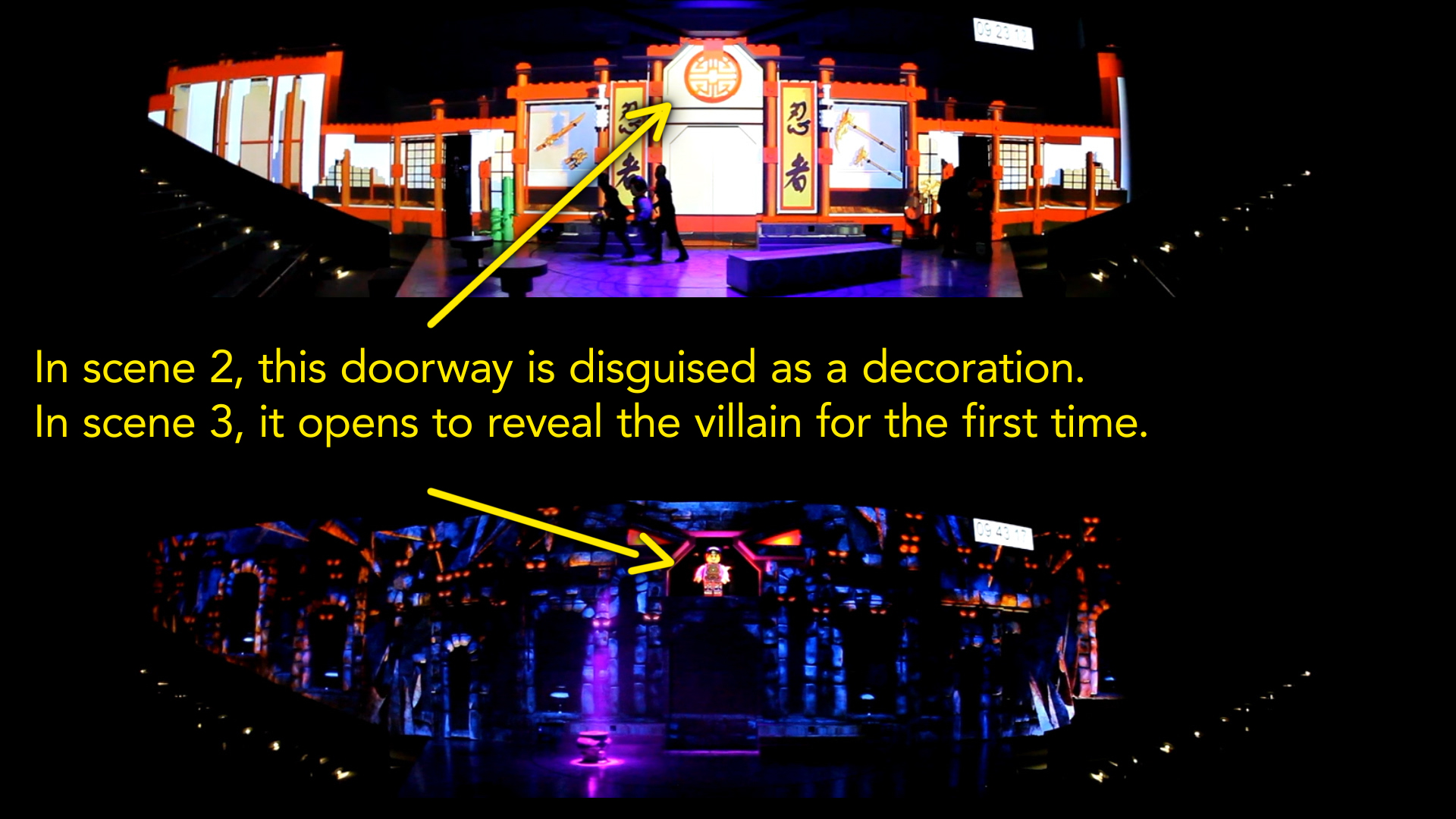
In the dojo scene the door isn’t used, so we used the circular design element to hide the fact it was there. But in the scene after the dojo, the story’s villain is revealed for the first time in dramatic fashion by opening the door. In order to create the full theatrical event for a significant moment in the story, it was important for the audience not to know that the character – or even the door – was there until the big reveal.
The problem was that as the original Lego transition started at the sides of the stage and moved towards the centre, there was enough light from the projectors for the audience to see the puppeteer positioning the villain puppet in the doorway. Knowing something was already there ruined the whole gag, and so we had to fix it.
After being given some more footage of the rehearsals along with some precise timings, the Lego transition was time-remapped so the centre of the set disappeared first. This not only left the doorway in darkness, but as the transition animation moved to the sides the audience’s attention was likely to be drawn away from the centre.
https://vimeo.com/148959460
The transition out of the dojo scene – time-remapped to precisely match the rehearsal footage of the actors, and beginning at the centre.
This timing change came through on the very last day we were scheduled to work on the project, which was also the same day as the first dress rehearsal. So it was a bit of a mad rush to make that change, render it, and upload it to the client in time for the evening’s performance.
Render render render!
Throughout the project one issue we had to be mindful of was render times, and the overall turnaround time for each shot.
We were working out of Sydney, and the show was being staged in Malaysia. Even though we had an After Effects render farm (using Deadline software), rendering an entire 2 minute scene at a resolution of approximately 7460 x 3240 took some time. Depending on what scene and how busy the farm was, rendering the full 2-minutes could take several hours. Using a render farm meant we were all working with image sequences (multiple machines in a render farm can’t render to the same quicktime file, so if you have the luxury of a render farm everything is done with image sequences) so once a scene had rendered out it needed to be converted to a quicktime file before we could play it. Just converting the 2-minute sequence to a quicktime file we could play took about half an hour. Once we had checked the quicktime, it had to be uploaded to the internet and downloaded in Malaysia, then copied into the playback system.
The playback system used for the show required single quicktime files in a proprietary codec, so even small changes required us to render out the entire scene – we couldn’t simply supply the new change as a small patch..
For an entire scene, this process took about 4 hours, so even the smallest of changes wouldn’t be seen on-site for half a day. Perhaps the smallest change requested was to delay the appearance of an image on the background by 40 frames. To actually do the change only took a minute – open the project, select the layer, and move it later in the timeline by 40 frames. But even though this change was quick to do, and only affected a small part of the scene, we still had to render the patch, then convert the entire scene to a quicktime, check it, and then upload / download and import it into the playback system. So the overall turnaround for even the quickest change was still several hours.
Because of the lengthy rendering times, it was normal to work on two or three scenes simultaneously – switching between them while we waited for renders in the background.
Last minute jitters
Up until the final day we were scheduled to work on the show, the project had gone very smoothly. Even the problems caused by the CAD file were relatively simple to fix, and other changes had been implemented without any real problems. All of us involved in the project had commented on how well everything had gone – not every job is so uneventful! That was, until the last day…
While rehearsals had been going for several weeks, the show was scheduled for a dress rehearsal with a select audience before the show went live to the general public. The dress rehearsal was the last day we were scheduled to work on the project and it was assumed that all animations would be finished by this time.
However when we came into the office on our last day, we were presented with a list of changes that affected almost every scene. All of the changes were very minor – but as with the earlier example, even though they were quick to implement they took a long time to render, compress and upload. In all, we were effectively re-rendering about 80% of the show in one day!
Everyone in Malaysia was very nervous ahead of the dress rehearsal, and as the audience was comprised of the friends and families of those involved the pressure for them was even higher. We were getting constant calls asking us for the status of the requested changes, but in Sydney there wasn’t much we could do except watch the progress of our renders and hope that everything worked. The last few hours, as the calls became more frequent, became very stressful as there wasn’t anything we could do to make rendering faster – we were literally just standing around watching progress bars. Thanks to the difference in time zones between Sydney and Malaysia, however, everything made it just in time and the show went ahead as planned.
Lessons learned
While Ninjago was one of the smoothest projects I’ve worked on it wasn’t without its daily share of swearing, and at the end of every project it’s worth reflecting on what was learned.
By far the biggest problem we had with the project was actually to do with our network infrastructure, and the way After Effects handles image sequences. As mentioned before, when you have the luxury of a render farm then image sequences are a necessity, but when your image dimensions are 7000 x 3000 and there’s usually about 3000 frames in each sequence, After Effects takes a REALLY long time to import them. If it detects any changes in the sequence since the last time it opened it, then it stops everything and checks every frame. This became incredibly tedious.
We did have an After Effects project set up to preview the entire show – this had all of the scenes imported into the one project and sequenced together, however it took over 30 minutes just to open! This was tolerable if we had a spare machine around, as we could open the project on the spare machine and then move to a different machine to keep working while it figured everything out, but eventually we just gave up.
After lots of wailing and gnashing of teeth (and also a bit of googling) we discovered that a large amount of the blame can be firmly laid on Apple, and the way they’ve implemented the SMB network protocol. It seems that Apple broke something a few years ago and haven’t fixed it, and basically OS X can’t handle network folders with lots and lots of files in them.
Previously our office network infrastructure was based around OS X, and the network protocol was AFP. After Effects still exhibited poor performance with image sequences but at least with AFP it was workable. Unfortunately our new fileserver only offers SMB, and so this was a relatively new issue for us.
While it was a small consolation to discover that many people around the globe were experiencing the same problems, it was still disconcerting that it’s been this way for several years and even the latest OS X release – El Capitan – suffers from the same poor performance.
In one test we did, importing an image sequence into After Effects running on Windows took 12 seconds, while on a Mac the same sequence took over 70 seconds.
Compounded with the fact that After Effects would insist on checking EVERY frame in the sequence if it detected any changes, this meant we couldn’t re-render over existing renders that were in the same project we had open (which is a very normal thing for me to do with a render farm at my disposal), as After Effects spent so much time checking and re-checking the sequence as it updated that the entire computer would simply lock up for minutes at a time. Sometimes it was faster to force-quit After Effects and open it again.
It’s difficult to overstate how significantly this affected us, and even lead to the momentous decision to ditch Apple computers and OS X completely, and over the next few years transition everyone to Windows machines. And while not everyone has to deal with large folders containing thousands of large images, for those of us who do – it really is that bad.
While Apple have to shoulder most of the blame, this doesn’t mean that After Effects is completely blameless, because there’s the potential for it to handle image sequences a lot better than it does. The new preference in CC 2014 to ignore background changes in image sequences is already an improvement, but the simple fact is that other compositing applications such as Nuke are able to work with long sequences much faster than After Effects does.
Too clever for my own files
After Effects isn’t the only piece of software that has a few quirks. If you work regularly with Maya, for example, then two important things to know are that it needs periods and not underscores as the prefix for sequence numbers (ie name.001, not name_001) and also that its default behavior is for image sequences to begin at 1, and not 0. Both of these quirks are different to After Effects default behavior.
The problem is that I was working with a few different Maya artists and many different sequences, and some began at 0 and some began at 1. It’s normal for me to make a new composition from a piece of footage by dragging it onto the composition icon, which then sets the composition up to match the footage settings. So if a sequence came in that began at frame 1, then the comp would begin at frame 1. But if version 1 of a 3D render began at frame 1, then version two was re-rendered starting at frame 0, things would drift when I used the ‘replace footage’ feature to update sequences. And if I had pre-renders made from After Effects I would have to shift them by a frame to match the new 3D renders and so on. This was a little thing, but over the course of the project I found myself often having to shift things around by 1 frame here and there to keep everything aligned. Surprisingly, I’d never had this problem before, but it seemed to arise because everyone in the office was polite and tried to accomodate each other, so I would start my compositions at frame 1 when normally they’d start at 0 – but then the Maya guys would remember that AE prefers sequences that start with 0, so they’d change them.
In a similar manner, another naive mistake also created problems further down the track. Despite having almost 20 years of experience behind me, early on in the project I was foolish enough to think that the audio track was final, simply because it was called “final”. This is a common schoolboy error, and I can only assume that I was either accidentally drinking decaf that day, or I’d suffered from a heavy fall. Whichever it was, something made me think it would be clever to set up my compositions so the frame numbers matched the show’s master timecode track. In other words, instead of having my master/output compositions begin at frame 0, I would set the start time to match the exact frame that the sequence begins in the show.
This was great for the first few weeks and meant that when I was given feedback for a specific timecode, I could easily navigate to that exact point in my compositions.
The problem was that the audio track was revised and re-mixed at several stages, and this threw out the alignment of my After Effects comps. Simply changing the ‘start time’ in each composition wouldn’t change the frame numbers on all the pre-rendered elements, so when the master timecode of the show changed I either had to re-render everything to match, or else just learn to manage a whole bunch of frame sequences that had different timecodes, and try to keep them in sync. Needless to say, it wasn’t feasible to re-render everything each time they made an audio edit, so by the end of the project all my After Effects had different timecodes and starting points, and I had to manually keep them all in sync. As they say- who is more fool, the fool or the fool who thinks that ‘final’ actually means ‘final”…
It’s funny how a few decisions made very early on in the project could continue to have daily ramifications several weeks later, but it did make me think about how After Effects could improve the way it handles image sequences.
It’s a wrap!
Overall, the Ninjago project went very smoothly and the production was a success. The puppets and puppeteers were excellent and it was always nice to view the latest rehearsals and see the little figures come to life.
As can be expected for a project of this scale, there was a constant trickle of small but significant tweaks and changes as it progressed, but thankfully there were no major dramas for a project of this scale.
As far as I know, the show is up and running in Legoland Malaysia, so if you’re in the area then drop by and check it out!

Filmtools
Filmmakers go-to destination for pre-production, production & post production equipment!
Shop Now