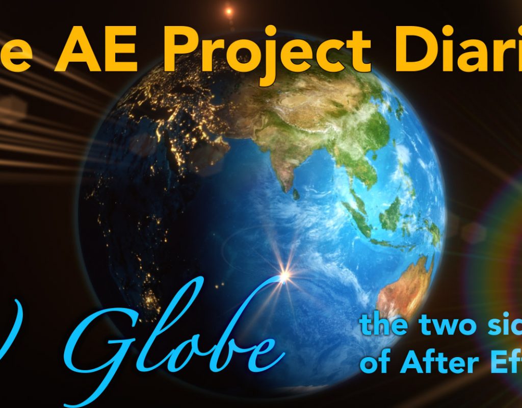
It might not be obvious, but this simple globe animation was influenced by a Hollywood blockbuster. I’m happy to admit that there’s nothing spectacular about it, and that globe animations in After Effects aren’t new- the guidelines for selling After Effects templates on VideoHive specifically say not to submit globe animations because there are so many already out there.
But as I point out in every project diary, it’s not the animation itself that’s the point of the article, but other angles or stories behind the project that are worth discussing.
(click the fullscreen button to see all the details. The video jumps straight into the After Effects project, so it will make more sense if you read the article first.)
Firstly, this job was a freebie. Obviously that has nothing to do with the After Effects side of the project but I thought I’d mention it, because one thing I learned in the first few years of working was that a lot of clients ask for favours or freebies. I started my career working in the type of environment where clients would book out the suite by the hour, and many regular clients were local advertising agencies. One in particular would often propose that I help them with their pitches for free, with the idea being that if they won the pitch we would both benefit in the long term.
This project was made in 2010, but the principle was the same. In this case an agency called up in the morning and said they had a big pitch in the afternoon, and asked if we could help out by producing an animation for the presentation. (The original animation included highlighting specific cities around the world with accompanying text supers, but I’ve removed the text for this breakdown.) By the time we got the call in the morning, agreed to help them and got a brief, then made the animation and delivered it to their office in time for their pitch, I had about 4 hours to put this together.
But the most interesting aspect of this project was the thought process behind the way I approached it. In many ways, this globe project was the culmination of several sources of inspiration, a little bit of history, but also the experience of working on a large Hollywood feature film.
A little bit of history
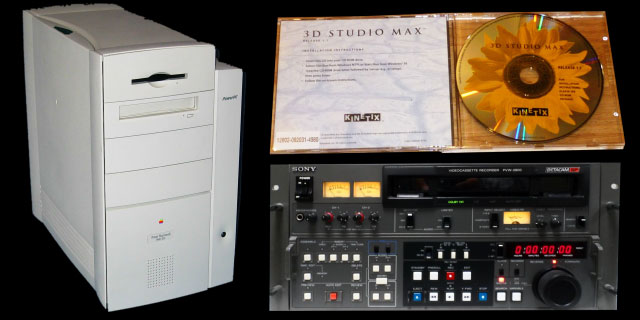
I started working in 1997, and to put that in context Maya did not exist yet, 3D Studio Max was only at version 1, After Effects was at version 3.1, and the Mac I was running it on had 128 megabytes of RAM and a PowerPC processor.
Initially I was working as a non-linear editor, and in 1997 an edit suite was simply an edit suite, so all it did was edit footage together (Blackmagic Design didn’t exist in 1997, either). Around that time I had a project where the client wanted a spinning globe animation, and we had to go to a dedicated 3D animation company to have it made. Because there was such a clear distinction between what an edit suite was and what 3D animation was, I guess I thought of the process as a technical exercise: in order to make a 3D animation of a spinning globe you needed specific software, we did not have it and so we needed to go to a company that did.

I’d never heard of After Effects when I started working as an editor, it had been bundled with our Media 100 suite as a tool to make animated text supers. Many of the plugins that are now included with After Effects used to be sold separately, including all of the “CC” plugins that you find sprinkled throughout the effects menus. Made by Cycore FX (which is where the “CC” comes from) Adobe licensed them in 2004 and bundled them with After Effects version 6.5. They’re still included with the current version of After Effects and many of them are invaluable tools.
So when I upgraded to version 6.5 in 2004, After Effects came with the “CC Sphere” plugin – giving me the ability to wrap a flat 2D image onto a sphere. It occurred to me that the map animation we had made in 1997 wasn’t really any different to what I could now do inside of After Effects. Still thinking of a globe animation as a technical exercise, the software was no longer limited to a dedicated 3D animation company, but was something that was much more accessible.
Inspiration strikes
Because I had only ever considered the technical aspect of creating a globe animation, I was incredibly impressed by a post on the Creative Cow forum in 2005, where Filip Vandueren (a Belgian After Effects user) shared a globe animation project he had created in After Effects.

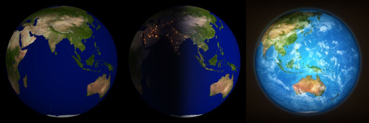
What Filip had done was to think beyond the technical aspects of animating a globe, and create something that actually looked good. Instead of using a basic world map as the texture on a sphere, he used two matching photographs of the earth that had been published by NASA – a day time image and a night time image with glowing city lights. By using 2 layers, each with CC Sphere, Filip had created a globe animation where half the earth was in daylight and the other half in darkness – as the globe rotated the Earth transitioned from day to night.
This looked brilliant, and was incredibly influential to me. Up to that point, I had only considered the practicalities of animating a spinning globe: you needed specific software to wrap an image onto a sphere. I’d never given any thought as to what the globe should look like. While in 1997 we would have accepted whatever map image the 3D animation company used, here I was looking at a project that had been set up from a design perspective.
Blue Marvels

While Filip’s post on the Creative Cow is still there – dating back to 2005 – unfortunately the project file is not. I contacted Filip to see if he had a copy somewhere, but unfortunately he doesn’t. However the project had its base in a collection of images released by NASA, under the title “Blue Marble”.
You can simply do an internet search for “NASA blue marble” and you’ll find a gallery with a whole range of images of the earth that have been put together by NASA – including day time images, night time, cloud cover, a height map, and water depths. These images can be freely downloaded at a range of sizes, the largest being several hundred megabytes. The key to Filip’s project was that all of these images align perfectly with each other, so the image of the earth’s land areas at day time perfectly matches the image of the city lights at night time, which match the oceans, and so on.
Video Copilot
A couple of years after Filip posted his project on the Creative Cow, Andrew Kramer and the crew at Video Copilot posted their own globe animation project – which again was totally focused on making something that looked good. While Filip’s project has disappeared into the ether, the Video Copilot tutorial is still up and can be viewed here.

While the original tutorial was called “The Blue Planet”, it was the small addendum that came a few days later that really made me excited. Using some expressions from After Effects’ expressions guru Dan Ebberts, they tweaked the project so that the CC Sphere plugin was linked to the After Effects camera. While the CC Sphere plugin is not camera aware – in other words you can add a camera to your composition, move it around and CC Sphere won’t do anything – Dan had engineered a workaround so that the CC Sphere plugin would match the movements of the After Effects camera, which meant that you could create animated camera moves to fly around the globe and any other 3D layers in After Effects – or other plugins that were 3D aware – would all line up.
Over the years there have been several techniques and expressions published that link the After Effects camera to the CC Sphere plugin, and in 2014 Rich Young even published a compilation of them here on the ProVideo Coalition. I noticed that one of the expressions in Rich’s article also came from Filip Vandueren, so presumably he’d been motivated by the same goal and figured out his own solution.
Already inspired by Filip’s original animation, the linked camera in the Video Copilot tutorial and the images available from NASA made me consider even more possibilities for creating a globe animation in After Effects.
Animal Experience

For the bulk of my career I’ve mostly worked on corporate productions, and one of the recurring themes of my articles is how “the industry” isn’t really one big industry, but a loose collection of several different industries. The world of TV commercials is quite separate from the world of wedding videos, working for a TV station is quite different to working on events and exhibitions, working on conference graphics is quite different to working on a feature film and so on. While there are definite similarities – sitting at a computer using After Effects looks the same no matter what type of work you’re doing – everything else about the working environment and office cultures can be very different.
Up until 2010, the largest project I had worked on probably involved less than 10 people – most would involve less than five. For several years I was almost a 1-person post production suite, and it wasn’t uncommon to find people like myself who worked as editors but also did motion graphics, visual fx, audio mixing, and even DVD authoring. Even high profile projects, such as TV commercials and music videos, still had surprisingly small post production teams.

In 2010 I was lucky enough to be involved with the production of “Legend of the Guardians”, a stereoscopic 3D animated film directed by Zack Synder. Produced by Animal Logic in Sydney, at the time I started work on the title sequence there were over 600 people working on the film, spread out across several buildings. It was wonderful and exciting but mainly really, really interesting. While I certainly learned an awful lot about 3D stereoscopic compositing, I was equally fascinated by the culture of working on a feature film. I’d simply never been part of a team, or infrastructure, that huge before.
By far the biggest difference I saw was how specific everyone’s roles were. In the corporate sector you do a bit of everything, but in the feature film world everyone had very defined responsibilities. While in the corporate world it’s common to work with people who describe themselves as a “Maya generalist”, in the feature film world you have people who specialise in modeling, or texturing, or shading, or lighting, or rigging, or scene layout and so. Someone who works on scene layouts, for example might never actually “animate” at all, someone who specialises in lighting may never rig a character or model one. In the corporate world you might find someone who’s pretty good with X particles, but in the feature film world you’ll find people who don’t just specialize in particle animations, but specific types of particle animations – or fluids, or fire, or cloth, or hair and so on. On “Legend of the Guardians” there were people who specialized in the animation of feathers, and the proprietary techniques developed by Animal Logic for animating feathers were cutting edge.
By 2010 I was beginning to describe myself as a compositor (as opposed to a motion graphics designer), so I was especially interested to see how the compositors at Animal Logic worked solely as compositors. This might sound a bit obvious, but what I was seeing was that any elements required in a shot were created by other people who specialized in creating whatever it was – matte painting, rotoscoping, particles, fluids, fire, other visual fx and so on – and the compositors concentrated on compositing it all together. While this might sound like a textbook example of what compositing is, it was a more rigidly defined world to the corporate (and TV commercial) environments I was familiar with, where After Effects was not only a compositing application but also a design and animation tool as well. Compositing in After Effects could mean that you were also a matte painter, motion graphics designer, colour grader, motion tracker, rotoscoper, particle expert and so on.
After Effects – the two sides of the app
After Effects has always had these two different sides. If you bury down beneath the user interface and look at the underlying code base, you’ll see that After Effects is essentially a compositing engine. But the ability to composite images together has been bolted onto a timeline-based animation tool that can also design and create the images themselves. While the basic version of After Effects is already an immensely powerful motion graphics design tool, there are all sorts of 3rd party add-ons which increase the creative possibilities even further.
It’s not just the After Effects application itself, but also the types of people using it. After Effects is a creative design tool and so it stands to reason that it’s used by designers, animators, and people who create. The people who use After Effects are more likely to come from a background where compositing isn’t a rigidly defined role, but just part of an overall creative process.
If I look back at some of the projects I’ve written about in previous project diaries, there are several examples where After Effects has been used as both a design and animation tool, as well as a compositing application. The burning embers were completely created in After Effects. In the Ausgrid project, basic 3D passes were embellished with particle animations (eg. rain), motion graphics including text, and other animated elements that were created inside After Effects as part of the compositing process. Similarly with the Xian project, 3D renders were augmented with elements created in After Effects such as volumetric fog (Trapcode Shine), cg water (fractal noise) and cg rose petals (Trapcode Particular). So while it might sound a little obvious to say that the compositors on Legend of the Guardians were only doing compositing, it was a significant observation based on the differences to my own experiences working on much, much smaller scale productions.
Hats on, hats off
Working on Legend of the Guardians with over 600 other people was an exhilarating experience, and a very valuable one. The differences in the culture at Animal Logic, compared to the small corporate & TVC projects I normally worked on, were something I pondered for a long time – and which indirectly inspired several articles here.
But one thought kept recurring – while After Effects is a powerful tool that can design and create animation elements as well as composite them together, what would it be like to approach a project as if these tasks were separate? Would it make a difference to approach a project firstly as an animator, and then secondly as a compositor? In other words, could you pretend that you’re two different people with two different roles? It was an experiment I wanted to try.
A few months after working on Legend of the Guardians the globe project came along, and I thought it was the perfect candidate to use as a test subject. Originally inspired by Filip’s project on the Creative Cow, and combined with the techniques expanded on by Video CoPilot, I saw that I could use the library of images from NASA to initially create a bunch of “passes” in After Effects, then composite them together in a separate process. The video at the top of the page takes you through the project and demonstrates these steps in more detail.
Overall this was an interesting, fun and pretty quick experiment that ended up working well. Because I didn’t have much time to work on it – it was rushed out in about 4 hours – I decided that it was an approach worth remembering to try again. But while this project was small and light, my next experiment – coming soon in the next project diary – would really push After Effects to the limits…
If you’ve enjoyed this article please check out my others!
And a special shout out to an earlier project diary of mine, episode 5 – which shows how I made some burning embers with Trapcode Form earlier this year. The approach I used there is very similar to the one I’ve outlined here.

Filmtools
Filmmakers go-to destination for pre-production, production & post production equipment!
Shop Now