In each edition of our book After Effects Apprentice, the last chapter is a project that brings together skills learned throughout the book, applied to a real-world scenario such as creating a show opening title. For the third edition of our book, we chose the example of creating an open (plus lower thirds and more) for a medical special, with particular emphasis on the technical and design process we go through when building something from scratch to a client’s specifications. The video training version of this chapter has recently been released on Lynda.com, and we want to share the free movies that are available from it.
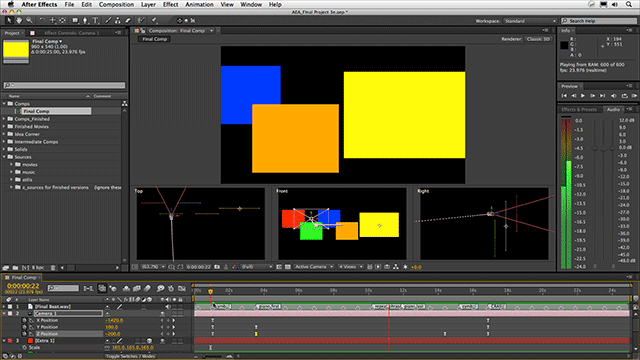
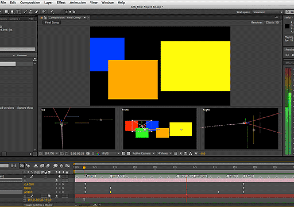
In the movie below, we’ve already arranged stand-ins for a collection of video screens in 3D space, and now we want to craft a camera move between them. Quite often, we will approach an animation like this by setting keyframes for the beginning and ending poses, and then deciding how to move smoothly (and attractively) between them. This particular move is a variation on the “gallery wall” pan, where we move along a series of images arranged horizontally. We start pushed in beyond the images, focusing on the (yet to be constructed) background, pull back to reveal the images, move along them, and then push in until the hero image fills the frame.
A move like this is a perfect candidate to take advantage of the Separate Dimensions command in After Effects, where the normally bundled-together Position values for the camera can be unbundled into separate X, Y, and Z values (and more importantly, keyframes). The wall pan is strictly an X dimension move (left and right); the pull back and push in are Z dimension moves, and we also need to do some slight movement in Y (up/down or “elevator” move) to dodge some of the images during the initial pull back, lest they be revealed too soon or present an unbalanced final frame.
Along the way, we also touch on additional tips, such as how to get AE’s Comp panel to render smoothly regardless of the Magnification value (at its default settings, unclean values such as 80.8% result in doubled or skipped pixels), our tendency to use “short” lenses to exaggerate perspective and movement in motion graphics projects, and paying attention to not just 16:9 action and title safe areas but also the 4:3 center cut zone in the middle:
The full course may be viewed here. We’ll be sharing a couple more movies from this course over the next few weeks. If you’re curious to get an overview for the entire course (including the final opening title), watch the short movie below:


