Although the aspect ratio chosen for any particular film can make a huge difference, it’s not usually a choice entirely made by the filmmaker. Technical limitations of the delivery platform can absolutely limit your choices, as can the preferences of your viewers and even the UI of the playback apps in which they view your work. Today, most of us will deliver widescreen content (usually 16:9) to more serious platforms, or vertical (9:16) videos to social platforms like TikTok and Instagram. But it’s not that simple, and even TikTok might be contemplating a more horizontal future — more on that soon.
Let’s take a tour through several different video aspect ratios to see why we’ve ended up with today’s diverse mess.

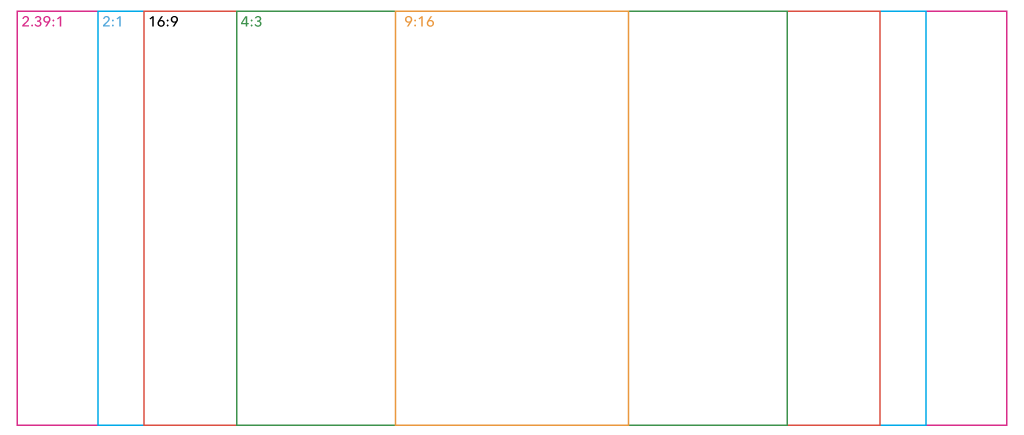
16:9 (1.78:1) — today’s TV standard
Most HDTVs are this shape, and there’s therefore an awful lot of modern content made to fit this shape. It’s also the standard for most YouTube videos. It’s the standard. It’s familiar. Many video creators shooting today will have started work in 16:9 and never delivered anything else. But if you’ve been around a little longer, you’ll remember the world before widescreen HD video.

Around the year 2000, the world transitioned from 4:3 SD to 16:9 HD, and it was a big deal. Beyond the quality improvement, the aspect ratio change made older shows feel dated, and only some productions shot on film have been able to be rescanned and reframed for modern widescreen audiences. Friends and Seinfeld made the jump, while Star Trek: The Next Generation has remained in 4:3. Famously, Buffy: The Vampire Slayer had a painful, studio-imposed transition to 16:9, in which crew members can sometimes be seen on the edges of frame.
Clearly, there are benefits to matching modern standards and expectations. Just about every modern camera shoots in 16:9, and it’s a comfortable way to show two or more people in frame at the same time. So why would you choose another ratio?
2:1 — the Netflix way
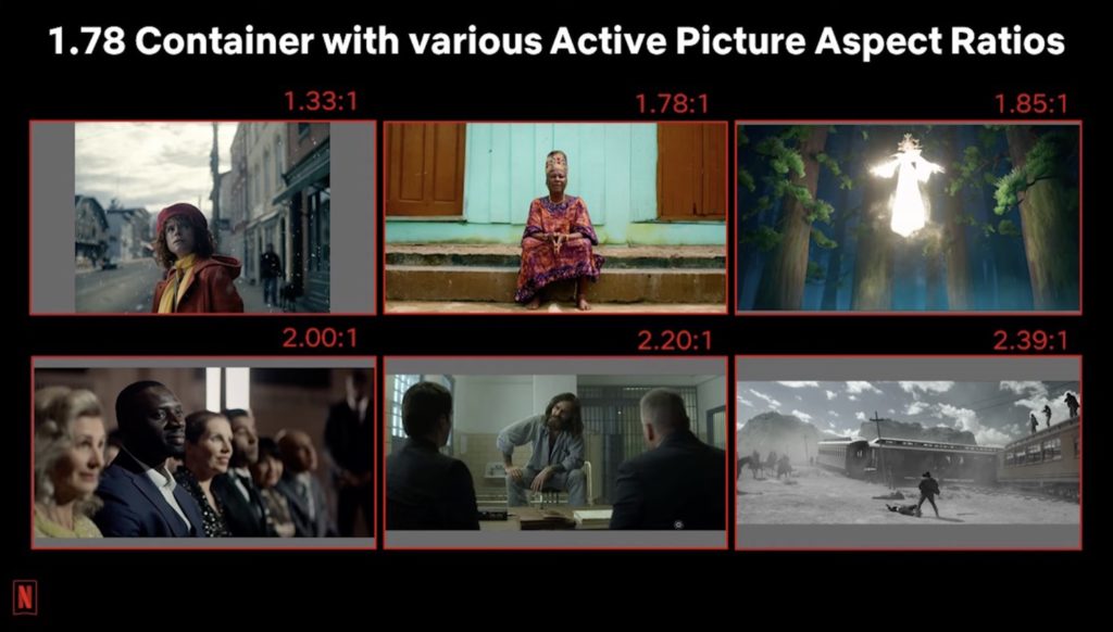
In an ideal world, a wider aspect ratio would be chosen by the cinematographer because it best suits the kind of film they want to make, but they don’t always have that freedom. Since most films made in the last several decades have used 1.85:1 or 2.39:1, shown with black bars above and below on a 16:9 TV, many of us associate “black bars” with “cinema”. Choosing a traditional film aspect ratio is an easy way to mark your film as a real “film”.

But it’s not just the cinematographer who has a say here — you may not be allowed to shoot 2.39:1, because most viewers will see your film on a screen they own, not in an aspect-agnostic cinema. Studios may therefore request or demand that a film be cropped to 16:9 for eventual streaming delivery, because many viewers want to fill up their big screens.
Netflix, for example, needs you to make a special case for shooting wider than 2:1, and so that’s the aspect (AKA Univisium) which many of their original productions have settled on. It’s wider than 16:9 and 1.85:1, but doesn’t leave as much of a TV’s display black as 2.39:1 does. A happy compromise.
Wider to 2.39:1, and then taller again
Even if you’re making a capital-F Film, you can’t just keep going wider. At some point, the image stops feeling “expansively wide” and starts feeling “oppressively short” instead. The traditional Cinemascope ratio of 2.39:1 is great for two gunslingers standing at the opposite sides of frame, or for a majestic landscape, but it’s not very intimate, and doesn’t suit every film. It’s hard for two people to stand close and fill the frame without a fair chunk of empty space to the sides.
Even in a less intimate scene, some recent movies expand the height of certain scenes to show more of the frame vertically. For example, IMAX cameras were used to shoot at least some scenes in Avengers: Endgame and Dunkirk, and the version of the film you were shown depended on where you saw it. Though most viewers didn’t get to see these films in IMAX cinemas, where you could enjoy the full 1.43:1 ratio of Dunkirk, you can still see many wider Marvel movies expand up to 16:9 for their biggest action sequences on Disney Plus.
Some less mainstream films have also used aspect ratios as part of the storytelling. Wes Anderson’s The Grand Budapest Hotel used 1.37:1 for the shots set in 1932, 2.40:1 for shots set in 1968, and 1.85:1 for the modern day shots. You don’t necessarily have to stick with one aspect throughout a film, and you don’t always have to stick with the standards either.
Old school 4:3 (1.33:1) and other square-ish frames
This nearly square format was used a long time ago in the world of cinema (and the similar 1.37:1 Academy format was popular for decades) but it’s now most closely associated with VHS and standard definition CRT TVs. While the “retro” look will always have a certain nostalgic appeal, as a teen I was horrified to discover that every movie I’d ever seen on VHS had been destroyed by the pan-and-scan process for 4:3 VHS delivery. Before the age of widescreen DVDs, if you missed a movie in cinemas, you might never see the edges of it, and sometimes the transition was brutal.
Today, new 4:3 content is uncommon, but far from unknown, and if a music video wants to look “retro”, it’s an easy win. It’s also been a choice for music videos that don’t want to lose too much content when they’re inevitably cropped for social media’s vertical 9:16.
Films are rarely shot in this format today, but Emerald Fennell’s recent Saltburn did, and it’s not simply a retro choice. While photographing the main shooting location, the director and cinematographer preferred the voyueristic look of the 4:3 shots and stuck with it. Another modern example is The Lighthouse, which shot in a nearly-square 1.19:1 in black and white, as a nod to early German expressionist filmmakers. Similarly, Marriage Story uses a nearly-widescreen 1.66:1, again as a nod to European filmmakers.
Modern portrait 9:16 (0.5625:1)
This polarizing aspect ratio took off with social media, but is most widely used today for videos on TikTok, Instagram and YouTube Shorts. While it’s fine for shots of a single person on their own, it’s a horrible format for showing groups of people, or majestic landscapes. It’s ironic that the aspect ratio chosen for social media is anti-social.
But of course, this aspect ratio wasn’t chosen for filmmakers. It was chosen for the viewers, holding their phones and scrolling. It’s not for us, and if you’re creating content that nobody asked for, such as advertising, you’ll have to meet the viewer on their own terms. By all means, deliver a widescreen movie anywhere people will choose to watch it, in whatever aspect you prefer, but if you’re making a Facebook ad, vertical is the way to go. CONTENT (from the creators of Bluey) is the best thing I’ve seen in portrait, entirely set on a phone — enjoy, for free, on YouTube.
It’s also worth noting that these days, you can deliver widescreen videos to TikTok if you want to, so if your content can’t be easily reframed, no problem. By default, there will be large black bars above and below the widescreen clip, but a “Full Screen” button beneath the video will spin the video 90° and take up the whole screen. (Here’s a video I made that does this.)
Though horizontal video has been tested on TikTok for the last year or so, it’s only recently that they’ve actively promoted wider, longer videos. Some creators have been offered the promise of massively increased views for uploads wider than they are tall and over a minute in length, and it’ll be interesting to see where this leads. Unfortunately, landscape videos shown in this Full Screen mode must be explicitly closed before a viewer can swipe to the next video, and it remains to be seen if the TikTok audience is willing to do that. (Based on the analytics, I don’t think they are.)
How can you accommodate portrait in production? If you only need to deliver in vertical formats, you can turn your camera on its side (or just use a phone) but if you need to deliver to both portrait and landscape, you don’t necessarily need to shoot everything twice.
Production tips
To deliver content to multiple different aspect ratios, oversample, shoot wide, and use a squarer aspect ratio. Shooting like this allows you to crop for widescreen or portrait delivery, but it doesn’t have to be as simple as doing a center cut — you can reframe however you wish. One great trick is to use a “common top”, like the classic movie Ronin. What’s the trick? They captured the entire movie in 4:3, and delivered that to VHS, but for the cinema release, they used only the top 2.35:1 section of the 4:3 frame. The “common top” between both aspects means no giant gaps above people’s heads and predictable results. Ronin is one of the few movies that actually included more of the image on VHS than it did on DVD.
If you want to shoot with extra height, plenty of modern cameras will let you record the full image from their sensors, with plenty of resolution to allow reframing. Modern Panasonic cameras like the GH6 or LUMIX S5II allow you to record in 5.8K 4:3, while the Canon R7 lets you record 3:2 with an external recorder. Even action cameras allow this trick — you can record 4K 4:3 video on the Insta360 Ace Pro, or 8:7 video on a GoPro.
If you can bear in mind the final crop in all your target aspect ratios as you shoot, you may be able to make everyone happy — or at least, stop them complaining.
Delivery considerations
If you’re not delivering to cinema, but to modern digital devices, should you deliver in 4:3? Probably not, because users will be left with large black bars on any modern device except an iPad. Should you choose 2:1 to differentiate yourself from other creators on YouTube, like MKBHD and others have? If you want to, sure, but no matter what aspect you choose, you can’t make all the people happy all of the time. Your audience is less homogenous than ever, using devices with different aspects, held in different orientations, some in full screen and others in windows.
Note that if you’re delivering online and do decide to use non-standard aspect ratios, it’s probably best to deliver (or at least edit in) a pixel size that’s non-standard in one dimension, rather than a 16:9 frame with black bars. A video that fills its frame will give better results when viewers try to view a 2:1 video on a phone, or a 4:3 video on an iPad.
Conclusion
There has never been a single aspect ratio for motion pictures, and the generally agreed consensus has changed many times over the years. While experimentation with aspect ratios has certainly stretched the inventiveness of filmmakers, it’s hard to tell a compelling story in portrait, with only one person in the frame.
The good news? Over the next few years, if more people move towards devices like Apple Vision Pro, you’ll have more freedom to deliver whatever you wish, because there is no fixed screen size. Indeed, if you record a 3D Spatial Video on an iPhone 15 Pro, it’s 16:9, but if you record one on the Apple Vision Pro itself, it’s 1:1. Both work fine.
Broadcast will remain locked into its 16:9 standards just as most social is stuck to the super-scrollable 9:16, but elsewhere online, we can deliver quality productions in whatever aspect we wish. Today’s cameras give us more flexibility than we’ve ever had, and when a client asks for an additional aspect deliverable after shooting, you may not need to reshoot. Do keep an open mind, and don’t be afraid to experiment. Enjoy!

