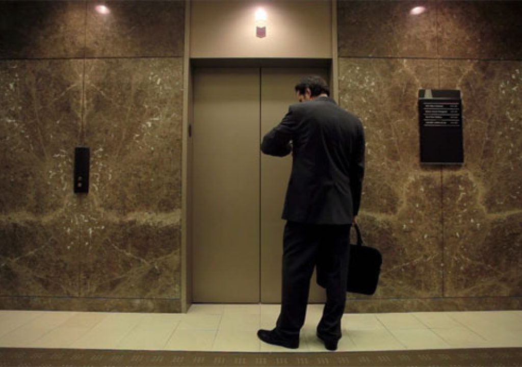
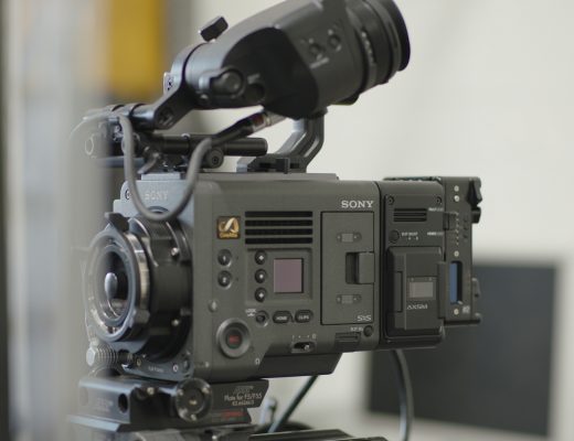
Over time I’ve come to respect the Canon 5D. It’s not the most user friendly of cameras, and it has some fairly serious faults, but if you can avoid the pitfalls it can make very pretty images.
Film industry lesson #1: You never know where future jobs will come from. I had no idea that shooting this project would introduce me to the great people at Teak Digital. They cut the project for producer Sean Cope, and they liked what they saw and hired me to shoot this web spot for T-Mobile.
This was my first job for Teak Digital and director Greg Rowan. Working with Greg is a treat: he’s an easy-going director who knows exactly what he wants but isn’t afraid to collaborate if it makes the project better. As a result of that collaboration we took what could have been a fairly straightforward project and gave it a little something extra.
Here’s the final version:
For those of you who don’t speak Spanish (I don’t): the idea is that everyone the texting guy is communicating with is actually in the elevator with him, and the businessman has to fight his way through the invisible crowd.
This was shot on a Canon 5D with a very wide lens. I don’t remember the exact zoom we used as it was owned by someone at the production company, but the wide end was something crazy like 11mm or 12mm. I do remember that we shot this wide open on the lens, which was T4, and I rated the camera at EI 800. I used one of Steve Shaw’s Light Illusion gamma curves, probably #1. (Light Illusion curve #1 is great for low contrast situations as it adds a bit more “crunch” to the look. Curve #2 is better for high contrast situations as it flattens things out a bit. I haven’t found a use for curve #3. You can get all three, plus a new flatter log curve, for a very reasonable price at the Light Illusion website.)
The lighting scheme was startlingly simple. The elevator lobby was lit by tungsten units bounced off the ceiling. The elevator was lit by a single Kino Flo tube, with a second smaller unit used inside when shooting out of the elevator.. And we used the tungsten practicals in the elevator’s ceiling to accent a number of shots. This simplicity allowed us to move quickly and grab shots spontaneously without moving a lot of gear around.
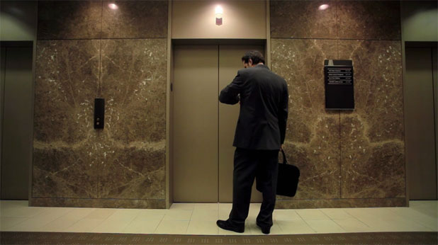
We were able to turn off the overhead fluorescent fixtures in the center of the lobby but there were fluorescent cans along the walls that we couldn’t kill. Rather than waste time removing the bulbs or covering them with black wrap we drowned them out by punching a couple of 1k Mickey Moles into the ceiling to recreate the overhead fluorescent look, and then we gelled the three can lights that impacted the acting area directly with 1/2 minus green. (I define “impacted” as “The actor will walk under them and turn green if we don’t do something.”)
A BRIEF ASIDE
In the old days we had to gel or replace fluroescent tubes because they cast light that appeared bright green on film, and for a long time we never had to do this with prism HD cameras because they didn’t see the fluorescent green spike. I suspect this is because the green filter used on the prism block was dichroic and could be carefully tuned to pass very specific wavelengths of light that didn’t include the fluorescent green spike wavelengths.
Single sensor cameras are completely different. They can’t use dichroic filters as the photosites are too small to cover individually using that technology. Instead materials and dyes are chosen not just because they pass the frequencies of light desired but because they stick to the sensor. They don’t seem as precisely tuned as prism block filters.
The green dyes on most (if not all) single-sensor cameras DO pass the fluorescent green spike, and as a result we have to filter fluorescent tubes again.
For example, when shooting with a Panasonic Varicam it’s possible to mix tungsten lights with warm white fluorescents and get away with it. The fluorescents appear a little green but not objectionably so. Not so with the RED ONE, the Arri Alexa, the Sony F3 and the Canon 5D: they see the green spike, and in mixed lighting situations that requires either swapping in color correct fluorescent tubes, using minus green gel on the existing tubes, or–and this is the more economical method–gelling the tungsten lights with 1/2 plus green to match the fluorescents and then white balancing to “remove” the green. This will make any non-gelled or non-fluorescent light sources in the scene turn bright magenta, but this trick is a life saver in an all-fluorescent environment.
As there were only three can lights directly over the acting area we gelled those and left the rest alone. As long as the actor looked normal the background could do what it wanted. Green flesh tone would have looked really odd, but the slightly green back wall of an elevator lobby is not objectionable to an audience.
You can see the reflections of two of the gelled cans in the marble surface above the elevators. There’s an additional can directly over the actor. Note that the light passing through the gels looks neutral but the actual gelled lights look magenta. This is a very odd and interesting side effect of gelling fluorescents, and I can’t explain why that happens.
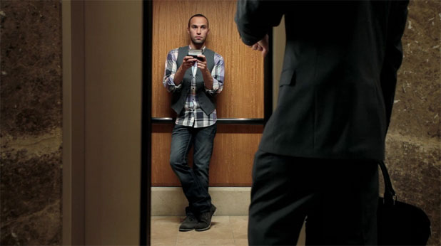
People look great lit from over the lens axis with a horizontal light source that’s about as wide as the distance between between the actor and the light. In this case a 4′ wide Kino Flo set 4′ from the actor creates a look that borders on fashion advertising. Here’s the lighting setup:
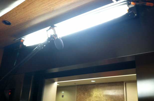
Pretty sophisticated, eh? The top barn door takes a little light off the top of the back wall to give it some shape, but otherwise it’s just a big soft horizontal source. A source that’s wide but not tall can be easily cut in the vertical dimension because the light source isn’t very big on the vertical axis, and small sources cast sharper shadows. It would be a lot harder to cut this off the side walls of the elevator because we’d be dealing with a 4′ wide source instead of a 2″ tall source, and soft sources require a lot more space to control.
In this case the narrowness of the light source in the vertical dimension casts a very nice chin shadow, which is important when lighting, say, women for glamor: the horizontal soft light smooths their skin and wraps around their face, while the vertical hard light casts a shadow that hides what a friend of mine calls “The Gobbler,” which is the small sack of flesh that dangles under the chin of older people.
One of the many cool things about Kino Flos is that they are both hard lights and soft lights at the same time, and we can use that quality to our advantage.
A NOTE ABOUT IMITATING NATURAL LIGHT SOURCES
The audience doesn’t care or notice if the direction of a light is cheated a bit as long as it’s still coming from the same general direction as the light source they believe is lighting the shot. In this case putting the light directly overhead, where a practical light would normally be placed in an elevator, would create dark eye sockets and generally unflattering lighting unless it was a very large source covering the entire ceiling. Using a smaller source gives us more control, and cheating it toward the front of the elevator so that it wraps around the actor’s face is both aesthetically pleasing and completely believable.
We ran all the cables down the interior left side of the elevator as I knew from the storyboards that we’d never see that direction. That kind of planning saves a lot of time as we only had to dress the cables once.
I’ll continue in the order that the shots appear, not in the order that they were lit:
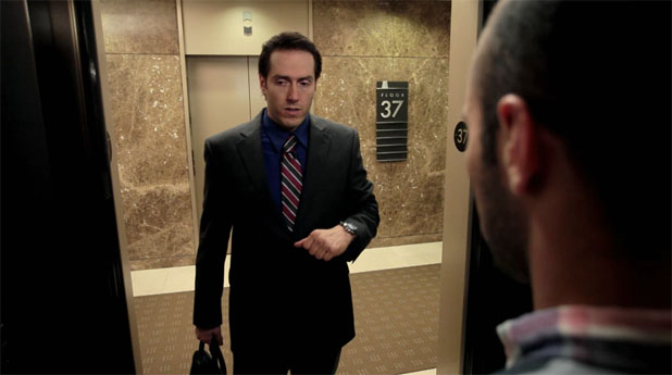
This was the only turnaround shot where we saw out of the elevator. We cheated the texting guy forward to get his head into frame. There’s a little bit of green in the background from the non-gelled fluorescents, but I let them go because they were background elements and they weren’t really worth wasting time on. The rest of the lighting is exactly the same as the previous shot except for a couple of things: there’s a 2’x2 tube Kino Flo inside the elevator, on the right side of cell phone guy, covered with diffusion, to light the businessman’s face; a 4’x4 tube Kino Flo suspended above the exterior door of the elevator; and a large white bounce card just outside the left edge of the frame.
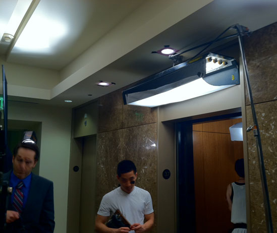
This exterior 4’x4 tube Kino Flo, covered with Lee 216 gel, was meant to be a flattering and soft overhead glow from the ceiling lights outside the elevator. You don’t see its effect in the final project as the editor cut to the shot after the actor passed underneath it. I suspected this would happen but it’s always best to give the editor options. Adding this light meant the editor would have a nice looking shot to cut to if they opted to use this shot to reveal the businessman at the beginning of the spot.
Also visible is part of the 2’x2 tube Kino Flo inside the elevator, as well as the effect of one of the Mickey Moles aimed into the lobby ceiling for general illumination. I later rotated the interior 2′ Kino Flo 90 degrees as I preferred to wrap the light around the businessman’s face vertically, softening his chin shadow and making the light less obvious. Usually I orient Kino Flos horizontally as I like soft nose shadows more than soft chin shadows, but in this case the nose shadow wasn’t much of an issue and a hard chin shadow made the shot look “lit.”
Two of the three gelled fluorescent can lights are visible above the elevator.
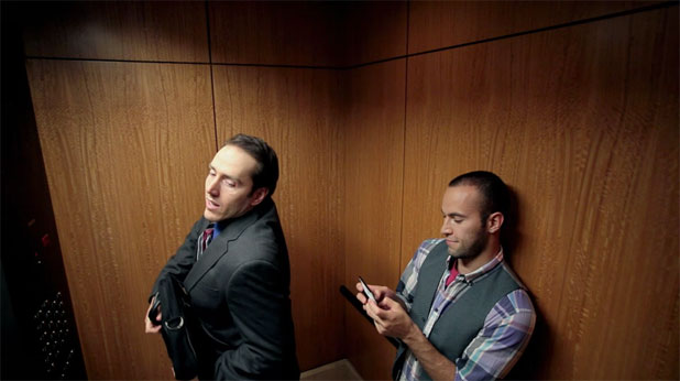
This shot was initially inspired by surveillance camera imagery, but in the end we just liked the extra headroom. Headroom is a contentious issue as everyone is taught in film school that it should fall at a particular place in the frame and rarely be varied. This is complete bull. Headroom is a stylistic choice, and if you walk through nearly any classical art gallery you’ll see most of the paintings are bottom-weighted–action is arranged along the bottom of the painting–while the top of the painting, which looms over you, contains additional compositional elements that help set tone or mood. Still photographers aren’t tied to traditional headroom at all, preferring instead to use the entire frame to tell a story, and while that doesn’t always work well for narrative projects it certainly works well for spots, which are meant to be visually intriguing.
In this case the back corner of the elevator creates a dividing line that separates the two characters nicely. The top cut on the Kino Flo mounted over the elevator door creates a nice angled shadow that leads the eye across the frame, through the businessman to the texter. The high angle is also meant to imply that we’re looking over the top of a small crowd of people.
I’m a big fan of what I call “volumetric lighting.” In film school I remember a lot of us were bent on figuring out how to light locations and stages evenly, which in reality is almost never desirable. Our brains enjoy texture and contrast, and a certain amount of that comes from how the set is lit. Soft lighting can be particularly effective at creating a sense of space because we get a strong sense of where a light is based on what happens when people pass near it. In this frame the businessman’s face is a bit hot (I refuse to say “overexposed” because that implies a technical mistake, which this is not) which tells me that he is near a light source. As he moves away from the light we see this:
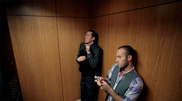
I don’t think there’s a more claustrophobic method of lighting a small space than to show how quickly and dramatically exposure drops off as people move away from a diffuse light source. I like this shot for a number of reasons: the businessman is now darker than the texter, which focuses the eye on the texter as he’s the dominant character, and the businessman is now a very stiff vertical placed directly in front of the corner of the elevator, another stiff vertical. He comes across as very rigid and uncomfortable in comparison with the texter, and that suits the story nicely.
One of the strengths of the Canon 5D and 7D is that they clip very beautifully. Highlights don’t look electronic or “zingy.” There are a lot of cameras that don’t take kindly to overly bright flesh tones.
In the image above you can see the effect of the ceiling lights, which we left on for some shots and off for others. Here’s what they looked like:
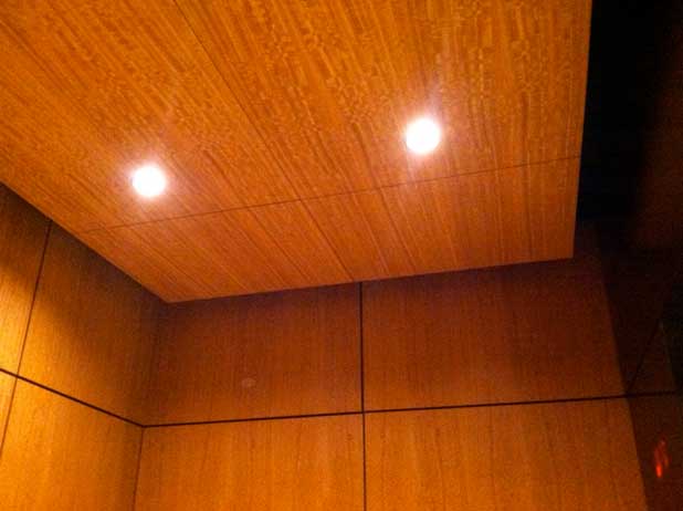
They created a nice glow that added some production value.
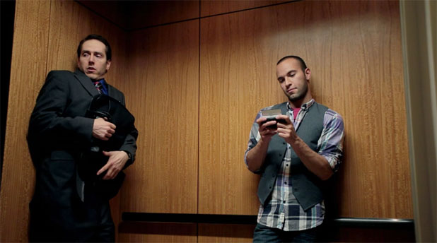
This shot is simply a lower angle version of the previous shot. The lighting for this was the same as the high “surveillance camera” shot. We can see a little bit of reflection from the single tube Kino Flo reflected in the back wall but that doesn’t bother me. I think it makes the lighting a bit more “real” as we get a sense of where the light source is, and that serves as an unconscious clue as to the size and depth of the space.
There are a couple of tricks to lighting elevators, but making sure there’s power inside is key. There’s usually an outlet behind the service panel below the controls and that’s how we powered the interior lights. Powering the lights from the inside means the doors can’t close all the way, and if the elevator takes off unexpectedly for another floor you won’t damage any gear or hurt anyone when a cable running through the doors opts to stay behind.
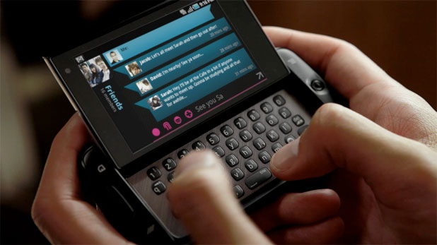
The trick to most product shots is soft back light. I’m oversimplifying a bit, but that’s the basic approach for nearly anything that’s black or shiny: reflect a nice soft source in the surface and let the shadows fall toward the camera for depth. In this case we re-purposed the 2′ Kino Flo in the elevator that lit the businessman for the turnaround shot and used it to light the product, with a bounce card of some sort low and to the left to fill in the shadows and add a little edge to the texter’s left hand.
That’s about it. The color grade is very nice, and I think we did a great job shooting in a confined space with very few lights. I’m quite happy with the results.
Project: T-Mobile “Friends” (web spot)
Production Company: Teak Digital
Exec. Producer: Greg Martinez
Producer: Emily Van Nierop
Director: Greg Rowan
DP: Art Adams
Gaffer: Gordon McIver
Camera: Canon 5D loaded with Light Illusion gamma curves
Art Adams is a DP who thinks small when the occasion demands it. His website is at www.artadamsdp.com.
Filmtools
Filmmakers go-to destination for pre-production, production & post production equipment!
Shop Now