If you’re familiar with animating text in After Effects, you might glance at Apple’s Motion and think that it offers many of the same features for flying text around. While that is true, if you look a little closer you’ll find that Motion can create some really great looks that you just can’t get with After Effects. In this article, I’ll review the text capabilites of both programs, and lead you through in detail how to typeset and animate text in Motion. At the end, I’ll discuss some additional details that separate the two programs. (Note: This article compares Motion 3 and After Effects CS4. Motion 4 has added some new text capabilities.)
Everyone will have different requirements for what they are looking for in an animated text engine, and these may change from one job to the next. My basic wishlist includes the following:
-
- type on text one character at a time
- animate in a “cascade” of characters (rather than one at a time)
- animate characters on in a random order (rather than from left to right)
- wiggle or randomize the transformation values
- fill text with a gradient and have it accurately track animated text
- apply effects such as glows and blurs to individual characters
- per-character drop shadow (so a shadow can fall from one character to another as they cross over each other during an animation)
- motion blur for fast moving characters
- animate the characters in 3D space (i.e., rotate on Y, animate Position in Z)
- save your custom animations as presets
Both programs offer unique animation opportunities, but the above is what I consider a solid list of text animation features to build on. So let’s compare how both programs would go about these jobs (quickly in After Effects, and then in some detail in Motion), and check out their strengths and weaknesses:
Text Animators in After Effects CS4
Most of the above wish list can be accomplished fairly easily in After Effects using text animators to animate properties. These include transformations, fill and stroke color, tracking, and so on. You can start from scratch or use an animation preset as a starting point. (Note that you can only view animated previews of Adobe presets in Bridge, whereas Motion has built-in previews.)
In After Effects, you can type on one character at a time by animating the Start parameter in the Text Animator’s Range Selector. To animate a cascade of characters is less obvious: First set Start and End to set the number of characters in the cascade, set the Range Selector’s Shape popup to Ramp Up, and then animate Offset.
To animate on in a random order, simply toggle on Randomize Order in the Range Selector. Adding a Wiggly Selector will randomize the property values.
After Effects does not have a per-character gradient fill. You can apply a gradient to the text using the Ramp effect or the Gradient Overlay Layer Style. But they are both applied to the text’s overall bounding box, and not to each character individually – so as the text animates, the gradient will look wrong. These gradients are also applied after the fill and stroke are rendered, so they replace the stroke.
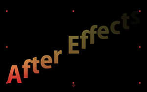
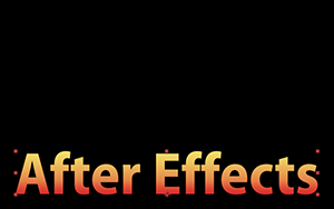
Although After Effects has Gradient Overlay Layer Style, the gradient stretches as the text animates, and also obliterates the stroke color.
You can add a per-character Blur to a text animator, but no glow or drop shadow per character. Motion Blur is a simple toggle per layer (though it would be nice if this switch could be saved as part of a text animation preset).
To apply a drop shadow to text in After Effects, you apply the Drop Shadow effect or layer style. Unfortunately, this applies the shadow to the layer’s alpha channel, not to each character individually.
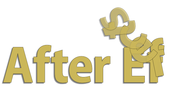
In After Effects, drop shadow effects can only be applied to the entire layer, not to individual characters.
To get individual drop shadows per character, you need to enable the Per-character 3D option for the text animator, and add a light to create shadows falling from one character to another. 3D layers in the background can also receive shadows with this method. While this is obviously the way to go for a 3D design, it’s not worth the extra setup time for 2D.
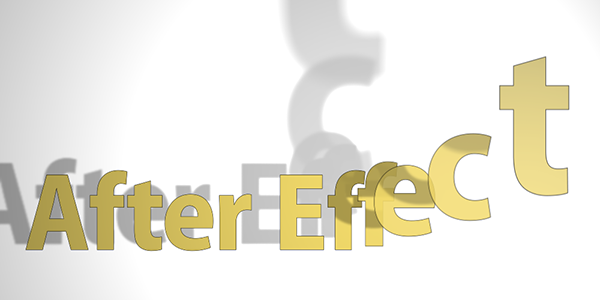
For realistic shadows in After Effects, create your text animation in 3D space.
By the way, to animate characters in 3D, you’ll need After Effects CS3 or later. Toggle on the Enable Per-character 3D option for the animator, and now you can move and rotate individual characters in X, Y, and Z. (We’ll look at text animation in 3D in more detail in a future article.)
After Effects does offer some unique properties, such as Character Offset and Character Value, which are handy in those rare cases when you need to randomize characters (as in “spy code” animations).
So with that overview of the After Effects’ text engine, let’s compare similar features in Apple’s Motion 3…
continued///
Creating Text in Motion
In Motion, you create text directly in the Canvas with the Text tool, pressing Esc (or Enter) when you’re done. A bounding box will surround your title.
Just as in After Effects, there are two modes: editing mode and layer mode. When the cursor is visible, you’re in editing mode; when you press Esc, you’re in layer mode (where any changes you make to the formatting apply to the entire layer). When the selection tool is active, you can double-click the text layer to re-enter editing mode. Note that the shortcut for kerning is Control plus the left and right arrow keys (not the Option or Alt key you might be used to).
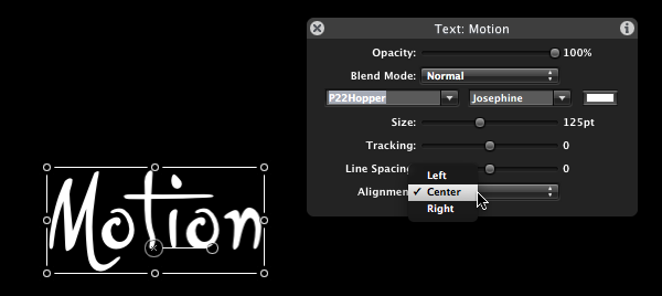
Motion’s HUD (Heads Up Display) gives access to the most common text formating properties such as font, size, tracking, and alignment.
Once you have some text to play with, select Inspector tab then the Text tab. The Text inspector has three panes to explore: Format, Style, and Layout.
The Format Pane
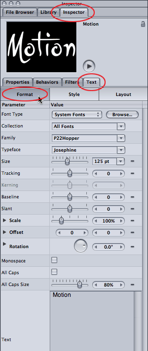
The Format pane in Motion. You can keyframe most of these properties by setting keyframes, although more interesting animations will be achieved using “behaviors.”
The Format tab includes standard parameters such as font, size, tracking, baseline, slant, scale, offset, and rotation. Note that Rotation offers separate X, Y and Z dials, and applies per character (not per layer).
More unusual features include a Monospace checkbox (useful when you need all characters to be the same width), and an All Caps checkbox, which converts lowercase characters to capital letters. The All Caps Size slider sets the size of the converted characters; at 100%, they will equal the size of a capital letter, but at a lower value you can create “small caps.” The Text Editor area lets you to edit the text directly; handy when it’s being animated in a crazy fashion.
If you’ve installed Apple’s LiveType application (it comes bundled with Final Cut Pro), it comes with a bunch of LiveFonts that Motion can also take advantage. LiveFonts are fonts where the characters are small movies; so they self-animate, write themselves on, and so on. A few are quite usable, and more are available from third parties.
The Layout Pane
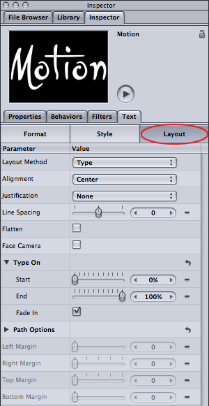
The Layout pane in Motion. Worth noting is the Type On section, which can either be keyframed to type on characters or can be automatically animated with the Type On behavior (more on both options in a bit).
The Layout tab covers more of the paragraph-type setting, such as alignment, justification, and line spacing. The Layout Method popup can be set to Type, Paragraph, or Path modes (refer to the Help > Motion User Manual for more on type-on-a-path).
The Flatten checkbox comes into play when text is moving in 3D space. Enable it to force characters to remain on their 2D plane. The Face Camera checkbox is also a 3D feature: enable it to forece characters to always face the camera. (We’ll look at animating text in 3D in a future article.)
The Type On section can be used to quickly type on text by keyframing Start (more on that later). The margin parameters at the bottom of the Layout panel are only for paragraph text (which I won’t be covering here since it’s rarely used in video work).
The Style Pane
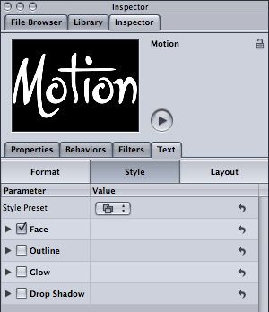
The Style pane in Motion. Text consists of four main groups – Face, Outline, Glow, and Shadow – each of which can be enabled or disabled separately. Note also the Style Preset popup menu at the top.
Move onto the Style tab to find the biggest difference with After Effects. In Motion, a text layer consists of four distinct “sub-layers”: Face, Outline, Glow, and Shadow. You can toggle each one on or off depending on what you need, and each has its own set of controls.
The Face (or “fill”) can be filled with a solid color, a gradient, or a texture (an image). You can choose from a useful bunch of gradient presets which you can modify and save as another preset. Select Gradient, then twirl down the Gradient section to reveal the full-featured Gradient editor. What’s cool is that the gradient is applied to each character individually, so it behaves as you would expect when the characters are moved, rotated, scaled and so on.
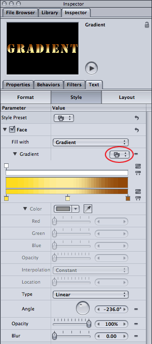

If you edit any of the the preset gradients, you can save your new gradient by clicking on the Gradient popup (circled, left). Because the gradient is applied per character, it will animate in a natural way (above).
You can also fill the text with a texture (just add the texture image or movie as a layer, then drag it to the texture > image area). Check the user guide if this is your cup of tea.
Finally, each of the four sections (Face, Outline, Glow and Shadow), each have their own Opacity and Blur controls, so I’ll just mention that once.
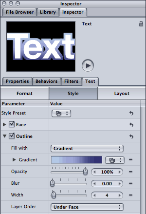
The Outline parameters in Motion’s Style pane.
The Outline (or “stroke”) section has similar features to Face, including fill with gradient or texture. Additional parameters include Width and a popup for whether the stroke draws under or over the Face.
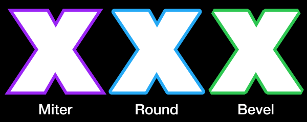
Aesthetically, I prefer the quality of the stroke in After Effects, particularly as you now have control in CS4 for how the corners are joined (set Line Join to either Miter, Round, or Bevel from the Character panel’s Options menu). In Motion, most of the corners appear miter but some appear clipped or beveled (see figure). It would be nice to see the outline options for Shape layers (Joint > Square, Round, and Bevel) migrate over to text outlines.

In Motion, the outline can appear slightly clipped at some of the corners or edges (above). In After Effects CS4, you can set the stroke to Miter, Round, or Bevel (below).
A bevel alpha effect would be a nice addition to Motion titling; I couldn’t figure out how to do this even with a filter. In After Effects you can choose Bevel Alpha effect or the Bevel & Emboss layer style. While the bevel is applied to the layer as a whole, you can get away with it if the characters don’t touch each other; plus, during the animation you can use motion blur to disguise it.
continued///
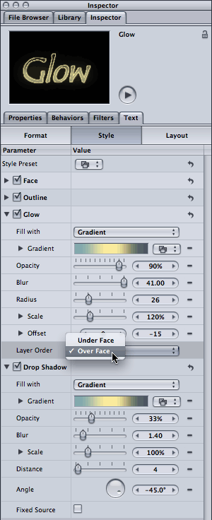
The Glow and Drop Shadow sections (left). Since each of the Outline, Glow and Drop Shadow offers gradient fills and blur, you can dial these in to create some very interesting looks.
Moving along to the Glow and Shadow sections in the Style tab, this is where you can craft some really nice looks. They share some features, such as their fill options (color, gradient, or texture), opacity, and blur amount parameters. The Glow also allows you to set the Radius, which combined with Blur sets the basic look. Note that the Blur slider only goes to 10, so scrub its value for larger amounts. Gotcha warning: decreasing the Blur amount to 0 makes the entire Glow pop off. So don’t do that…
You can use Scale to make the glow larger than the text; the glows overlap using Add mode creating nice “hot spots.” Note that the glow scales up from the baseline; you can use the Offset parameters to recenter the glow around the text.


One style with the Glow set to render Under Face (left) and Over Face (right).
The Drop Shadow is straightforward and has similar features, although when you scale it large and the shadows overlap, the effect is more of a Screen blending mode rather than Add.
Saving Text Styles
Once you arrive at a style you like, check out the Style Preset popup at the top of the Style tab. Here you can select:
- Save Format (the settings in the Format pane only)
- Save Style (the settings for Face/Outline/Glow/Drop Shadow only), or
- Save All (the settings for both the Format and Style panes)
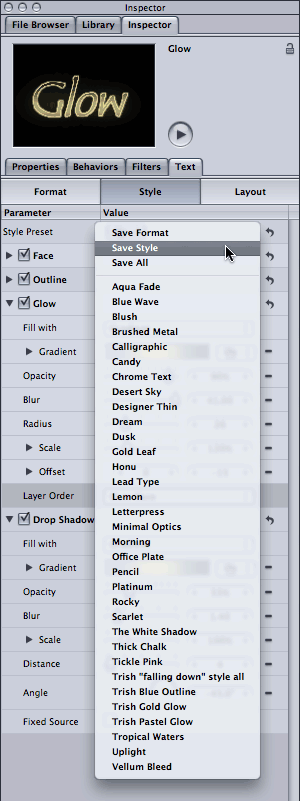
To save your hard work as a preset, select either Save Format, Save Style, or Save All from the Style Preset popup in the Style tab. (Save All includes the settings from both the Format and Style panes.)
Of course, you can also apply a built-in preset from the Style Preset popup menu, which will override your current style. It would be nice if the name of the preset indicated whether the Format settings were also saved, as some presets obliterate your font choice. (I got in the habit of putting “all” at the end my preset names when I did a Save All so I’d be forewarned in future.)
Note that if you create a mess in any section or pane, look for the Reset button (a rotated arrow icon) to reset those parameters for the default settings. You can also toggle on and off each section to troubleshoot individual areas.
Being able to save the Style settings separately from the Format settings is great, and note that both options do not include the underlying characters. Compare that to After Effects: The only option you have to save the settings in the Character and Paragraph panels is to save an animation preset for the Text Source property. But this saves everything: the text itself, the fill & stroke colors, and the formatting (font, weight, and so on). So if you just want to re-apply text formatting (the way Word would apply a “style” to something you’ve typed), you end up replacing the underlying text as well and then have to retype and rekern it.

To save your text style in After Effect, you select the Source Text parameter and save it as an animation preset. However, applying this preset in the future to another title will replace the underlying text, which makes it much less useful. You also don’t get to see a preview of your own presets (only Adobe presets have preview movies in Bridge).
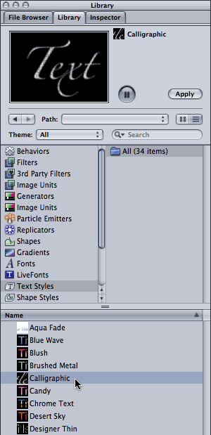
To preview Text Styles presets, bring forward the Library > Text Styles folder. Note that some, such as the Calligraphic preset, also include the formatting as well as a fill texture.
To preview the Text Style presets, select the main Library tab, then select the Text Styles folder. The individual styles will appear below. When you click on a style’s name, a preview appears in the preview window using the current font style. As you preview each preset, make a note of which one changes the font; these are the ones with the Format settings included. When you apply such a preset, it selects the texture layer in the Layer tab rather than the text, which is a bit confusing.
You can delete your own presets in the Library by right-clicking and choosing Move to Trash. This is how you can replace a preset with one with the same name; just delete it and save it again (otherwise it saves it as a second preset with a “1” at the end).
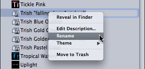
Right-click (Control+click) on your own Text Style presets in the Library to Rename or delete a preset.
Finally, saving and applying a Text Style is independent of any text animation. Animation is saved separately in the Behaviors section, which is coming up next…
continued///
Animating Text in Motion
When you create text in Motion, you can animate it just like any other layer from the Properties tab. Keyframing the transformations applies to the entire layer though, so let’s look instead at how you can animate individual characters.
If you have Motion in front of you, I suggest you create a basic text layer, then duplicate it a few times so you always have a fresh layer to work with if you make a big mess. Make sure the Window > Layers pane is open. You might also want to show the Timeline pane.
First off, to just type on one character at a time is pretty simple. Select your text layer, bring forward the Text > Layout tab and check out the Type On section. By animating End from 0% to 100%, the text will type on over time. The Fade slider determines whether the text fades or pops on.
A reminder for After Effects users: Keyframing is different in Motion! Click the red Record button in Motion’s Timeline to have keyframes created automatically, albeit for everything you touch. It tends to work better if you toggle it on when you are setting keyframes, then toggle it off when done.

Toggle on the Record button to easily create keyframes in Motion. Toggle it off again when done.
When the Record button is off, you can still create keyframes manually. First, select Add Keyframe from the popup menu to the right of any parameter, then change its value. Repeat for each keyframe. For confirmation that you are creating keyframes as you edit, you can bring the Keyframe Editor forward in the timeline area (or select Window > Keyframe Editor). Set the Show menu popup to Animated, and you should see an interesting graph and not just a flat line.
In Motion, although you can animate individual parameters directly, you’re more likely to animate characters using a behavior. Behaviors create animation without creating keyframes at specific points in time. For instance, instead of keyframing a text scroll from point A to point B over 10 seconds, you would add a behavior that says “scroll in this direction at this speed” or “increase tracking at the rate of change” and so on. (I think of behaviors like a wind-up toy that never runs out of steam…)
To preview the available behaviors, bring forward the main Library tab, then select Behaviors from the list below. While you can apply any behavior to text, for now concentrate on the two special text categories: Text Animation and Text Sequence.
Text Animation Behaviors
![]()
If you’re new to behaviors, then start by applying a simple one such as Text Tracking from the Library > Behaviors > Text Animation folder.
Click on the Text Animation folder, and you’ll see a short list of animation presets. Select one from the list below, and a preview will play at the top of the pane. (Ignore the Sequence Text one for now, as this needs a lot more explanation!)
Let’s say you want to apply Text Tracking. First, make sure a text layer is selected in the Layers tab. Then choose from these options for applying a behavior:
- drag the behavior to the text in the Canvas, Timeline, or Layers tab
- click the Apply button in the Preview area at the top of the Library pane
- if you already know what the behavior looks like, select it from the Add Behavior dropdown menu in the toolbar
After you apply the Text Tracking behavior, press Play and the text will automatically start tracking outwards. Notice that when you applied this behavior:
- The Text Tracking behavior was added in the Layers tab below the text layer.
- A Text Tracking behavior was also added in the Timeline (the duration defaults to using the same in and out points as the text layer).
- Select the Text tab and then the Behaviors tab and the unique parameters for this behavior will be editable. Note that these parameters also appear in the HUD (press F7 if the HUD is not visible).
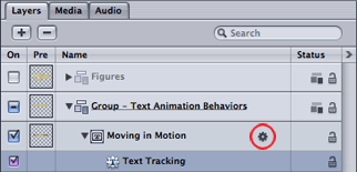
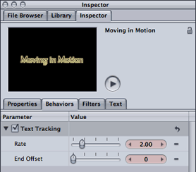
The Text Tracking behavior now appears in the Layers tab (above left) and the Inspector > Behaviors tab (above right).
For the Text Tracking behavior, the Rate of change parameter is the speed control. The End Offset defaults to 0, which means continue tracking until the end of the behavior layer. Increase End Offset to have it stop before the end of the layer. (Note that normally you would shorten a behavior by trimming its layer bar in the Timeline. However, shortening Text Tracking duration will make the text jump back to its original tracking value, so use the End Offset parameter for such behaviors.)
Feel free to explore more Text Animation behaviors but skip Sequence Text for now. You should find the others, such as the scrolling ones, pretty straightforward. Note that behaviors stack on top of each other, so you can add the Scroll Up or Type On behaviors on top of Text Tracking. The Type On behavior also animates the Type On > End parameter in the Layout pane, but the speed is determined by the duration of the Type On layer bar, not by explicit keyframes.
When seeing how a new behavior works, feel free to disable any existing behaviors by toggling off their checkboxes in the Layers tab (or disable the entire layer and use one of your duplicate text layers).
Incidentally, you can also animate Text Tracking using what Motion calls a Parameter behavior. Bring the Style pane forward, and right+click (Control+click) on the word “Tracking”. Select Rate from the popup menu; options will appear in the Behavior tab. (Thanks to Motion expert Mark Spencer for that tip!)
continued///
The Sequence Text Basic Behavior
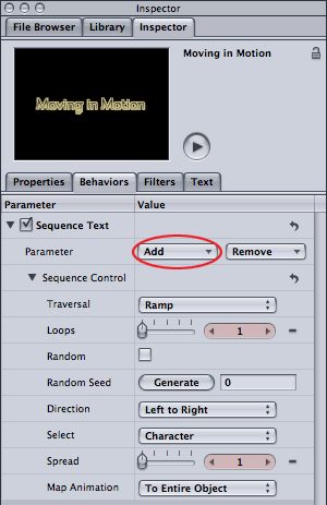
All behaviors in the Text Sequence folder are based on the Sequence Text behavior. When first applied, note there are two sections: Parameter and Sequence Control. Click the Add menu to add individual properties to animate.
In Motion, you have dozens of behaviors to choose from in the Library > Behavior > Text Sequence folder. Because these are all based on the Sequence Text behavior, learning how to animate from scratch using this behavior will go a long way in helping you understand and edit the existing presets:
Start by selecting your text and applying the Sequence Text behavior from the Library > Behaviors > Text Animation folder. (Note that the animated preview is lying – the characters won’t jump up and down like that without a little more work…) Bring the Behaviors pane forward and you’ll see it consists of two sections: Parameter and Sequence Control. The Sequence Control section is akin to the “range selector” section of an After Effects’ text animator – it decides how many characters are selected, whether they animate randomly, and whether the selection should be based on characters/words/lines/all and so on. The difference in Motion is that no property is applied as a starting point, so nothing appears to happen when you first apply the Sequence Text behavior!
In the Sequence Text > Parameter section, click on the Add menu and select Format > Position. Position starts off with an Offset of X=0, Y=0, so change the value for Y position to, say, 100. Press Play and as the selection moves across the title, one character at a time moves up 100 pixels and then back down again.
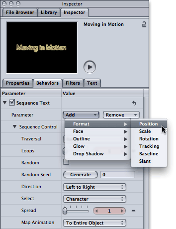
Many of the Format and Style properties can be added to the Sequence Text behavior to build a custom animation. Start with adding Format > Position and then set the X and Y offset values.
As the animation progresses, note the thin lines surrounding the characters as the animation moves from left to right across the text; this is the animated selection. The characters inside the selection are affected by the Position offset, and the characters on either side are not affected, with a slight roll-off between the two states.
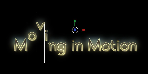
As the animation plays, note the moving selection in the Canvas. (If you don’t see it, make sure the behavior is selected, not just the type layer.) Characters inside the selection are affected by the Y Position offset value of 100. Dragging the green and red arrows edits this Position offset value interactively.
Note that the default duration for a Text Sequence behavior is 60 frames, not the entire duration of the text. To speed up the animation, shorten the duration of the behavior’s layer bar. When the behavior ends, the text returns to its normal style. (Obviously, if you apply a behavior that transitions off a title, be sure to align it with the end of your text layer.)
So far so good, but the animation is a little goofy with one character bouncing up and down! In the Sequence Control section, set the Select popup to All. Now all the text after the end of the selection will be fully affected by the Position offset so they will all be raised 100 pixels. (This is not unlike the Ramp Up shape in After Effects’s Range Selector.) As the animation plays, they will return to their normal position.
Now increase the Spread parameter to affect additional characters. Press Play and the characters should fall down into place with a cascading effect. That was an easy way to create a cascade effect!
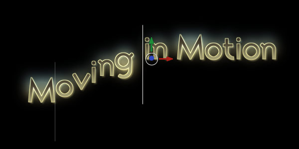
In Sequence Control, setting the Select popup to all and increase the Spread value to 6 creates a cascading effect.
Now that you have the hang of it, add more properties. Select Add > Format > Scale or > Rotation, adjust their offset values, and these offsets will be applied to characters inside the selection. Add Format > Baseline to adjust the anchor point around which they scale and rotate. All in all, Motion’s workflow is very similar to adding properties to a text animator in After Effects.
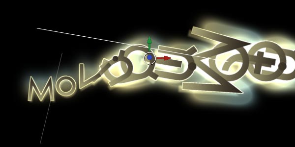
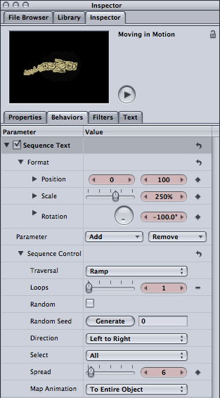
Adding Scale and Rotation to the cascade (left) creates a more interesting look (above). Note that text will look smooth at any size as it’s vector based, and that the glow and drop shadow scale up but the thickness of the outline remains the same.
From there, you can Add parameters for the Face, Outline, Glow, and Drop Shadow to create some very interesting looks. Check out the preset behaviors in the Behaviors > Text Sequence > Text-Glow section for some ideas on what’s possible. If you want to apply these behaviors, toggle off your behavior before you apply them (or use a fresh text layer).
Transitioning on Text
To hide the characters before their big moment, you’ll need to make the characters after the end of the selection disappear. There are three obvious ways to do this:
- set the Position offset so that the characters are completely of the canvas
- select Add > Format > Scale and set scale to 0%
- make the characters invisible by setting their Opacity to 0%
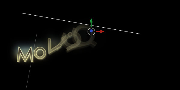
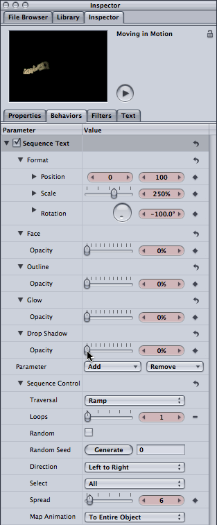
To make the cascading text appear to transition on (above), the Opacity for the Face/Outline/Glow/Drop Shadow parameters is set to 0% (left). As the selection moves across the text, the opacity values return to normal.
Regarding the last option, note that there is no global Opacity control – you need to add Opacity to each of the Face/Outline/Glow/Drop Shadow components separately, depending on which parameters are enabled in the Style pane. For example, if you just have the Face enabled, then Add > Face > Opacity and set the Opacity value to 0%. Select Add again and repeat this step for all other active parameters. (A “master” opacity control would be a nice addition…)
(By the way, this explains why every behavior from the Text Sequence folder has Opacity set to 0% for all four components, just in case you have them enabled.)
Finally, toggle on the Random checkbox in the Sequence Controls, and generate a different seed if needed. Now the text transitions over the same amount of time, but in a random order.
If you create an animation you’d like to save, instructions are in the User Guide, page 675, “Saving a Modified Text Behavior to the Library.”
continued///
Summary
There’s no argument that Motion offers better control over the style of the text; I especially like the gradient fills for everything and the glow per character – the latter being used in the movie below:
Motion offers enough animation control to animate the majority of title jobs, considering that most clients don’t really want titles doing figures of eights… On the other hand, when you do need to be really tweaky, I found the Sequence Control parameters in Motion 3 were just not as powerful as the controls in After Effects CS4. By lumping together whether the selection is based on characters, words or lines with the “shape” of the selection, I just couldn’t get Motion to do some of the tweaky tricks that After Effects can do with animating on words versus characters. Also, the More Options section in After Effects allow you to set the anchor point to characters, words, lines or all. In Motion, although you can move the selection based on words and lines, the scale and rotation always affect individual characters.
Another thing I miss is more control over easing. In Motion, changing the Traversal popup from Ramp to one of the “ease” options only affects how the selection moves across the text, not how the characters transition from being selected to unselected. In After Effects, you have control over both: You can ease the keyframes that are moving the selection, while also adjusting the Ease High and Ease Low parameters of the Range Selectors. These ease controls how “sticky” the selection is (the “high” point) and how hard or soft the characters exit the selection (the “low” point).
On the other hand, Motion allows you to create an animation and then Map Animation “To Selection”. This is how the Drop & Bounce behavior was created (see User Guide for a full explanation).
Motion also offer additional behaviors that are really fun to play with in the Text Sequence folder, such as those in the Text-Miscellaneous subfolder like Explode Text and Megawatts (the latter being used in the movie below):
Other Behaviors
After you’ve explored the behaviors supplied in the Library > Behaviors > Text Sequence folder, check out some of the other behaviors as well especially those in Basic Motion and Simulations. (Note that some behaviors in the Text-Miscellaneous subfolder also use some of the Simulation behaviors!) Be sure to enable the Affects Subobjects parameter in a behavior to ensure text is animated as individual characters and not just a single layer.
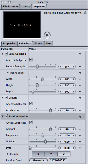
Applying three other behaviors (Edge Collision, Gravity and Random Motion) (left) makes a title fall down and bounce off the bottom (above – it’s a movie; click the arrow to play). Be sure to select Affects Subobjects to have the characters animate as individual objects.
And don’t forget the Replicator, which can also be applied to text. (That would require a whole article in itself… We wrote an introduction here.)
In a follow-up article later, I’ll compare animating characters in 2D vs. 3D in both After Effects and Motion.
The content contained in our books, videos, blogs, and articles for other sites are all copyright Crish Design, except where otherwise attributed.

Filmtools
Filmmakers go-to destination for pre-production, production & post production equipment!
Shop Now


