In this two-part series, we’ll first break down the look of an ARRI Signature lens, and then, in part two, we’ll rebuild it into a modern take on a vintage lens.
As a cinematographer, I’ve used all kinds of lenses ranging from modern to vintage. Each has a vibe that spoke to me when looking at lens options for a specific project. When I joined ARRI Americas as product specialist for cinema lenses, I found myself faced with a challenge: how to move beyond thinking of lenses in terms of a simple “vibe” and, instead, break down the look of these lenses into their specific components. In other words, I had to reverse engineer my brain to learn why an ARRI Signature lens felt a certain way, and then try to communicate that feeling to others. It’s a bit like being an art teacher: if I can show you what I see, maybe you can see those things too. And if you can see them, maybe you’ll like them.
It took some time, but eventually I was able to break down the ARRI Signature look into discreet components that I could share with others—just in time for a new challenge. I found myself testing a variety of magnet-mounted optical elements that changed the character of Signature lenses in fascinating ways. Because Signature lenses are such high performance lenses, they are fairly easy to manipulate from the outside by adding an additional optical element to the back of a lens.
In the process of testing these new elements, I learned a lot about why vintage lenses look the way they do. Several things that I took for granted, such as exposure, focus, and depth of field, work very differently in older lenses. I’d never realized the magnitude of these differences because I’d never been able to take the “vintage” out of a vintage lens and compare the “before” and “after” images.


A series of frames from a test shoot comparing rear optical elements. DP: Jeff Berlin.
This article (in two parts) is a diary of my journey into understanding the many ways lenses exhibit character, along with the traps that make vintage lenses both visually distinct and tricky to work with.
In part one, I’m going to describe how ARRI went about making a beautiful, modern lens. In part two, I’m going to show you how we went about shaping that look in very specific ways to create a modern, HDR-friendly take on a vintage lens.
DESCRIBING LENSES IS HARD
It’s difficult to describe the look of a lens from scratch without using words that often have multiple meanings. For example, I once asked three cinematographers to define the word “creamy.” One said it referred to the quality of skin reproduction. The next said it referred to the quality of bokeh. And the last said it referred to the quality of a specular flare. Clearly words were not going to be enough. I set out to gather images.
In an effort to focus my research, I asked why we made these lenses to begin with. “What’s the philosophy behind this lens family?” As someone who works for a lens manufacturer, I get this question a lot. As a cinematographer I know this is really two questions in one:
- “What problem is this lens meant to solve?”
- “When should I consider using this lens?”
The answer turned out to be simple. As a company, ARRI tries to make tools that work right now, as well as ten years from now. We had to make informed guesses as to how audiences will view moving images in both the near and distant future. Every path led to one conclusion: very high resolution, very high dynamic range imagery. Maybe not everywhere and not all the time, but it’s clear that this will be the premium experience of the future.
What we discovered, both from internal testing and looking at images captured by others, is that both high resolution and high dynamic range images exaggerate lens aberrations. For example, lens flares in HDR are incredibly bright, very saturated, and extremely distracting. Half of the HDR effect is in shadows, so when veiling glare turns deep blacks into shades of gray, the entire image looks muddy. In Rec 709, chromatic aberration often blends into bright highlights, but in HDR it can appear as neon lines snaking around out-of-focus highlights.
As display contrast and color increase to the point where images look increasingly natural, unnaturalness stands out. Our goal with Signatures was to define a new kind of character that plays well with HDR and high-resolution displays and doesn’t appear boring or lifeless. In the words of a cinematographer who was an early ARRI Signature Prime adopter, “They are like looking through a beautiful window.”
As a side benefit, ARRI Signature lenses are phenomenal at making the fantastic seem real.
Spot: Bose “It’s Beautiful Up Here”
DP: Mauro Chiarello
Lenses: ARRI Signature Primes
What I didn’t know at the time, but learned later, is that while these lenses were released with the ALEXA LF—a full frame camera—they were designed around the increased dynamic range and color fidelity of the ALEXA 35, whose sensor was already in development. It’s not easy to create a lens with pleasing character that can retain its natural beauty over a dynamic range of 17 stops.
Let’s break the look down, and maybe you’ll start to see these lenses the way I do.
HIGH RESOLUTION LENSES LOOK SOFT
4K and UHD images are here now. 8K is on the horizon. Will we stop there? Unlikely. A key driver of both TV set sales and movie theater attendance is change. The way we see images will only improve over time.
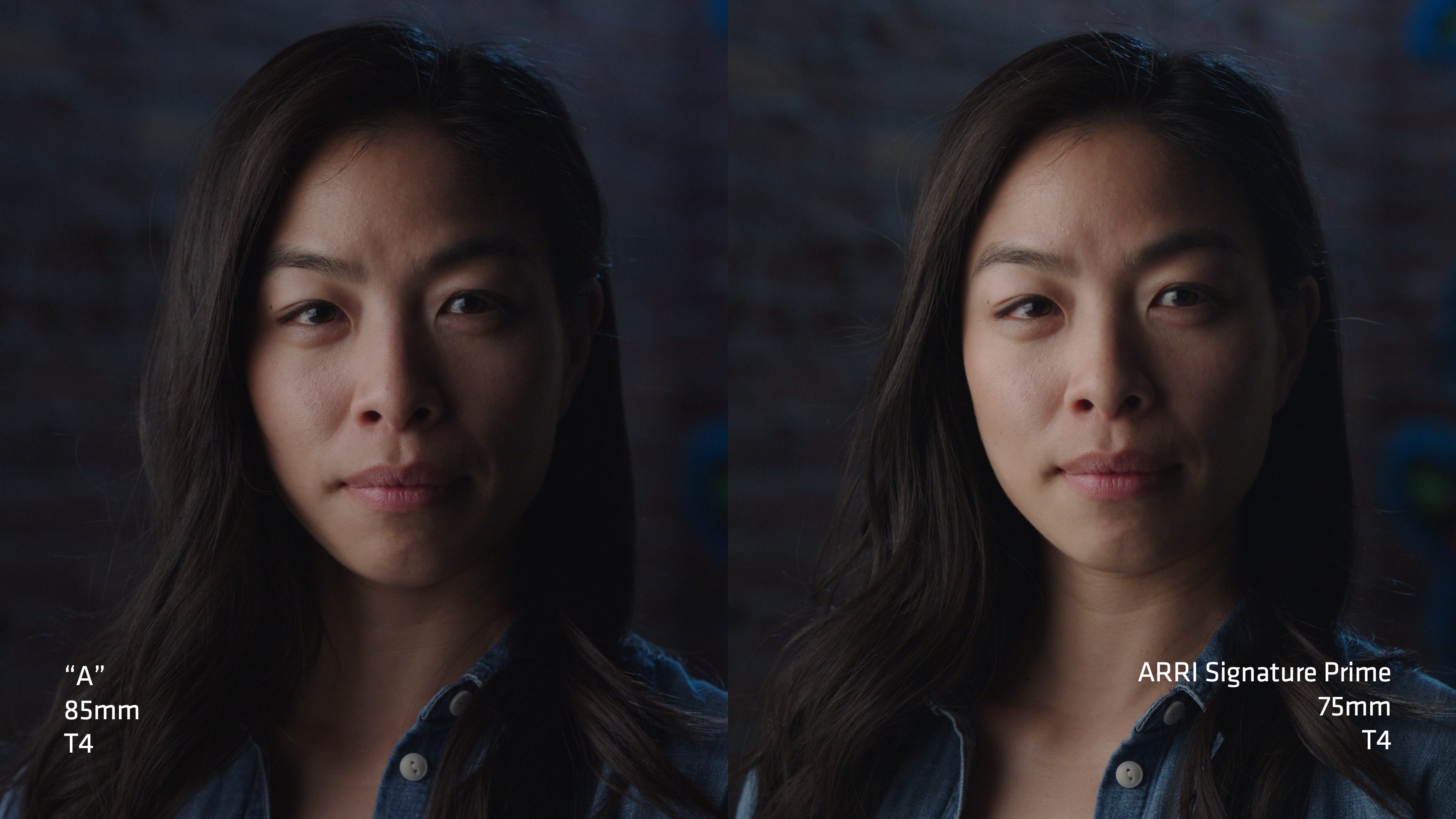
Lens “A” looks sharp. I can see this in the hair draped across the model’s forehead just over her right eye. I’ve heard cinematographers describe this as “crispy,” and this is not generally a desirable characteristic.
Because contrast in an ARRI Signature lens is high at all discernible detail levels, the image on the right doesn’t feel artificially sharp. Instead, the model looks much the way she would if you were looking at her directly. The same strand of hair feels delicate and natural.
When an image is neither sharp nor soft, but full of discernible detail, I would describe it as natural. Images that appear sharp or soft are deviations from natural. Lens “A” shows a lot of contrast in coarse details, such as hair, eyes, etc., and that makes the image look overly sharp. This look works for film (a soft medium) or for digital still photography (where “sharp” is often the preferred look). Cinematographers tend to shy away from lenses that look sharp, preferring “natural” or “soft” instead.
If a display produces high resolution images with high dynamic range, then a lens that captures all that information, paired with a camera that can do the same, will deliver the most natural or realistic viewing experience. If nothing else, this combination delivers the most malleable image for post processing, as any kind of look creation in post is selectively destructive. You’re starting at a baseline from which the image can be pushed in any direction. This is the philosophy behind ARRI cameras, and it applies to our lenses as well.

It’s one thing to look at detail on an MTF machine or test chart. It’s another to look at an actual image. Pawel Achtel, ACS is an Australian cinematographer who invented his own 9K high resolution camera. His favorite lenses are ARRI Signature Primes.

It’s easy to see why. I see a lot of detail in this image, but it doesn’t feel “sharp” or “crisp.” Instead, it feels like I’m looking at a very large predator from a closer-than-preferable distance.
Because of this naturalness, we’re seeing strong adoption of Signature lenses for fashion and beauty work. You wouldn’t think that a super high resolution lens would be in demand for that kind of work, but when you understand that resolution and sharpness are different things it starts to make more sense.
Spot: Black Opium
DP: Oliver Millar
Lenses: ARRI Signature Primes
Because of this contrast, Signatures tend to respond differently to diffusion. My suspicion is that diffusion filters cut detail more precisely in Signature lenses, so each filter strength delivers a distinctly different look.
Music Video: Luna de Xelajú – Gaby Moreno & Oscar Isaac
DP: Jon Chema
Lenses: ARRI Signature Primes
Diffusion: 1/8 Glimmerglass
EXPOSURE CAN BE A MOVING TARGET
Here, the Signature lens looks brighter than all the other lenses shown. I found this to be the case with every lens that I compared to Signatures. When I emailed the optical team in Munich asking why our lenses are magically brighter than other lenses… well, I think they wrote me off as slightly crazy. It was only after I sent them my test images that they taught me about a phenomenon called “focus ramping.” Their explanation:
T-stops are set by looking through the center of the lens with the lens focused at infinity. In most cases, lens exposure drops when it is focused closer than infinity, and the longer the lens the faster the exposure drop.
My examples show two lenses that are focused at about 6’ (2m) and the image on the left is about a half stop darker than the image on the right. Both irises are closed to T4 to eliminate vignetting at the frame edges.
At the time, I couldn’t quite believe what I was seeing. How could I have looked through lenses for several decades without noticing this? Just to make sure, I repeated this test by taping a piece of typing paper across a matte box and lighting it from behind with an ARRI SkyPanel. The difference was obvious. I was not hallucinating.


I suspect I’d never noticed this phenomenon before because a half stop is not a lot of light. Also, when the subject is large in the frame, a small drop in exposure is not obvious.
Eliminating focus ramping takes more design and manufacturing effort, and pushes the price up a little, but Signatures perform consistently and reliably, which makes for fewer surprises.
VEILING GLARE: DESTROYING HDR ONE SHADOW AT A TIME
When I joined ARRI, one of the walls in our standing set featured a large, blue face painted on a faux brick wall surface. I thought it was interesting, but most of my coworkers hated it. It was eventually painted over.
This blue face served a purpose for this test: it produced just enough spill light that it noticeably contaminated the shadows in this closeup.
Lens “B” is not very good at controlling flare. The shadow side of the model’s face doesn’t contain a true black and shows a blue color cast. The small amount of spill from that blue face in the background is affecting every tone darker than middle gray. In HDR, these shadows would look blueish gray, and would lack the contrast “snap” of a true black. I see a lot of detail, but it feels muddy.
The Signature lens sees the same amount of detail in those shadows but without the veiling glare. The shadows aren’t blue, and black levels are retained. The image feels richer, with a nice range of tones from light to dark. This is due to exceptional stray light control within the lens.
Most low contrast lenses appear that way because flare causes shadows to appear brighter and flatter. Signatures feel like low contrast lenses because they deliver exceptional shadow detail, but this is not due to flare. They have a kind of clarity that is constructive, not destructive.
You can always change the black level later. You can’t usually put it back if you don’t have it in the first place. If shadows are too muddy then the tonal range is compressed, and this can make it difficult to separate your desired black tone from all the others.
Cinematographer Austin Kwok chose ARRI Signature lenses to shoot white-clad dancers in a dark forest against a bright sky. He told me he didn’t want to worry about lens flares or other surprises in this extreme environment, as he preferred to stay in the moment with the director and the talent.
Short film: Roots
DP: Austin Kwok
Lenses: ARRI Signature Primes
ALEXA 35 with Textures enabled
And just to show the range that’s possible with these lenses, Austin shot the following PSA on Signatures as well. The ability of the lens + camera combination to capture subtleties of hue and color really comes through.
PSA: “What Did They Say?”
DP: Austin Kwok
Lenses: ARRI Signature Primes
BOKEH: WHERE PAST AND PRESENT COLLIDE
Bokeh is, by far, my favorite subject. I’ve heard several cinematographers say that Signature lenses feel modern at the point of focus and vintage in the bokeh. As best I can tell, this is because Signature lenses roll out of focus both smoothly and rapidly.
Our brains process letters and numbers differently from other objects, so it’s easier to evaluate how they are changing. For example, in the image on the left, the letters and numbers on the mailbox are still readable, despite being out of focus. I cannot say the same about the image on the right: none of the letters and numbers are readable.
The difference is spherical aberration. The lens on the left has quite a lot of overcorrected spherical aberration, which produces bokeh with a dark center and a hot outer edge (“donut bokeh”). The lens on the right is extremely well corrected for spherical aberration, so the focus roll off is rapid and the bokeh disks are evenly illuminated. More on this in part two of this article, which will cover bokeh in more depth. (Pun intended.)
Even at T4, the Signature lens background is smoother, and the text is less readable.
Rather than produce subjects that are sharp against a moderately soft background, we decided that Signature lenses should produce clear subjects against an exceptionally smooth background. Our brains are visually attracted to hard edges. By eliminating them, the eye slips naturally back to the point of focus as there is nothing for it to grab on to.
We can see this effect clearly in this image. The rock has a lot of detail that looks very natural, and focus rolls off very quickly on either side of it.
Here’s another example, shot on a 75 mm Signature Prime at T1.8. The still photographer and his camera stand out nicely from the background because they are the clearest things in the frame, but they don’t come across as artificially sharp.
Detail melts away on the near and far side of his shoes. This separation increases the sense of depth in 2D images. It is not an understatement to say that we spent as much time working on the out-of-focus image as on the in-focus image.
THE FINAL DETAILS: HOW TO MAKE A LENS DISAPPEAR
If you want a lens to disappear—meaning that the image is beautiful without telegraphing, “You’re seeing me through a lens!”—there are few more things to deal with. (In part two, I’ll show you how to make a lens jump up and down and demand your attention. Yes, you can do both things with the same lens.)
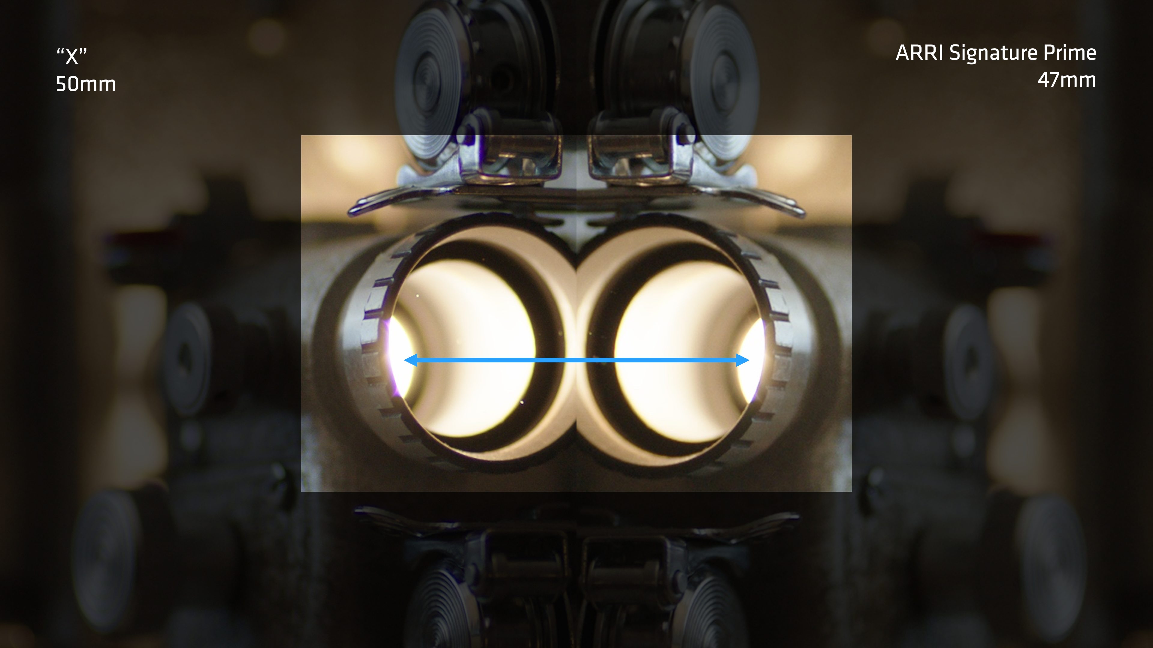
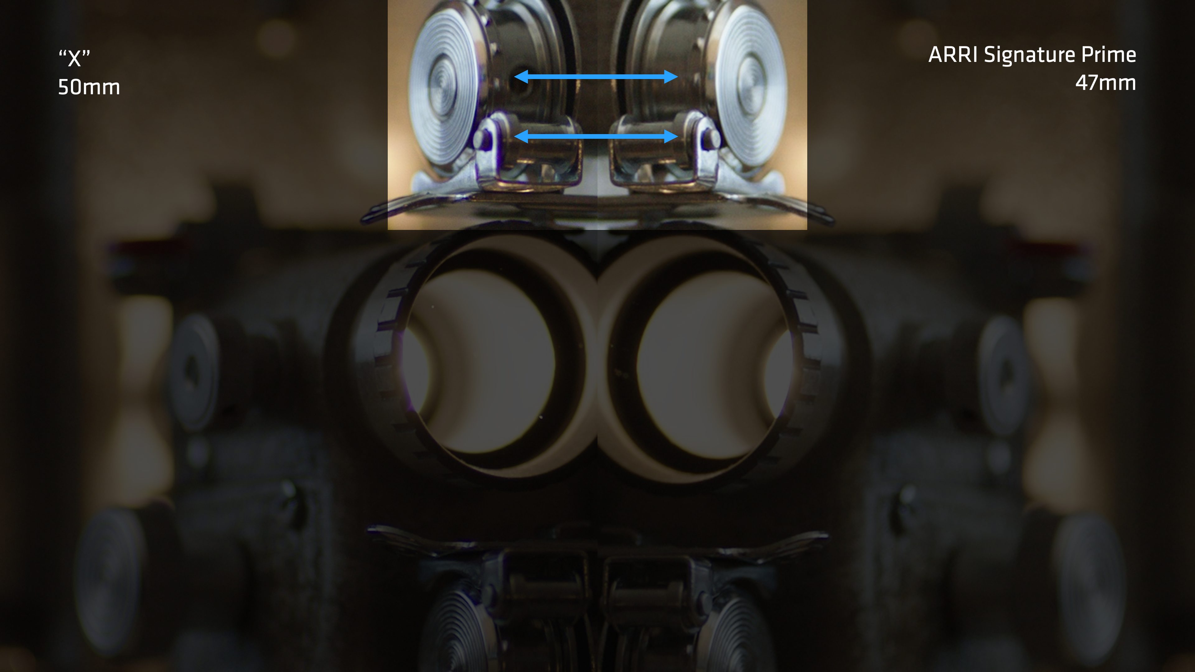
The images on the left have some chromatic aberration. I’ve learned to tune it out because many commonly-used lenses have it. The images on the right are devoid of noticeable chromatic aberration. When I first looked at these images, I knew something was different, but I couldn’t put my finger on what it was. It wasn’t until I looked at them side by side that I realized that the lack of chromatic aberration in the Signature lens caught my (subconscious) attention.
This is a chart designed to tease chromatic aberration out of lenses. We can see this clearly if we throw the lenses slightly out of focus, either forward or backward.
The lens on the left is a common lens, and it has a lot of chromatic aberration. The Signature Prime on the right has significantly less, and when we see it, the colors are warm and cool. That’s because it is not yet possible to eliminate spherical aberration in a lens, and warm and cool are hues we see naturally all around us. Cyan and magenta light only appears in artificial environments, and those hues draw a lot of attention in natural environments. On the rare occasion that chromatic aberration becomes slightly visible in a Signature lens, you will likely not notice it because the hues are natural.
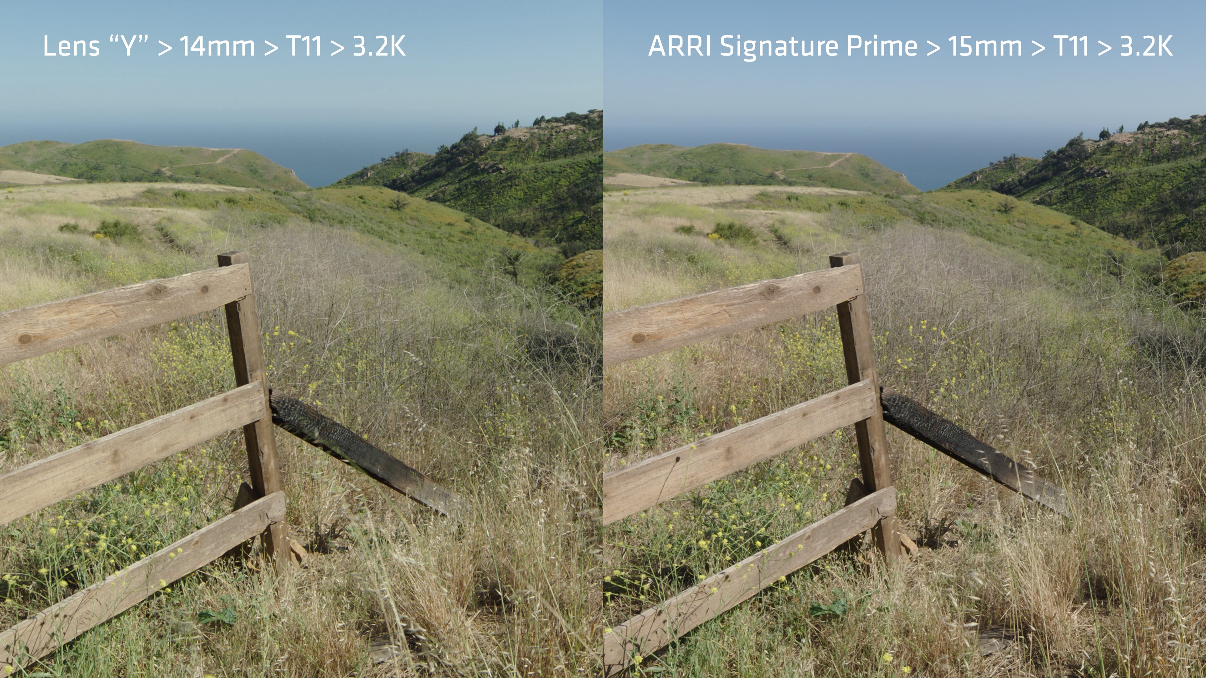
Lenses “X” and “Y” show lenses that are very neutral to slightly cool. They are older lenses that likely contain some leaded glass elements. Leaded glass solves a lot of chromatic aberration issues while remaining neutral in color. It is a key glass component in vintage lenses, however most of the world prohibits the manufacture of leaded glass for both environmental and health reasons. (The process generates toxic waste that must be handled properly.) ARRI chose a different glass that serves the same purpose, is not toxic to manufacture, and has a slight amber tint that makes flesh tone “pop.” You can see the warmth on the gray asphalt and in the sky.
Note: ARRI cameras have a reputation for slightly greenish/yellowish white balance presets. When we set those, we have to put a lens on the camera or we’re not going to see much. Lenses have color. The reference lens for all of our cameras prior to the ALEXA 35 was a mid-range ARRI Ultra Prime, which has a neutral-to-slightly-cool hue. Because of this, a warm lens on an ARRI camera sometimes looked a little too yellow.
As we’ve discontinued manufacture of ARRI Ultra Primes (after 20+ years), we chose to switch to a mid-range ARRI Signature Prime as our white balance reference lens. As those are slightly warm already, warm lenses no longer look yellowish at white balance presets on ALEXA 35.
Wide lenses typically show some barrel distortion, but not here. All the lines on this 15 mm ARRI Signature Prime are straight. I like this look a lot. It’s cool without screaming, “I’m a wide lens!” It’s simply a different (and rare) perspective.
Long lenses tend to show some pincushion distortion, but not this 280 mm Signature Prime. What interests me about this image is that I see something new every time I look at it.
OKAY, NOW LET’S MESS IT UP
These lenses are optical masterpieces. While the lenses themselves aren’t fragile, their look is: it’s very easy to bend it in any number of different directions.
By adding a single optical element to the back of these lenses, I can completely change their look in some very specific ways. For example, this lens:
Can also look like this:
…or even like this:
And I can do this very quickly on-set.
In part two, we’ll “build” a vintage lens that works for the long-term future of digital cinematography, and learn a fair bit about how vintage lenses work because we can now take the “vintage” out of a lens and see the differences. Look for it on July 9th, here on ProVideo Coalition.
To see more projects shot on Signature lenses, please visit the ARRI Signature Lens Showcase.
Art Adams is the product specialist for cinema lenses at ARRI Americas. He freelanced in the film industry for 32 years. For 27 of those years he was a cinematographer. He works out of the ARRI office in Burbank, California.

Filmtools
Filmmakers go-to destination for pre-production, production & post production equipment!
Shop Now


