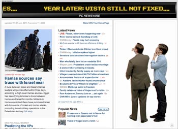
Hurry: go to CNN’s home page, look for the Mac/PC ad on the right, and click on “Click to play with sound.” Then keep your eye on the ad to the right, as well as the banner ad that goes along the top of the page. The two ads are coordinated, with the characters in the ad on the right commentating on the animated banner ad above them.
I constantly rail about how clients just slap an ad intended for one medium into another, very different medium without modification. This is a case of an adaptation of a television ad that really takes advantage of a different medium: a web page. Kudos to the creatives who thought that up (whether you’re an Apple fan or not).
Just like multiscreen video projections are a real fun project for motion graphics designers, maybe multi-panel web ad or graphic design will prove to be a new outlet for us as well. You don’t get to do it too often, but when you do, take advantage of the space!


