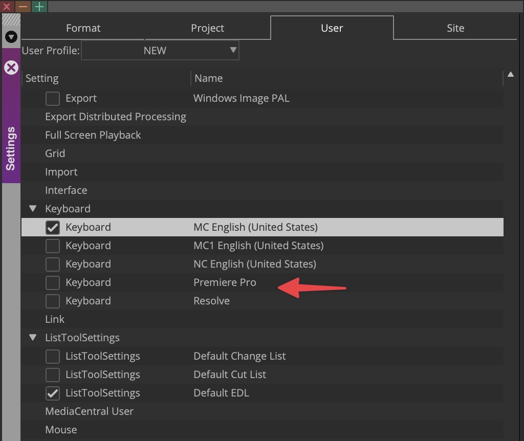
The venerable Avid Media Composer recently updated to version 2022.7. This in and of itself might not be big news and I don’t always cover every NLE release as there are so many of them (and it depends on what I’m working in at the time TBH). But this Media Composer release had one addition that I thought was quite surprising.
That is the addition of Premiere Pro and Resolve keyboard mappings as an option in addition to the Media Composer defaults.

On the surface, this wouldn’t seem unusual as other non-linear editing applications have long included default mappings for competing NLEs but this is the first time Avid has done so. It stood to reason back in the day that Final Cut Pro Classic was trying to woo editors from Avid and Adobe Premiere Pro has always tried to lure in editors from Avid and FCP.
But this has never been a thing in the Avid world so I was surprised to see this. It’s also the first time I remember seeing Resolve as a competitor keyboard shortcut option. 🤔
I was curious so I fired up Media Composer to see what these shortcuts looked like as Avid kinda by its very design isn’t really a “tool” based editor. Meaning you often work in different modes and you don’t have a lot of tools like you do in Premiere that get keyboard shortcut. If you want to slip a clip you don’t grab a slip tool and drag but rather you enter Trim Mode and do a slip trim which is a far more effective way to do it anyway since you can play the media and not drag. But I digress.
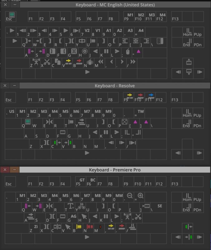
Here’s the Media Composer default keyboard.
I have always thought that this keyboard layout was a thing of beauty. It was well thought out with what an editor has to do for much of an editing job which is watching media, making edits and then finessing the story. It was designed with two hands on the keyboard, the right doing a lot of playing of media with the JKL keys and the left marking and modifying IN and OUT points. I’ve always found this base idea to be the best for craft/creative editorial so I’ve made it my base keyboard layout as best I can in other NLEs. This was outlined years ago in my Keyboard Manifesto.
Of course, we do live in a drag-and-drop era when many editors have never bothered to learn about proper Source/Record 3-point editing and they just drag everything they need right into the timeline. God help them. That isn’t a way that Avid was ever meant to work.
Compare the MC default above to Avid’s new Adobe Premiere Pro keyboard layout.
While you might not understand all those Avid symbols you can get an idea of the difference. I think the folks at Avid have done an admirable job trying to put a square peg in a round hole though I don’t understand why Render Effect is on the “]” key since they could have put Avid’s audio volume adjustment on the [ and ] keys to match PPro.
But this is a tricky place to put yourself in. See the – and + magnifying glasses on the – and = keys? That matches Zoom In and Zoom Out on the Premiere keyboard. And when you’re working in the PPro timeline it does what you’d expect it to do in zooming the timeline. But in Avid those keys are for Reduce/Enlarge.
That doesn’t reduce or enlarge the zoom level of the timeline but rather zooms in or out on the image in the Record window. That’s for sure useful when you’re working on positioning a graphic or drawing a matte but I don’t think that’s the behavior a PPro editor is going to expect. Zooming the timeline is still CMD+[ and ] (CTRL on a PC I think) as it always has been by default.
And here’s the new DaVinci Resolve layout.
First of all, I was quite surprised to see Resolve as a keyboard option. I’m not sure if this says more about a worry of Avid people moving to Resolve or if Avid has seen an influx of people wanting to move from Resolve.
Looking at the TW on the = key, that’s for the Timecode Window. Press the = while in the Resolve keyboard layout in Avid and the timecode window will open. Actually in Resolve hitting the = doesn’t open a timecode window but rather takes you to the timecode entry field of the Resolve Timeline Viewer. That allows for manual timecode entry and the +/- navigation by timecode. While you can +/- navigate by timecode increments in Resolve you have to hit that = for manual timecode entry to jump to a specific time. In Avid you can just type the timecode value so Resolve users will rejoice at that as it’s quite nice.
Overall since Resolve uses a similar mode-based way of working as Avid does it might be an easier keyboard adaptation. I’ll have to use it more to make a judgment.
This is just a couple of the tricky places a software designer might find themselves in when trying to adapt one NLE keyboard to another. NLE designers can feel free to hire me as a consultant to help with this. 😉
These new to Avid keyboard layouts aren’t the only new features in this update to Media Composer, it’s just the ones that caught my eye. There are a lot of bug fixes.
Here are the bullet points of this release with details available here on the What’s New for Avid® MediaComposer® v2022.7 pdf:
- New Match Frame Results for Group and MultiGroup Subclips
- Custom Workspaces for Multiple Monitor Configurations
- New Keyboard Mapping Options for Adobe Premiere Pro and DaVinci Resolve
- Text Justification Relative to Anchor Point in Titler+
- Select Filler with Segment Tools Added to the Timeline Menu
- Timeline Clip Notes Display for Nested Clips
- New Enablers with Improved Design
The Avid Knowledge Base is the place to read over recent updates including this v2022.7 release as well as the 2022.4. Avid’s great about putting out What’s New videos so hopefully we’ll get one of those for 2022.7 soon.


