In the main article, we discussed some of the more interesting design topics brought up during the 1999 BDA Conference in San Francisco. In this companion post, we focus on nine studios that particularly caught our eye.
Belief
USA Network Redesign
USA Networks

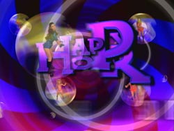


Belief was hired to create a package of open, bumpers, promo elements, end pages and various logo treatments for several USA programs, such as Pacific Blue, Happy Hour, USA Movie and Matinee, Up All Night, and La Femme Nikita. Steve Kazanjian comments “We like clients that trust our visual style and will let us run wild. The perfect client says these are the parameters, build me something cool, and USA is very much like that. They guide the process of creation versus micro-managing it. This allows the artist working on the spot the most creative freedom.”
What draws us personally to Belief’s work is the layered use of plug-in effects, that are manipulated in thoughtful ways to create a deeper visual effect, rather than just appearing as pasted-on special effects.
Brian Diecks
Sports Center
ESPN International
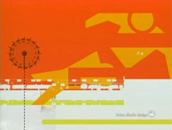
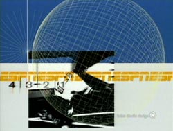
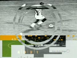
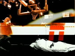
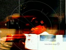
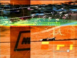
“The format of the footage that we were given was all over the place. From low-quality VHS to amazing film. My choice was to make all the clips look consistent” reveals designer Brian Diecks about these multiple award winning spots. “We gave everything a grainy feel so the diminished quality looked intentional and everything was on an even keel. Any color that occurred in the clips, was exaggerated and pumped up.” Numerous illustrative elements were then added, with a frantic editing pace. “We integrated photographic, scanned and xeroxed type, newspaper and various paper elements with footage. These imperfect pieces, combined with 3D wireframes, brought out the intensity of the competition.”
Digital Kitchen
Digital Cinema Sound
Sony
“Without a doubt, this piece validates the desktop platform as a development tool” states Paul Matthaeus, founder of Digital Kitchen . “This project was rendered at both Academy and Cinemascope resolutions, and mastered to film for the big screen. Rendering was done on a Macintosh computer, running After Effects. Only at the very end was the sequence dumped to an Inferno for final film-out.”
The purpose is to demonstrate the power of Sony’s new cinema sound system – something that does not immediately bring images to mind. And neither should the visuals detract from the sound. “Initially, the agency came to us wanting a very understated, white-type-on-black-background treatment. As we got into it, we found an opportunity to have the typography contribute quite a bit more to the experience, but still, not necessarily upstaging the bigger-than-god texture and dynamics of the sound.”
Giant Octopus
Local News Designs
KGMB, WBNS and WCHS
Local television stations face a challenge, and an opportunity. They cannot lower theirs standards just because they are a “local market”, with cable, viewers anywhere can see sophisticated broadcast designs such as MTV, ESPN, CNN, and MSNBC. But they can raise above the noise by clearly localizing their look to that of their community.
Florida’s Giant Octopus was one the leaders in designs that answered both these issues. Their award-winning spots for Hawaiian broadcaster KGMB utilized 35mm shoots of 250 gallon tanks filled with sand, water, and the station’s logo, later combined with CGI. Their Gold award winning graphics for Columbus, Ohio station WBNS included DigiBeta backgrounds of fabric and lighting, 35mm film skyline shots, and additional effects created in ElectricImage and After Effects. Most recently, they completed an all-CGI look for WCHS, again using ElectricImage.
H-Gun Labs
Drag, Helter Skelter ’97
MTV, Meat Beat Manifesto
These two Gold-award-winning clips from last year show that an idea and a camera (or 40 of them) can be just as compelling as any computer-generator imagery. For “Drag”, a large MTV M2 steel logo was built and later dragged from behind a speeding pick up truck throughout the urban streets of Chicago and its many steel bridges. “On its journey, the logo picks up garbage, splashes through puddles, carries rocks, jumps, and jives.” As simple as it is, you can’t help but watch it.
For the music video to Meat Beat Manifesto’s “Helter Skelter ’97”, H-Gun Labs explored a technique they call “360 degree dead time filming” which is similar to the “view morph” concept so many use today. 40 Nikon F-4s were remote triggered, with the resulting stills blended together to create motion. “Ultimately, this was equally as much a live action piece as it was an animation piece,” notes H-Gun’s Jim Deloye.
L.inc Design
“Leading Edge”
CNET
We’re personally drawn to L.inc’s work for its strong illustrative influence. In addition to numerous BDA awards, founder Lisa Berghout of L.inc Design has also won two Type Directors Club Awards. This project shows these influences, and uses the common high-end technique of having compositors creating numerous interesting source “shots” that are later edited together into a final spot. “The entire show package was initially designed in Photoshop,” notes Berghout. “350 stills were shot and imported into After Effects. Sixteen scenes were animated, for a total of 3.5 minutes of animation. This ‘source footage’ was then edited in an Avid to create the 15 second open and bumpers.”
Reality Check
“NFL Today”
CBS Sports
“8 weeks, new technology, new software, and a new design; an overwhelming task” is how CBS Sports Technology and Production Consultant Linda Rheinstein described it. Reality Check created hundreds of graphic elements in two months. The CGI-heavy main elements, such as the show opens, were animated and rendered using Play’s ElectricImage on Macintoshes. Other elements, such as animated score updates and other live on-screen graphics, were built to run in real time using Peak Everest running on Silicon Graphics Onyx 2s. Co-founder Kory Jones explained, “The SGI’s and Peak Everest integrated seamlessly into our production environment. We were able to use all of our existing infrastructure to create these graphics.”
Toast
“In Flight Panic”
MTV Asia
A fretting claymation passenger grabs the safety card out of the seat back in front of him for reassurance, only to hallucinate and see the drawings animate out “varying horrific scenarios of an airline disaster.” Deciding relaxation is the best solution, he straps on his CD player – which disables the airplane’s navigation system in the process. A gutsy spot, given that Singapore Airlines is one of MTV Asia’s major sponsors, that connects with the intended young audience because of its irreverance. Originally conceived (and budgeted) as a ten second spot, the artists (Silas Hickey and Kym Sansovini of Toast) survived often long-distance exchanges and management of some 3000 files (the master of which got scrambled by the post house), 16-18 hour days, and the project blossoming to over a minute in length, to win a World Class award.
Velvet
History
ProSieben
This spot by Velvet is one of our personal favorites. It takes the currently popular look of lots of glow, blurs, stretched lines, ornamental type and layers of small images, and transports it into an abstract 3D world by mapping layers of these images onto planes in a cube. There are multiple scene cuts, with fast, jerky camera moves interspersed with lingering shots – an invigorating break from the temptation so many 3D animators succumb to using one, long, smooth camera move.


