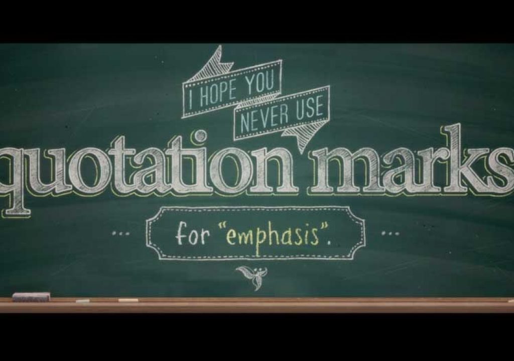
On Tuesday, July 15th, the most shared video on YouTube and Facebook was “Weird Al” Yankovic’s “Word Crimes,” a parody of Robin Thicke’s popular “Blurred Lines” single. With more than 12 million YouTube views and climbing, the song is both clever and catchy. But what really brings it to life is the video’s impressive typographic animation. Jarrett Heather, a software developer with the California Department of Food and Agriculture, spent 500 hours over three months working with Al Yankovic on the project, which relies heavily on Adobe After Effects, Photoshop, and Illustrator.
Adobe: How did you get involved with this project?
Heather: One day last November I opened my email, and there was a message from Al Yankovic. He had seen the “Shop Vac” video I created a few years ago and wanted to know if I’d be interested in a directing gig. I wrote back right away and let him know that I’d be honored to work on the project. He was still in the conceptual phase with the song, so I didn’t get the specs and lyrics until the first week in January.
Shop Vac from Jarrett Heather on Vimeo.
Adobe: How did you get started?
Heather: In early January Al cut a demo together, which I used to create the animatic. I thought I would just get a click track with vocals tapped in, but it is a fully produced demo, with six or seven vocal tracks. After Effects was my canvas for designing the entire animatic. I pulled in clip art from the web, put the assets together in Photoshop, and just brought them in and started working.
Animatic from Jarrett Heather on Vimeo.
Adobe: What type of direction did “Weird Al” Yankovic give you for the visuals?
Heather: At the start of the project he had a long list of specific visual ideas he wanted to see me try out. One thing I was grateful for is that he decided that the whole rap section should be done on a chalkboard; I love how it turned out. But some ideas didn’t jive with my vision for the video and he was really respectful of that fact. Overall, he was wonderful to work with.
Adobe: How did you come up with the other ideas for the visuals?
Heather: I started by reading the lyrics and imagining the look of the video. I knew the concept would be a contrast between old media textbooks and encyclopedias against new media interfaces, applications, and sites. Basically, I created a visual argument between the past and the present, the grammar police and the grammar criminals. I also looked at the “Blurred Lines” video a lot. That’s the video we were parodying and I wanted to bring as much in from the original video as I could. You can see that in the color palette and hashtag typography.
Adobe: Can you tell us more about how you utilized After Effects?
Heather: I had to do a little pre-analysis on the song before I got started, because three minutes and 44 seconds is too much to fit into one project file. I decided what the different sections would be and broke it into chunks. I used the type tool in After Effects to put the type on the canvas and went from there. The design process went pretty quickly. Every day I would do a test render of an animatic and send it to Al and he would give me feedback on the jokes and designs right away.
Adobe: Did you take any unique approaches with the animation?
Heather: I’m not a professional animator, so nothing technically crazy is going on in the video. Other animators may actually want to look at how often things aren’t moving in the animation. That alone may set the style apart from other typography videos. You can’t really read type while it is moving and you can’t read it while the camera is moving. I had to be careful about how much animation I put into it.
Adobe: What other Adobe products did you use on the “Word Crimes” project?
Heather: Most of the art assets were created in Photoshop or directly in After Effects. I also used Illustrator now and then. The less or fewer signage in the video was an illustration I created in Illustrator. I also used Illustrator to trace over the computer interface in the tweet animation to make it nice and sharp. I also used Adobe Premiere Pro to edit the whole thing together and Adobe Media Encoder to encode the final video.
Adobe: Tell us about your job.
Heather: I got started in design putting websites together. My job is mainly designing user interfaces for software, integrating user interfaces into the back end of software, and creating iOS and desktop apps. I mostly create graphics for the web, so Photoshop is my bread and butter, and I get to work with Adobe Creative Cloud on a daily basis. I’m lucky because my job gives me lots of opportunity to be creative.
Adobe: What’s next for you?
Heather: All my life I’ve been curious and I’ve learned to do different things. It turns out I’m good at a lot of them, but I don’t have any formal training in the arts. I enjoy working on side projects but I’m pretty picky about what I take on. I’m really happy to see how successful the video has been for Al and I want to see his Mandatory Fun album succeed, but I’m not looking to quit my day job! The Internet is a pretty fast moving stream these days, so it won’t be long until everyone is on to the next thing.
Learn more about Adobe Creative Cloud

