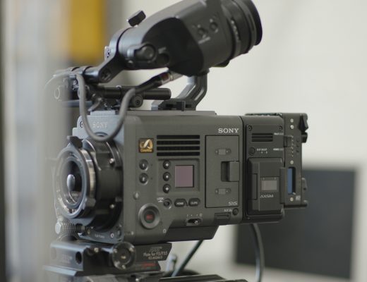
Rambus is a company of big ideas, and they wanted their 20th anniversary celebration to include a theatrical production that accurately reflected who they are and where they came from. The resulting short film–shown in an Omnimax dome at the San Jose Tech Museum–moved Rambus founders and employees to tears.
That’s a high compliment indeed for Santa Cruz-based production company Compass Rose Media, whose creative director’s vision left no room for dry eyes. “Think epic,” he said when we had our first conversation about the project. “It’s an epic corporate video, but on a budget.” “No problem” was my response. Stretching the visual dollar is a craft I’ve more than perfected over the years.
I’ve worked with Jono Schaferkotter on other Compass Rose projects, as well as on some spec spots and music videos. Jono has a great sense of style, and very early on he decided that the RED ONE was the only way to go. As the final deliverable was only 1.9k we could have shot on any number of cameras, but his feeling was that the 35mm feel of the RED, coupled with its high resolution (an effective 3.2k for a 1920×1080 finish), was the right look for a project whose stated goal was to be a modern corporate “epic.”
I completely agreed, given that oversampling always gives the impression of increased resolution–especially when the final project will be projected on a massive screen. Originally there was talk of releasing the project in Imax format but that proved to be cost prohibitive–the output to film alone ran $2 per foot!–so the final piece was projected 60′ across onto an Omnimax screen at 1920×1080 resolution.
Our camera package consisted of a RED ONE and a set of Zeiss Super Speeds from Chater Camera. Bret Allen of Gearnex loaned me a prototype Gearnex gear head,
Part of our epic “look” involved setting the camera to 4K HD mode and recording in variable speed mode at 30fps for a 23.98fps finish. 4K HD mode’s resolution is a multiple of 1920×1080 (3840×2160) and, in theory, yields sharper images with less processing time when shooting for 1080i delivery. Shooting off-speed at 30fps slowed everything down just enough to give movement a little more mass and drama.
I normally rate the RED at EI 160 to crush the shadow noise into the blacks. That was especially important for this project given the projection parameters. The RED ONE is the only camera I’ve worked with whose EI I can comfortably change to suit the look of the project, thanks to the fact that most of the image processing happens in post instead of in the camera’s digital signal processor (DSP) before recording.
The shoot took place over five days, with each day split between two locations. Not all locations made it into the final piece, so I’ll just cover the sequences that did.
First, let’s take a look at the finished project:
And now, the bonus behind-the-scenes featurette:
Most of the behind-the-scenes footage was shot with a Flip camera.
Compass Rose has graciously given me quite a lot of behind-the-scenes footage and stills. Let’s go through the production scene by scene, starting on the next page…
HERBST THEATER, SAN FRANCISCO
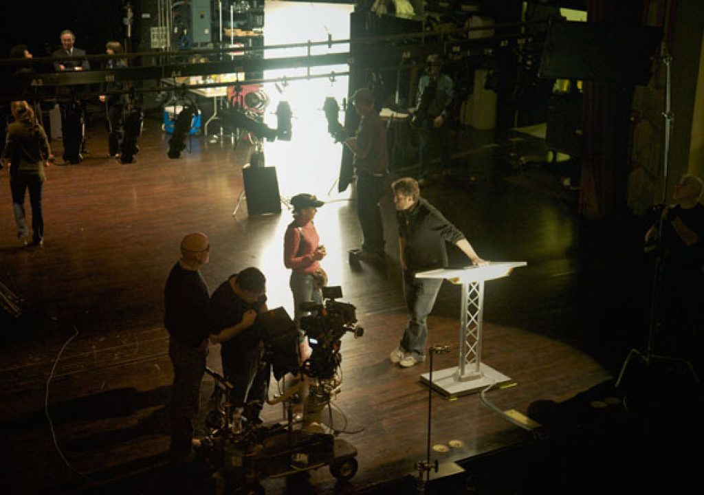
We recorded the opening shot of the piece on the third day of the shoot. The theater location had been a difficult one to find and lock, and my gaffer (Luke Seerveld) and I hadn’t been able to scout it. Of all of the locations scheduled, this was the one that gave us the most heartburn. Without looking at it first and formulating a plan we felt it was going to be difficult to get in, light, shoot, and get out on schedule if we had to light the entire location from scratch.
It turned out to be very, very easy, thanks to some help from the house stagehand, “Rhymes with golf” Rolf, who made our shooting experience very pleasant indeed.
The first thing we did was to look at the ambient illumination through the camera. With all the house lights on my spotmeter told me that we had a very good base light level at T1.3. Once we saw that we were able to relax a bit, as this allowed us to focus on little touches as opposed to lighting the entire space. I had a two person lighting/grip crew, plus a dolly grip for specific days when we had a Chapman PeeWee on the job, so whatever we did had to be simple.
Initially I’d thought of putting a bunch of lights–probably 1200w tungsten PAR “firestarters” (so-called because they will if you put something close enough, like a flag or a human head) and some Source 4 leikos–on the balcony. Putting all those lights in one place would have made them easy to power, and it should have been fairly simple to pan them around and sketch out parts of the theater. When I actually looked at the theater, though, it became clear that lighting from the balcony would not do much for the beautiful red seats: backlighting them might have revealed their presence but would have done little to show off their richness, which was one of the reasons this location had been chosen. It became clear that front light was necessary to bring out the plush red seats.
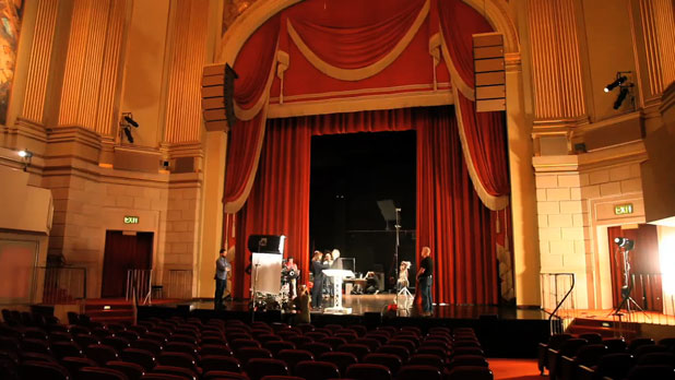
We put our theater lights on either side of the stage, out of the shot, and created some pools of light that washed across the front of the seats. At first we created symmetrical washes, lighting left and right in even sections, but that didn’t really work artistically. We took Rolf up on his offer to light the balcony symmetrically by repurposing some wall-mounted stage lights, but the lower level looked better with “random” washes of light from Source 4 leikos placed on the stage itself.
I’d envisioned the podium lit by a spotlight of some sort, but once I saw that the podium was made of translucent plastic I had another idea. If we’d been able to add a light haze of smoke to the theater I’d have stuck with the spotlight idea as the shaft of light it created would have been spectacular, but as we weren’t allowed to use smoke it made more sense to put lights on the podium itself. I asked Luke to put two 2′ Kino Flo tubes underneath the top of the podium, turning the frosted surface of the podium into a large light source. (I love putting lights in the shot. It not only looks good but saves time because we have to hide fewer lights.)
We put a 4’x8′ bounce card horizontally on the floor to the left of the dolly track to add a little bit of fill.
As a last touch, Rolf re-aimed a high stage light on frame left to rake across the podium, giving our talent a light to walk into as he approaches the podium. This light also worked as a backlight for our other angles. In this sequence of stills you can see the talent gradually walk into that hard sidelight as he approaches the podium:
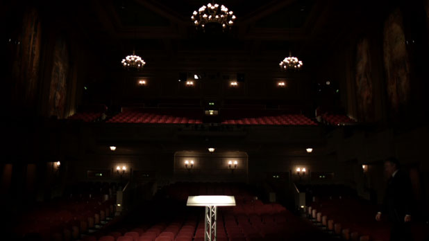
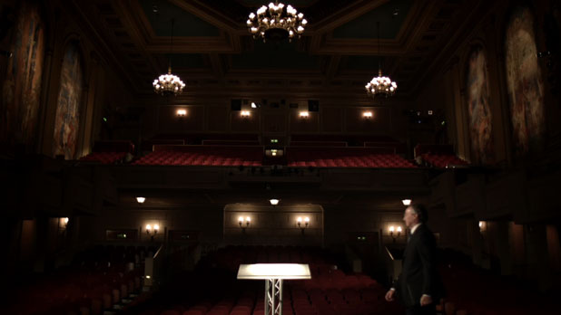
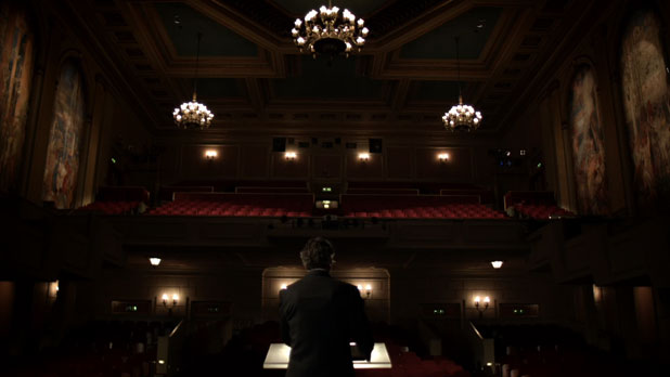
As the camera dollied toward the podium, Luke gave Rolf a voice cue to bring up the house lights, revealing the expanse of the theater.
This next shot is one of my favorites:
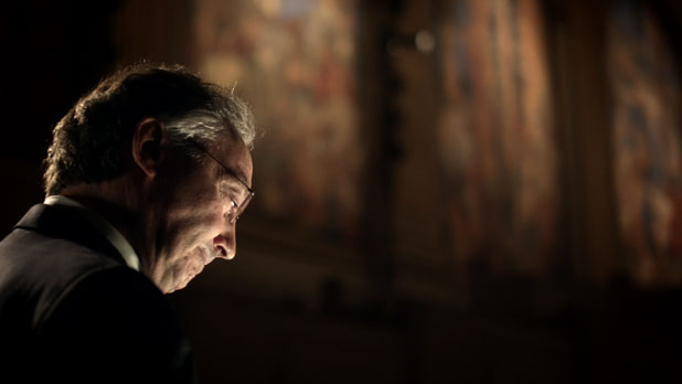
I used the GearNex gear head for all of the shots in the theater. It gave shots like this one a wonderfully smooth feel. We didn’t change any of the lighting between this shot and the last one.
While we’re here, let’s jump to the last shots of the piece, as they were shot at the same time as the opening shots:
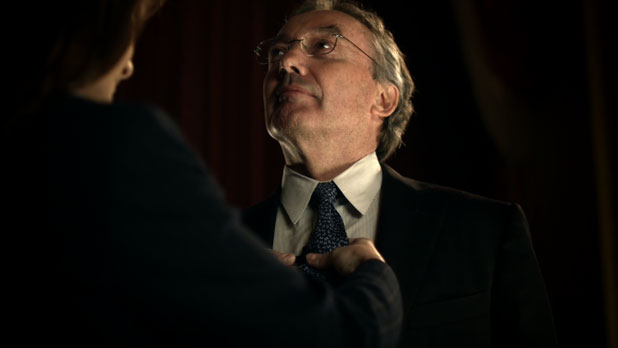
And here’s the lighting setup, from the behind-the-scenes film:
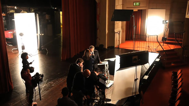
The Kino Flo is filling from the key side. The podium light was a bit too stark and contrasty on its own, so the Kino Flo lowers the contrast a little and wraps nicely around the talent’s face.
The bounce card on frame right is casting soft light across the front of the curtains, as well as giving the talent a little hint of edge light. The vertical bounce card on the left is casting a shine onto the left side of the talent’s face. Skin is shiny, and rather than hitting it with a hard edge light it’s often prettier and more interesting to reflect a large source in it. That’s why the card is vertical: it’s reflecting in the vertical plane that is the talent’s face. As reflections follow the physics of “angle in = angle out,” a taller source means that the shine will be visible from a greater number of angles–important in a shot that booms upwards and changes the relationship between the angle in/angle out of the light and the camera lens. (We originally tried a boom-up shot but I think we settled on a simple tilt.)
The flag is keeping the talent’s backlight (one of the stage lights rigged on a truss above the far right bounce card) from flaring the lens. One of the hallmarks of a great grip (in this case, key grip Jeff Nealon) is that flags like this appear before I have a chance to ask for them.
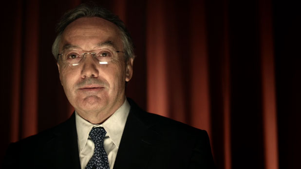
The final shot is lit with many of the same lights, only reconfigured a bit. The Kino Flo is now in front of the podium and over the lens, and the light aimed into the bounce card to the right of frame has been panned to rake directly across the curtains.
This was the first time I’d shot the RED under tungsten light without any filtration, and I’m pretty happy with the results.
By the way, that final shot–with the talent’s audio–was the only shot in this entire piece done at 23.98fps. All else was shot at variable speed 30fps for 23.98fps playback.
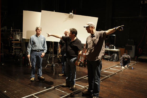
The key to working successfully with a gaffer is to learn strong communication skills.
Travel with us now to the next location, the BBC, on the next page…
THE BRITISH BANKERS CLUB, MENLO PARK
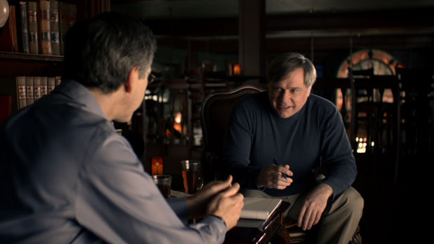
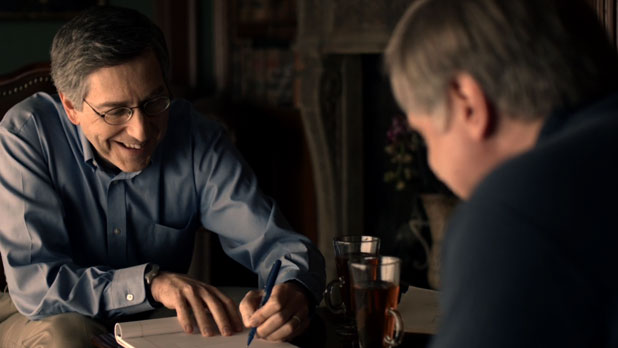
This was a fairly simple lighting setup:
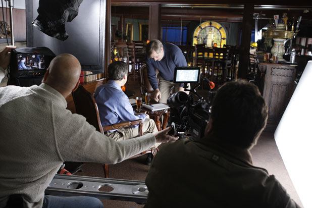
The flag at top left keeps hard light from the HMI’s lens from spilling into the shot. Before rolling I always stand in the middle of the set, on the talent’s mark, and look around for light sources that shouldn’t be there. HMI lenses frequently leak hard light through barn doors, and occasionally a shiny barn door will act like a mirror, reflecting light from the lens into the shot.
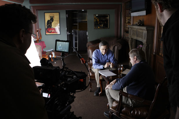
Our talent consisted almost entirely of company executives with busy schedules, so the trick was always to get the lighting in place before they arrived and then change it as little as possible while shooting, in order to maximize our coverage options. If most of the lighting stays the same, and all that’s left is moving the camera around and adding a little fill for closeups, it’s possible to get a lot done in a very short amount of time.
In this case most of our lighting comes from a 4’x8′ bounce card, sitting horizontally on the floor, to sidelight the upstairs lounge of this restaurant/bar. Placed about 6′-8′ away from the talent, the 4’x8′ source wrapped nicely around their faces. No fill was necessary.
This entire setup was lit with HMI’s. I think we have an 800w Joker bouncing into the 4’x8′ card, with another HMI PAR bouncing into a 4’x4′ card around the corner to light the background. (You can see its effects on the pillar behind the blond gentleman.) There’s also a PAR off to the right augmenting the background ambience and bringing the back wall up a bit in exposure.
As this setup was on the second floor of a building that had no elevator, and given that I had a grip/electric crew of two for the day with no dolly grip, I pitched Jono on the idea of using a small 4′ slider for our dolly moves. By mounting it between two apple boxes I was able to do some very long, slow and smooth moves in a cramped space without forcing my small crew to carry a heavy dolly upstairs. It worked out very, very well.
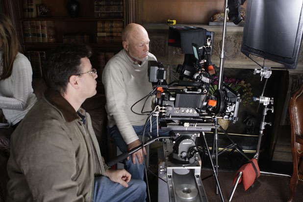
Sliders are designed for short, super smooth moves on small tabletop shots, but they work well in cases where the budget or the location decide against the use of a normal dolly. I’m not sure who made this slider but this page gives you a better idea of what they look like.
Originally I exposed this shot at EI 160, but with the camera set to EI 320. I’d discovered a while back that setting the camera to EI 160 yielded an image that looked too dark on the monitor, and while the RED is not a WYSIWYG camera most clients tend to treat it that way. By leaving the meta data EI set to 320 and overexposing the image, the monitor image looked okay although the highlights were a little toasty and were meant to be fixed in post.
Here’s the original exposure:
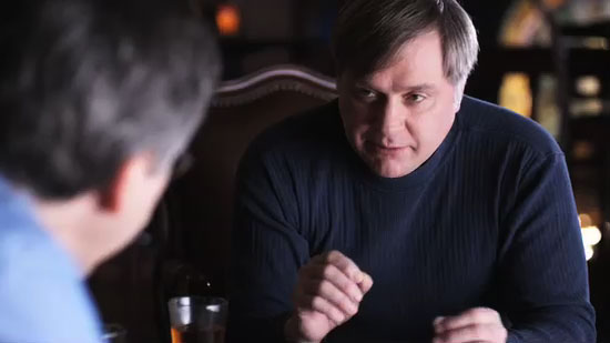
And here’s the color graded shot:
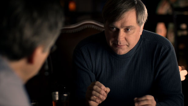
(This still is a little darker than it is in the video. I think there was some sort of color or gamma shift when converting YUV video into an RGB still.)
Later on in the shoot I figured out how to work around this exposure issue, with a little help from my friends. More on that shortly.
RAMBUS CUBICLE FARM, PALO ALTO
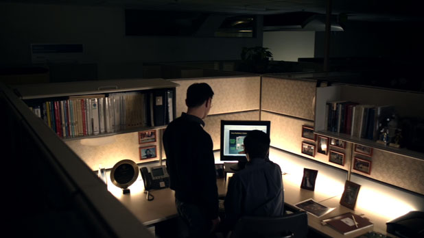
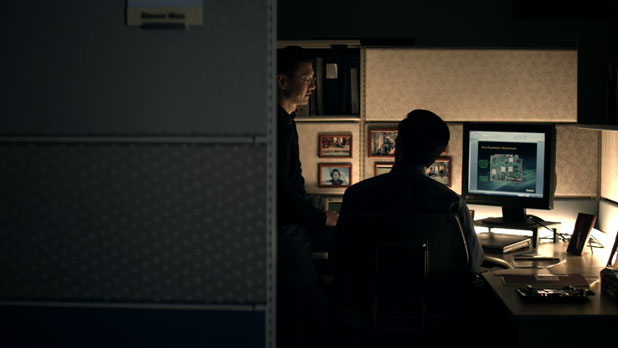
Cubicles can be a bit dull, so I decided to try something new in lighting this one: we laid Kino Flo tubes along the back edge of the cubicle wall and left them in the shot. The traditional way to light a cubicle is to poke lights over the walls, but that felt a bit boring to me. This project was not served by simple illumination. It had to look cool as well.
I love leaving lights in the shot when it’s appropriate. We save a lot of time by not having to hide them anywhere, and they give the shot a cutting edge look. You’d never be able to work in a cubicle lit this way, but it looks great onscreen.
The light in the back hallway is one of ours, and we created little pools of light in distant cubicles that aren’t seen in this particular take. I don’t think we’re using any fill other than some cool 5600k light on the outside wall with the nameplate.
I shot this scene with a Schneider 1/2 CTB filter, to correct the raw tungsten light halfway to daylight for better skin tone and color rendition. By splitting the difference between tungsten and daylight, and using both kinds of light in the shot, I’ve found I can create a pleasing warm/cool contrast very quickly.
We did some closeups of one of these two gentleman that can be seen in the behind-the-scenes video but that aren’t in this edit. I believe his closeup will be used in a series of spots that are currently being cut from this project’s raw footage.
Our next meeting is in the conference room, just down the hall…
RAMBUS CONFERENCE ROOM, PALO ALTO
We spent a morning shooting circuit boards, which tend to be fairly easy to light. We used a 4’x4′ frame of Lee 216 as our light source and put an 800w PAR through the back of it. If we’d wanted deep depth of field we would have needed a lot more light, but we were good with the “shallow focus” look.
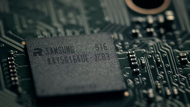
The trick with this kind of product shot is to create a nice broad light source that reflects in the shiny surfaces without eliminating all the shadows. The highlights and shadows combine to delineate the fine detail, so by creating a source that’s wide but not very tall it’s fairly easy to create nice long shiny highlights without washing out the shadows.
These shots were done either by simply panning and tilting on a tripod or by using a P+S Technik Skater Dolly:
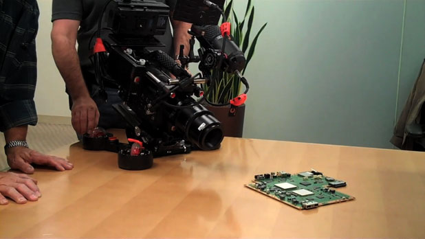
Ling up a shot, before lighting, just to test the Skater Dolly and our 100mm Zeiss Macro.
The Skater Dolly does very smooth moves but doesn’t do repeatable arcs very well. The wheels drift a little from take to take. For that reason I’d often do the shots in reverse: the beginning of the shot wasn’t as important as the end frame, so I’d line up the final frame of the shot and then roll away from it to the beginning mark. When reversed in post the camera lands perfectly on the end frame every time.
For example, here’s a behind-the-scenes clip of a shot that didn’t make it into the final piece:
We used a 100mm Zeiss Macro for all of our tabletop shots. The shooting stop was probably about T8.
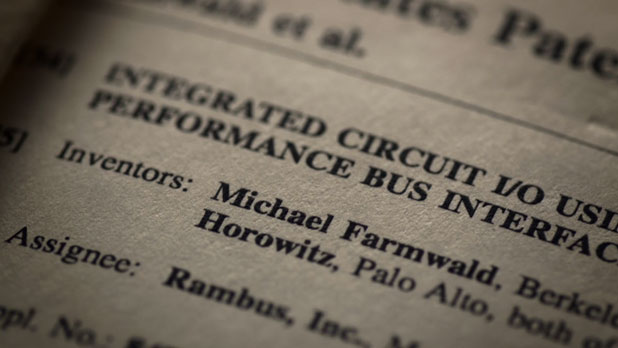
For this shot I simply tilted down the page while my assistant followed focus by watching a monitor. This shot is lit by the same soft light source as the previous shots, but notice how the paper’s texture is so beautifully rendered. By limited the height of the diffused light source, and placing the page at the right angle, I can easily emphasize the paper’s subtle texture.
Here’s the setup:
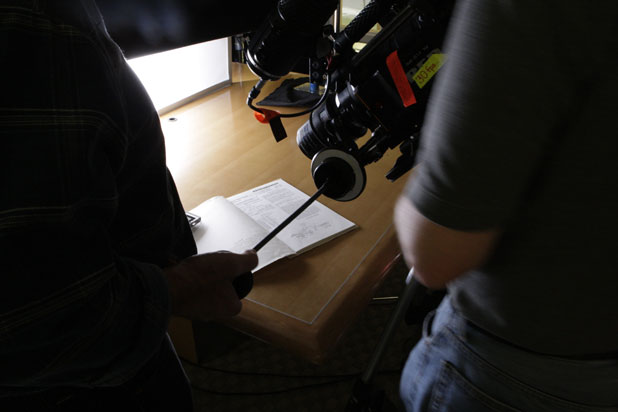
Notice how I’m using a 4’x4′ frame of diffusion, but there’s a flag in front of it that’s limiting the height of the source to 8″ or so. The light source’s large horizontal size allows it to wrap softly around horizontal objects, like the creased pages of the book, while the smaller vertical size of the light source casts shadows across vertical objects, like the texture of the paper.
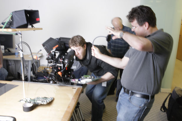
Always treat the director with the utmost respect.
VENTURE CAPITAL OFFICE, PALO ALTO
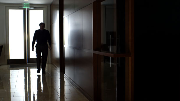
I hated this location, and I think this sequence turned out okay but not great. We spent a lot of time blowing out that window in order to mask the pouring rain outside. There’s a 12’x12′ gryfflon along with a couple of 4’x8′ bounce cards outside that door, lit by a couple of small HMI PAR’s. I do love the reflection in the wall. argh.
Some locations just aren’t pretty or conducive to pretty lighting, especially when you’re working fast with limited resources.
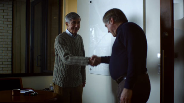
We lit this with a 1200w HMI PAR aimed into a 4’x4′ bounce card outside a window on frame left. It worked okay. I spent very little time on this setup as we had to have the hallway lit at the same time and that was the harder setup.
This was another situation where we weren’t able to scout in advance. It’s always nice to see a location and then have a day or so to run through strategies mentally.
We’re late for another meeting, so let’s head back to the conference room…
RAMBUS CONFERENCE ROOM, PALO ALTO
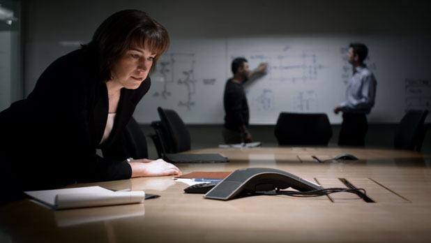
This was a fun setup. This is the same location where we shot the circuit boards. The background is lit by a 4’x4 tube Kino Flo, bulbed for 4300k, hung from the ceiling in front of the white board. I opted to cool the background down, as it seemed more interesting to make the white board a different color than white, and it helped to “pop” the person in the foreground by contrasting her warm flesh tones against a cool background.
There are two 1k fresnels aimed straight down into the conference table. A long time ago I discovered that the fastest, prettiest way to light an otherwise dull conference room was to bounce light off the table surface itself, as the light radiating upward created very interesting soft modeling on faces. In this case it beautifully lights the woman as she leans down to speak into the phone. We added a little fill from a Kino Flo out of frame to the right.
Bounced light from below the lens feels very much like “ambient” light to me, and I use it in a lot of situations where I don’t want the environment to seem lit.
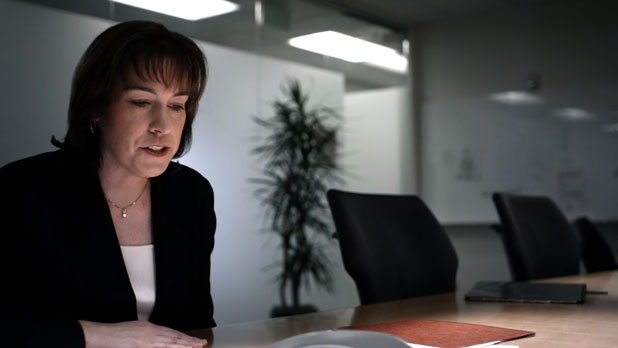
The dolly move was done on the Skater Dolly. We didn’t have a real dolly in the budget that day so I proposed making the Skater Dolly do double duty. I love how the lens is so close to the table.
Remember how I said that shiny barn doors can act like mirrors and reflect hard light onto the set? That’s what all that black wrap is there to prevent.
For this shot we placed some daylight-bulbed Kino Flos outside the window and turned on one bulb each, just to add a blue glow to the background and give the glass wall some additional depth. We probably covered them with diffusion as well. Kino Flo bulbs are very bright to look at, so usually less is more.
The ceiling fluorescents in the hallways are uncorrected office lights.
For this sequence I used a trick that I learned from fellow DP Graham Futerfas, who I know through the Cinematography Mailing List. I mentioned earlier that I rated the RED ONE at EI 160 but kept the camera set at EI 320 to keep the output from looking too dark. Graham told me that he goes into the RED’s Video>Color>Exposure option and tweaks the Exposure value to match the raw image, because the RED’s raw mode is roughly EI 160 when judged by placing an 18% gray card exposure in the middle of the histogram. By toggling between raw and REDspace while adjusting the Exposure value, I found that an Exposure setting of -.4 gave me that match. (This value appears to have changed in later software builds.)
I ended up being able to expose at my desired EI while providing the client with an image that looked brighter than if I set the camera to EI 160, with the added advantage of providing the colorist with meta data that showed them the intended exposure.
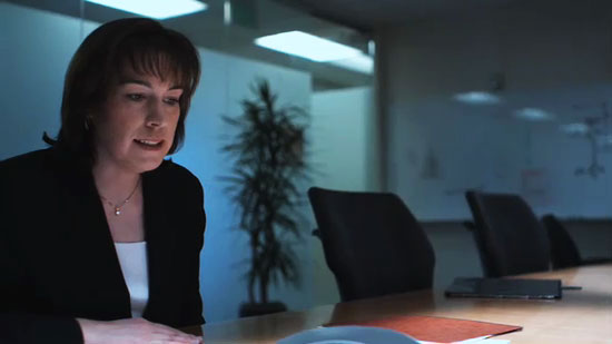
The original exposure: camera is set to EI 320 but with the Exposure meta tag set to -.4 to reduce brightness in the output image.

The final grade.
The most interesting thing about this technique is that the image looks really, really smooth.
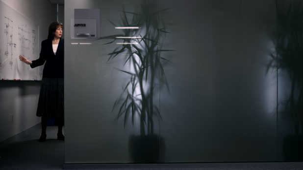
This shot was lit with a floor-mounted 4’x4 tube Kino Flo inside the room lighting the talent, plus our blue colored Kino Flos were moved inside to silhouette plants against the frosted windows.
I used a Tiffen 80D Hot Mirror filter for this entire sequence, which corrected the tungsten light halfway to daylight, or 4300k. I wanted smooth, beautiful flesh tones, so reducing the red channel kept them from looking pasty while boosting the blue channel increased its exposure and reduced noise.
Fly with me to China, on the next page…
HILLER AVIATION MUSEUM, SAN CARLOS
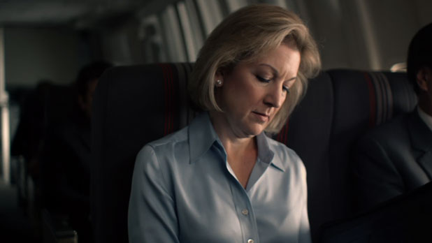
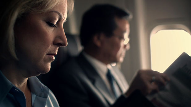
Originally we were going to try to shoot some airport travel scenes at San Francisco Airport but the logistics of getting in and out proved too great. We had a half day scheduled for this sequence and it became clear that we were never going to be able to load in, park all the vehicles, get through security, shoot at a gate, load out, get our vehicles, and arrive at the second location on schedule if we shot at an actual airport. Gaffer Luke and I suggested that we instead shoot at the Hiller Aviation Museum in San Carlos. The museum owns nose section of a 747, which is both part of the museum and a handy aircraft set for local productions.
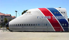
I’d lit this set once before, for a Cisco corporate video, and I knew how to do it cheaply and quickly. The best way to light an interior like this is through the windows, because that creates the most natural looking light. The trick then becomes how to do that without having a lot of lights at your disposal. Consider this diagram:
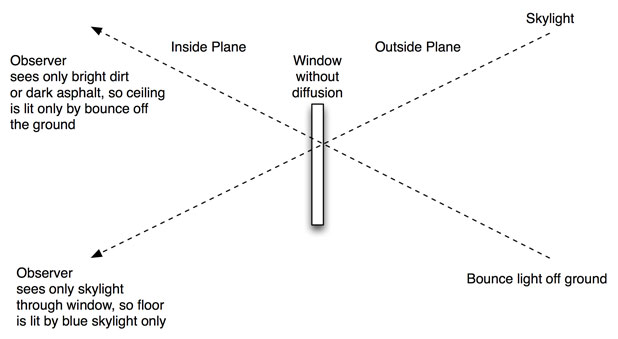
Each plane window is an aperture through which light can pass. If you look through a window from a distance, whatever you see through that window is the light source lighting your face. At standing height, whatever light is bouncing off the ground would light your face because that’s what you’d see through the window. If you lay on the floor, your face would be blue as it would be lit by blue skylight. I’ve seen this effect at work in houses: light through a window will color a floor blue with skylight while the walls will be golden brown with light reflected off a nearby wood fence.
There are cases where this kind of lighting can be very interesting, but in this case it wasn’t the right look or enough light to shoot by. We also didn’t want to see out the windows and notice that the plane wasn’t actually going anywhere. The solution was to put Lee 216 diffusion over all the windows:
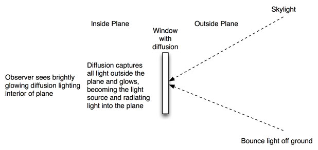
By doing this the diffusion becomes the light source, gathering light from outside the plane and radiating it inside. We added a little fill from a Kino Flo inside the plane to fill from the key side, and we shot.
Well, almost.
This was another location that was locked down late in the game, and we didn’t have a chance to scout it. Initially that was no big deal as Luke and I had both worked here during the summer months, but this was winter and the sun didn’t rise very high in the sky. The side of the plane we utilized looked roughly south-east, and the museum building proper lay roughly south. In the summer months the sun pops over the top of the museum, but in the winter months… well, at some point we realized the sun was going to go behind the museum, and while skylight alone had worked well for me when I’d shot there before with a Sony F900 it wasn’t going to work so well with a RED rated at EI 160.
As we so often do, we punted. We aimed a couple of small HMI PAR’s (probably a 1200w and a 575w) through the diffusion covering the windows at our “hero” row of seats, where the talent sat, and popped another small PAR into the diffusion covering the window where our background gentleman sat. We used shiny boards to light up the windows at the rear bulkhead. We had to add some CTB to the shiny boards as the sun was very warm compared to our PAR’s.
By lighting only those three “layers,” and letting the ambient light play on the rows where no one sat and that we couldn’t see well anyway, we were able to effectively light a large plane interior very quickly and with very few lights.
We also placed a 1200w PAR on the other side of the plane and rolled it back and forth on a wheeled stand to create the illusion of sun rippling through a banking plane:
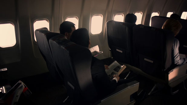
In reality the window patterns would be a lot smaller because the sun is much farther away, but the moving light adds interest and viewers never ask why the sun is the size of a basketball and hovering 6′ outside the plane windows.
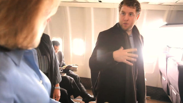
Jono gives direction to a Rambus VP. It’s nice work if you can get it.
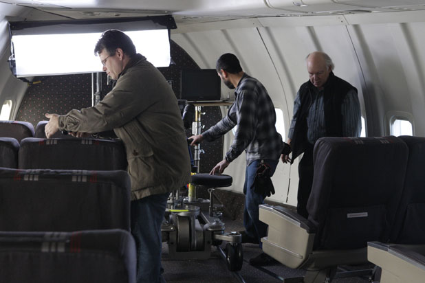
That’s me taking a light reading at the hero seat, while dolly grip Rick Edmondson preps the dolly and camera assistant Paul Marbury wonders where his coffee went. (I probably drank it by mistake.)
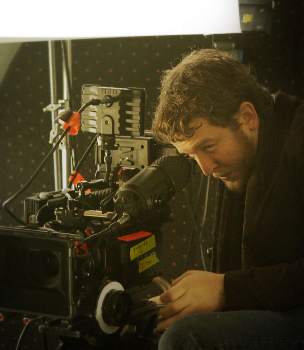
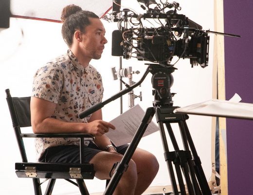
Jono checks my work, as directors do. Fortunately he tends to like it, and on the rare occasion when he doesn’t he usually has a better idea.
Let’s take a hard left turn at China and go to…
KOREAN RESTAURANT, SAN FRANCISCO
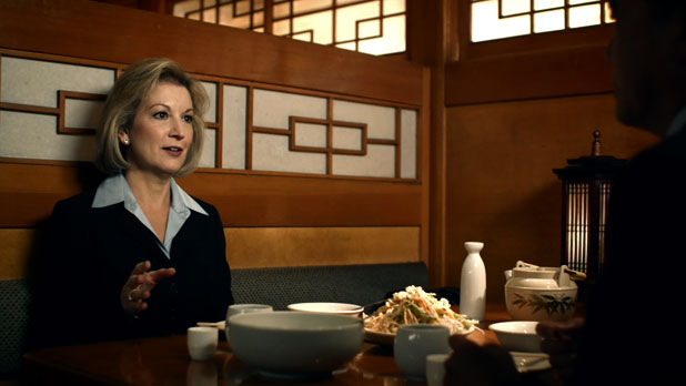
After shooting the plane sequence we had to show the talent having dinner in a Chinese restaurant after a long flight. Our location scout had a hell of a time finding a good location because the Chinese restaurants that were willing to allow shooting had white walls and almost no decoration. We settled on a Korean restaurant in San Francisco’s Japantown as a compromise. The restaurant had very little power available, and it was open for business the entire time, but it was fun to find ways to overcome the difficulties.
The talent is lit by a 4’x4 tube Kino Flo poking over the wall of the booth to the right of camera. The other booths were lit by similar Kinos hidden against the booth walls. We added some hard tungsten light to pop the salad and food. Leafy greens look better lit by hard light.
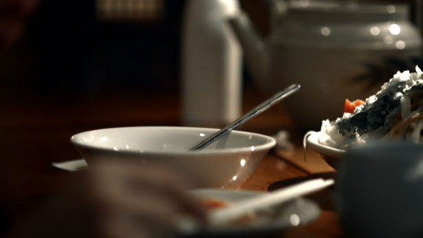
We shot this in tungsten light using the Tiffen 80D Hot Mirror filter. We could have shot daylight but for the fact that the lights illuminating the screens on the back wall were built-in tungsten lights, and the room itself had large tungsten lights in it that we could block but couldn’t turn out. Rather than fight the tungsten spill I decided to work with it instead.
In some cases, tungsten lights shot with a camera balanced for daylight will tend to turn green. Orange and green are adjacent on both the color wheel and the vectorscope, and excessively saturated orange can “tip over” into green. This is true of any camera, not just the RED, and can also be seen in certain film stocks. It is rarely a desirable effect.
Let’s hop a red eye from China to Palo Alto for our final setup…
RAMBUS, PALO ALTO
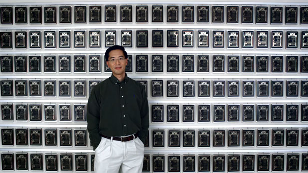
Every single one of those plaques is a patent. Yikes. These people are smart AND prolific.
If you ever wanted to know what barrel distortion in a lens is, this is it. While a different set of lenses might have made the plaques appear more level, barrel distortion puts an interesting spin on shots like these. In a way it exaggerates the depth of the shot by making the center of the shot bulge a little.
We shot this on the same day as the cubicle farm setup, and we didn’t have a PeeWee dolly available to us. We did, though, have a doorway dolly and track, which worked fine for this wide shot. I used an 18mm Super Speed and we pulled slowly back through the doorway of the Rambus security office in order to get enough distance for a nice wide shot. The lighting consists of two 8’x8′ Ultrabounces, one on either side of the camera lit by 1200w HMI PAR’s. Ultrabounces have a clay coating which gives them a very matte finish. They’re great for shots where you want very even illumination without specular reflections. (You can get much the same effect by covering a gryfflon with silk or muslin, although Ultrabounces are faster to work with as they are only one layer of material and not two.)
The idea was to reflect light in as many of the plaques as possible, while lighting the talent in a flattering manner. The plaques aren’t lit perfectly–there’s a dark area in the center where the bounces are separated to make room for the camera, and the reflections taper off toward the sides of the frame–but the mix of shiny and dark plaques gives the shot some interesting contrasts.
This kind of shot can look a little flat during shooting, so you have to see the image in your head, with the blacks pulled down, in order to know that it’s really going to work. Not only did the colorist, Chris Martin at Spy Post, do exactly what I asked for, but he added to the shot by making the whites look a little cool to pop the talent’s flesh tones. (I love working with talented individuals who can take my work and make it better without compromising the look I sought to achieve in the first place.)
We shot all the shots around the plaques with the same basic lighting setup.
And that’s about it. Feel free to ask questions in comments, and I’ll answer them if I can. Enjoy!
Project: Rambus 20th Anniversary
Production Company: Compass Rose Media
Exec. Producer: Steve Weisser
Production Manager: Vanessa Tomasello
Creative Director, Director & Editor: Jono SchaferkotterDirector of Photography: Art Adams
Gaffer: Luke Seerveld
Key Grip: Jeff Nealon
Dolly Grip: Rick Edmondson
First Camera Assistants: Bruce MacGregor (week one), Paul Marbury (week two)Animation: Elastic Creative
Online and color grading: Spy Post
Colorist: Chris Martin
All materials are copyright 2009/2010 by Compass Rose Media, and used with permission. Behind-the-scenes videos shot by Vanessa Tomasello and Julian Weisser. Stills by Steve Weisser.
Disclosure: the filters named in this article were originally given to me for testing, after which the companies allowed me to keep them.
Art Adams is a DP who shoots every project as if it was “Lawrence of Arabia” on a budget. His web site is at www.artadams.net.
Filmtools
Filmmakers go-to destination for pre-production, production & post production equipment!
Shop Now