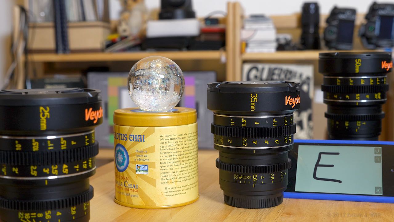
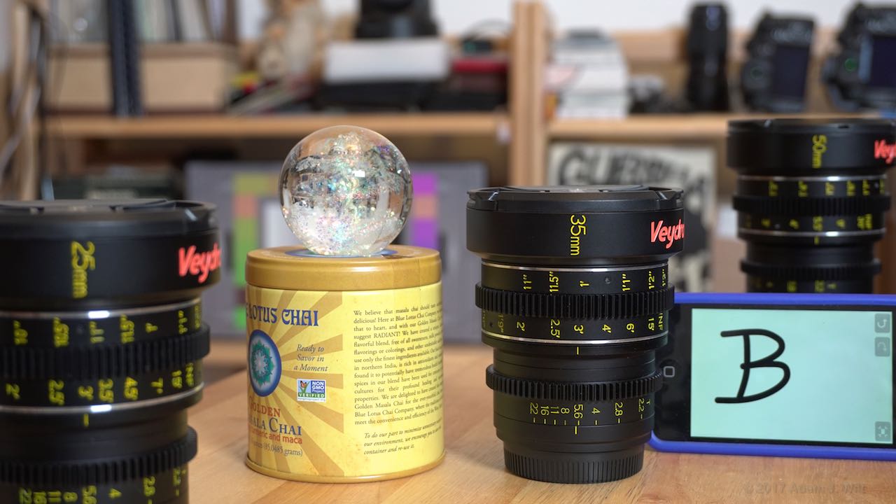
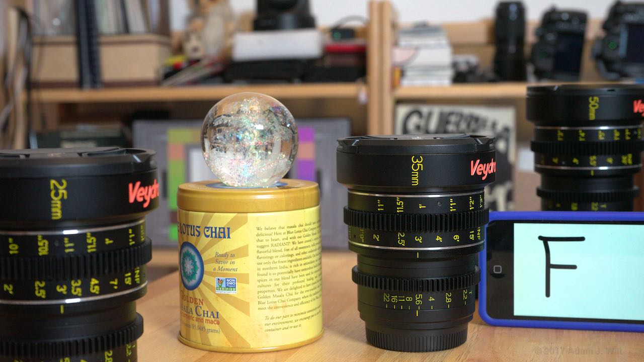
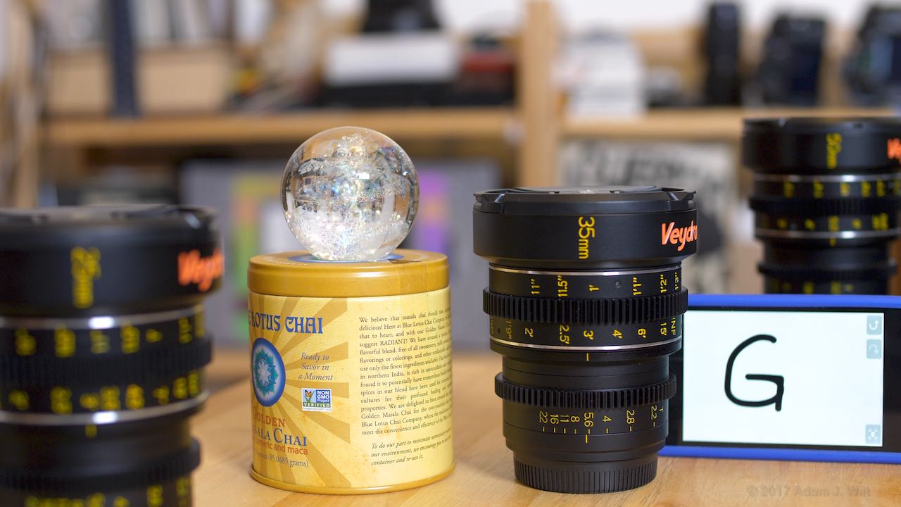
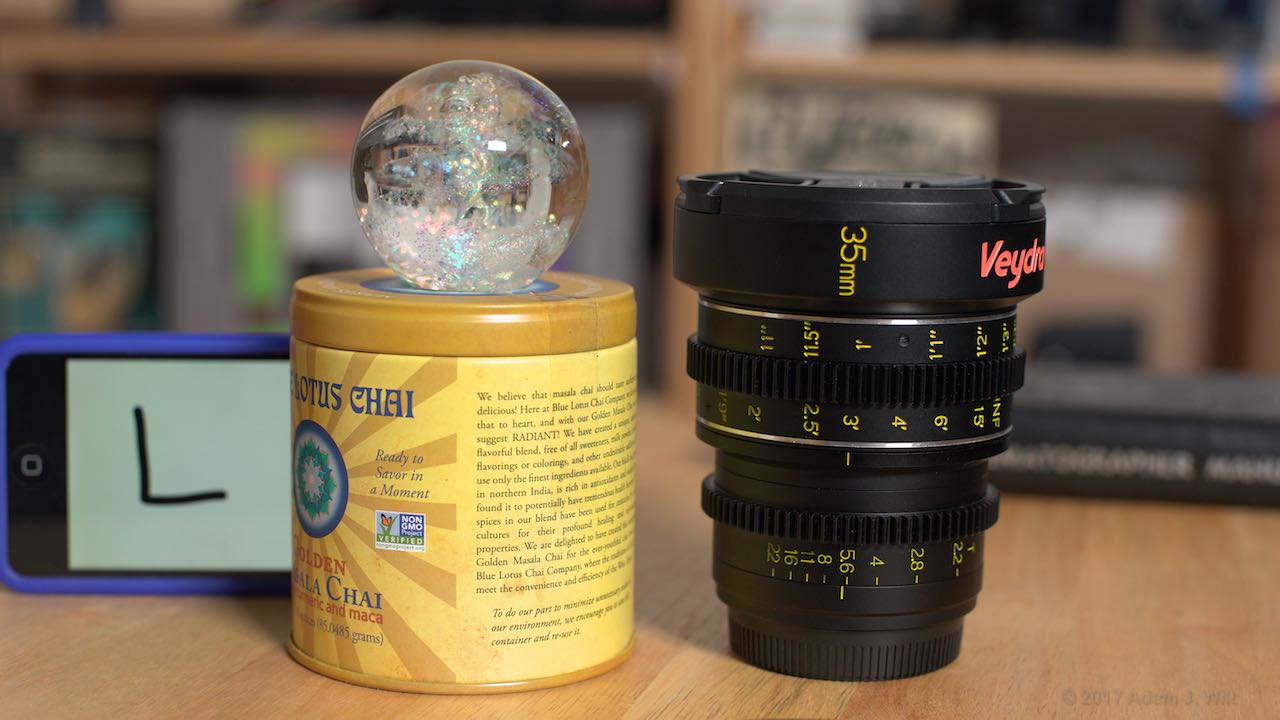
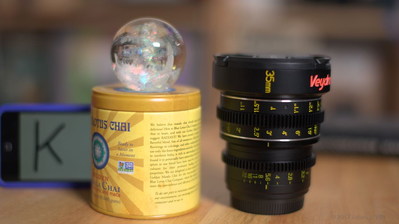
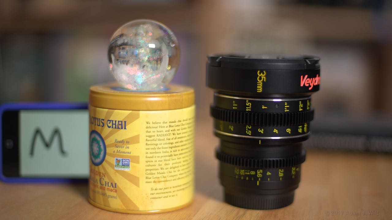
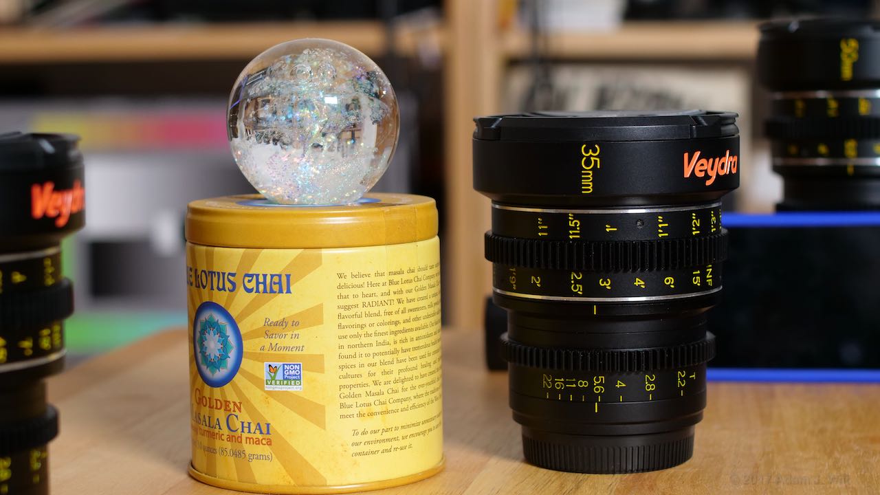
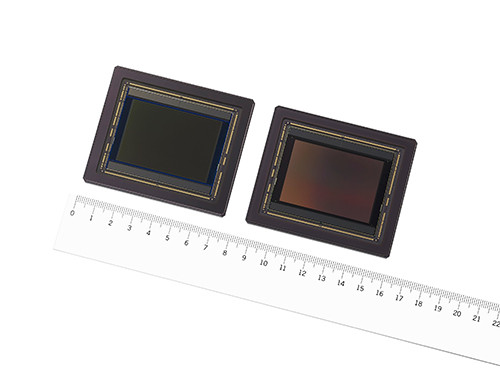
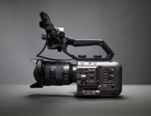
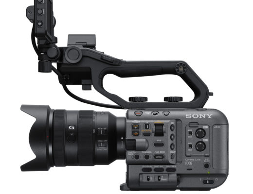
Whether it’s Quentin Tarantino shooting “Hateful Eight” in 65mm, the Panavision Millenium DXL, RED’s VV sensors, the Arri Alexa 65, or the new Sony Venice, large format cinematography is being touted as the Next Big Thing (pun intended). Large format—from full-frame 36 x 24mm to RED/DXL’s 40.96 x 21.60mm, Arri’s 54.12 x 25.58 mm, and beyond—is said to deliver greater depth, dimensionality, roundness, naturalness, and just all-around goodness than plain old Super35mm at 25 x 18mm (more or less, depending on the camera). It’s not uncommon to find rapturous reports of using large formats, and there’s a raging discussion on CML this past week about just why bigger is better.
What strikes me in many of these colloquies is that it’s exceedingly hard to pin down what exactly it is about large format work that gives it that special quality. There tends to be a lot of handwaving, with amorphous terms like “naturalness”, “dimensionality”, and “roundness” that elude definition. Sometimes two images are presented for comparison: shot on different film stocks, of different subjects, with different lighting in different environments, using different aspect ratios (we are not making this up). It’s all a bit too much “is this apple more like a banana, or is this tangerine more like a guava?” for my tastes.
Trust, but verify
In an attempt to better understand the “large format experience”, I decided to shoot the same subjects on two or three formats of different sizes, varying some parameters while keeping others constant. In this way I could look at individual factors, including:
- Aspect ratio
- Resolution
- Focal length / angle of view
- Aperture / depth of field
- “Look-around”
If there’s magic sauce involved, this methodology should squeeze it out.
To that end, I procured two Sony ILCs: an A6300 with a Super35mm-ish sensor, and an A7ii as a full-frame exemplar. Both cameras have the same photosite count so I could match resolutions between formats. They also have similar image rendering characteristics, so I can minimize the effects of differing color and tonal-scale responses.
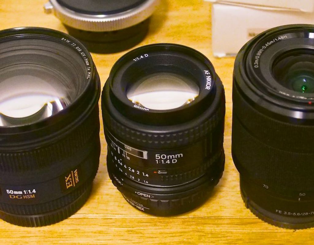
Both cameras came with kit lenses, a 16–50mm f/3.5–5.6 on the A6300 and a 28–70mm f/3.5–5.6 on the A7ii. These are typical Sony kit zooms: they render images with boringly middle-of-the-road good quality, low distortion, minimal flare, and unfussy bokeh. Importantly, the lenses lack substantial differentiating “character”, so there’s nothing that calls attention to the particular lens used to make an image. Thus I can avoid the sorts of biases that might creep in from shooting one format with a crisp Zeiss prime and the other with, say, a Lomo Petzval.
You might ask why I didn’t get some proper video or cine cameras and lenses for this test, like a Sony F55 for S35mm and a Venice for full frame, and a case full of matched Zeiss primes for each. All I can say is: if you pay for the rentals and insurance, I’ll happily test ’em.
I also threw a Panasonic GH5 into the mix, with an MFT sensor half the width of full-frame. Its photosite count is 14% lower and its color and tone handling are different, but its 12-35mm f/2.8 zoom is just about as boring as the Sony kit zooms when it comes to “character”. I shot all three cameras in their Rec.709 modes (PP4 on the Sonys, Like709 on the Panasonic) to get them all as close as possible to a common rendering.
- Sony A7ii: 35.8 x 20.1 mm (in 16×9); 6000 x 3376 photosites. Full-frame, “FF”
- Sony A6300: 23.5 x 13.2mm (in 16×9); 6000 x 3376 photosites. Super35mm, “S35mm”
- Panasonic GH5: 17.3 x 9.7mm (in 16×9); 5184 x 2916 photosites. Micro Four Thirds, “MFT”
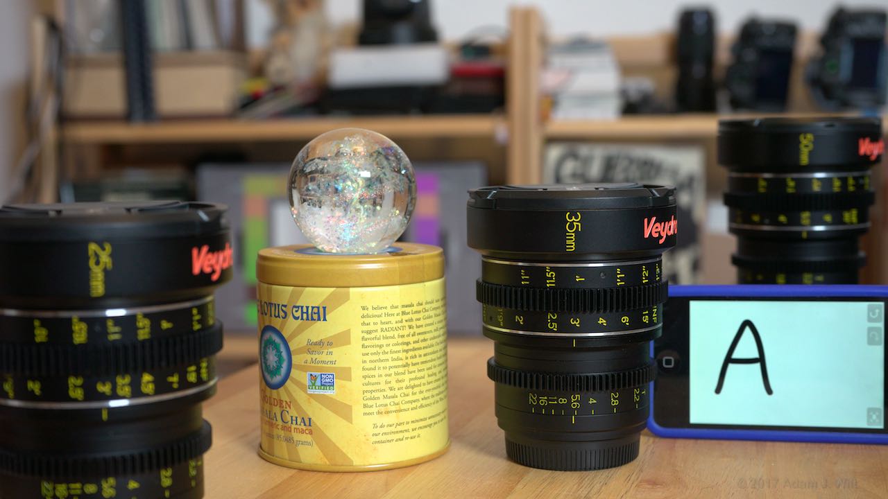
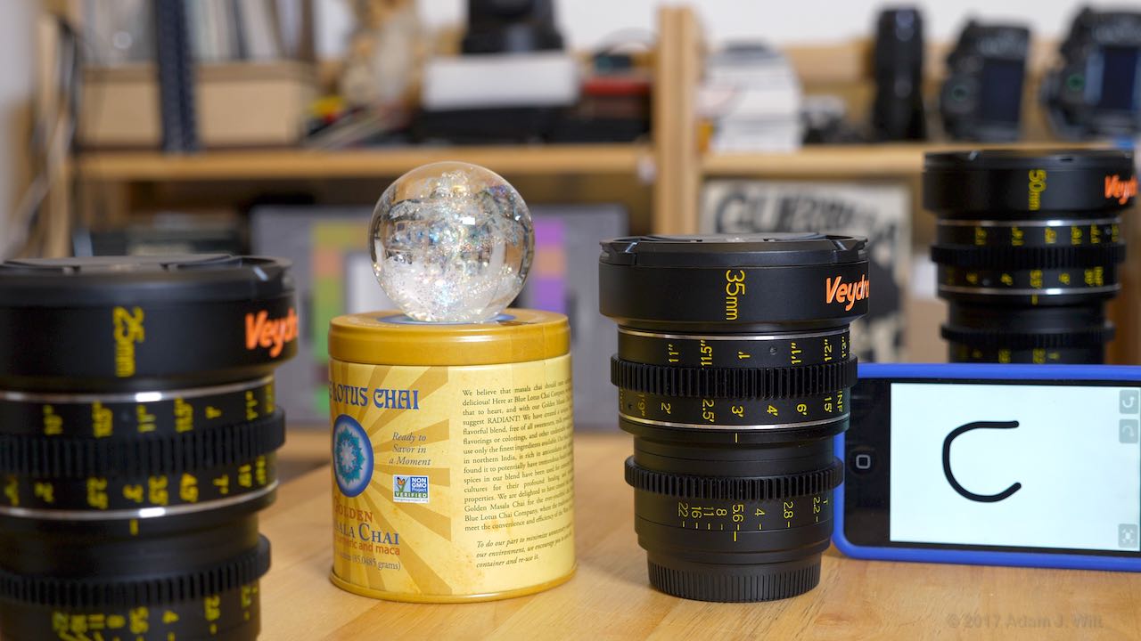
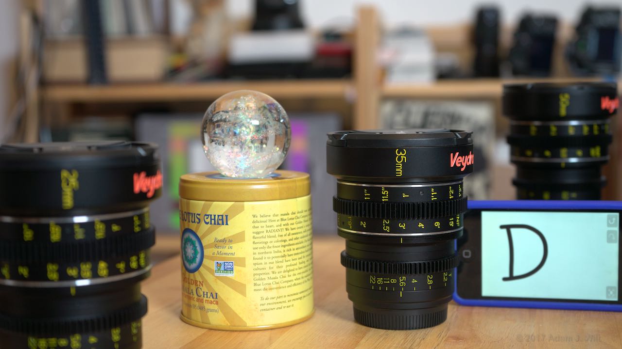
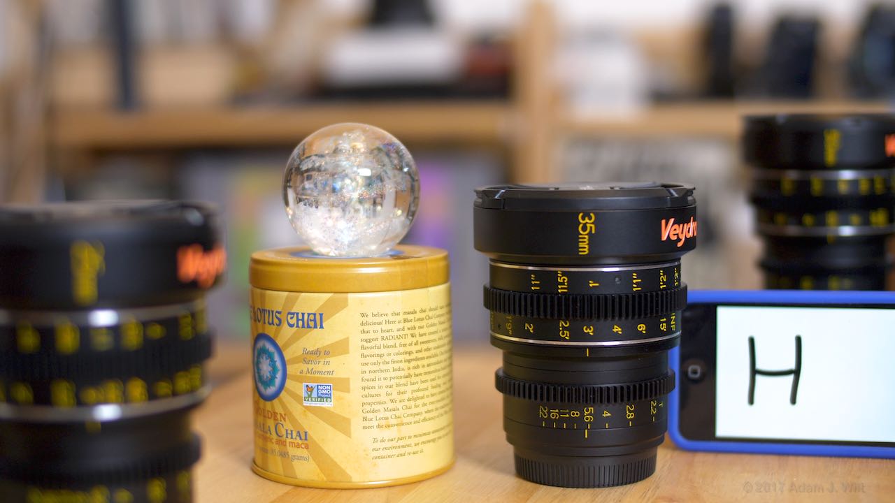
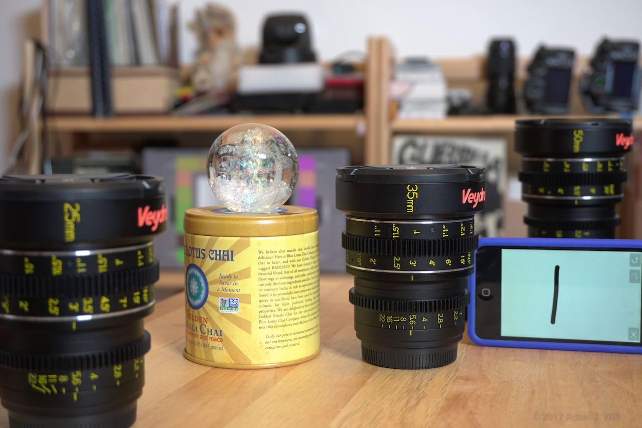
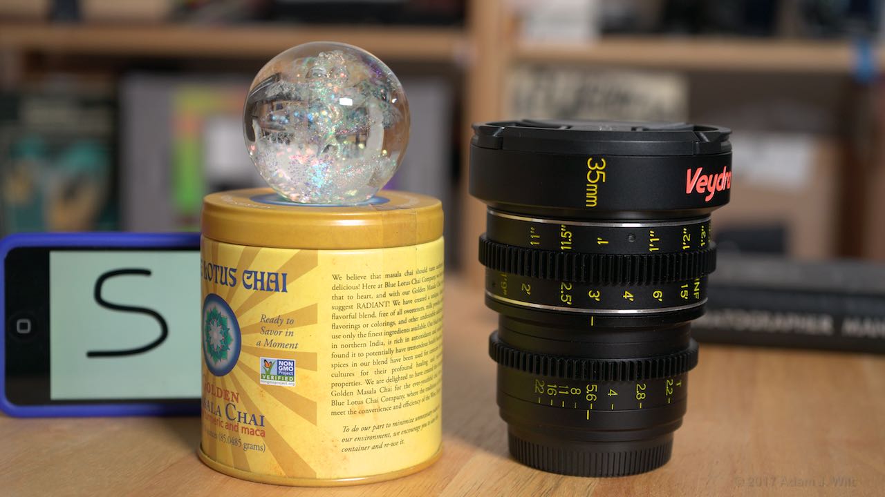
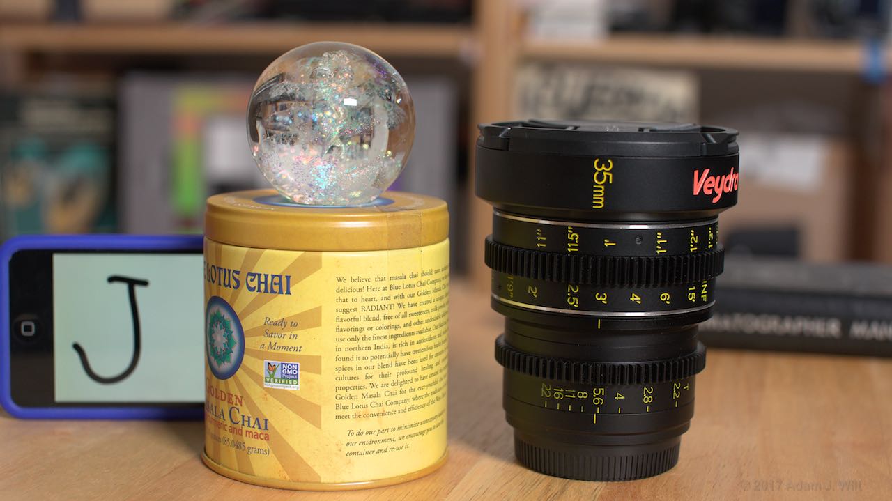
Shall we have a look? I’ll present a series of image comparisons. In each one, I’ve varied one thing while keeping everything else constant—but I won’t say what I’ve done. Have a look at each comparison and see how the images vary—if they do.
For best results use a “large format” tablet, laptop, or desktop machine; a “small format” phone won’t give the clearest view of the images. Yes, sometimes size does matter.
Which images have the most “dimensionality”, “depth”, “roundness”, and/or “naturalness”? What have I changed between the images in a comparison, and how do those changes contribute to the “large format look”?
Afterwards, I’ll show each series again, with explanations and commentary.
TL;DR version: skip to page 2 if you want to bypass all the freakin’ Junior Detective work and just see what the heck it was I did. Because, maybe—just maybe—you have a life and want to get on with it?
Series 1
Series 2
Series 3
Series 4
Series 5
Series 6
Series 7
Series 8
Series 9
When you’re ready, go to page 2…
Filmtools
Filmmakers go-to destination for pre-production, production & post production equipment!
Shop Now