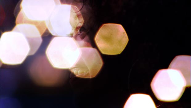
As a motion graphics artist, one of our favorite tricks to enhance an uninspiring clip is not to use effects, but instead to combine it with other clips using Blend Modes (also known as Blending, Composite, or Transfer Modes). Modes provide simple, high-quality ways to drop out the black or white background in a clip, enhance its saturation and contrast, give it a tint, and add lighting effects or a filmic glow in post. I call it our “secret sauce” to create rich, layered imagery you don’t normally see created in an editing program.
Happily, Adobe Premiere Pro CS4 added support for Blend Modes, allowing editors to enjoy these sexy results without having to set them up first in After Effects. In this article, I will show you how to apply Blend Modes in Premiere Pro CS5, what sort of results are typical for different groups of modes, and give you some application ideas.
Applying Modes
Blend Modes contain different algorithms to combine the pixels of one clip in hopefully interesting ways with the pixels of one or more clips underneath.
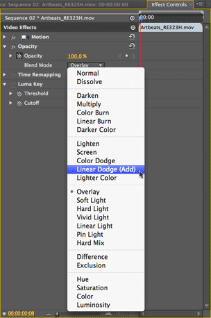 The first trick to using Blend Modes in Premiere Pro is finding them, as they’re not accessed from the timeline as they are in After Effects or Final Cut Pro.
Select the clip you wish to set the mode for (remember: it must be the one in the upper video track), and open its Effect Controls panel. Click on the arrow to the left of Opacity to twirl open this section, and you will find the Blend Mode popup menu as seen at left. It defaults to Normal, which provides the typical Opacity blend you see during a crossfade.
Underneath the hood, when the Blend Mode is set to Normal the algorithm is “take my pixel color values, multiply them by my Opacity value, and add them to the color values of the corresponding pixels underneath multiplied by the opposite of my Opacity (i.e. 100% minus my opacity value).” Interesting things happen when you use a little more complex math to combine the images.
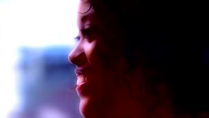
Below is the clip we wish to enhance. There’s certainly nothing wrong with it – it’s well-shot and nicely composed – but we can tell an even more interesting story with it if we added some mood lighting or filtering to it:

Clip GU127H1 courtesy of Artbeats.
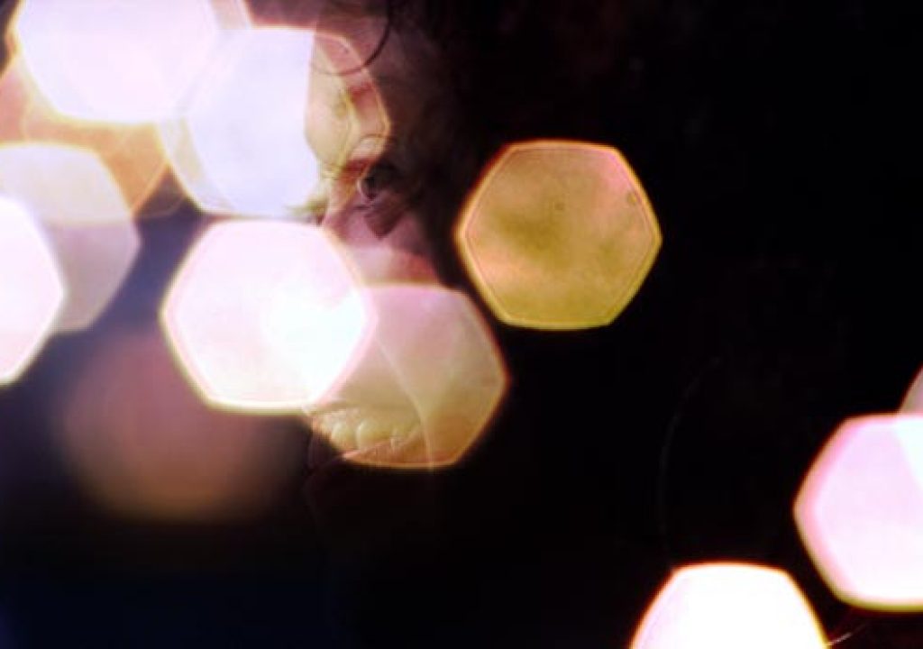
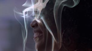
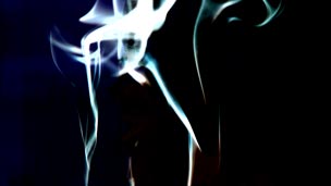
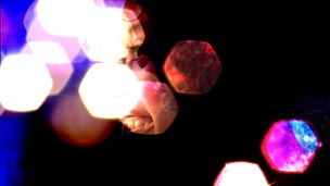
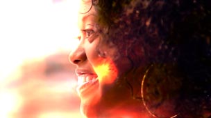
Next are four different clips we going to explore for providing the desired enhancement. Defocused, slow-moving footage with interesting lighting effects or shadows often provide excellent source material for mode tricks; the first two clips below are examples of these (full disclosure: the second clip is part of a collection I created for Artbeats), and is a concept to keep in the back of your mind when you’re out shooting B-roll. The third clip was selected to show off how modes treat blacks and whites. The fourth clip is a blurred version of the original: Applying a treated clip on top of itself using modes can create all sorts of interesting lens and filter effects, with the flexibility of creating them in post rather than in-camera (or on-lens) during the shoot.

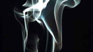
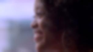
In order: clips T307-07H, LAB128H, UM243H, and a copy of GU127H1 (with 60 pixels of blur applied to the original 1080p clip), all courtesy of Artbeats.
Opacity Blend (Normal Mode)
For reference, let’s start by looking at the result of the Normal Opacity blend you may be used to. In each of the figures below, the “enhancement” clip was placed above the original clip, and set to 50% Opacity:
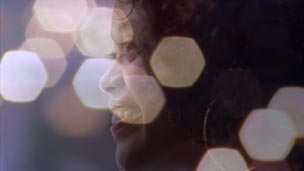
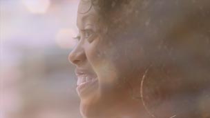

Interesting…but note that in most cases, the result lacks contrast and clarity, and is otherwise missing the visual “pop” you might hope for. In the following pages, we’ll go in search of that “pop” by setting the enhancement clip’s Opacity back to 100%, and trying out different modes.
A Better Luma Key
Many special effects – such as lens flares, stock footage of explosions, and so forth – are shot against a black background. When presented with such a clip, many editors reflexively reach for the Luma Key effect to drop out the black. The result is often an unsightly black fringe around the desired portion of the shot. Fortunately, some Blend Modes provide an alternative to luma keying, often yielding cleaner and more interesting results.
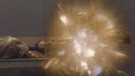
Here are the two shots we wish to composite – a tank, and a fireworks explosion:
Clips RTB107H1 and RE323H courtesy of Artbeats.
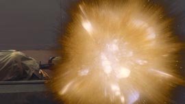
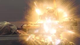
To its credit, Premiere Pro’s Luma Key effect provides better results than most straight out of the box; its result is shown below at left. A typical result I see out of other programs is shown below at right:
Now let’s try the same composite using Blend Modes. Linear Dodge (Add) – shown below at left – essentially adds the pixel values of the clip it is set for to the pixel values of the clip underneath. Since black has a pixel value of zero, these areas of the clip on top add nothing to the corresponding areas of the clip underneath, leaving it unchanged. The result is more akin to adding light to a scene, compared to just layering one clip on top of another. Notice the improved clarity, as well as the more realistic overexposed look of the result. The Blend Mode group that contains Linear Dodge contains other variations on this theme, including Color Dodge (below right):
If there is one thing I hope you take away from this article, it’s that you will no longer automatically reach for the Luma Key effect when presented with footage shot against black – you can often get a better result using a Blend Mode.
next page: Overlay, Soft Light, Hard Light, Linear Light, and Vivid Light modes

The original clip we’re enhancing (Artbeats GU127H1).
Modes are grouped by similar function. Not all modes are equally useful; I will focus on what I feel are the best ones out of each group. Rather than going through the groups in order, I’m going to jump straight to my favorite eye candy group: What I call the “lighting” modes including Overlay, Soft Light, Hard Light, Vivid Light, and Pin Light.
Overlay
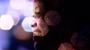

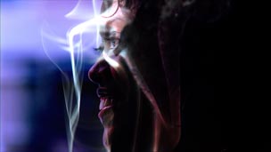
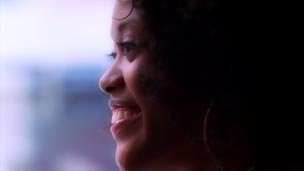
Overlay is often the first mode I reach for when I want to combine two clips in sexy, interesting ways, as it tends to increase the contrast and apparent saturation of the original clip. Technically, the lighter areas of the enhancement clip on top will lighten the corresponding areas of the original clip underneath, the darker areas in the enhancement clip will darken the corresponding areas in the original clip, and areas that are 50% gray in the enhancement clip have no effect on the original clip. Given that, note in the first example above that the predominantly dark enhancement clip has the overall effect of darkening the original, while the predominantly light second clip lightens the result.
Overlay is also an excellent choice when compositing a clip back on top of itself (the fourth example above). If no effects are applied to the copy on top, the result is increased contrast and saturation, which is great for improving washed out or flat footage or 3D renders; applying a bit of blur to the copy on top adds subtle blooming to both the highlights and shadows.
Soft Light
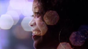

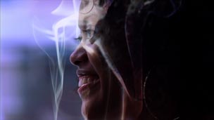
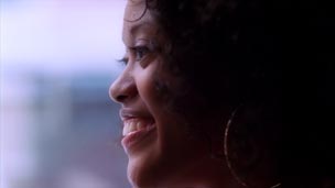
Soft Light is a subdued version of Overlay – there is less saturation added, and the result usually will not clip in the highlights and shadows. Overall, the contribution of the enhancement clip will be more subdued. (Of course, you can control the depth of any of these effects by altering the Opacity of the moded clip on top.)
Hard Light
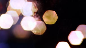
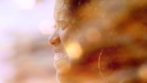
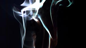

Hard Light is an amped-up version of Overlay, with increased contrast and usually more saturation. Note that in the final mix, the enhancement clip tends to appear more prominently than the original clip underneath.
Linear Light
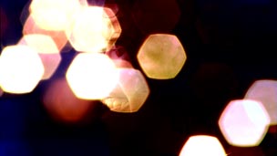
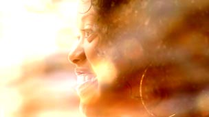
Technically, Linear Light is supposed to be an amped-up version of Soft Light (increasing or decreasing the brightness of the original clip based on the pixel values of the enhancement clip), but the result looks more like a slightly amped-up version of Hard Light. Use it when Hard Light gets you close, but you want it to go to 11.
Vivid Light
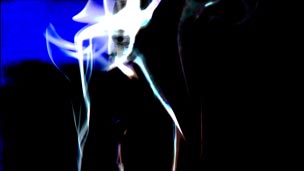
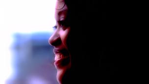
Vivid Light continues the progression, offering an even more amped-up version of Linear Light. For those with a Photoshop background, it dodges and burns the underlying original clip based on the pixel values of the enhancement clip, resulting in more of a color shift in addition to the extreme contrast. As with Hard Light and Linear Light, the composite favors the image on top; you can try reversing the stacking order of the clips in the timeline for an alternate look (don’t forget to set the Blend Mode for the new top clip!). And again: You can always reduce the Opacity of the enhancement clip to dial back the effect.
next page: Linear Dodge, Screen, Color Dodge, Multiply, Color Burn, and Linear Burn modes

The original clip we’re enhancing (Artbeats GU127H1).
On this page, we’ll cover modes that lighten the final result, and then those that darken the result.
Linear Dodge (Add)
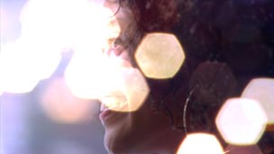
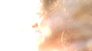
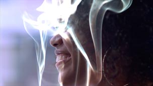
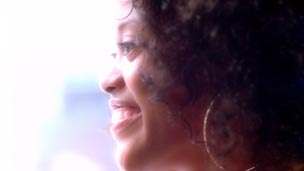
This mode adds the color values of the pixels in the enhancement clip to the corresponding pixels in the original clip. If a pixel in the enhancement clip is black, that pixel in the original clip will be unchanged; if a pixel is white – or if the sum of the color values of the same pixel for both clips is white – the result is white. Individual color channels may clip before the others do (for example, red may clip before blue), potentially resulting in some color shift in bright areas.
The result is the enhancement clip adds illumination to the original clip. As noted in the sidebar on the first page, this mode is often used to composite pyrotechnic footage and other lighting effects onto a scene. If the enhancement clip is predominantly bright (as is the case with the second example above), the overall result may be too blown out – either use a darker enhancement clip, or try Screen mode instead. Also note in the fourth example above and below how the highlights seem to “bloom” out: You can increase the blur to increase the bloom amount, and/or reduce the Opacity to cut back the strength of the effect.
Screen
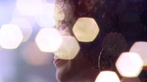

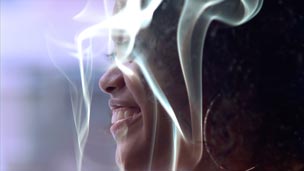
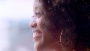
Screen is a toned-down version of Linear Dodge (Add). The result is akin to having two projectors casting their respective images onto the same screen – thus the name. The result is less likely to be blown out, with less chance for color shifts as well. Notice how the smoke in the third example looks more natural, and the fourth example exhibits a subtler glow compared to Linear Dodge.
Color Dodge
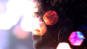
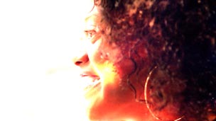
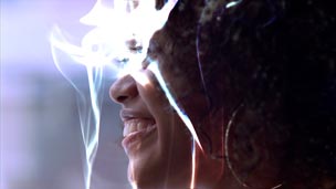
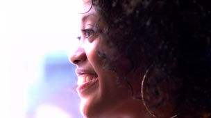
Conversely, Color Dodge is an amped-up version of Linear Dodge with increased color shifts and saturation. Technically, this mode scales up the brightness of the original clip underneath based on the color values in the corresponding pixels of the enhancement clip. Although Premiere Pro’s Color Dodge is based on the Photoshop mode of the same name, be on the lookout for artifacts, such as those in some of the hexagons in the first example above. Color Dodge and Color Burn (further down this page) can also sometimes emphasize compression artifacts.
Multiply
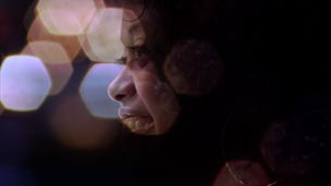
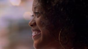
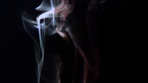
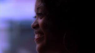
Whereas the first three modes on this page are used to brighten the final result, Multiply plus the two modes below are used to darken the final result. With Multiply, the color values for the corresponding pixels in the two clips are multiplied together. White corresponds to a value of 1 (no change). If a pixel in the enhancement clip is anything but pure white, it will darken the corresponding pixel in the original clip. If a pixel is black (value = 0), the result will be black.
Multiply is useful as a variation of a luma (luminance) matte, revealing the underlying clip only where the enhancement clip is bright. Notice how the bright areas in the first and third examples (especially the smoke in the latter) reveal just portions of the actress’s face, for a mysterious look. Although the math is different, you can think of Multiply (yin) as the opposite of Linear Dodge (yang), adding shadows rather than adding illumination.
Linear Burn
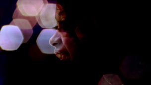
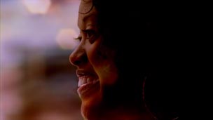
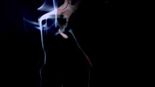
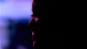
Linear Burn is akin to Multiply, with more contrast and saturation. Technically, it uses color information in the enhancement clip to reduce the brightness of original clip. Any combination of brightness that adds up to 100% – such as 70% brightness for the enhancement clip and 30% brightness for the original clip – produces black (compared to Multiply, which in this examples would produce 0.70 x 0.30 = 21% brightness). Linear Burn works best when the enhancement clip is predominately light, as in the second example above.
Color Burn
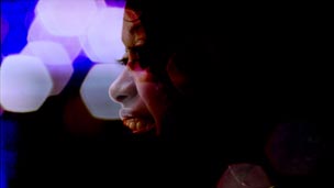
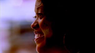
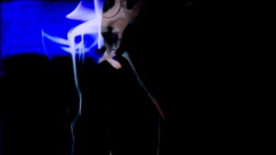
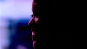
Color Burn uses the color information in the enhancement clip to increase the contrast in the original clip (compared to Linear Burn, which changes the brightness rather than contrast). The result is a more severely affected result that is prone to artifacts, as seen in the first and third examples above. Although you may be more familiar with the name Color Burn from earlier versions of Photoshop, the relatively newer mode Linear Burn often yields nicer results.
next page: Color, Luminosity, Difference, Exclusion, and Pin Light modes

The original clip we’re enhancing (Artbeats GU127H1).
We’ll end with some of the more unusual Blend Modes available in Premiere Pro. Some may be used for interesting tinting effects; others are more suitable for recreating bad acid trips (or so I’ve been told).
Color
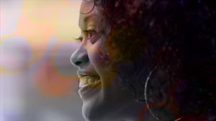
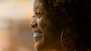

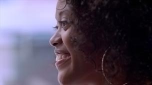
This Blend Mode uses the color information from the enhancement clip on top and the luminosity (grayscale) information from the original clip underneath to create a new composite image. In short, the enhancement clip is used to re-color the original clip – see the second example above for the clearest version of this.
If you use a solid or gradient color layer for the enhancement clip instead, it would have a similar effect as shooting through a gel. Alter the Opacity of the enhancement clip to control the depth of colorization.
Luminosity
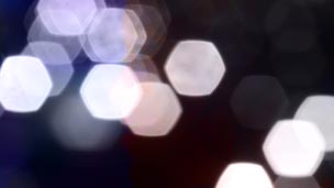
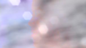
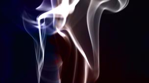

This mode uses the luminance values of the enhancement clip and the color values of the original clip to create a new image. This is the opposite of Color mode, in that the original clip is now re-coloring the enhancement clip (examine the second and third examples above). If the enhancement clip consisted of, say, pale gray text on black text, the original clip would appear to colorize the light areas of the text – study the third example above with the smoke to get an idea how this might work.
Difference
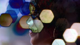
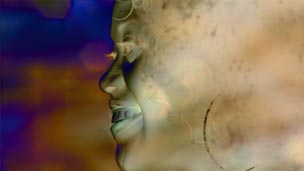
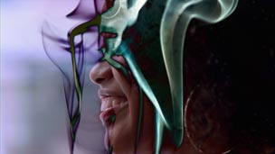
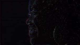
With this mode, the color values of the enhancement clip are subtracted from the colors in the original clip. If the result would be black, the colors “wrap around” creating a selectively inverted, psychedelic effect. Particularly interesting is example four above: the result is a sort of embossed look, caused by the difference between the blurred and unblurred image. Indeed, some use Difference mode in conjunction with a locked-down camera or different passes of a motion control camera move to remove any parts of an scene that were unchanged between the two takes.
(If you need a true Subtract mode without the wrap around, this mode was added to After Effects CS5. Among other tricks, this is useful for white balancing a clip after it was shot: Just place a solid layer with the color tint you wish to remove in Subtract mode on top of the original clip. You can then use Dynamic Link to bring this result into Premiere Pro.)
Exclusion
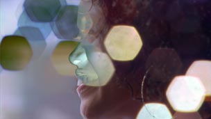
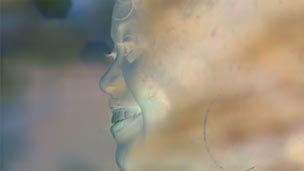
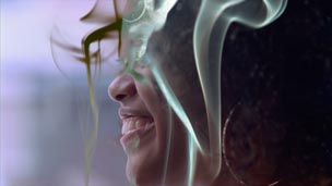
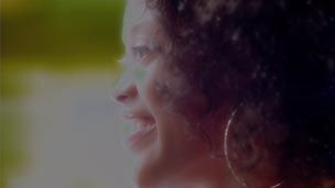
If you like the general idea of what Difference mode is doing to your clips, but wish the effect wasn’t as severe, try Exclusion as an alternative. The results are more akin to a selective film negative than an outright color invert – compare the second example in particular to Difference.
Pin Light
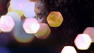
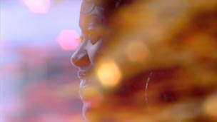
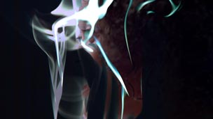

As long as we’re showing psychedelic effects, Pin Light – found in the same group as the other “lighting” modes such as Overlay and Hard Light – uses a more complex logic to combine clips. If a pixel in the enhancement clip is brighter than 50% gray as well as the corresponding pixel in the original clip, then the enhancement clip’s pixel is used – otherwise, the original pixel is left untouched. Likewise, if a pixel in the enhancement clip is darker than 50% gray as well as the corresponding pixel in the original clip, the enhancement pixel is again used. Most of the time, the result is a posterized mess; sometimes, it is strangely alluring (such as in the second example above). This is one of those cases where it’s far easier to just try a mode and see if you like it, rather trying to predict the outcome ahead of time.
That said, the point of this article was to indeed help you predict the outcome ahead of time instead of having to randomly try every mode in every situation. Once you know some general rules – use Linear Dodge and its relatives to brighten the composite, Multiply and its kin to darken, the Overlay group to increase contrast and saturation, and Color to tint – you can work more intelligently, quickly, and intuitively.
If you find that you like Blend Modes but wish you had more, keep in mind that Premiere Pro’s cousin After Effects has a longer list to play with. You can set up the look you desire in an After Effects composition, and then use Dynamic Link to load that comp into Premiere Pro. Either way, enjoy the richer final imagery you can now create in post!
FTC Disclosure: Adobe partially subsidized the creation of this article. However, they had no control over either the subject matter or the actual content. Most of the video clips used were downloaded from Artbeats.com during their “Free Clip of the Day” promotion earlier this year; I created the remaining clip (which is sold by Artbeats).
The content contained in our books, videos, blogs, and articles for other sites are all copyright Crish Design, except where otherwise attributed.

Filmtools
Filmmakers go-to destination for pre-production, production & post production equipment!
Shop Now