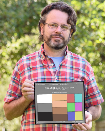
In the old days of video, what we saw was what we got. Now, with log and raw, the possibilities are infinite. Only one of those possibilities, though, is what YOU want. Here’s how to make sure your vision is the one everyone else sees.
I’ll be showing off this chart at IBC, Sept. 7-11. Look for booth information at the end of this article.
We live in a digital intermediate/telecine world, which is wonderful as we can shoot HD and expect our footage to end up in a grading suite, where the number of looks available is nearly endless.
The downside is that the look we envisioned is not always the look that’s created by a dailies colorist.
If dailies don’t resemble the look we’ve promised then our days on the job may be numbered. The director and producer may decide that we can’t give them the look they want–the look we agreed on in advance–when the problem actually lies off set. Or, if dailies come back looking okay but not exactly the way we want them, the odds that we’ll be able to change the grade during the final online or DI is slim: directors and producers tend to fall in love with the dailies grade during the edit and often resist changing the look later.
There are several software packages that allow us to communicate with a colorist by emailing files and images back and forth. Some of these cost thousands of dollars and require the colorist to have a copy of the same software that you’re using. Ultimately, though, if we start off with a common reference and then adjust a still frame in a common picture editor using only the controls that a colorist will have available (overall exposure, contrast, overall hue–no curves or power windows) we can create 80% of the look using basic image editing tools, and then let the colorist take over and finesse it. (Colorists will always do a better job at grading our footage than we will, as that’s all they do and they know all the tricks. It’s not hard to learn to do 80% of a grade, but the last 20% is the hardest and makes all the difference.)
Color charts are that common reference. If we shoot a reference in the real world, and the colorist knows how that reference is supposed to look, she/he can use that as a starting point to either grade your image to be as color accurate as possible, or to add a consistent look to the footage by balancing to the chart and adding in a pre-built look.
The broadcast world lives and dies by the ITU 709 HDTV standard (also known as “Rec 709”, for “Recommendation 709”), which defines (among other things) the primary colors that every television in the world must reproduce in order to display color accurate images. That triangle of very specific hues of red, green and blue is the palette from which every color in a TV program is reproduced. If we have an instrument that can measure where those primary colors fall, and if we shoot a chart containing those primary colors, we can quickly grade the footage containing the chart so that colors are reproduced as faithfully as the camera allows.
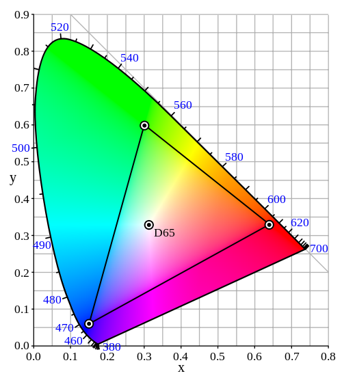
The ITU 709 color space. The corners of the triangle represent the exact hues of the three primary colors necessary to create every possible color combination visible on your TV. The image is balanced roughly for daylight: the D65 notation in the center of the triangle shows that neutral white is pegged at 6500K.
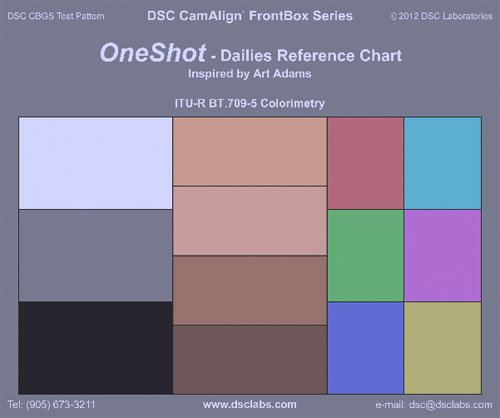
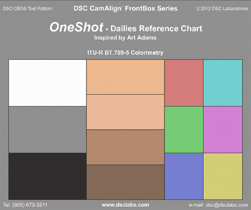
We have an instrument for measuring color objectively: it’s called a vectorscope. We also have access to a number of charts containing these key primary colors, including the one I’m focusing on in this article: the new DSC Labs OneShot. I designed this chart to bridge the needs of film-style production and video post production.
Using a vectorscope, together with a waveform monitor, we can quickly “zero out” an image so that colors are reproduced as faithfully as HDTV will allow. There are several ways to use a chart like this:
To communicate with a colorist by saying, “Here’s a properly exposed chart–everything that follows is pretty much the way I want it. Leave the dark shadows, leave the blue moonlight, I really want that moody feeling. Don’t ‘save’ me by making everything bright and neutral.”
To ensure that product colors are reproduced as accurately as possible (such as making sure that a Coke can is reproduced as “Coke red.”)
To allow a colorist to more easily correct for lighting anomalies on location. Seeing the ITU 709 primaries lit by fluorescent light, for example, will help them remove the green cast and boost undersaturated colors.
To show the colorist a starting point from which your pre-determined look can be added. If the two of you come up with, say, a bleach-bypass look with a blue hue, shooting this chart at sunset will allow the colorist to quickly dial out the warmth of the setting sun and add your predetermined cool and contrasty look to the balanced footage.
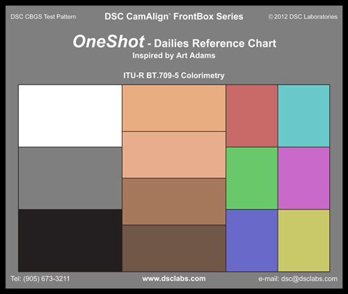
The DSC Labs OneShot provides all the color and luminance information necessary to reproduce color accurately in one quick shot.
Normally DSC Labs charts are manufactured with a glossy finish, which improves both color accuracy and increases the chart’s contrast, but these charts are most often used by large productions with multiple cameras (such as the Olympics) who have the time to line up all the cameras in front of a perfectly-lit chart, eliminate all the reflections, and paint them to match perfectly. Film-style productions tend to work a lot faster, and there’s no time to set up a glossy chart and then flag off the reflections of the crew and the set.
For that reason the OneShot is a matte chart. There are advantages and disadvantages to this:
Matte charts are subject to flare, while glossy charts are subject to reflection. It’s easy (but time consuming) to observe and remove reflections in a glossy chart, but not very easy to observe and remove flare in a matte chart.
Matte charts are usually much lower contrast than glossy charts. Matte surfaces don’t allow for the printing of a true deep black, while glossy charts (without reflections) yield a much darker and richer black.
The OneShot is unique in maintaining the most dynamic range possible in a matte printed chart by using an “AcuTech” black chip with a gloss finish. This is the same process used to create DSC Lab’s Chroma Du Monde charts, only in this case it is applied to the black chip only.
This AcuTech black chip is 1/2 IRE brighter than DSC’s cavity black, in which the black chip is a hole in the center of the chart backed by a cavity lined with black velvet.
Applying this finish to a single chip is an ideal compromise between a full-on AcuTech glossy but reflective chart, originally developed for the U.S. space program, and the speed and efficiency of a matte chart, which can be shot quickly without the need to remove unwanted reflections.
There’s a reason that pure black in video is referred to as the “pedestal”: everything in the image rides on it. Capturing a color accurate image is impossible if the pedestal is not balanced to be pure black. (I once had a shoot where a blond woman’s hair appeared green while everything else in the shot looked normal. After some hurried checking we discovered via the vectorscope that the pedestal wasn’t neutral. Once we balanced it the woman’s blonde hair became the proper color–and we pulled a LOT of minus green gel off her backlight.)
Matte charts are still reflective, but the reflections are less obvious. If you’re shooting a day exterior it’s probably a good idea to tilt the chart away from sunlit grass to avoid a green tint, for example. You won’t see the actual reflection of the grass the way you would with a glossy chart, but some green flare may still be present. (This is true of any matte chart.)
Lets look at how this chart really works, on the next page…
The left column of the OneShot contains the white, black and middle gray chips. The gray chip is probably the most important as it’s calibrated to 18% reflectance, the same as your spot meter. Setting the chart exposure using this chip helps the colorist reproduce the chart accurately in their grading suite, as exposure affects saturation and can make the color chips look too colorful or not colorful enough. 18% gray is generally accepted as being around 40% on a waveform monitor, with some manufacturers suggesting slightly lower values and some slightly higher. 40% has worked well for me, but you may find that you like something slightly different.
18% gray is particularly important in the video world because it moves around a lot. For example, while testing the dynamic range of the Canon C300 I discovered that the Cinema1 gamma curve gave me 3.5 stops of overexposure latitude above 18% gray, but Cinema2 gave me 4.5 stops! Canon apparently decided that the camera was quiet enough that they could add 6db (one stop) of gain to the mid-tones in Cinema1 to create the Cinema2 curve. By pulling the mid-tones of the gamma curve up one stop we appear to gain an additional stop of highlight latitude, because the distance between 18% gray and Cinema1’s highlight clip increases by one stop.
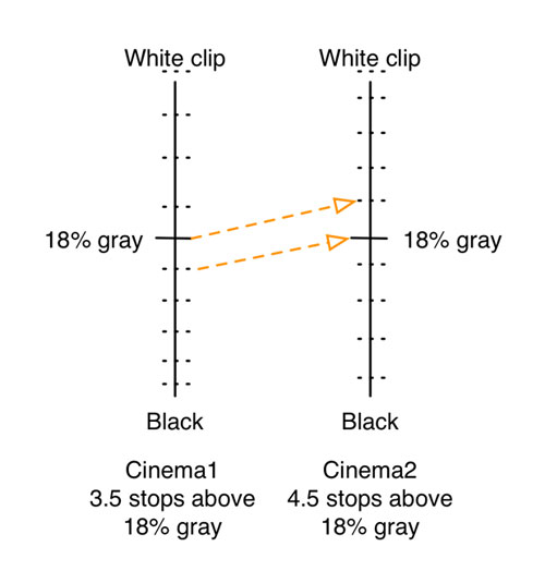
Not to scale: Here’s the basic idea of what happens when one switches from the Cinema1 gamma curve to Cinema2 in the Canon C300.
Even though the ISO remained the same (in this case, ISO 850) the gain applied to the mid-tones changed depending on the gamma setting. Nearly every camera does this. (It’s important to watch for noise changes when switching between gamma curves: the ISO may not change but the gain structure of the camera most definitely changes.)
Note that in both cases 18% gray would be exactly the same tone at ISO 850, regardless of which curve is used. One would simply be a little noisier than the other.
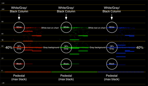
The OneShot is divided into columns of information. The leftmost column shows color-neutral references, including the most important: 18% gray. This view, in RGB parade, shows white, black and gray are balanced.
NOTE: Waveform and vectorscope images in this article are simulated using a digital version of the OneShot chart as the only printed versions are in Toronto at the moment, while I’m near San Francisco. I’ll have physical charts in hand at IBC.
White balancing and black balancing in post are relatively easy: while watching RGB parade on your waveform monitor, adjust the color of the gains until the white chip is at the same level in each color channel. Adjust black the same way, using the pedestal control (or whatever other control is provided; different programs call it different names, such as “offset.”) Neither white nor black will hit their maximums as modern cameras see at least ten stops of dynamic range and a matte chart is not contrasty enough to push those limits, but the white and black chips are bright enough and dark enough to allow for proper balancing.
Then place the 18% gray chip at 40% on the waveform monitor. The gray chip is easy to find as it is the same tone as the chart’s background: the two blend together, so 18% gray is a very wide line that stretches across the waveform monitor. It’s hard to miss.
It’s also possible to white balance and black balance by zooming into the white and black chips in your grading software and looking at a vectorscope. When looking at white only, the dot representing white should be placed dead center of the vectorscope display. The same thing is true when looking only at black, although the dot for black is usually smaller.
Once the gray chip has been set up so that it hits your desired 18% gray value on the waveform monitor it’s time to look at color accuracy with the vectorscope. Each ITU 709 primary and secondary color in the far right column has a box on the vectorscope display into which it should fall–in an ideal world. Our world is not so ideal, however, so there are a couple of things you should know about how these color chips work:
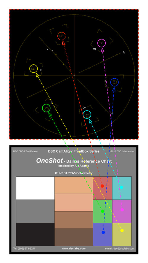
It’s impossible to print pure ITU 709 primaries and secondaries as printing technology can’t reproduce colors as bright and saturated as HDTV television sets. Because of this the printed color chips are reproduced at 50% saturation. In theory, turning on 2x magnification on a vectorscope will put them into their boxes.
The reality, though, is that the only way to accurately create ITU 709 colors is to generate electronic color bars in your camera. Most cameras can’t reproduce ITU 709 colors perfectly from sources in the real world. Often they can put red and blue into their boxes, but green rarely extends far enough. Also, colors may change saturation when shooting under daylight or tungsten light, so while green might not hit its box under tungsten light it may under daylight. Every camera model is different, because every manufacturer’s color science–the unique combination of the filter colors on the sensor’s photosites and mathematical tricks employed by the manufacturer to bend that data into pleasing color–is different. Each has its own “secret sauce” that results in various cameras having their unique looks.
Perfectly saturating the primary colors to ITU 709 standards, by placing them all in their boxes, is less important than making sure they are simply accurate. Saturation is defined by how far from the center of the vectorscope a color falls: the farther from the center it is, the more saturated it is. Accuracy is determined by whether a primary or secondary color is on the line–or vector–drawn from the center of the vectorscope through that color’s target box. A camera may not render all the colors in the chart at the proper saturation to put them in their boxes, but it should be able to put them on the right vectors leading to their boxes.
Perfectly saturated ITU 709 colors may not be pleasing anyway, as sophisticated viewers tend to appreciate colors with lower saturation over highly saturated hues.
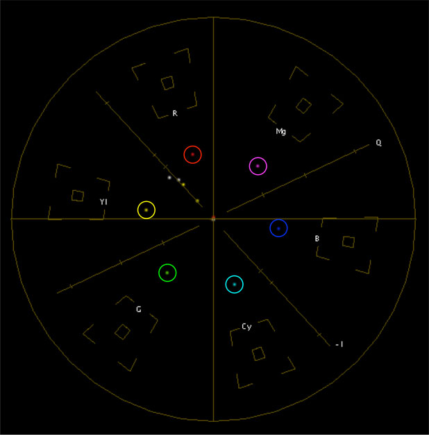
In this case the primary colors aren’t saturated enough to put them into their boxes on a vectorscope…
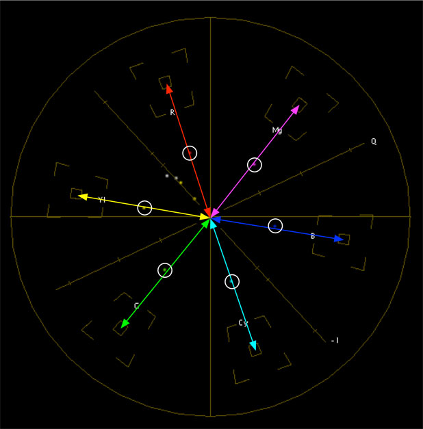
…but they are still accurate in hue, as they fall on the proper vectors (lines drawn from the center of the vectorscope through the color target boxes).
Going back to our column motif:
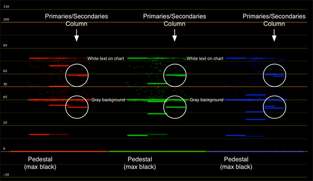
It’s easiest to check color balance by lining up the black, white and gray chips, but you can look at the color chips as well. If they are aligned horizontally then the image is neutrally balanced. (Each color column consists of three colors but appears as two horizontal lines in each color channel. The primary colors in each channel are the top line–for example, the red chip viewed in the red channel will be the topmost line, as will the magenta and yellow chips as they are equal amounts of red and blue or red and green–while the other chips comprise the lower horizontal lines.)
The most important colors on this chart are the flesh tones, in the center column. Turn the page to learn how to use them…
Last but not least, the middle column of the OneShot contains four standard hues of flesh tone. There’s a special line on vectorscopes, the I-line, around which these tones should fall. Flesh tone saturation and hue are a matter of taste–as is the saturation of the primary and secondary colors in the chart–but accurate flesh tones will always fall on or near that line.
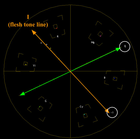
The I and Q lines. The best explanation I can find for why these lines exist is here. The short answer: The I-line is useful because flesh tones are meant to fall on or near that line.
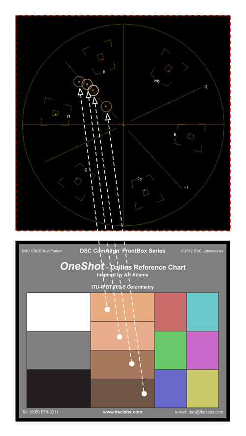
The flesh tone values are stacked in ascending order: the darkest chip is the only one that falls directly on the I-line. The others fall just to one side or the other, and increase in saturation and brightness from bottom to top. (The vectorscope only shows color saturation, not luminance, although the brighter the color is the more saturated it appears.)
Your taste will determine which of those tones falls on the I-Q line, or how far to either side they land. Referencing a standardized chart for this kind of setup is much more repeatable and reliable than trusting that the first flesh tone the colorist may see is the one you want to use as a reference.
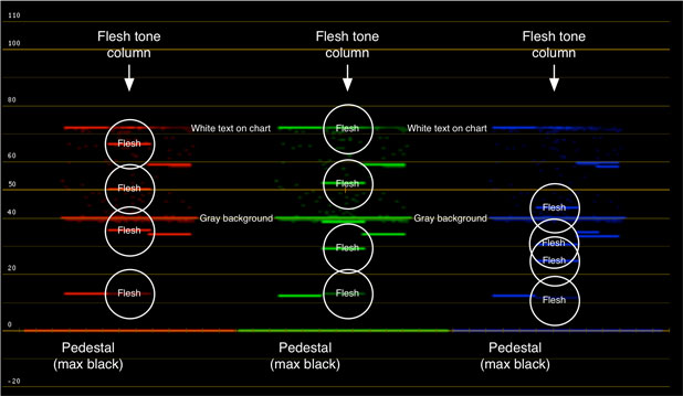
In parage RGB view on a waveform monitor we can see how each flesh tone chip is a combination of different amounts of red and green, with just a bit of blue in each one. These chips aren’t designed to fall onto any particular luminance values (the waveform shows only luminance, while the vectorscope shows only color saturation), but once you find a look that you like you can note where these chips fall and use the chart to repeat that look.
Now, to put it all together, here’s what it looks like when the chart is lit with blue light:

Note that all the colors, including the white balance “dot” in the center of the vectorscope, are pulling toward the blue target box. The waveform shows us that the blue channel is elevated in comparison to the red and green channels.
And now, to fix it:

Using the gain control in Apple Color, the white balance “dot” has been moved back into the center of the vectorscope and all the colors are in their boxes. This is an idealized version of what you’d see in the real world: the colors would probably not fall exactly into their boxes, but if they are on their vectors then their hues will be accurate and the image will look neutral and free of color shifts. The waveform shows all the color channels are equal.
(These chart images are low res as they are screen grabs from Apple’s Color.)
This demonstrates how the OneShot can be used to fix color casts, but it can also be used to reproduce color casts:
Grade a shot containing a OneShot chart to create your look, and then note where the colors fall. To repeat that look for a new scene, shoot a OneShot reference at the beginning of the scene and then move the colors to the positions on the vectorscope that gave you your chosen look.
Here’s all we needed in the film days:

The Kodak gray card, and instructions for its use with film stocks. It’s not completely obsolete, but it’s close.
There are some who say that the old 18% gray card reference is all you need for color grading. Whenever I hear that I think back to a demonstration given to me by a Bexel engineer when the Sony F900 was a new camera. He filled an F900’s frame with a typical Kodak gray card and then went into the user matrix (the one with labels like R-G, B-R, etc.) and entered crazy values for each setting (like +99 or -99). The user matrix affects color at a very deep level in the camera and yet, no matter what he did, the gray card didn’t change hue at all. It wasn’t until he zoomed out that my DIT and I saw that everything around the gray card that contained actual color was horribly, horribly wrong. The gray card stayed perfectly neutral throughout this process, as would a white card, but anything in the frame that was not color neutral reacted strongly to the settings in the user matrix.
Film color is determined by chemistry, so shooting a gray card is usually enough to ensure that properly exposed and processed film is printed properly. Video gamma curves are numbers in a table and don’t always track perfectly, so color references matter more.
Gray cards and white cards are not always enough. If you want to see what the camera is really doing you must look at color–and not just any color, but known colors like the ITU 709 primaries and secondaries.
When you’re chasing the light, or shooting in strangely-lit environments, or trying to quickly shoot a reference so the “B” camera that just got added for a closeup has half a chance of being matched to the wide “A” camera in the grade, the OneShot chart will allow you to record the most color reference information possible in a very short amount of time.
The back of the chart is useful as well. Half of it is perfectly neutral CamWhite, for white balancing, and the other half is 18% gray, either for spot metering or white balancing cameras that prefer to see a darker neutral tone than white (such as Canon 5D and RED cameras).

The back of the OneShot chart. The white portion is a perfectly neutral white and is perfect for white balancing. (Many materials, such as white T-shirts and white paper, appear to be a neutral white but may not be–and may also reflect light outside the visible spectrum that can influence the camera’s white balance.) The gray portion is 18% gray and is perfect for metering with a spot meter, or for white balancing when using a camera that prefers using darker tones.
Both sides are matte to minimize reflection issues. The flare level in the chart varies depending on the specularity and angle of lighting, but the OneShot’s matte finish eliminates hard reflections that occur in glossy charts. Still, it’s important to be aware that flare can vary based on chart position so if you’re trying to match multiple cameras it’s important to shoot the chart from as close to the same camera angle as possible.
Hold the chart in the main light source on the set, expose it so the gray chip is perfectly exposed, roll a second of footage, and bring the actors in acting. It’s that simple.
Visit me at IBC, Sept. 7-11: Friday and Tuesday I’ll primarily be at DSC Labs’ booth B46, in hall 5–part of the Ontario Pavilion; Saturday, Sunday and Monday I’ll most likely be in our demonstration room D201 in The Elicium building.
Note: I have worked as a paid consultant to DSC Labs.
Art Adams is a DP who is so obsessed with color accuracy that he designed his own chart. His website is at www.artadamsdp.com.

Filmtools
Filmmakers go-to destination for pre-production, production & post production equipment!
Shop Now


