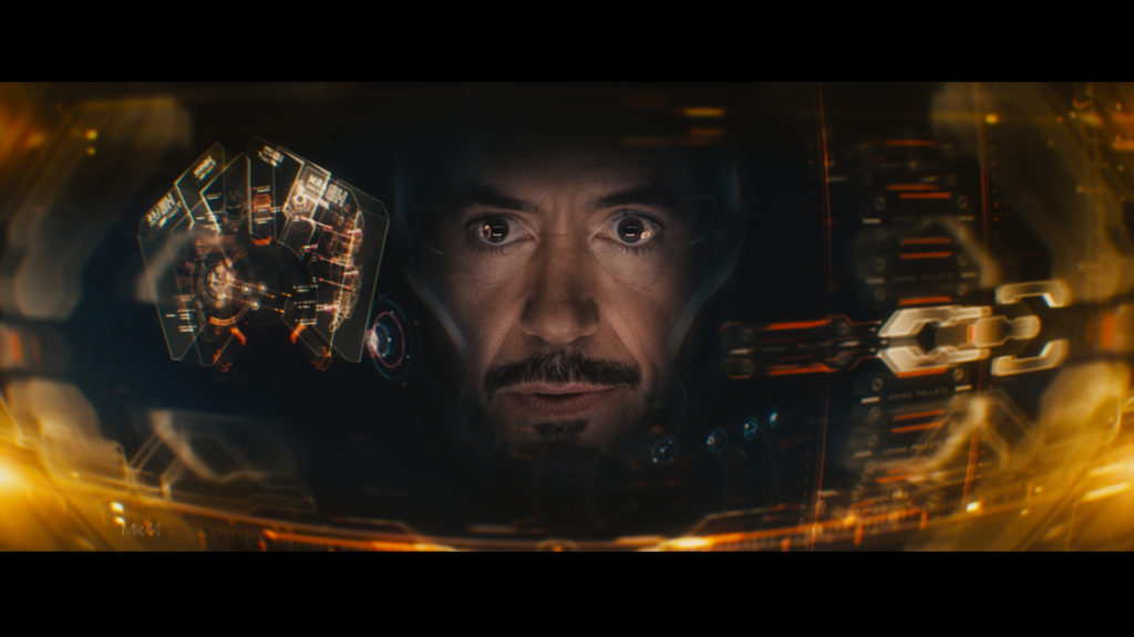
When the design team at Cantina Creative started visual effects work on Iron Man 2, they had no idea that their heads-up display (HUD) for Tony Stark’s Iron Man would become iconic. The visual arts studio became one of the industry’s go-to agencies for futuristic user interfaces, computer monitor graphics, and HUDs found in some of the world’s biggest superhero, action, and science fiction films.
As recreational drones, augmented reality apps, and electronic displays in cars gained popularity in the years following the movie’s release, Cantina Creative’s HUDs became the standard that many designers and consumers expected. The studio is increasingly taking its artistic storytelling approach into the real world to help companies create intuitive and engaging displays for users.
I spoke with co-founders Sean Cushing and Stephen Lawes about how they use Adobe After Effects and other Adobe Creative Cloud apps to bring interfaces to life on screen and in life.

Tell us about some of the work that Cantina Creative is known for.
Sean: We’re known for a lot of big action, science fiction, and fantasy movies and television shows: “Avatar,” “The Hunger Games,” “Aquaman,” and the Marvel Cinematic Universe. One project that I really loved working on was the Ryan Reynolds movie, “Free Guy.” The idea is that he’s in a video game, so when he wears special glasses, he can see the video game world on top of the real world. The HUD becomes a really instrumental part of conveying his emotions and experience and is an added element of humor. It goes beyond information and shares new layers of the story.
Stephen: Iron Man’s HUD really changed things for us. You don’t see a lot of truly memorable motion graphics in films, but that HUD became something that everyone could instantly recognize. What amazed us is how it started to influence the real world in terms of design ethos. We started to get job requests from companies who loved what we did in the movies and wanted to bring it into their products.
We’re now engaging with aerospace companies to develop UIs and HUDs for future tech. And we’re just starting to work with Apple Vision Pro goggles to add our design sense to those applications.

What makes your approach to HUDs stand out?
Stephen: For us, every single HUD needs to tell a story. You can see it best in “Iron Man” and how the HUD evolves throughout the movies. We start by analyzing the character, who they are, what they want, and what their world is like. Then we try to convey all of that visually, particularly paying attention to design beats that will connect audiences to that character. “Iron Man” has this little boot-up moment when Tony Stark puts on his suit to let the audiences feel like, this is it, now Iron Man is here.
We update the HUD for every Iron Man appearance in a film. It starts by looking at the suit itself. How did it change from the previous movie? What are its new capabilities? How would the HUD need to evolve for Tony Stark to control it?
Does that story-telling based design philosophy hold true for real-world HUD designs?
Stephen: Absolutely. It’s really a back-and-forth conversation because when we work on movies, our goal is to elevate very grounded scenarios. But then our creativity inspires what real-world clients are looking for. You start to see those direct design connections.
Sean: There are big differences as well. In movies, we’ll use cinematic tricks like depth of field, but in reality, adding too much dimensionality to displays can be really distracting and confusing for the human brain. We focus more on how we can add dynamic elements to 2D designs.
What does a typical HUD design workflow look like?
Stephen: It always starts with sketches. That might mean pencil and paper, Adobe Illustrator, or even drawing over a photograph in Adobe Photoshop. For movies and TV shows, we often get imagery from the production design team, so we can start to expand on those foundations to find our visual language.
Once we get a general design figured out, we’ll start doing animation tests in Adobe After Effects to see how it will work with the aesthetics of the production and the character. What I like about After Effects is that it lends itself to a very fast turnaround with iterative processes. Since it’s layer based, you can really mess around and jump between different ideas without restrictions.
We also use a lot of Adobe Substance 3D Collection for any CG assets. For the television series “The Lord of the Rings: The Rings of Power,” we used Substance for all of the texturing and shading when we created the maps that the characters follow. Best of all, we can bring 3D models directly into After Effects and do all of the shading and rendering in the same application. It skips a stage and makes everything faster.
What are some of your favorite new Adobe capabilities?
Stephen: Generative Fill in Photoshop is a gamechanger. Often times we’ll need to make a clean plate for a shot, and it can take us hours to erase objects from the foreground to get what we need. Generative Fill turns that into a five-minute task. That’s a real lifesaver, and it gives us back so much time to focus on what we’re doing on screen.
What do you think the future of technology and design look like?
Sean: With recent advancements in AI-powered virtual assistants that can respond to voice commands, images, and video, we may soon be applying our experience in that area to projects. We’ve created virtual assistants for Netflix’s “Atlas” and many HUDs in the Marvel Cinematic Universe so why not real-life?
I also think augmented reality will become much more commonplace in daily life. We’ll start to ask how we lived without it, like a smartphone. I just hope that it’s interesting and enhances our lives and isn’t defined by just one company.
Having said that, I think AR designs are a bit too austere right now. We push animations to entertain and draw visual interest in movies, but it’s often seen as superfluous in real life. There’s a way to use dynamic animations to bring interfaces to life without adding too much complexity, and I hope we’ll start to see that in the future. That’s another place where I think After Effects will really help people push the limits of creativity.
Learn more about Cantina Creative at their website.

